60s – 80s Modernism
1. Corita Kent
Corita Kent (1918–1986) was an artist, educator, and advocate for social justice.
Throughout the ‘60s, her work became increasingly political, urging viewers to consider poverty, racism, and social injustice. I think this is a lesson for us that we have to get involved more with the community and the political issues.
She remained active in social causes until her death in 1986.
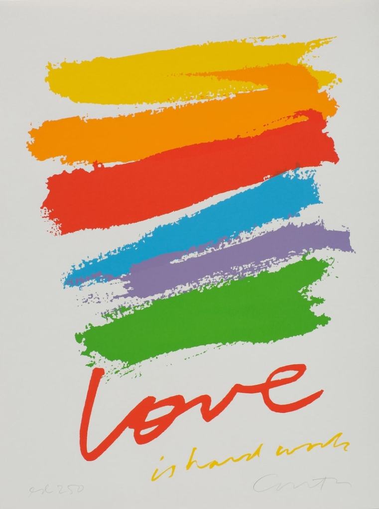
She just wanted things to be beautiful, an expression of joy.
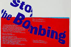
More political is stop the bombing (1967), her protest against Vietnam, with blue text against an angry red background.
From the age of 50 she lived alone, for the first time in her life, moving into an apartment in Boston. From now on her work becomes quieter, includes nature-inspired watercolours, and reflects her search for meaning from other religious traditions as well as pieces that reflect her experience of cancer, with which she was diagnosed in 1974 and again three years later.
She had unique teaching techniques – school trips would vary from visiting Charles Eames’ studio, to going to the local supermarket to observe people and packaging.
Corita’s artwork has a profound effect on people. Its vibrancy, enthusiasm and hopefulness has the ability to touch anyone, art lover or not.

2.Derek Birdsall
Birdsall enrolled at Wakefield College of Art in 1949 for a three-year foundation course. He won a scholarship to the Central School of Arts and Crafts where he studied under typography tutor Anthony Froshaug in a department called Book Production and Commercial Design.Birdsall was born in Wakefield, Yorkshire, in 1934 and attended The King’s School, Pontefract, Wakefield College of Art and Central School of Arts and Crafts in London
Between 1955 and 1957 Birdsall did his National Service in an army printing unit. He was posted to Cyprus during the Suez Crisis, when he received magazine cuttings and books ordered from Penguin booklists sent by his wife Shirley, a childhood sweetheart.
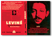
Birdsall was lecturing in the history of typography at the London College of Printing. In 1960 he had joined forces with three other designers: George Daulby, Peter Wildbur and George Mayhew, a designer who had done a lot of work for Joan Littlewood’s Theatre Workshop company. The team was named BDMW Associates.
Shaker Design won a gold award from the New York Art Directors Club in 1987.
His drawer is full of handwritten notes and will one day be transformed into a large-format compendium of Birdsall tips on everything from typefaces and typesizes to papers, grids and impositions. I think this is good idea for us – too collect and keep ideas not only digitally but as notes.
Birdsall says ‘White space is the lungs of the layout. Clients don’t understand the function of white space. It’s not there for aesthetic reasons. It’s there for physical reasons. I want to do this entire book without a single reference to aesthetics. “
“I admire people like Paul Rand, Alan Fletcher, Bruno Munari and Henry Wolf.”
Derek Birdsall has established himself as one of Britain’s leading book designers. He wrote “Notes on Book Design”.
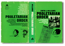
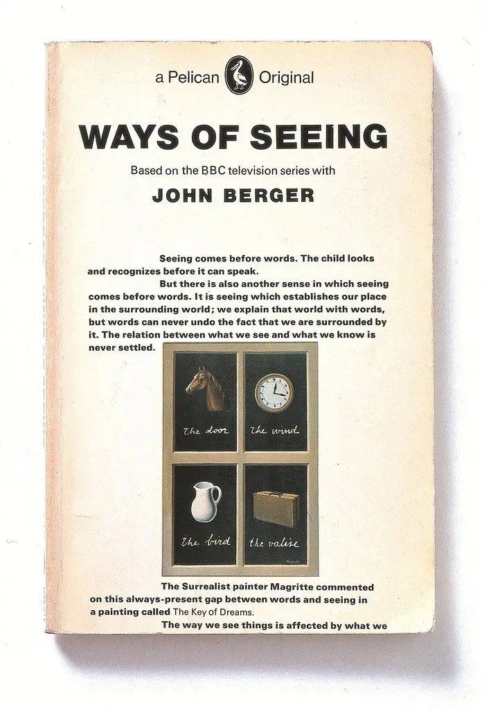
3.Richard Hollis
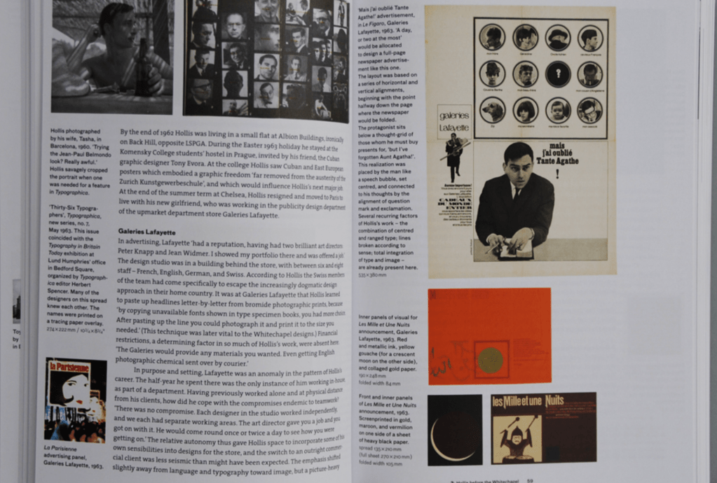
Hollis was born in London and studied art and typography at Chelsea School of Art, Wimbledon School of Art and Central School of Art and Crafts in London, before moving to Paris in the early 1960s.
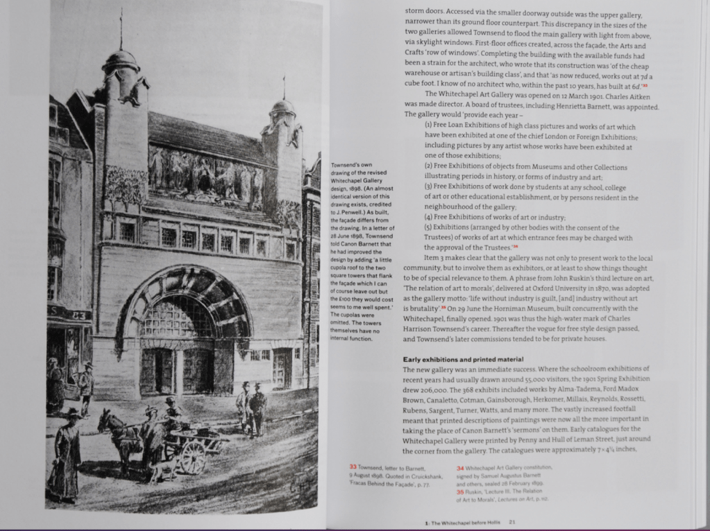
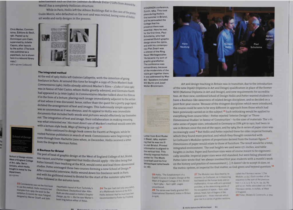
He designed the visual identity and marketing material for the Whitechapel Art Gallery in London. He also co-founded the School of Design at West of England College of Art.
He has taught at various art schools, written books, and worked as a printer, as a magazine editor and as a print-production manager.
He wrote Graphic Design: a concise history; Swiss Graphic Design: The origins and growth of an International Style; About Graphic Design, and co-author of Avant-Garde Graphics 1918-1934.
Book Design:
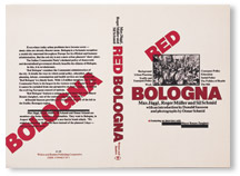

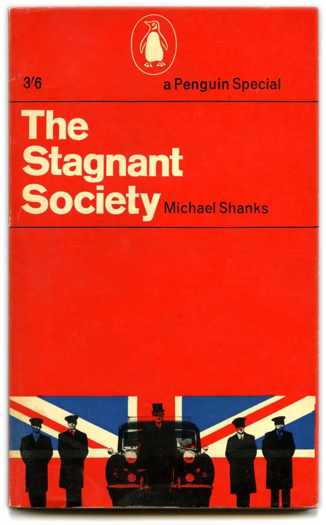
A 1961 book cover for ‘‘The Stagnant Society’’ by Michael Shanks, designed by Richard Hollis.
Designed lettering on buildings, the best-known being Hackney Empire, 2003.
Appointed Royal Designer for Industry, 2005.
Hollis became fascinated by Swiss Modernism while the movement was still fresh and largely unknown in Britain; many of his typographic habits defy the dogma of the style’s later period. Influenced by concrete poetry, Hollis tends to break lines ‘for sense’ rather than neurotic neatness, and he has often made dynamic juxtapositions of unjustified and centred texts on the same plane.
Potter was a nightmare to work with, but he had very highly developed programmes for teaching. We both used to prepare client questionnaires for each job.
It is interesting what he shares:
“CW: Having set up your new Bauhaus, why did you leave after only two years?
RH: Most art schools then were run by people who came out of the war and got grants for art school, which was an ‘easy’ option. There was always this dead weight of people with whom one had the most astonishing arguments. If they designed a book jacket, they’d then make a mount for it with a bevelled edge, like a watercolour painting. I tried to explain that you didn’t look through a window at it. But this was attacking their values.
CW: So you have never wanted to display an image huge because you felt like it, or because it worked but you couldn’t say why?
RH: It wouldn’t interest me – the ideal situation is where you sit with the client and design with them. If anything is emphasised, it’s what they want to emphasise. So often you’re left with no guidance as to what to give prominence to. I much prefer collaborative effort to doing what I want to do. It’s diametrically opposite to being an artist. Artists are free to put things into any form they like, which may or may not be comprehensible in the way they hope. For me, working with the person whose message it is is the most comfortable.
CW: Designers who prefer more space might argue: ‘I’m the expert; why should I let someone who is quite possibly visually illiterate tell me how to do my job?’
RH: It’s more like a consultation with a doctor, who has the knowledge and expertise, and the patient, who explains what the symptoms are, and later says whether the prescribed treatment is working. The client certainly shouldn’t express any expertise in design – they should only express an understanding of what they want to get across. In conversation the designer can sometimes help them understand what they’re saying. It’s a mutual engagement to effect a response from anyone who looks at the material being produced. The more distant from the client you are, the worse it is. This is why client questionnaires are so good: ‘what are you trying to say?’
We can take from this conversation that working an a project, we need to find way to engage the client and consider his opinion at every stage of the project.
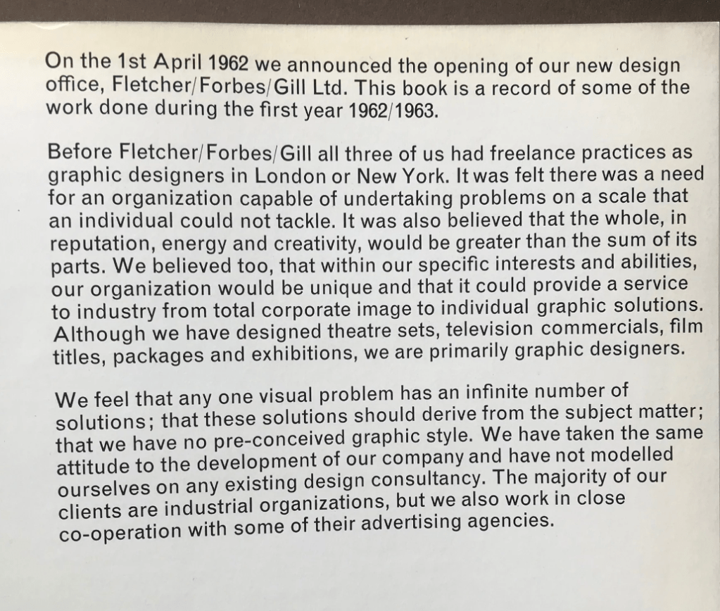
4.Fletcher Forbes and Gill
5.Pentagram
“Pentagram is a multi-disciplinary, independently owned design studio.
Our work encompasses graphics and identity, strategy and positioning, products and packaging, exhibitions and installations, websites and digital experiences, advertising and communications, data visualizations and typefaces, sound and motion. Our 23 partners are all practicing designers, and whether working collaboratively or independently, they do so in friendship.
Our structure is unique. We are the only major design studio where the owners of the business are the creators of the work and serve as the primary contact for every client. This reflects our conviction that great design cannot happen without passion, intelligence and — above all — personal commitment, and is demonstrated by a portfolio that spans five decades, many industries, and clients of every size.”
https://www.pentagram.com/about
I browse at the work of the group – there are so many amazing pieces.


“Pentagram is a design firm. It was founded in 1972, by Alan Fletcher, Theo Crosby, Colin Forbes, Kenneth Grange, and Mervyn Kurlansky at Needham Road, Notting Hill, London. The company has offices in London, New York City, San Francisco, Berlin and Austin, Texas. In addition to its influential work, the firm is known for its unusual structure, in which a hierarchically flat group of partners own and manage the firm, often working collaboratively, and share in profits and decisionmaking.”
“[Pentagram] was truly about doing the work and not about bureaucracy… It is not like joining some big corporation – it is very personal and human.”
Emily Oberman

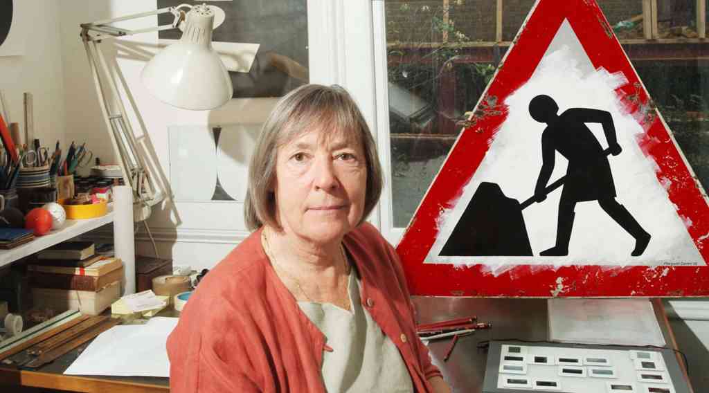
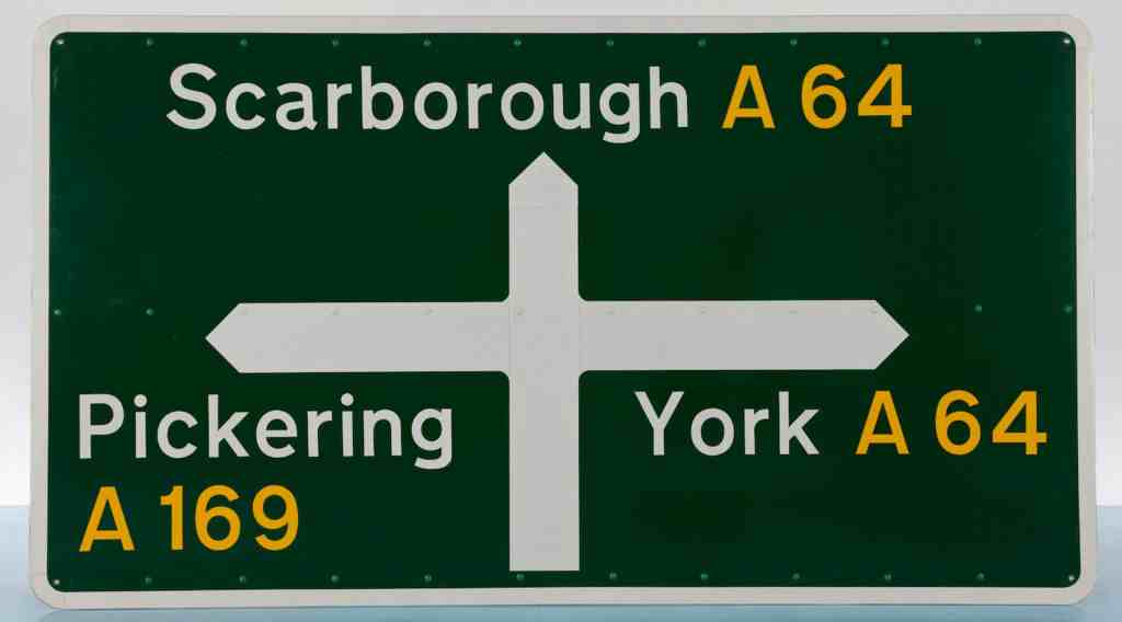
6.Margaret Calvert Jock Kinnear
Often considered the ‘Mother of modern-day information design’, born in South Africa, Calvert moved to England at the age of 14. Studying at Chelsea College of Art, it was here that she met tutor Richard “Jock” Kinneir, who went on to ask Calvert to assist on the design of the new wayfinding signage at Gatwick Airport. Here, the infamous black on yellow scheme was founded, a scheme that continues to live on today, some 60 years later.
The rail alphabet typeface was designed for use on the British railway system. Similar, but not identical to the widely used weight of Helvetica, the typeface was first used at London’s Liverpool Street Station. It was then adopted by the Design Research Unit as part of their comprehensive 1965 rebranding of the company. The typeface became British Rails most successful and long-lasting element of their corporate.
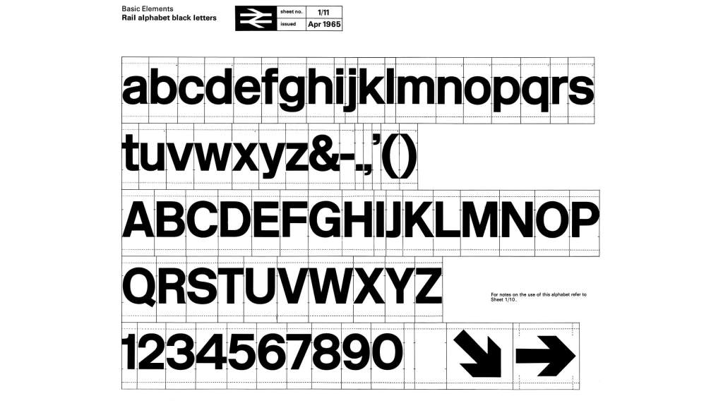
Each and every one of Calvert’s designs have become an integral part of the national landscape.
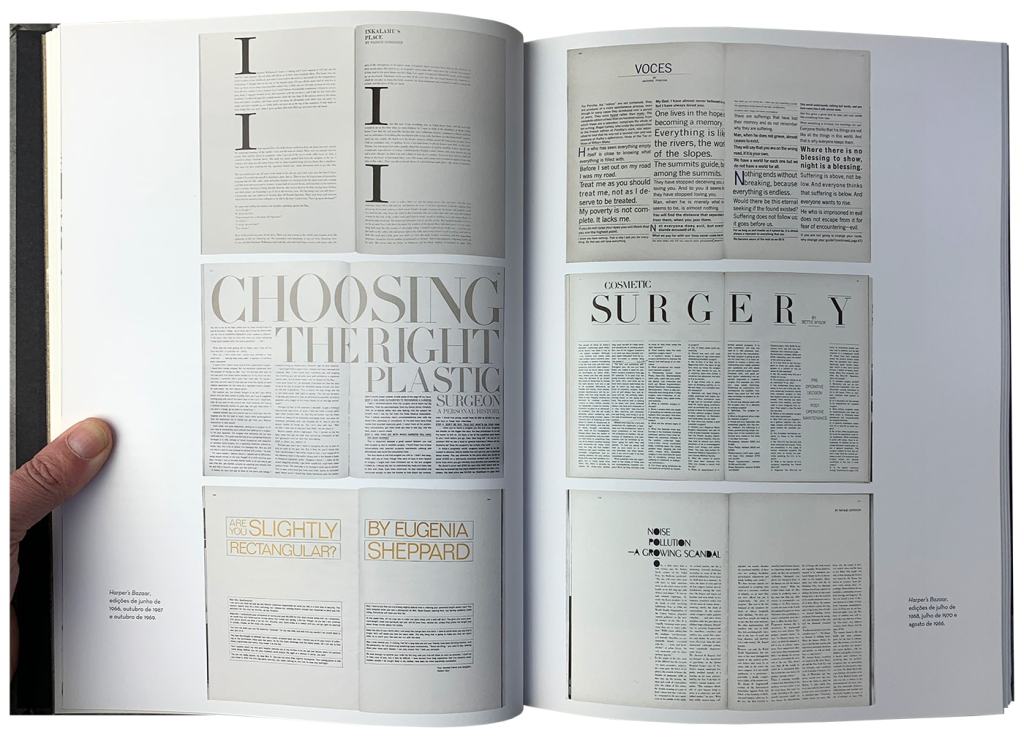
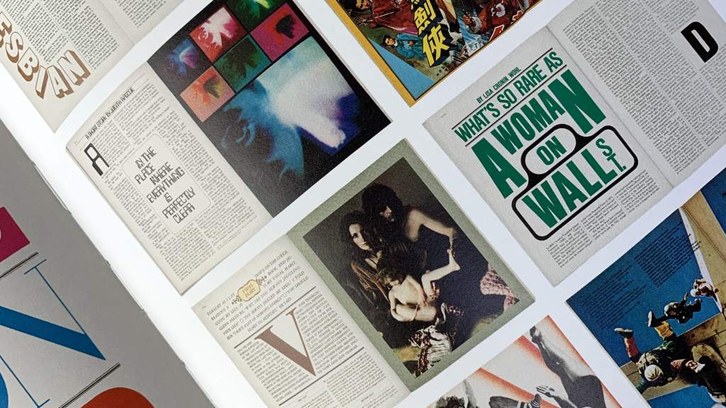
7.Bea Feitler
Beatriz Feitler (February 5, 1938 – April 8, 1982)[ was a Brazilian designer and art director best known for her work in Harper’s Bazaar, Ms., Rolling Stone and the premiere issue of the modern Vanity Fair.
Born in Rio de Janeiro in 1938, Feitler’s Jewish family had escaped from Nazi Germany. She studied at the Parsons School of Design in Manhattan and at only 25 years old she became an art assistant, then one of the youngest—and the first female co-art directors—at Harper’s Bazaar magazine. There, she worked with photographers including Richard Avedon, David Bailey, and Annie Leibovitz, and in 1965 she cast Donyale Luna, the first black model featured on the cover of a mainstream fashion magazine.
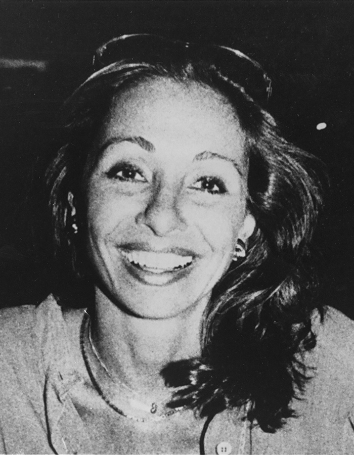
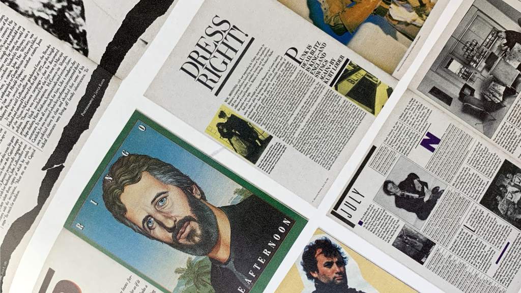
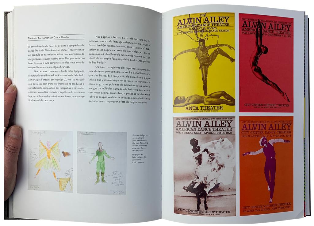
Bea Feitler sadly died from cancer in 1982 before her redesign of Vanity Fair magazine was published. She was only 44.
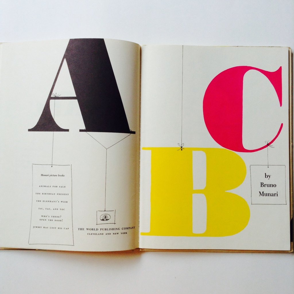
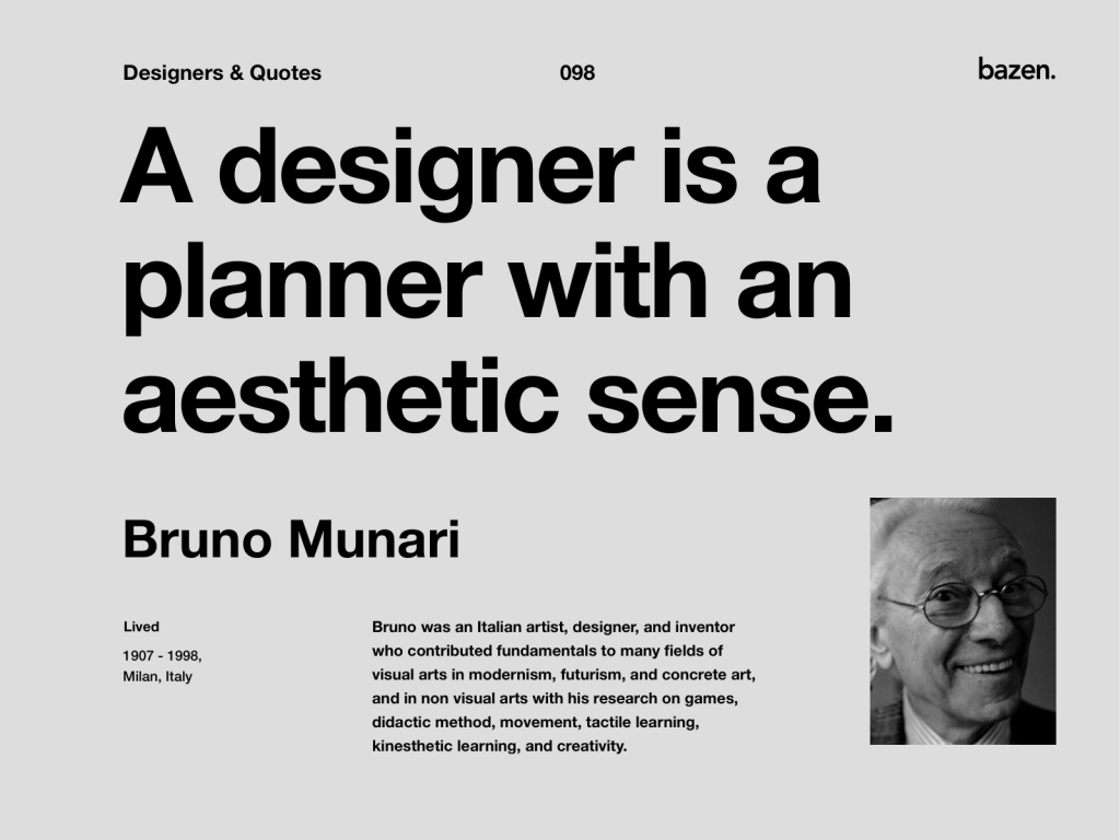
8.Bruno Munari
Bruno Munari (October 24, 1907 in Milan – September 30, 1998 in Milan) was an Italian artist, designer, and inventor who contributed fundamentals to many fields of visual arts (painting, sculpture, film, industrial design, graphic design) in modernism, futurism, and concrete art, and in non-visual arts (literature, poetry) with his research on games, didactic method, movement, tactile learning, kinesthetic learning, and creativity.
In seventy years of activity, Bruno Munari created works ranging from art to graphics to design to book series – the stainless steel Talking Forks accompanied by an illustrated book with the project’s drawings and illustrations (1958); the Concave-Convex installation (1947); the Negative-Positive series of abstract paintings (1963); children’s books – Prelibri (1980), Libri Tattili and Libri Illeggibili (1957), one of which is exhibited at MoMA in New York. L’Ora X Clock (1945) and Girondella Kinetic Objet (1965) are also shown at MoMA. Munari created such iconic design objects as the Cubo ashtray, which received the ADI Compasso d’Oro in 1954, and the Falkland lamp (1964), both for Danese.
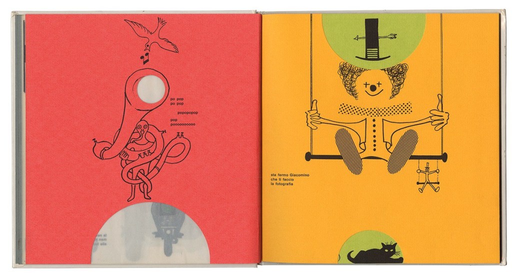
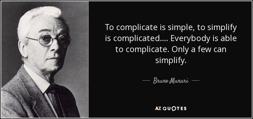
I like his thoughts on design:
“In 1948, Munari, Gillo Dorfles, Gianni Monnet and Atanasio Soldati, founded Movimento Arte Concreta (MAC), the Italian movement for concrete art. During the 1940s and 1950s, Munari produced many objects for the Italian design industry, including light fixtures, ash trays, televisions, espresso machines, and toys among other objects.”
80s, 90s Post Modern
Branding logo and individualism, technology and society
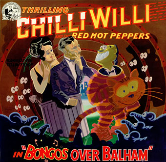
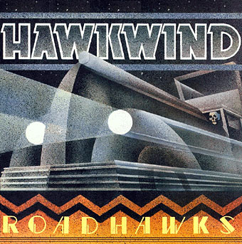
9.Barney Bubbles
Barney Bubbles (born Colin Fulcher; 30 July 1942 – 14 November 1983) was an English graphic artist whose work encompassed graphic design and music video direction. Bubbles, who also sketched and painted privately, is best known for his distinctive contribution to the design practices associated with the British independent music scene of the 1970s and 1980s. His record sleeves, laden with symbols and riddles, were his most recognisable output.
Fulcher, who suffered from manic depression, committed suicide in London on 14 November 1983 by gassing himself, trapping the fumes in a plastic bag he placed over his head, at the age of 41.
Yet many of the British designers who made their names in the 1980s – among them Neville Brody and Malcolm Garrett – cite Bubble’s eclectic appropriation of twentieth-century art and suburban kitsch as a vital influence.
Bubble’s favourite medium was the record sleeve. According to Hollis, Bubble’s decision to drop out of mainstream design and confine himself to the music industry is one reason why he was overlooked by the writers of his day.
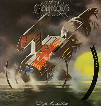
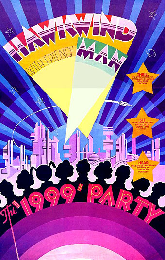
The shift of emphasis in the mid-Seventies was away from Art Nouveau towards Art Deco poster graphics, a style evident in all the 1999 Party tour artwork and the two sleeves that follow.
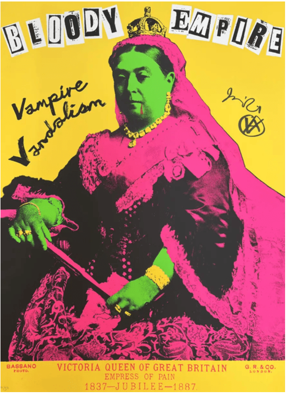
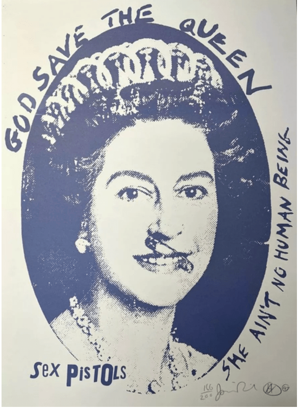
10. Jamie Reid
Jamie Reid (born 16 January 1947 in London, United Kingdom) is an English artist and anarchist.
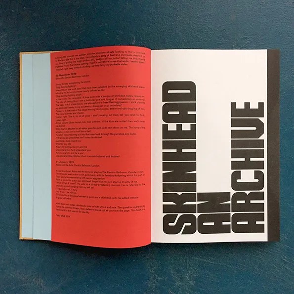
Jamie Reid helped shape the visual identity of the British punk movement with his décollage-style graphics that feature iconoclastic defacements of pop culture imagery and letters cut from newspaper headlines arranged like ransom notes.
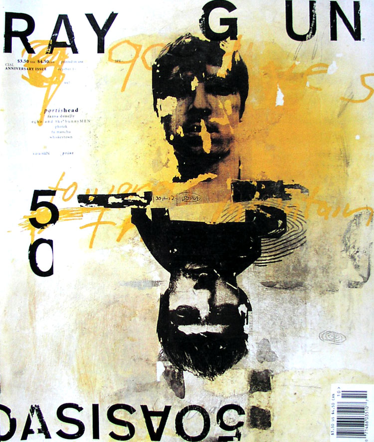
11. Ray Gun
“Ray Gun was an American alternative rock-and-roll magazine, first published in 1992 in Santa Monica, California. While the contents of its pages were not related to graphic design, Ray Gun magazine proved to be an exploration of typography, layout and visual storytelling that would shift the approach of many graphic designers. The magazine was founded in 1992 and led by the work of David Carson, who served as its art director for the first three years of its career, which lasted 7 years and over 70 issues.
Carson’s style of typographic experimentation influenced the development of the deconstruction style of design and a whole new generation of designers. The experiments by Carson and other Ray Gun designers were chaotic, abstract and distinctive, but sometimes illegible. The magazine’s radical subject matter often related to music and pop culture icons and the magazine became a reliable source for the prediction of up-and-coming stars.”
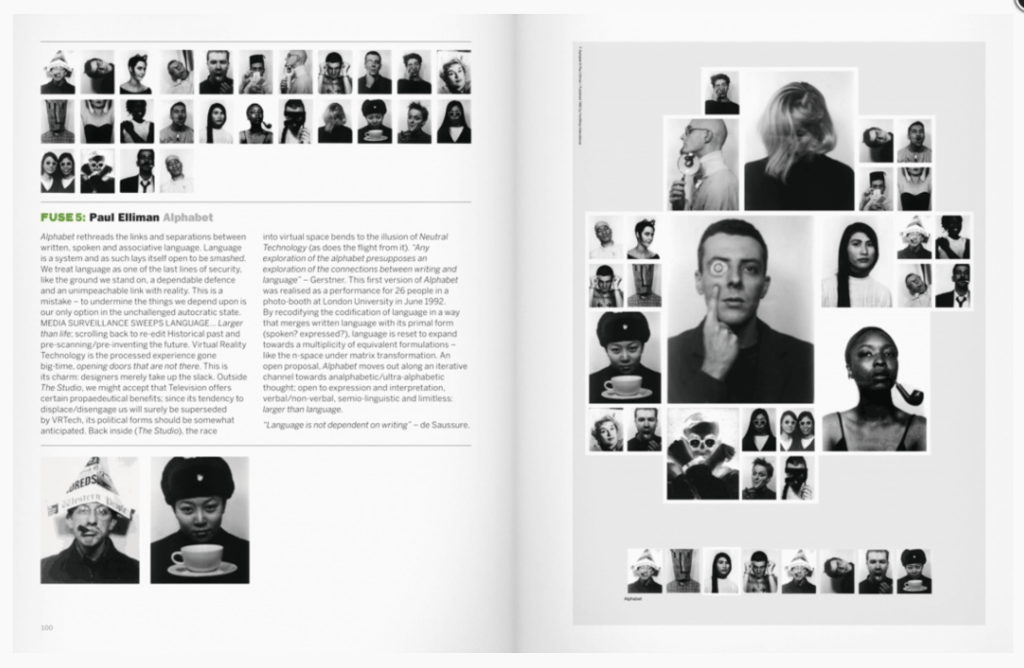
12. Fuse
Fuse is Neville Brody and Jon Wozencroft’s experimental publication on fonts and typography.
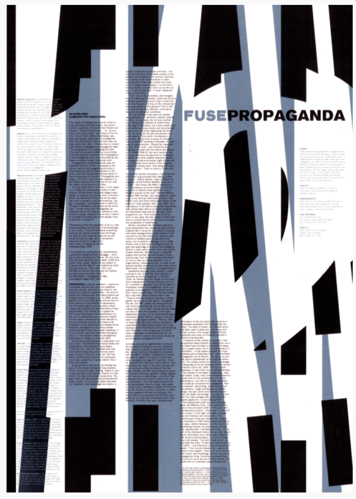
Neville Brody was born in London in 1957. He attended the London College of Printing from 1976-79 before becoming a freelance designer, mainly of record sleeves. In 1981 he became designer of The Face magazine, where his typographic experiments won international acclaim.
The magazine was very popular in the 1980s, it was called a “fashion bible” and set many of the trends of design which enjoyed success during the same time period.
In 1994 he formed Neville Brody Studio, now Research Studios, which has enjoyed much success and has since expanded to include offices in London, Paris, Berlin and Barcelona. He is a founding member of the London based type foundry Fontworks and has designed over 20 different typefaces during his career.

Leave a comment