1. Reflective Journal: The Effect of Globalisation on Design
Simon Manchipp says ” There’s a lot of negativity surrounding globalisation and how it’s leading to a homogenization of thinking, but actually I think the opposite is true, I think it’s encouraging greater collaboration, it’s encouraging bigger ideas and then it’s allowing us to work on a much bigger canvas. I think it’s a good thing, something to be celebrated and embraced. It’s an unstoppable force as well, so it’s not really worth worrying about, in as much as, there’s not a lot we can do about it. ”
I also agree with Sam Winston saying that ” The globalisation has added a lot of speed to life, it’s added a lot of connectivity to it, but I don’t think it’s necessarily changed some quite basic things about how we operate. I think people are still responding to other humans the most, that’s what makes the most impression. “
I think even although the globalizations has a lot of pluses, the connection with people still plays very important role – I am talking about the face to face meetings – I know we can use Skype, Facetime…and many other tools to see the face but is not the same as talking to somebody live. You also have to always consider the time difference.
Regarding this downside is what Tom Finn and Kristoffer Soeling mention that “we have a client in Puerto Rico, it’s a very smooth process because when we do speak on SKYPE, we have to make sure that we talk about all of the things that we need to get there, because you can’t just call up very easily. “
I like what Sarah Boris said “Globalisation has affected my business in the sense that it’s given me a lot of opportunities. It kind of opened a lot of doors and also new ways of thinking. “\
We are able to work with people anywhere in the world and see what others have done.
2. Guest Lecture. The Effect of Globalisation on Design
- with Harriet Ferguson – senior designer at Pearlfisher’s London Studio -https://www.pearlfisher.com/
“Pearlfisher started 25 years ago and has been working on projects around the world since then. They started in London, adding a New York studio in 2005, followed by studios in San-Francisco and Copenhagen in 2016. We use them as bases to work with clients even further afield, from Canada to China, Finland to the Lebanon. We share knowledge and resources between the four studios. This collaborative approach lets us get under the skins of our clients and their cultures.
At Pearlfisher we’ve got around 90 people from all corners of the world, working in four different time zones on projects globally. Most of the time, technology is the thing that links us all up together and allows us to get stuff done.
Even within each studio, there is a cultural diversity “
Harriet mention that the they also have little problem with the time difference when it comes to communications.
I like her pointers to us:
• Tell the story, one that the brand you are designing for can truly own;
• Find a unique way of talking that stands out and is fresh in the category;
• Keep it simple, consumers have enough on their plates already;
• Think global but act local;
• Consider the impact on the planet and what the brand can give back;
• Make it fun – an emotional engagement with a brand will make it more memorable.
3.What is the scope, and what are the boundaries of graphic design today? Current and future?
D&AD Awards showcases and celebrates the world’s best commercial creativity in design, advertising, craft, and production.
it is amazing what kind of ideas the designers have come up with. Going trough all the awards, watching the videos, the book covers, digital design, illustrations, media design, photography and many others, I felt like seeing a snapshot of the time we live in right now. There are touched so many issues that we live in today – women abuse, family, discrimination, animal abuse, gender identity, plastic pollution, gun law, global warming, online abuse….
This is one of the examples https://www.dandad.org/awards/professional/2022/236404/dont-ever-leave-me/
In 2021, Greece saw a disturbing rise in domestic violence and femicides. Many of these murders were falsely put down to intense feelings of love. Lacta, a chocolate brand that for years has been telling love stories, produced a short film that shows what love is not. Don’t Ever Leave Me starts as a clichéd love story under the Greek summer sun. Soon, however, the story takes a darker turn, and viewers experience the manipulative ways women are being trapped in toxic relationships. The film shook the nation and became the number one trending video on YouTube, with all TV channels airing it for free.
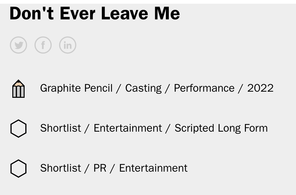
This video was created for the International Day for thee Elimination of Violence against women (November 25th). The video is very sad but meanwhile is trying to make us “to wake up” and realize that still there are people like this around us. I like the message “True love is your right and we are here to defend it.”
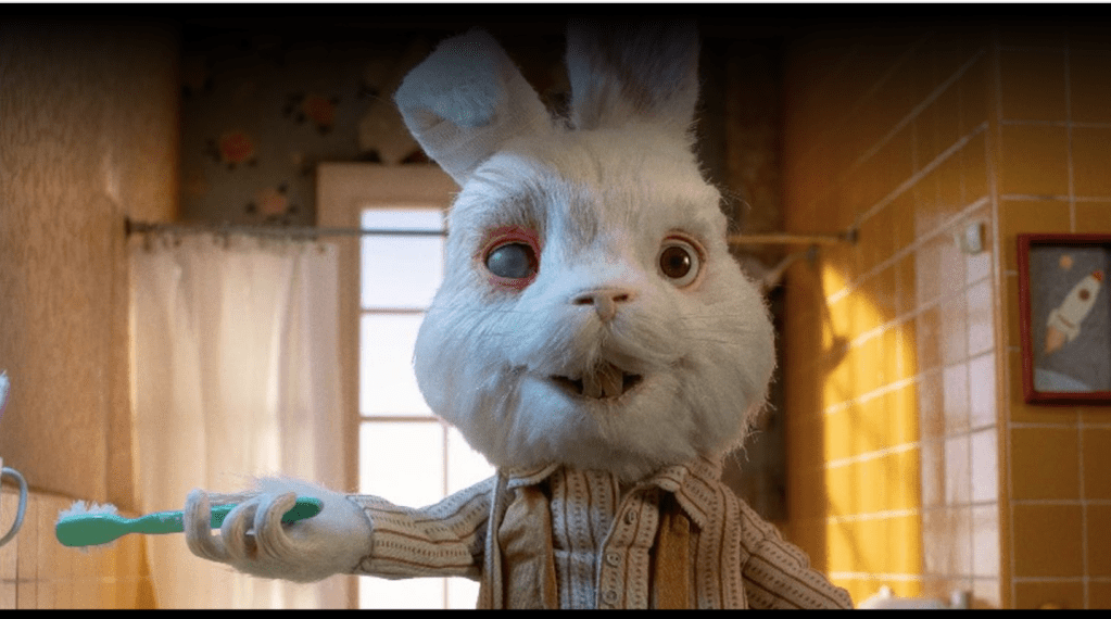
“Save Ralph” is another great video – I almost cry on the end of it.
Thee messages the creators were sending are:
“No animals should suffer and die in thee name of beauty!”
“Help Humane society International ban cosmetic testing on animals globally”
Save Ralph is a poignant and heartbreaking stop-motion animated short film calling for an end to cosmetic testing on animals around the world. The film tackled the disturbing issue using the story of one bunny, Ralph, to shine a light on countless rabbits and animals suffering in laboratories. Ralph, a modest rabbit, takes part in a documentary-style interview as he goes through his daily routine as a ‘tester’ in a lab. Dark humour, celebrity voices, stop-motion animation and a strong emotional message engaged viewers to help ban animal testing of cosmetics once and for all.
The “Adulthood” is an interesting movie – gives a courage to the young people coming from a different background to have better self-esteem and fight for their dreams. Because is advertisement for the Chrome book, tells us that this can be achieved using the technology.
“The technology help me to realize that is such a big world abut there.”
“Let’s put our focus on enjoying the ride.”
What impresses me here is the great design on the different images used in the video.
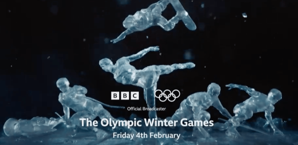
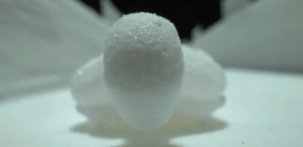
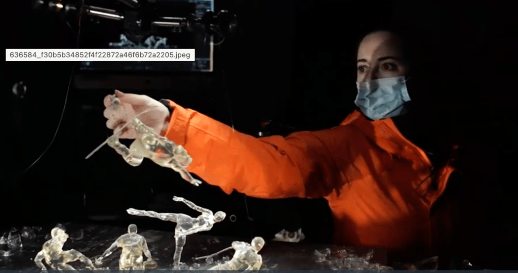
The video “Extreme By Nature” show us how much work is done on the background. The creators had to design every single piece for each timeframe of the movie.
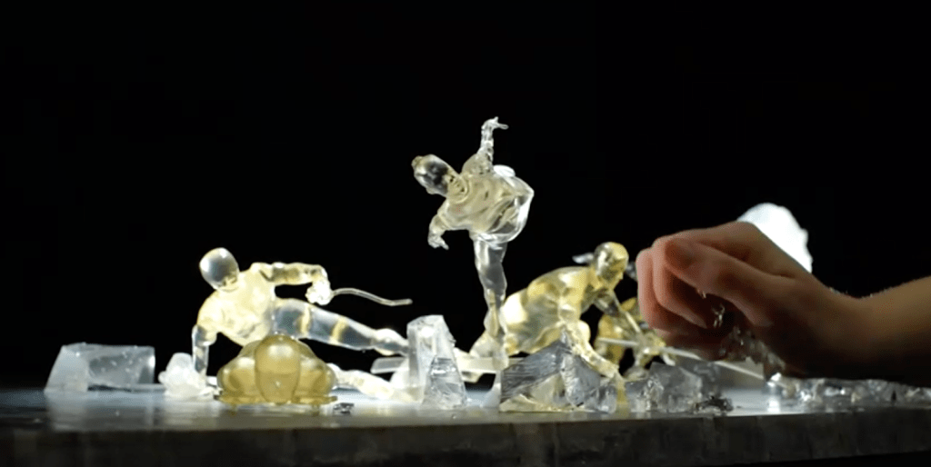
To launch the BBC’s coverage of the Beijing 2022 Winter Olympics, Extreme by Nature imagined a world where Winter Olympians are transformed into figures made of pure snow and ice, showcasing the unique grit required to compete in one of sport’s toughest spectacles. The mixed media animation created two distinctly crafted worlds of snow and ice within a cube: one brought to life in stop motion as individually 3D printed frames, and the other made through a combination of practical camera effects, CGI and post.
Tencent Youth Science needed a way to connect with its young audience beyond the conference format. The answer was to design an interactive ‘poster-card’ that became a fun puzzle for both children and their parents. Children that scanned the QR Code on the poster received an e-book version of Becoming A Scientist. Children mailed the postcards, shared it on social media and inspired others to participate. A print and publishing budget of $3,000 led to 5.2 million e-book downloads.
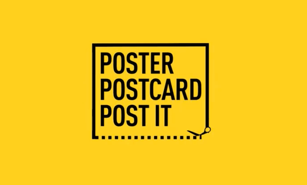
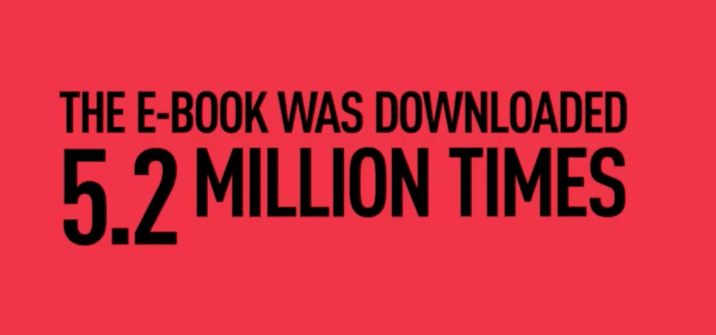
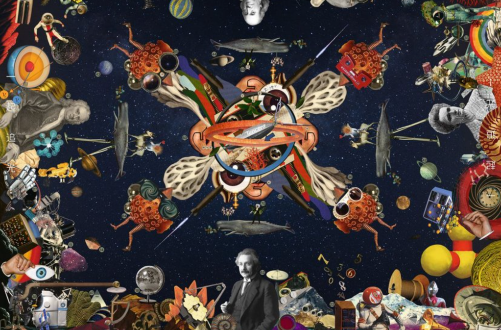
When we are creative the result is amazing – 5.2 million e-book downloads!
There is another video (Spice up your Valentine’s Day) that shows that in today social media boundaries we have to find different way to send a message that is little out of the ordinary.
Le Chocolat des Français is a brand known for its creative, illustrated packaging. For Valentine’s Day 2022, the brand created chocolate using ginger, which is considered an aphrodisiac, making it ideal for couples who have fallen into a routine.The brief was simple: create packaging and a campaign that is colourful, fun and sexy, so five packs were created, each with naughty visuals showing five different scenes of bored couples. To avoid censorship issues, the visuals used everyday objects that serve as innuendos when read with the line ‘Spice up your Valentine’s Day’.
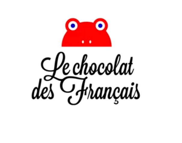
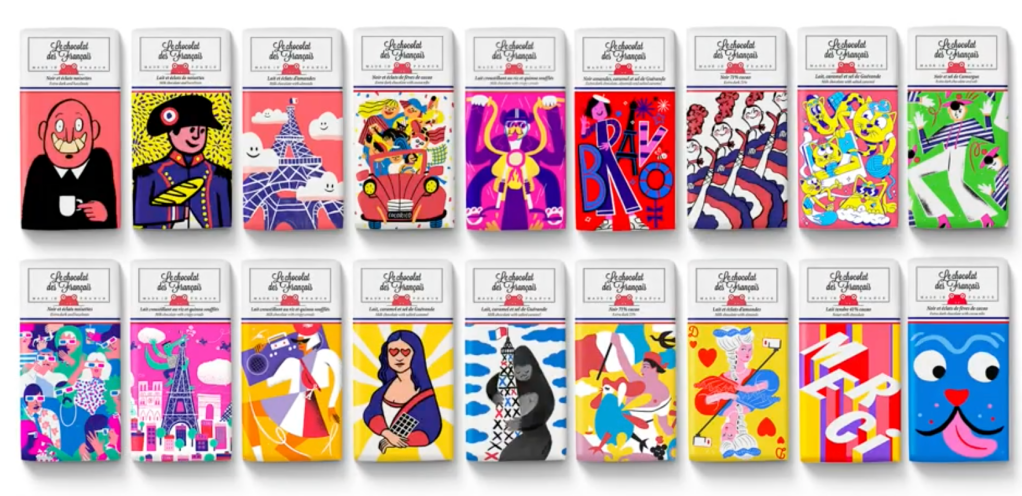
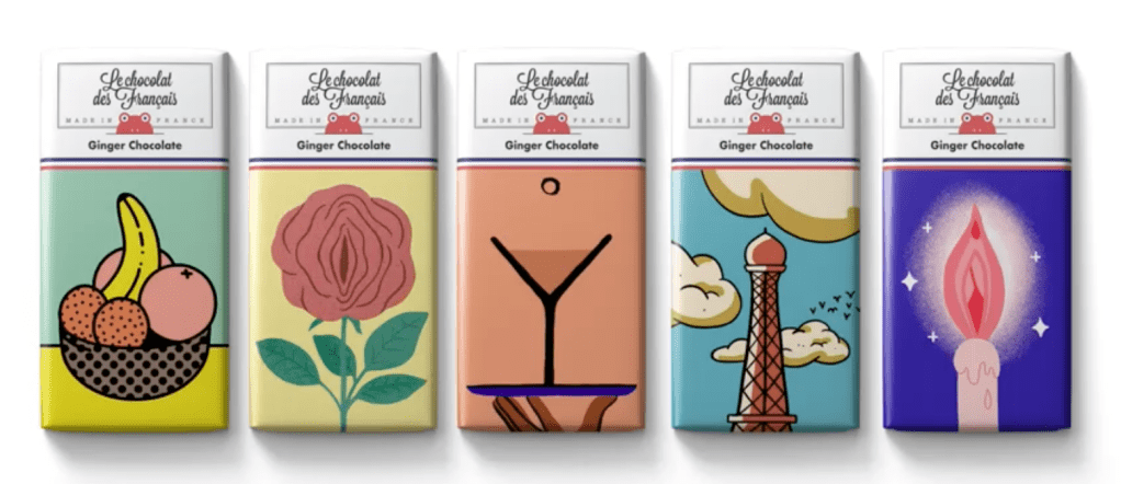
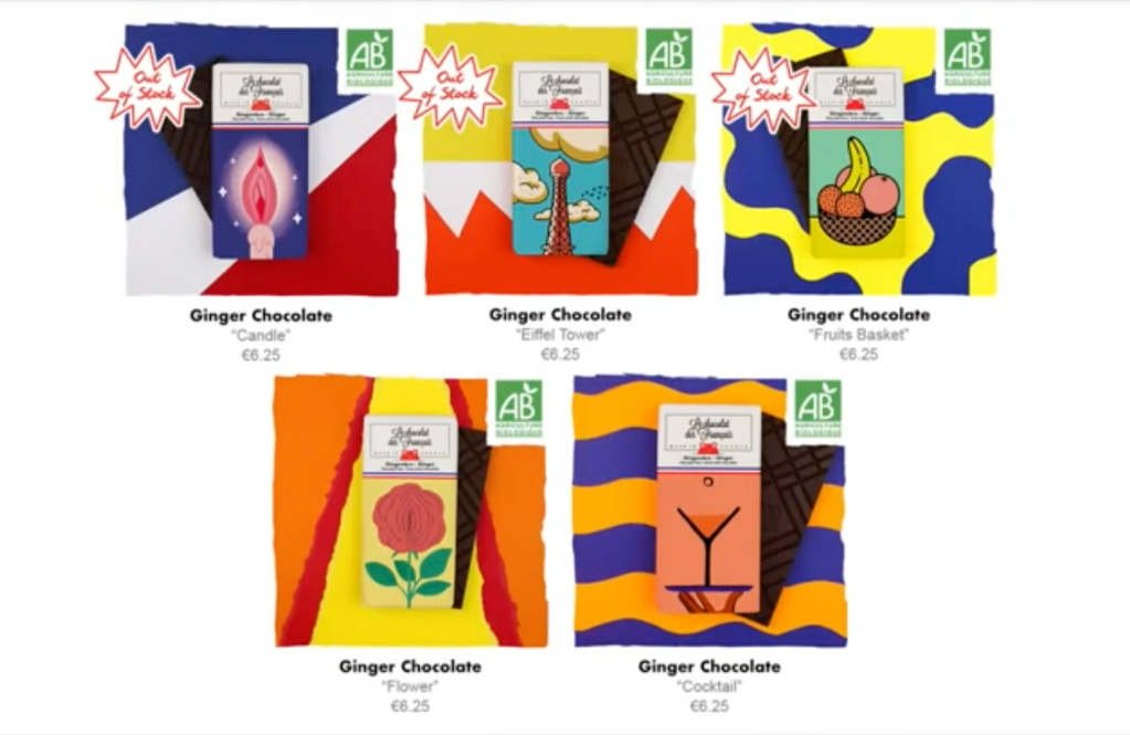
This are the results of this creative approach – they use objects only human eye can see – this way the social media din’t took them down.
This video made me laugh.
The question was what are the boundaries of graphic design – but I think there no boundaries – design is needed everywhere. On order to help solving a problem, the designers need to create unique message and be bold.
The video The Lost Class is a proof of it.
The National Rifle Association (NRA) spends $250 million annually to advocate for pro-gun legislation. How do you fight for common sense gun laws while facing such a powerful Goliath? One idea was to hold a graduation ceremony for The Lost Class, the 3,044 students who would have graduated this year if they hadn’t been killed by a gun. Two well-known gun advocates then gave the commencement address to the 3,044 empty chairs representing these lost students, ultimately turning pro-gun advocates into anti-gun spokespeople.
It is brilliant to come up with idea like this.
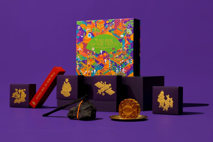
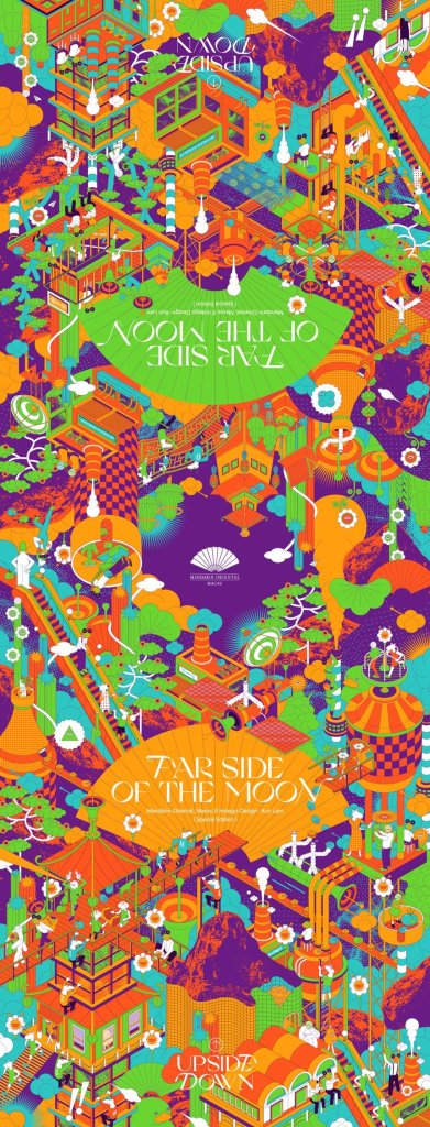
In the Far Side Of The Moon Mooncake were used humorous and absurd techniques creating the package and the poster.
https://www.dandad.org/awards/professional/2022/235197/far-side-of-the-moon-mooncake/
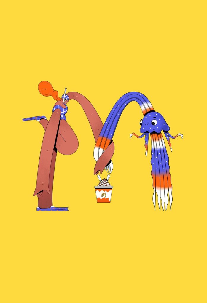
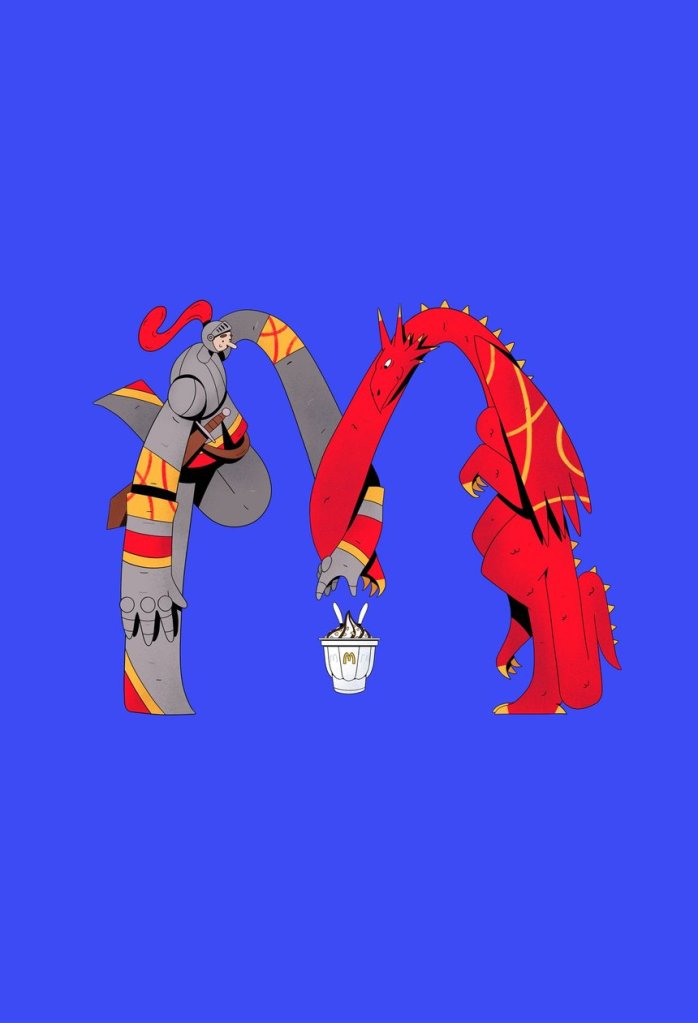
The illustration Reconciliation is good example of looking for hope after the difficult 2021.
A year of isolation gave rise to a strong sense of community France. McDonald’s ended the year with a message of hope, and a true feeling of togetherness and optimism for the years to come.
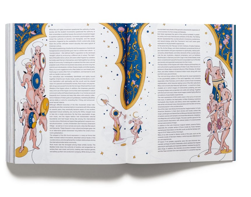
I love the illustrations in Acne Paper 16: Age of Aquarius – they remind me a little about the Art Deco style.
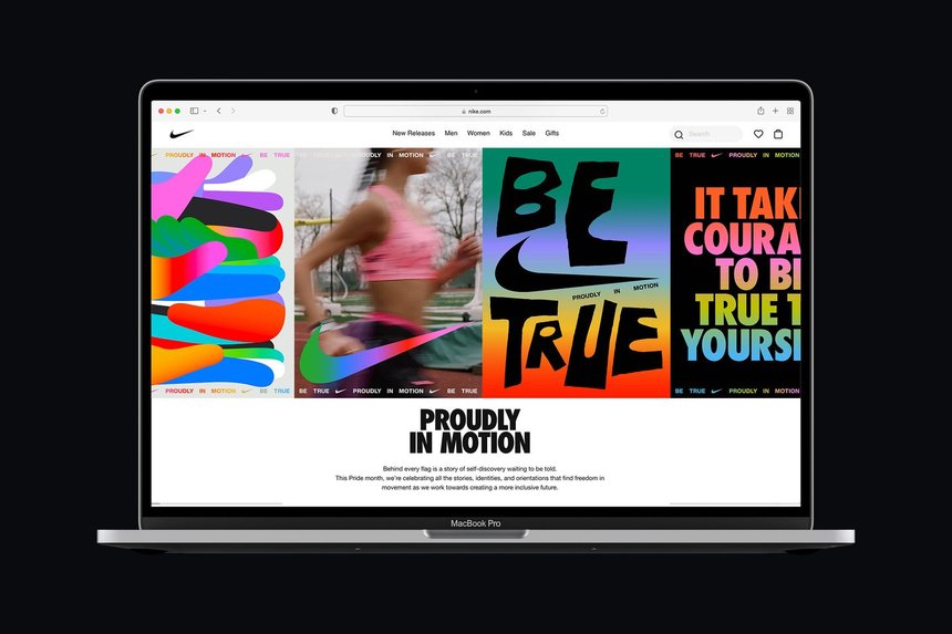
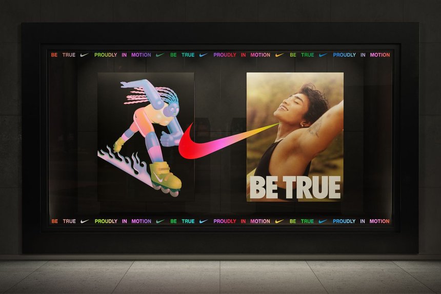
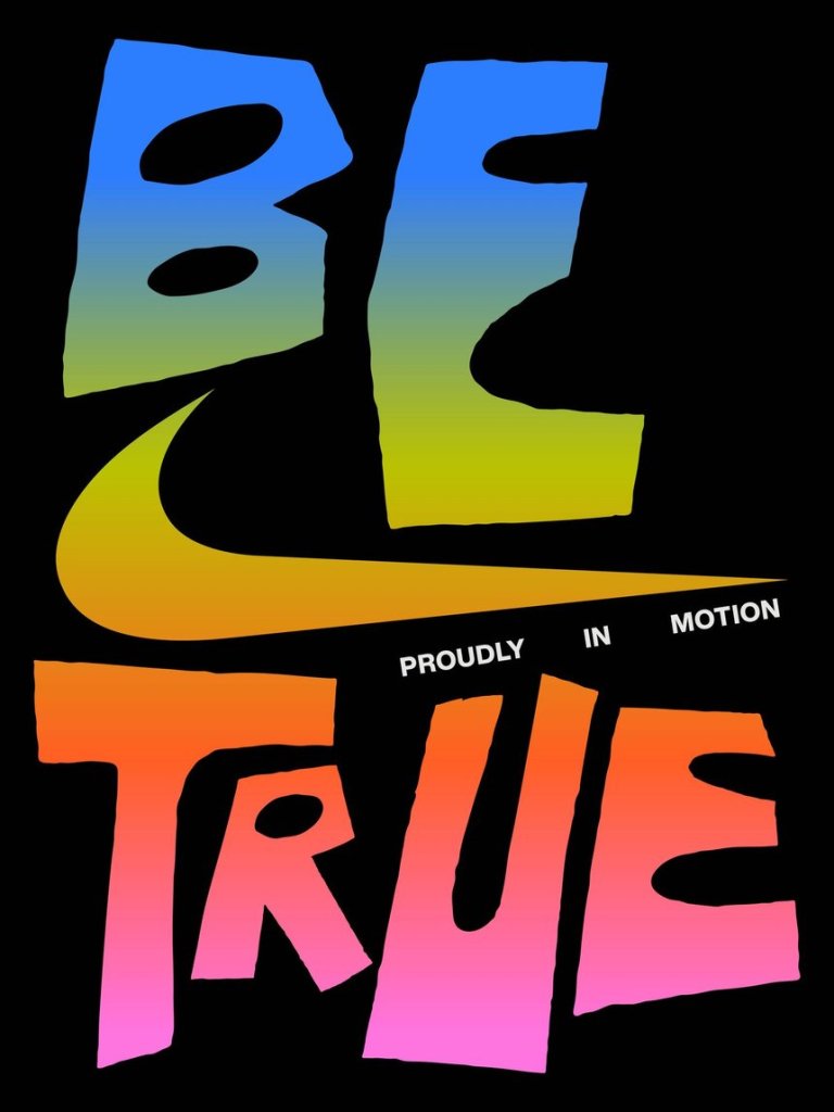
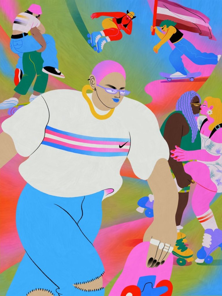
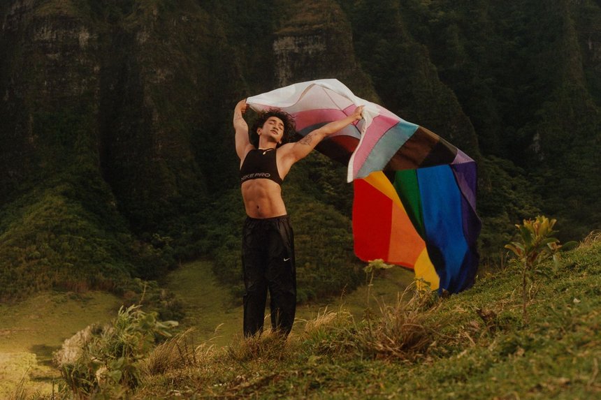
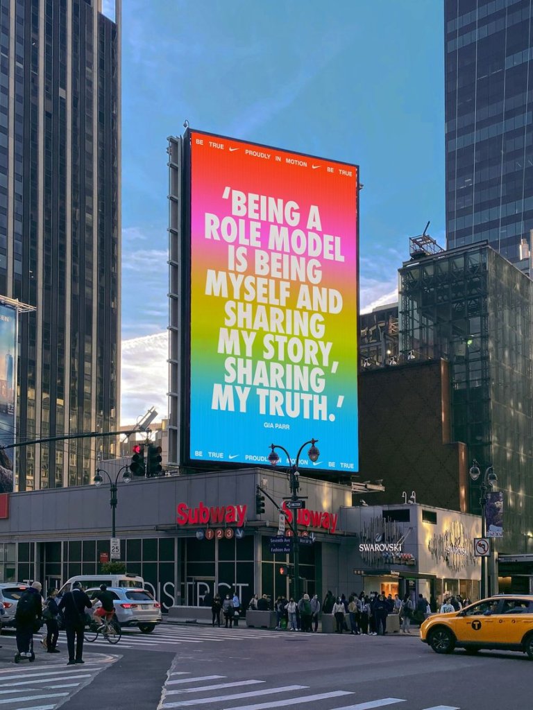
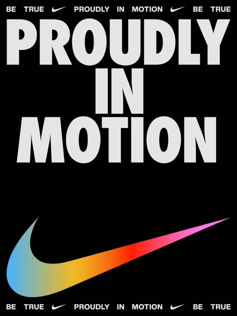
The Nike – Be True marketing campaign is a respond to the contemporary issue about gender identity.
Nike Be True required a fluid identity system that would allow for continual evolution. Embracing the full spectrum of identity expression within the LGBTQIA+ community, a more inclusive design system was introduced as well as a logo that’s designed to be reinterpreted every year. Creating space for more localised collaborations and partnerships with queer artists and athletes around the world, the new Be True identity creates a powerful platform for self-representation that can evolve with the community.
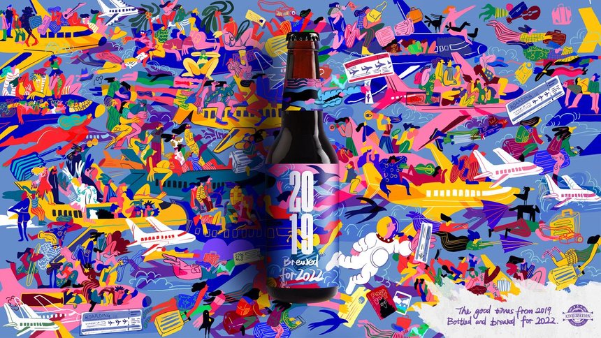
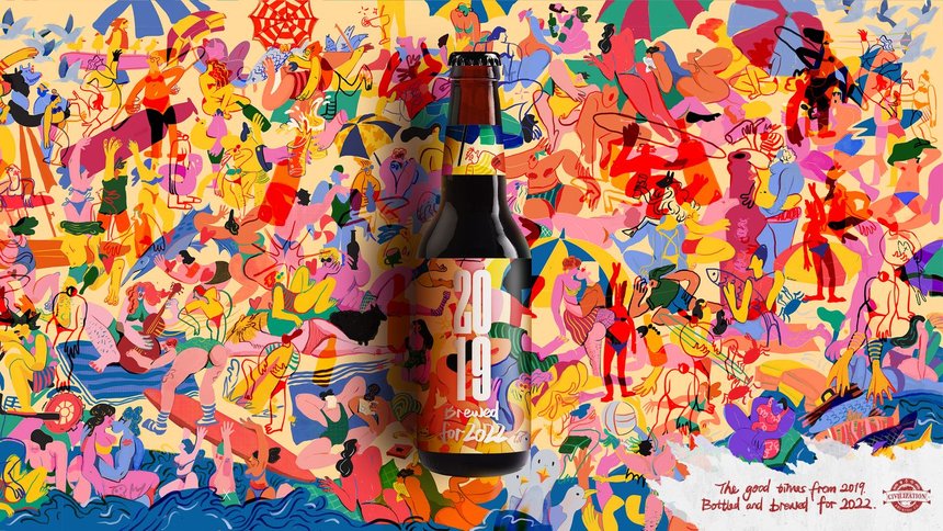
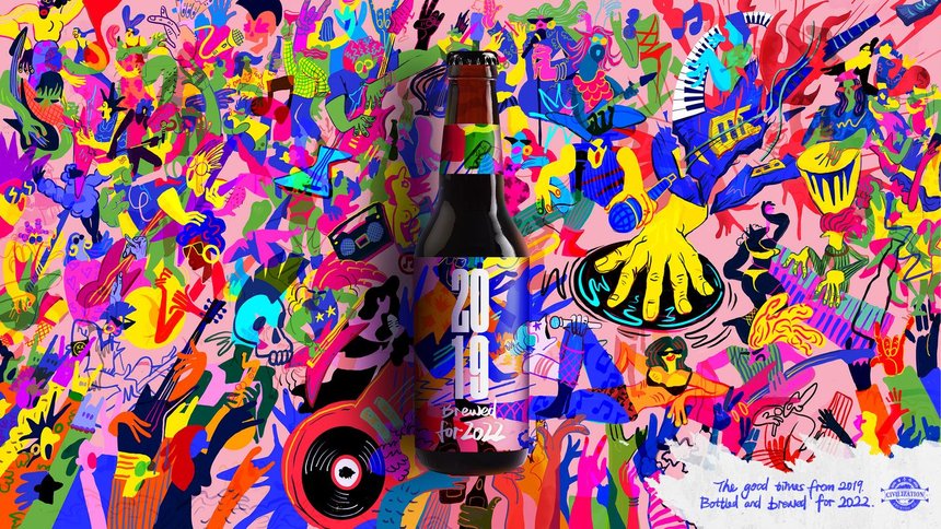
The 2019, Brewed for 2022 expresses the optimism of the people in the planet for better times after the lock down. Beautiful illustrations and great idea.
After two blurry years marked by lockdowns, 2022 brought with it some renewed optimism. Everyone was ready to taste that much-needed freedom, that pre-pandemic feeling was bottled and brewed for 2022 with Civilisation Beer. The illustration style embodied the feeling of having a good time in huge crowds, with each label bringing to life something that people are looking forward to doing in 2022 – from beach holidays with sketchy Wi-Fi to real-life concerts surrounded by real-life people.
https://www.dandad.org/awards/professional/2022/235196/google-shopping-shop-small-murals/
Google Shopping- Shop Small Murals is another example that there are no boundaries in the design – is brilliant – mural shopping – you see the illustrations in the murals – scan it – and shop – help the small local shops – help the community.
When Google needed to build awareness and consideration as a shopping brand, meaning people would have to think of Google as a shopping destination, not just a search engine. The answer was simple: Shop with Google. Those three words cemented the CTA in the minds of consumers and helped them realize they aren’t alone in the complicated world of ecommerce; they’re shopping with a trusted friend. A 60-second anthem launched a 3-month long national multimedia campaign that included film, OOH city takeovers, experiential OOH, shoppable murals, digital displays, editorial partnerships and social.
Sushi is ad with another creative approach.
Tradition and futurism came together to give sushi an entirely new look. Every object on the screen is broken down into cell-like particles, each of which has a traditional Japanese family crest attached to it – a visual metaphor for contemporary Japanese society.
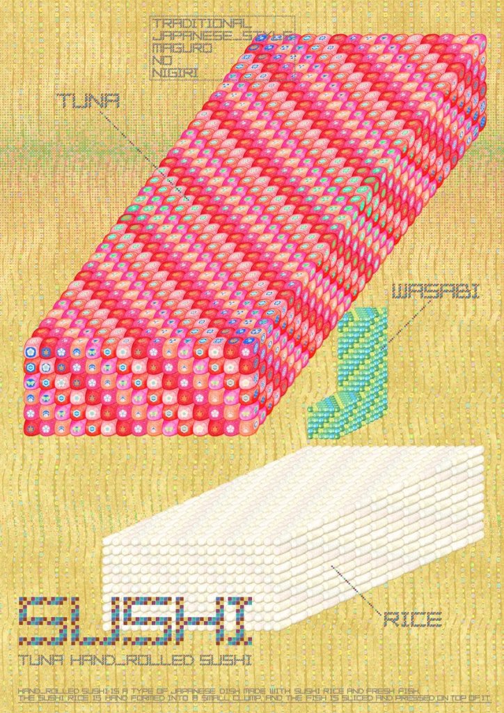
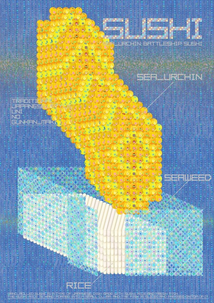
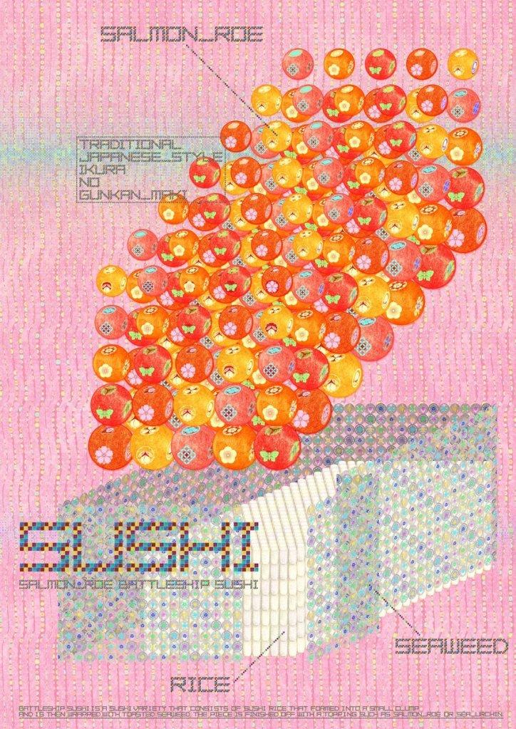
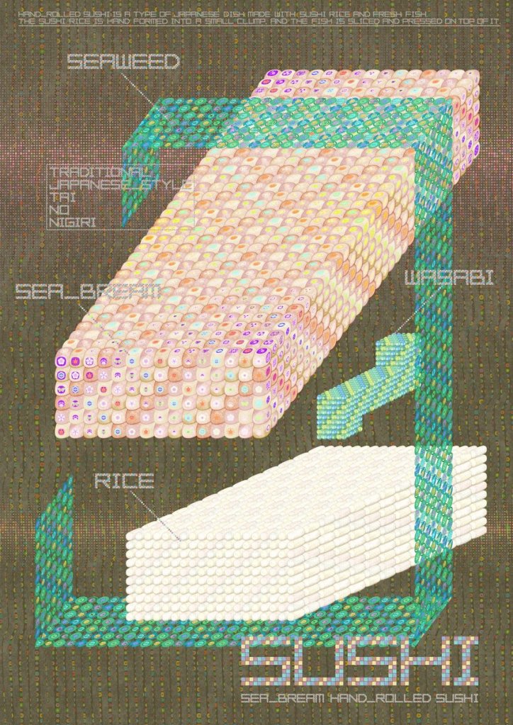
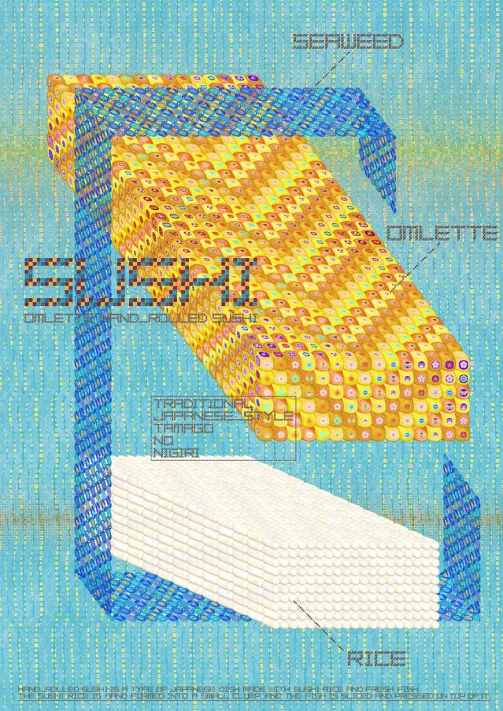

To me the texture on the images reminds me of the fish skin.
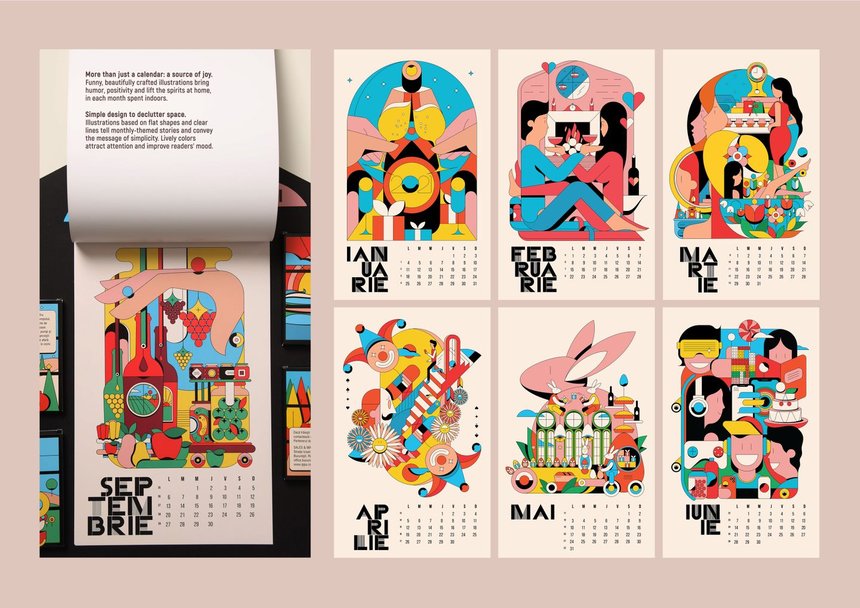
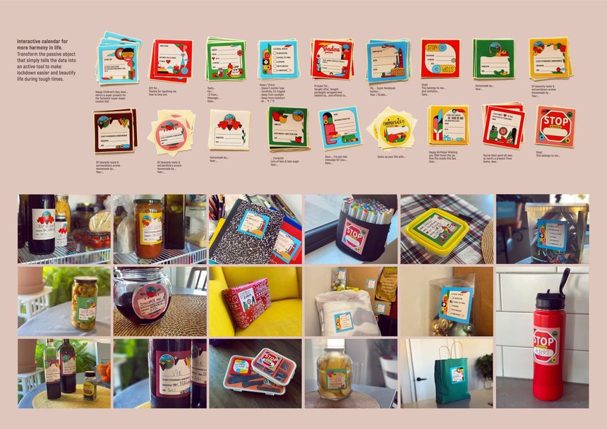
Another project abut the negative impact of Covid is The Everyday Labels – this is product of Rumanian company – proof that there are so many places around the world with creative ideas.
As people stayed at home to limit the spread of Covid-19, our home became an office, meeting room, gym, restaurant and cinema, all at once. Living in a confined area for so long had a negative impact on people’s emotional wellbeing, so IPPU Packaging, the largest self-adhesive label manufacturer in Romania, stepped in to brighten their day – and year. The Everyday Labels Calendar was designed to be an entertaining way of labelling objects and spaces throughout people’s homes.
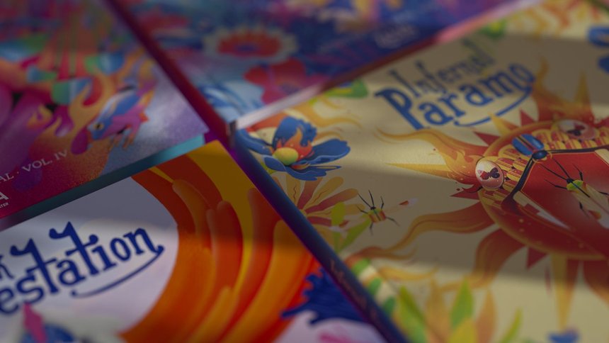
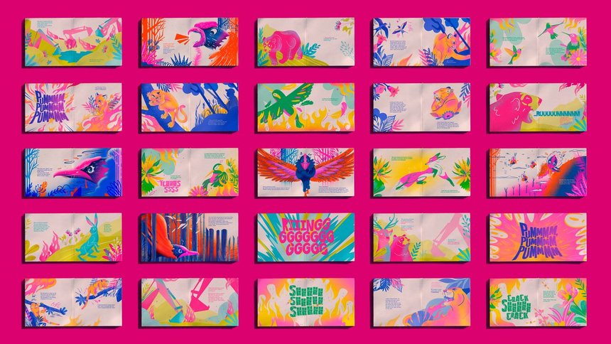
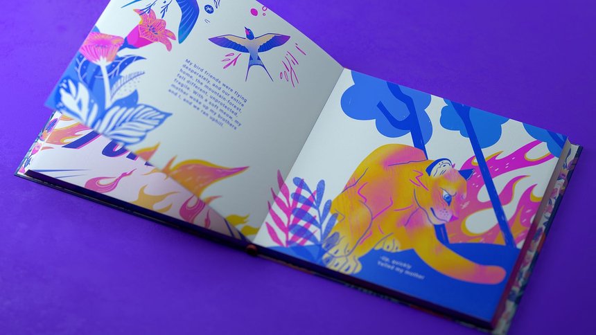
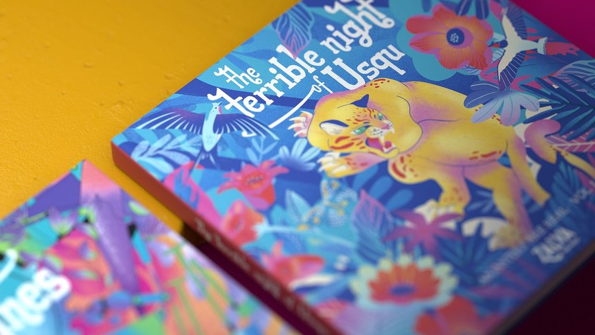
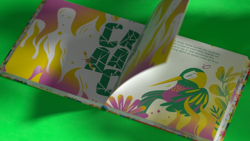
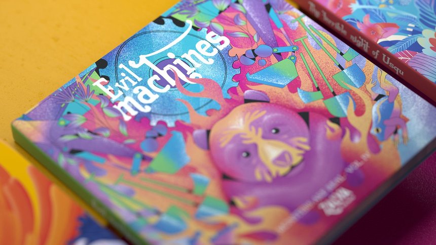
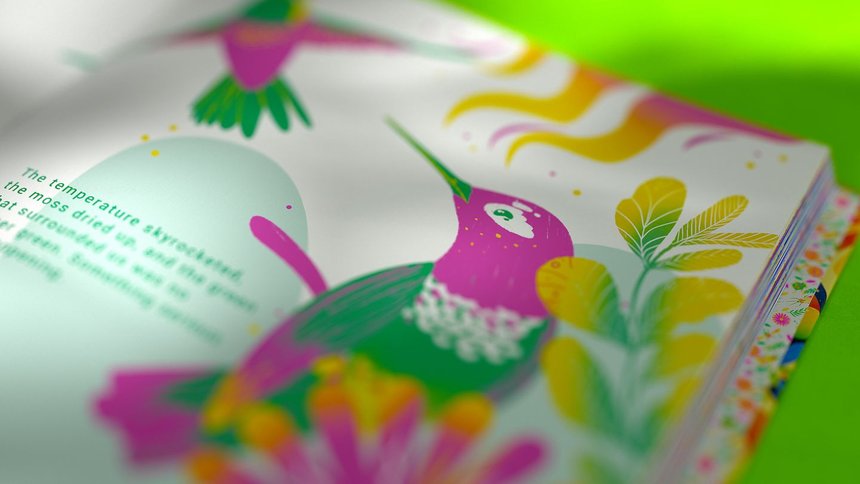
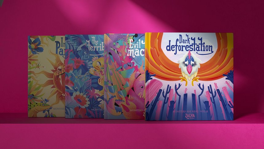
Monsters are real is a Colombian project about the global warming.
Global warming, deforestation and poaching are all like monsters attacking our planet, but most people don’t see these issues that way. Zalva Water, the brand that protects the environment, wanted to talk to a generation who do believe in monsters: children. To do so, it created a collection of bedtime stories made with recycled paper and ecological inks, and portrayed the main environmental problems as the monsters in the stories: Usqu’s Terrible Night, Dark Deforestation, Evil Machines and Infernal Paramo.
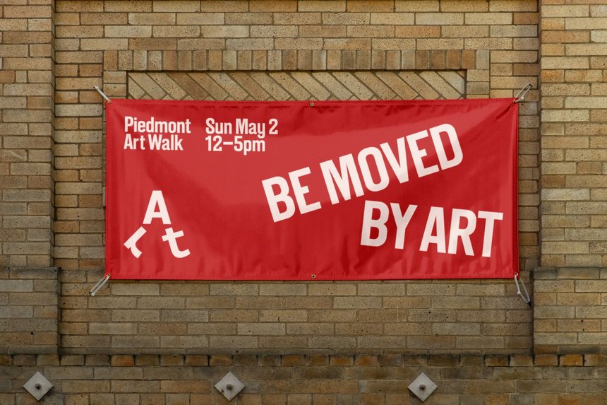
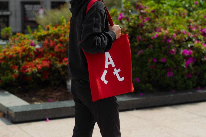
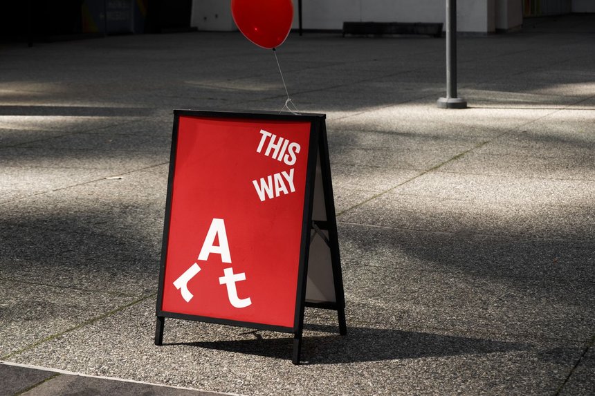
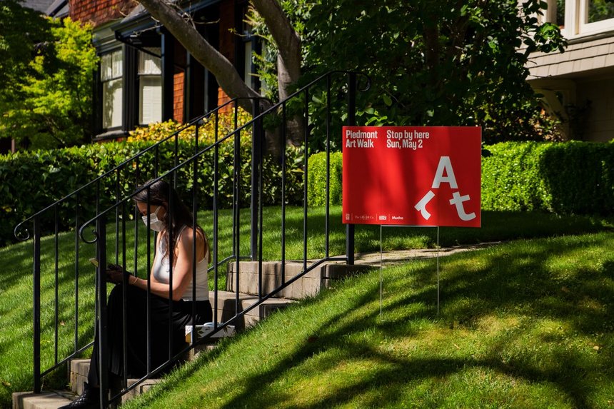
The project Piedmont is brilliant – the use of one letter to represents the event is impressive.
Piedmont Art Walk is an annual event celebrating the rich diversity of artists living in Piedmont, California. Pavements, gardens and front lawns across the city are transformed into walkable outdoor exhibits for one day only, attracting families and art-lovers far and wide. The identity is designed to reflect the community-oriented nature of the event. The symbol transforms the word ‘Art’ into a walking character and manifests itself in fun ways. The identity also features typography inspired by pathways and playful copy lines.
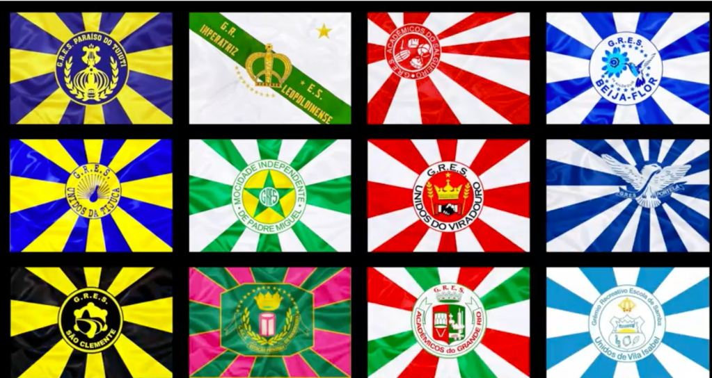
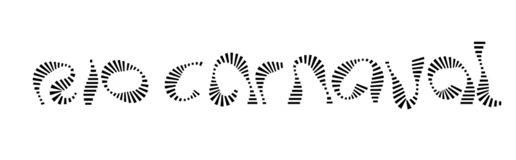
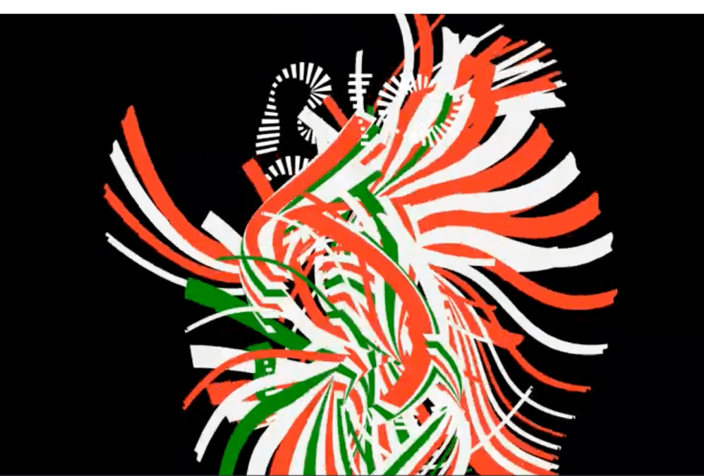
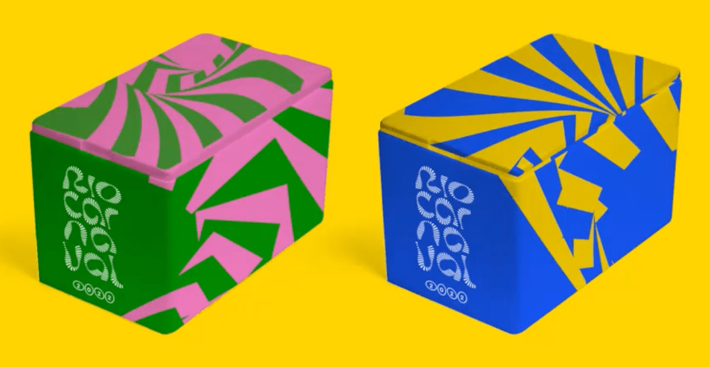
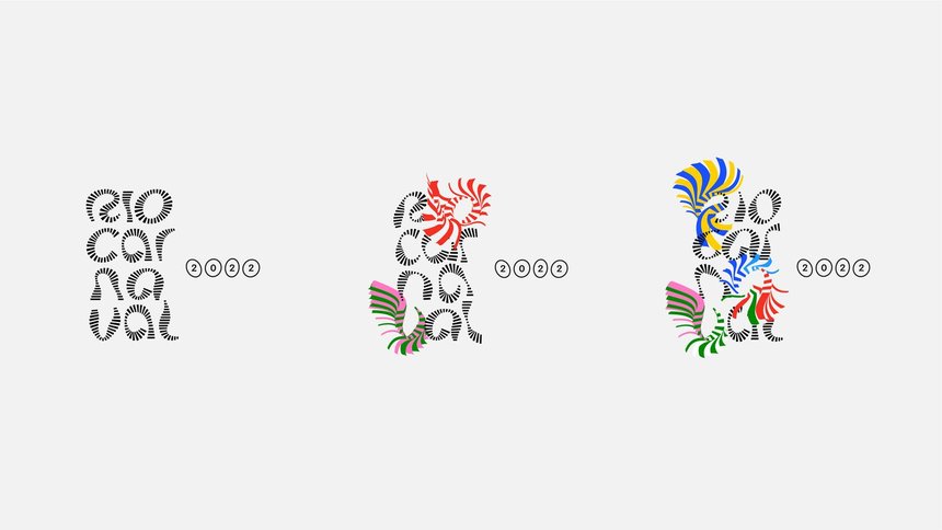
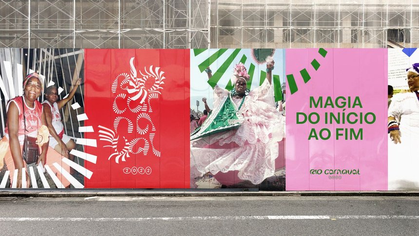
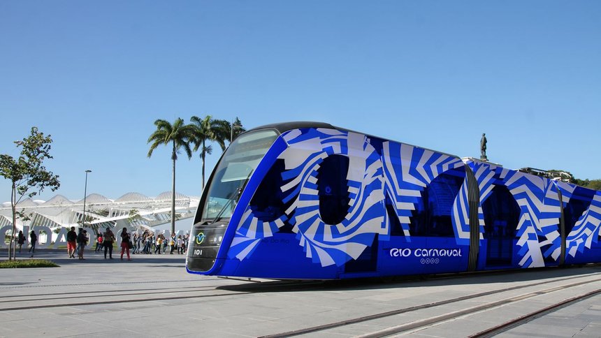
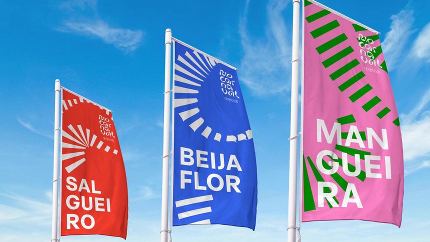
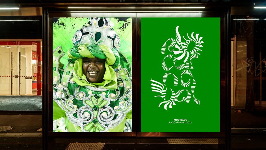
Let’s go to Brazil – the project Rio Carnaval – Typography is Drawing inspiration from lively spirit of Rio Carnival, the typography reacts to the sound of the instruments, adapting colours and motion in a rhythmic way.

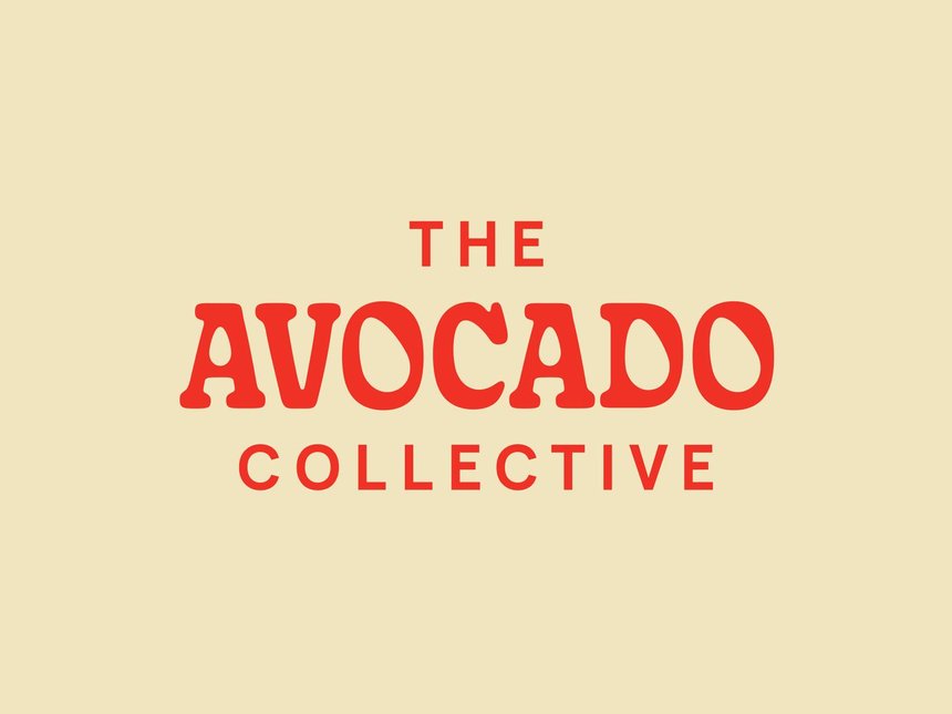
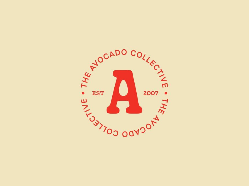
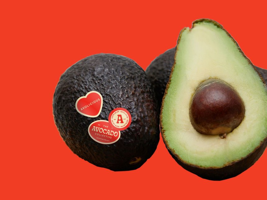
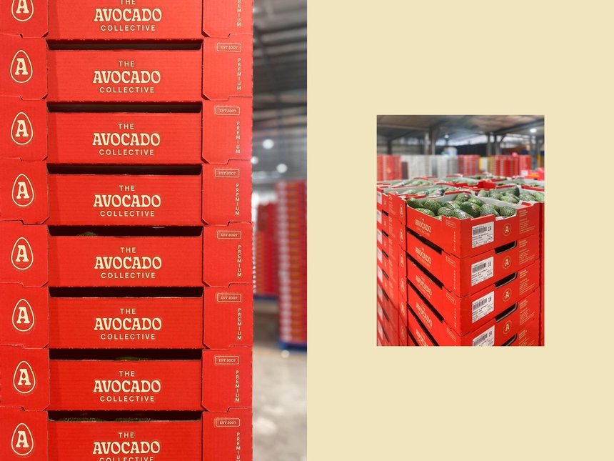
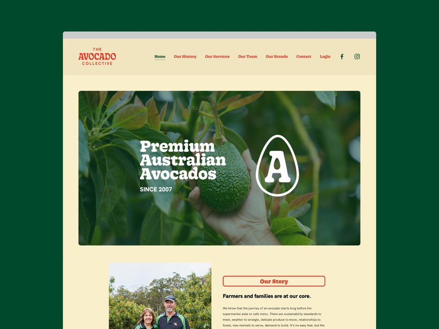
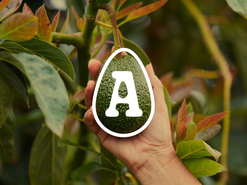
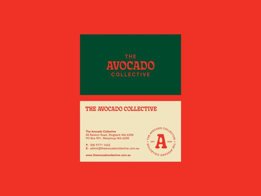
The next project if from Australia The Avocado Collective Logo – great choice of typography.
As part of its new brand refresh, the newly renamed Avocado Collective – a fruit packing, marketing and advocacy group – needed a logo that would remain fun, fresh and visible in the future. The avocado became the centre of it all, helping to create an instantly recognisable identity for decades to come.

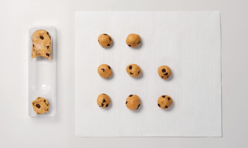
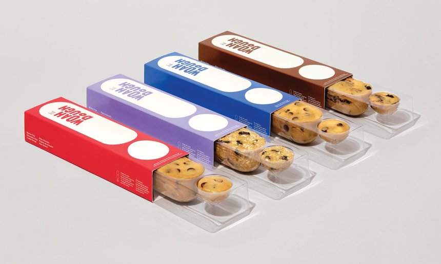
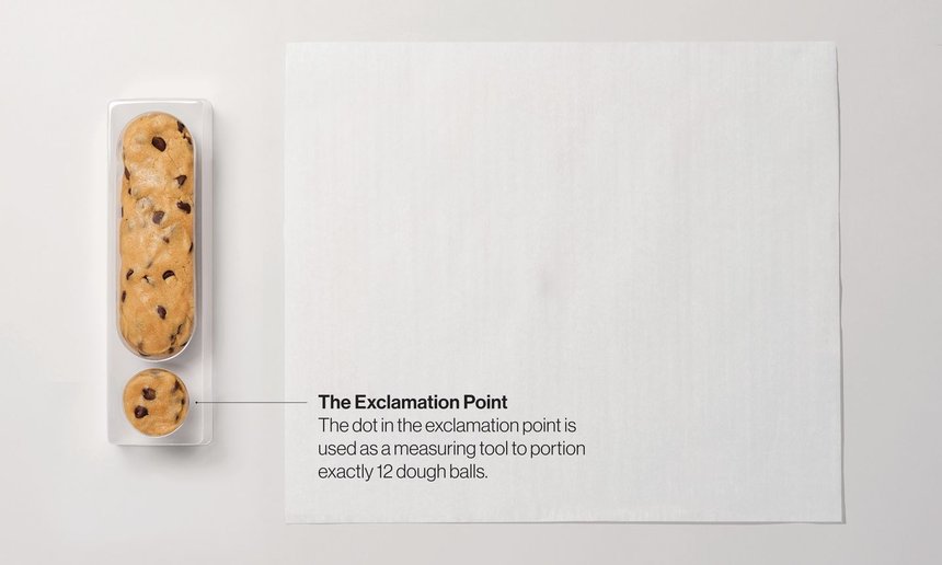
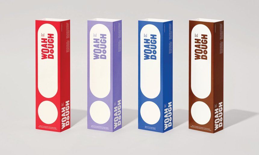
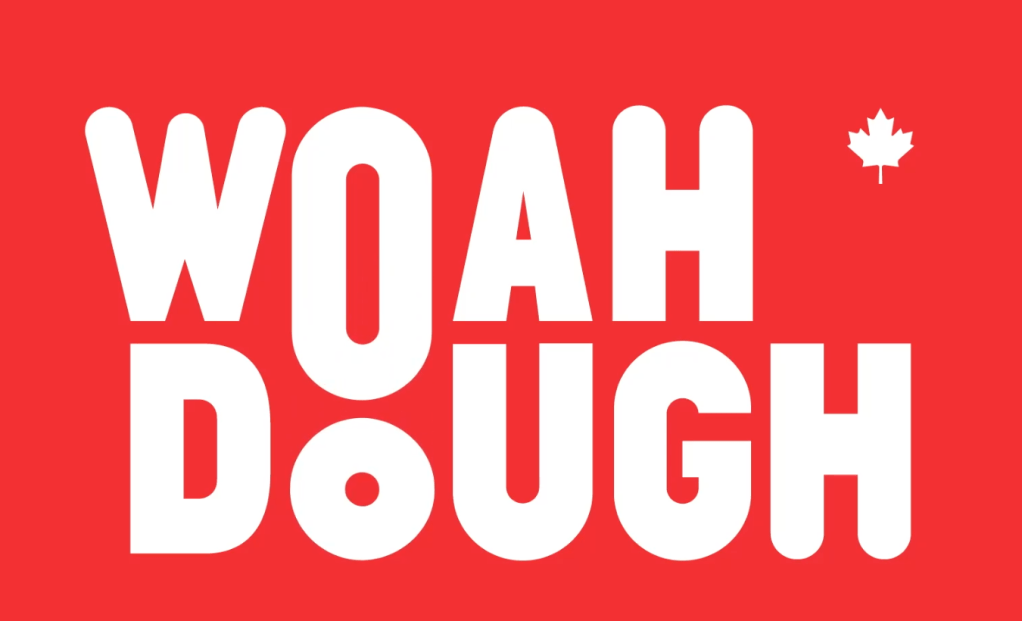
You have to watch the Woah Dough video -it is example how you can get inspiration from the reaction of the people trying the cookies.
https://www.dandad.org/awards/professional/2022/235215/woah-dough/
This project made me smile – is a French project about the American company KFC
https://www.dandad.org/awards/professional/2022/236314/kfcinema/
To mark the reopening of French cinemas in May 2021, KFC showed its support by launching a new communications campaign making use of KFC’s menu. KFC’s campaign film showed a professional film foley artist, Romain Anklewicz, dubbing scenes of movies, such as The Way of the Dragon, using menu items including KFC Tenders, Boxmasters and burgers. At the end of the film, KFC invited people to support movie theatres by going back to the movies in the first days of their reopening, offering them KFC Tenders on presentation of their movie ticket.
I think the world has become one big village – the project No Drama is good prove for it – an American actor helps to advertise Switzerland.
Switzerland Tourism’s new ambassador Roger Federer features in the organisation’s latest film. He’s joined by legendary actor and Oscar winner Robert De Niro. In the short film, De Niro turns down an invitation by Federer to be part of a movie about Switzerland. He feels the destination is pure, impressive and utterly beautiful, but that there is no drama in Switzerland – and no drama is no good for De Niro.
https://www.dandad.org/awards/professional/2022/235767/no-drama/
The design defiantly has no boundaries – and that is good thing – we should combine efforts and make the world better place.
Comments from other students:
“Hi Vicky – Thanks for sharing. I liked the structure that you used at the beginning of your post where you incorporated the various viewpoints from different designers into one seamless conversation – it felt like a nice, natural way to reflect on the thoughts they were sharing.”
“I agree with Emily. You structured the post in a really interesting way and we’ve been able to see how you’ve developed your thought process. It’s also been interesting to note that a lot of the entries to the D&AD awards that spoke to you were quirky and full of bright colours. Or spoke about important socio-economic points. We can see where your design aesthetic may get it’s inspiration from and although it may not have been intentional, we can see clearly what matters to you as a designer in terms of what you would bring into your practice.”

Breaking the Boundaries of Graphic Design
Let’s now consider classic design models and definitions, and what breaks these boundaries. We believe in graphic design as a term but what are the areas that you believe fit under the umbrella of graphic design?
Branding
Type designer
Editorial design
Interactive design
Web design
Speculative design
Graphic artist
Book design
Logo design
Animation
Choose a piece of design that breaks definitions of design practice and write a paragraph describing this practice.
Come up with a new term that describes this area of work.
Upload this design and your new terminology and paragraph onto the Ideas Wall on the following page, along with your blog for group forum and discussion.
I pick web design
The different areas of web design include web graphic design; user interface design; authoring, including standardized code and proprietary software; HTML and CSS design, Java Script design, user experience design; and search engine optimization.
What I think is getting very popular lately is the promotional graphic design – not just the print materials but using web sites and social media. I think it should be a term promotional online design (because the digital type of design is stepping too far way from the print one – there are so many new techniques involved.)
Consider this week’s activities and reflect on your course-mates’ comments from the Ideas Wall. Copy and paste their insights into your blog and reflect on what you have learnt this week with regards to: the boundaries and scope of graphic design.
Research and Inspiration
https://www.digitalartsonline.co.uk/features/graphic-design/has-globalisation-canned-creativity/
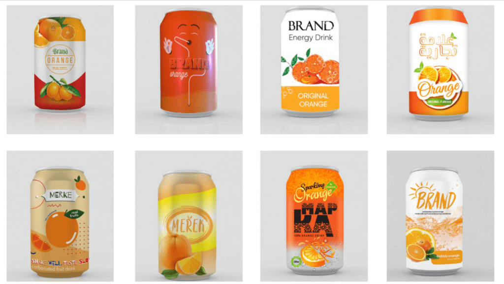
“
A can of orange drink takes a journey around the world in design and branding.
Do you fear that the internet and its globalising effect will take away our sense of identity? It is easy to believe that the invasive influence of worldwide connectivity could bring a bland uniformity to art and design. In a bid to explore trends in design around the world, Nuprint undertook an experiment. Taking 12 designers from 12 countries around the world, they asked for the label for a can of orange carbonated drink.”
from the webinar
Resources for inspiration:

The students:
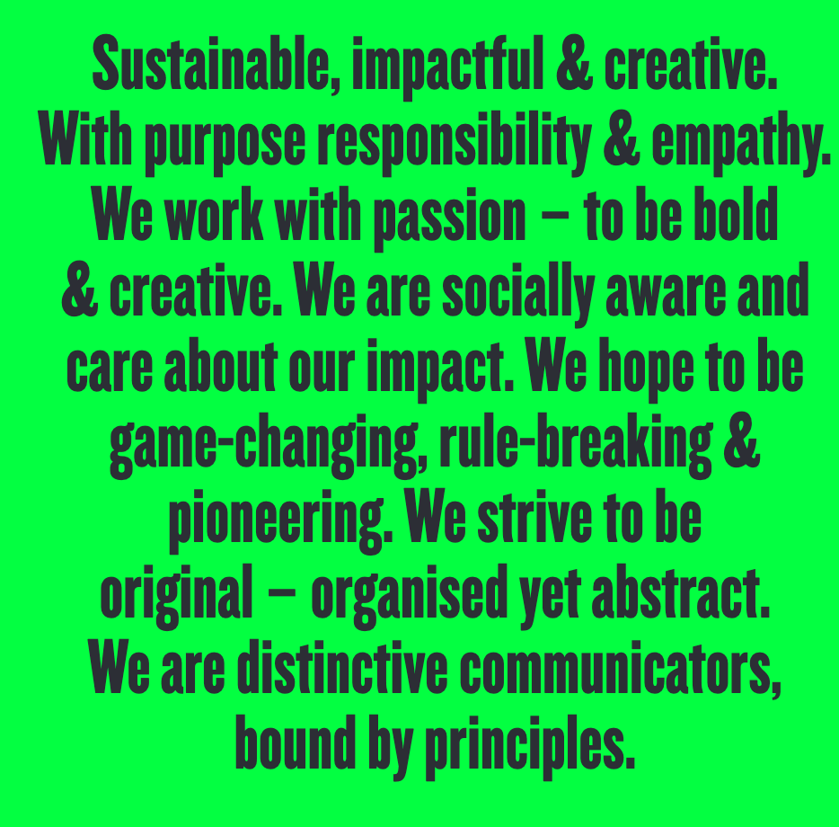
Sustainable, Impactful, Creative,
Purpose, Responsibility, Empathy,
Passion, Bold, Creative,
Social, Aware, Impact,
Game changer, Rule breaker, Diverge,
Distinctive
Here my 3 words: Curiosity (we have to be curious to everything around us); Innovative (trying to do something different, something new); Awareness

Leave a comment