Typography
lecture from Kristoffer Soelling
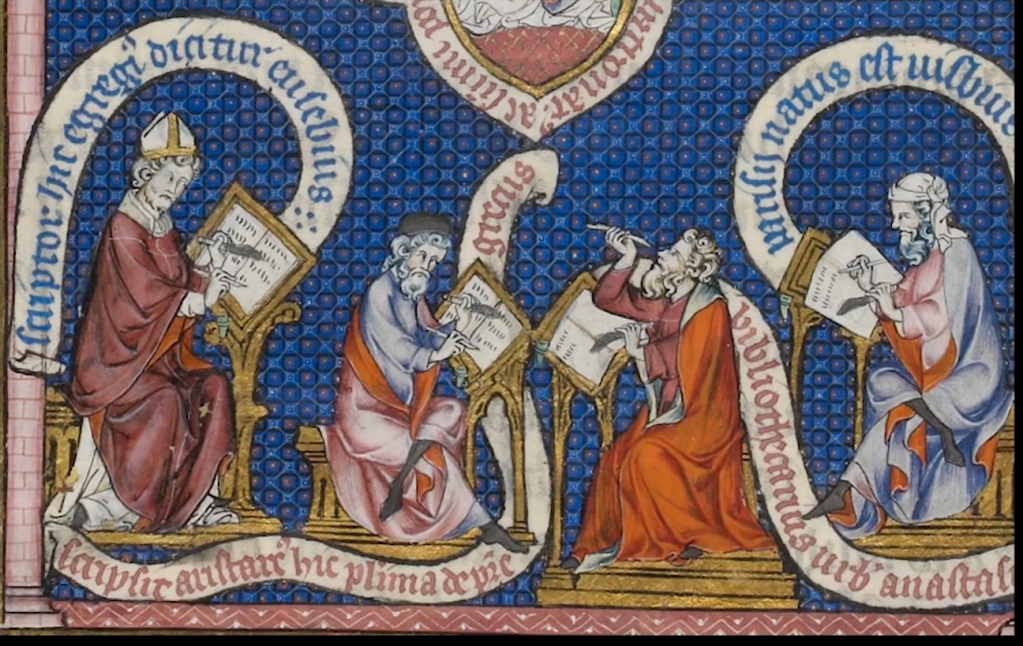
“Back in the days, if you wanted to make a book, you had to do it yourself… While this system perhaps worked, there was a guy in Germany called Johannes Gutenberg who thought maybe there was a better way. And by many he was ascribed the invention of movable type. That’s not entirely true, because the idea of movable blocks, movable printing blocks, was not first thought up by Johannes Gutenberg, but for the sake of our argument in the west, or regarding the Latin alphabet, we can say he invented the idea of movable type.”
Movable type will have sort of blocks that you can adjust, that’ll push the composition really tightly together so that it doesn’t move about and at that point, you can roll the cylinder over the type.
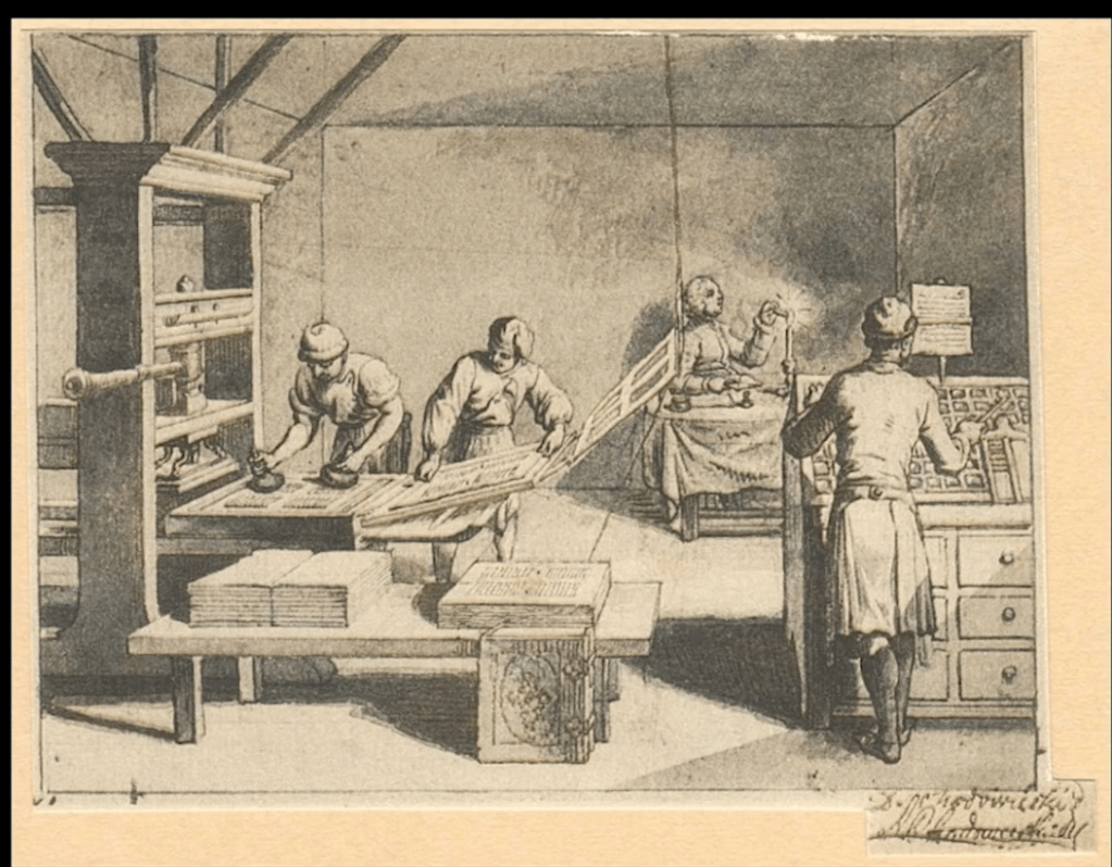

A machine like a linotype machine is incredibly expensive, 4
incredibly large, incredibly noisy.
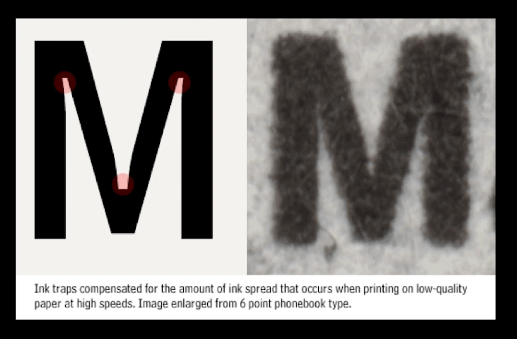
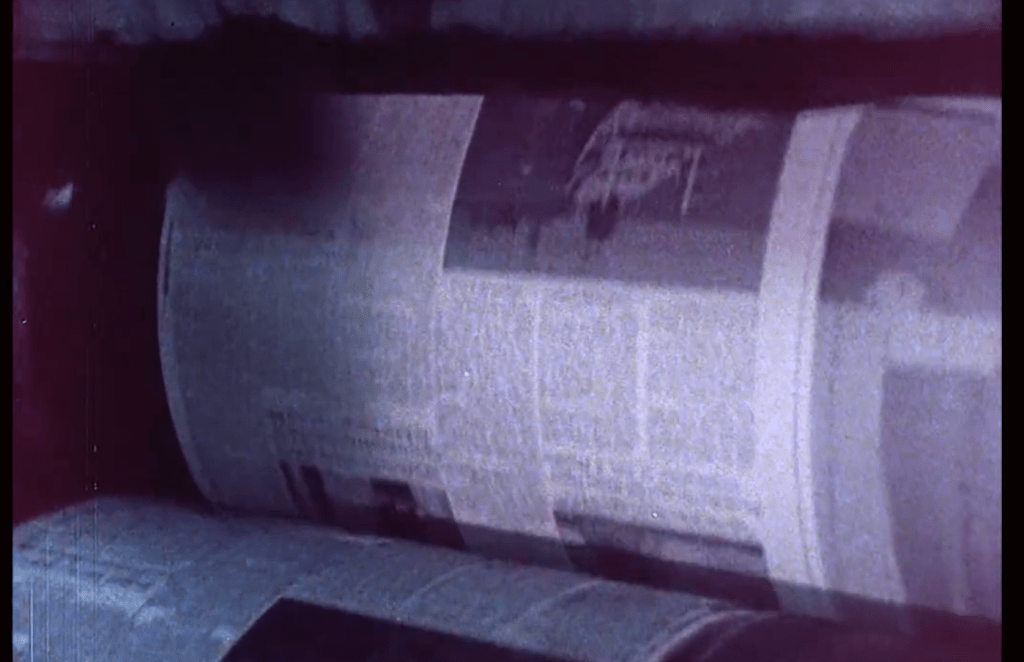
On July 2, 1978 the New York Times made a significant technological leap when they scuttled the last of 60 manually-operated linotype machines to usher in the era of digital and photographic typesetting. When working at 100% efficiency with an experienced operator the Linotype machines could produce 14 lines per minute cast on the spot from hot lead. That number would increase to 1,000 lines per minute the very next day using an array of computers and digital storage.
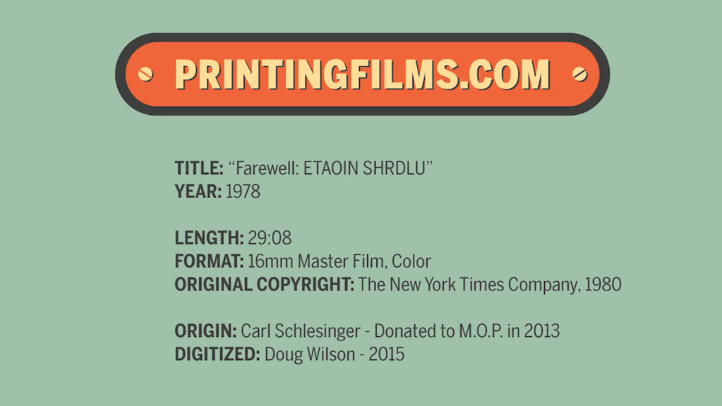
Typesetter Carl Schlesinger and filmmaker David Loeb Weiss documented the last day of hot metal typesetting in a film called Farewell — ETAOIN SHRDLU (the obscure title is poignantly explained in the film). This amazing behind-the-scenes view not only captures the laborious effort to create a single page of printed type, but also the the emotions and thoughts of several New York Times employees as they candidly discuss their feelings about transitioning to a new technology. One man decides he’s not ready for the digital age and plans to retire on the spot after 49 years, while others seem to transition smoothly into the new methods of production.
Watching this film makes me think how hard was years ago and how easy we have it now with the new print technology.
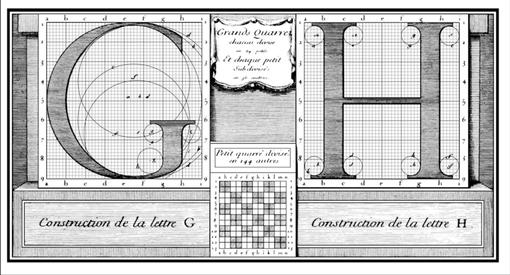
This is an example of the Romain du Roi from around the 1600s, designed or constructed for Louis XIV. It serves an interesting point in time in terms of type history because it is one of the first examples of this very systematic and constructivist way of thinking about letters, where something like the Trajan Column is perhaps constructed more from, or not constructed but made from how a scribe might draw a letter using a particular tool. This, obviously, is inspired by that, meaning that’s why you have the modulated stroke. For example, the round shape of the ‘G’ is thin in certain places and thick in other places. Then you also see how it’s put on this grid and how, for example, the serifs of the ‘H’ are constructed using a circle. You really have shapes that inherently come from how the hand works, meaning how you use certain tools, but that are also overlaid on this very fine system, this construction system.
We need as designers to be able to differentiate all the different types of letters and also know their history.
Maybe we can talk about a kind of liberation of type.
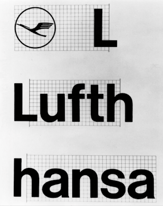
This is Otl Aicher’s design: the branding for Lufthansa
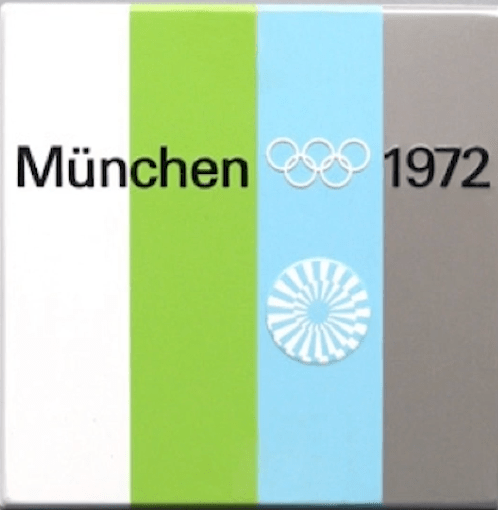
Generally, in the graphic design that would come out of there, there was this focus on the system. If you look at the Munich here. The kind of base symbol, it’s really devoid of any meaning apart of being this systematic shape, this programmed shape. And that’s quite symptomatic for these kinds of designers. Everything is about the system and it’s not so much about the meaning of something
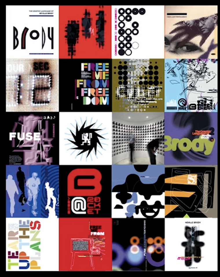
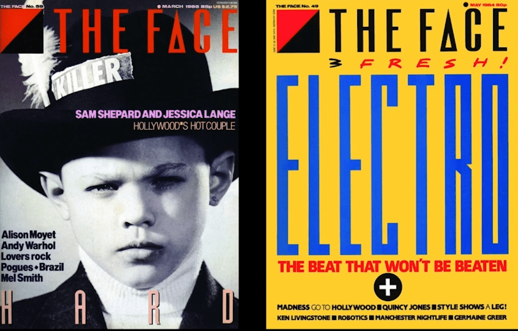
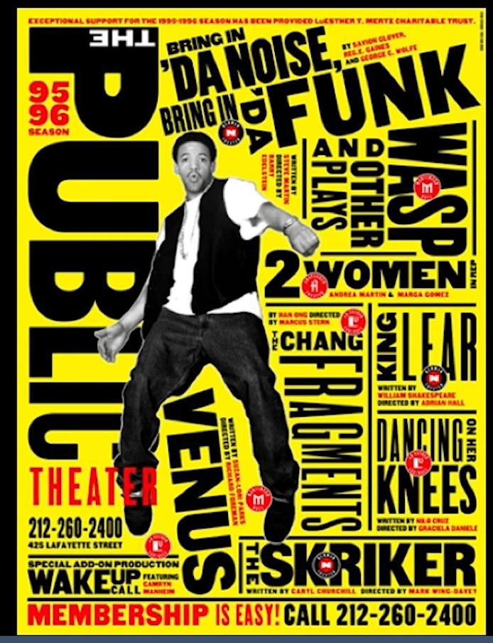
Someone a little bit later on who was really pushing that kind of stuff is Neville Brody. In particular, when you get into the photo typesetting days where scale is out the window, you can make things big and small, you can make them blurry, you can put them on top of themselves easily. You get this completely. The rules just go completely out of the window. Everything’s possible. It just allows for really post-modern aesthetic – put the rules to bed, now let’s try all the things we can actually try.


Monika Parrinder & Colin Davies
Kubel, H. and Williams, S., (2015) Type: New Perspectives in Typography
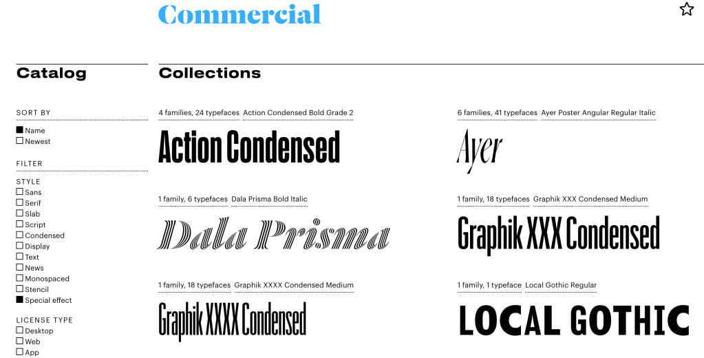
Commercial is one of the better known foundries- Based in New York and London, Commercial Type is a joint venture between Paul Barnes and Christian Schwartz, who have collaborated since 2004 on various typeface projects, most notably the award winning Guardian Egyptian. The company publishes retail fonts developed by Barnes and Schwartz, their staff, and outside collaborators, and also represents the two and their team when they work together on type design projects.
Many use the skill and craft of typography to create cultural reflection, rather than simply fashionable visual statement, in their work.
https://carvalho-bernau.com/info/ – Atelier Carvalho Bernau’s focus is on reading* experiences across traditional, current and future media – from typefaces to user experience.
Atelier Carvalho Bernau is a design studio based in Porto, Portugal. The atelier was originally established in 2005 by Susana Carvalho and Kai Bernau in The Hague, the Netherlands. We mainly work for the culture and publishing fields, both locally and internationally.
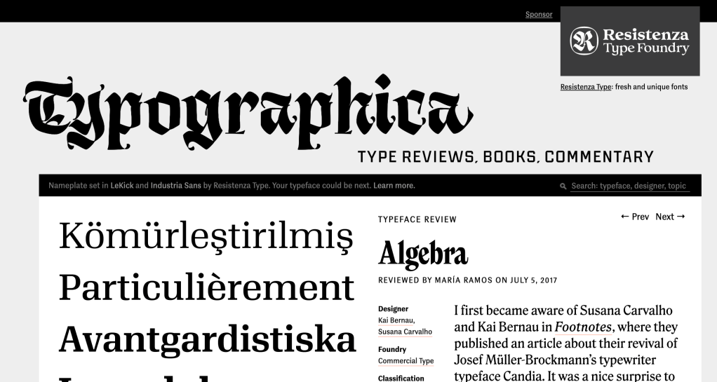
Favorite Typefaces of 2016: Algebra, Typographica (2017)
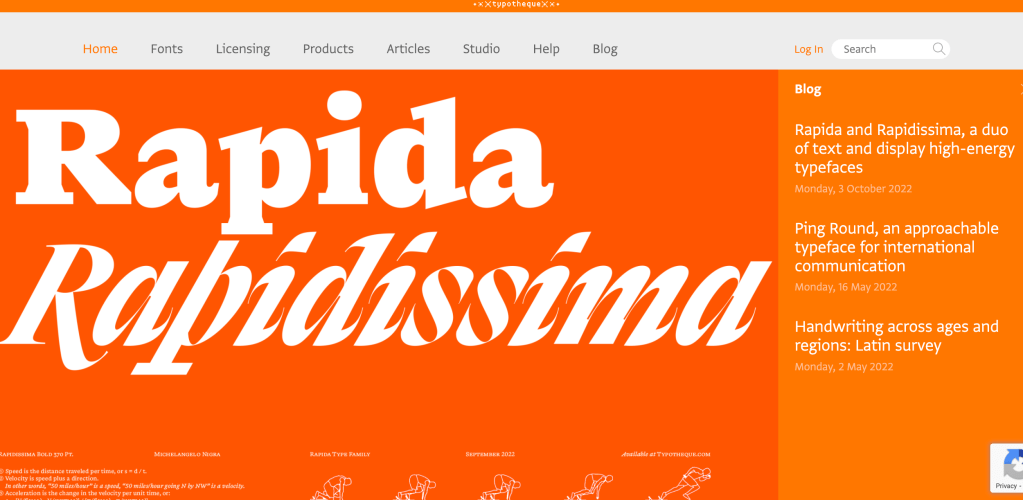
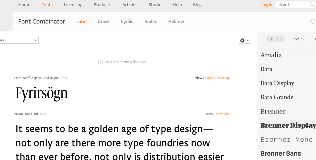
I like the font combinator tool they have on their site:
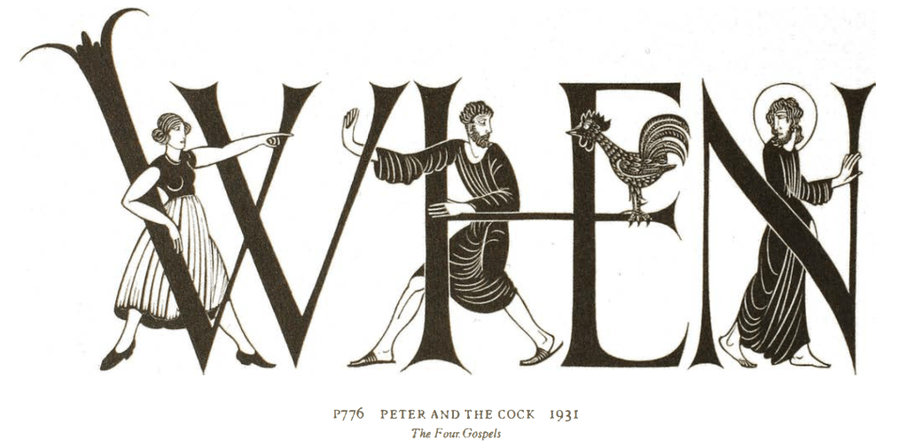
Peter and the Cock – Eric Gill 1931
Balland’s posters display another contemporary tendency that can be found, expressed in differing ways, in many of the designs shown here: the tension between structure and informality, function and playfulness.
Structure in Type and typography – by Phil Baines; Andrew Haslam
“Typeface choices might be influenced by what is legible, what is available on a computer and by the nature of the text. Typefaces can also be chosen for historical reasons. While a novel set in Renaissance Italy or eighteenth-century Britain may benefit from the use of Bembo or Baskerville respectively, it is not a necessity. What matters is that the text is readable and attractive to its intended audience today. A broad knowledge of history – architectural and social as well as typographic – is a useful aid in the design process, but it should not become a straitjacket.
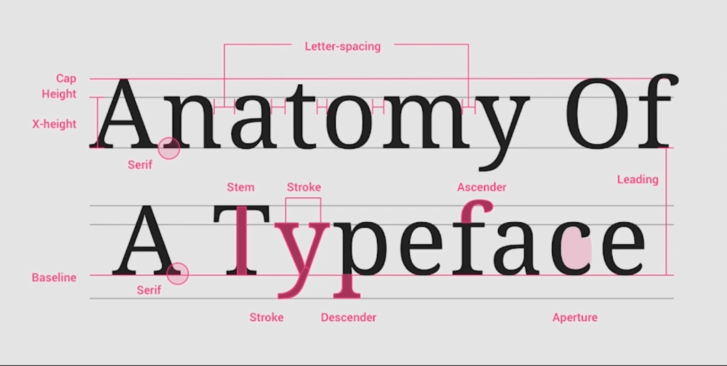
Legibility and readability. These two terms are often confused, and although related they are possible to separate. Legibility refers to the typeform, how easy an individual character or alphabet is to recognize when presented in a particular font. Readability encompasses both typeform and arrangement – how easily a text can be read.
Typefaces for use in continuous text are often chosen for their colour or texture on the page and how it relates to other elements in the design such as illustrations or photographs.
It is a good idea to collect examples of typefaces and keep them for reference. These can come from obvious sources such as manufacturers’ or retailers’ catalogues or advertisements, but they might also include press cuttings of type in use. These samples do not have to be exemplary: in fact, specimens of type or treatments which do not work can be equally instructive.
Type and the web
When preparing work for the web a designer is faced with an environment over which there is less control than print and which is governed by a quickly changing set of standards.
You can tell the book is old – they are talking about Flash!
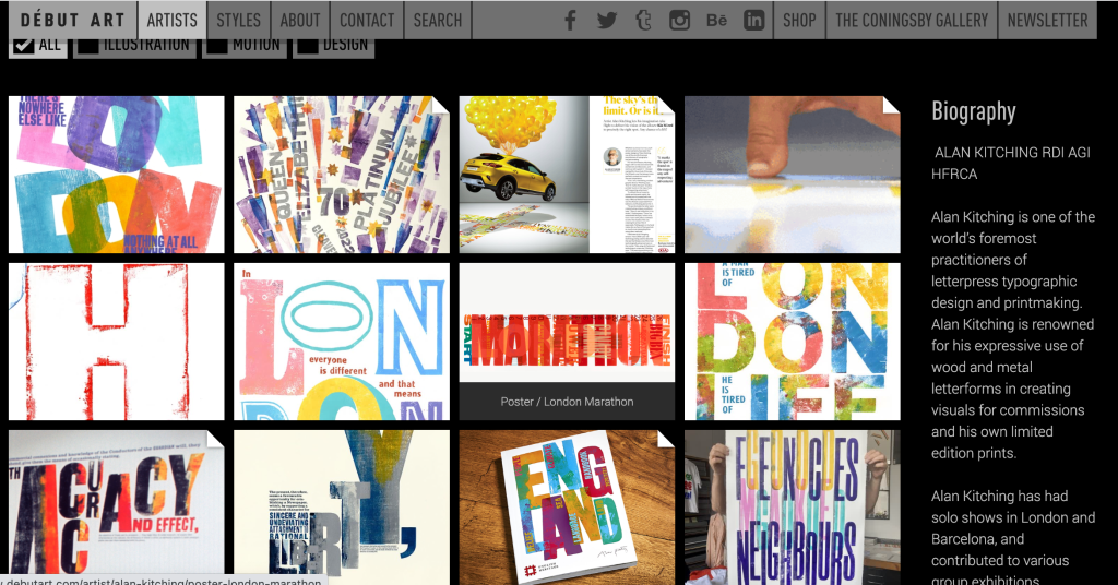
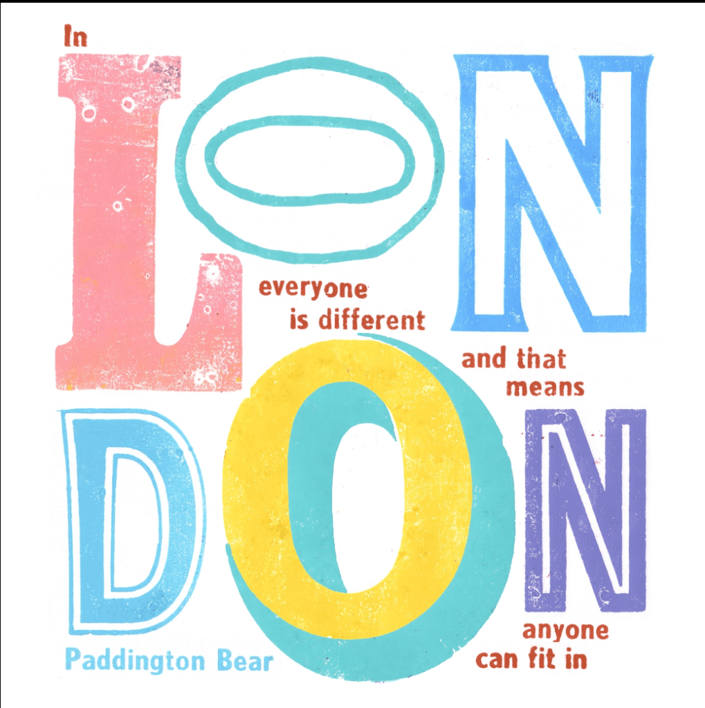
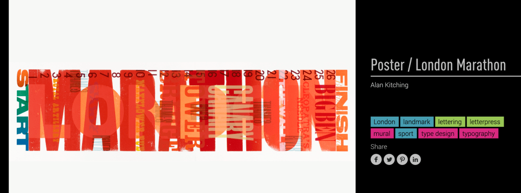
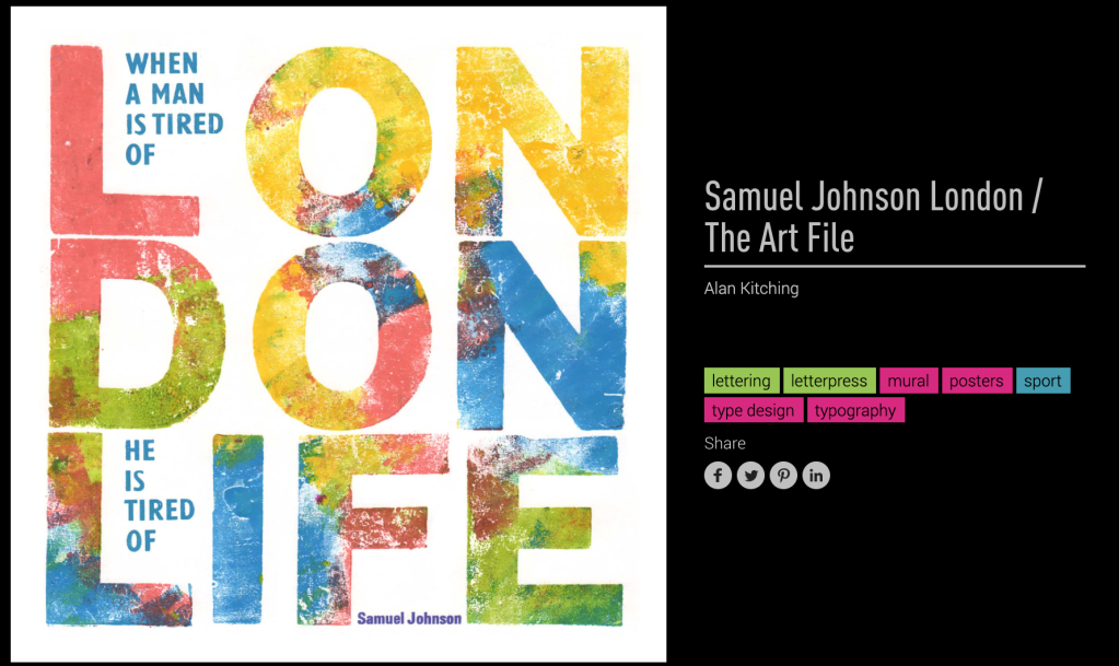
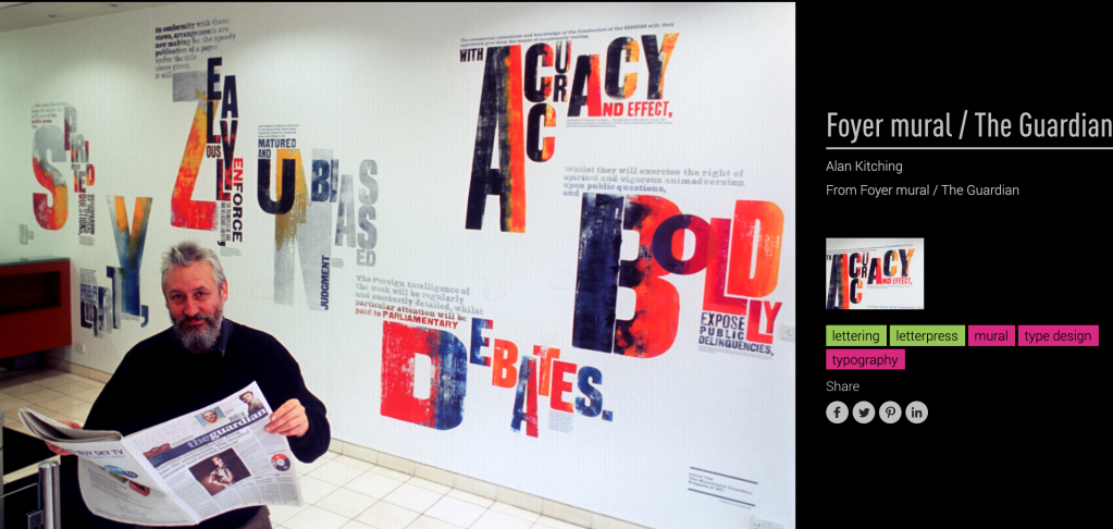
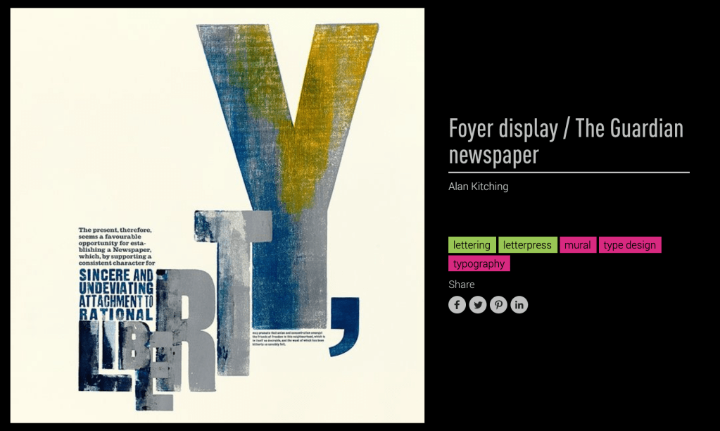
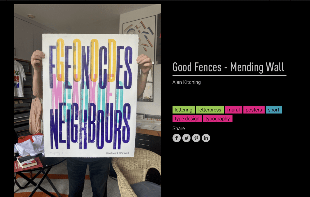
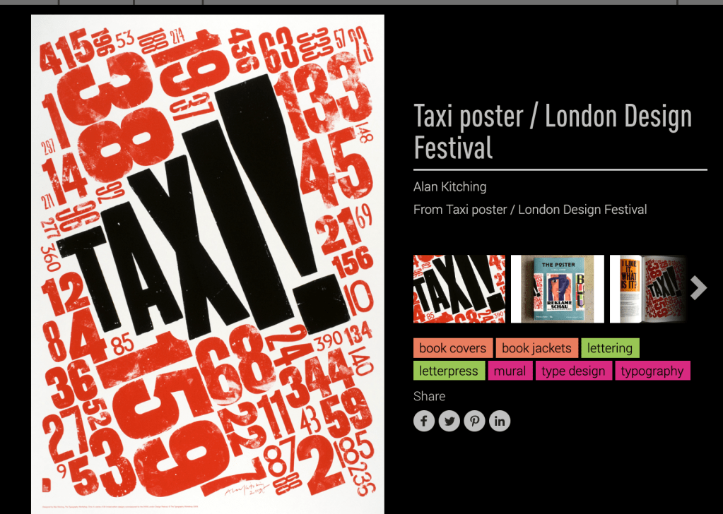
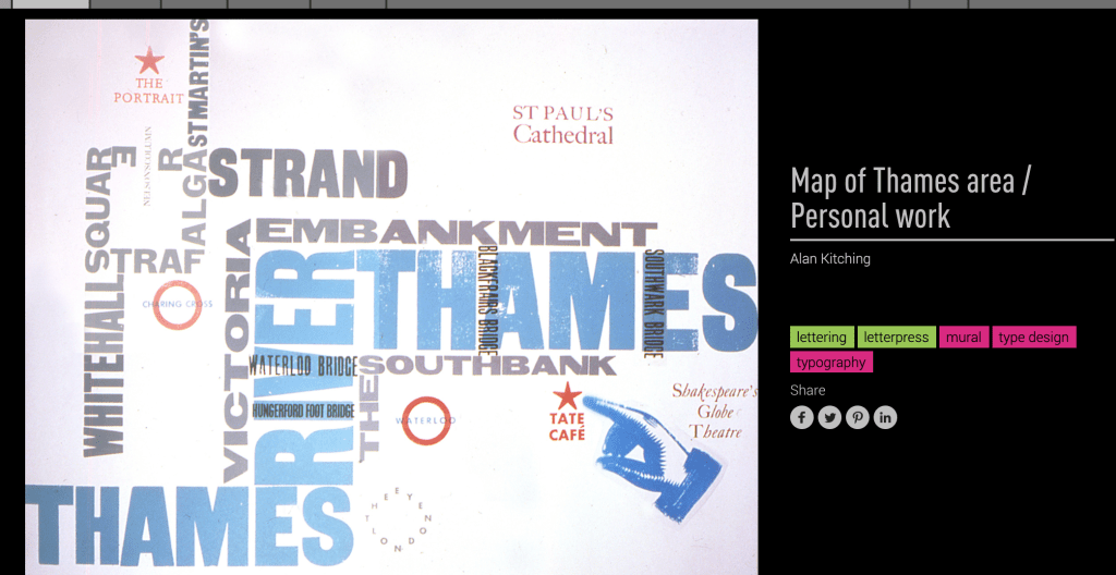
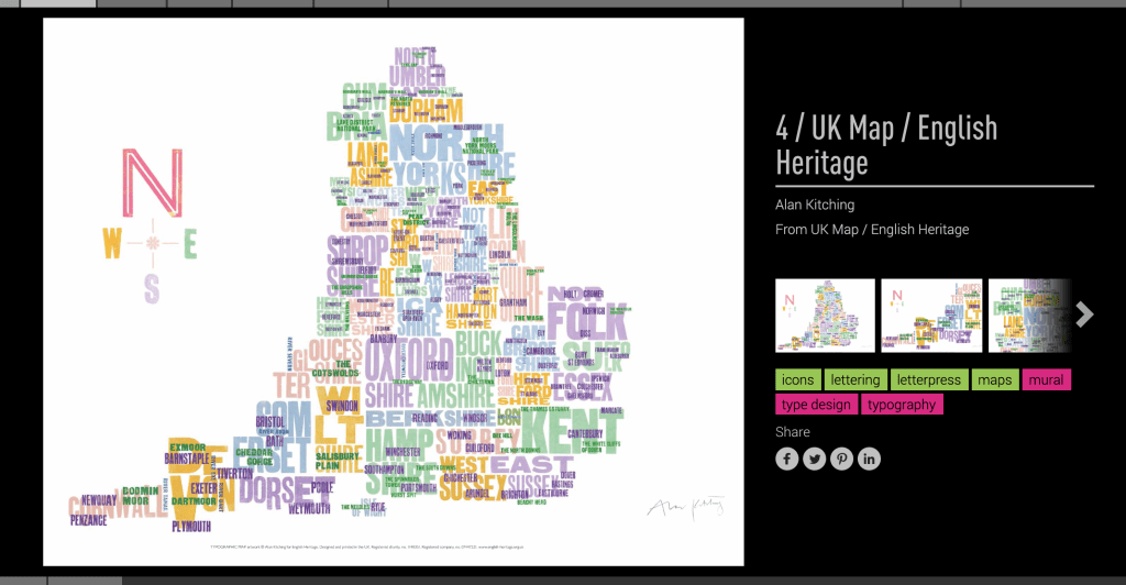
https://www.debutart.com/artist/alan-kitching


Challenge 10

Leave a comment