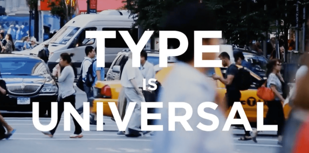
- Discover and analyse a selection of typefaces you think appraise the social, political and historical context of your location.
- Research a broad selection of typefaces in your area using appropriate research methodologies, such as photography, sketchbook entries and notes about location.
- Analyse the typography collected from your area to evaluate your research findings into varying type classification, styles and identity.
- Define and distil your selection of type observations to an edit of five contemporary and historical examples you think best inform your investigation into the identity of your location.
- Deliver a short written analysis to contextualise and communicate your research into the impact typography has on your location, so it is clearly understood by a non-specialist audience.”
Lecture by Stuart Tolley
He talks about his works and his design studio Transmission ( https://www.transmission.design/work/min-thames-hudson/)
“Typefaces are not toys, they are tools, they are design to solve problems”
“You need type again, and again, and again….to get trough life”
“I determine how to design something based on the audience but also you can push the audience to see something on different way…”
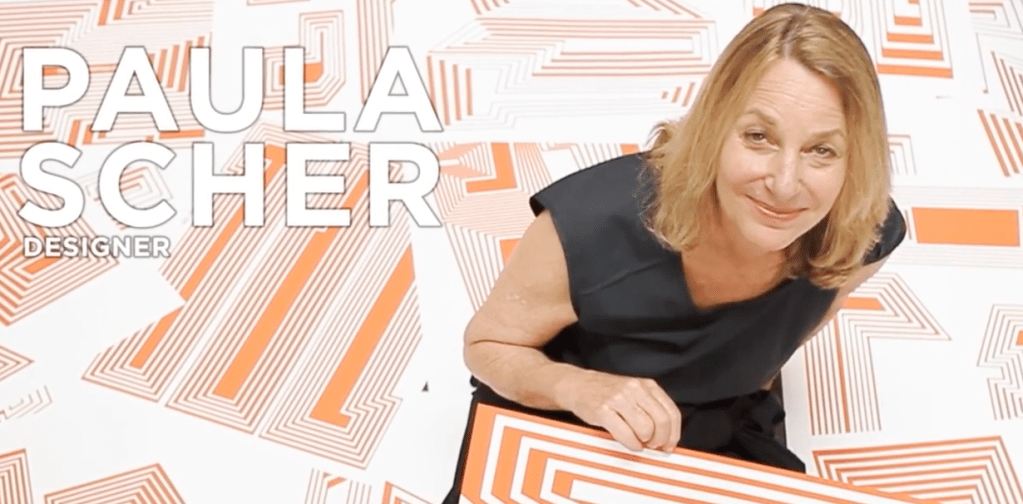
“…Words have meaning and typography has feeling. When you put them together it’s a spectacular combination. I think the reason I responded so negatively to Helvetica way back when was that it neutralises feeling. A Modernist would argue that that’s terrific because then the words speak and you’re not influencing the content by creating disorder with them. It’s almost like an understood, generic form … that you can say OK take the words as they are because they’re laid out very clearly in Helvetica. All other styles imbue the words with a shade or meaning, which changes them, which is where I think all the fun is!” (https://www.eyemagazine.com/feature/article/reputations-paula-scher)
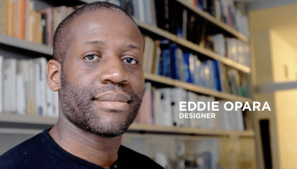
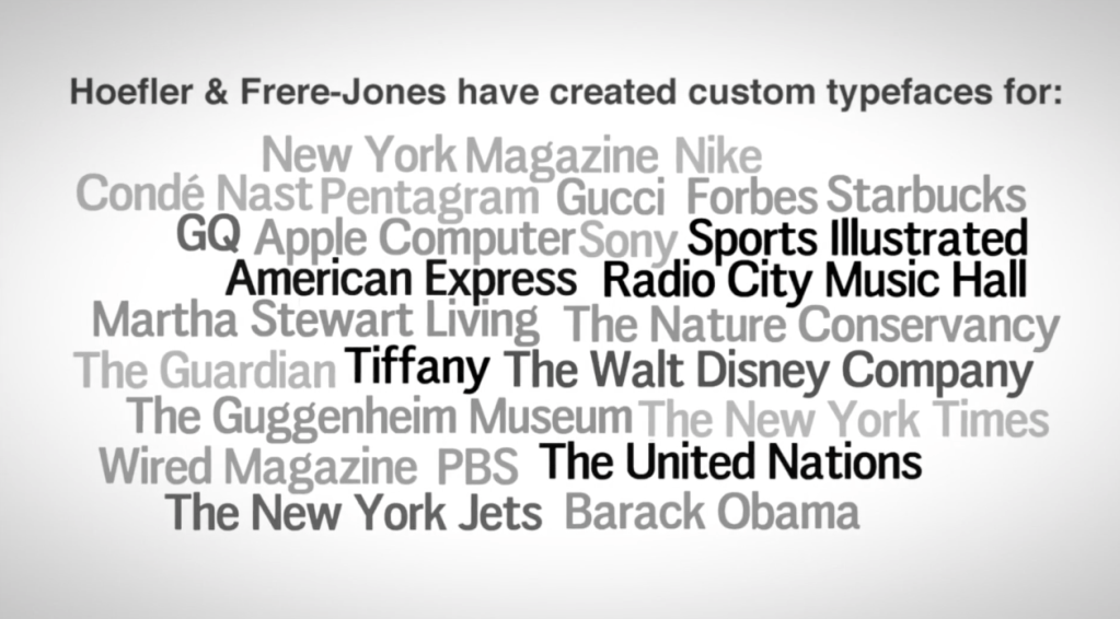
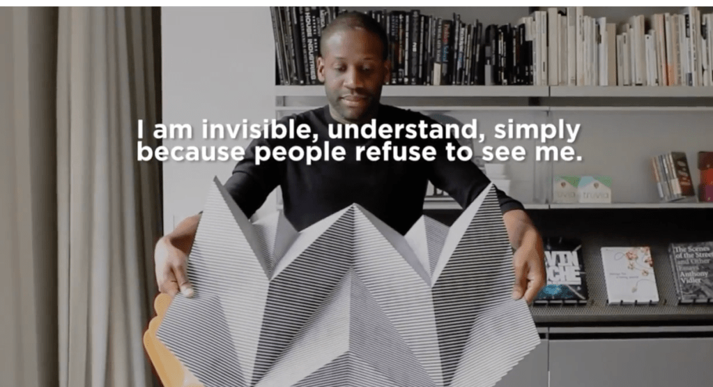
“Eddie Opara was born in Wandsworth, London in 1972. He studied graphic design at the London College of Printing and Yale University, where he received his MFA in 1997. He began his career as a designer at ATG and Imaginary Forces and worked as a senior designer/art director at 2×4 before establishing his own studio, The Map Office, in 2005. He joined Pentagram’s New York office as partner in 2010. Opara is a multi-faceted designer whose work encompasses strategy, design and technology. His projects have included the design of brand identity, publications, packaging, environments, exhibitions, interactive installations, websites, user interfaces and software, with many of his projects ranging across multiple media. Opara has won numerous awards including a Gold Cube from the Art Directors Club and honors from D&AD, the Society for Experiential Graphic Design (SEGD), Type Directors Club, Tokyo Type Directors Club, the American Institute of Graphic Arts (AIGA) and Communication Arts. His work is in the permanent collection of the Museum of Modern Art and has appeared in publications such as Wired, Fast Company, Creative Review, Archis, Surface and Graphis.” (https://www.pentagram.com/about/eddie-opara)
“…When you see a poster that is different than the others, you are going to like it …”
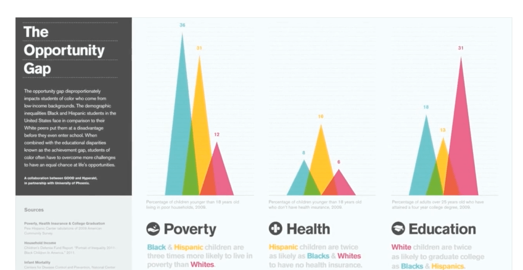
The challenging part about creating infographics is taking all the data and determining witch is the most import part that you need to communicate…
Infographics are like fun sience”
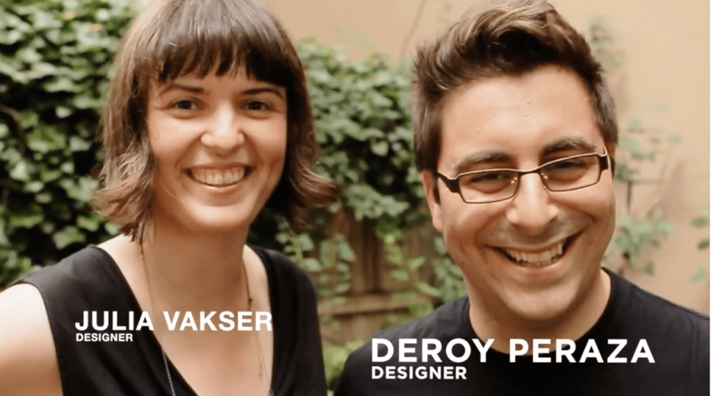
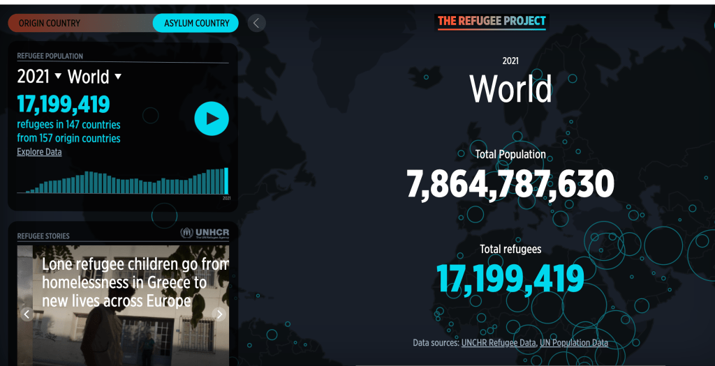
Thee project of Deroy Pereza is amazing (https://www.therefugeeproject.org/#/2021):
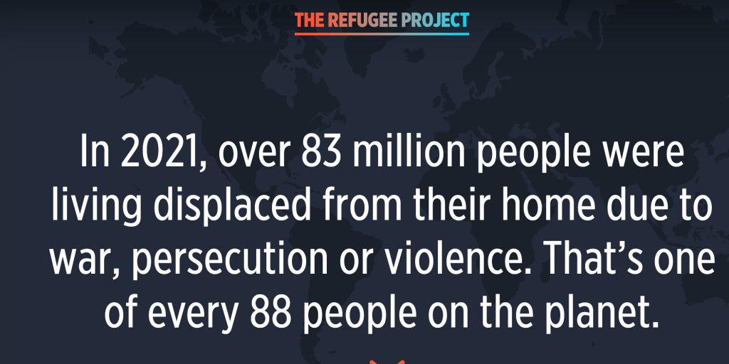
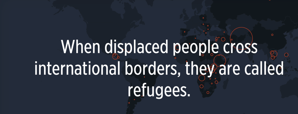
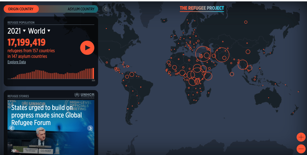
the map is interactive – there is so much information…
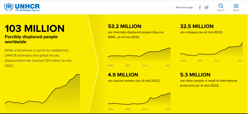
“
Designer Deroy Peraza’s family tried to flee the oppression and instability of Cuba a total of 10 times in the 1980s. When Peraza was five, a back-alley deal for a Panamanian visa finally granted his family a path to the United States. These days, Peraza is a principal at the design firm Hyperakt, which just launched a year-in-the-making interactive map, The Refugee Project. The visualization manages to make sense of the millions of people like Peraza who live in exile due to social or political crises over the past 40 years.
“It all started when we were invited by the United Nations High Commission for Refugees (UNHCR) to a conference in Geneva,” Peraza says in a phone interview. “What was eye-opening for us was that they’ve been around since the 1950s, and they have a budget of billions of dollars and millions of people in their care. But they weren’t using their data in a
compelling narrative structure.”
The basics of the graphic are immediately grokkable: A map of bubbles shows the size of each country’s refugee population from 1975 to 2012. Hovering over each bubble releases lines extending to the countries where those refugees fled. Users can navigate through the decades to watch diasporas return home or, in countries riven by decades of conflict, continue to grow.
Goal number one is to make people aware that this is happening.
Peraza isn’t officially a refugee, but thousands of Cubans are. To qualify for the UNHCR’s official designation, an individual must be living outside his or her country due to a well-founded fear of persecution. “The story of my childhood and the story of every Cuban who lives in exile is very much the story of a population in exile,” Peraza says. “It’s about retaining a Cuban identity while not living in the country for most of our lives.”
(https://www.fastcompany.com/3024735/infographic-where-do-the-worlds-refugees-flee)
“Words have meaning and type has spirit” (Paula Scher)
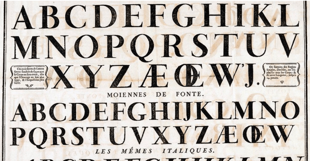
History of type
Stencilling was used in the beginning:
“Another traditional process deployed to duplicate convenient and economical ‘public lettering’ and signage was stencilling, a technique for reproducing designs by passing ink or paint over holes cut in cardboard or metal onto the surface to be decorated. Stencil type is defined simply by their ‘essential element’, the break, which opened out normally enclosed counters, and was known in China as early as the 8th century. This example is the stencil disk, invented by Eugene L. Tarbox in 1868, and manufactured by the New York Stencil Works, which demonstrates how the typographic characters are punched out of brass. “
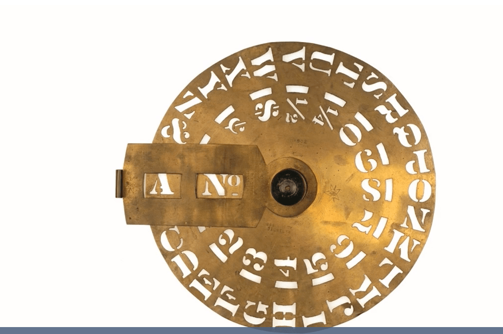
“stenciling, in the visual arts, a technique for reproducing designs by passing ink or paint over holes cut in cardboard or metal onto the surface to be decorated. Stencils were known in China as early as the 8th century, and Eskimo in Baffin Island were making prints from stencils cut in sealskins before their contact with Western civilization. “(https://www.britannica.com/art/stenciling)
“
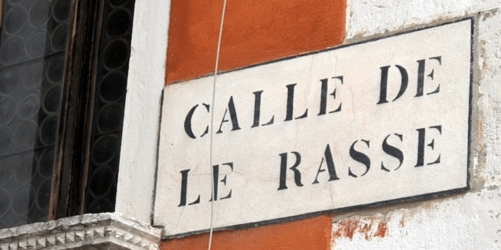
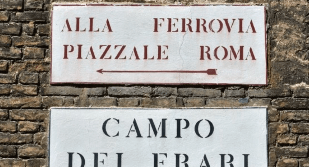
The street signs are seen throughout the city and are organized by a hierarchy in size – the larger type of a district, which sits above a smaller bridge name.
The stencil lettering personifies the image of Venice, as a beautiful, although not very practical, place. As John Morgan, the British graphic designer commissioned to create the identity of the 13th Venice Biennale, noted “The Venetian stencil street signs or nizioletti don’t prevent you from getting lost in the labyrinth. But they allow you to get lost in the most elegant way.”
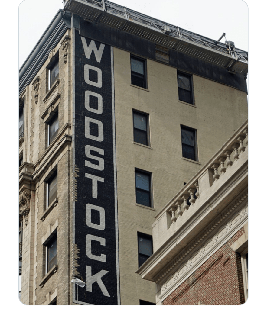
In the 20 century street signs are taking over the landscape
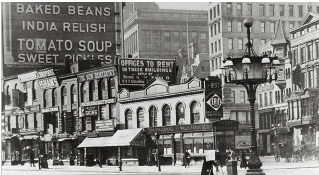
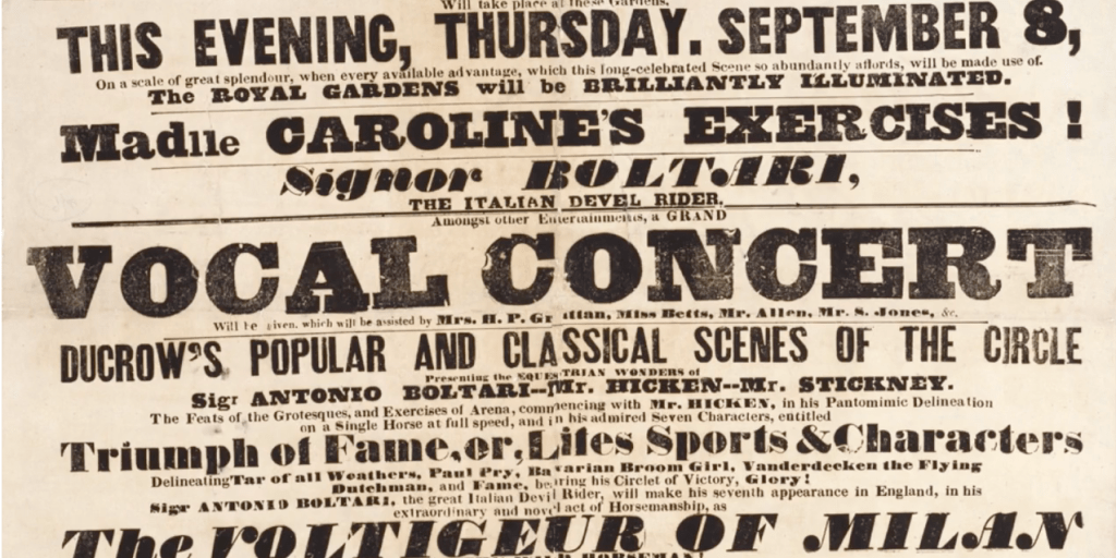
“By the time of the Industrial Revolution, from mid 19th century, the social landscape in the western world had changed significantly, as people moved en masse from the countryside to urban locations in the search of employment. This population shift had an impact on typography, which was being consumed at an industrial scale through signs, posters, newspapers, periodicals and advertisements. In order to compete in the era of mass production and over saturation, new type styles were developed and became larger and catchier, with bolder lettering and shading. “
“
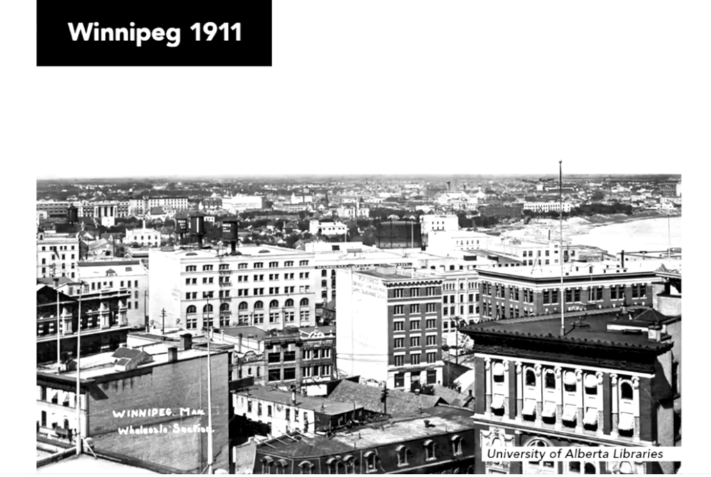
By the turn of the 20th century, street signs had transformed the urban landscape and were a precursor to the street advertising and billboards we recognize today.
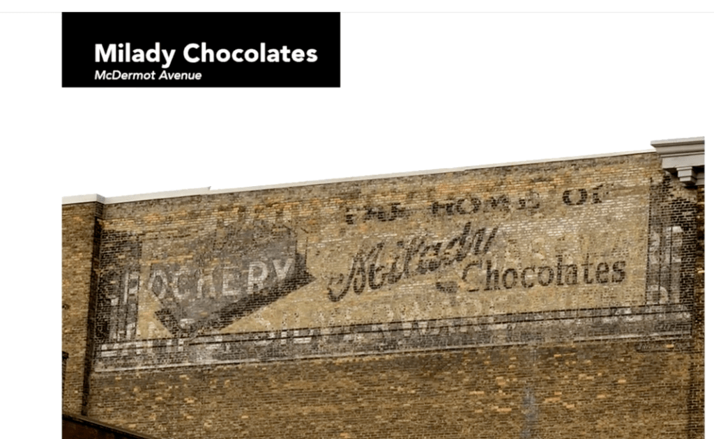
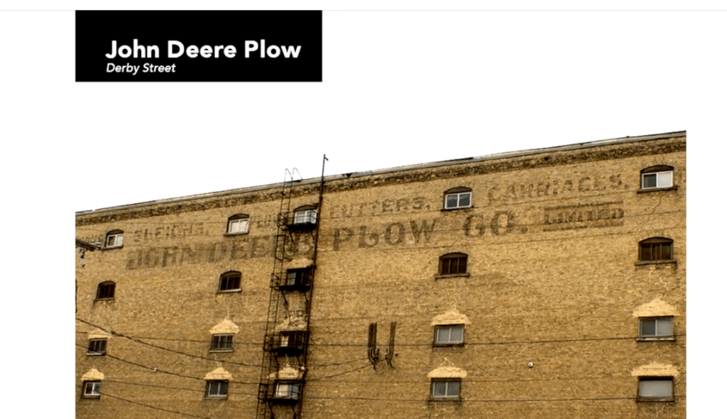
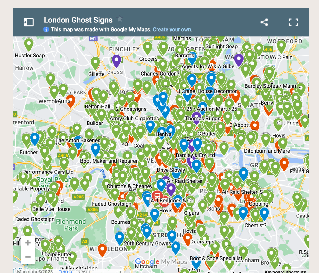
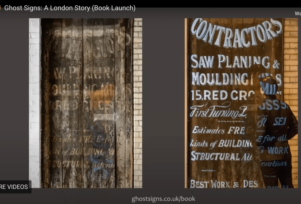
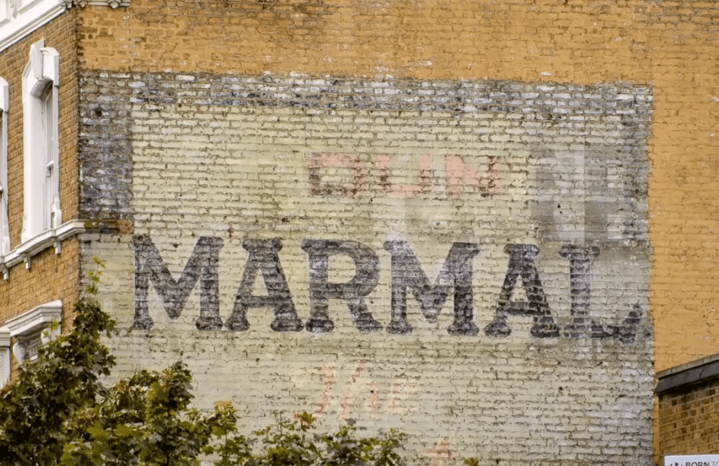
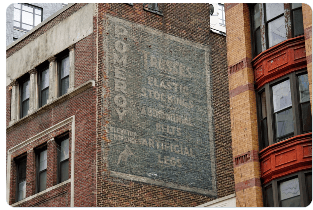
Many of these original street signs have been lost, as the buildings they adorned have been destroyed, painted over or faded over time. But there are a number of the original street signs out there, and people who want to preserve and celebrate them, such as Matt Cohen from Winnipeg in Canada. “
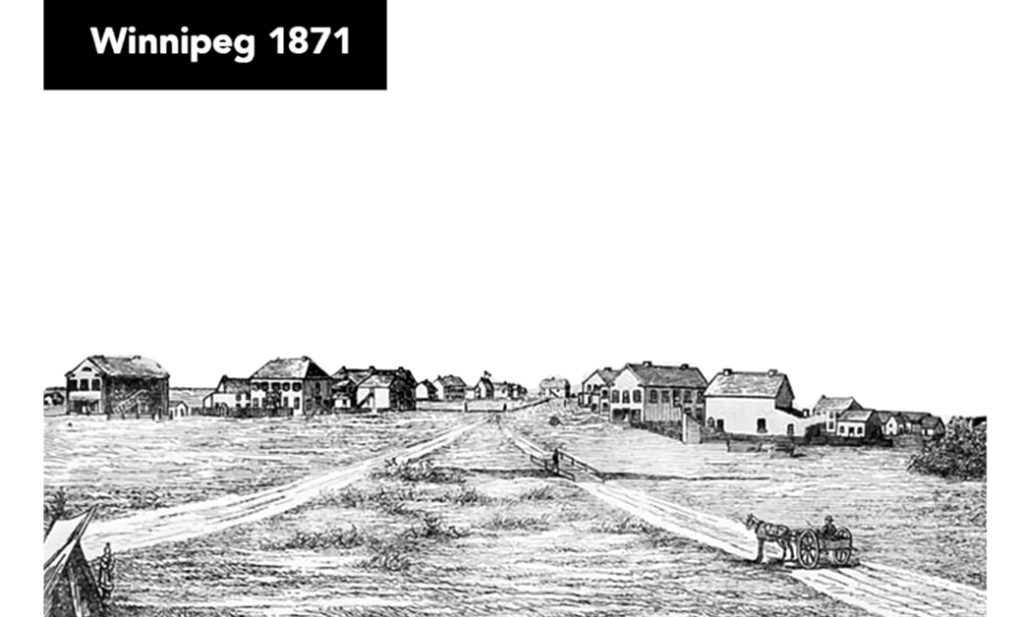
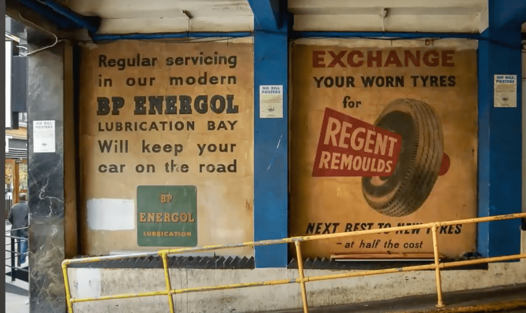
There are many ghost signs from that period – signs were suppose to be functional – let know people that you are there…
Signs start to change – they have a message – call to action – being persuasive

Heinz company is early marketing pioniar – they put their product in a clear bottle so the consumer can see the content…
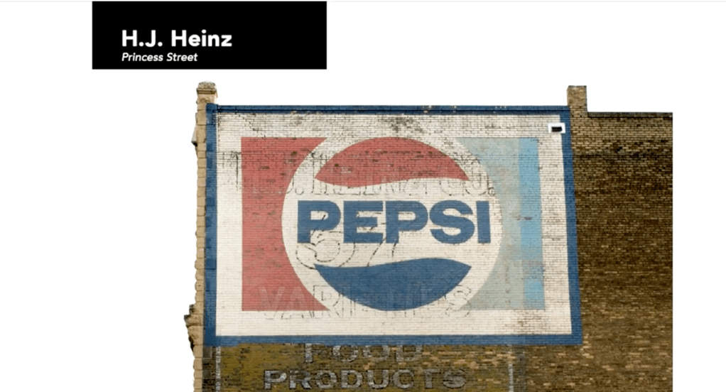
Matt makes me thinking that I wen I walk around – especially in a new place – I should pay more attention to signs – there is probably a story attached to them….
Paris was an need of unified identity to represent the city
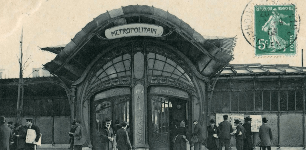
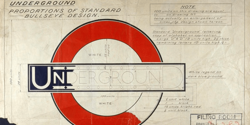
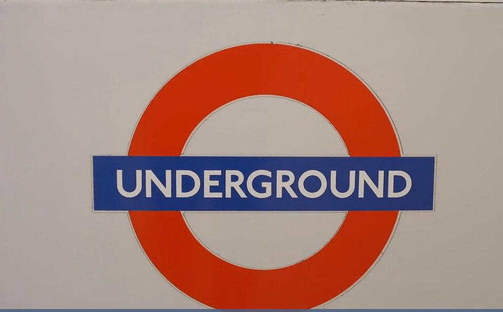
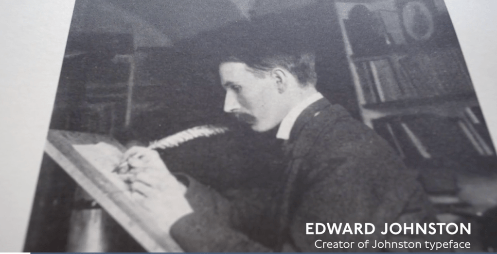
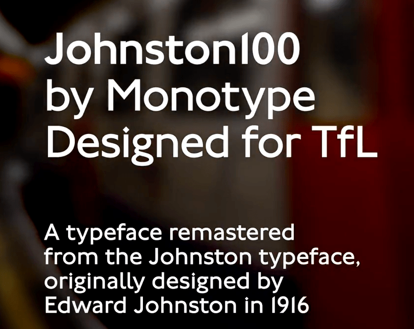
“The new typeface, called Johnston Sans, a Humanist sans serif typeface, was unveiled in 1916. It was revolutionary because, until then, printed script tried to reproduce the calligraphic fancies of Victorian handwriting, with its decorative curls and flourishes, known as serifs. The new letters deliberately left out the flourishes
Johnston Sans combined readability, beauty, simplicity. It was reassuring, which is so important when we’re travelling, because when we’re travelling we’re vulnerable. With Johnston, the typeface is confident and reassuring. “
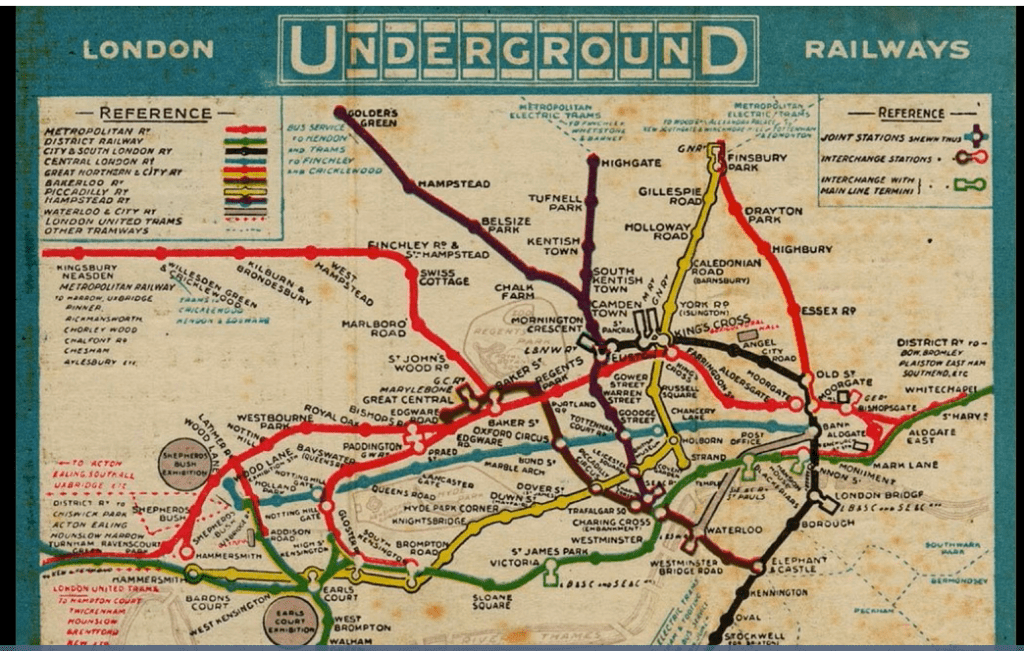
1933 was introduced the LUmap
“The London Underground map was revolutionary because it simplified the navigation of a city, instead of being a literal representation of its geography. This design became the industry standard for the cartographers and graphic designers who were commissioned to create maps that navigate the growing number of transport systems around the world.
The most famous iteration of Beck’s revolutionary approach was created by Massimo Vignelli, a graphic designer from Milan, who created the New York subway signage in 1966. “
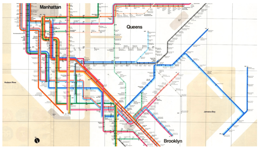
“Massimo was a graphic design from Milan, who briefly relocated to New York with his wife Lella, in 1957, before returning due to a visa lapse. In 1965, he and three graphic design partners established Unimark, a milestone in the history of design.
Unimark was the first design consultancy with an international scope and offices worldwide: Chicago, New York City, Milan, Detroit, Johannesburg, Cleveland, Denver, San Francisco, London, Melbourne, Copenhagen, and for a short period, Aspen and Palo Alto.
Unimark became the world’s best design firm, producing iconic projects for Ford, Knoll and American Airlines, as well as the New York City Subway sign system, in its signature Modernist style “
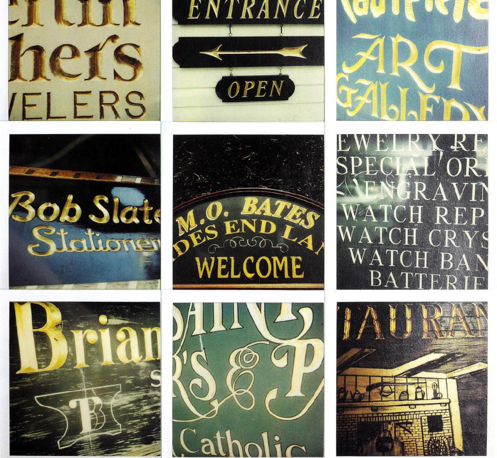
“Letters on America” – Edward Fella
“This book has some pages of hand-drawn lettering in pen and coloured pencil and many pages that show signs in whole or part captured on 1134 photographs shot with a Polaroid 680 SE camera on type 600 film.
We are touched by the person who made the sign, and by Ed Fell a making
the picture.
He admits to sometimes ‘theorizing after the fact’, realizing
the powers of what he has photographed or what has fed
through into his work after the event of shooting that image or
making a letterform. ‘I have this idea that I’ m taking these pictures
because I’m going to do some kind of future project around it.’ Which, in several ways, he has . .. and continues to do each time he opens up a sketchbook and creates letterforms and related elements that draw on the accumulated appreciation of the vernacular forms and practices.
This Americana, these telling quirks of everyday clutter that speak of and define a whole nation and its culture, these are outpourings and aspirations washed on the littered shore of the roadside; it is the opposite of high culture, it is the mythical, dream dimension of American visual culture that emerges from the ephemeral.
“Signs; lettering in the environment“
Phil Baines, Catherine Dixon & Baines, Phil & Dixon, Catherine
Signs for roads may be divided into two main groups: ‘informatory’, that is, direction giving and related information; and ‘regulatory’, which include all signs giving instructions or warning and prohibiting certain behaviour.
They work by taking into account issues of readability – scale, contrast, letterform – and practicalities such as manufacture and placement.
As with any typeface, the design of the character shapes is only half the
job: what helps those shapes to be read easily or not is the space around and
between them. Compared to type used in books and general printed graphic design, type on large signs needs more space between characters, words and lines if it is to remain legible from a long distance.
Extensive use of symbols, or pictograms, has been argued for many
years as it was thought that they could form the basis for an international
language which transcended national barriers. More recent research has suggested that pictograms are most effective when they depict the actual thing,
The signs which greet a traveller at an airport. a ferry”terminal or on the roads after a border crossing all have the aim of helping us on our way, but they also become the first words of welcome to that country: ‘You can trust me’, ‘I am modern’ , or even ‘You will be robbed’.
What becomes clear when looking at the field of lettering is that the criteria for assessment cannot be limited to a consideration of the letterforms alone. It is a relationship of four main factors – letterform, placement or situation,
scale and material – with the dominant influence varying from on example to the next. Situation, scale and material can all dictate the forms of the letters themselves giving them an unexpected beauty.
This capacity for architectural lettering to give voice to a sense of civic
identity was perhaps most magnificently exploited in ancient Rome. As the
architects, artists and letterers of this early civilization explored the potential
of the medium, great quantities of lettering were applied across a vast range of structures for a whole variety of purposes. The potential properties of architectural lettering as an instrument of propaganda were not lost to ancient history, being exploited by the church throughout the succeeding centuries and totalitarian regimes in the twentieth century. As a general rule, architectural lettering is conceived with, an is designed to last as long as the
building. Neither the building nor the lettering should look quite right without the other.
But other factors can play a part. Given the limited hours of daylight in Scandinavian countries perhaps it is no coincidence that a high proportion of fascia lettering uses neon.
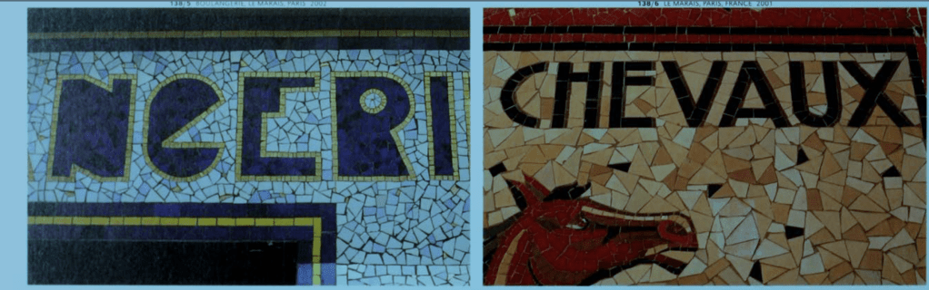
Ceramic mosaics have been a popular material for decorative purposes since Roman times.

(https://www.fastcompany.com/3044133/a-rare-interview-with-graphic-design-legend-massimo-vignelli)
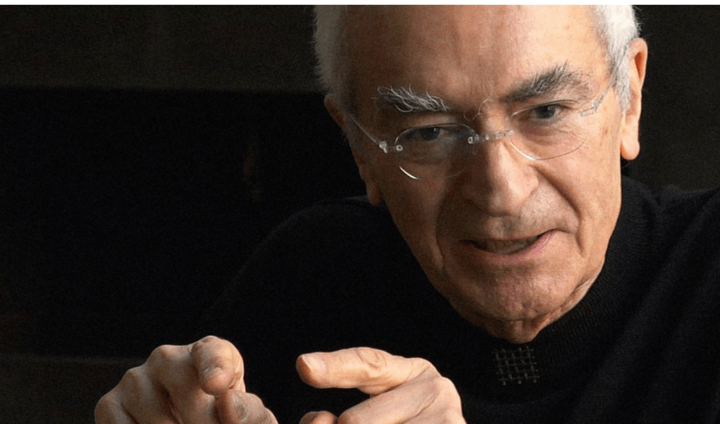
About the map of the New York subway system that he design he said ” It’s very simple. Every subway line on the map has a color, and in reality they already have one. And every station has a dot, you know. Every stop is a dot—no dot, no stop. It couldn’t be easier than that.”
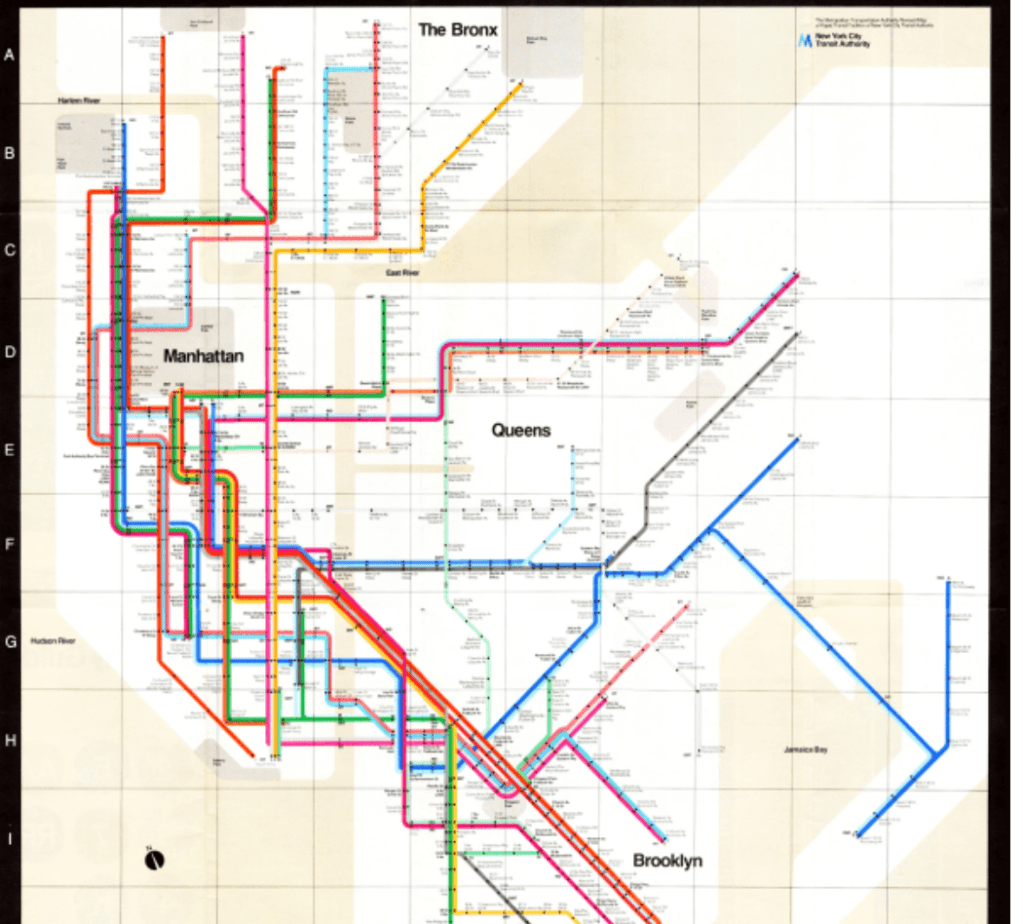
“Consistency is extremely important in design.
The fewer number of typefaces you use, the better, and the fewer number of type sizes is even better.
The life of a designer is a life of fight, to fight against the ugliness.
There is very little awareness of graphic design and graphic designers. Even with clients.“
“The Acceleration of Cultural Change : From Ancestors to Algorithms”
by R. Alexander Bentley, , Michael J. O’Brien, , and John Maeda
https://www.itsnicethat.com/news/heimat-berlin-voice-of-the-wall-typeface-graphic-design-121119
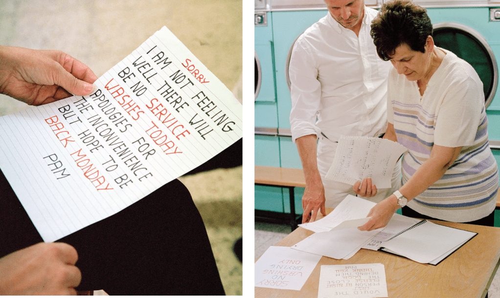
https://www.itsnicethat.com/features/bam-and-pam-launderette-signs-typography-graphic-design-270919
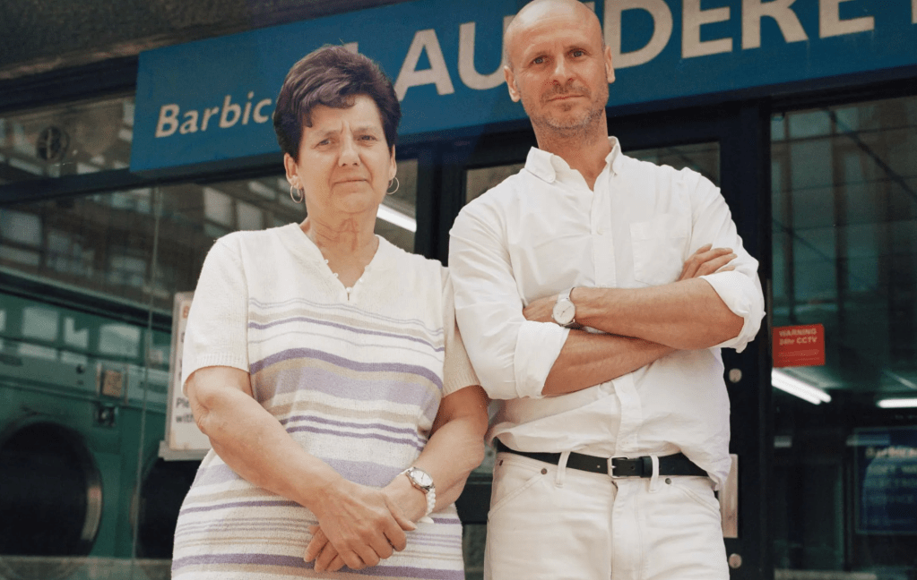
“David first met Pam when he arrived in London after graduating from Glasgow School of Art in 2000.
Over the past 20 years, David and Pam have built up a fondness for one another, a friendship held up by three pillars: routine, gentle teasing, and typography.
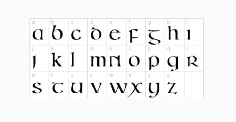
Celtic letters shared by Jamie Cook
https://www.giacopazzis.co.uk/
Shared by Jamie Cook
Brick typography
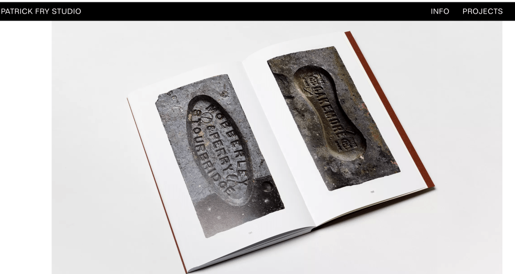
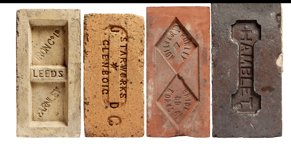
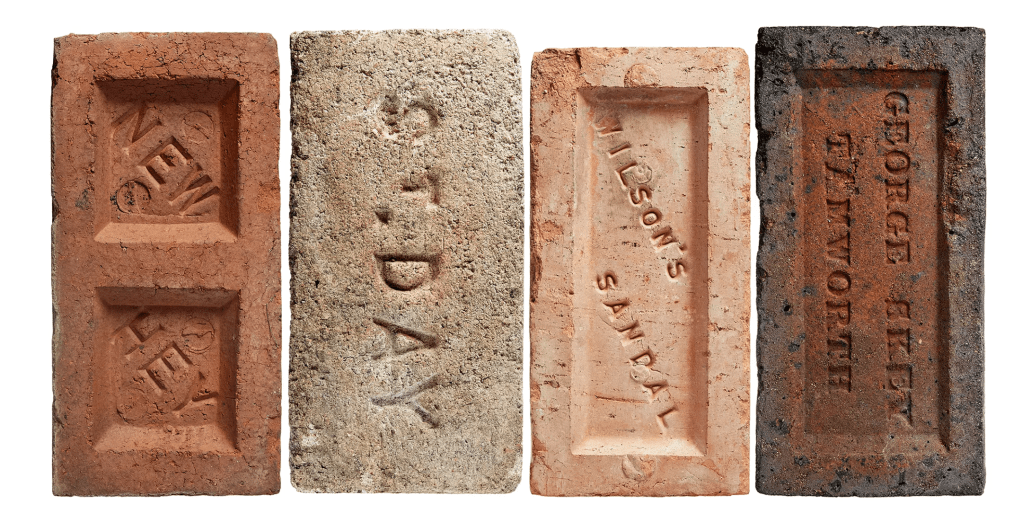
Resource shared by Eli Luntz

Shared by Kate Green
I love the part where he explains how they came up with the idea or lipgloss EOS
https://www.toptal.com/designers/typography/typeface-classification
Challenge for week 1

Leave a comment