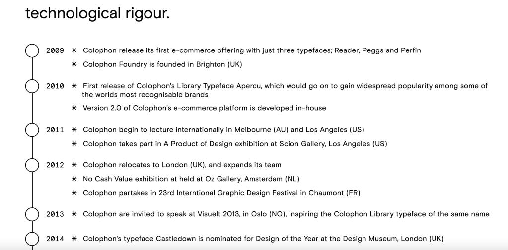
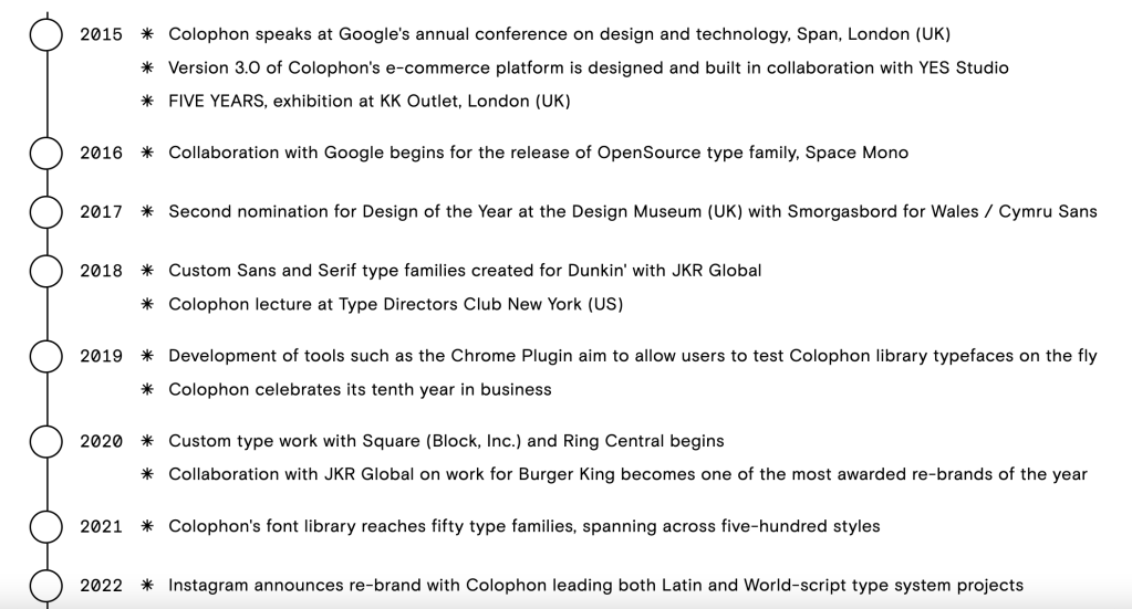
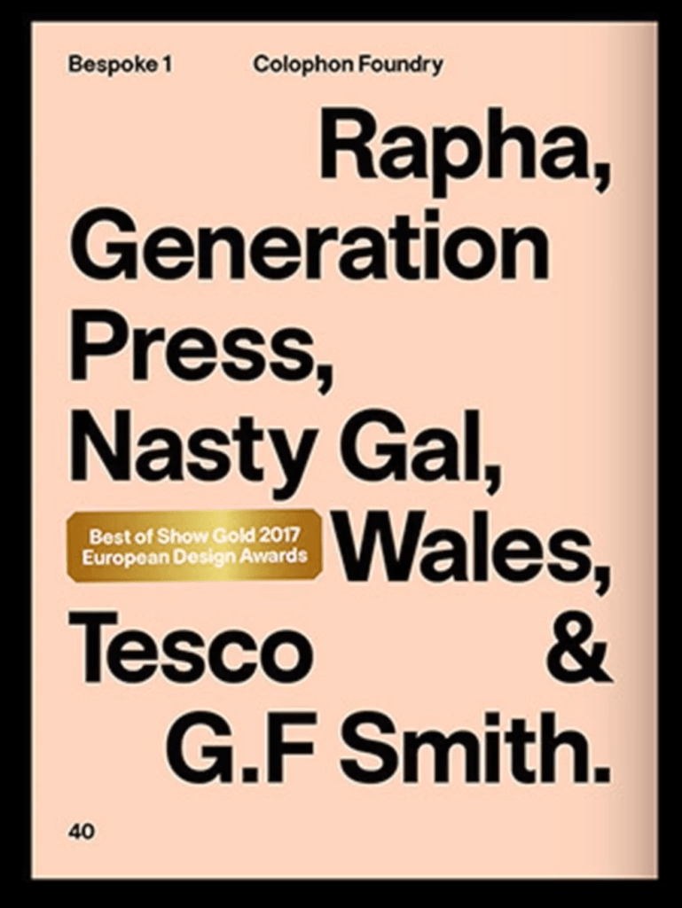
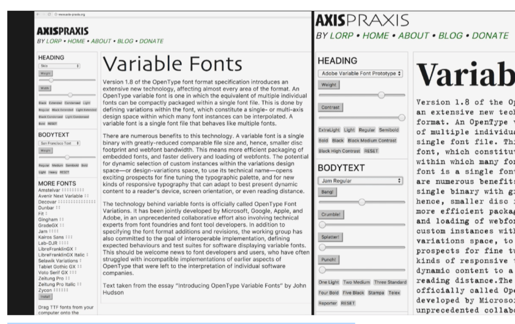
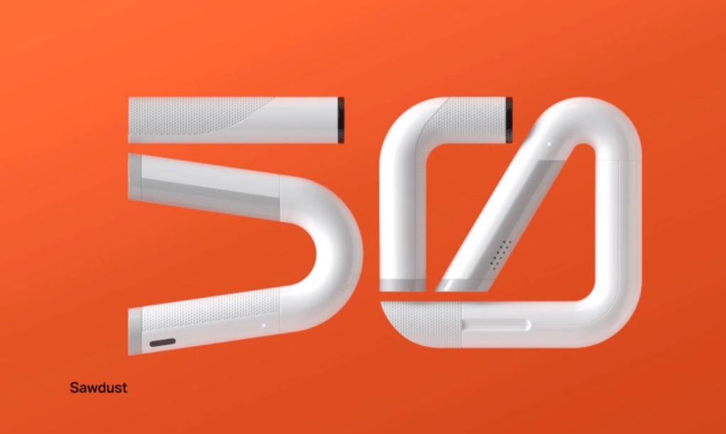
We were introduced to Colophon Foundry (https://www.colophon-foundry.org/).
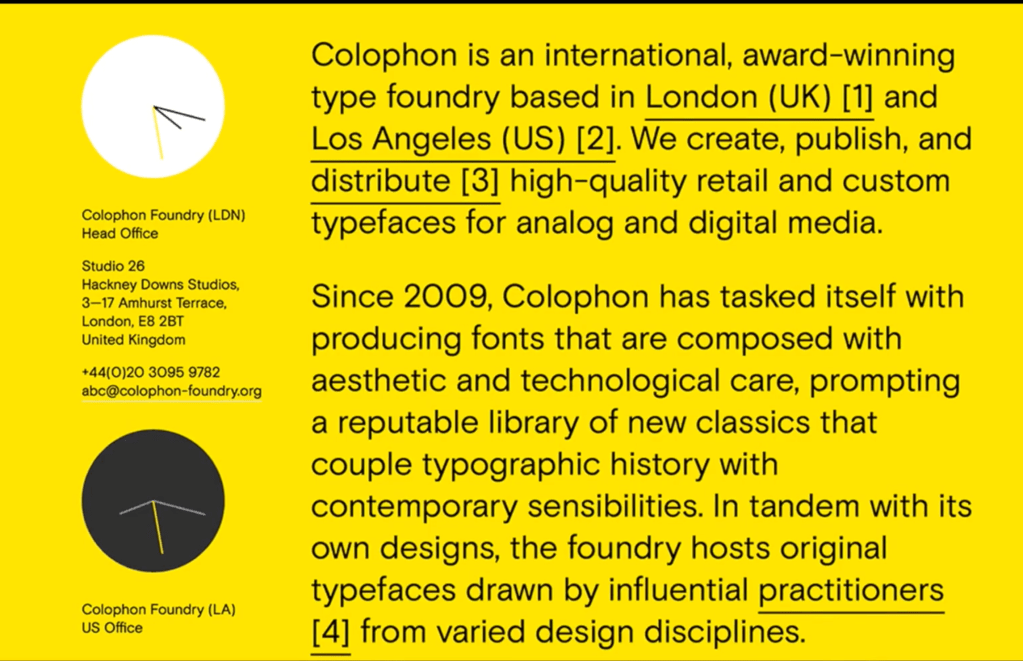

“We combine creative typographic vision with the highest quality technical solutions to create typographic assets that power brand differentiation at scale for some of the world’s most recognised brands, including Instagram, Google, Cadillac and Burger King.”
They demonstrated how appropriate research into provincial and historical issues are imperative to the success of a project that portrays national identity and also how do graphic designers create an identity for an outward facing client, that must evoke a sense of nationality and also a strategic design alignment – such as speed, travel, heritage and luxury.
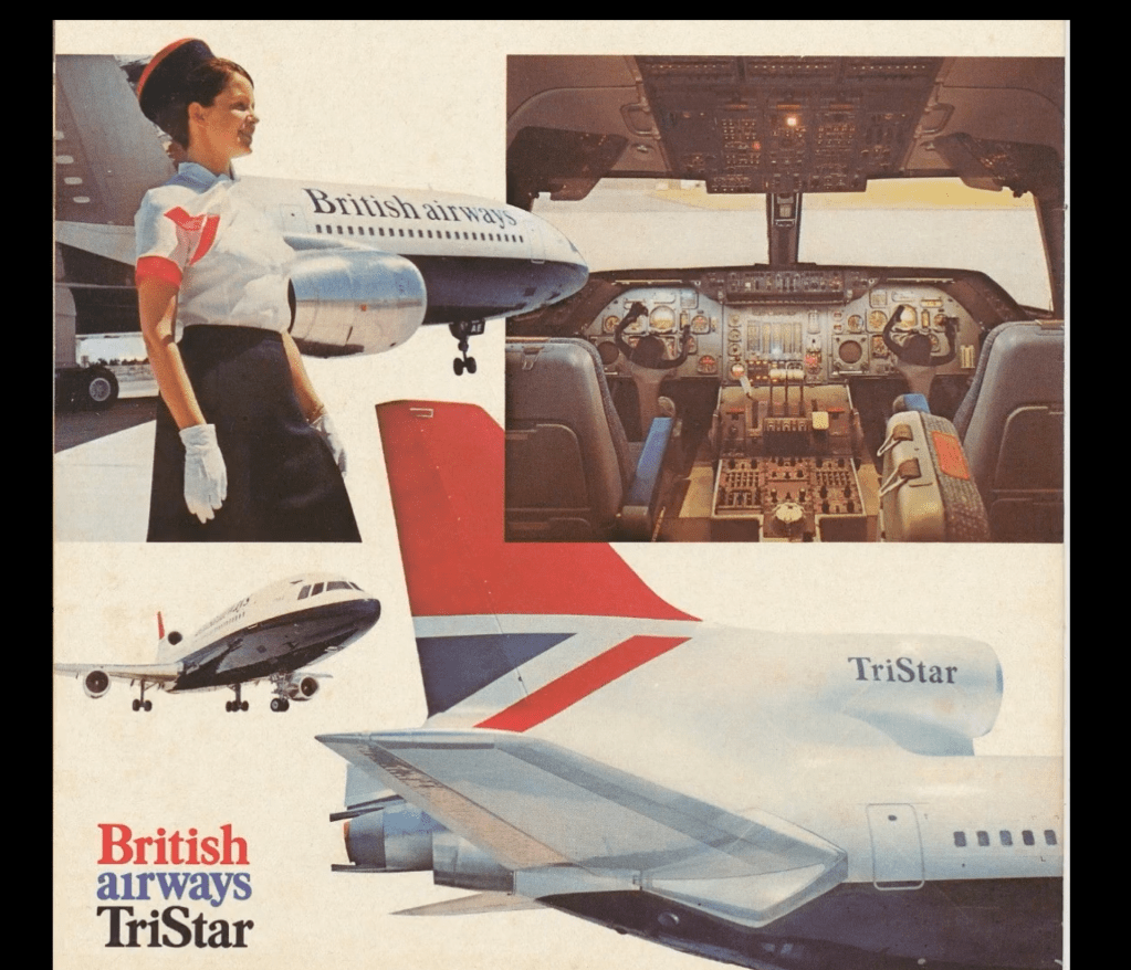
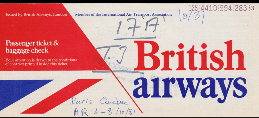
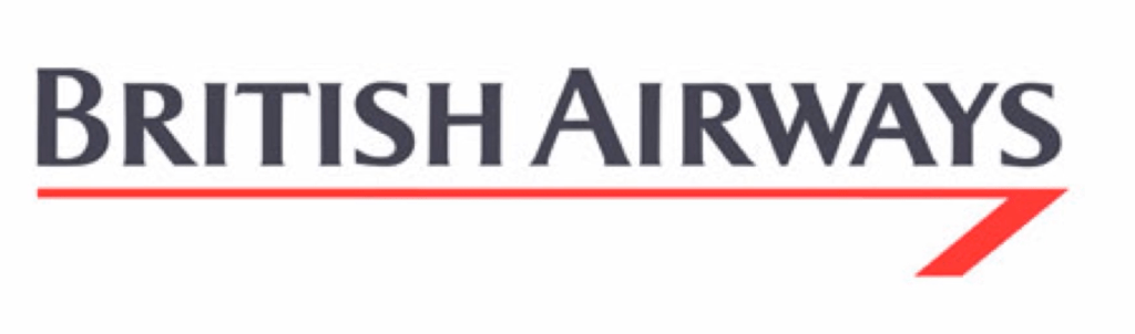
“At the time, British Airways was managed by the UK government, and it was imperative the new logo evoked a sense of Britishness, while also reflecting a sense of modernity, speed and luxury.
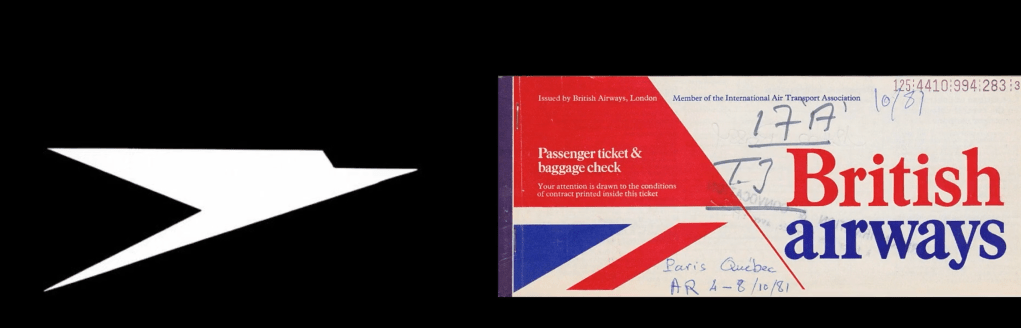
The resulting logo, completed in 1973, combined elements of the Union Jack flag – to reference the British nationality – and the previous BOAC and Imperial Airways logo, affectionately known as the ‘speedbird’, which is seen on the left.
The reference to the much loved and iconic speedbird logo, created in 1932 by Theyre Lee-Elliott, an English art deco artist, which depicts a bird in flight, was an important addition for its ability to reflect a sense of speed, travel and heritage.
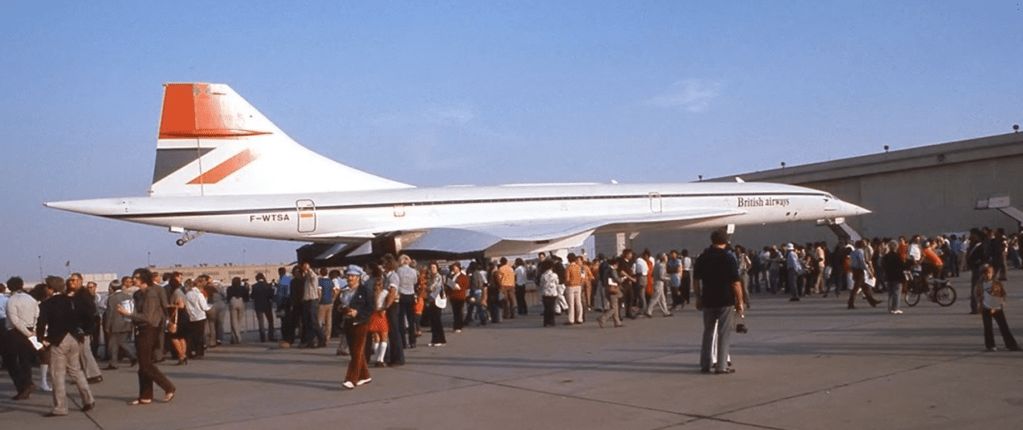
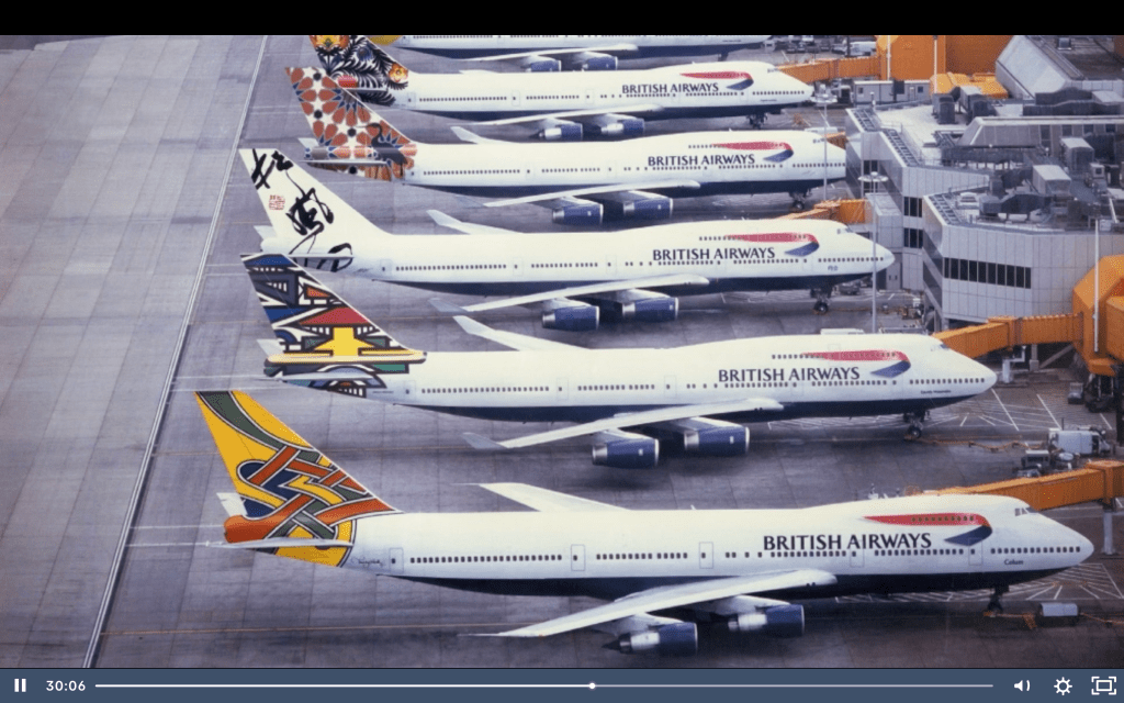
The geometric icon adorned airplane tail fins, while a new serif typeface was adopted as the main visual representation of the British Airways name, which appeared on the body of the plane – as seen here in an early photo of Concorde, the supersonic jet airliner and flagship of the British Airways fleet. “
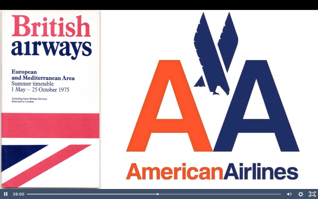
“Now it’s fair to say, the use of typography and its application wasn’t very progressive, especially when compared to the contemporary and now iconic American Airways logo, created by Massimo Vignelli in 1967, seen on the right.
The choice of serif typeface and the combination of title case and lowercase lettering, with the removal of the dot over the ‘i’ in ‘airways’, is more reminiscent of a low cost airline and certainly didn’t position British Airways as a contemporary airline.”
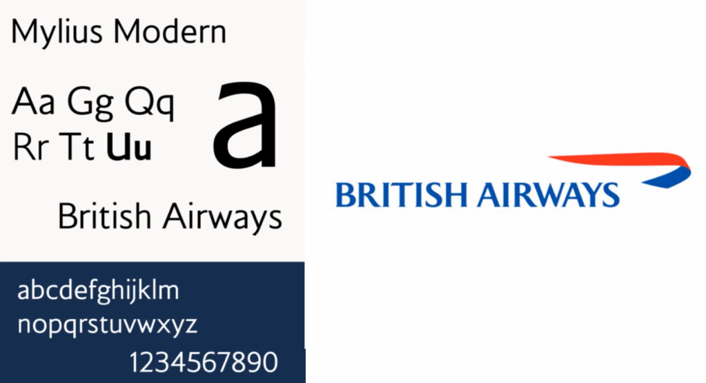
“This all changed in 1984, when Landor Associates, an American brand design agency, unveiled its upgraded design for the British Airways identity.
Until this point, British Airways was Britain’s flag carrier and was state-owned for many years. It was privatised in the mid 1980s, under the prime minister-ship of Margaret Thatcher, a keen advocate of the privatisation of state-owned industries. The new design still referenced the Union Jack, and the red, white, blue colour schemes from the previous design, but the most distinctive change was the introduction of a red ‘speedwing’ that sat below the logotype, which was reminiscent of the original ‘speedbird’ logo designed in 1932. The original serif typeface was replaced by a new logotype to evoke understated British elegance and luxury.
“
However, by 1997 the Landor identity was replaced, as its overtly national visual language was perceived to be too British and projected an image of being too conservative, old-fashioned, stuffy and staid.
Newell & Sorrell was commissioned to create a new identity with the aim of positioning the airline in a global, but more customer-centric, marketplace in which the airline was competing.
Newell & Sorrell developed a less formal identity, which was accompanied by development of the warmer, more human, ‘Mylius’ typeface, created by MonoType.
The British press ran articles accusing the company of being a traitor to the British identity – that show us that is not unusual at certain time some designs not be understand or welcomed but after years to be characterized as evolutional and very creative.
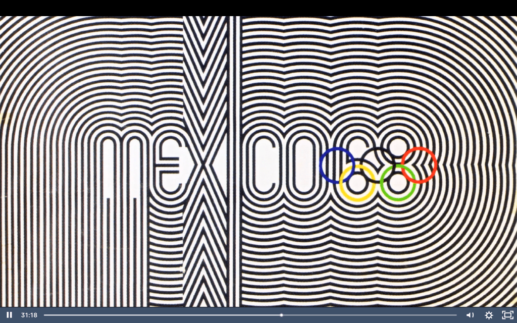
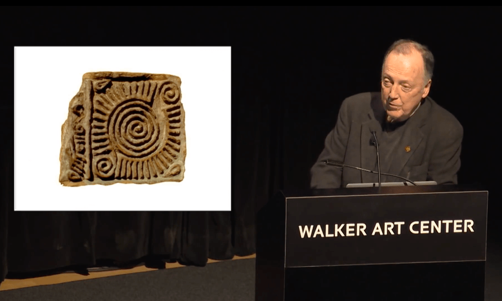
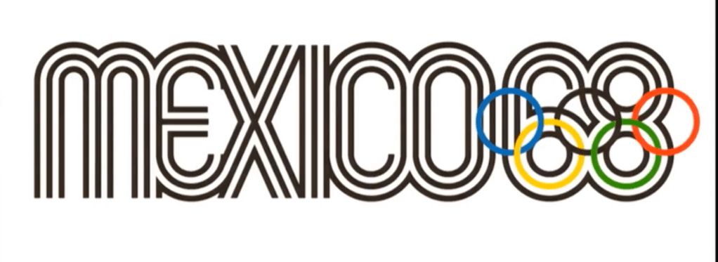
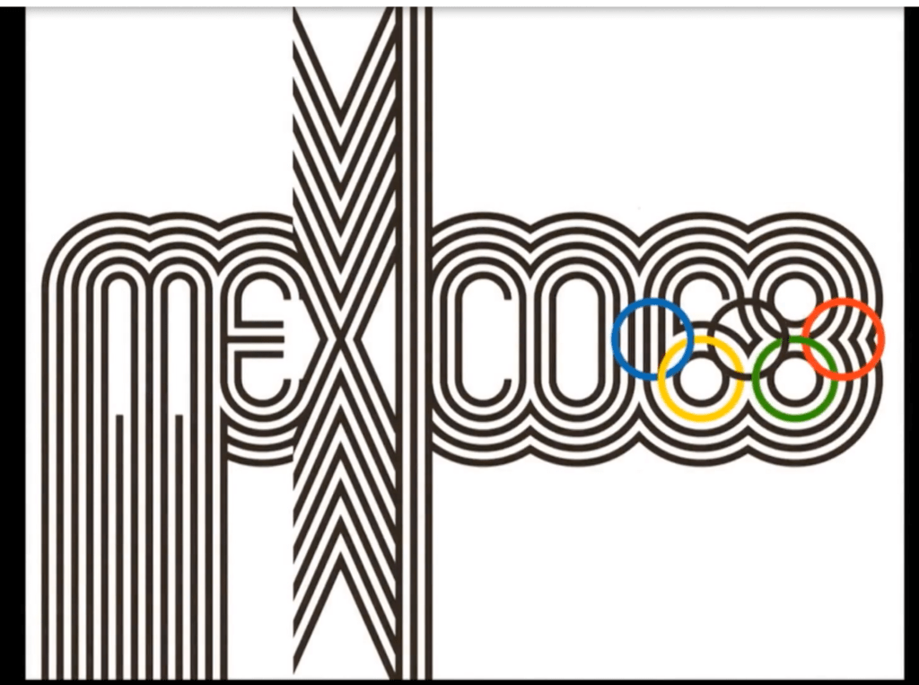
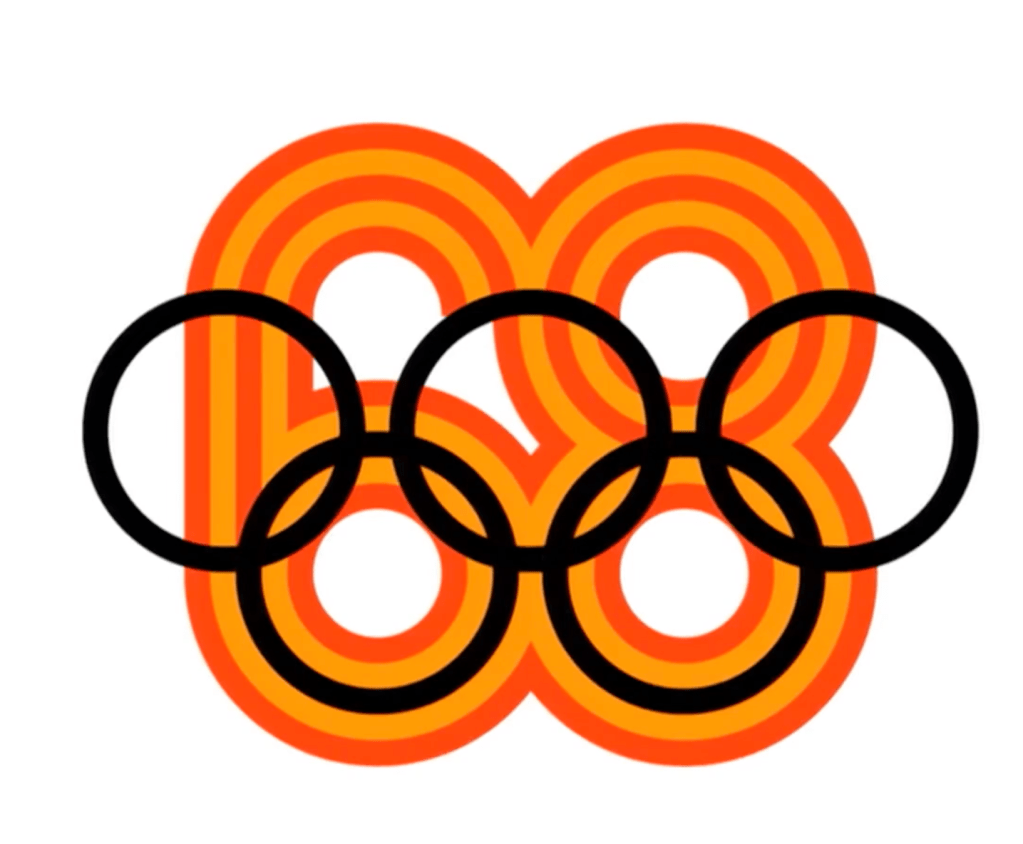
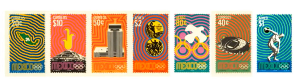
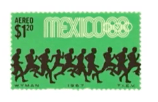
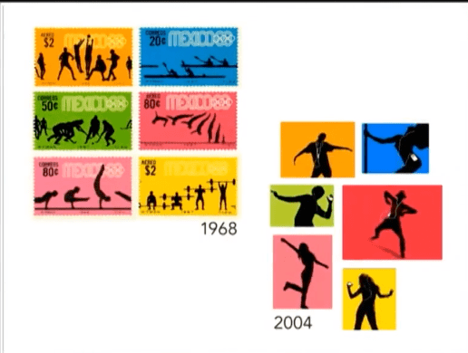
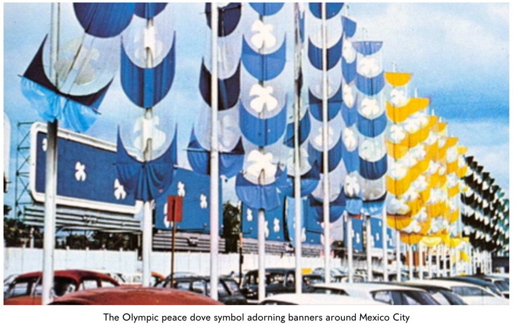
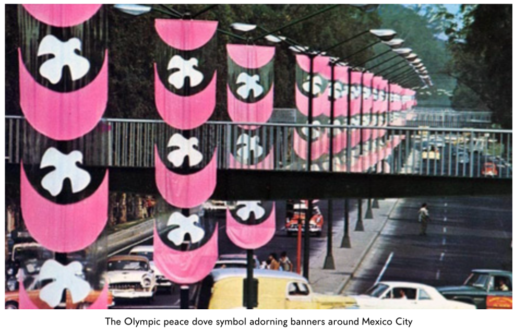
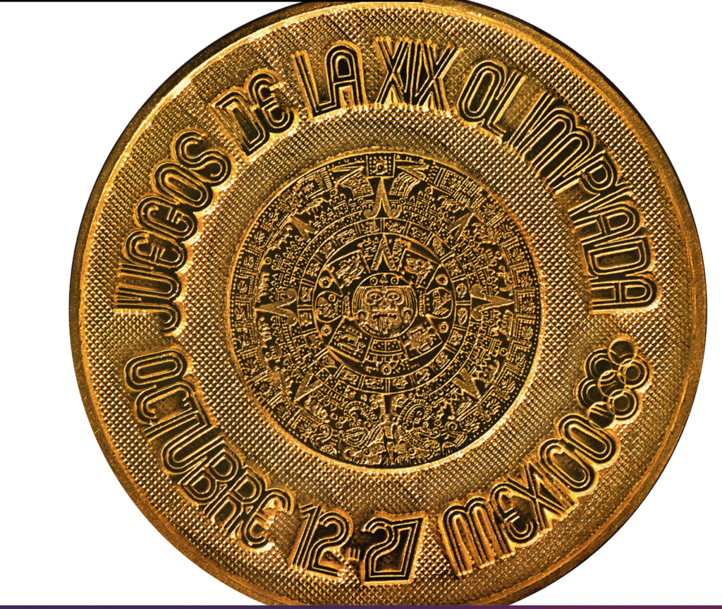
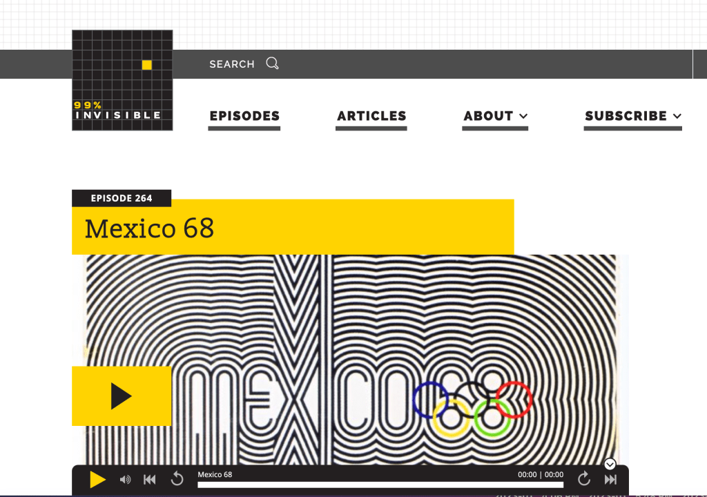
Lance Wyman talks about creating the logo in 1966 for the Olympic games in Mexico.
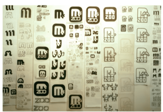
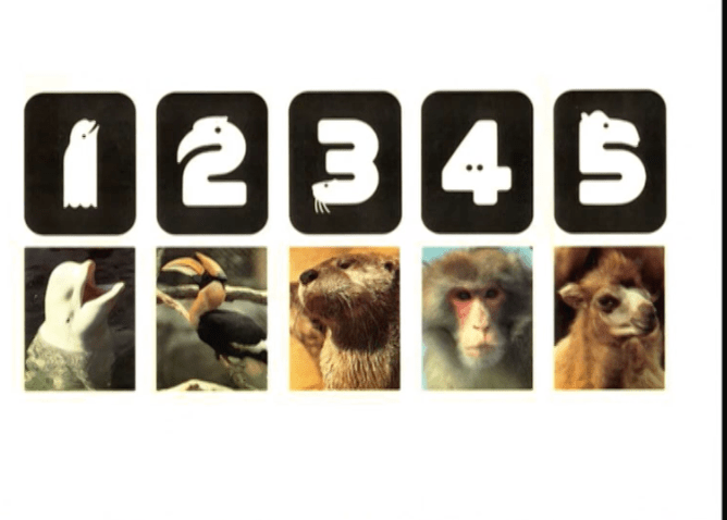
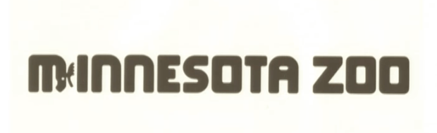
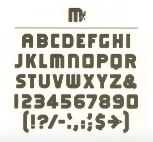
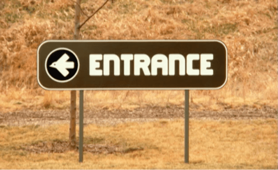
“When combined, the art of branding and the science of wayfinding design can profoundly transform a space. Lance Wyman is a humble master of designing massive systems for cities, airports, expos, transit systems, zoos, and museums over his more than 40-year career. In the process, Wyman helped to define the field of environmental graphics. His iconic identity for the 1968 Mexico City Summer Olympics—”’60s op-art kinetic typography,” as Wyman calls it—exists as a pinnacle of environmental and branding design and was credited with reintroducing Mexican visual culture back into the nation’s design vocabulary. Other projects include the Washington DC Metro map, the identity for the 1970 FIFA World Cup, the 1980 Minnesota Zoo identity (which was selected as one of the 10 best designs of the year by Time magazine), and projects for the Library of Congress, Jeddah International Airport, Chrysler World’s Fair, and the Aspen Design Conference. His work has been exhibited in museums around the world and is also in the collection of MoMA (New York). Wyman has taught corporate and wayfinding design at Parsons since 1973. Copresented by the Walker Art Center and AIGA Minnesota.”
First sketches:
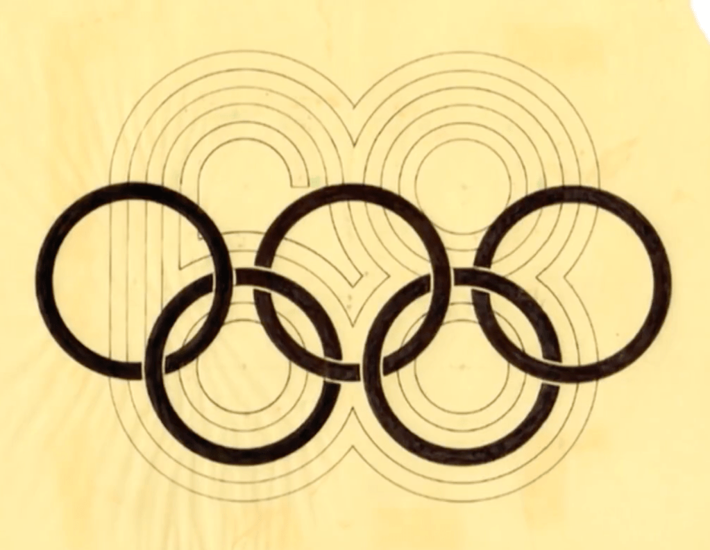
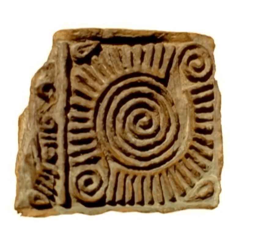
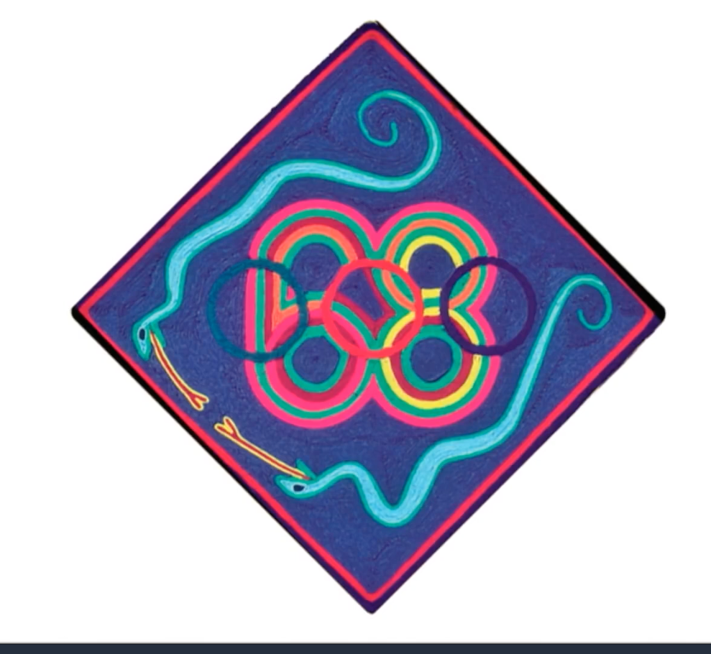
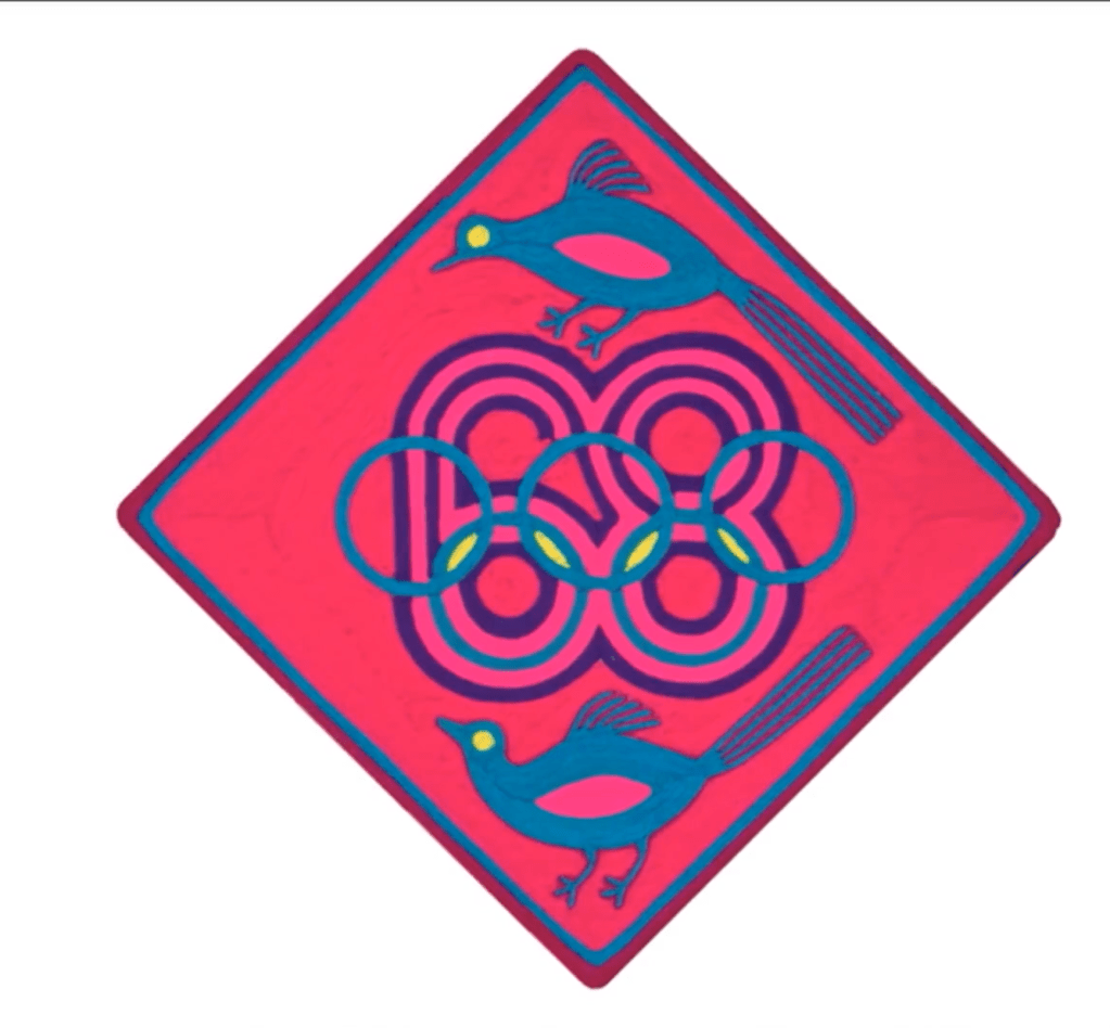
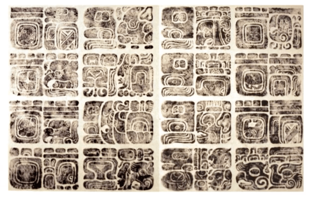
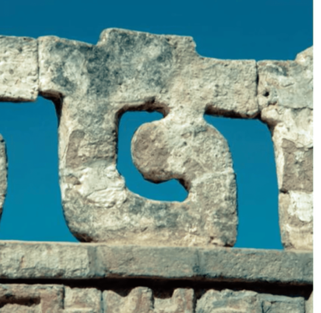
He got the idea for the images for the Olympic village from the old glyphs:
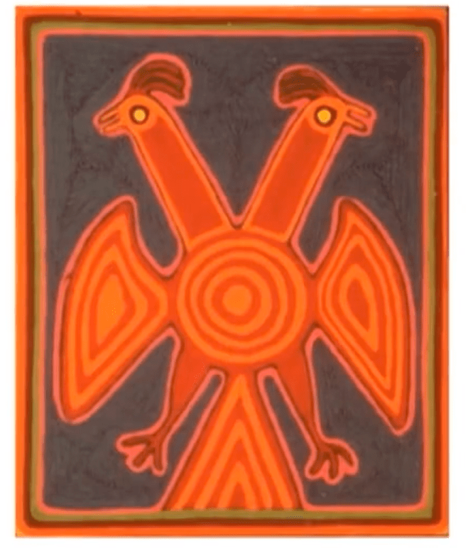
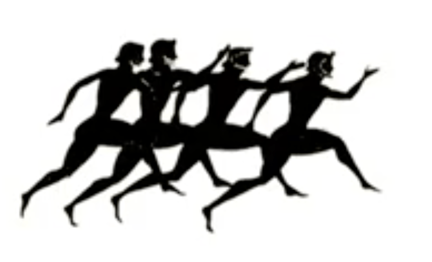
He also took the idea for using silhouette from the Greek pottery’s images:

The use of silhouette become popular since:
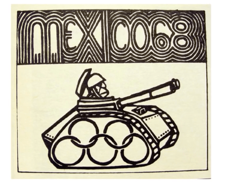
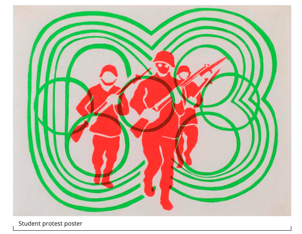
I like his respond back then to the social problem – a lot of students were getting killed back then
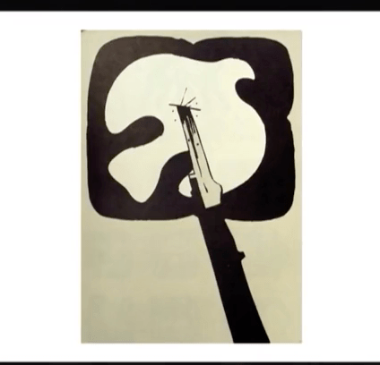
This is a project for one hotel:
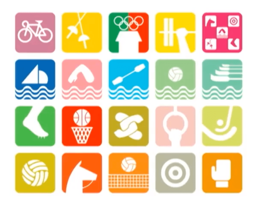
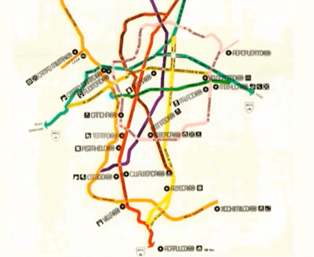
Lance Wyman start working on the metro project after he came back from Mexico – he created typeface and he suggested pictogram for each of the station
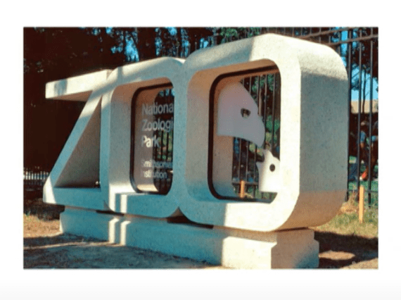
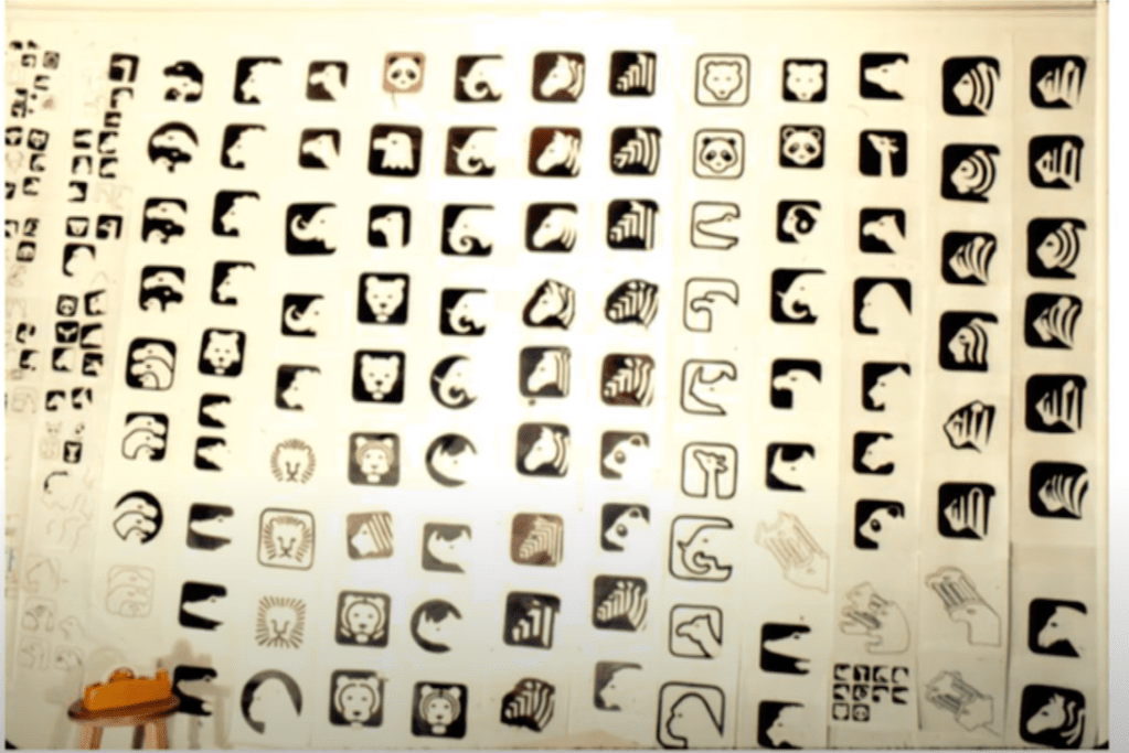
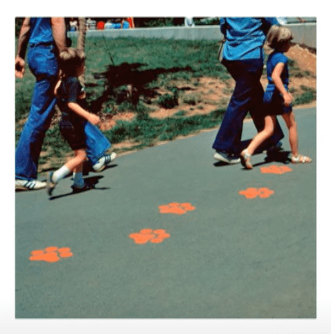
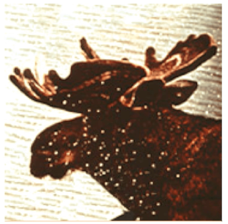
This for the project for the zoo in Washington:
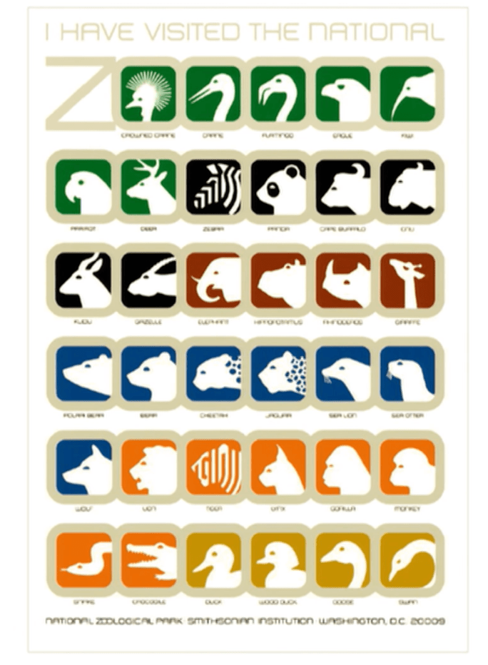
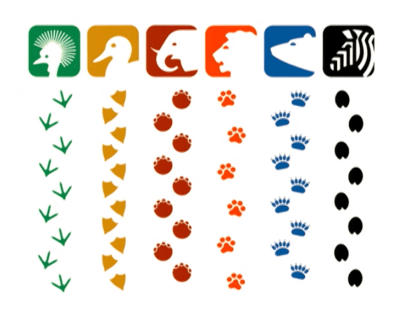
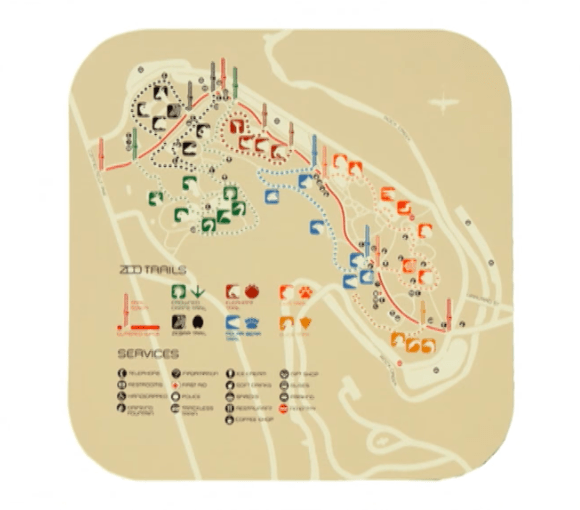
He uses images of the steps to create pats for the trails in the zoo.
Lance Wyman created his logo after started working independently.
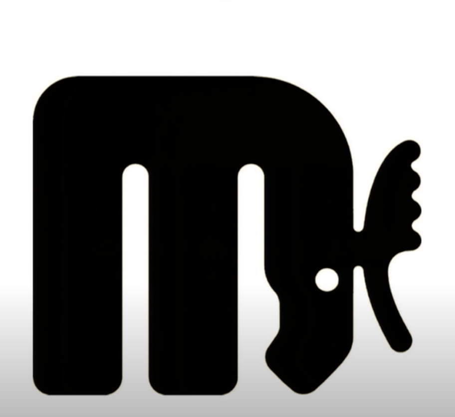
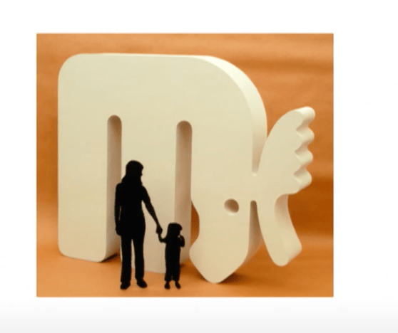
His project for the Minnesota zoo:


I like that he said – “follow your nose” – so, we should pay more attention to everything around us.
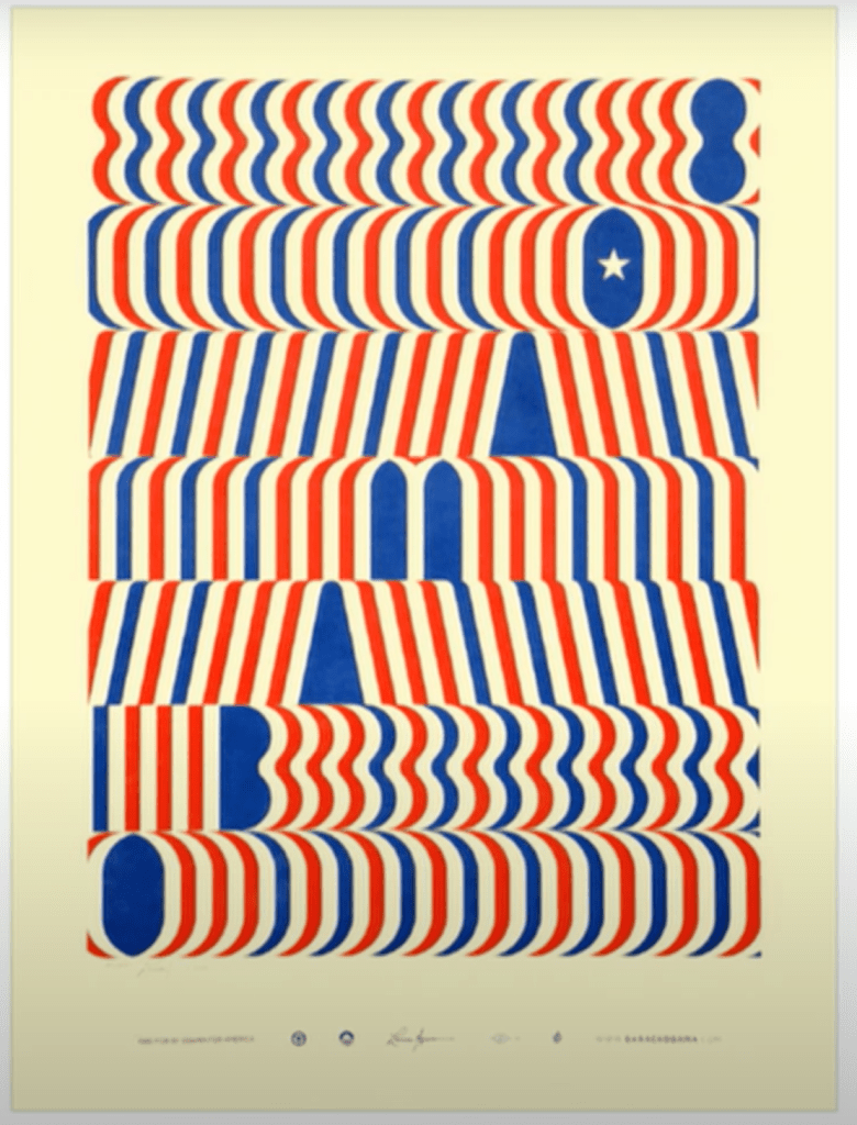
He created a poster for the Obama campaign
Ellen lupton says that our job as graphic designers is to tell people where to go, what button to push, what to buy…
https://podcasts.apple.com/gb/podcast/99-invisible/id394775318
Article shared by Brigitta Nagypal:
https://walkerart.org/magazine/lance-wyman-mexico-68-olympics-tlatelolco-massacre
“It’s fascinating the way a piece of design can accrete meaning over time, as new contexts are revealed, personal stories come to light, and history slowly reifies our perceptions of an era.There are designs that, for one reason or another, transition from being simply of their time to defining their time. Lance Wyman’s identity for the 1968 Mexico Summer Olympics has been hailed as a pinnacle of branding and wayfinding, creating an unparalleled sense of space in lieu of the extravagant architecture typical of the Olympics.
LANCE WYMAN (LW)
“The International Olympic Committee presented us with a simple brief: create an identity that incorporated the five-ring Olympic logo and used the host country language, Spanish, as well as French and English for all publications and signs. The brief from the Mexican Olympic Committee was equally simple, coming directly from Chairman Pedro Ramírez Vázquez: “Create an image showing that the games are in Mexico that isn’t an image of a Mexican wearing a sombrero sleeping under a cactus.”
It was a daunting challenge, and in some sense, a very open-ended assignment. I traveled to Mexico with Peter Murdoch and my wife of two months, Neila, to participate in a competitive arrangement—we had two weeks to come up with something, and if we didn’t, we would go home. It didn’t help, in terms of stress, that all we could afford were one-way tickets to get down there. Peter and I worked 12 or more hours every day and stayed up all night discussing the possibilities at the Hotel Montejo in Mexico City’s Zona Rosa. Every night poor Neila had to listen to our panic as time started to run out and we hadn’t hit on anything. This was in November 1966, less than two years prior to the Games...
I remember Otl Aicher, the designer of the 1972 Munich Games, visiting our studio and saying they were further ahead in Munich than we were. We had 18 months to go at that point, while Aicher had 18 months plus four years to go.
Resource shared by Jamie Cook
https://www.seblester.com/category/art/dreams-%E2%80%93-limited-edition-print

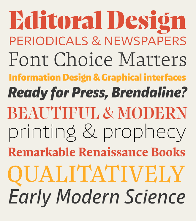
I am very impress of the design that got first prize last year for editorial design:
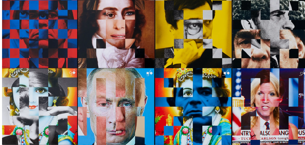
Game Six
by Thomas Sharp/Studio Sutherl&, for Thomas Sharp/Studio Sutherl&
Game Six is a selfpromotional, multimedia work designed to showcase writing, design, film deepfake, experience and digital means of communication, with the whole project aimed at a very specific audience of the ‘right’ people.
As a publication and experience designed to appeal to a literate and intelligent audience of potential clients, who are politically, socially and culturally active, Game Six was made to meet a challenging brief. The creators sought to do “Something that made us feel out of our depth,” that would put off the ‘wrong’ people and engage the ‘right’ onesEncompassing chess, Ukraine, Donald Trump’s hair, post truth politics, disinformation and warped logos, Game Six evolved into a 128 minute event in Camden, a website, a film and a book. The judges said: “Really interesting and innovative concept. The only entry that I came back to over and over, And one of the only entries that incorporated elements of social commentary and reflection.”
Editorial Design
Monotype’s Dan Rhatigan discusses Ryman Eco, the world’s most beautiful sustainable font.
Dan Rhatigan: “The best typefaces a marriage of something very functional and very beautiful.” I am impressed of the idea for sustainable font – the environment needs this.
“
Mexican Tradition Meets Op Art
One of the contenders who flew down for a trial period was Lance Wyman, a 29-year-old graphic designer from New York City. He and his design partner, Peter Murdoch, could afford only one-way tickets. They went down in November of 1966, to try to make a design that would represent Mexico.
….And neither of them had ever been to Mexico before.
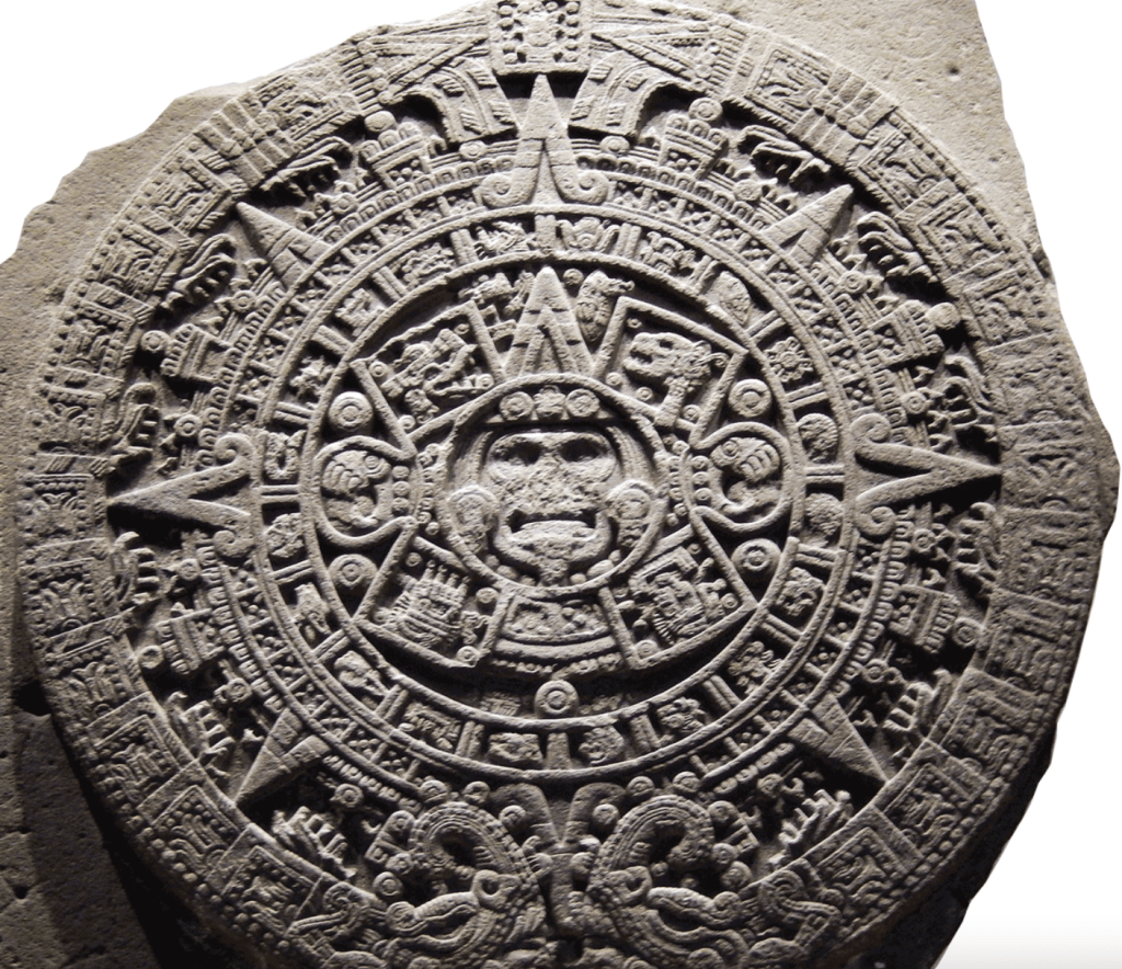
The pair started where most tourists start: visiting museums. They spent a lot of time at the Museum of Anthropology, where they studied artifacts from pre-Columbian Mexico, like the Aztec Sun Stone and ancient Mayan murals.
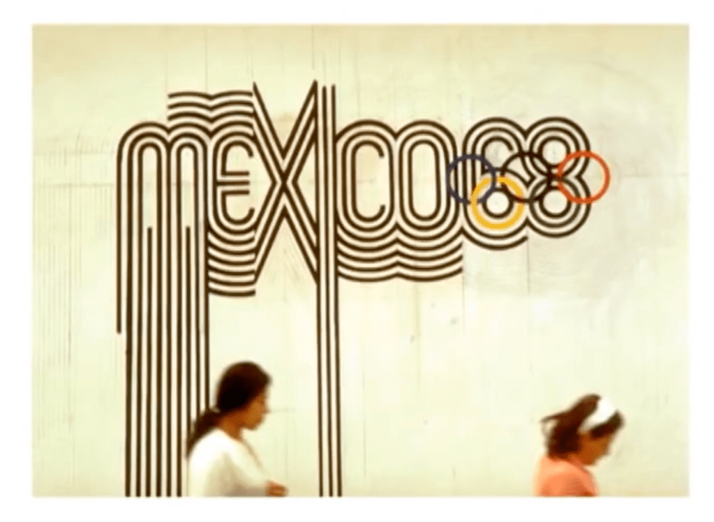
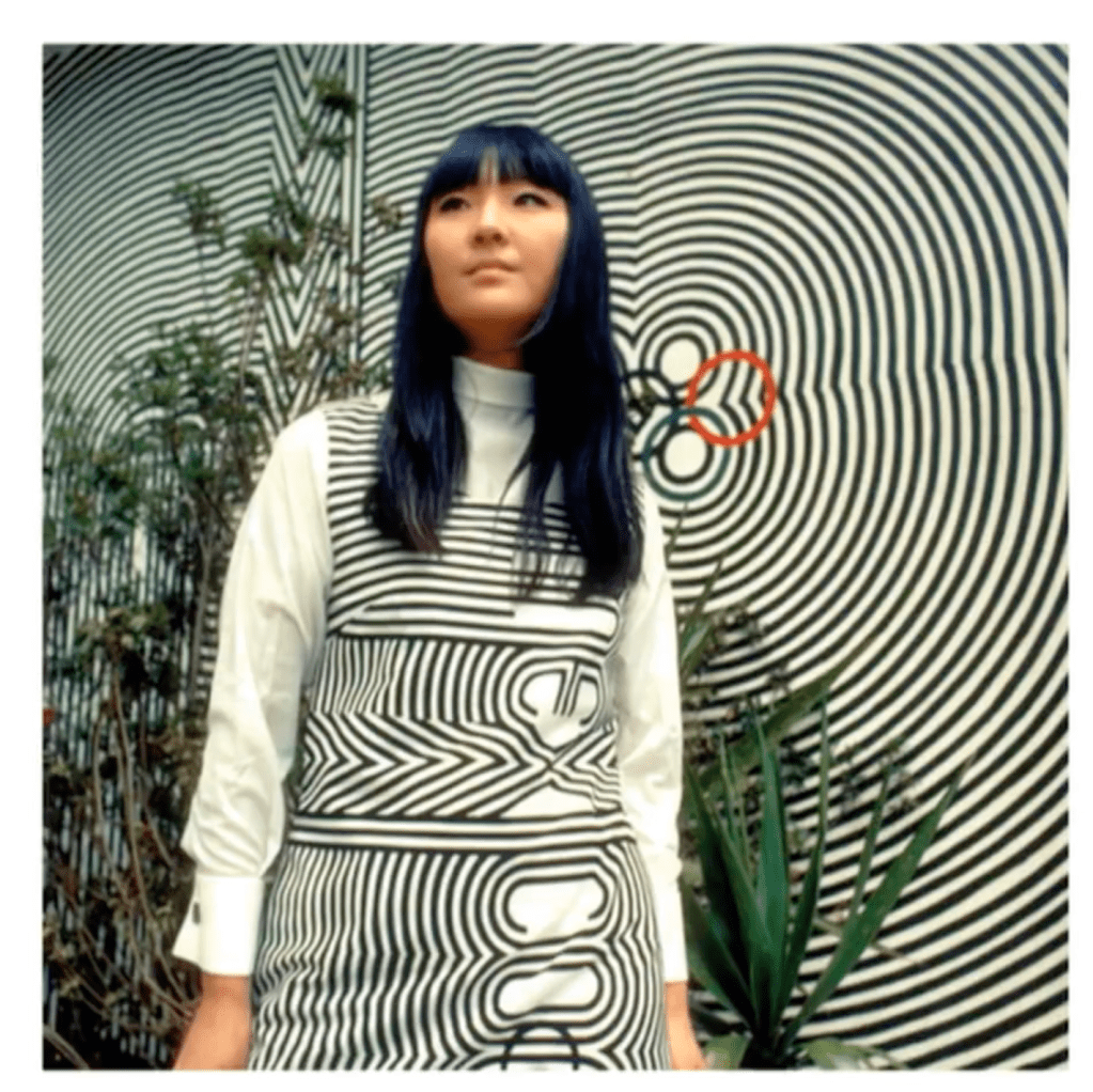
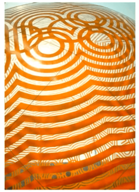
OP art, or Optical art, uses contrast, geometry and other tricks to give the viewer the impression of movement. And so, informed by both indigenous artifacts and modern OP art, Wyman came up with a hypnotic logo that riffed on the five rings of the Olympic symbol.
Wyman won the competition, and that was just the beginning.
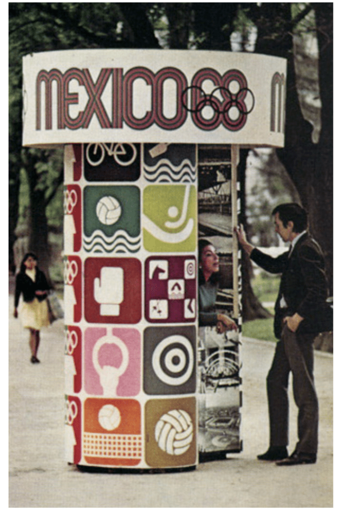
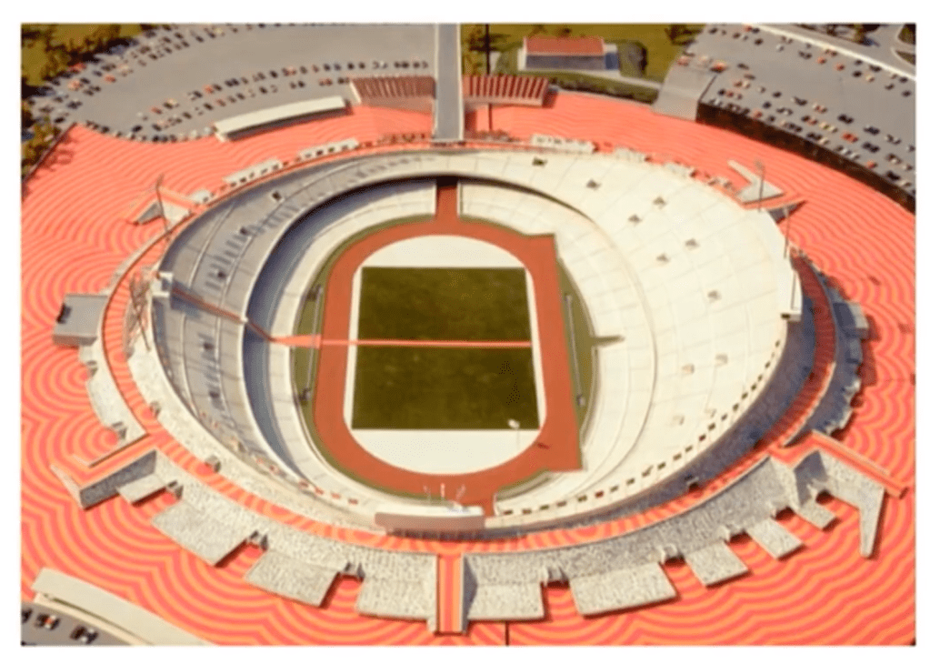
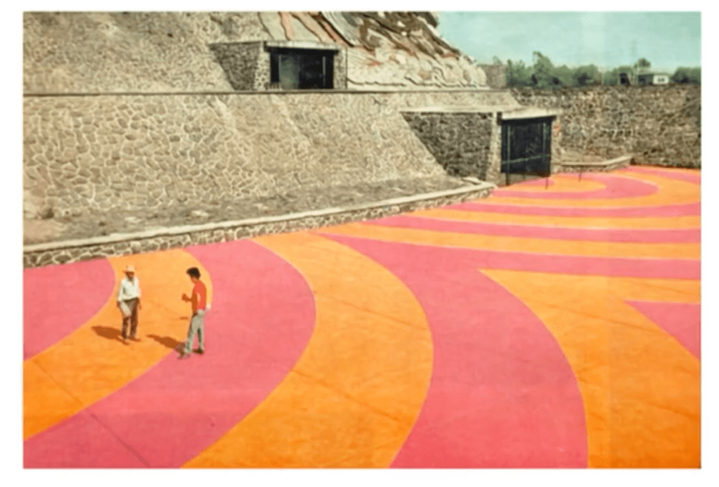
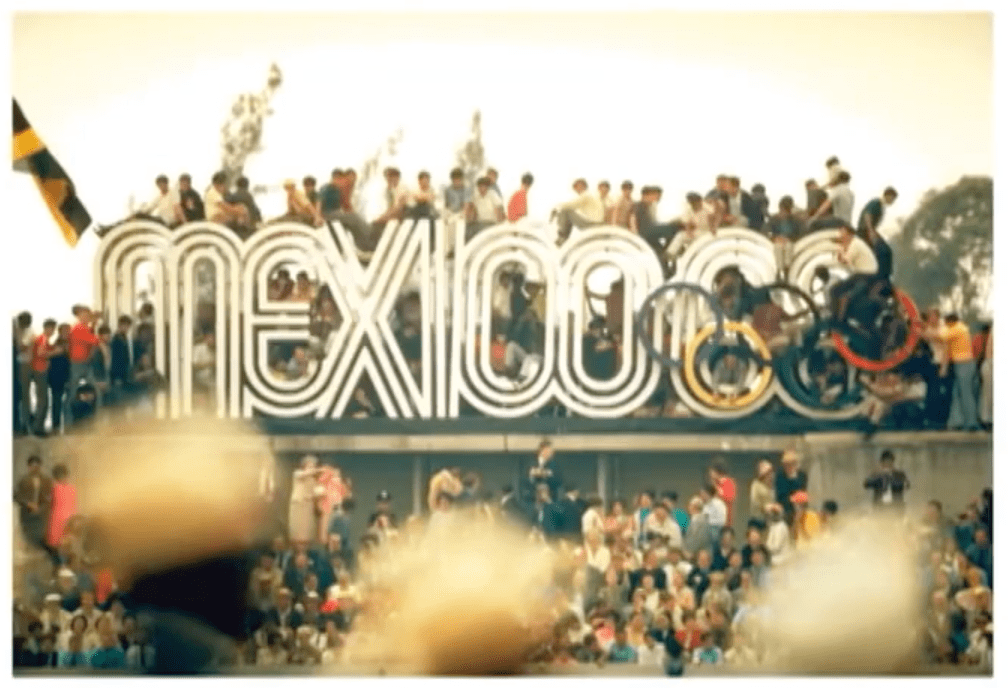
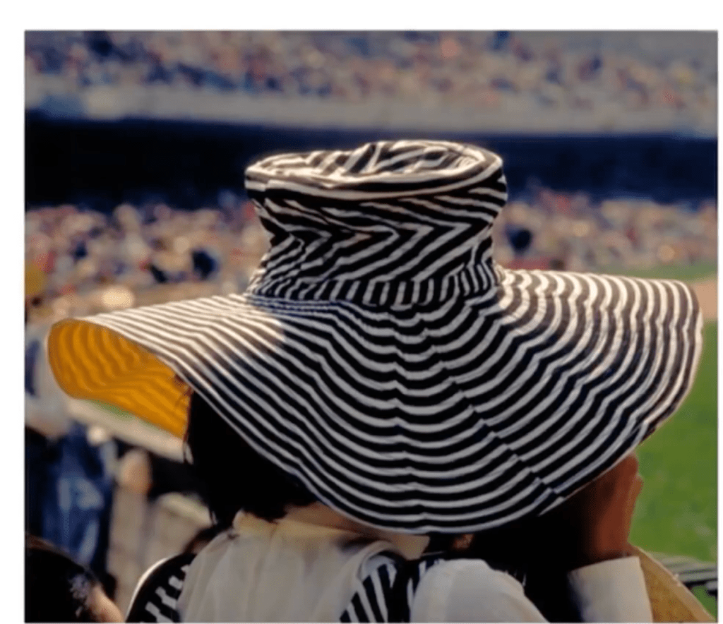
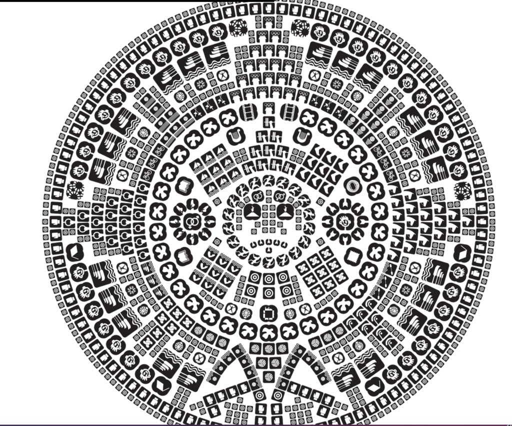
These bright, hypnotic designs gave the Olympic Games a visual coherence… but they also helped people find their way around. The graphic design language of the Olympics expanded into an entire system that helped visitors navigate the massive metropolis.
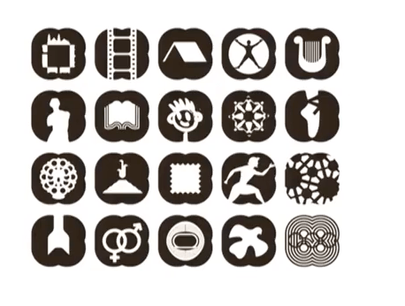
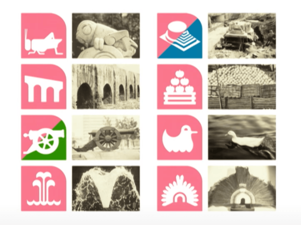
Wyman made simple color-coded icons to represent every sporting event.
Tens of thousands of protesters took to the streets, repeatedly, throughout 1968. Again and again police violently dispersed them, increasingly desperate to keep unrest from interfering with the Games.
Then, on October 2nd, just ten days before the “Games of Peace” were set to begin, thousands of students gathered at Tlatelolco square in the northeast area of Mexico City to demand the release of people who had been locked up at a previous protest. It was a quiet gathering of people with signs walking slowly around the plaza.
Suddenly, shots rang out. Soldiers opened fire on the students. The scene was cleared before there could be an accurate body count, but estimates range up into the hundreds. The blood was washed away. Thousands of protesters were arrested and locked up. The government took great pains to cover their tracks.
The government claimed that the students had fired first, to provoke the military. Evidence has since come to light that disproves that claim. “It’s an extremely shocking event for a long time kind of suppressed in Mexican national memory,” says Castañeda. “And in many ways it is the crux of the crisis that sets the stage for the very very dramatic sense for the Olympics themselves.”
Despite his relative isolation at work, Wyman heard about the massacre. “When I heard about it and how severe it was it was a very difficult situation because I was working for the government and I couldn’t do anything about it,” he says. He empathized with the students and had mixed feelings about continuing his work. But, in a way, he didn’t need to choose between the government and the protesters. His designs found a way to serve both sides.
Additional resource: https://v-fonts.com/about; https://v-fonts.com/designers/
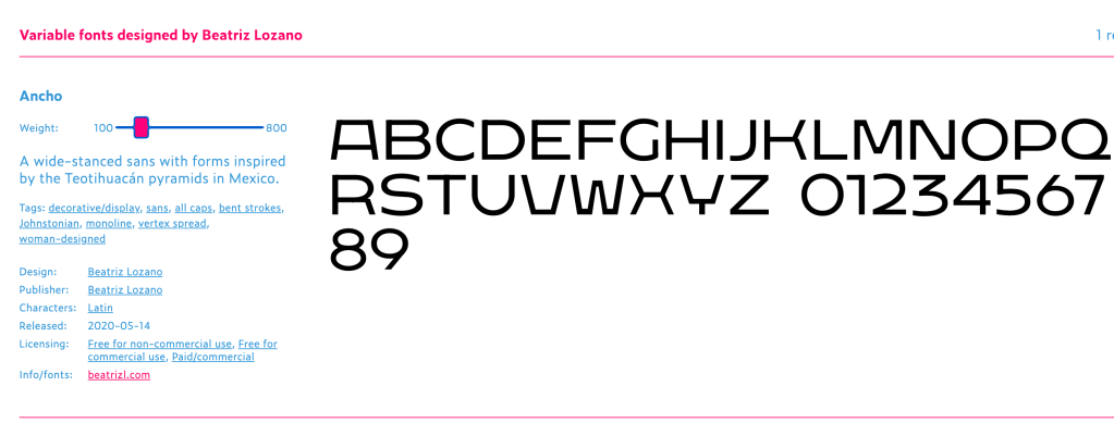
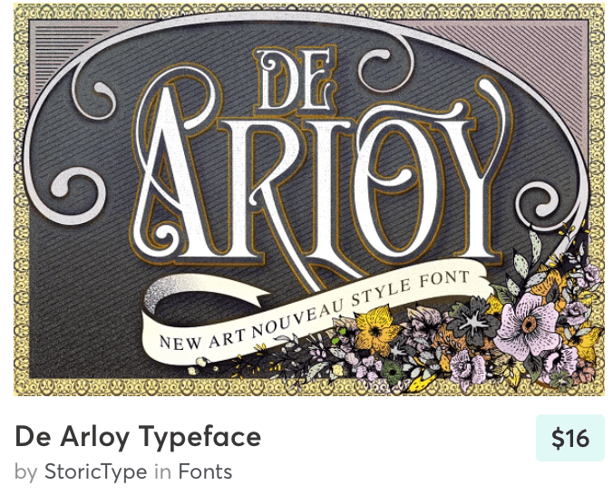
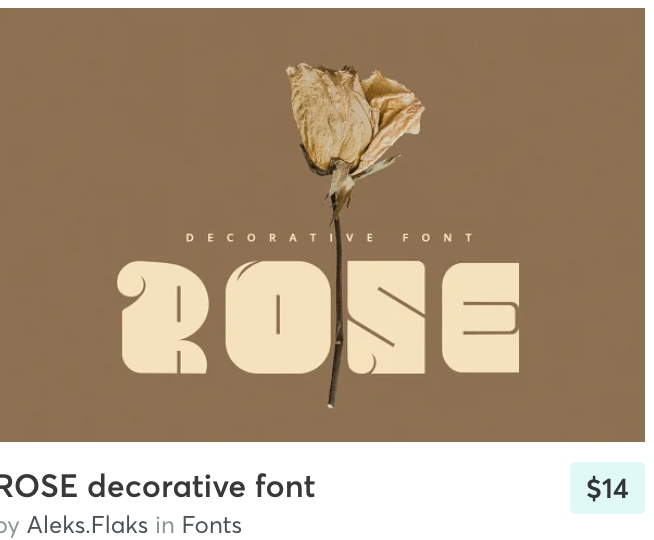
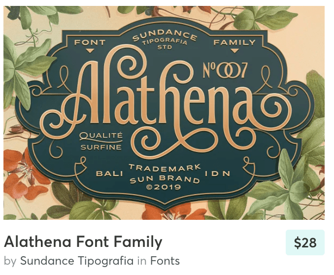
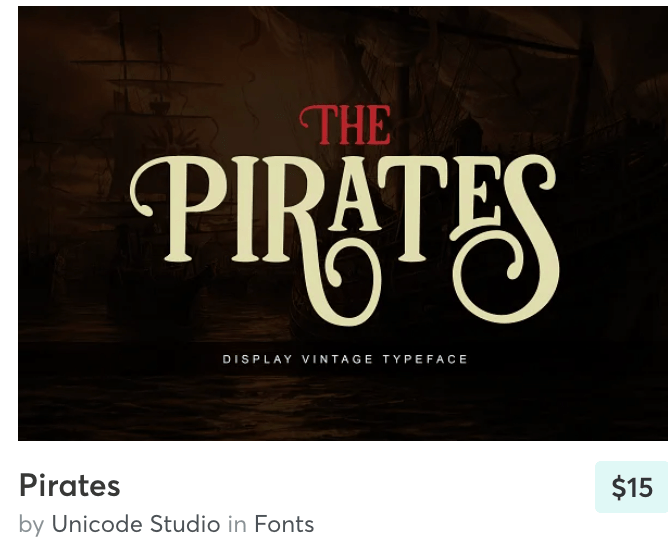
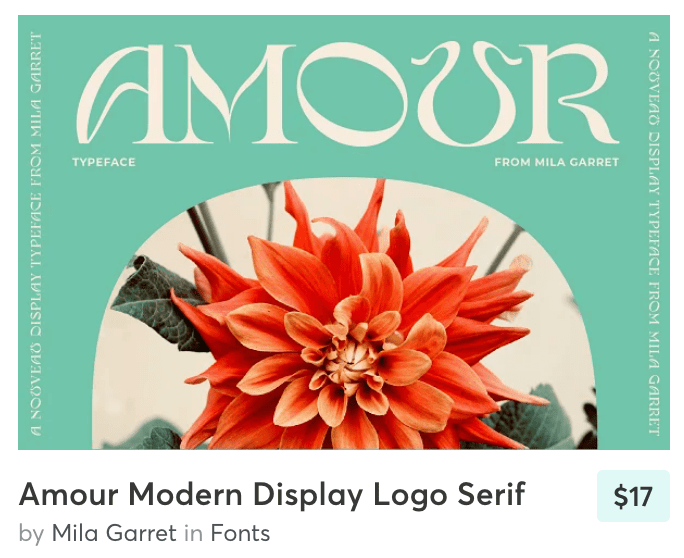
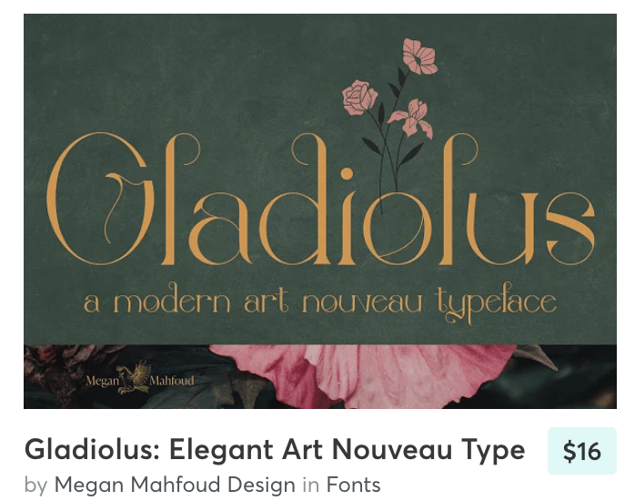
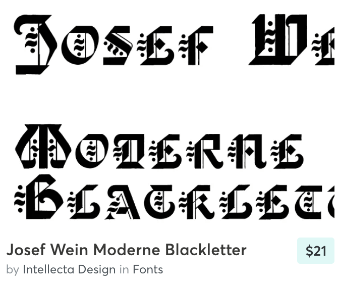
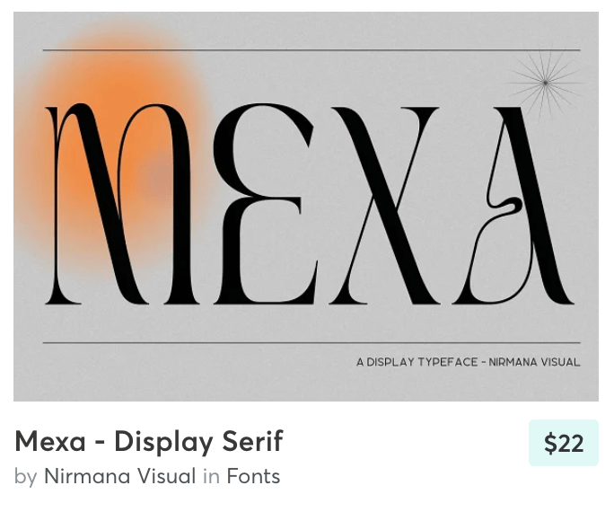
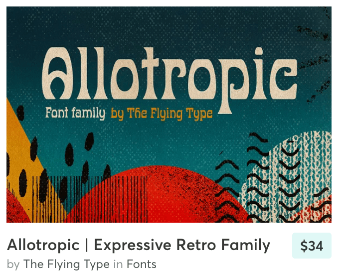
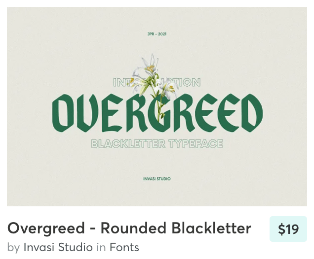
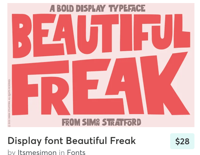
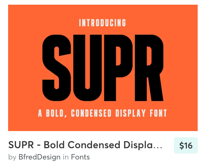
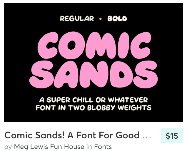
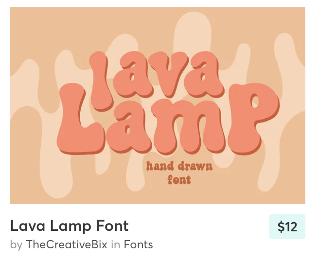
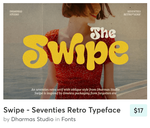
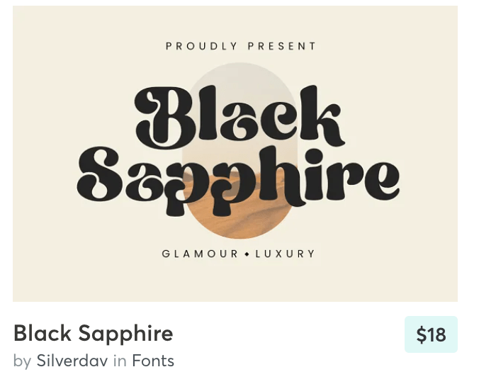
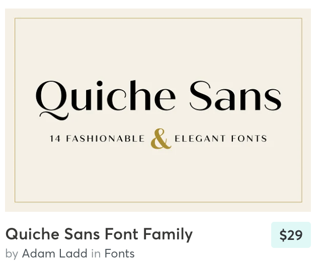
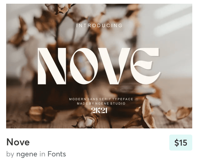
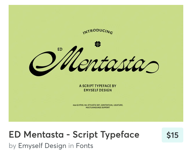
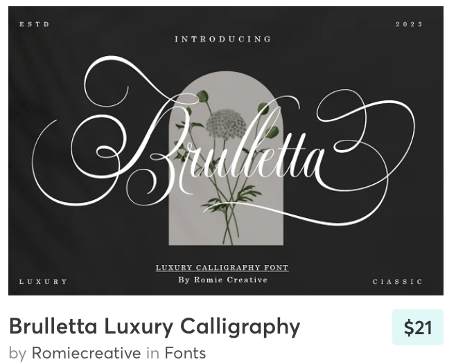
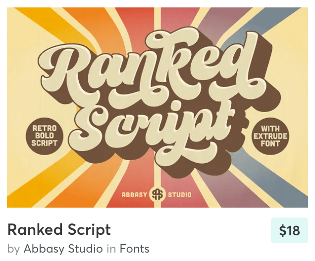
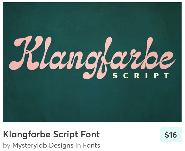
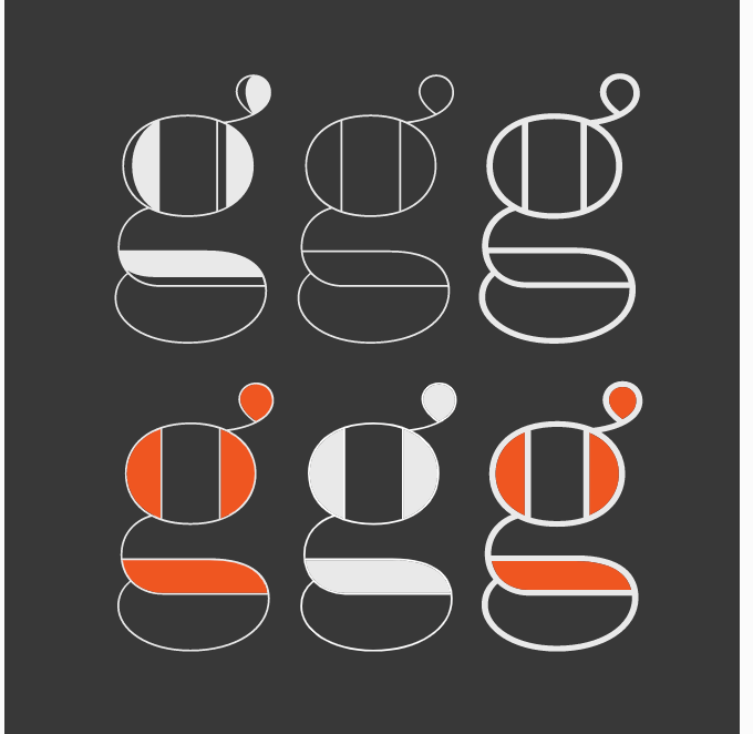
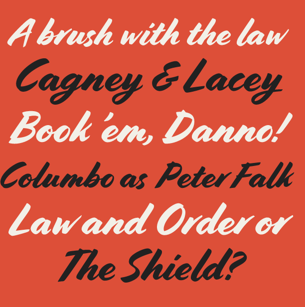
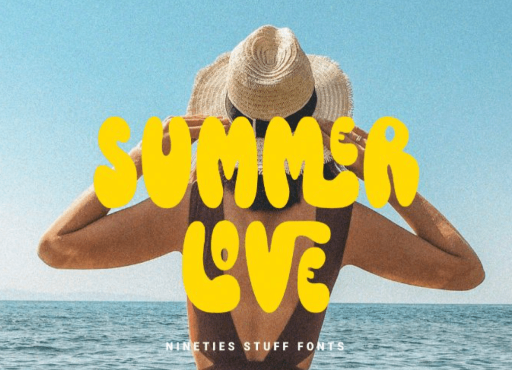
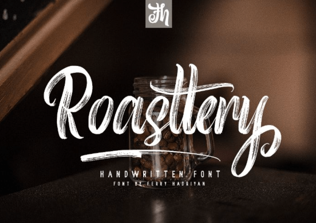
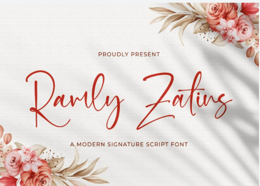
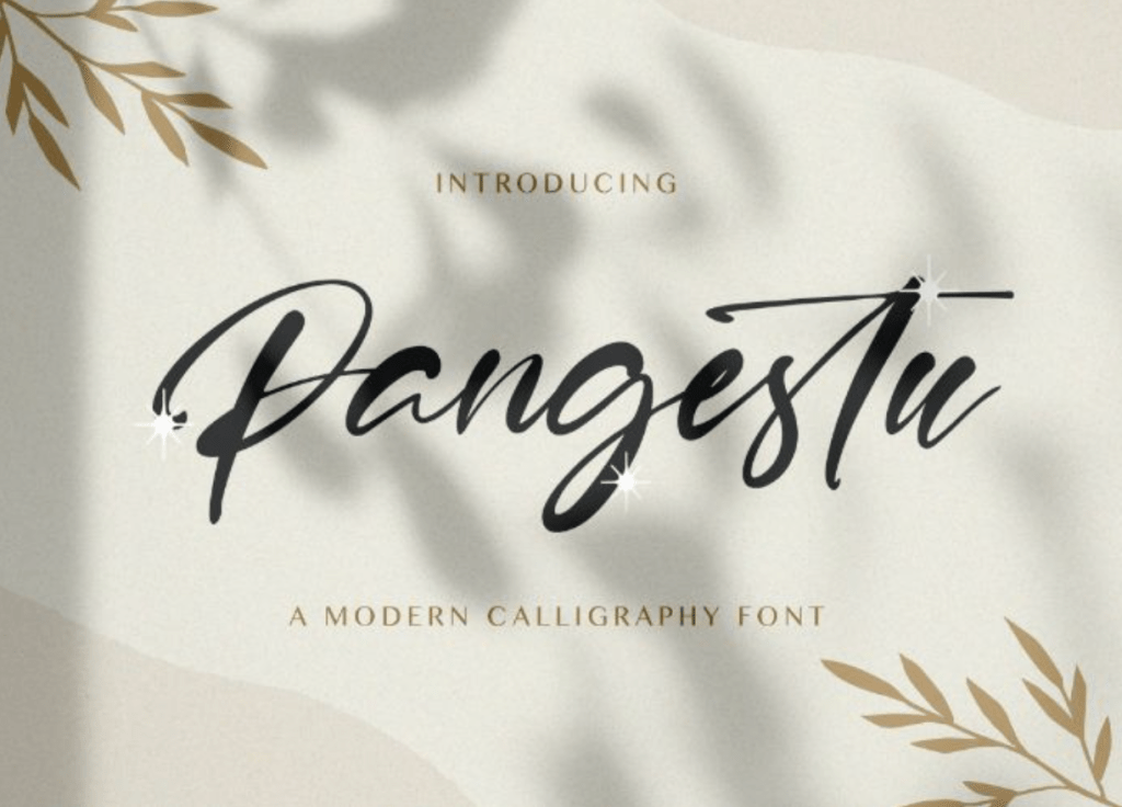
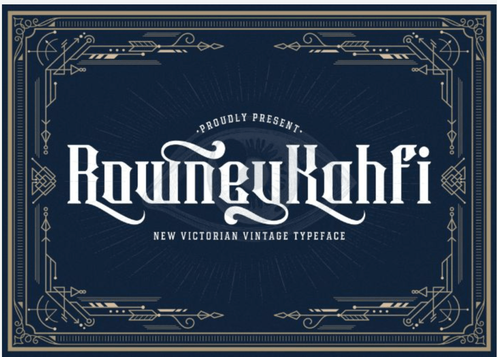
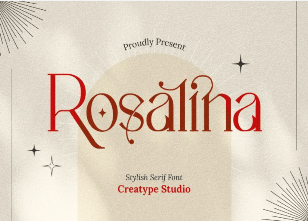
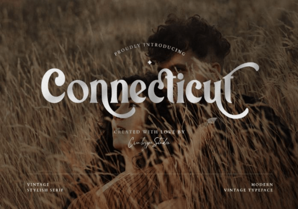
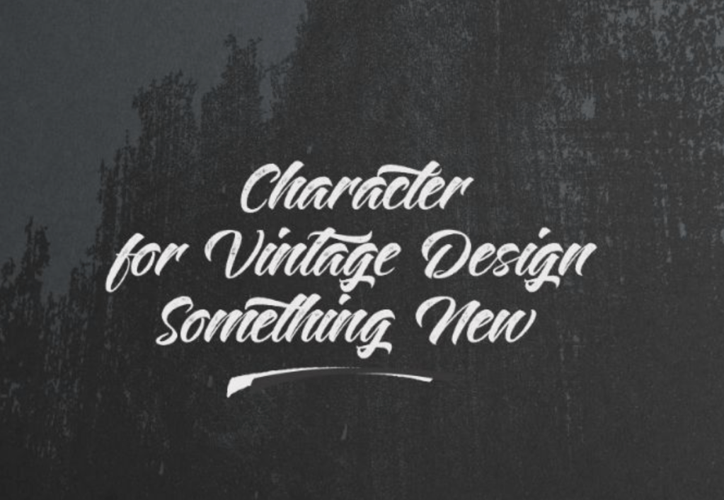
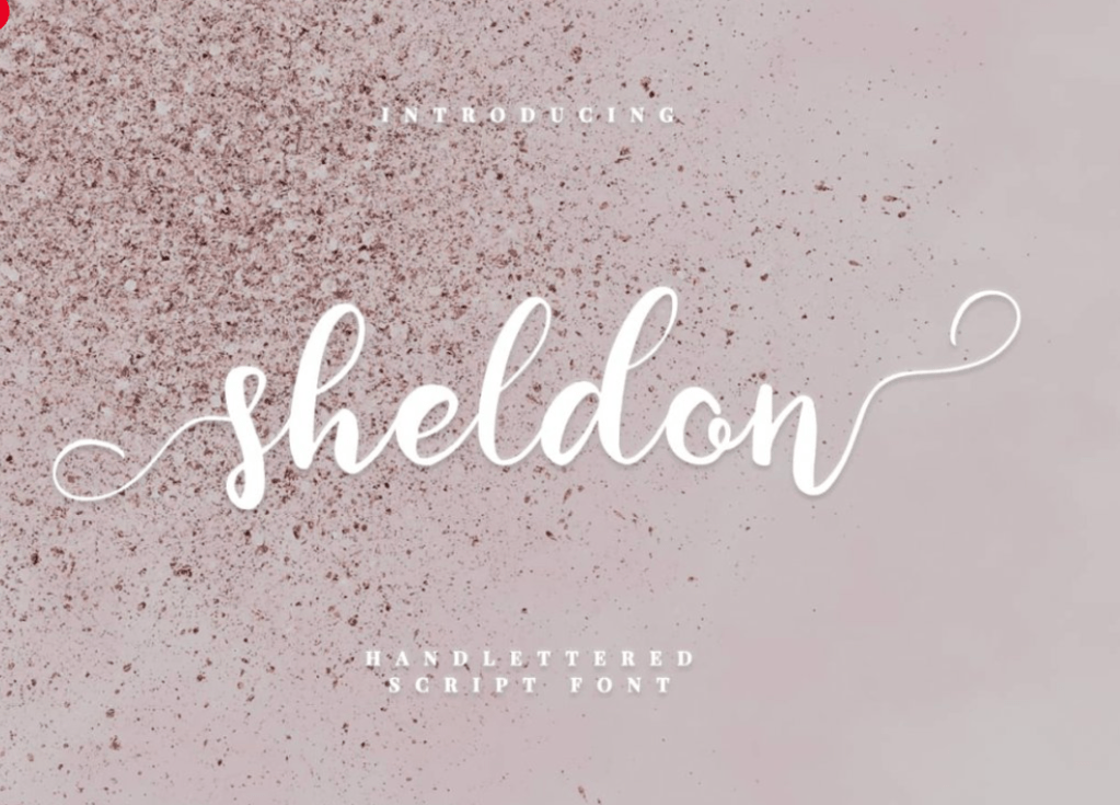
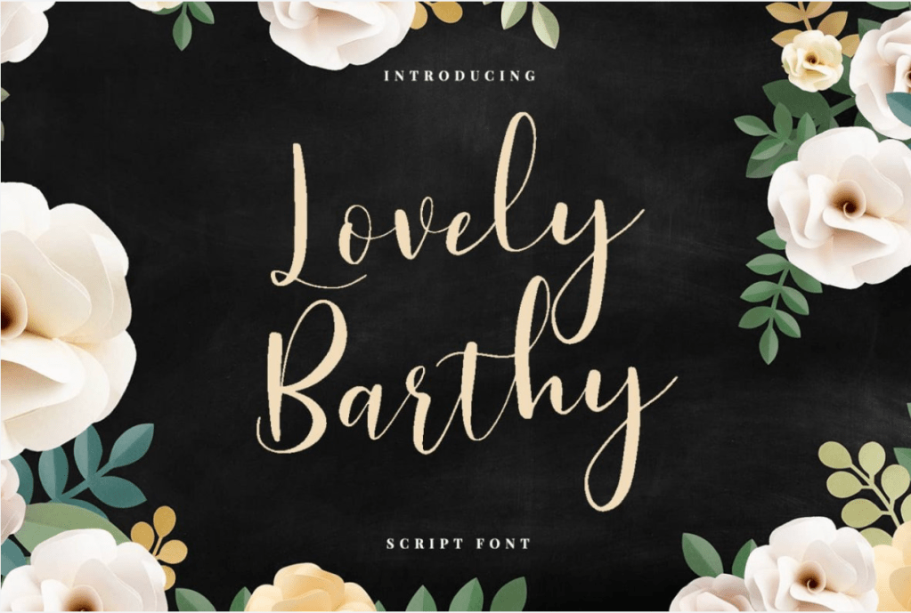
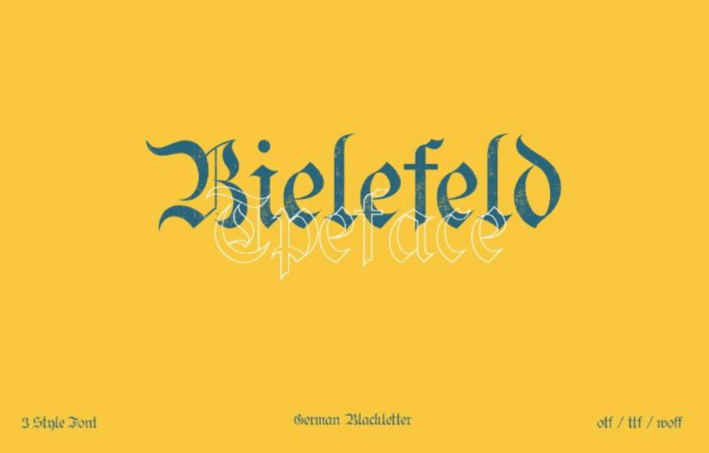
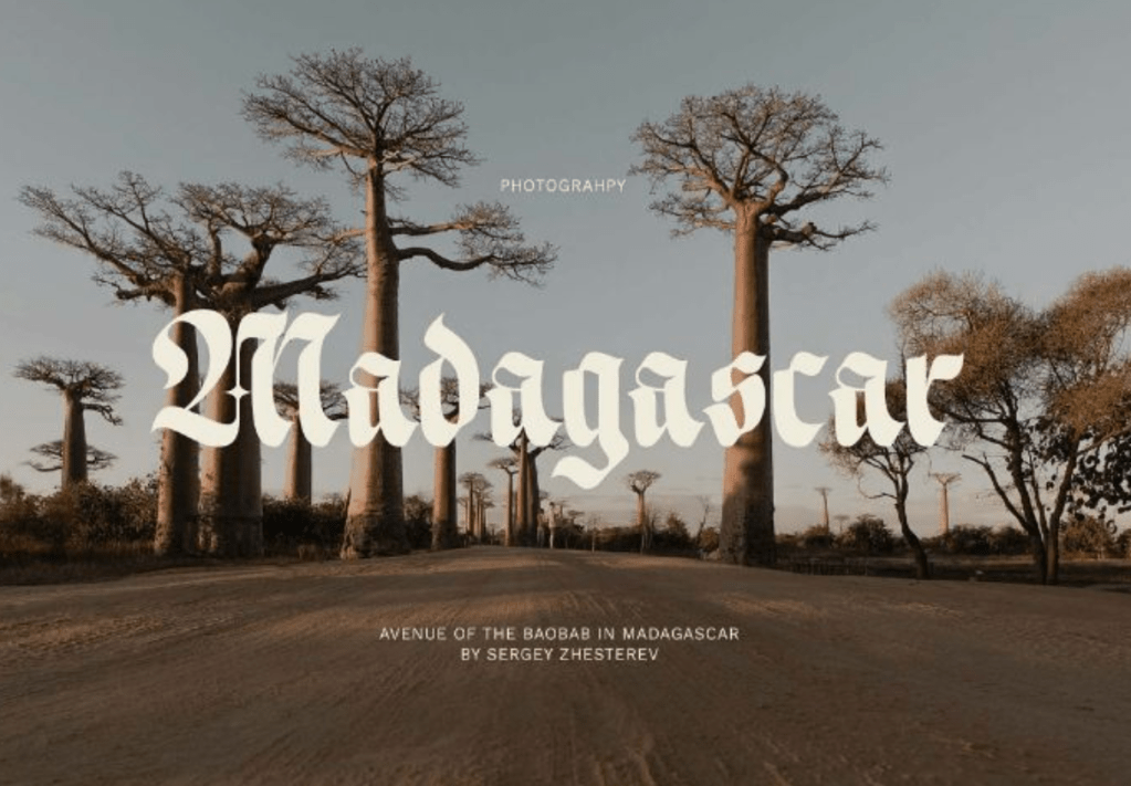
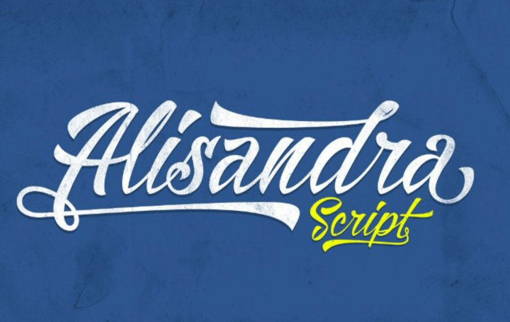
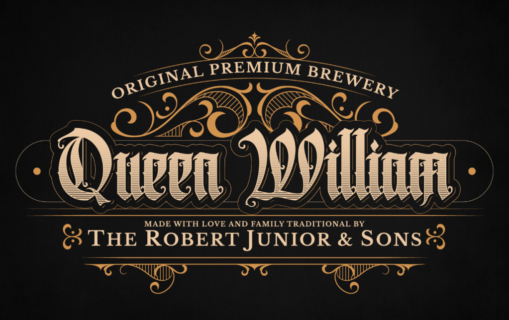
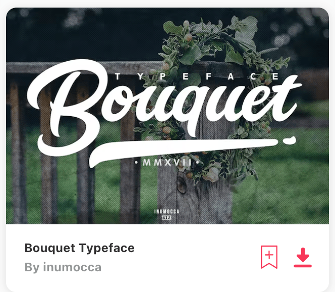
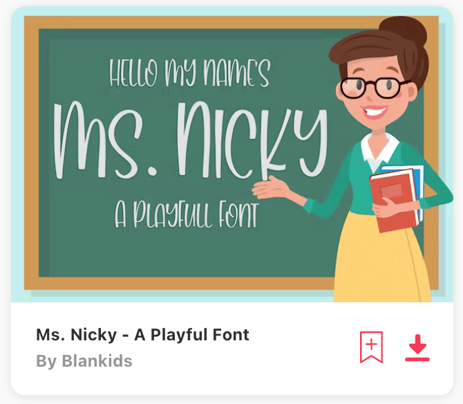
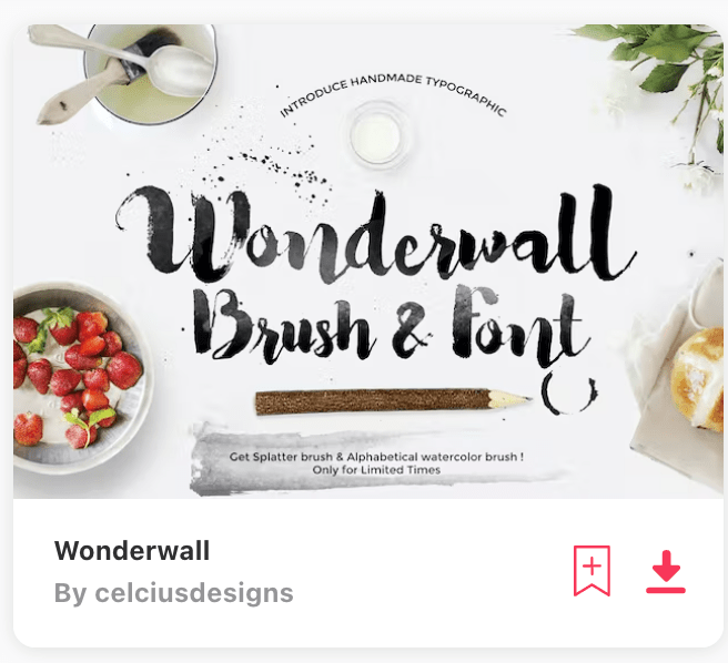
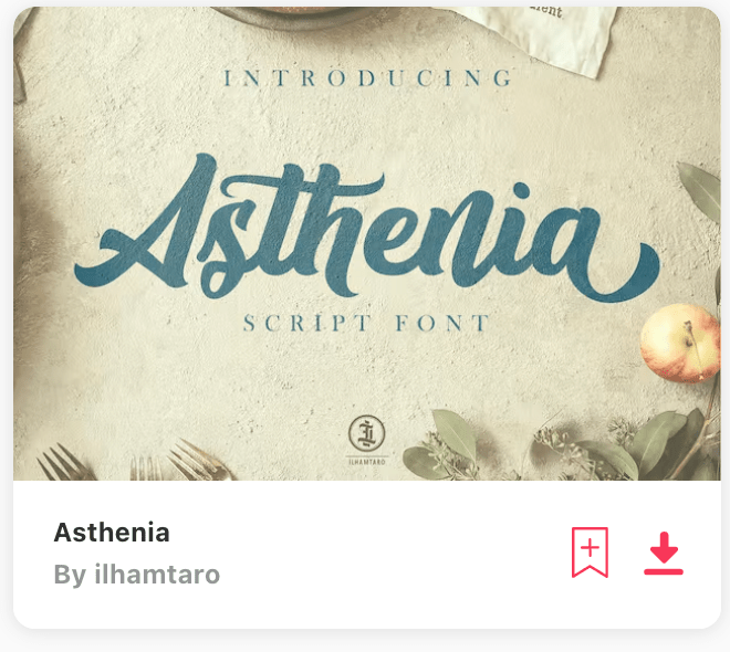
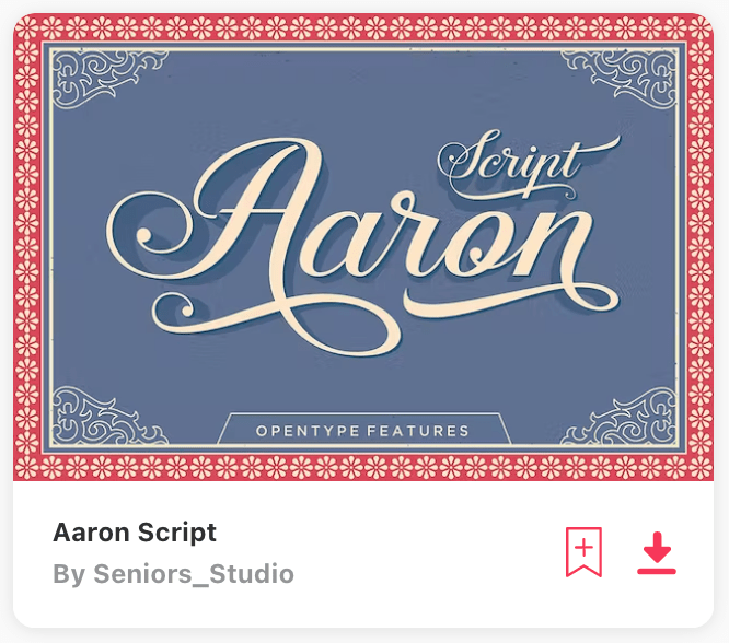
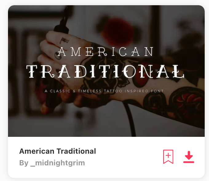
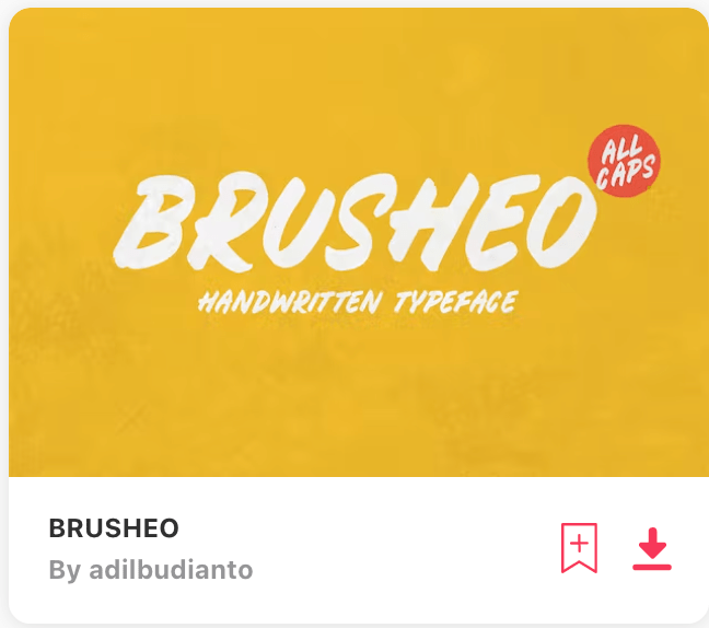
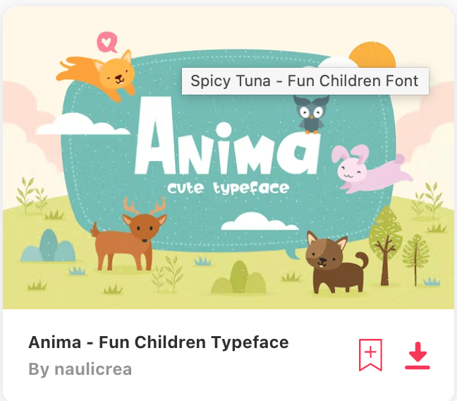
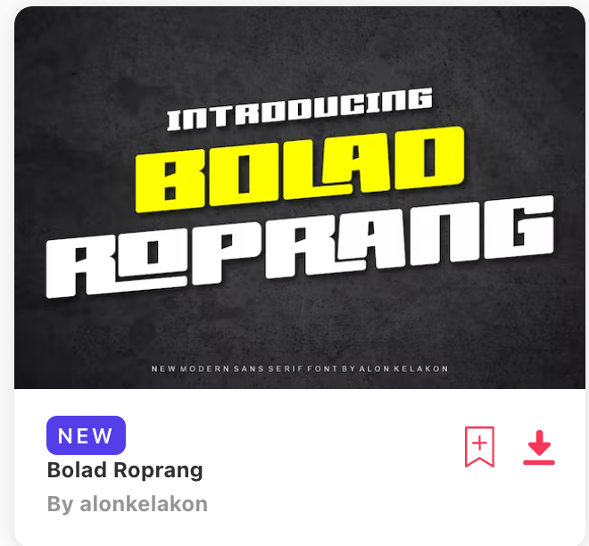
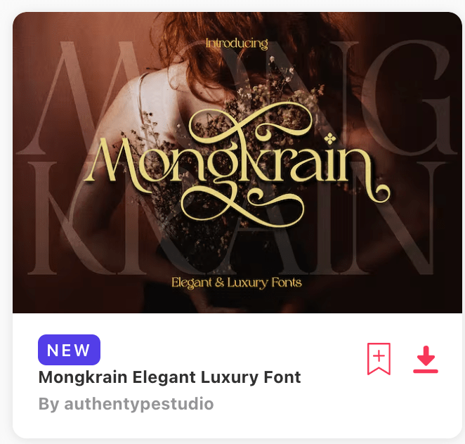
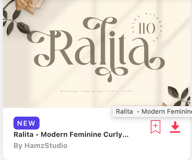
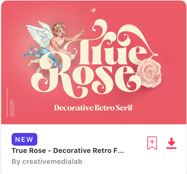
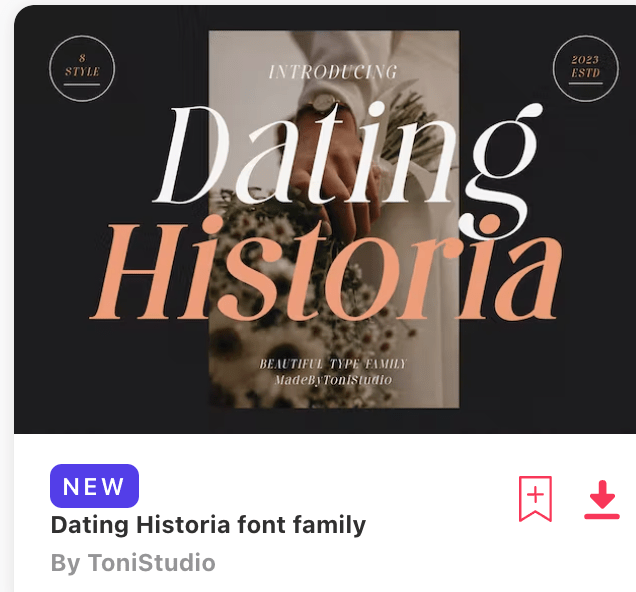
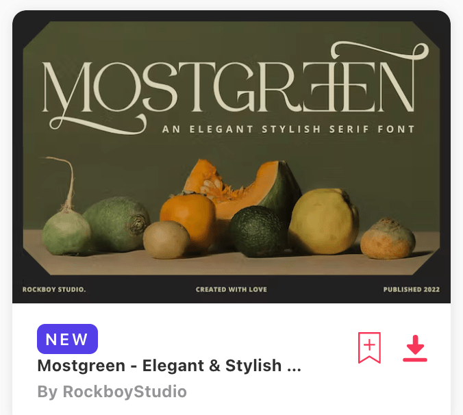
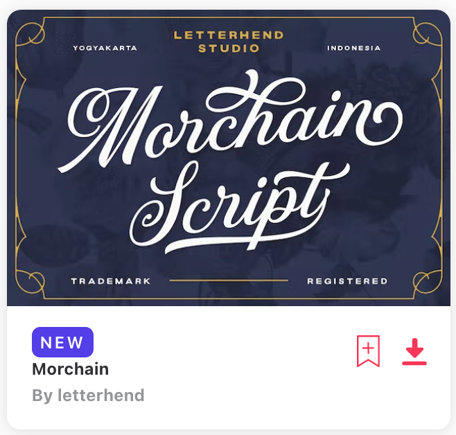
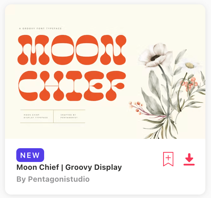
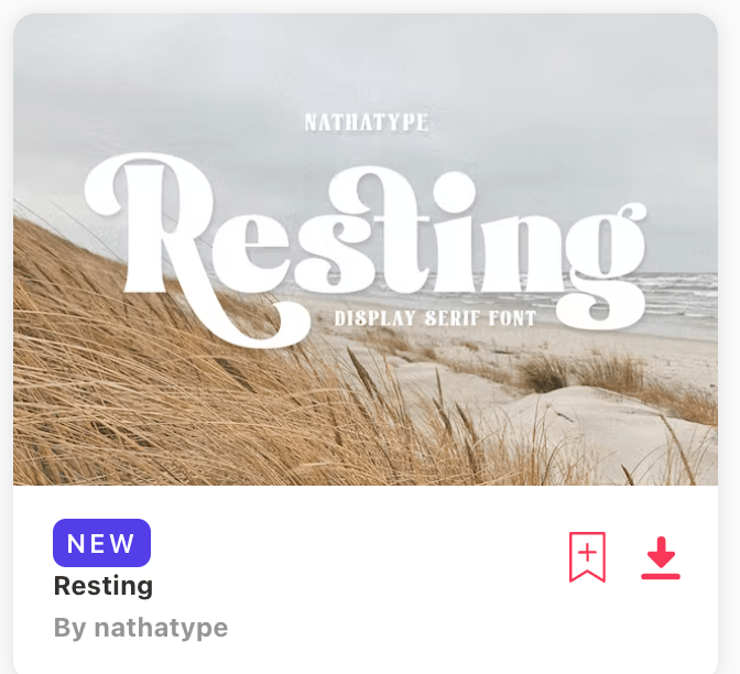
Fonts that I like (I like to use them as inspiration and ideas):
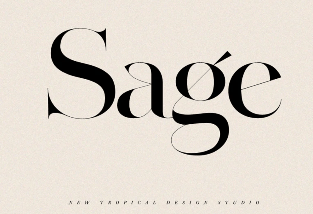
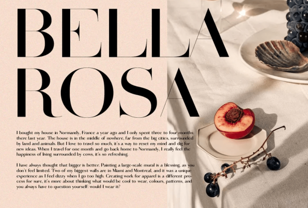
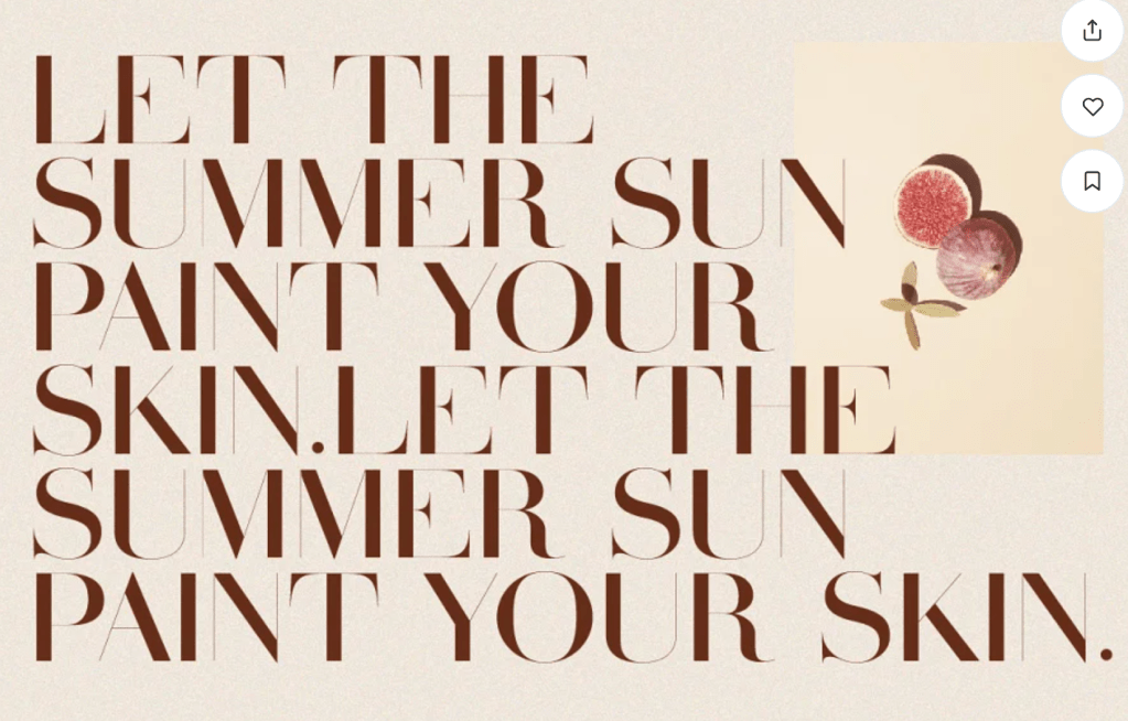


https://ilovetypography.com/font-inspiration/


“How To: Design Your Own Typeface” by Thomas Ramey (https://creativemarket.com/blog/how-to-design-your-own-typeface)
Tricks and Lessons I’ve Learned
1. Repetition: Start with one letter and work from there. For instance, you could take an uppercase R and draw from that your uppercase P, as well as possibly the bottom half of the uppercase K. Repeating shapes and forms in letters brings a typeface together. Think of it as creating a series of interchangeable parts to be used as a core for your letters. Adding unique elements can come after you have the basic form set into place
2. Options Can Help Your Idea Evolve: I also like to exhaust all the options before settling on just one character design. For each typeface, I created multiple variations of characters to see which worked and looked the best. Sometimes the first iteration is the best, but evolving an idea to its end helps you find gems and combinations you might not have thought about.
3. Form Words: Once you have a few letters created, start forming words as you are designing the typeface. Forming words helped me as a designer make decisions between iterations and where things should be placed. The letterforms will very rarely be used in isolation, so why design them that way? Yes, the desire should be for each letterform to be beautiful on its own, but if it doesn’t work within the system of the typeface it misses the mark.
4. Typographical Evolution: Along with the previous tip, let the typeface evolve as you create it. For example, Storyland originally had rounded letterforms and curves but as I started creating other letters and began forming words, I found it looked a bit odd, so I altered it and gave it straight edges even though I had already created most of the lowercase letters.
5. Don’t Be Scared of Change
Things to Know Before You Start
1. Rule for Sizing Artboards: Know the highest high, lowest low, and widest characters in your typeface. That will need to be the size of your art board. I created a box with the baseline, x-height and cap height rules placed inside as a group (see the image below for a better idea of what my files look like). Why does it matter? When you import it, the file will scale-to-fit so if you don’t have the common size for all the files, some characters will have different widths and it will not look like you imagined.
2. No Strokes: Outline your strokes because they will not render in the program. That’s a good idea no matter what program you are transferring a design to. Also, if you have anything special, for instance like Lightyear Inline, knock out the negative space. It works sometimes but not for all characters, so play it safe.
3. Naming Special Characters: In naming your artboard/file, not all special characters will transfer, so develop a system to name them or type them out. If you don’t, they will save over each other and you’ll be wondering why you’re missing some characters.
4. Upper & Lowercase Naming: In relation to the previous note, when exporting in Illustrator, it doesn’t differentiate between “a” and “A”, so I have used “lowercase-a” and “uppercase-a” to allow both to be saved as well as to group the alphabets. It makes life very easy when you are importing the .svg files individually into the program.
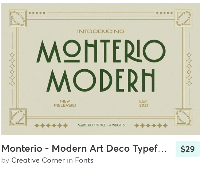
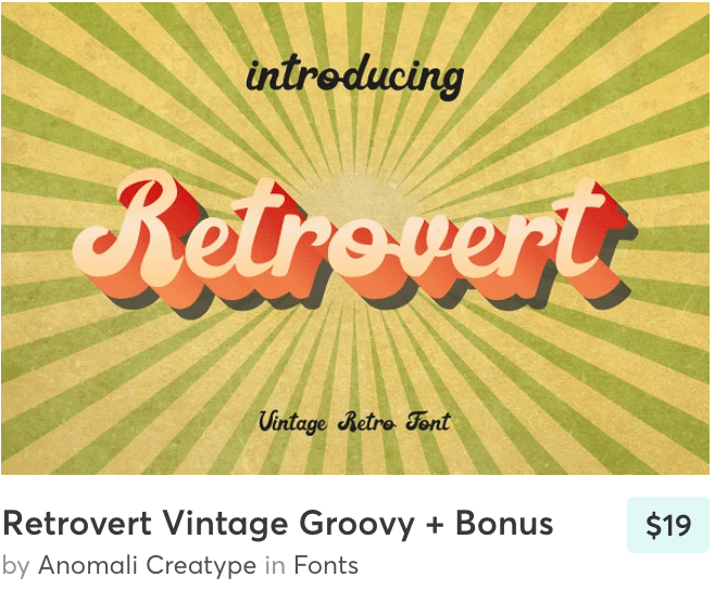
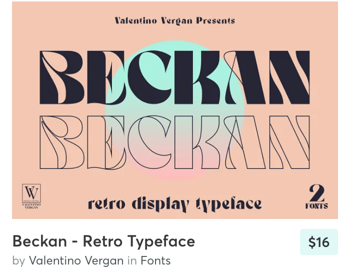
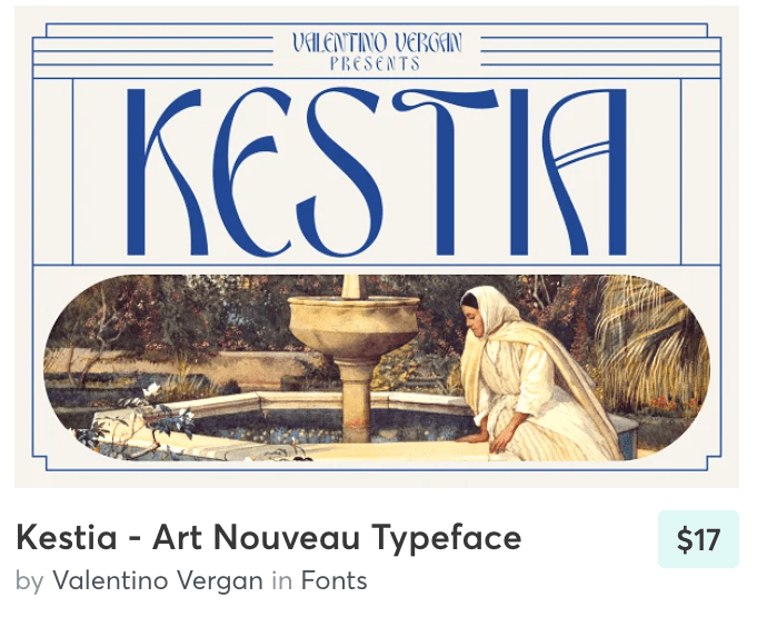
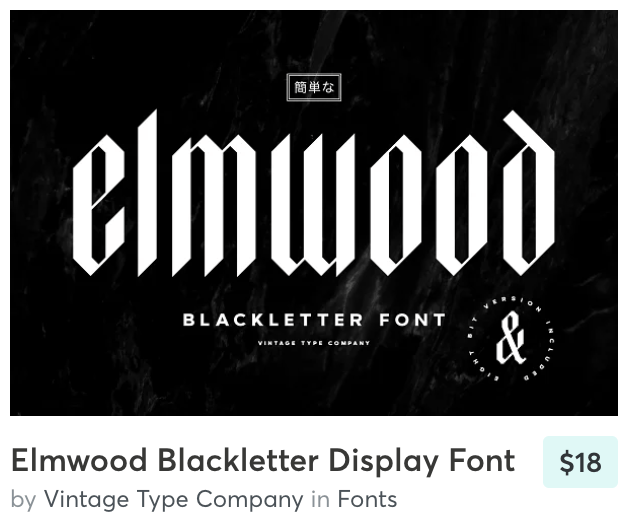
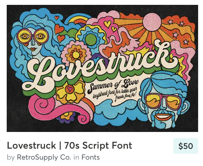
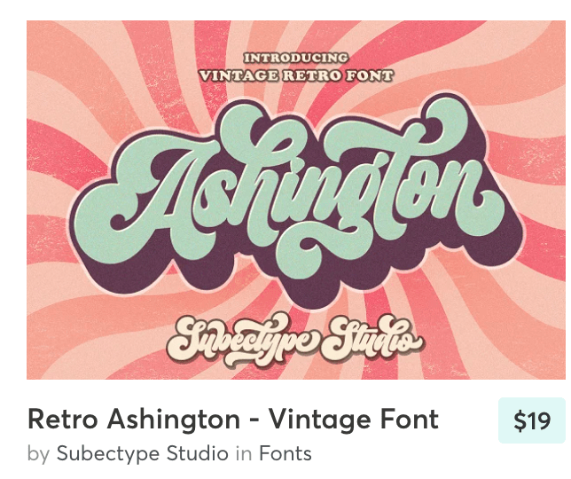
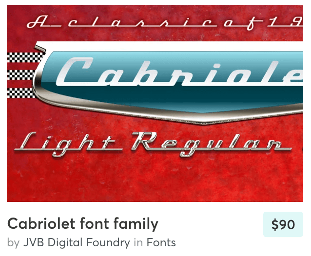
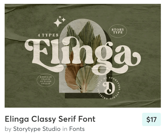
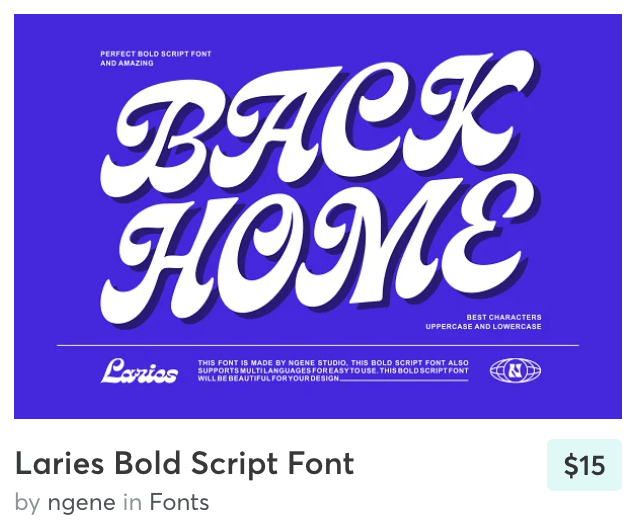
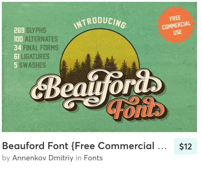
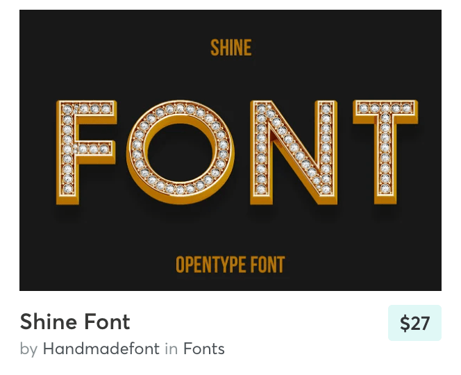
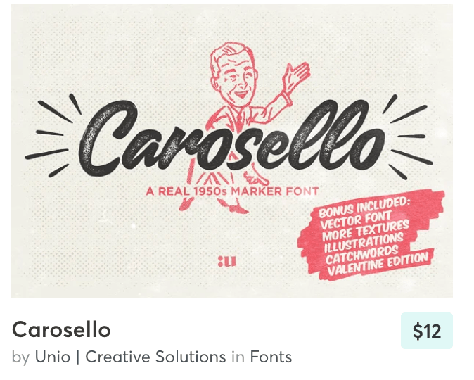
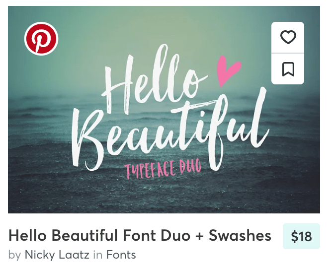
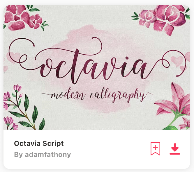
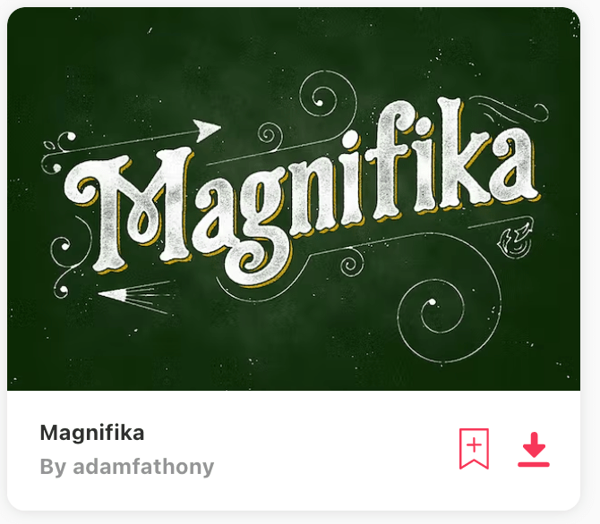
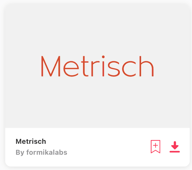
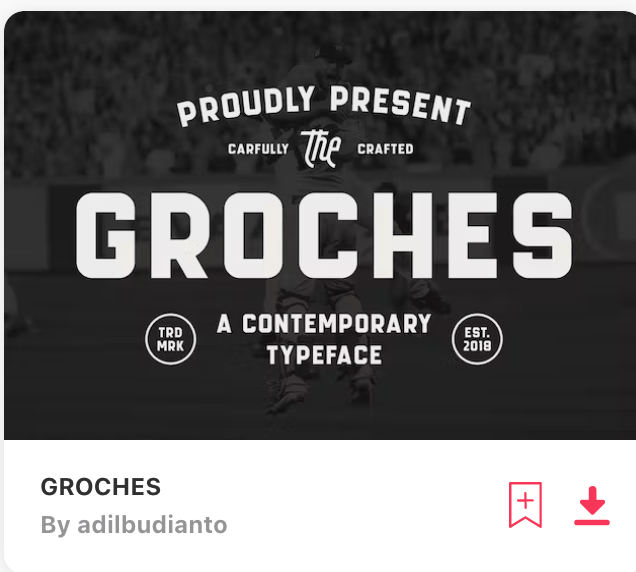
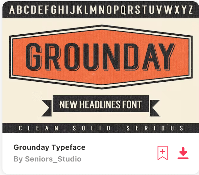
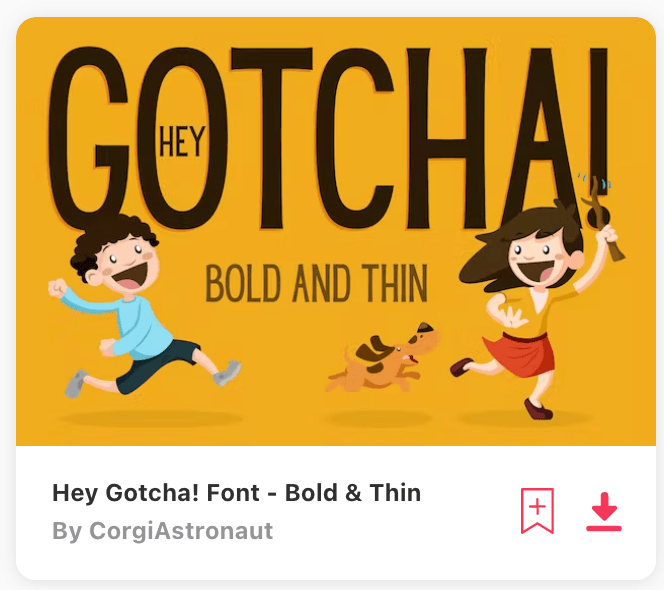
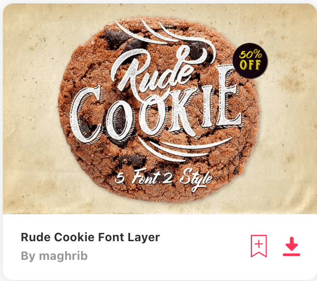
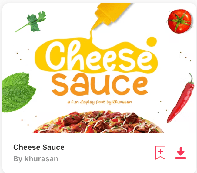
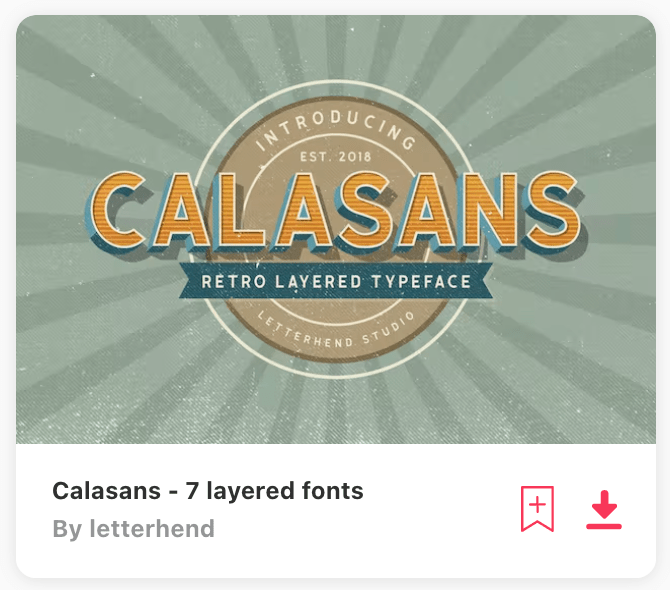
Some fonts from Pixelo:
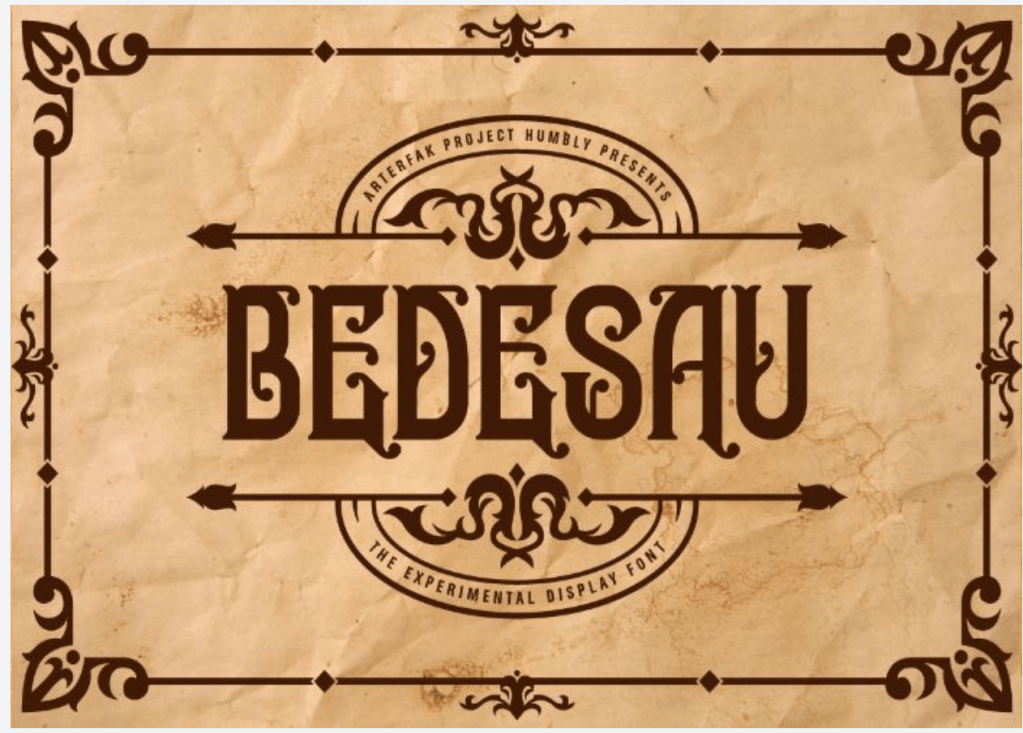
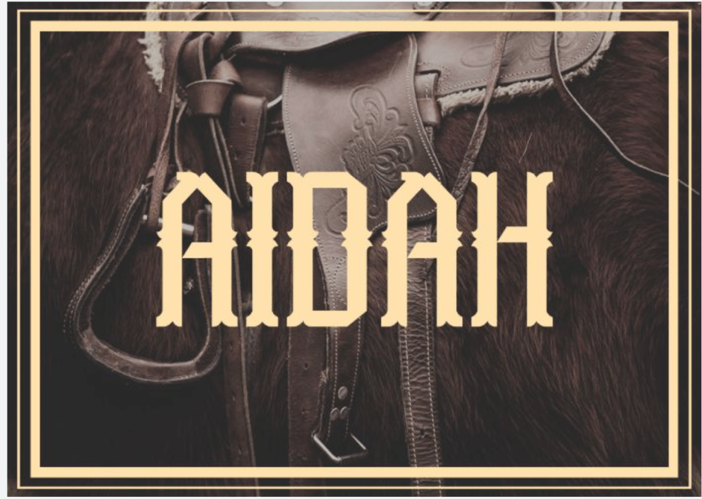
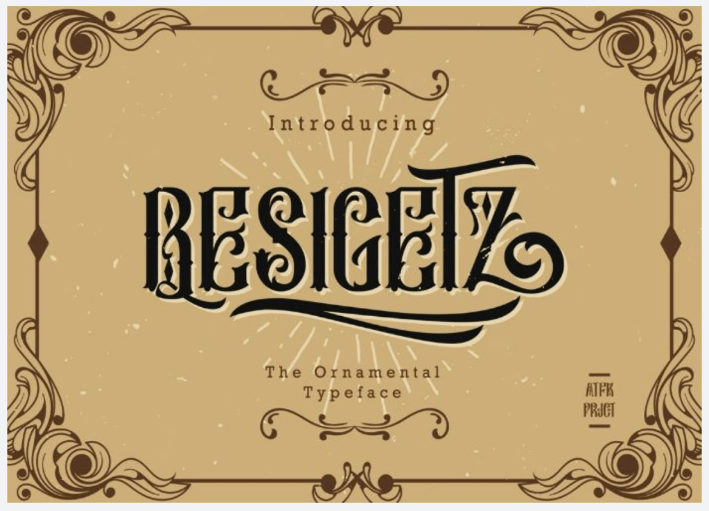
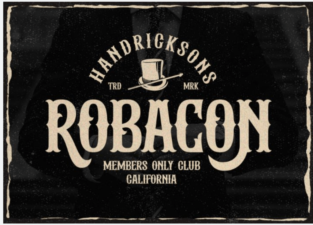
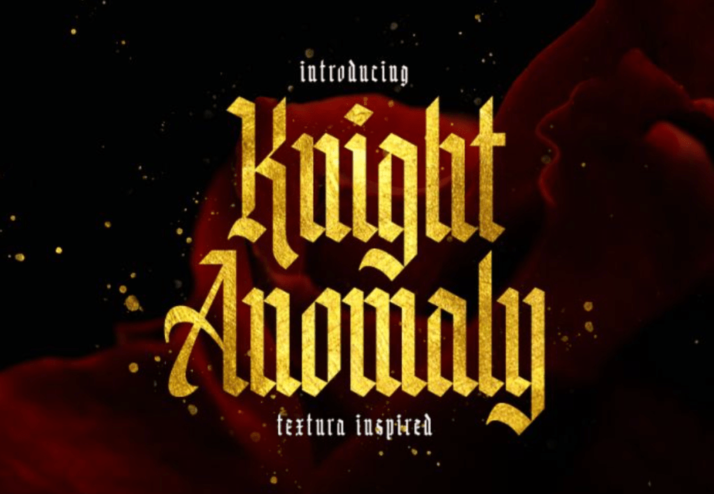

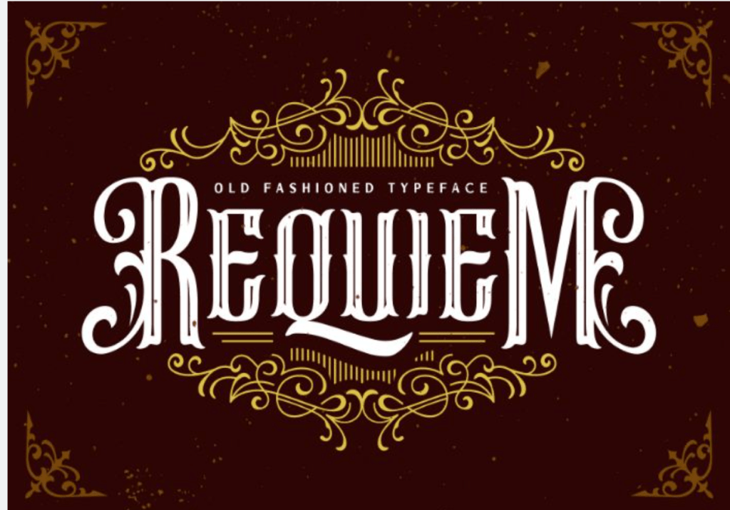
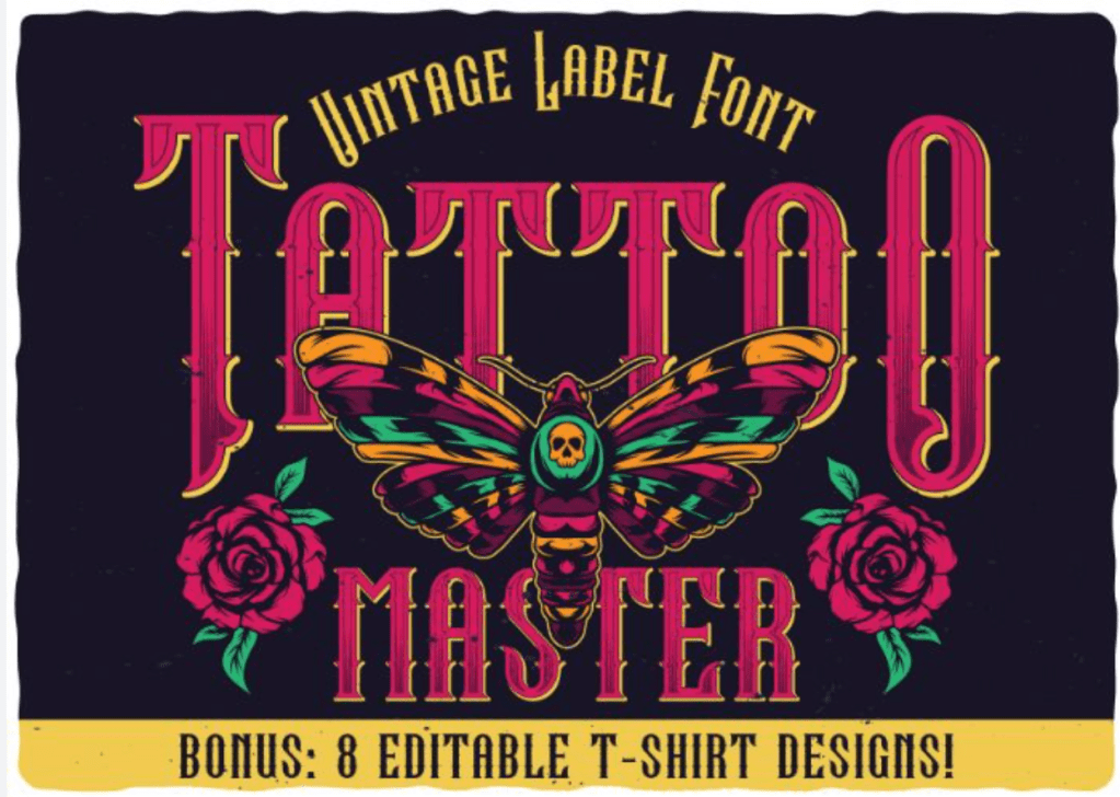
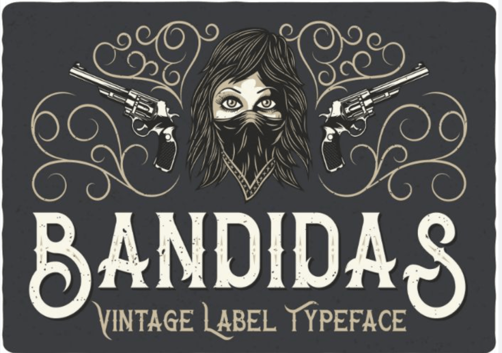
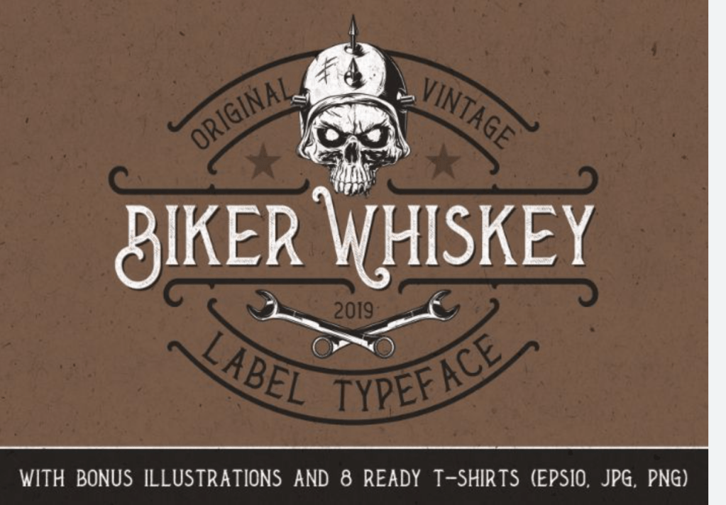
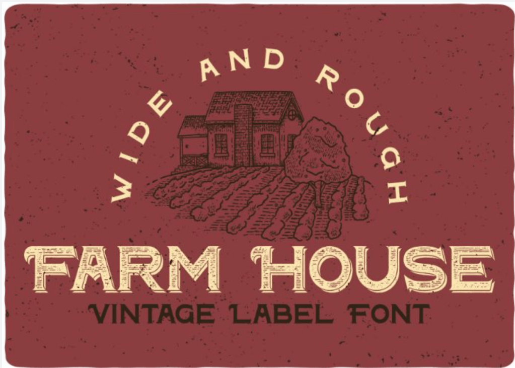
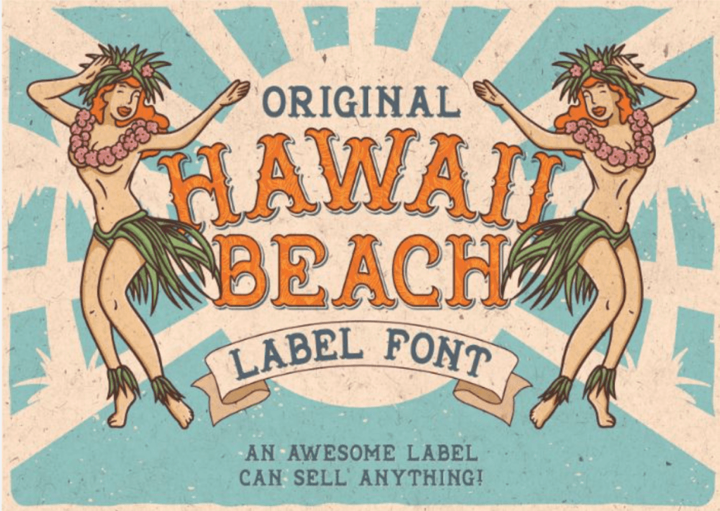
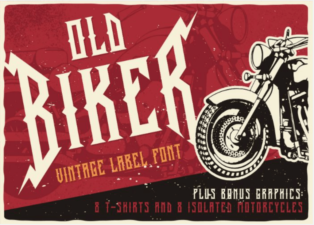
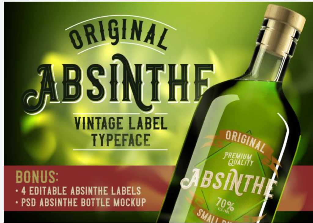
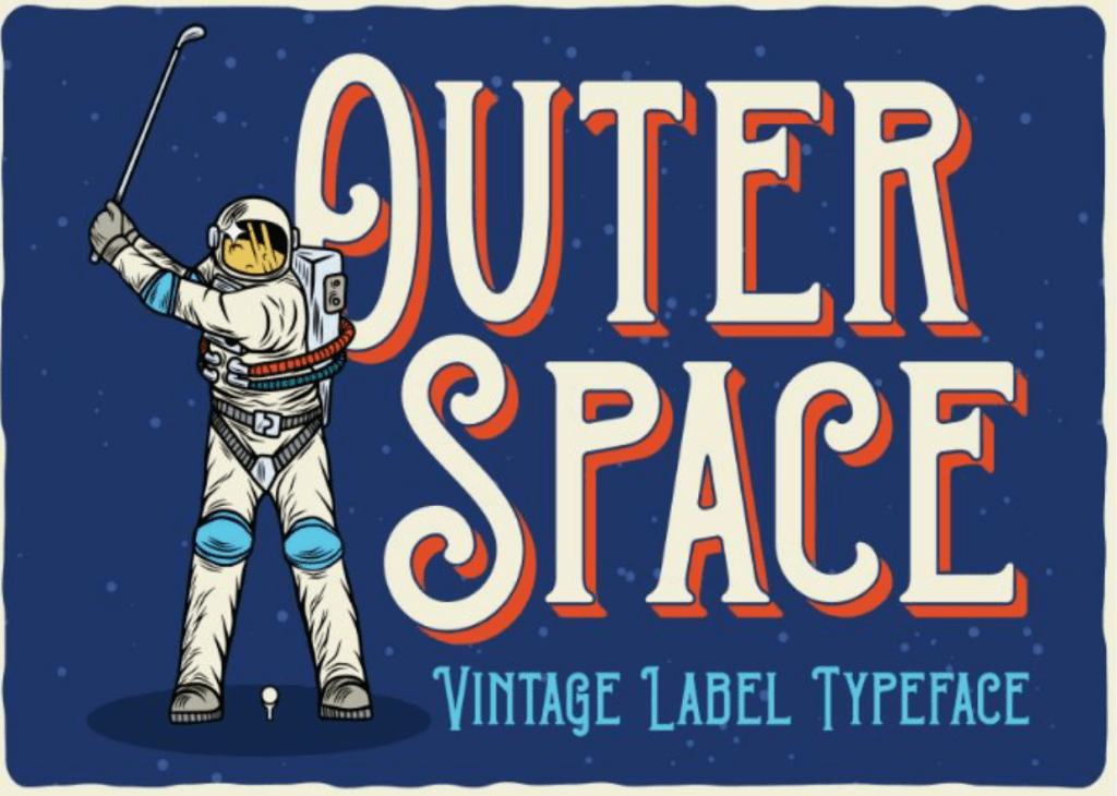
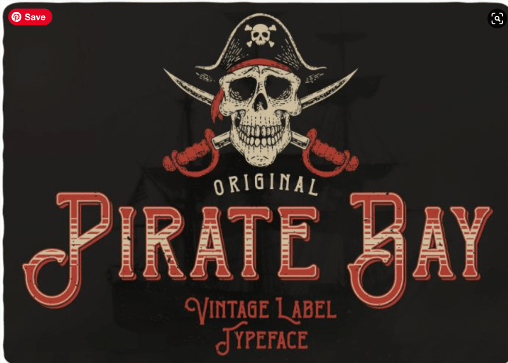
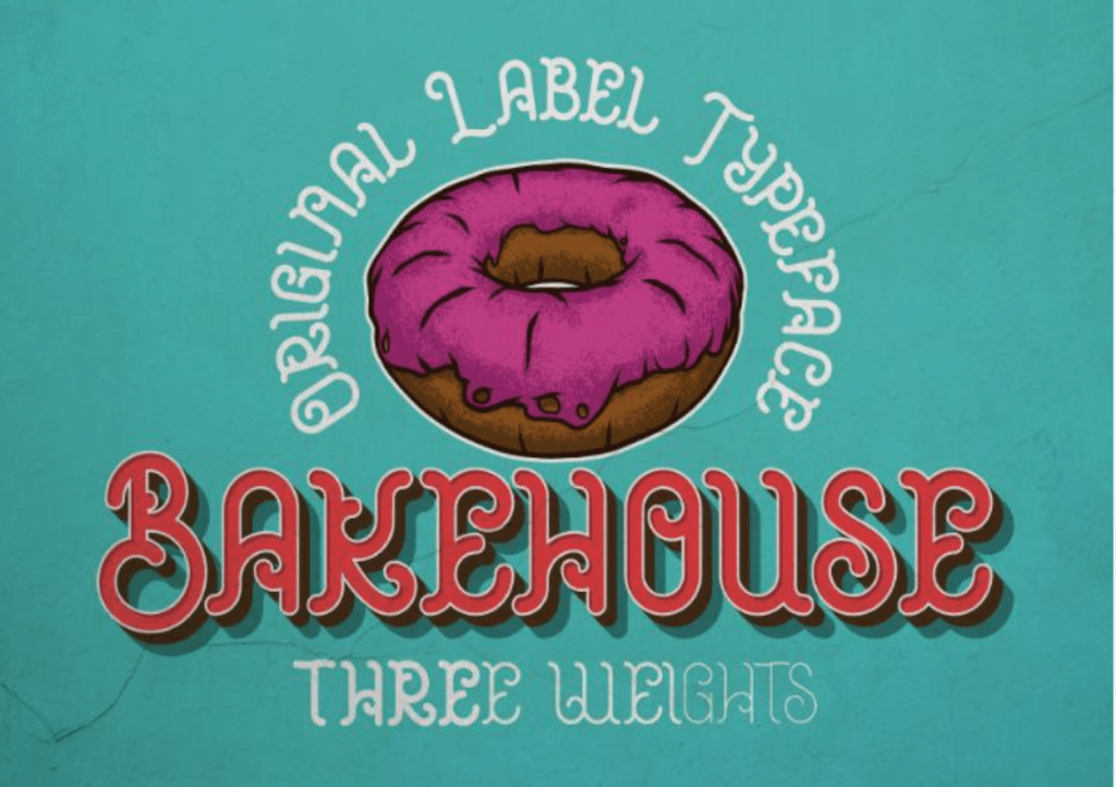


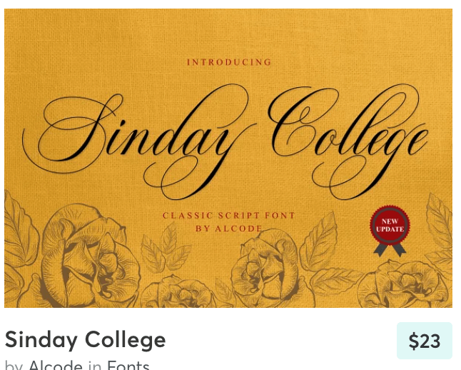
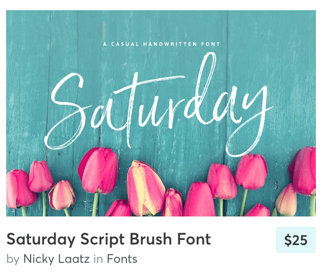
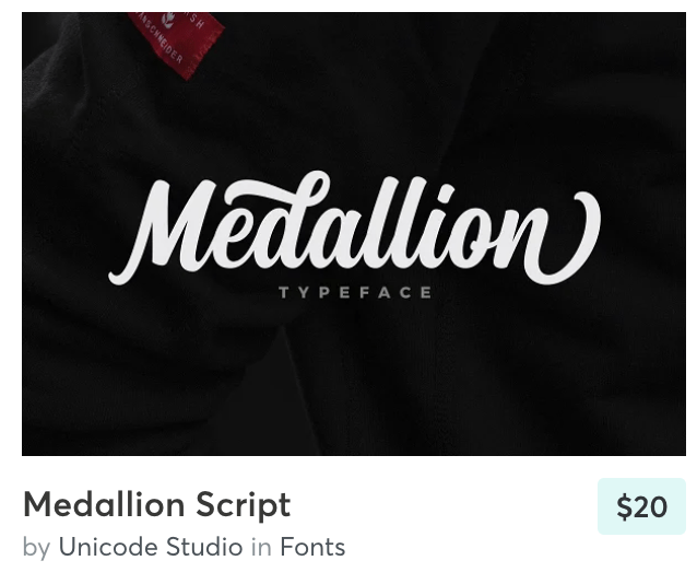
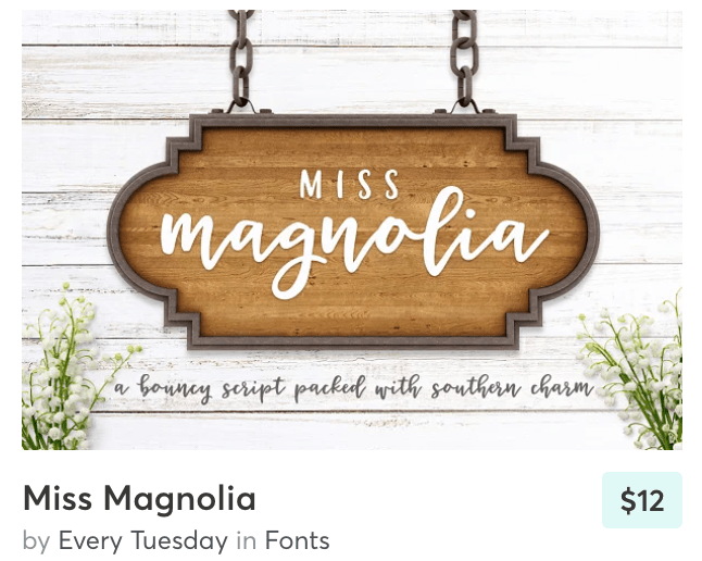
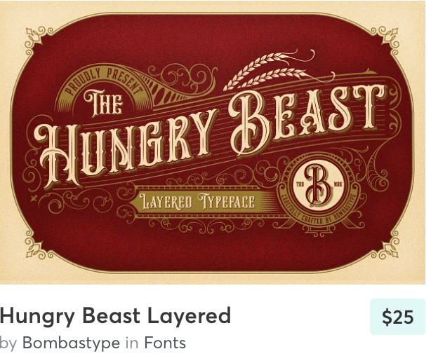
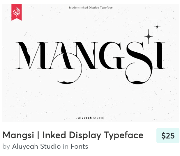
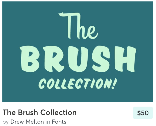
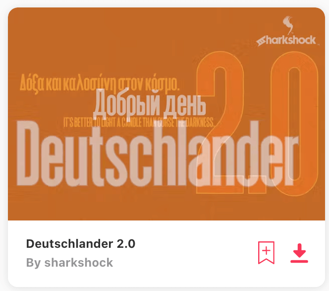
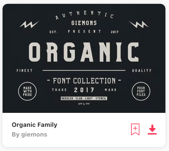
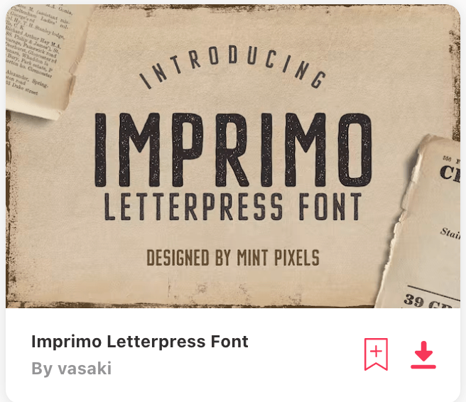
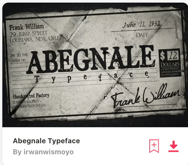
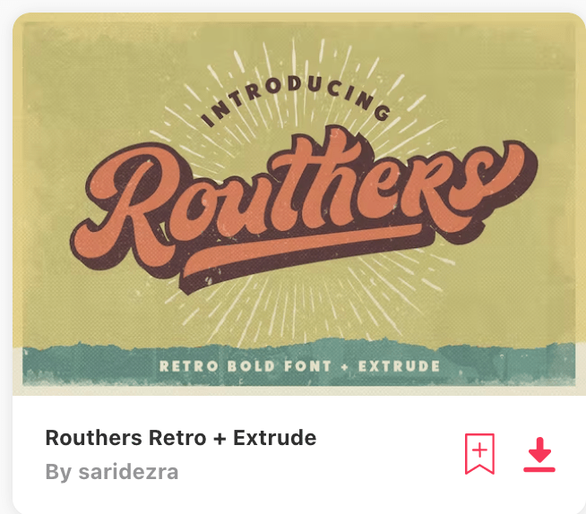
Fonts from Envato:


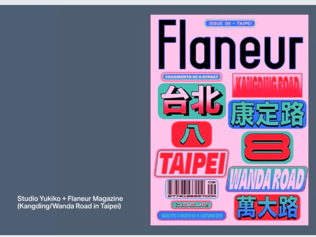
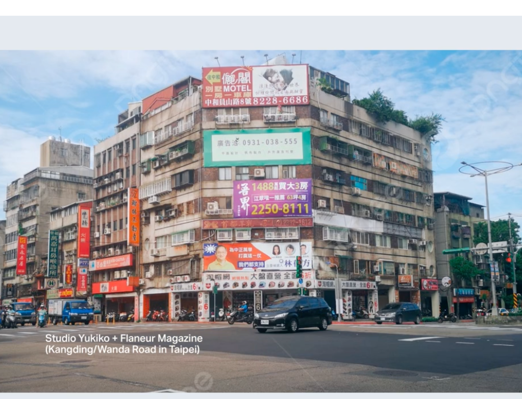
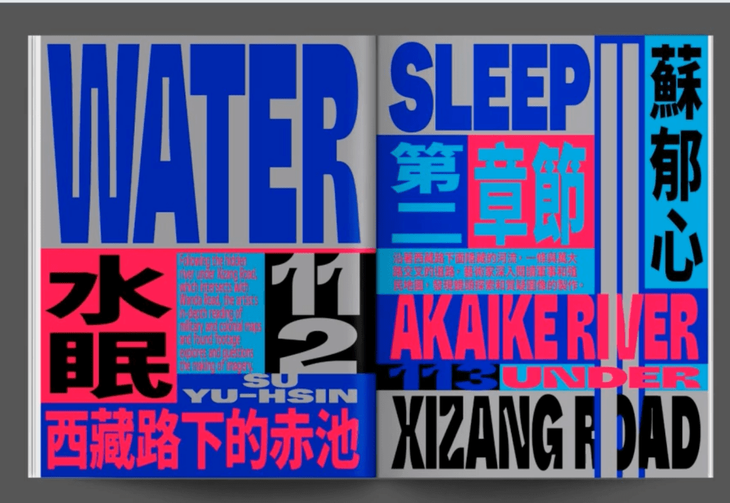
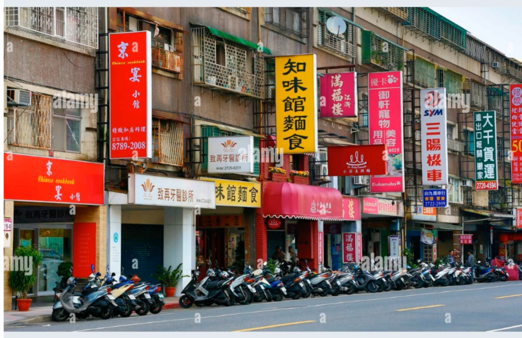
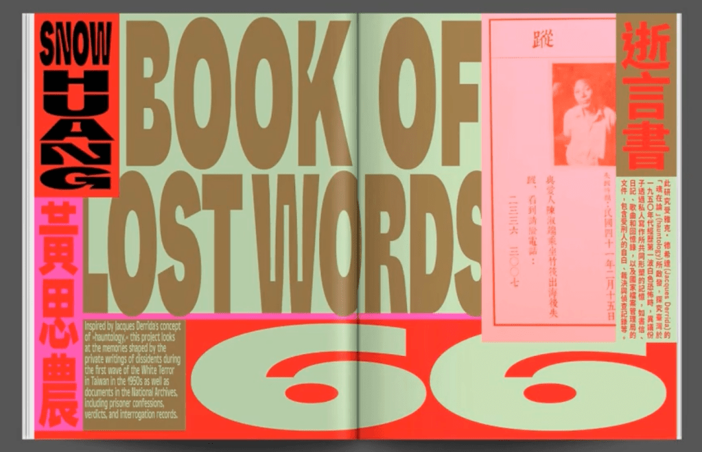
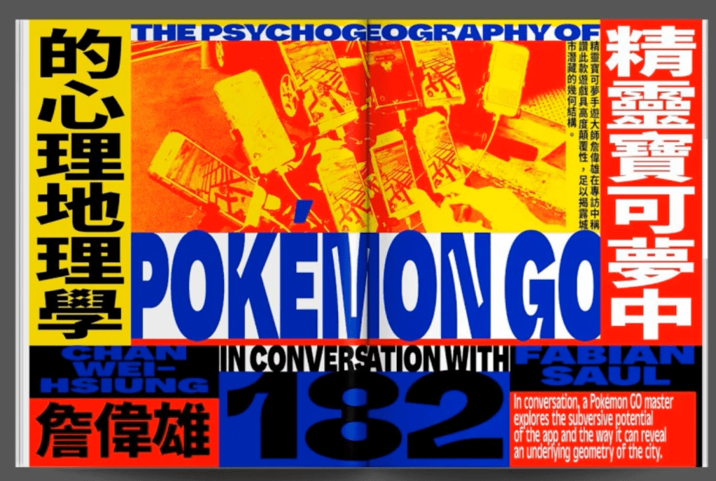
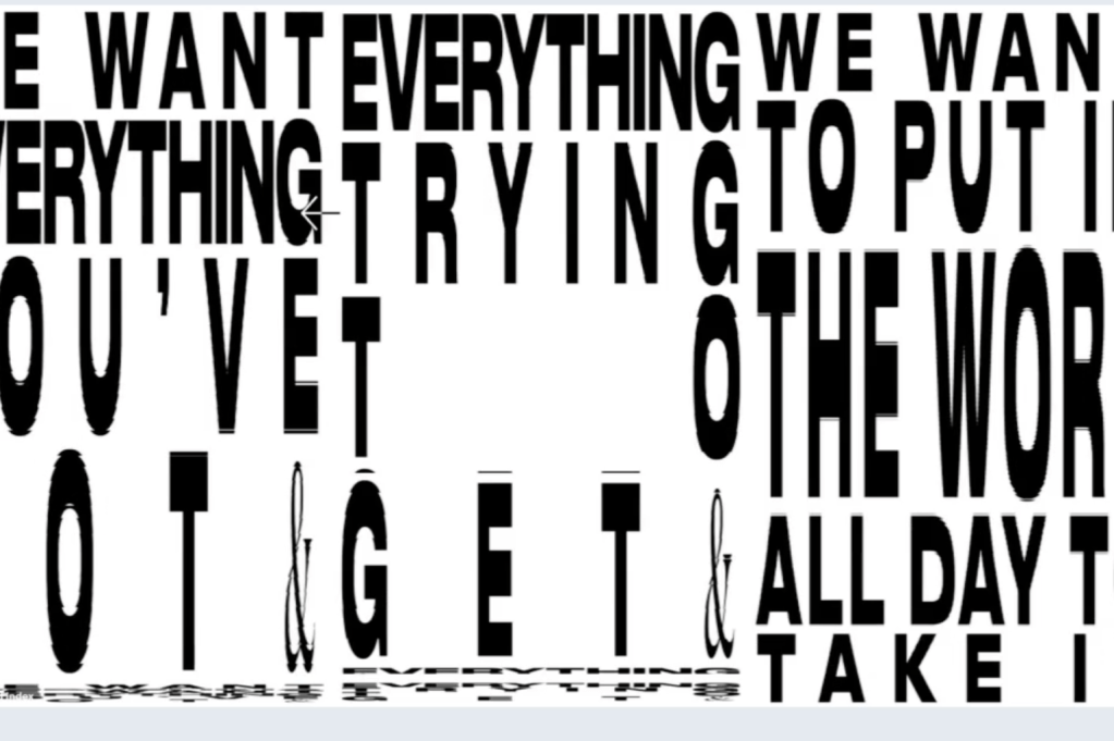
From the lecture: The visual language of a location
studio Yukiko was ask to design of type about the magazine of this city
- Use organic materials from your area
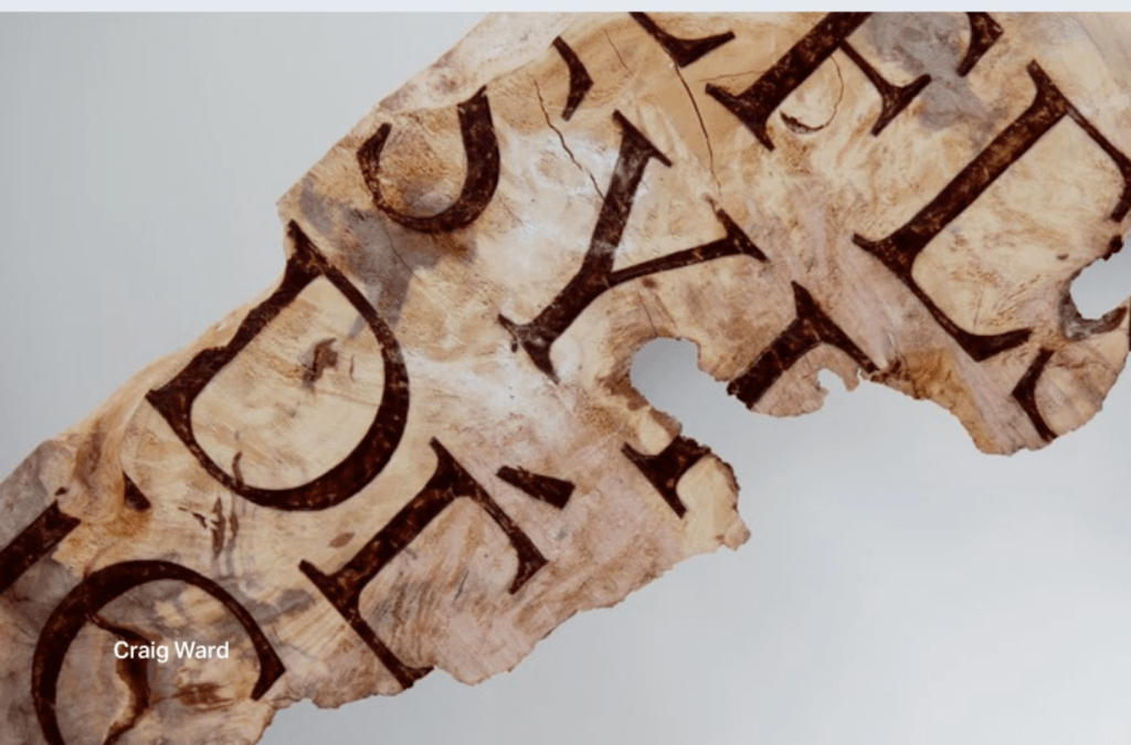
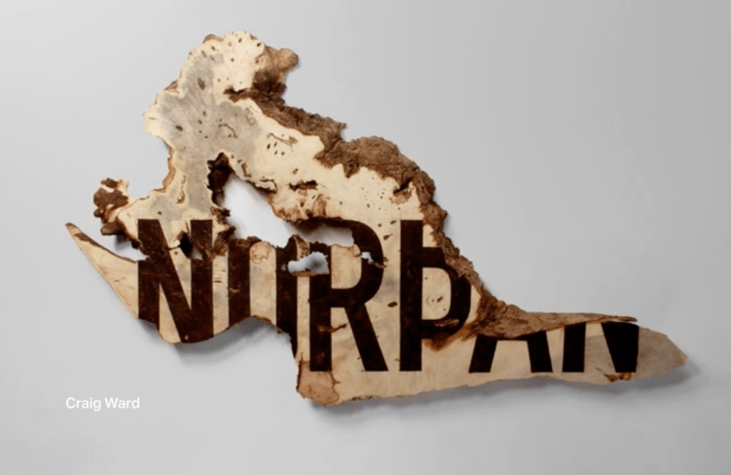
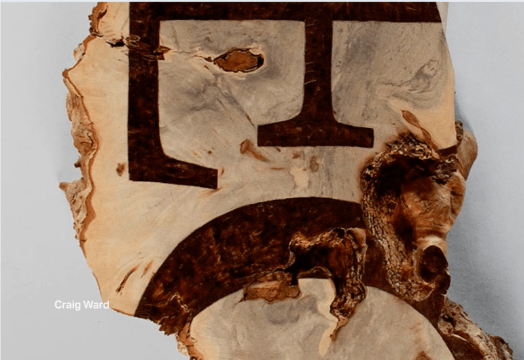
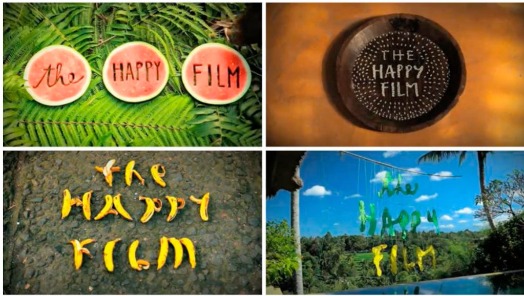
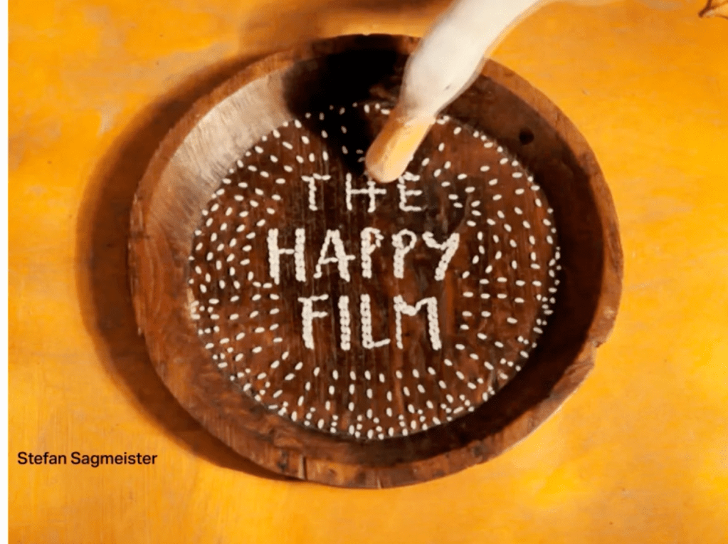
Stefan Sagmeister
- Stay way from the computer – take notes, do something organic

- Be brave! Pull letters apart.
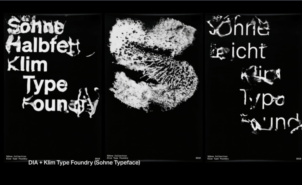
- Create new unique letterforms – think about what is around you
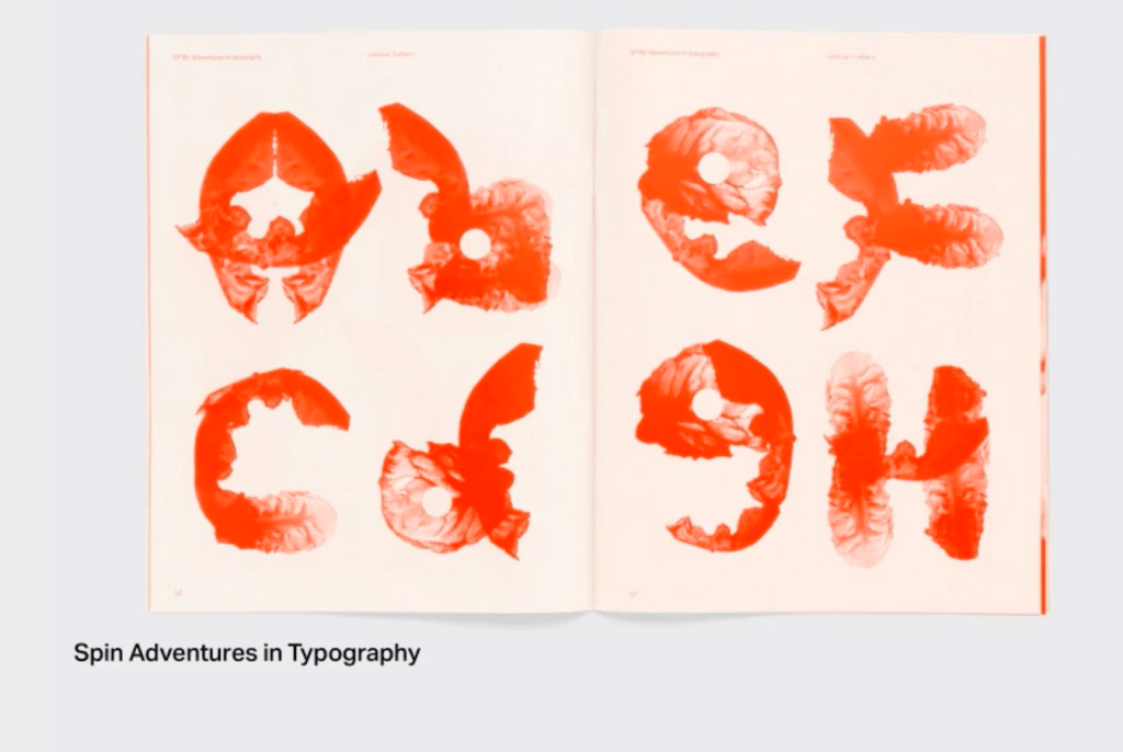
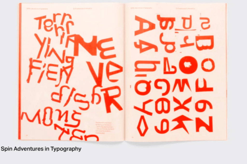
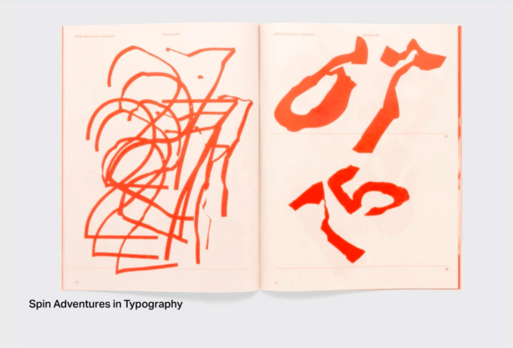
- Refine your work
- Make it move
- Further reading
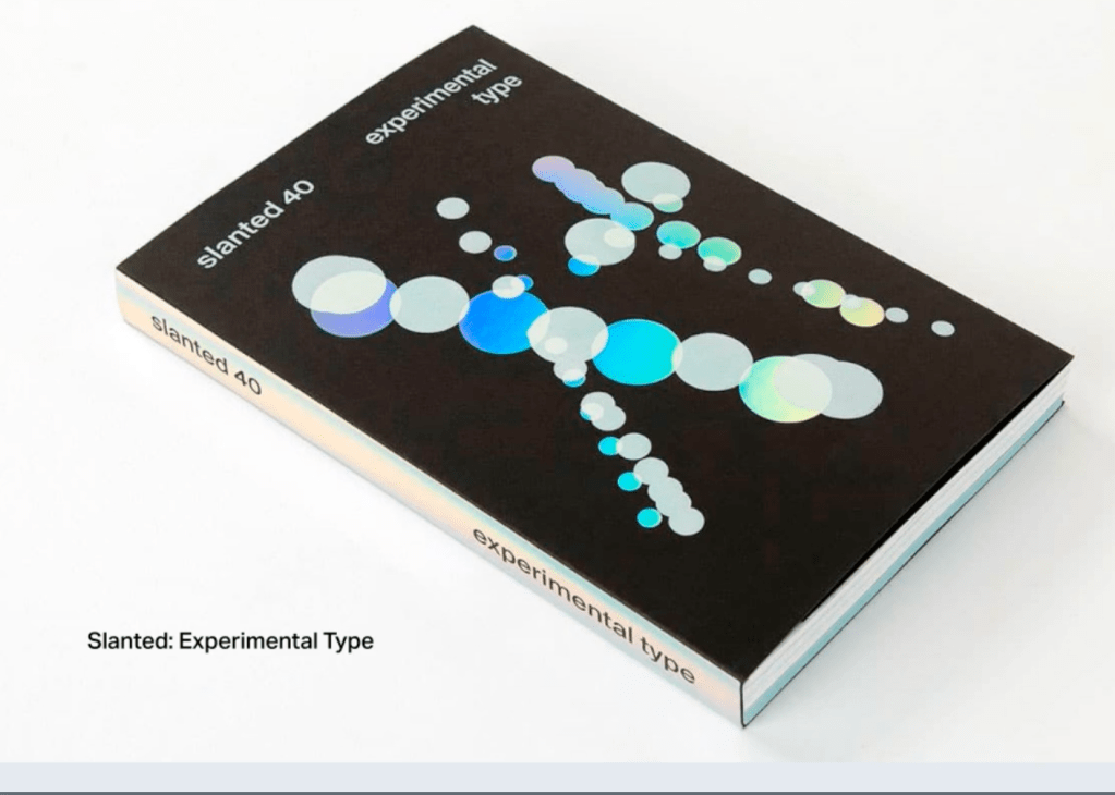
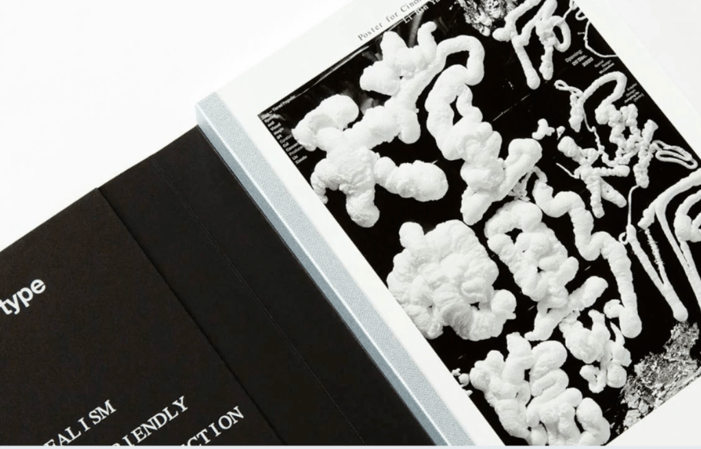
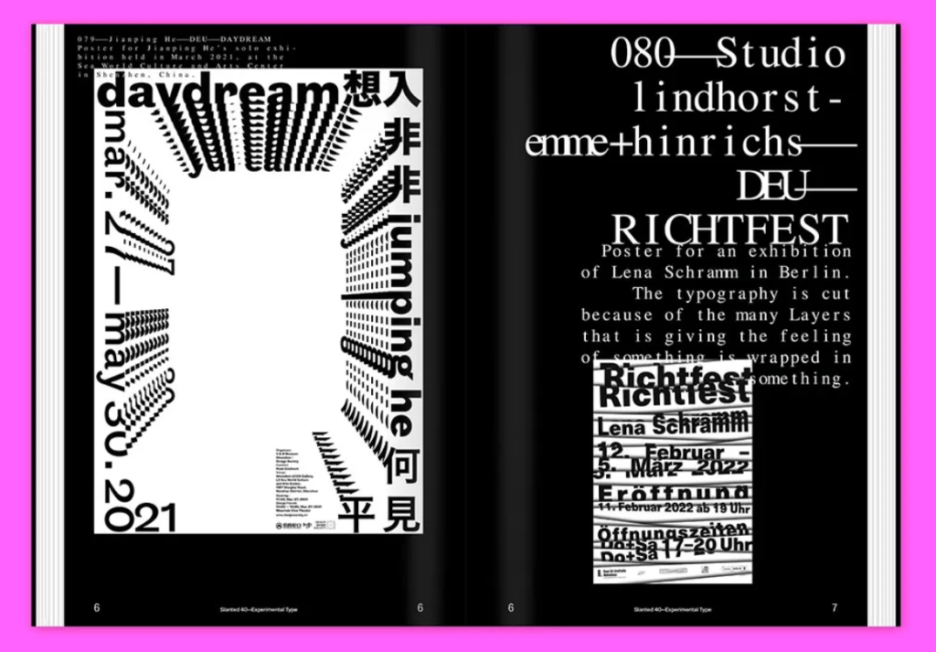
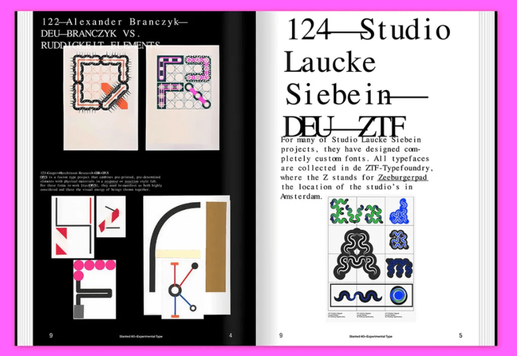
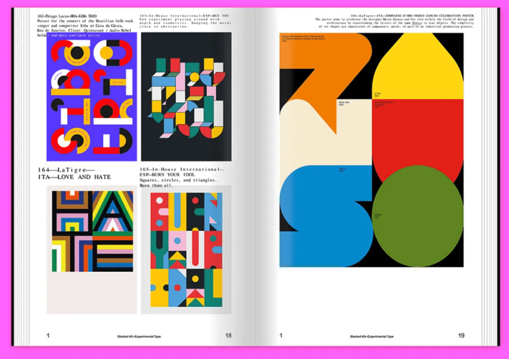
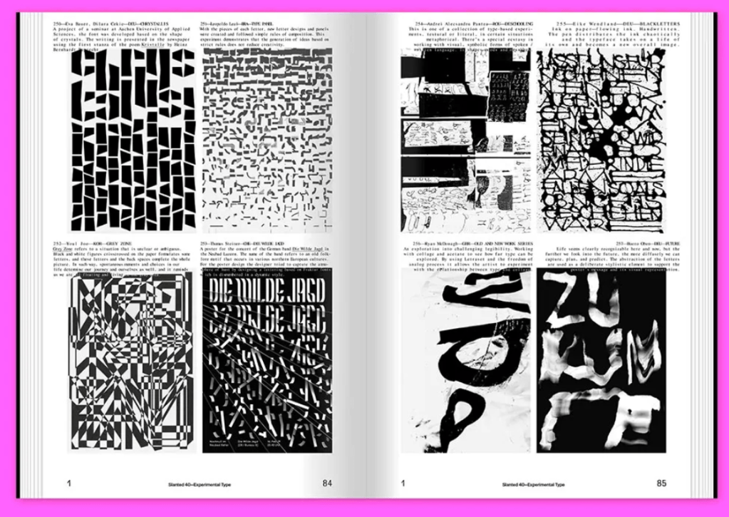
https://www.slanted.de/product/slanted-magazine-40-experimental-type/
https://lexica.art/ – good design resource – helps writing prompt

https://www.astria.ai/examples – good resource – you can get an image and the program creates deferent backgrounds…


Leave a comment