Images were an international language, and still are today. It’s truly amazing, but some of the oldest pieces of information design still exist today
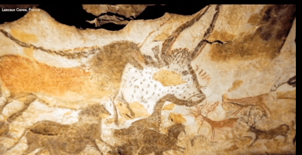
Cave paintings, such as those found at Lascaux in France, show different aspects of life for ancient mankind
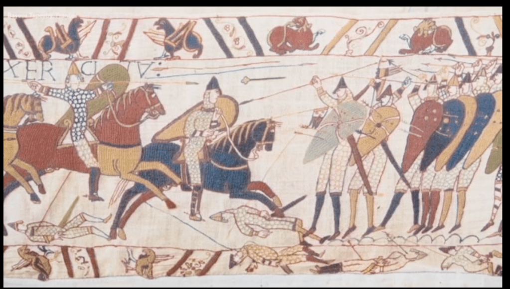
The Bayeaux tapestry is a stunning piece of design, telling the story of the events leading up to the Battle of Hastings in 1066
We can only guess what the true meanings behind these symbols are, as they are so very primitive, but our guts can translate a lot from these. Hunting was a very important part of their lives and survival, that’s why they put so much effort into these images. We can tell what kind of animals were living in this area at that time, and how our ancient ancestors would have lived. But these images were also used to communicate with others in the tribe or other tribes.
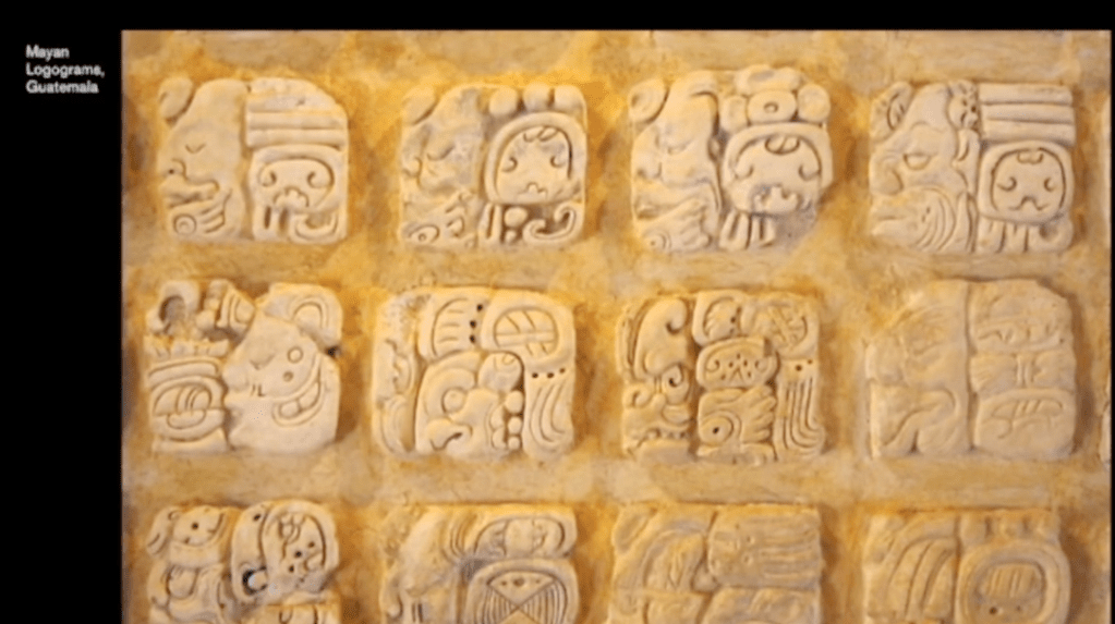
The Egyptians created a sophisticated language of icons. Hieroglyphics can be defined as a logogram system. A logogram (or ideogram) is a written or pictorial symbol intended to represent a whole word, and can be found in other cultures, such as China and Mayan. The concept is still used today in short hand and even our emoji obsession.

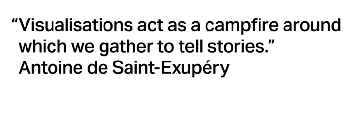
Antoine de Saint-Expery said ‘A designer knows he
has achieved perfection not when there is nothing left to add, but when there is nothing left to take away.’
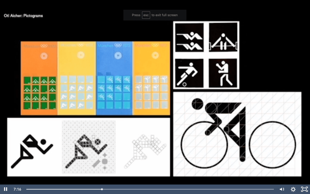
This sentiment was carried through the way-finding of The Design Museum by Cartlidge Levene’s choice to use Otl Aicher’s famous icon suite for navigation, which was designed in 1972 for the Munich Olympics. This is not the first time Aicher’s icons have been used since 1972, there are now over 700 pictograms in the range and new ones are constantly being created. He was originally inspired by the angles of the new buildings designed for the Olympics and created a simple grid system to base all the icons on, adding colour to the designs in application to add more energy and vibrancy. The original set has been a major influence on icons around the world
Another iconic designer in the sphere of information design is Harry Beck. The London Underground map that we know and love today was not always so easy to navigate. Until Beck’s first map was published in 1931, the lines were shown with geographic accuracy, but this was messy and hard to navigate.
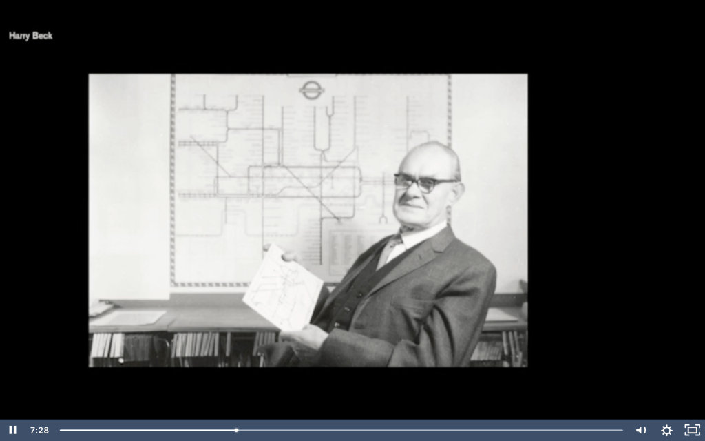
Beck was an electrical draughtsman by trade and he brought this approach to the design, creating a diagram rather than a map. Since then, the basic design has mostly remained unchanged, apart from the addition of extra lines, zones and different circles / diamonds for the different types of stations. This has strongly influenced train maps all around the world, such as the New York City tube map, helping condense complex information into its most basic visualisation.
Lindon Leader (designer of the brilliant FedEx logo) said ‘I strive for two things in design: simplicity and clarity. Great design is born of those two things.’ I think the London Underground map is a great example of that sentiment.
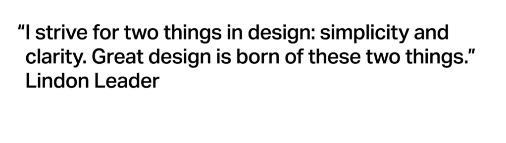
Diagram by Charles Joseph Minard, a French civil engineer who was an inspector-general of bridges and roads, but began creating statistical graphics like this in his retirement :
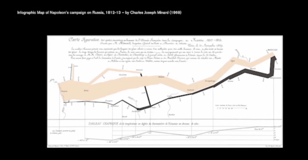
The cream bar chart moves left to right, showing the number of troops that set off from Poland and the number that finally made it to Moscow. The black bar can be seen making the return journey after defeat – the shocking difference between the beginning of the cream bar and the end of the black shows the effectiveness of this diagram. A table of the numbers would have been too much to digest, but by making it visual it is clearer to decipher.
In 1854, Jon Snow documented the outbreak of cholera in an area of Soho, which at the time was believed to be spread by miasma (or ‘bad air’). Snow was sceptical of this, and after mapping out the epidemic, he theorised that the cause of the illnesses was the water from a specific pump on Broad Street. The local council allowed for him to remove the handle from the pump, stopping people taking water from the well, and the rate of cholera cases diminished dramatically.
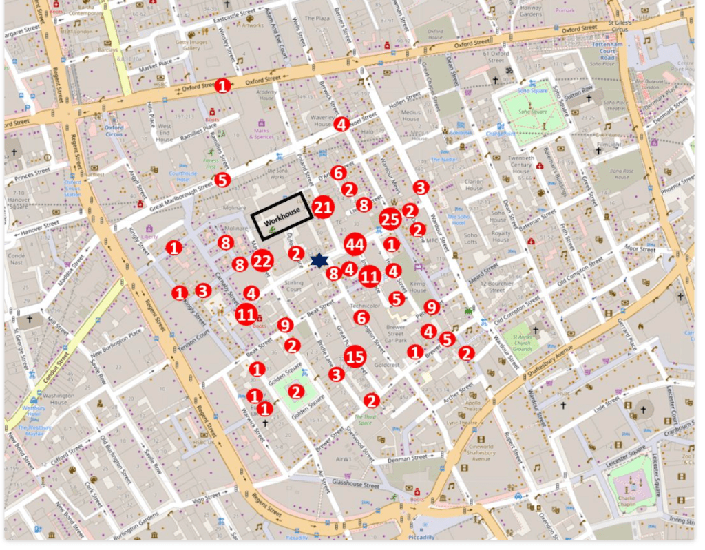
The dark blue star in the centre is the location of the pump. The numbers represent the total deaths listed for that street, so for example the number 44 to the right of the pump represents the total number of deaths in Broad Street to the left and right of the pump. There were a high number of deaths in Poland Street (21), and many of these occurred at the workhouse which is represented by the black rectangle in the above map.
John Snow wrote to the Medical Times and Gazette, describing his findings:
“I had an interview with the Board of Guardians of St. James’s parish, on the evening of the 7th, and represented the circumstances to them. In consequence of what I said, the handle of the pump was removed on the following day. The number of attacks of cholera had been diminished before this measure was adopted, but whether they had diminished in a greater proportion than might be accounted for by the flight of the great bulk of the population I am unable to say. In two or three days after the use of the water was discontinued the number of fresh attacks became very few.“
Another designer who led the way in information design was Jacques Bertin, a French cartographer and theorist who worked on creating a theoretical foundation for visualising information.
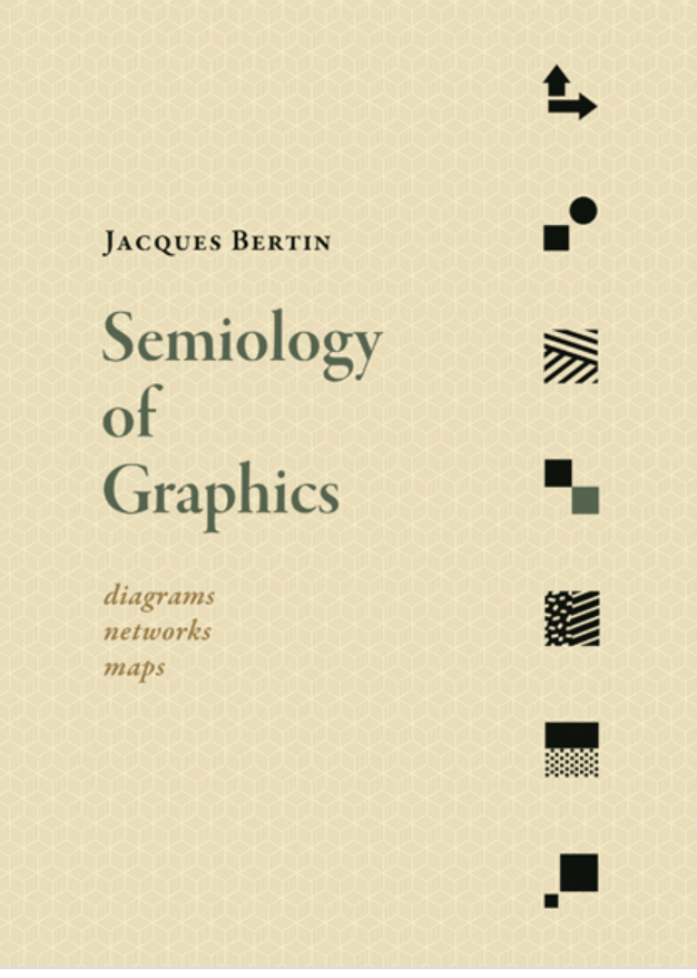
Semiology of Graphics synthesizes principles of graphic communication with the logic of standard rules applied to writing and topography.
Jacques Bertin (July 27, 1918 – May 3, 2010) was a French cartographer and theorist, known from his book Semiologie Graphique (Semiology of Graphics), published in 1967. This monumental work, based on his experience as a cartographer and geographer, represents the first and widest intent to provide a theoretical foundation to Information Visualization.
(https://en.wikiquote.org/wiki/Jacques_Bertin)
Another design that won’t take as long to digest (pun intended) are the photographs taken for the IKEA cookbook, Homemade is Best, by Carl Kleiner. Created in 2010 with creative agency Forsman & Bodenfors for the Swedish market, the images show all the ingredients laid out clearly in a very precise fashion – they feel more like information charts than ingredients. It was a fresh interpretation of cookbook styling and stood out in a crowded marketplace. It also perfectly suited the flatpack IKEA ethos.
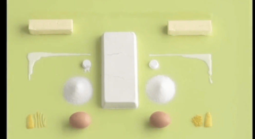

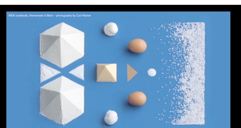


Photography by CARL KLEINER | Styling by EVELINA BRATELL
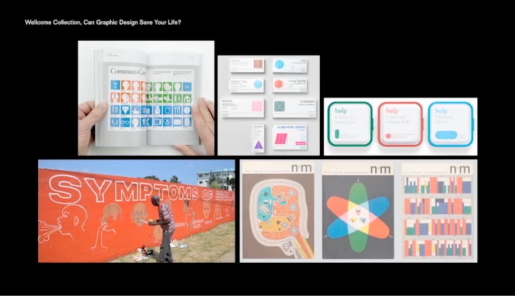
Less tasty and sometimes quite hard to swallow is the role of information graphics in health and health education. In 2017, the Wellcome Collection curated an exhibition called ‘Can Graphic Design Save your Life?’. It was a really interesting exploration into the different ways that information graphics and other forms of communication design can influence people with life-saving information, visualised in the clearest possible way. For example, this naive depiction of the different forms of the Ebola virus was painted on walls throughout Liberia, where over 30 languages are spoken. Rather than masses of text, they used the power of iconograms to highlight the key symptoms to help self diagnosis.
The publication Monocle as one of the best commissioners of interesting, effective infographics – they are obviously well known for creating good looking designs, but their infographics also show data clearly.
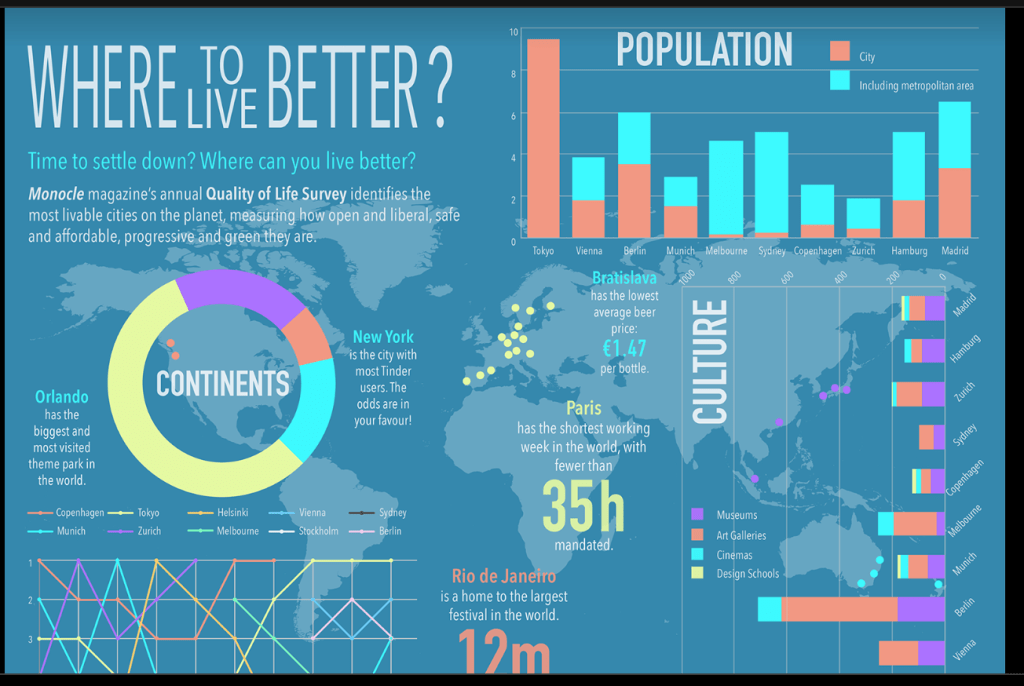
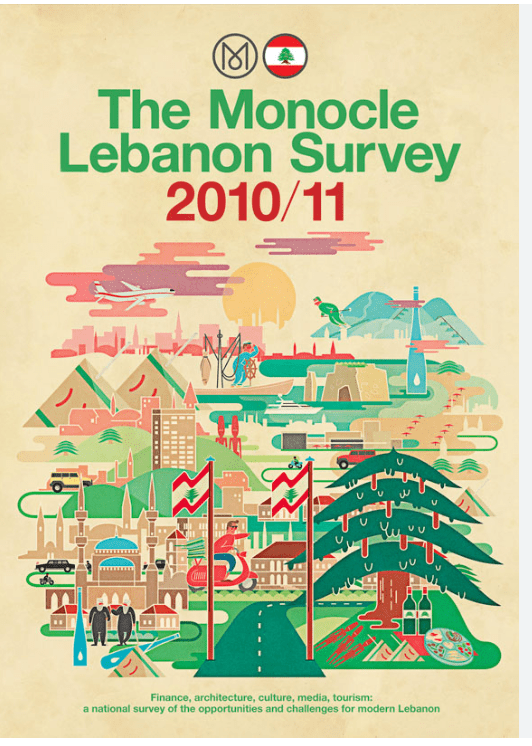
Striking the balance of form and function is key.
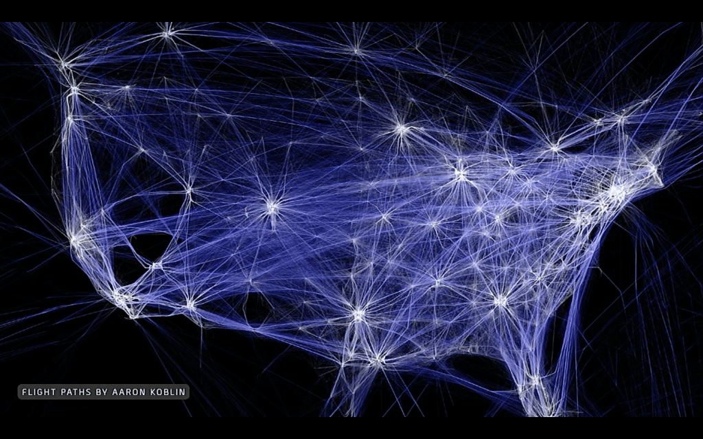
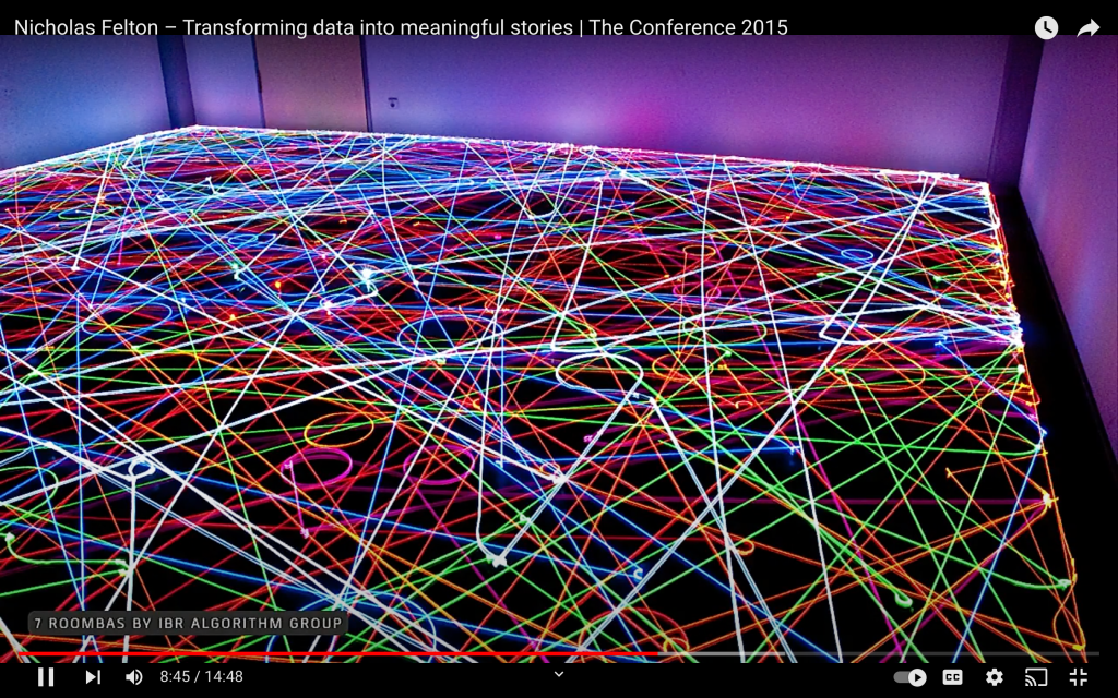
Technology is also aiding information designers – not only in collecting and analyzing their data, but also allowing us to create animations, a medium of information design that should be embraced.
The winner of 2018’s Design of the Year was an interesting blend of different fields in a visual manner, naming a new area called Forensic Architecture. The aim of this research group, based in London, is to share architectural evidence of humanitarian disasters, natural and man-made.
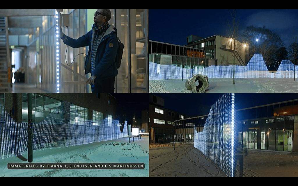
Another area where technology has been used to evolve information design is with the use of programs and generative systems. At the forefront of this movement was the installation by Studio Greyworld in 2010.
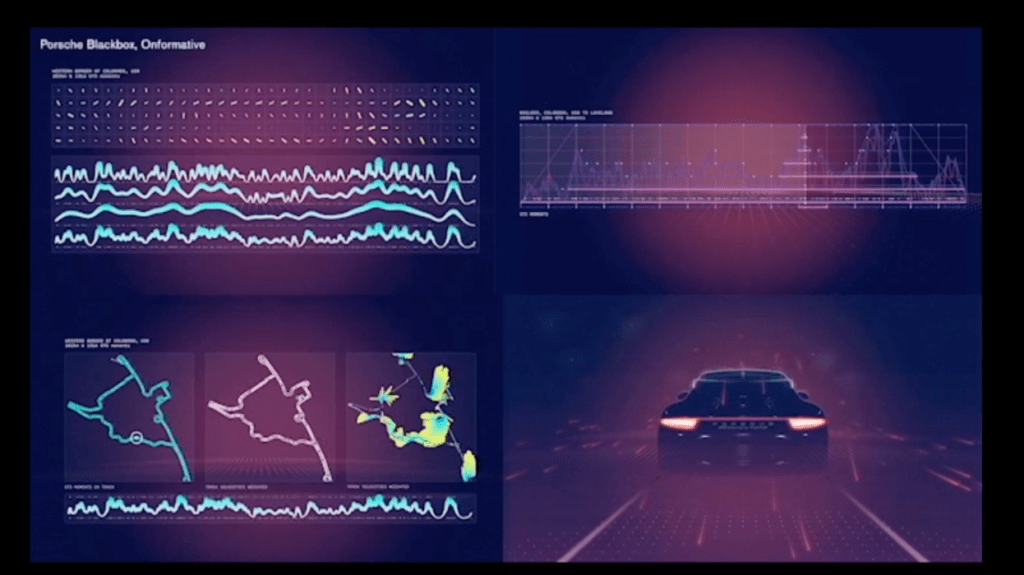
A more contemporary design collective looking at pushing the boundaries of generative design and data visualisation is Onformative. Based in Berlin, they collaborate on projects all over the world.

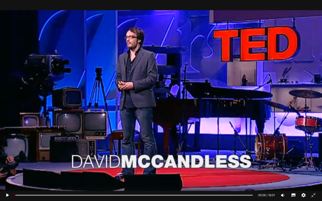
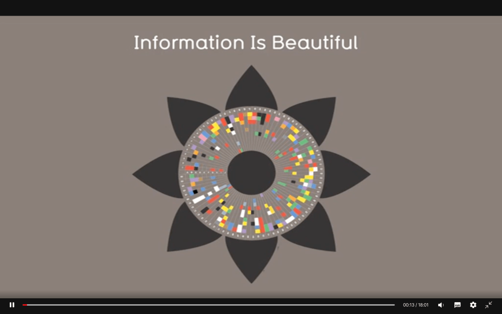
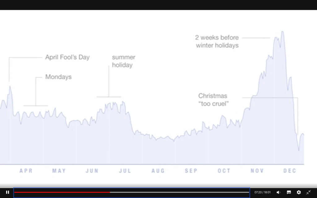
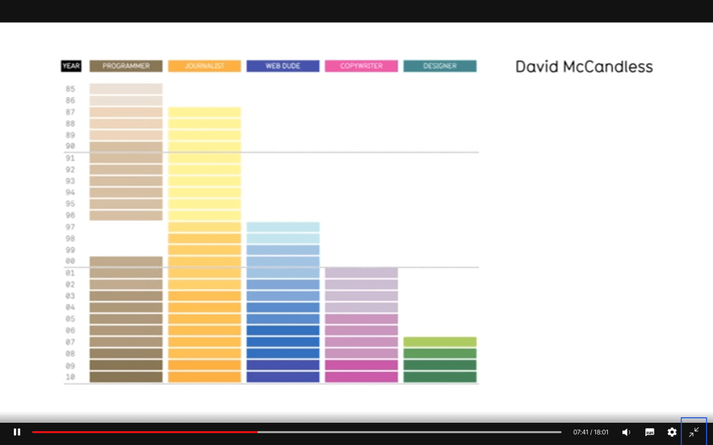
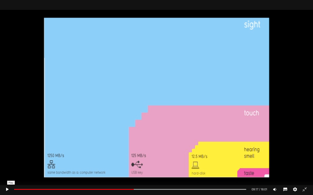
“Information is beautiful” by David McCandless
Hyperobjects: Philosophy and Ecology after the End of the World

Trinitite, an entirely new mineral formed by the explosion of the Gadget, the first nuclear device. Photograph by Shaddack.
“When I look at the sun gleaming on the solar panels on my roof, I am watching global warming unfold. Carbon compounds and other molecules in the upper atmosphere magnify the burning intensity of the sun in the Great Central Valley of California. Yet I do not see global warming as such. I see this brilliant blade of sunlight, burning the top of my head as I watch it with half-closed eyes reflecting off the burnished, sapphire surface of the solar panels. The manifold that I witness is not merely a “subjective impression,” but is rather just this collusion between sunlight, solar panels, roof, and eyes. Yet global warming is not here. Hyperobjects are nonlocal. Nuclear radiation is not visible to humans. The nuclear accidents at Chernobyl and Fukushima bathed beings thousands of miles away in unseen alpha, beta, and gamma particles, as radioactive specks floated in air currents across Europe and the Pacific. Days, weeks, months, or years later, some humans die of radiation sickness. Strange mutagenic flowers grow.
The book Hiroshima is a series of testimonies by people in the town when the bomb was dropped. Each witness gives a unique account of the bomb. No single witness experiences the entire bomb. No witness was too close to the bomb: otherwise they would have been evaporated, or quickly incinerated, or blown to pieces. There is a core of human silence around which the witnesses give their testimony. Each testimony is a local manifestation (Bryant’s term) of the bomb. Some witnesses assume that they are very close to a powerful conventional bomb, when they are relatively far away from the first nuclear bomb.
Hyperobjects end the idea that time and space are empty containers that entities sit in.
World is more or less a container in which objectified things float or stand.
World as the background of events is an objectification of a hyperobject: the biosphere, climate, evolution, capitalism (yes, perhaps economic relations compose hyperobjects).
There is a further problem with timescales concerning global warming— there are lots of them. We are dealing with an object that is not only massively distributed, but that also has different amortization rates for different parts of itself. Hyperobjects are messages in bottles from the future: they do not quite exist in a present, since they scoop the standard reference points from the idea of present time. In order to cope with them, we require theories of ethics that are based on scales and scopes that hugely transcend normative self-interest theories, even when we modify self-interest by many orders of magnitude to include several generations down the line or all existing lifeforms on Earth.
The hyperobject is a liar. We never see the hyperobject directly.
Analyzing Minard’s Visualization Of Napoleon’s 1812 March
Joanne Cheng June 8, 2014 UPDATED ON March 23, 2019
https://thoughtbot.com/blog/analyzing-minards-visualization-of-napoleons-1812-march
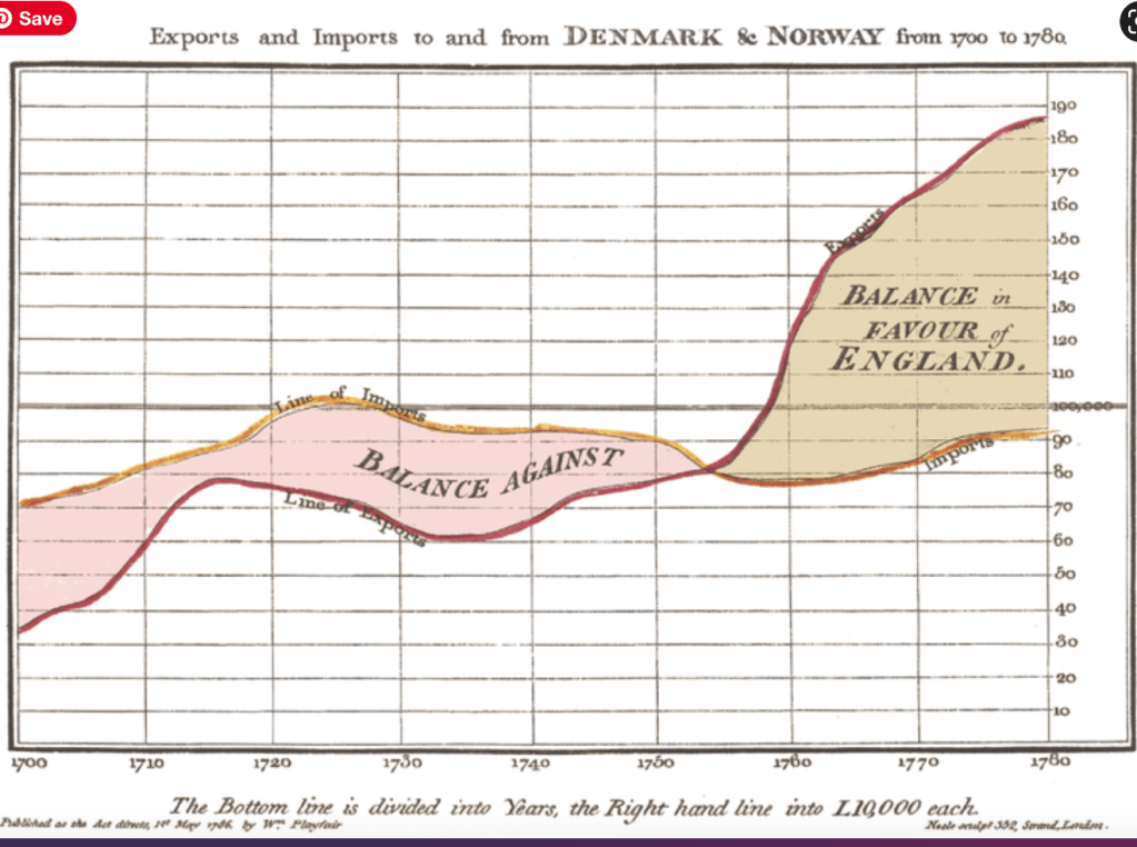
An earlier example of a well-published data visualization – created by William Playfair, largely considered to be the father of information design, in 1786 — about 100 years before Minard’s diagram was made. Playfair is the inventor of the pie chart, the bar graph, and the line graph – statistic graphics we use regularly today. This graphic has gridlines to mark the years and the number of exports.
Minard’s graphic:
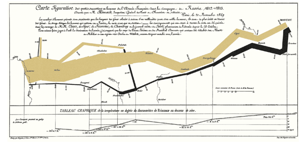
In The Visual Display of Quantitative Information, Edward Tufte calls Minard’s graphic of Napoleon in Russia one of the “best statistical drawings ever created.”
“
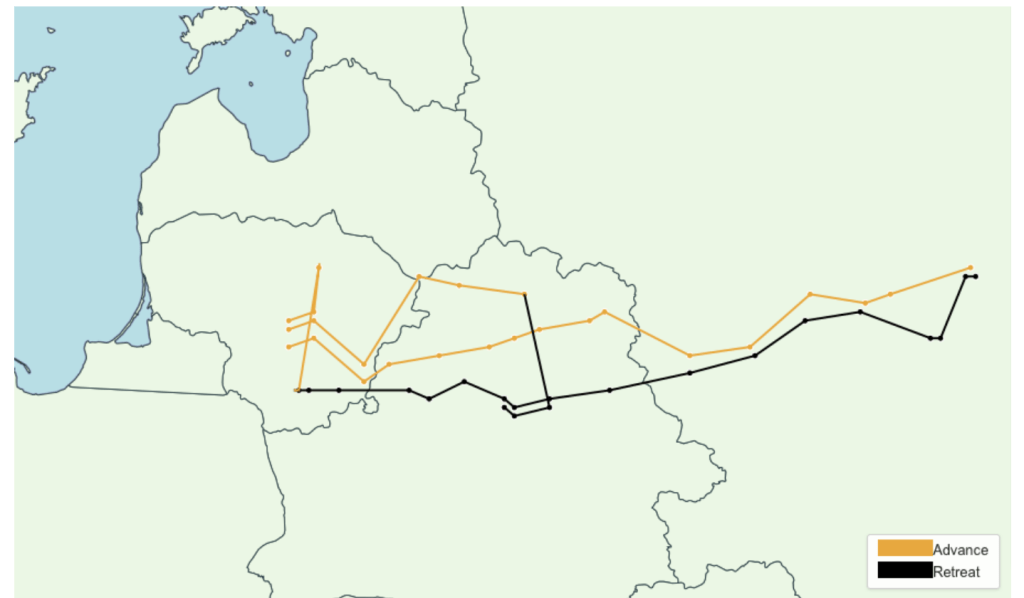
The year is 1812, and Napoleon is doing pretty well for himself. He has most of Europe under his control, except for the UK. No matter how many times he tried to invade them, he couldn’t break through their defenses. His plan was to place an embargo on them, forcing the other European countries to stop trade with the UK which would weaken them enough so that Napoleon could invade and take over easily.
Czar Alexander of Russia sees that Napoleon was becoming too powerful, so he refuses to participate in this embargo. Angry at Czar Alexander’s decision, Napoleon gathers a massive army of over 400,000 to attack Russia in June of the year 1812. While Russia’s troops are not as numerous as France’s, Russia has a plan. Russian troops keep retreating as Napoleon’s troops move forward, burning everything they pass, ensuring that the French forces could not take anything from their environment. Eventually the French army follows the Russian army all the way to Moscow during October, suffering major losses from lack of food. By the time Napoleon gets to Moscow, he knows he has to retreat. As winter settles into Europe and the temperature drops, Napoleon’s troops suffer even more losses, returning to France from lack of food, disease, and weather conditions.”
Why did Napoleon Fail in Russia in 1812?
Napoleon failed to conquer Russia in 1812 for several reasons: faulty logistics, poor discipline, disease, and not the least, the weather. Napoleon’s method of warfare was based on rapid concentration of his forces at a key place to destroy his enemy. This boiled down to moving his men as fast as possible to the place they were needed the most. To do this Napoleon would advance his army along several avenues and converging them only when necessary. The slowest part of any army at the time was the supply trains. While a soldier could march 15 – 20 miles a day, a supply wagon was generally limited to about 10 – 12 miles a day. To avoid being slowed down by the trains, Napoleon insisted that his troops live as much as possible off the land. The success of Napoleon time after time in Central Europe against the Prussians and the Austrians proved that his method of warfare worked. However for it to work, the terrain must co-operate. There must be a good road network for his army to advance along several axes and an agricultural base capable of supporting the foraging soldiers.
In 1812, Napoleon invaded Russia with about 600,000 men and over 50,000 horses. His plan was to bring the war to a conclusion within twenty days by forcing the Russians to fight a major battle. Just in case his plans were off, he had his supply wagons carry 30 days of food. Reality was a bit different. Napoleon found, as the Germans found in 1941, that Russia had a very poor road network. Thus he was forced to advance along a very narrow front. Even though he allowed for a larger supply train than usual, food was to be supplemented by whatever the soldiers could forage along the way. But this was a faulty plan. In addition to poor roads, the agricultural base was extremely poor and could not support the numbers of soldiers that would be living off the land. Since these 600,000 men were basically using the same roads, the first troops to pass by got the best food that could easily be foraged. The second troops to go by got less, etc. If you were at the rear, of course there would be little available. The Russians made the problem worse by adopting a scorched earth policy of destroying everything possible as they retreated before the French. As time went by, soldiers began to straggle, due to having to forage further away from the roads for food and weakness from lack of food.
The situation was just as bad for the horses. Grazing along the road or in a meadow was not adequate to maintain a healthy horse. Their food had to be supplemented with fodder.
The further the army went into Russia, the less fodder was available. Even the grass began to be thinned out, for like food the first horses had the best grazing, and those bringing up the rear had it the worse. By the end of the first month, over 10,000 horses had died!
Soldiers weakened by poor diets and fatigue are susceptible to disease. Typhus was rampant among the troops due to infestations of lice. Additionally, the poor food, combined with bad water, and camping on sites where tens of thousands bivouacked before (and thus contaminated the water and area with feces) made intestinal ailments such as diarrhea and dysentery common. By the time Napoleon had reached Moscow, three months later, over 200,000 of his soldiers were dead or hospitalized due to disease and exhaustion.
Poor discipline was another major problem. Troops had to forage to survive. The deeper they went into Russia the further they had to go each day to find food. Commanders lost control of their troops as many soldiers’ only concern became finding food and just disappeared. These soldiers did not necessarily die, but form a uncontrollable mass bringing up the rear. As months went by, units cease to exist, except in name only. This became especially true during the retreat in the late Fall. Much of the army was soon a mob, with little cohesion and no effectiveness. This in itself would not be too great of a detriment, except for the impact on those units that were still intact. There were several cases during the retreat where mobs of soldiers broke into the few warehouses that contained supplies and destroyed more than they ate — and leaving little or nothing for those fighting in the rear guard. The worse case of this was in Smolensk. At a major warehouse bureaucrats insisted that the soldiers must be with their units before they would be issued food. The troops couldn’t handle this stupidity and rioted, demolishing the warehouse and much of the food that was stored there. In another case, at the crossing of the Berezina, thousands of soldiers in these mobs panicked when they were attacked by the Russians. In their desperate attempt to cross the bridge it broke, and at least 10,000 – 20,000 soldiers died or were captured.
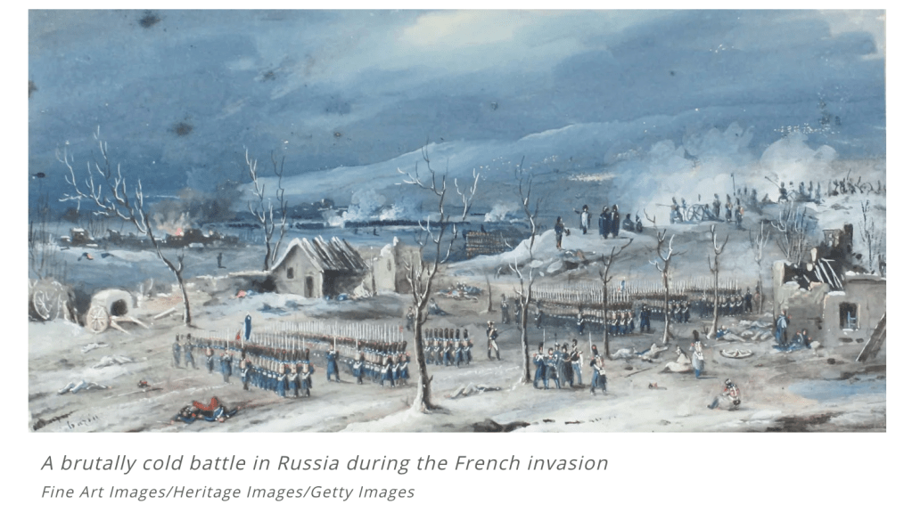
The final factor was the weather. First it was too hot — making it a dry, dusty march to Moscow. Then when the Retreat began, it was too cold at first. This was a bone-chilling well below zero cold that few had experienced before. First to die were the weak who, too exhausted to walk, laid down and died. As the little food supplies they had ran out, the strong got weaker and they too began to die. But then the weather changed. There was a warm spell which thawed the frozen roads — slowing down the march even more. Roads that were heavily rutted, but solid soon were quagmires of mud. Streams that were once frozen were quick moving and obstacles that had to be overcome. Rivers that could have been crossed without bridges now needed bridges. All of which took precious time and energy, something the army did not have. Then once again the weather took a turn for the worse — this time far colder than before. Thousands died in their sleep overcome by exhaustion and exposure. By the time the army crossed into Poland in early December, less than 100,000 exhausted, tattered soldiers remained of the 600,000 proud soldiers who crossed the Nieman five months before.
https://www.napoleon-series.org/faq/c_russia.html
https://education.nationalgeographic.org/resource/napoleon-invades-russia
Napoleon’s armies marched into Russia in 1812 in an attempt to force Tsar Alexander I to cease trading with Britain.
The invasion lasted six months, and the Grande Armée lost more than 300,000 men. Russia lost more than 200,000. A single battle (the Battle of Borodino) resulted in more than 70,000 casualties in one day. The invasion of Russia effectively halted Napoleon’s march across Europe, and resulted in his first exile, to the Mediterranean island of Elba.
https://informationisbeautiful.net/
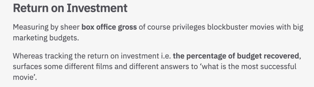
https://informationisbeautiful.net/visualizations/what-is-the-most-successful-hollywood-movie-of-all-time/ – the charts are interactive – that’s why is best tot view them on their sites
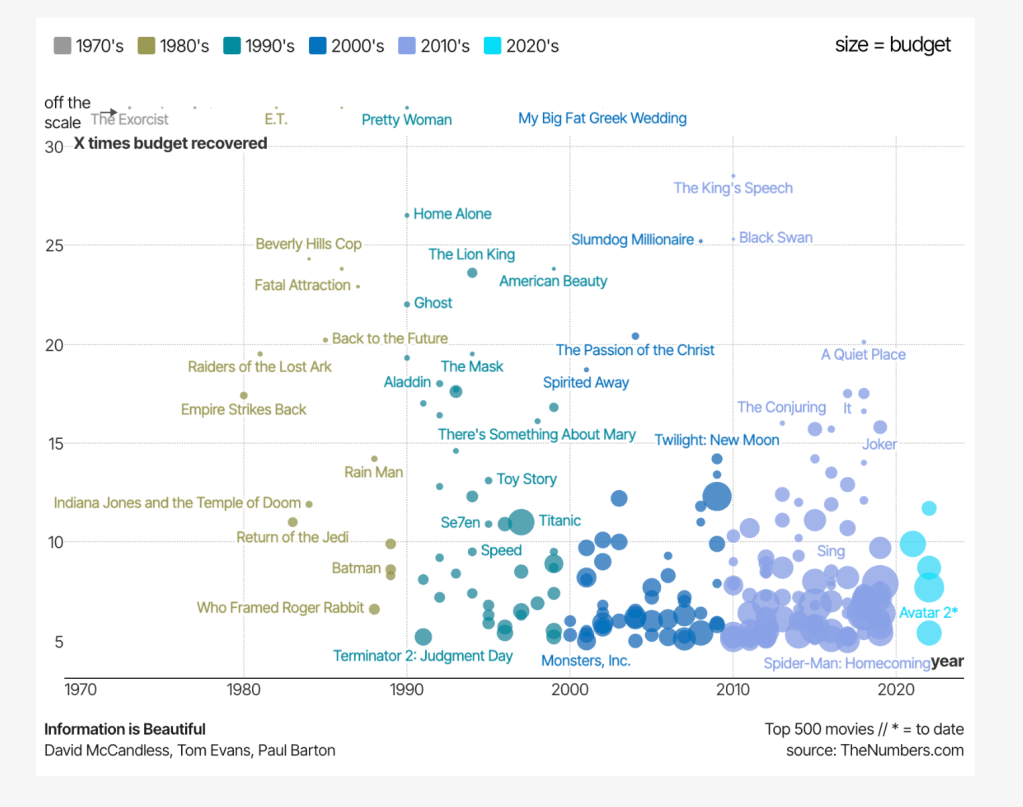
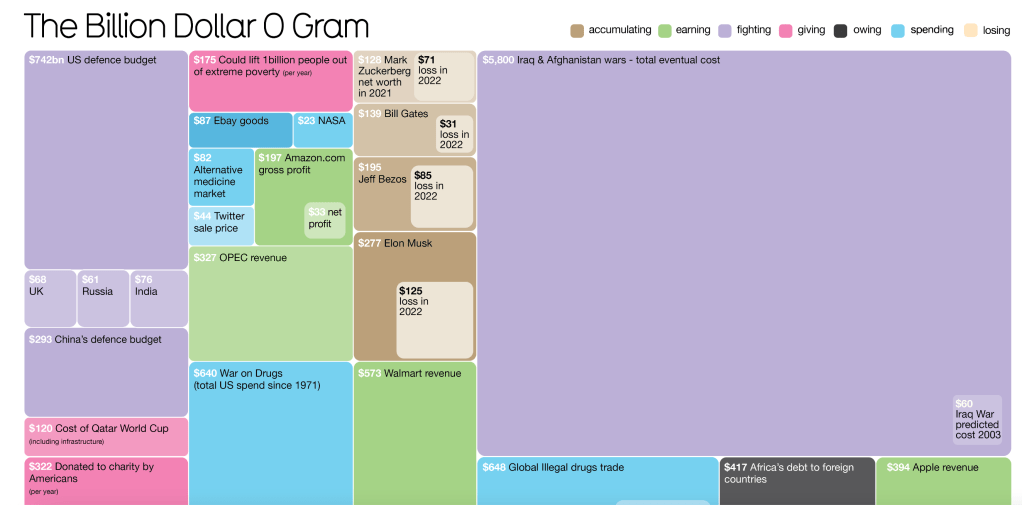
https://informationisbeautiful.net/visualizations/the-billion-dollar-gram/

https://informationisbeautiful.net/visualizations/most-beautiful-news-of-the-year/
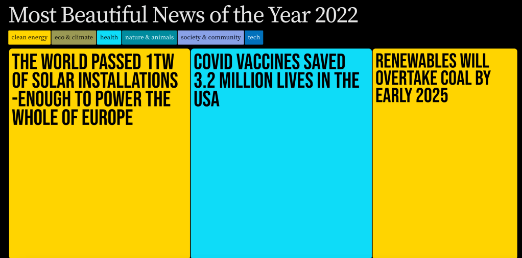
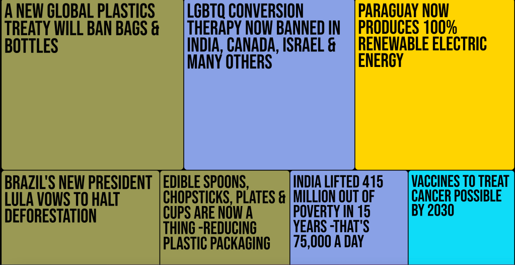
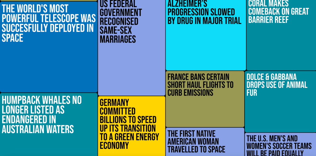
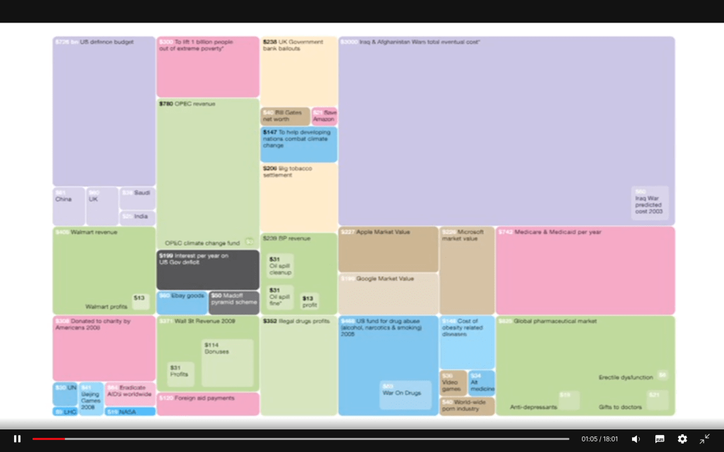
The colors represent the motivation and box size depends on the amount of money
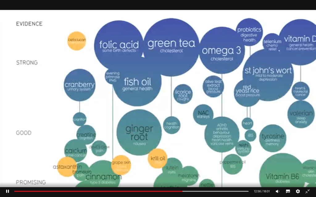
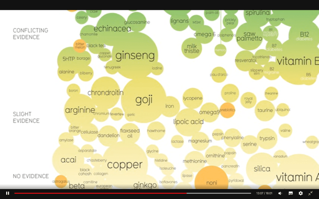
“…is a huge amount of work – wee scrape around one thousand studies to gather the info… I spend a month doing this and I only fill 2 pages. Visualizing information is a form of compressing the information – squeezing it”
“Data can cange my mind, my perspective – beautiful, lovely data! Information design is about solving information problems in our society.
Visualizing information can give us a quick solution to a problem. We can often get clarity or answer to a simple question.”
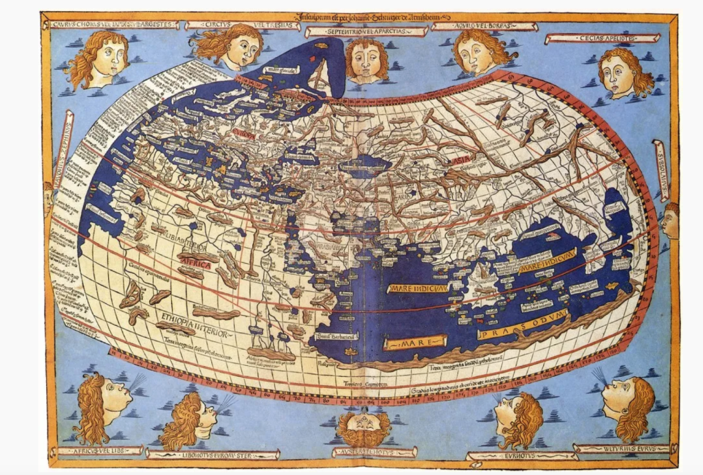
Information Visualization – A Brief Pre-20th Century History
The map designed by Claudius Ptolemy (between 85 and 165 A.D.) of a spherical earth was still used in the 14th century as a reference guide. The image below is a 15th century rendition of this map – which may be the information visualization with the highest level of longevity to date.
By the 14th century it was becoming more common for people to represent functions on graphs and by the 16th century as measurement systems became increasingly precise. There were many attempts to create ever increasingly accurate maps and graphs.
William Playfair invented, or at least was the first to use, the line graph, the circle graph, the pie chart (pictured below) and the bar chart, in visual representations.

https://www.itsnicethat.com/news/pentagram-mindworks-the-science-of-thinking-graphic-design-090821
Pentagram’s new interactive design project dedicated to the science of decision-making
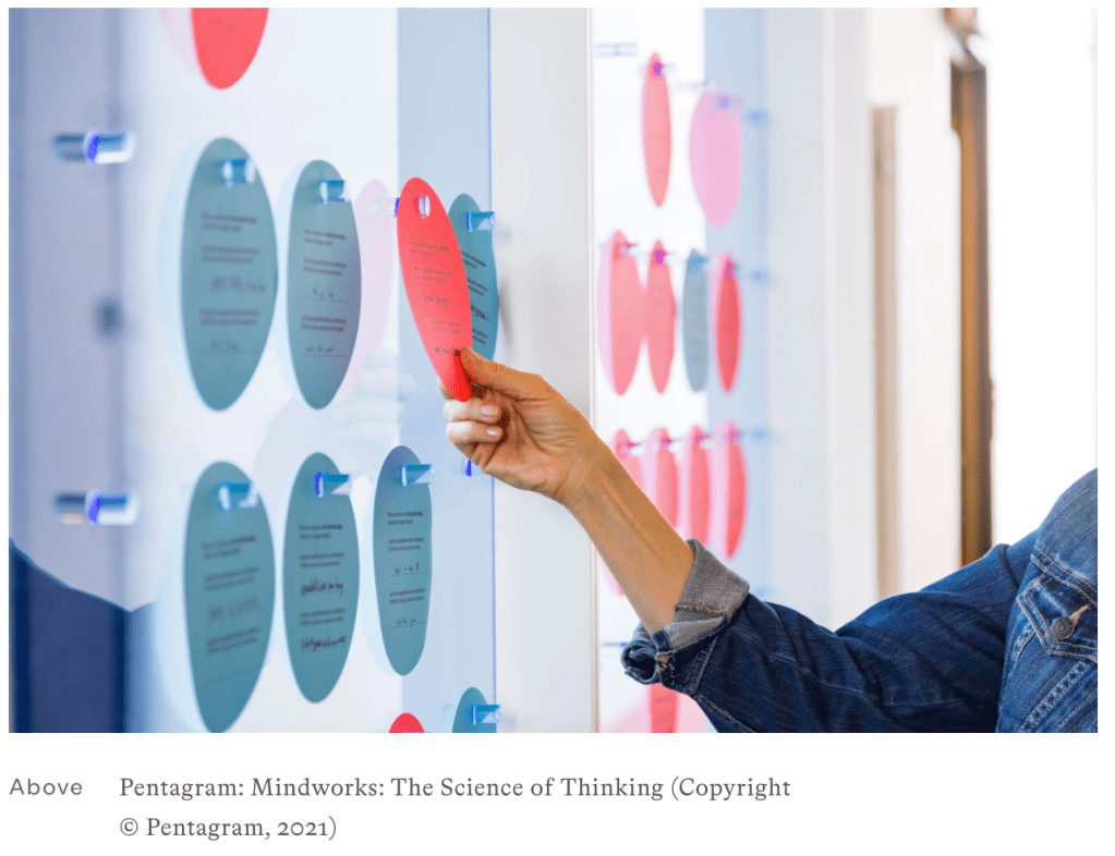
GIORGIALUPI –I am an information designer and a Partner at Pentagram advocating for Data Humanism.
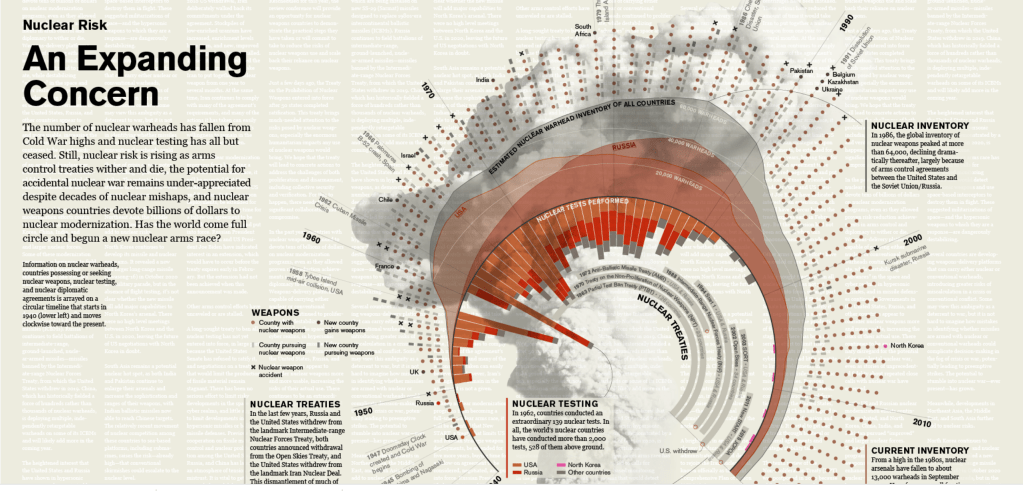
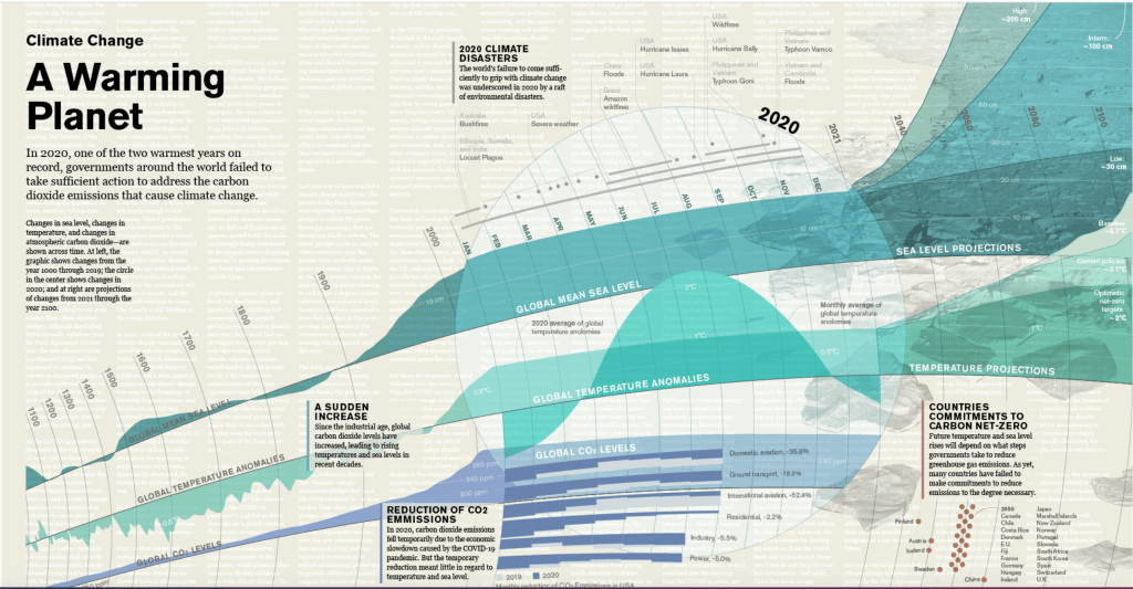
Each visualization utilizes a different form and has its own distinct color palette (red and orange for the infographic on nuclear risk; blue and green for the diagram on climate), but they all visually tie together as a group. The designs incorporate circular forms that echo the shape of the Clock and that reinforce the cyclical, time-based nature of the underlying issues, which are not always so linear. The Doomsday Clock appears on each, along with the message that “It is 100 seconds until midnight.”
To make the visualizations more memorable, the backgrounds feature a collage of imagery and the hint of text, which was drawn from the discussions of the advisory panel and suggests the amount of analysis that went into the decision.
Climate change is the focus of the other visualization, “A Warming Planet,” which is presented as a flowing linear timeline. The section representing 2020–one of the warmest years on record–has been enlarged as though under a magnifying glass, zooming in on the effects of environmental disasters such as wildfires and hurricanes, as well as the reduction of carbon dioxide emissions due to the economic slowdown caused by the Covid-19 pandemic. Looking forward, the timeline projects rising temperatures and sea levels through 2100 and beyond.
https://www.peterorntoft.com/infographics-in-context
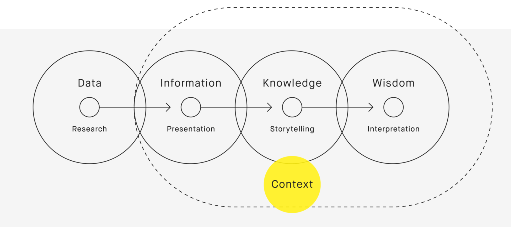
The concept of the project is inspired by Nathan Shedroff’s interpretation of the DIKW hierarchy where knowledge of a subject’s context is key in understanding and conveying it.
By using the context of a data to design its diagram, the designer can convey more layers of information than by presenting the data in a regular diagram.

https://www.eyemagazine.com/feature/article/the-pandemic-that-launched-a-thousand-visualisations
The pandemic that launched a thousand visualisations
The very nature of the Covid-19 pandemic presents a challenge for information design.
We have become regular consumers of the visualised statistics generated by news events. A sporting event produces a set of data describing who is winning. A major election, even a natural disaster, occurs in a predictable time. It generates data, the data is presented and it is over. The Covid-19 pandemic, by contrast, is unfolding daily, with no clear end in sight. This has created enormous pressure to produce not only individual visualisations, but entire visual systems into which data can flow, day after day. The curve of a line, the spikes of a histogram and bubbles on a map have become the brush and the background upon which we see our world changing.
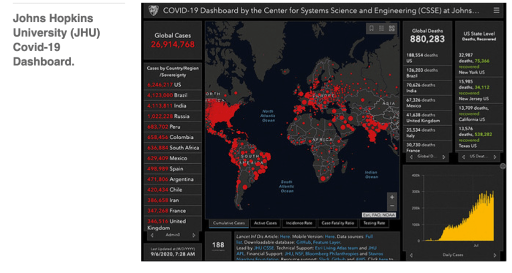
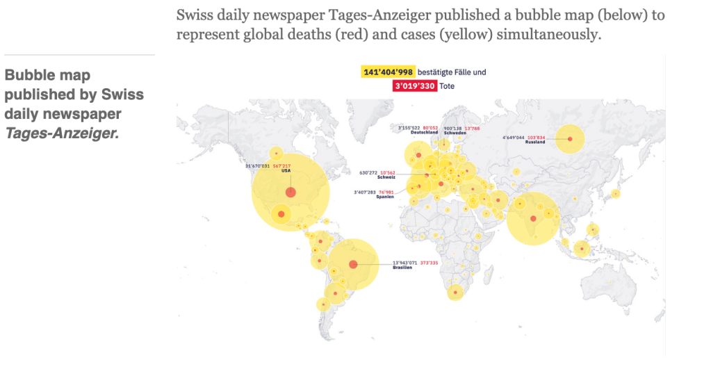
he dashboard, built from the Esri ArcGIS toolkit, combines numbers in bold contrasting colours with a bubble map. Its most striking visual comes from the red dots that represent cumulative reported cases on a black or grey geographic outline. The global focus results in a visualisation as uneven as the data that drives it. The dot number varies per country, representing the absence or availability of national, provincial or local data. The impression is of a world covered in red wounds. The user can pan and zoom into parts of the map to reveal additional detail.
Choropleth vs bubble
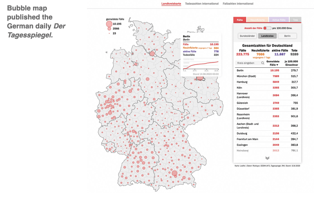
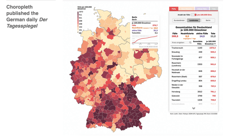
Online visualisations can place the advantage and disadvantage of choropleth and bubble maps in the hands of the reader, as seen in the German daily Der Tagesspiegel (below). The display for total cases (‘Anzahl der Fälle’) is a map with a range of three bubble sizes. To show cases per 100k population the visualisation switches to a choropleth display with six shades from light to dark encoding quantities. The density of cases in the south is more visible in the choropleth, while the distribution of cases is clearer in the bubbles.
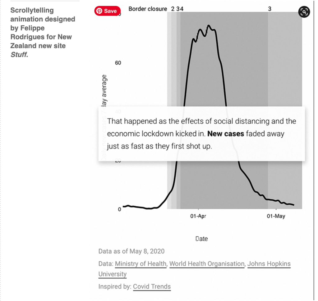
Scrollytelling
A piece written and designed by Felippe Rodrigues for the New Zealand news site Stuff, created in early May 2020 when that country managed to stop its infection rate, uses curves and permutations in line graphs to explain and compare the health situation in various countries (below). In an interview in Storybench, Rodrigues describes the ‘scrollytelling’ animation technique. Scrolling through the page focuses the reader on NZ data as he changes from a logarithmic scale for the number of cases (which displays flattening when the rate of infections decrease) to a linear scale that shows the moment when the number of falling active cases crossed the rising number of recoveries, producing a bell shape as the numbers decrease following a peak.
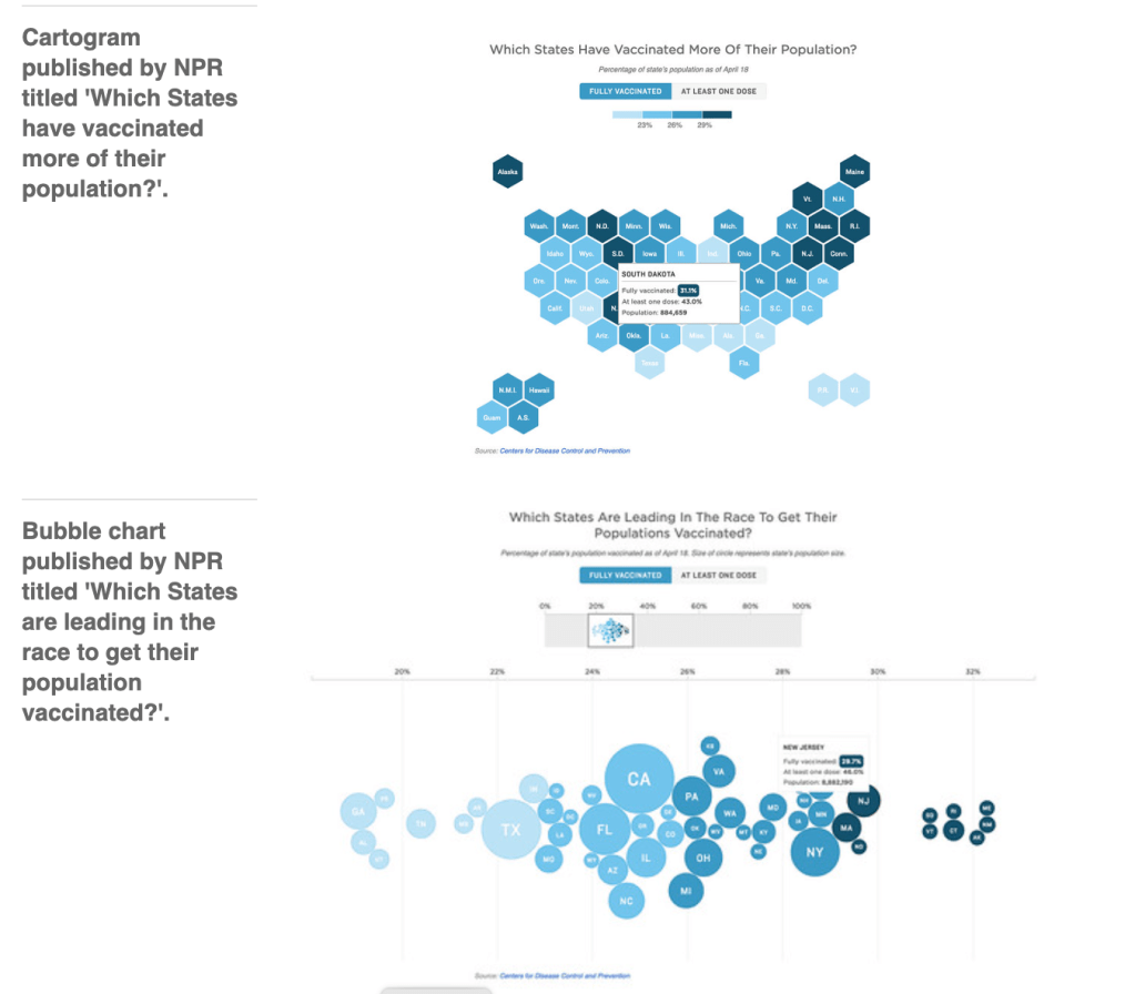
The vaccine race
Using a cartogram (below), which distorts the geography of a region to convey information, is useful for representing the states and territories of the US, whose size and population vary widely. This example from the NPR (National Public Radio) website presents the percentage of population fully and partially vaccinated with four shades of blue. Other dimensions of the same data are represented as bubble charts in the same story. Now the population (below) is visible in the bubble size. How close or far away states of the same colour are is visible by their position on the x-axis.
Eye is the world’s most beautiful and collectable graphic design journal, published for professional designers, students and anyone interested in critical, informed writing about graphic design and visual culture. It is available from all good design bookshops and online at the Eye shop, where you can buy subscriptions and single issues.
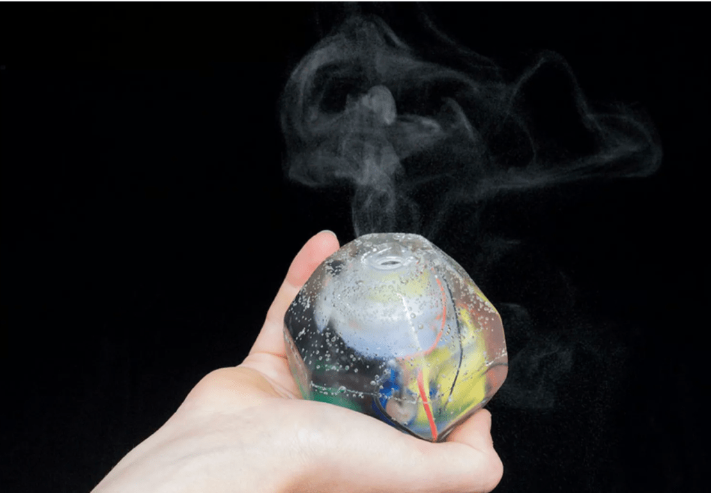
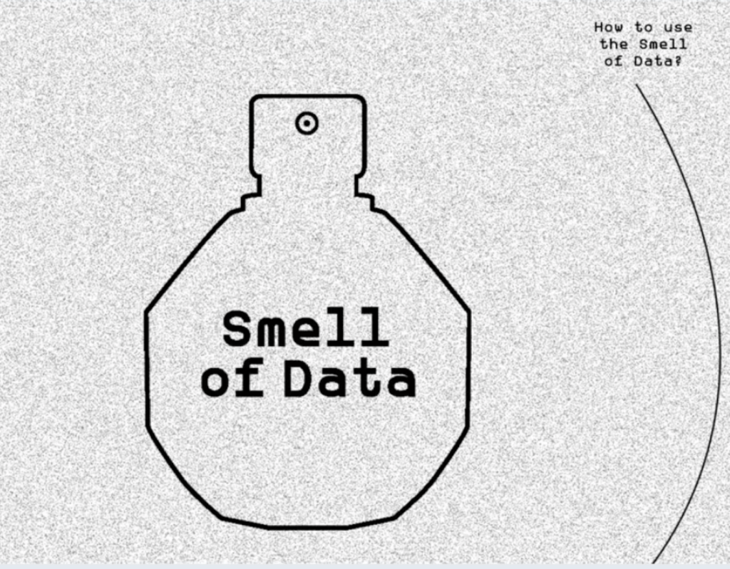
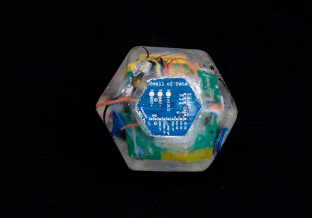
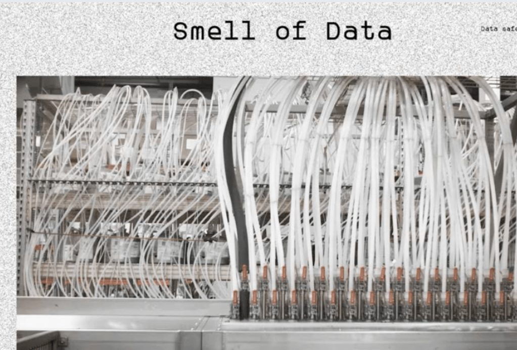
Please note: The Smell of Data won’t secure your data for you. It is an alert mechanism for a more instinctive Internet.
Welcome to the Atlas of Emotions
SUPPORTED BY THE DALAI LAMA
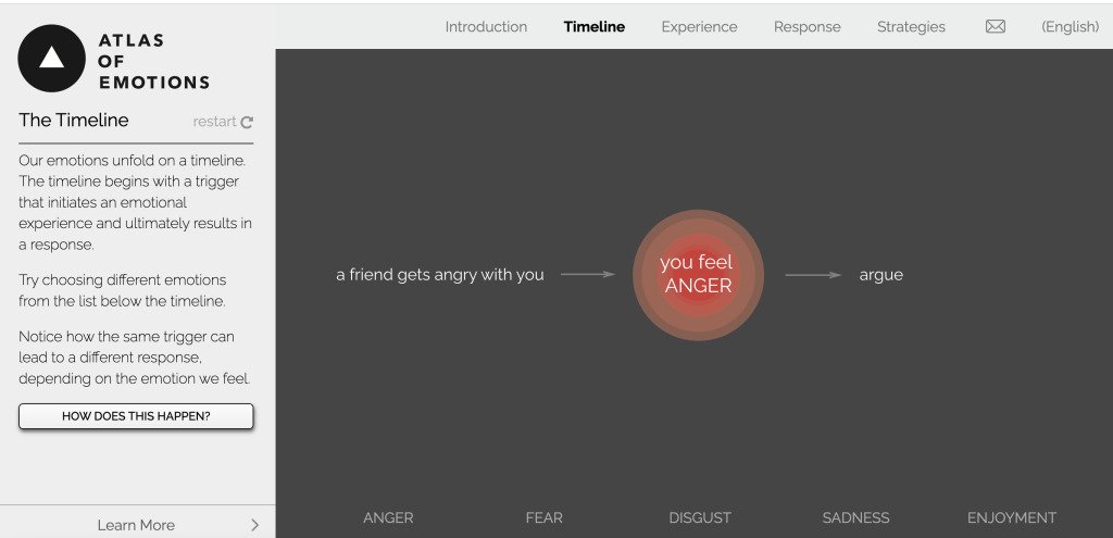


The Atlas of Emotion was commissioned by the Dalai Lama, his purpose is “ In order to find the new world we needed a map, and in order for us to find a calm mind we need a map of our emotions”. The simple, but not easy, goal of this Atlas is to help us be aware of our emotions. Awareness of our emotions means understanding how they are triggered, what they feel like and how we respond. Awareness itself is a strategy, it helps us understand our emotion experiences. We do not want to get rid of our emotions, we want strategies that help us respond in helpful, constructive ways.
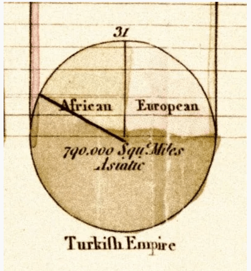
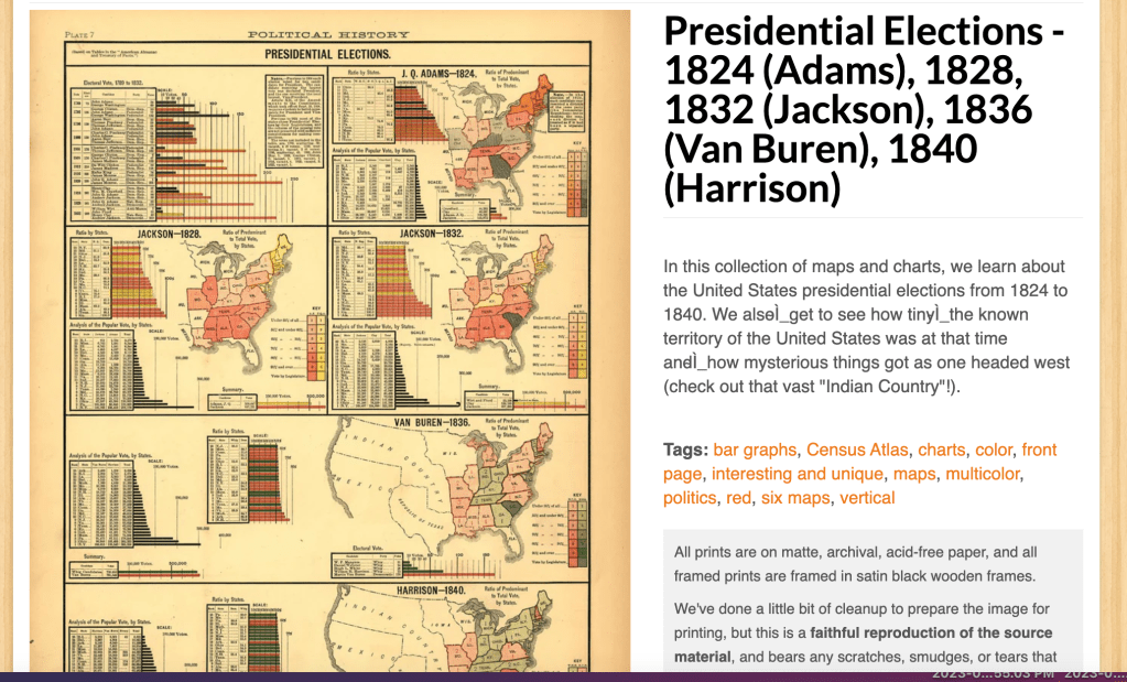
In this collection of maps and charts, we learn about the United States presidential elections from 1824 to 1840.
Webinar – Collecting and visualizing the unseen

When we work with data we should consider who’s true is, who’s perspective is?
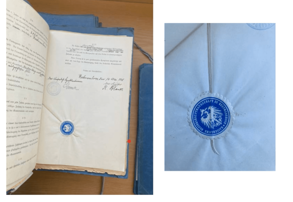
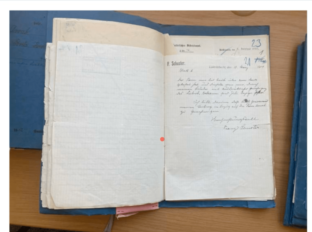
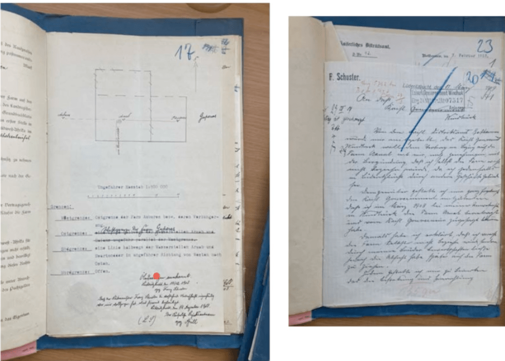
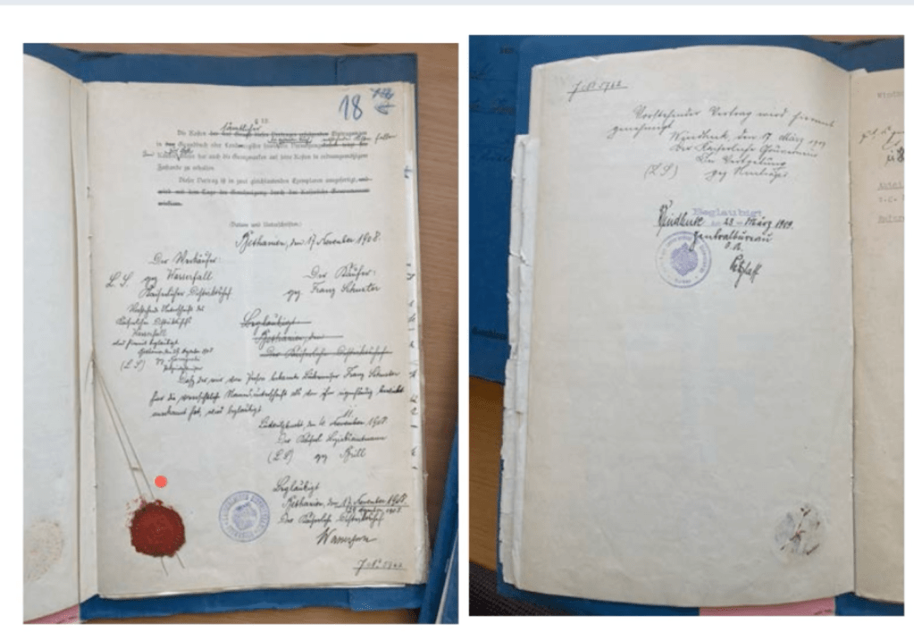
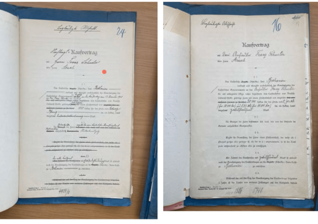
documents for sale of properties – to the Germans that have moved to South Africa


Workshop Challenge
it is 80% research and 20% design
Be critical!
Ask yourself if you had to work hard on order to understand the information r it was easy?
Once you’ve selected one piece of information graphics from the five pre-selected examples, we want you to analyse its effectiveness in revealing the story it’s trying to tell.
Ask yourself, did the information present itself to you immediately? Did you have to work hard to understand the information? Did you find out anything surprising about the information portrayed? We also want you to analyse the role that graphic design theory and practice has played in the production of these art works and also how that has helped reflect the information .
Once you have completed your analysis, we want you to write a 500-word synopsis of your research which must include visual references highlighted from your discoveries. This could be done as annotated notes or carefully edited image crops and captions to highlight your points, but whichever format you choose this is entirely up to you.
When articulating your analysis please try and remove yourself from the perspective as a graphic designer and instead look at the information portrayed with fresh eyes. As David McCandless points out, “a lot of graphic designers have the tendency to over visualise complex data without considering its effective communication and legibility.”
Once you’ve written your 500-word synopsis, we want you to present your findings as a piece of editorial design. The format of your editor tutorial design is up to you and can potentially reflect the subject of your chosen piece of information graphics. Remember to title your piece of editorial and include visual references and highlights of the piece examined. You may want to consider using annotations, captions, numbers and imagery to reflect your synopsis. It’s important that your piece of editorial design is clear and concise, but you should also have some fun with it too as we’re not limiting you to one or two pages. You could for example, design multiple amounts of pages and spreads.
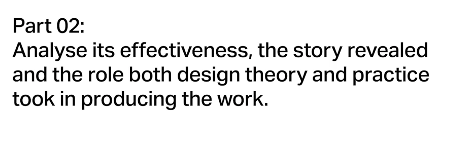
This example was created by Florence Nightingale in 1855 using the style she developed called the Rose Diagram, which has been noted before as quite reminiscent of polar area maps and diagrams.
Week 3. Big Data. Example #01
Florence Nightingale, Deaths from Disease (Rose Diagram, 1855)
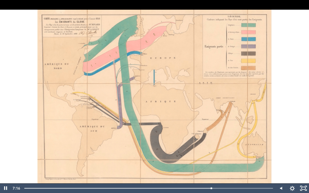
This second image was created by Charles Joseph Minard in 1858. You should already be aware of Minard, he’s a French civil engineer, recognised as the pioneer of information graphics as we’ve provided a bit of information about him in the read | watch | listen resource material, which is provided to accompany this week’s learning.
Week 3. Big Data. Example #02
Charles Minard, Global Immigration (1858)
This third example was created by the UK based design studio, Accept and Proceed. The studio have a tradition of creating beautiful data visualisation which they often release as limited edition prints. The most famous series is called The Light Calendars that depict the hours of light and dark for the forthcoming year, which they produced for 10 consecutive years. And, this one, as you’ll find out, is about the moon landings.

Week 3. Big Data. Example #03
Accept & Proceed, Moon Landings (2016) https://www.acceptandproceed.com/project/moonlandings
The fourth example is a website and app developed by Accurat Studio developed in close collaboration with Google News Lab. It was created in 2016 at the time of the US election. When you’re going through the PDF as well, please remember to click on the hyperlinks that I’ve provided and also click the animation videos, which will take you to the websites for closer examination.

Week 3. Big Data. Example #04
Accurat and Google News Lab, WorldPOTUS (2016) http://www.worldpotus.com
Lastly this is a slightly more abstract, playful example of information graphics, which was created by Dunne and Raby who used design as a medium to stimulate discussion and debate about the social, cultural and ethical implications of current and emerging technologies. Again, please remember to click on the hyperlink for this as it takes you through to quite an immersive website, which is about the projects. It also shows how they’ve created video installations based upon the research and data visualisation.


Leave a comment