This week we will learn:
- How to work with a data set, how to understand and build an information story or narrative.
- The importance of context, audience, truth and bias in an era of ‘fake-news’ and media manipulation.
- How you can effectively engage audiences in complex social issues and subjects – changing both perception and behaviour.
- How information design can help us better understand the past, the current times we are living in and anticipate future trends or needs.
- Also, throughout, you will see the need to consider our role – how we must collaborate with an array of experts and other fields in order to understand the data we are working with.
Understanding and knowledge is power – the ability to hold huge levels of information on populations can be both an empowering and emancipatory act, but it is also susceptible to manipulation and misuse. As we have seen with companies such as Facebook, holding so much data on individuals and groups of people gives these organisations immense power to influence the information we receive and the way that we understand the world around us.
I agree with this – we see how much of information came to surface after Elan Mask bought Tweeter – the American government was controlling the flow of information available to us.
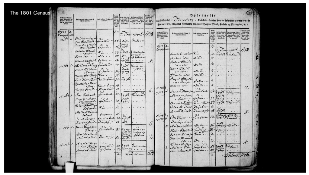
This is the oldest surviving public record in Britain, created in England in 1086 AD – the Domesday Book, also known as the Great Survey. Ordered by King William the Conqueror, it describes in immense detail the landholding and resources of late 11th century England. It is the first recorded demonstration of the power of the government machine, and its deep thirst for information. At a time of war, conquest and threats from overseas, this gave the administration of the country great power to know where resources lay, where taxes could be gathered and where the real interstices of power lay. This urgent record of the time, still legally active to this day, now acts as a fascinating record
Similarly, the first official country wide census in England occurred in 1801. This was again organised by the central government to obtain an accurate picture of a population at a time of an increased threat of invasion from revolutionary France. The obtaining of this information allowed officials to identify wealth, influence and individuals, which would allow it to exercise immense power over its population.
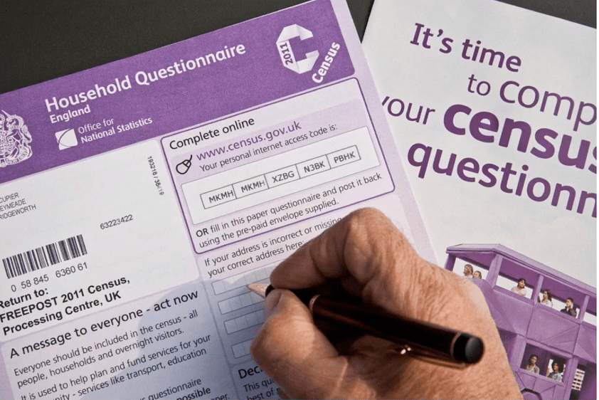
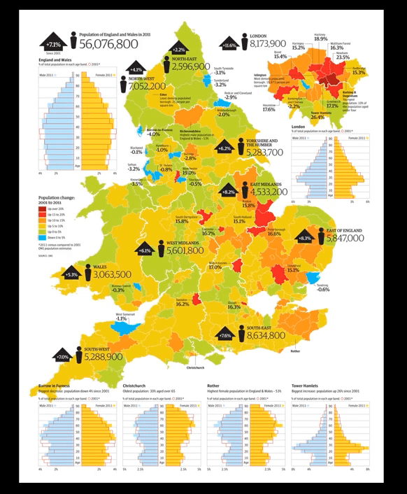
Today, most counties across the world still conduct a regular national census. In the UK, these are every 10 years – the last one in 2011. Asking about everything from income, sexual orientation, family relationships, workplace conditions, occupation and religious faith, it builds a complex picture of society.
This data is also then used by many organisations and media outlets to portray a demographic picture of population, migration, and often to talk about identity.
This image of former UKIP leader Nigel Farage in front of a 2015 General Election campaign poster clearly demonstrates the misuse of numbers, and statistics around immigration, to stoke a particular perception and politicization of demographic change.
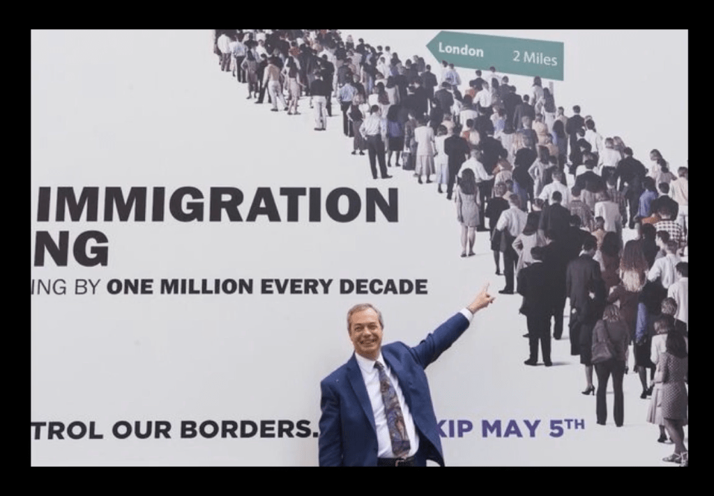
Without data analysts, statisticians or experts stood alongside this publicly available information. It is constantly susceptible to misappropriation, manipulation and misuse. We have become increasingly familiar with this in and around the Brexit ( Brexit is the name given to the United Kingdom’s departure from the European Union. It is a combination of Britain and exit.) referendum and with Trump’s election in the US.
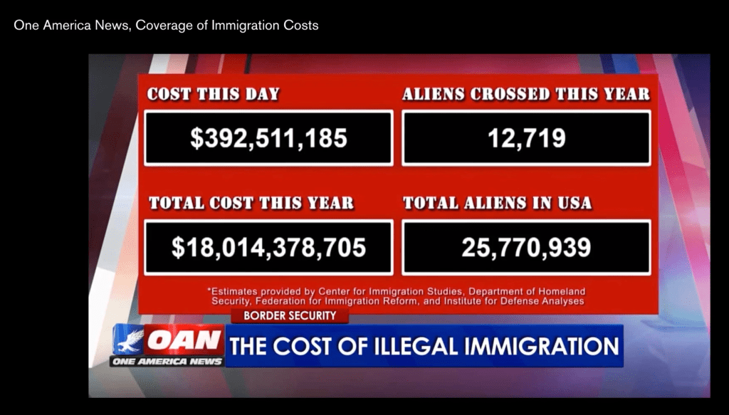
the Right wing American News network One America News pulls out complex and detailed information from a variety of sources and contextualizes them into this on-screen display of data, with no scrutiny or wider context provided.
Simplifying the debate and the emotive use of language of migrants as ‘aliens’, clearly fuels public fear of demographic change and immigration.
In the US, the next Census is due next year and there is increasing suspicion and fear in minority communities in the US in handing over information and power to a government many people no longer trust.
Ali Noorani, executive director of the National Immigration Forum:
“The immigrant community, documented or not, will think twice before sharing information with the government,” people who deem the citizenship question “data-based fearmongering.”
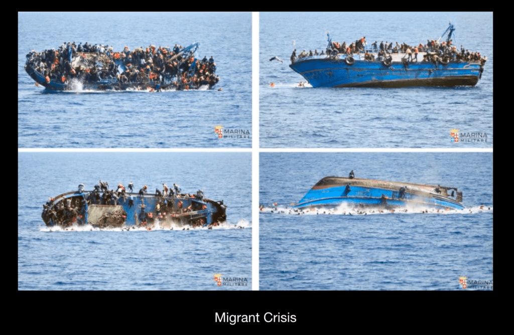
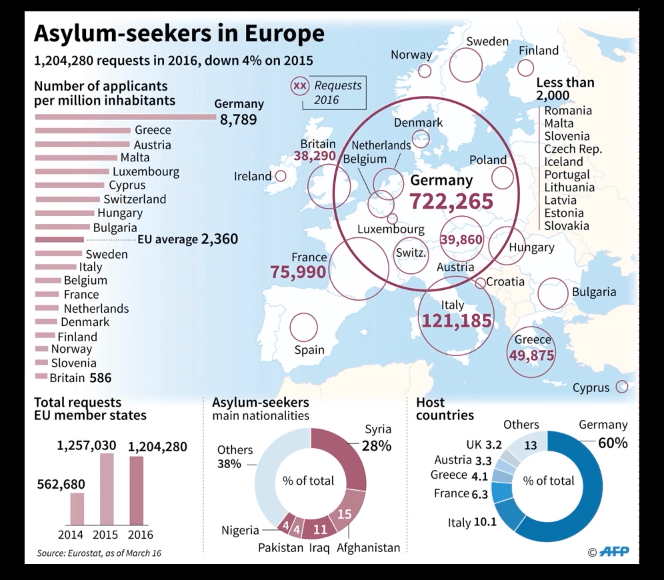
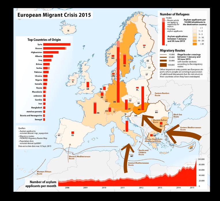
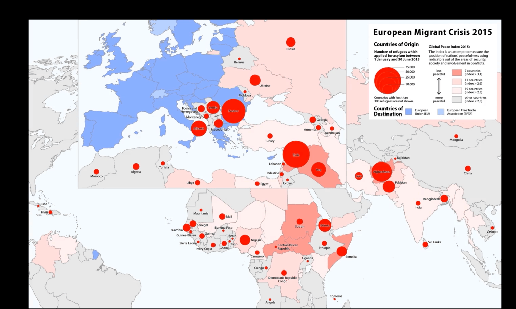
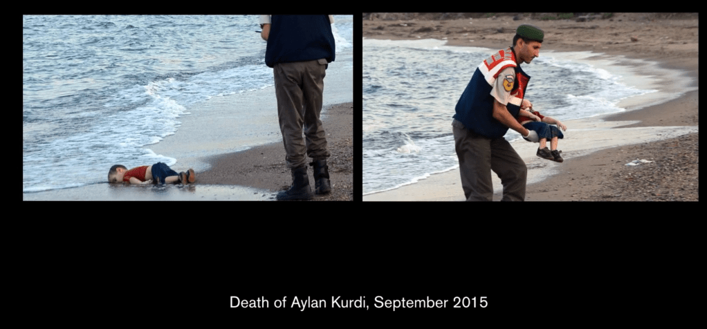
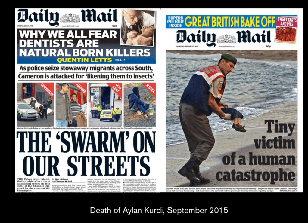
The migration and movement of people, with a particular focus on the horrific issue of the migrant crisis in Europe over the past few years, is a big issue. Scenes like these are all too familiar, yet social response and political action has been relatively muted, as thousands of people drown in our oceans in the pursuit of a better life.
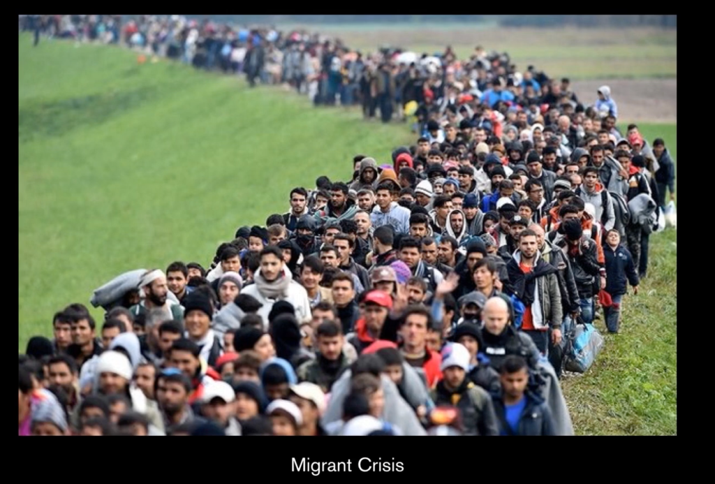
This human story, of people moving across Europe, is an emotive and highly charged issue in our current political environment.
These ‘visual essays’ are potent, analytical and transformative curated explorations of different issues and worth studying in more detail.
I like he called the infographics visual essays – I think that is one of the best description of it.
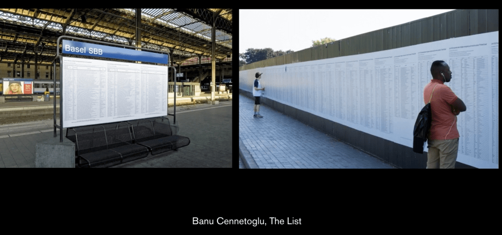
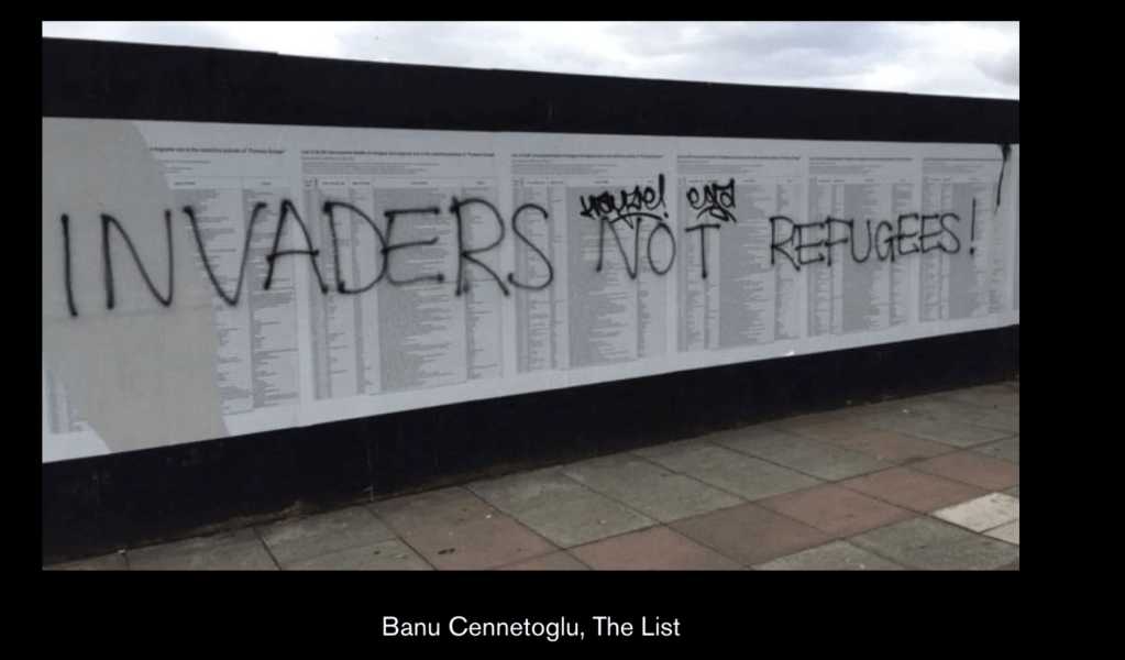
Artist Banu Cenetogluh, and her work titled The List, explores the migrant issues in an interesting way. In 2002 she discovered ‘the list’, which is a catalogue, made by volunteers, of those who had died in their attempt to make a new life in Europe. The list is one of the most powerful pieces of information design.

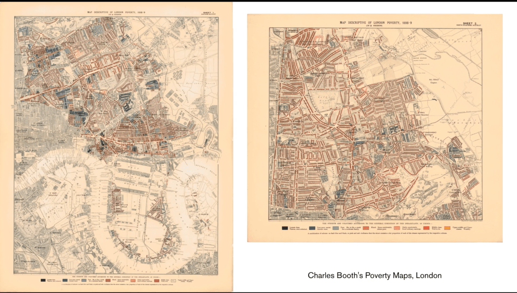
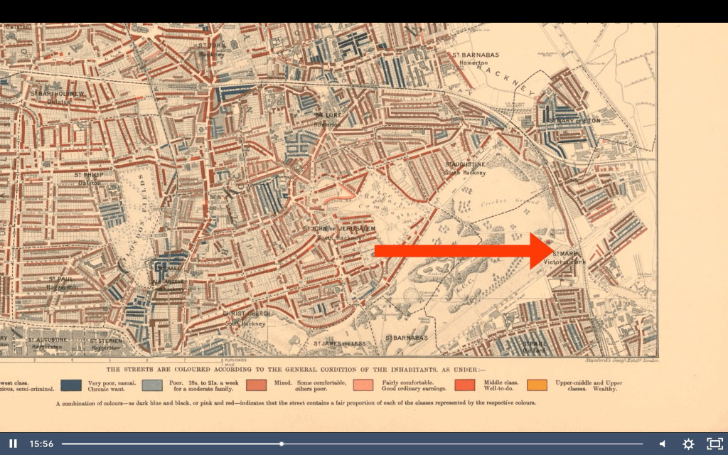
This example by English social researcher and reformer, Charles Booth, was an enquiry into life and labour in London between 1886-1903. An early example of social cartography, each street is coloured to indicate the income and social class of its inhabitants. Through direct first hand research and through detailed consultation with police records and residents, he mapped wealth and poverty throughout the streets of London.

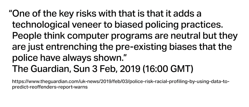
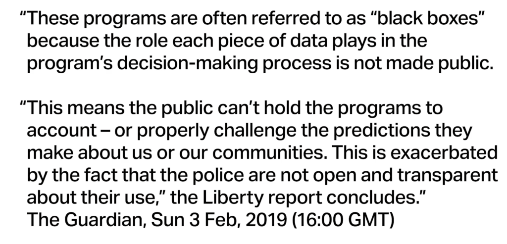
Much more recently, and somewhat controversially, UK police released crime data, creating online interfaces for people to discover levels of crime in their area or community
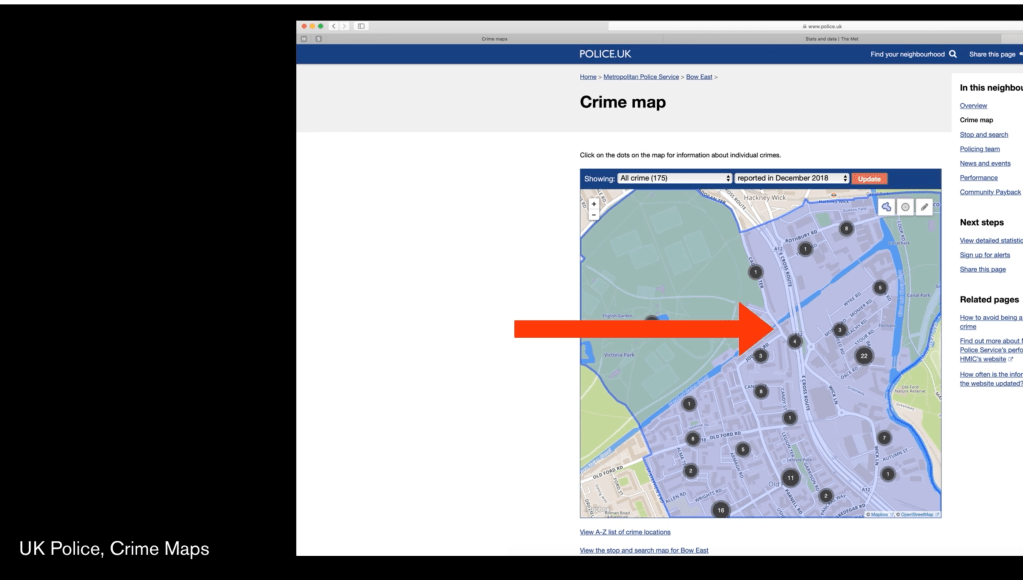
It became clear that the display of this data not only was for the ‘public-good’ but was also part of the police’s crime strategy, to not only map levels of crime but use this data to predict future criminal activity, and initiative preventative measures.
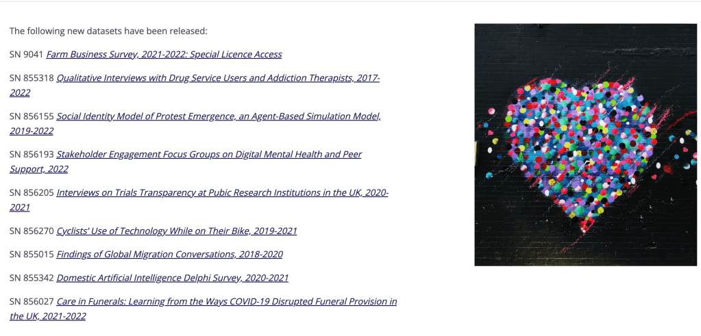
The UK Data Service holding huge amounts of data around governance.

This GitHub page contains a list of many interesting data archives by issue and subject, which might be helpful.
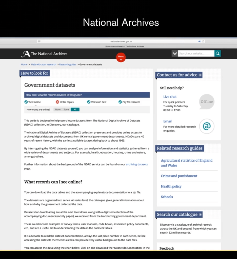
Also consider looking locally. Local government websites often contain fascinating and illuminating data about populations and communities where you live. The National Archives holds many historical data-sets and public information, which could also be an interesting place to look.
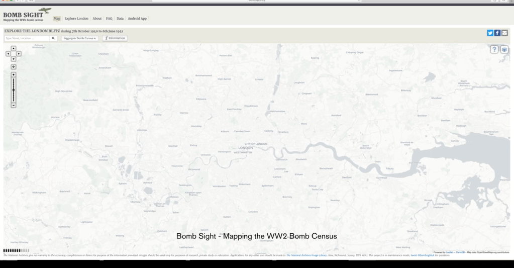
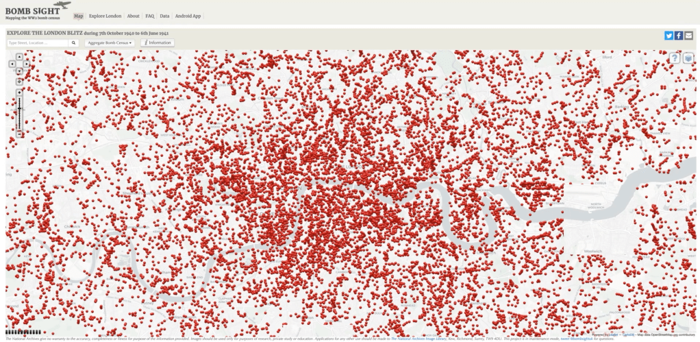
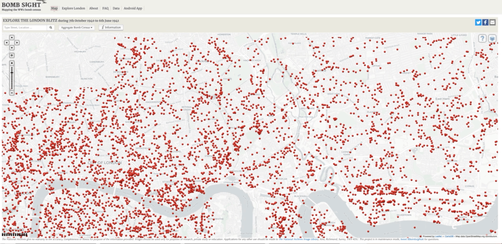
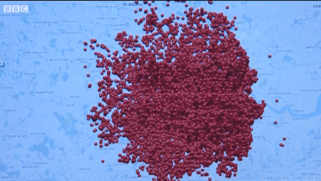
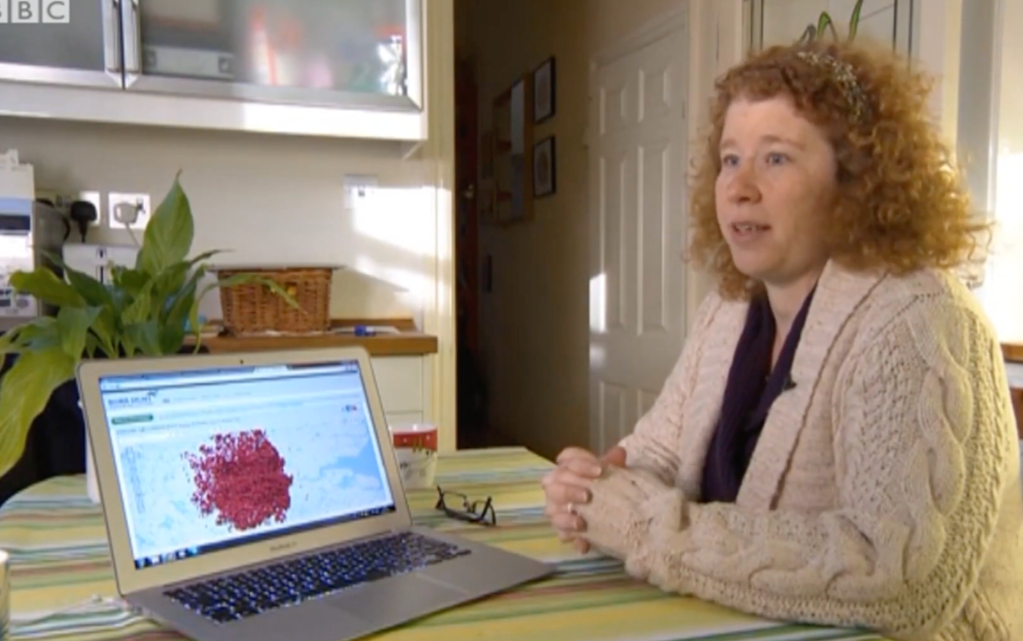
The project, called Bomb Sight, is built on data from the WW2 bomb census held in the National Archives. Organised by Dr Catherine Emma Jones, from the University of Plymouth – and working with a team of designers and developers – the project visualises bombs fallen during the Blitz in London, gathers complex data and observations, and gives it geographic and interactive form.
Not only does this information illuminate the sheer scale of bombing, it brings in photographs, stories and narratives, openly available now to the public, affecting understanding of what happened and the fabric and history of the city itself.
(The Blitz was a German bombing campaign against the United Kingdom, in 1940 and 1941, during the Second World War. The term was first used by the British press and originated from the term Blitzkrieg, the German word meaning ‘lightning war’.)
https://en.wikipedia.org/wiki/The_Blitz
Data analysis can not only help us understand history, it can help us interrogate more recent events and situations. It can assist in the investigation of political issues, disasters and events.
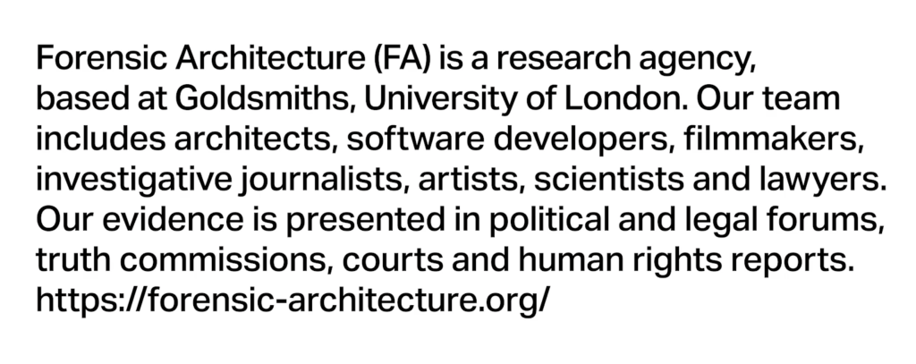
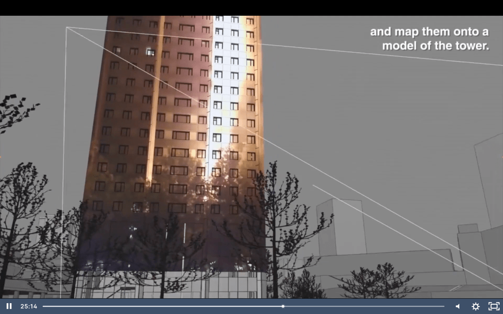
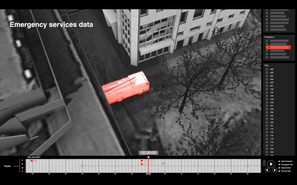
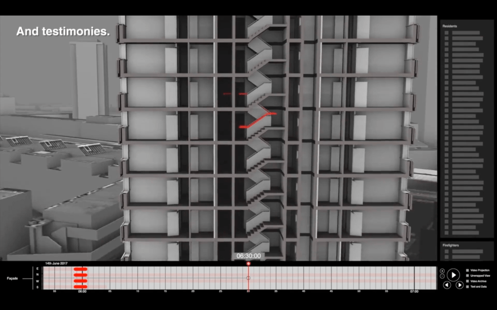
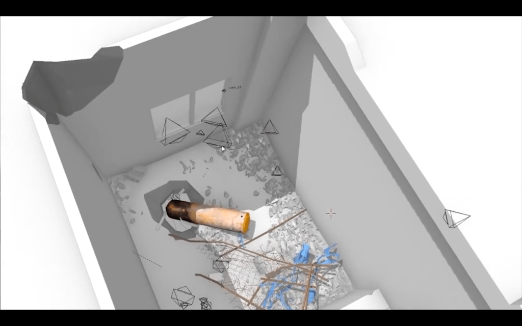
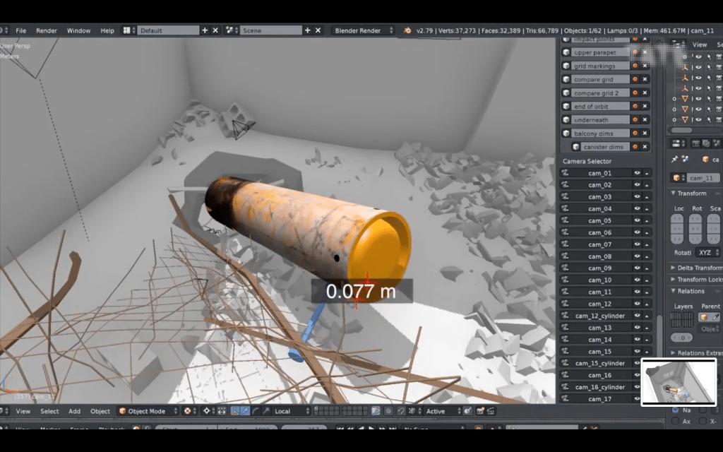
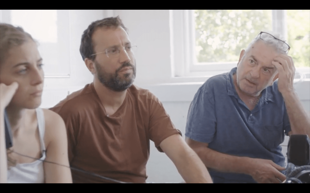
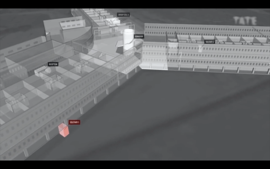
Independent research agency, Forensic Architecture, offers an interesting take on the purpose and role of data analysis and information design. Using urban and architectural research methodologies, it investigates sites of conflict, human rights abuses and breaches of international law.
Made up of interdisciplinary team of investigators, including architects, scholars, artists, filmmakers, software developers, investigative journalists, archaeologists, lawyers, and scientists, they visualise this evidence, which is then presented in political and legal forums, truth commissions, courts, and human rights reports.
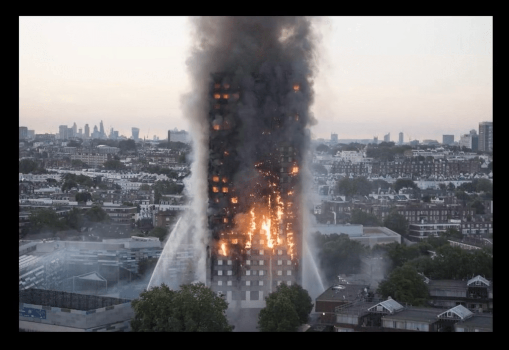
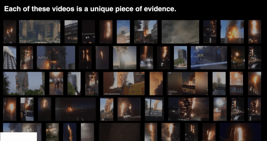
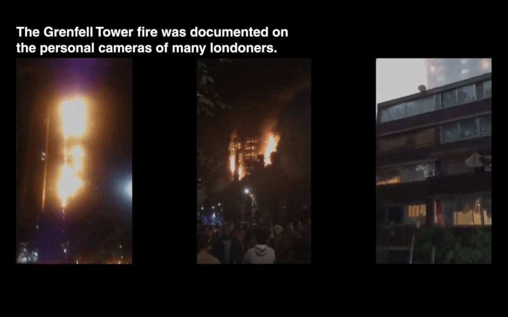
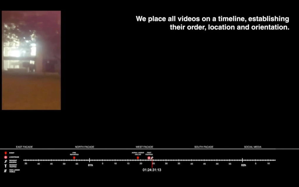
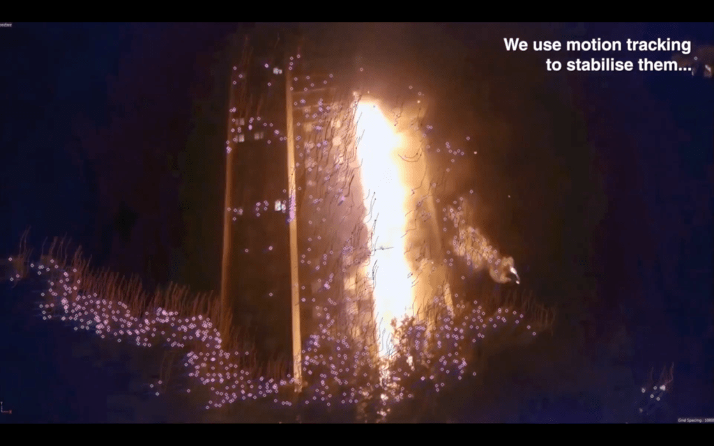
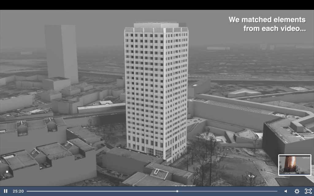
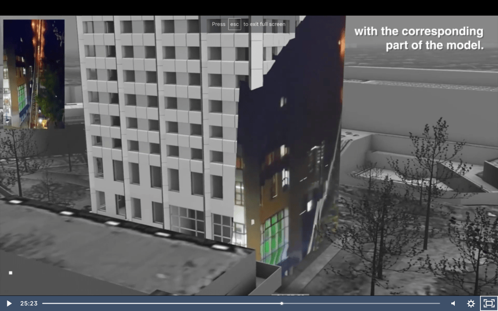
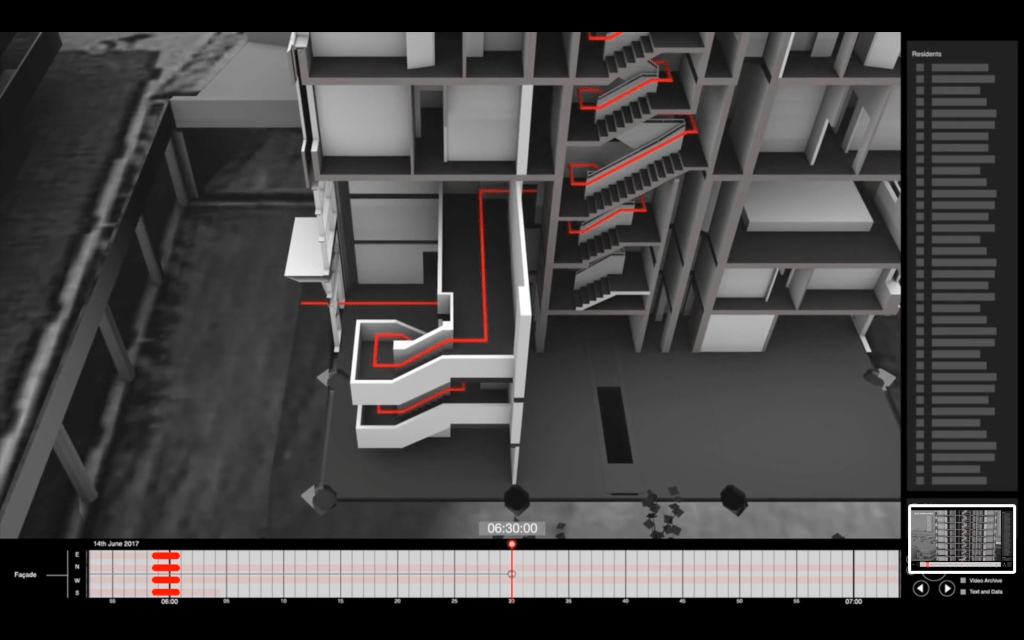
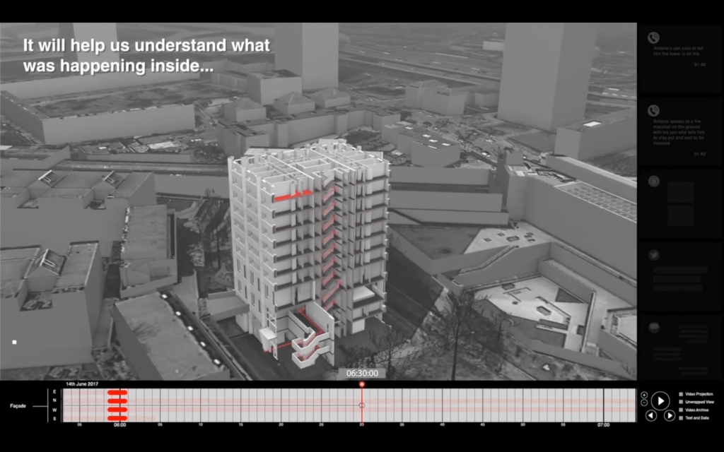
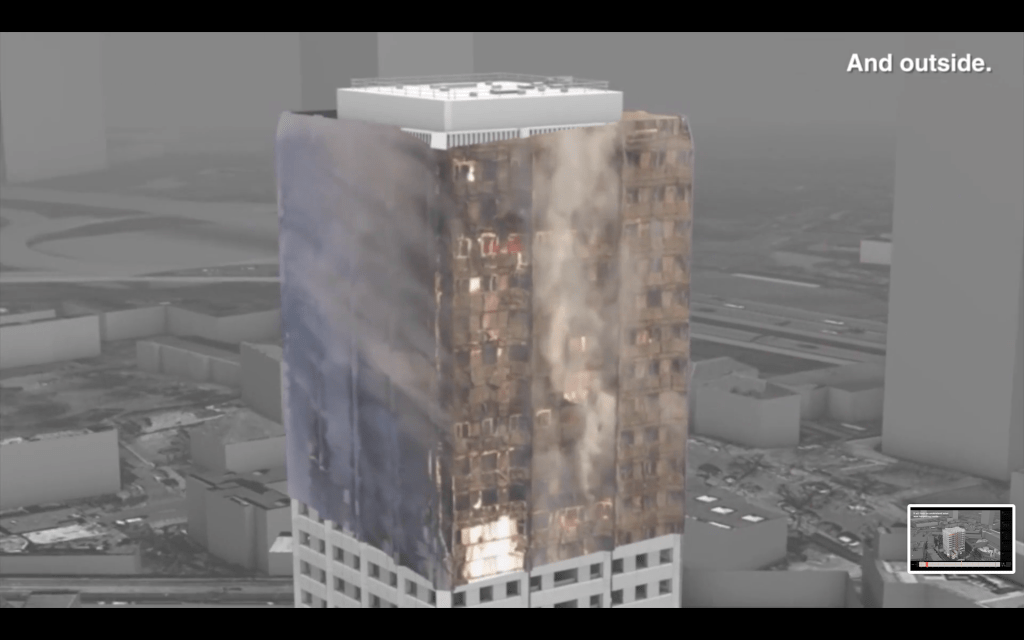
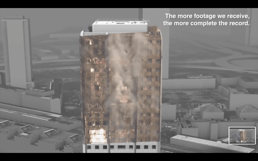
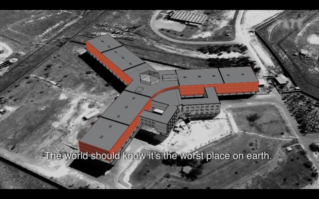
A recent project it has launched, focusing on the Grenfell Tower tragedy, aims to create a powerful and freely-available resource for members of the public to explore and better understand the events of the night of the fire.
By inviting members of the public to submit their video footage of the fire, they intend to build a complex and evolving picture of what happened and why.
The fire which destroyed Grenfell Tower in June 2017 was one of the UK’s worst modern disasters.
Just before 01:00 on 14 June, fire broke out in the kitchen of a fourth floor flat at the 23 storey tower block in North Kensington, West London.
Within minutes, the fire had raced up the exterior of the building and then spread to all four sides. By 03:00, most of the upper floors were well alight.
Seventy-two people died.
https://www.bbc.com/news/uk-40301289?zephr-modal-register


Eyal Weizman, of Forensic Architecture, describes the purpose in an interesting way. He says “Being an architect isn’t only about whether you take this or that commission, the morality of this or that project, but a way of acting politically as a citizen in the world. And of understanding the world through architecture in a way that other frameworks don’t allow.”


“…It is about making your audiences think, making the viewer wake up….and how the presentation can make a difference”
These can be applied in different sectors:
As Edward de Bono stated in 1979, “Studies have shown that 90% of error in thinking is due to error in perception. If you can change perception, you can change emotion.” This can lead to new ideas and realities emerging.
For the graphic designer, as for the researcher or the analyst, how we convey information, how we understand bias and truth, and how we engage audiences and the public in these information narratives is of critical importance.
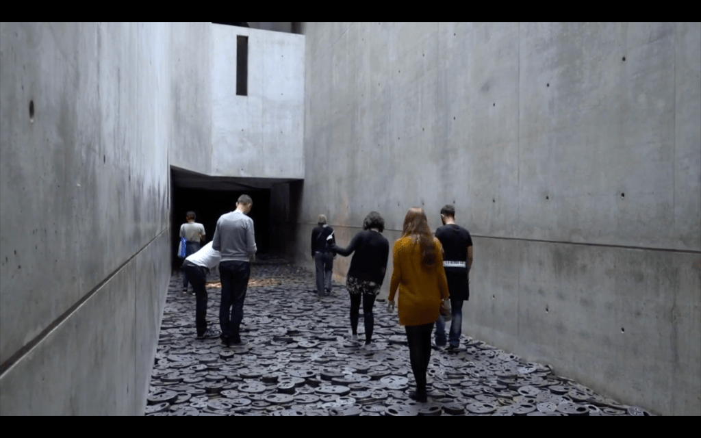
The project, called Fallen Leaves, by Artist Menashe Kashiman at the Jewish Museum in Berlin, is an interesting way of representing victims of violence and war. Rather than graphs, statistics or information displays, it asks visitors to walk over, heavy iron plates with faces cut into them, representing those that have died. The noise that the act of walking over the faces on the floor not only places the audience directly within this piece of work, it also evokes violent, clashing, memories of war and destruction.


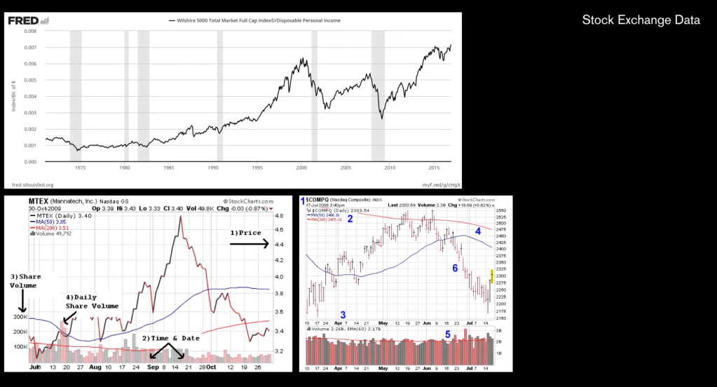
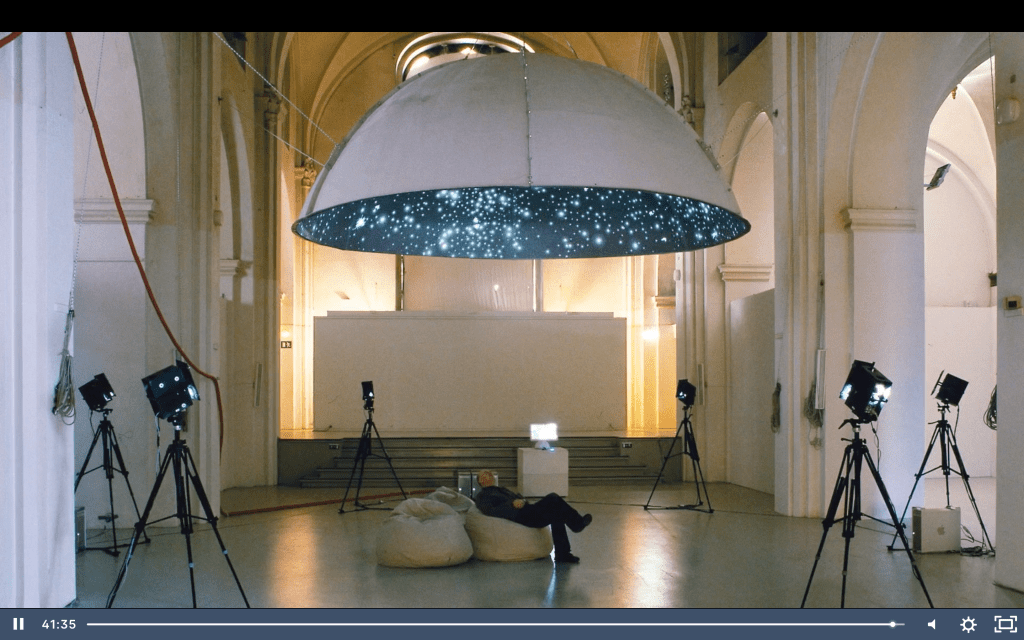
The Black Shoal is a project that takes live data from the Stock Market and transforms that data into an immersive planetarium, taking dense financial data flows and translating them into reactive and beautiful constellations.
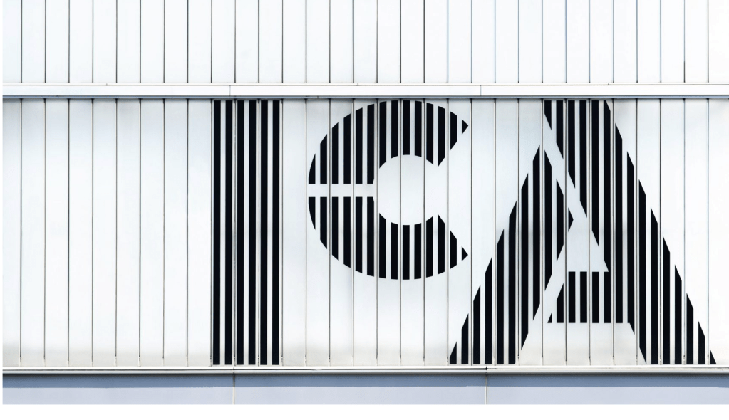
https://www.dezeen.com/2018/12/11/ica-boston-logo-rebrand-pentagram/


Leave a comment