This week we explored the genre of written communication and design and specifically graphic designers who write. We also examine the interrelationship between critical writing and design.
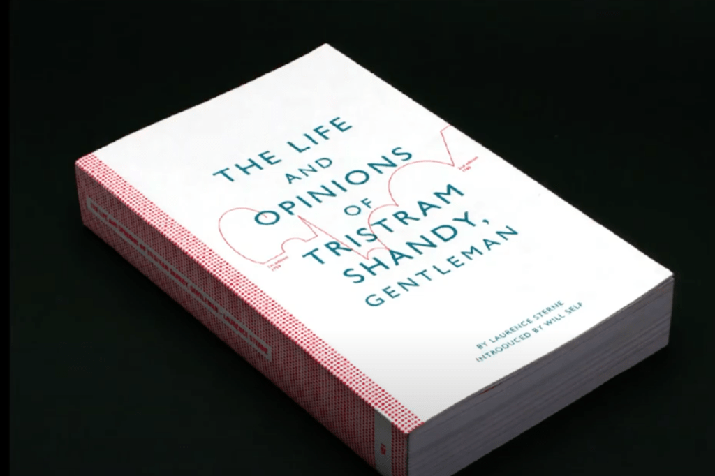
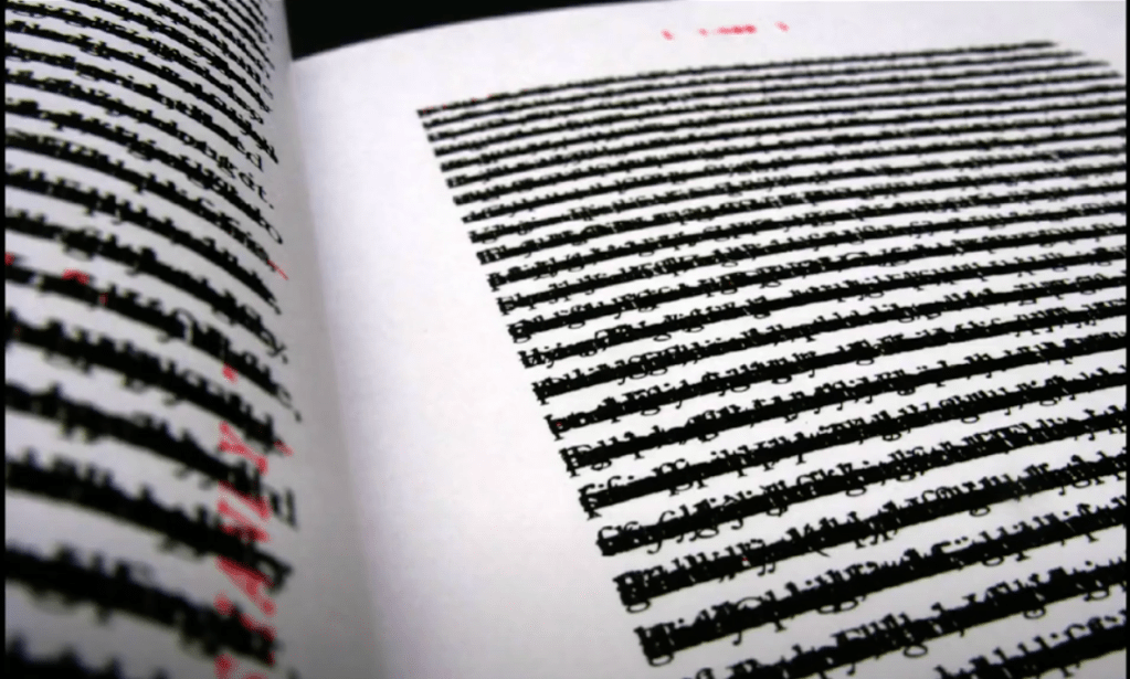
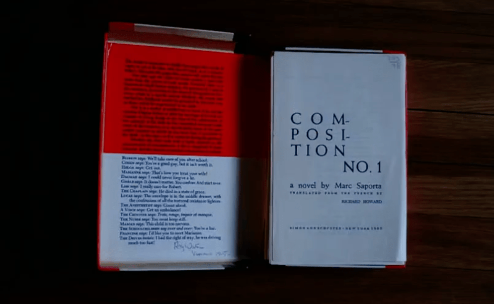
TOC 2011: Anna Gerber & Britt Iverson, “Visual Editions: Part Revolution, Part Reinvention…
I like what they said:”We want to give people a surprise…we want our books to have rigorous and craft…we believe in the power of books”


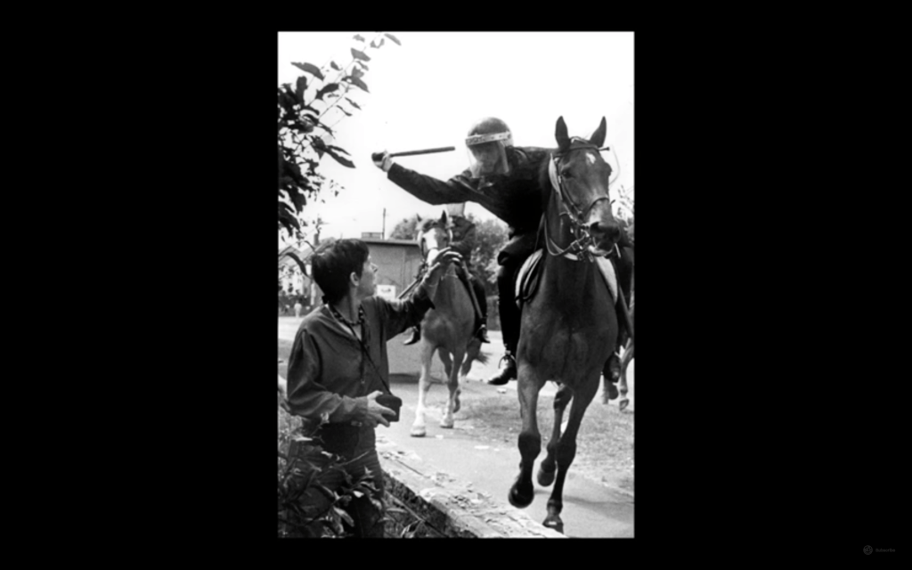
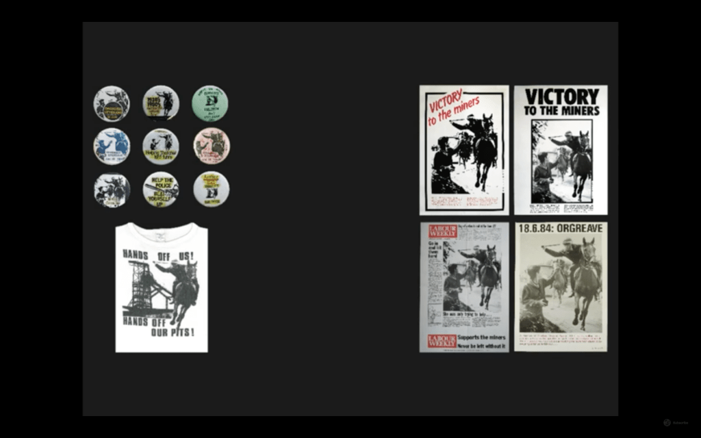
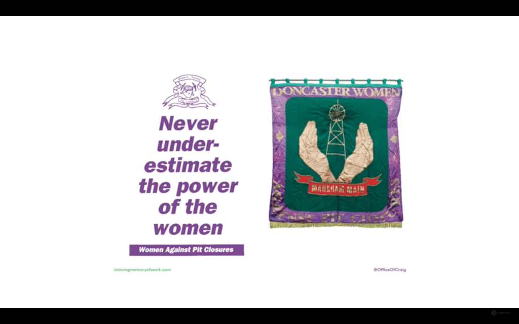
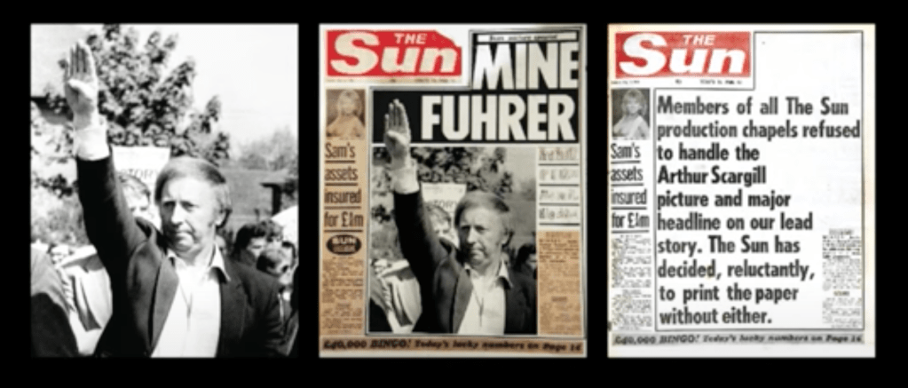


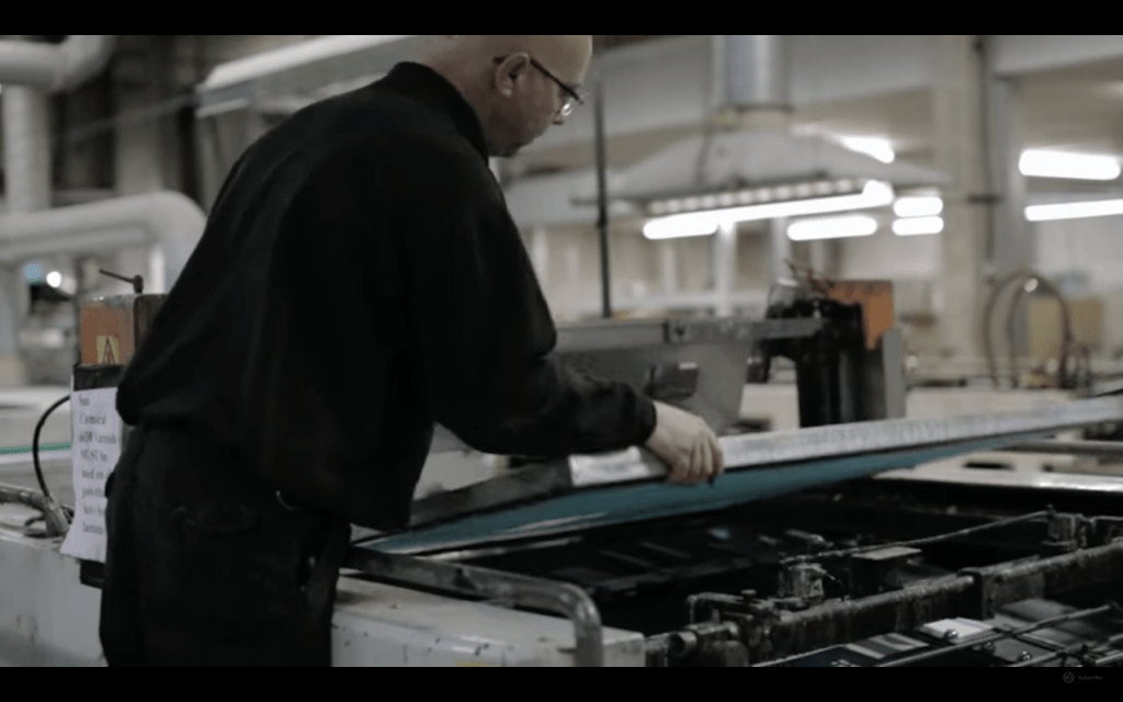
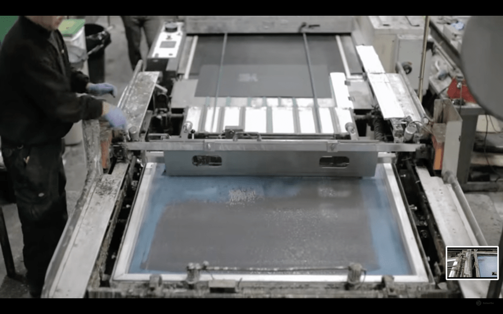
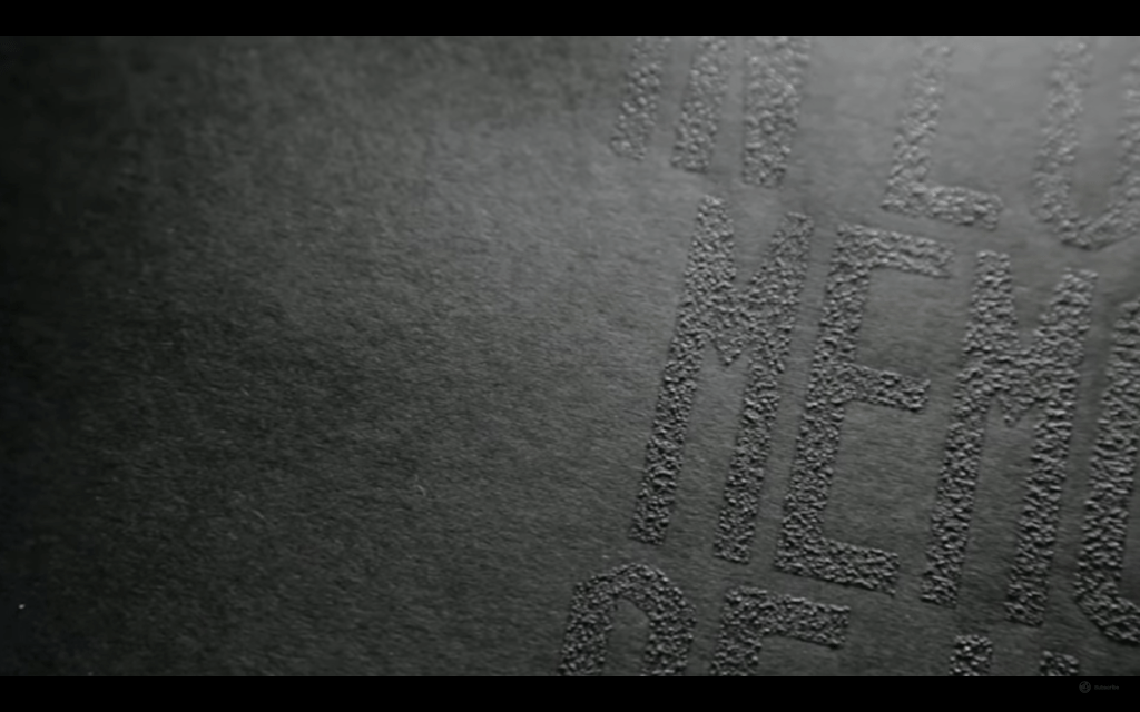
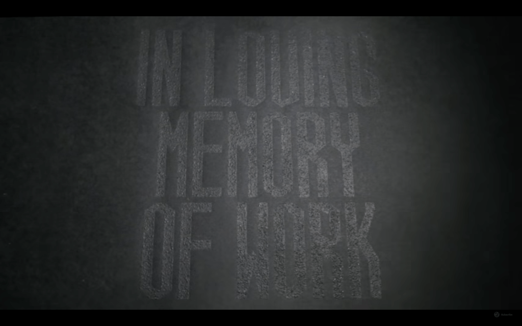
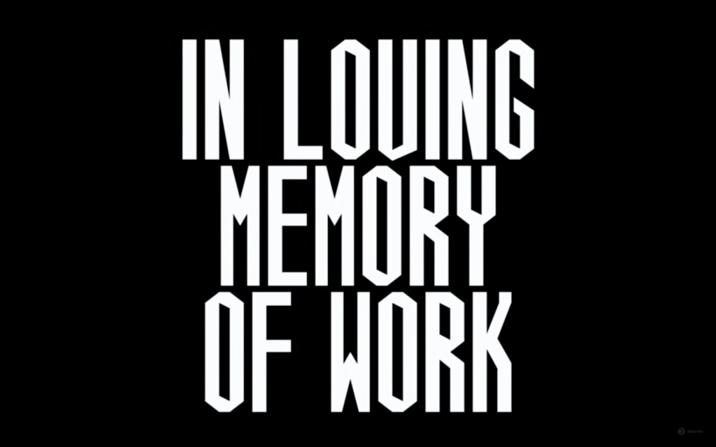
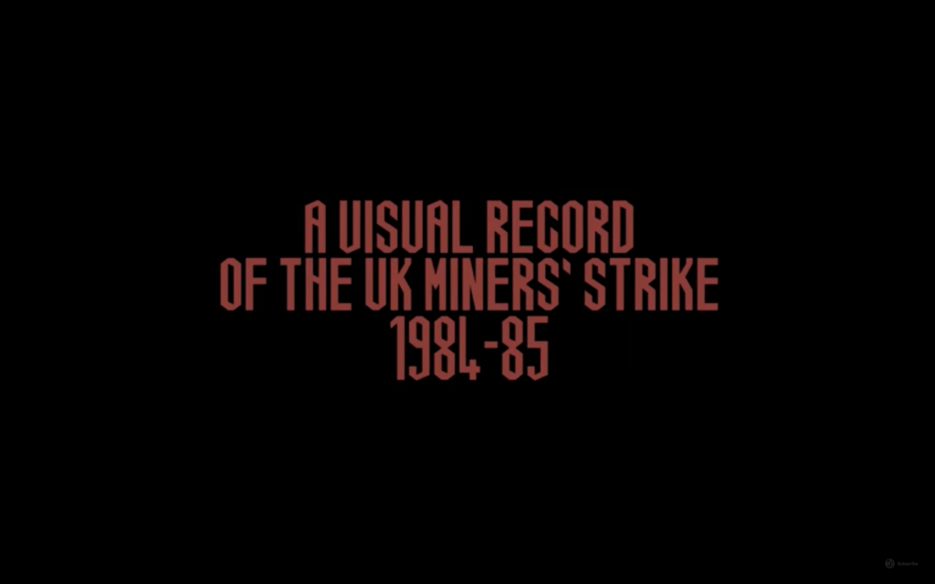
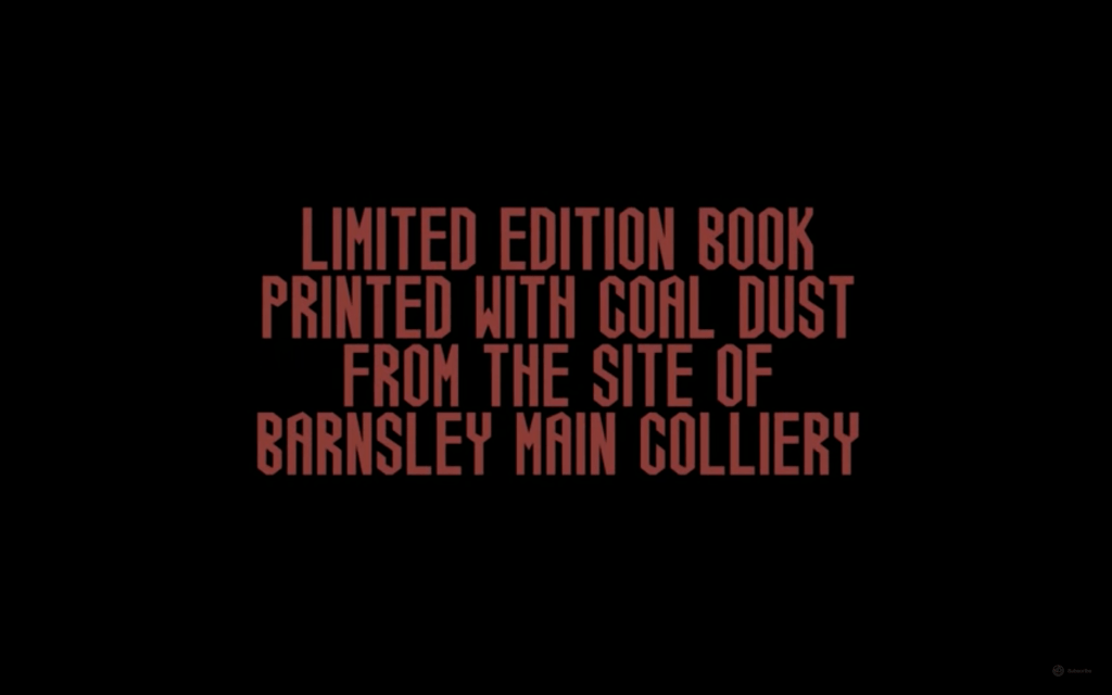
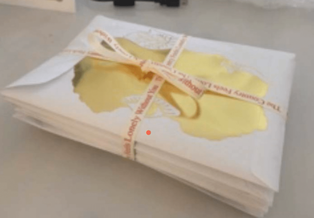
https://www.inlovingmemoryofwork.com/
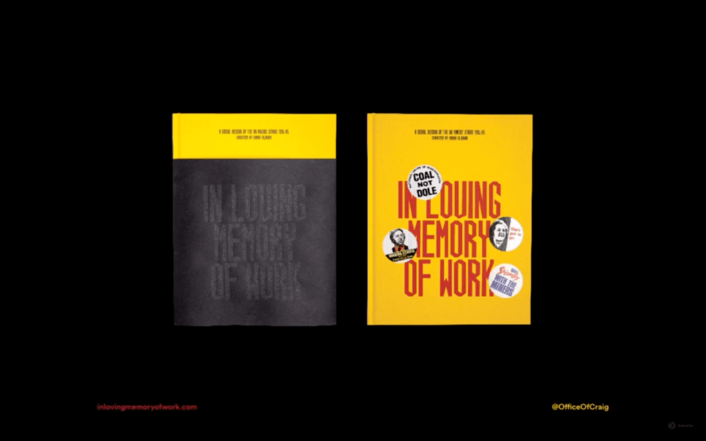
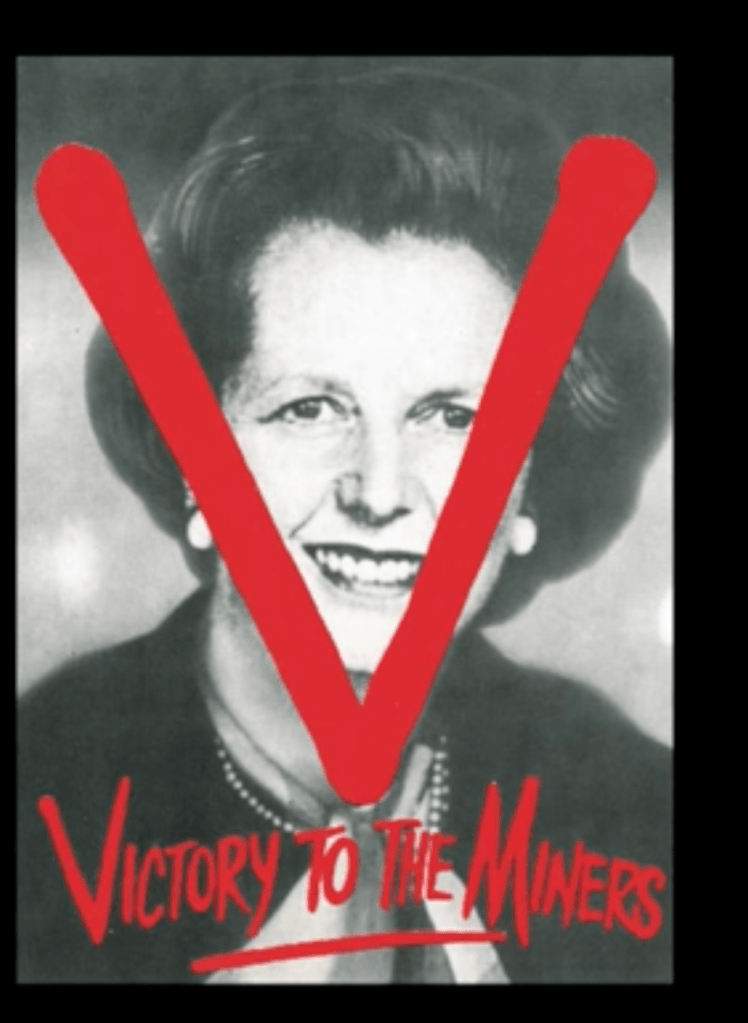
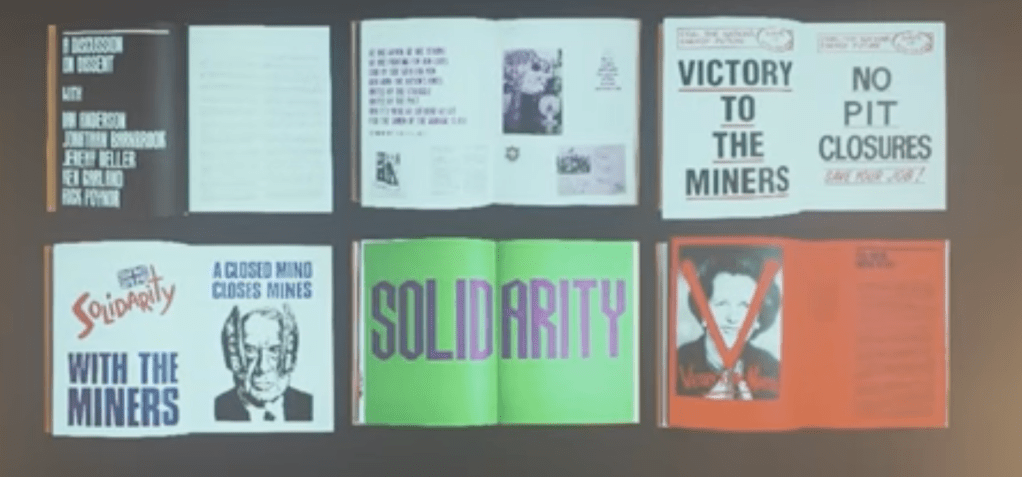
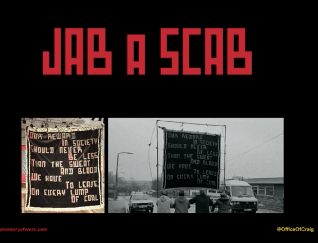
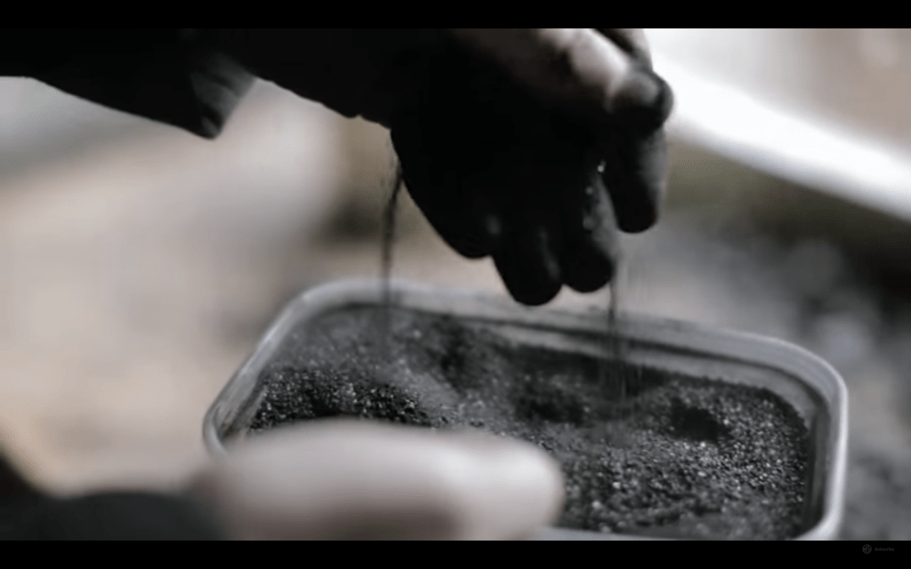
It is amazing – so clever – they use coal dust for the cover page – sending the message that coal is alive.
“THE ORGREAVE TRUTH & JUSTICE CAMPAIGN
In Loving Memory of Work is proud to support the Orgreave Truth and Justice Campaign as they seek truth and justice for all miners victimised by the police at the Orgreave Coking Plant, South Yorkshire, on June 18th 1984.
Orgreave is part of the pattern of cover-ups and lies by the police from many different forces, which are now being exposed. The OTJC call for a full public inquiry, to take place as soon as possible, into the policing and subsequent statements recorded by the police at the time.
We ask that everyone who seeks the truth and wants justice to support us in our campaign.”
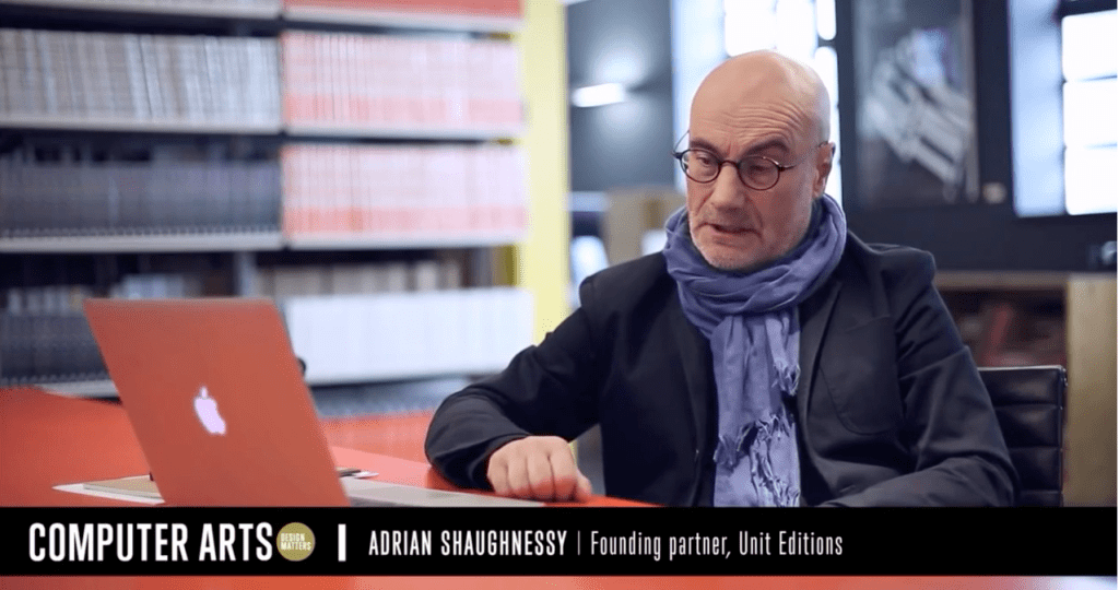
Adrian Shaughnessy – The graphic designer as writer, editor and publisher
https://designobserver.com/podcast-the-observatory.php
The Observatory
Michael Bierut and Jessica Helfand discuss, design, current events, and current enthusiasms.
They open their own agency -so, they could set the rules for publishing
He talks about the importance of the social media – as a distributor.
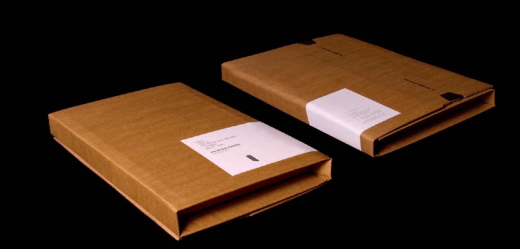
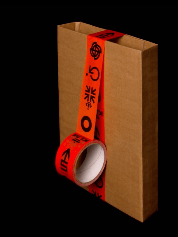
Because thee audience is designers, they think want to packaging to look better – so, when it arrives, will give pleasure to the designer.
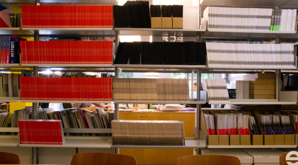

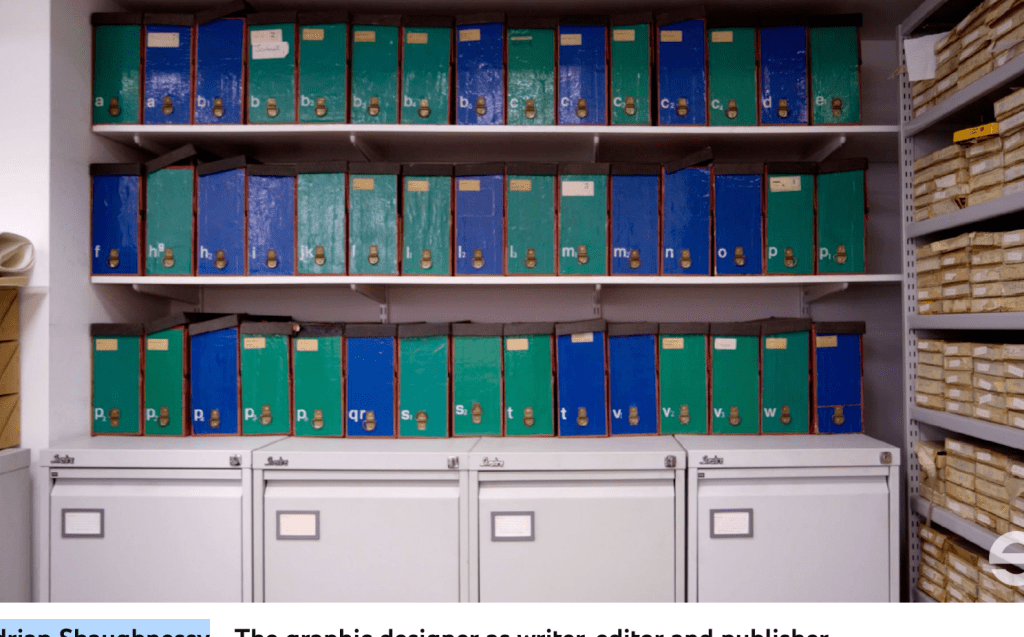
Because the books were about the design, he had to visit a lot of archives (places were they store everything…)

https://www.logohistories.com/p/the-lightning-bolt
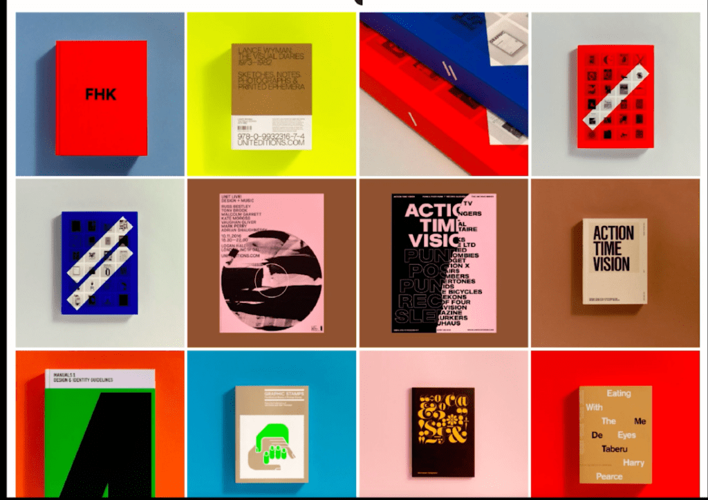
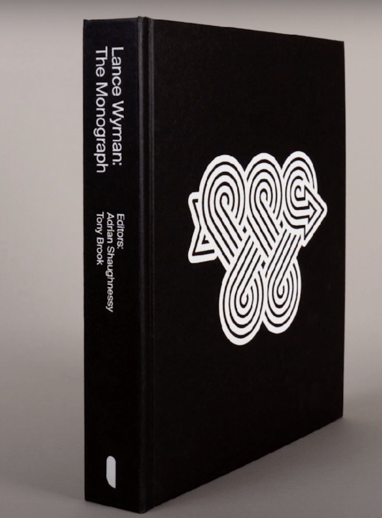
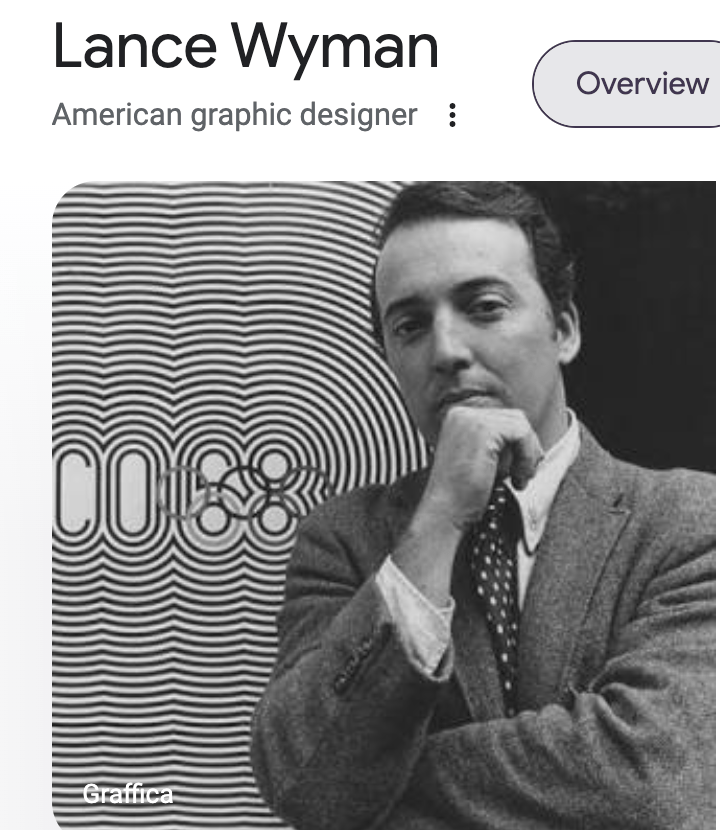
“Graphic designers are often capable of more than just graphic design. The graphic design sensibility and skill set are surprisingly well suited to a wide range of activities. Primary amongst these is the practice of writing, editing and publishing. In his talk, graphic designer Adrian Shaughnessy describes how he has expanded his practice to include these disciplines. Shaughnessy explains how many of the skills and experiences he acquired as the creative head of a graphic design studio for 15 years (Intro) enabled him to build a parallel writing and editing career, which he has subsequently expanded into a publishing company – Unit Editions. The imprint is now seven years old, and has published over 20 titles on graphic design and visual culture. In his talk, Shaughnessy describes the journey he has undertaken, and how despite radically changing his career path, he retains the outlook of a graphic designer. Adrian Shaughnessy: Adrian Shaughnessy is a self-taught graphic designer. In 1989 he co-founded the design group Intro. Under his creative leadership the studio won numerous awards. In 2004, Shaughnessy left Intro to pursue an interest in writing and lecturing, and to work as an independent design consultant. His book How to be a Graphic Designer Without Losing Your Soul has sold 80,000 copies to date. Shaughnessy writes regularly for all the leading graphic design journals. In 2010 he was elected to Alliance Graphique Internationale, the invitation-only organisation comprising the world’s leading graphic designers. He hosts an occasional series of radio shows on ResonanceFM called Graphic Design on the Radio, and is co-founder of the publishing imprint Unit Editions. He is the author of monographs on Herb Lubalin, Ken Garland, FHK Henrion and most recently Lance Wyman. He is a senior tutor in Visual Communication at the RCA.”
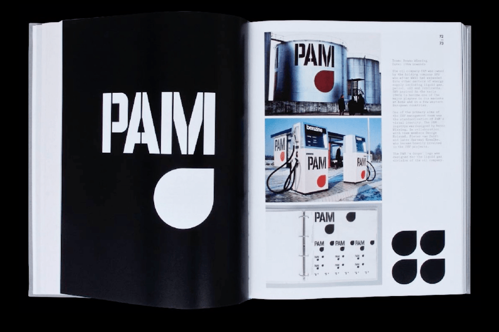
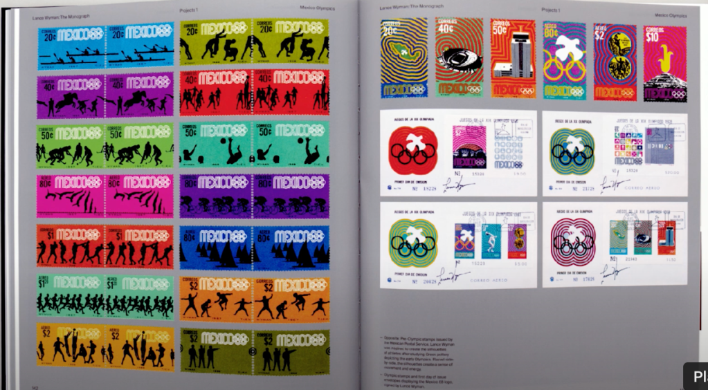
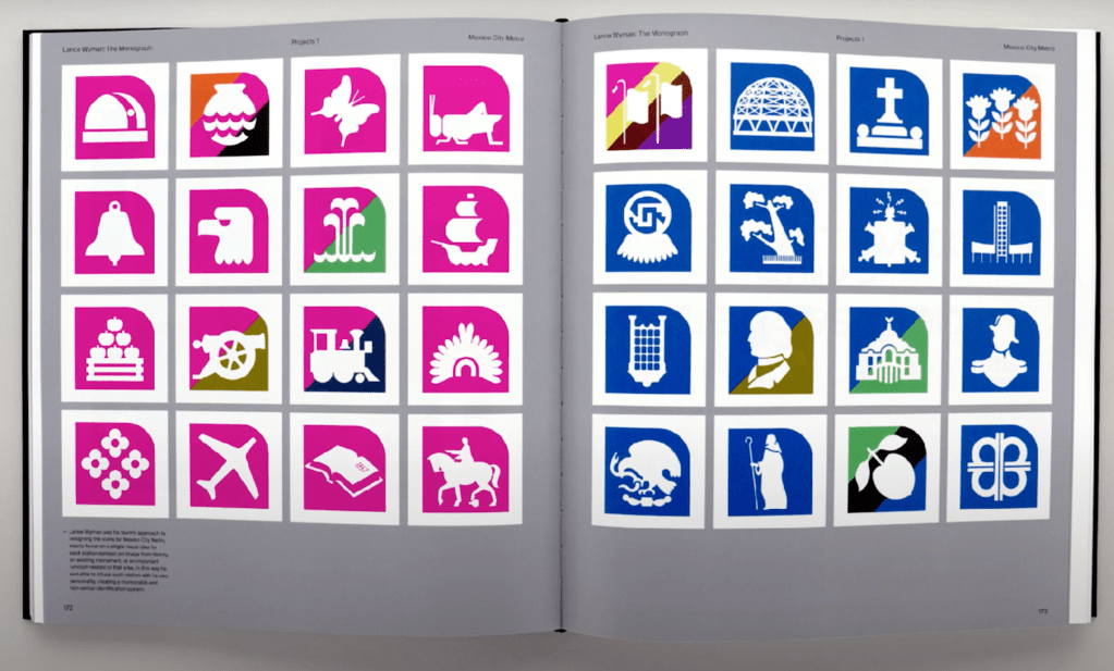
He talks about Lance Wyman – he admires the clarity and the simplicity. He also admires his discipline – every day after finish his work, he will put everything in a sketch book.
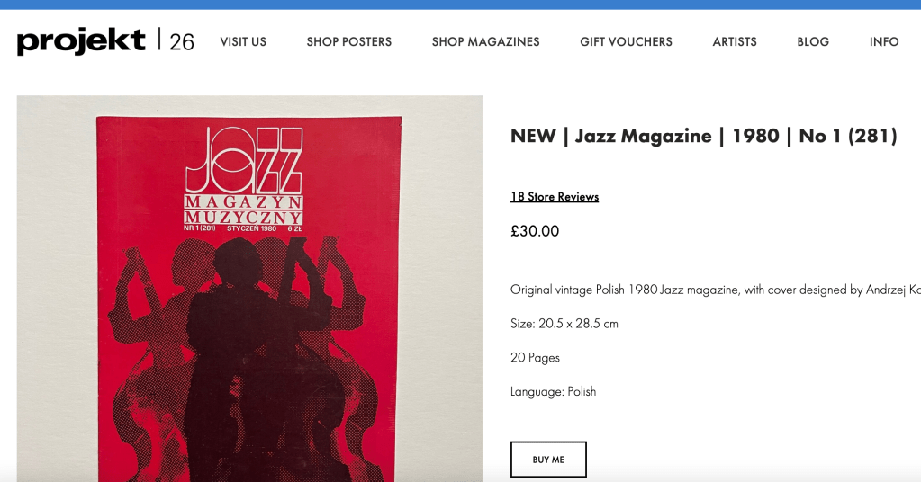
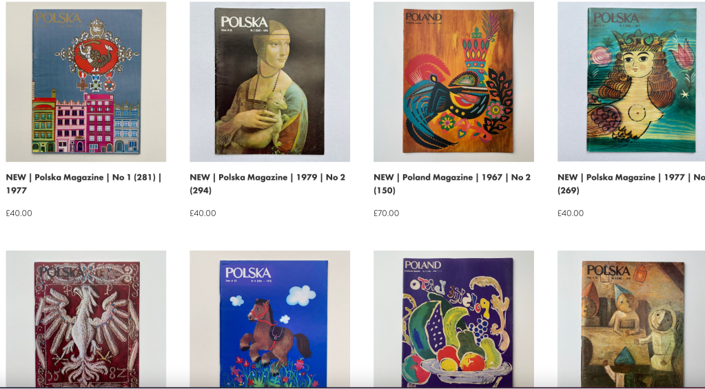
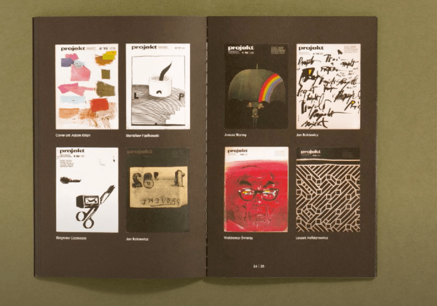
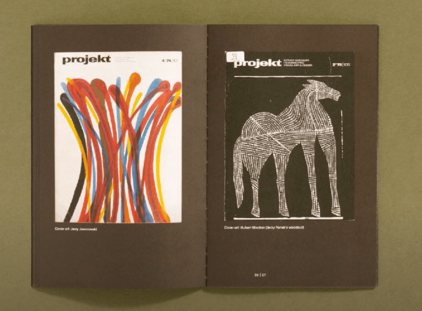
They also did a lot of research for graphic design magazines – every country has at least one. The earliest were from 1920-1921 (dutch magazines).
He also talks about the polish magazine (I think Prolet or Project)
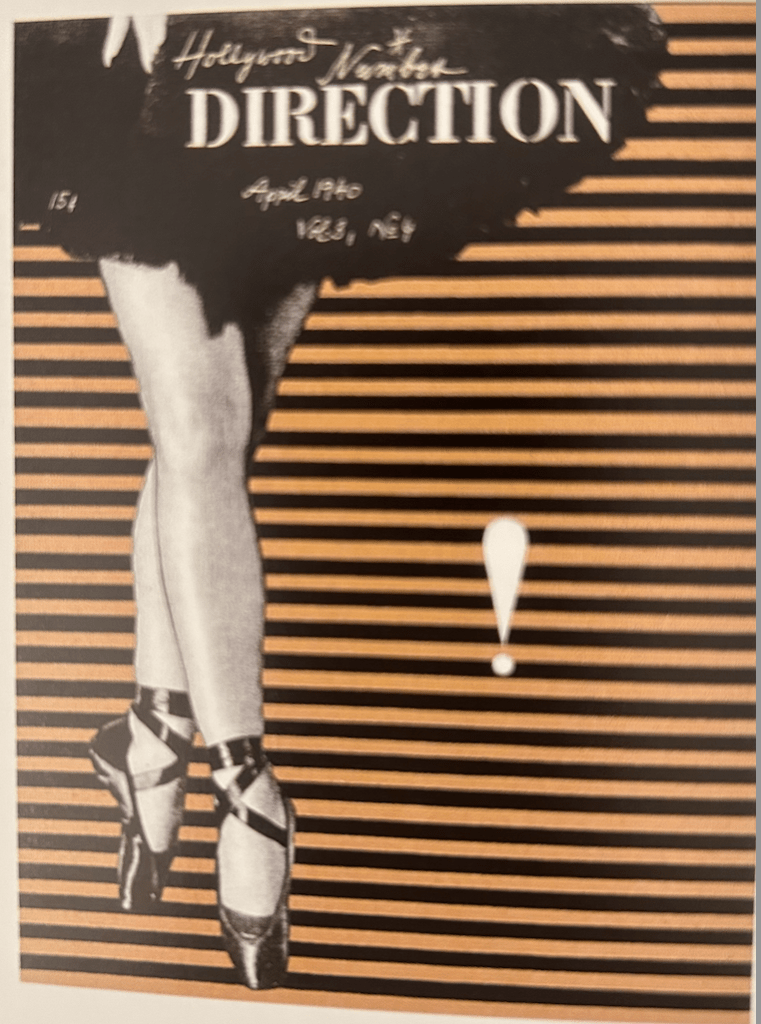
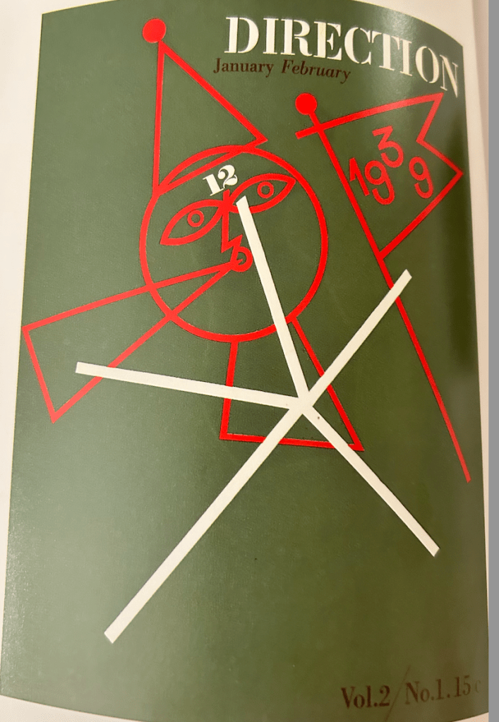
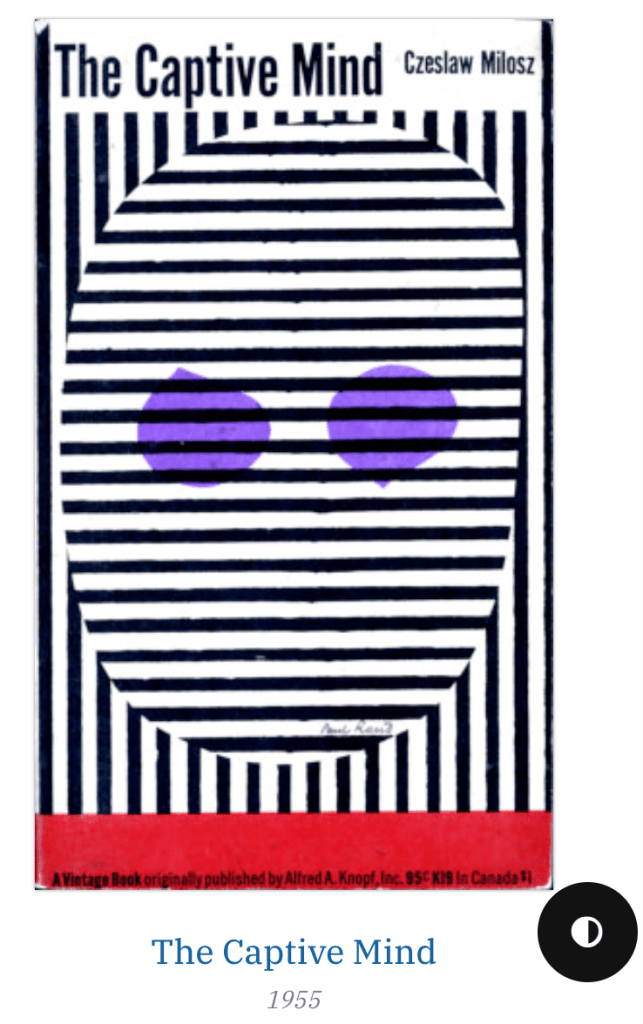
Week 5: Lecture by Stuart Tolley
“The genre of written communication and graphic designers who write is influenced by the creation of art manifestos, books and periodicals that were published to propagate opinions about modern art and encourage lively debate to discuss the burgeoning relationship between art, design and society or politics.
One of the most revolutionary, and arguably influential periods for the development of artist publications and manifestos was before and during the first world war, which started in 1914.
This was an era of widespread civil unrest – especially in Europe – political instability, provocation and modernisation, which culminated in prejudice, division and ultimately destruction and war.
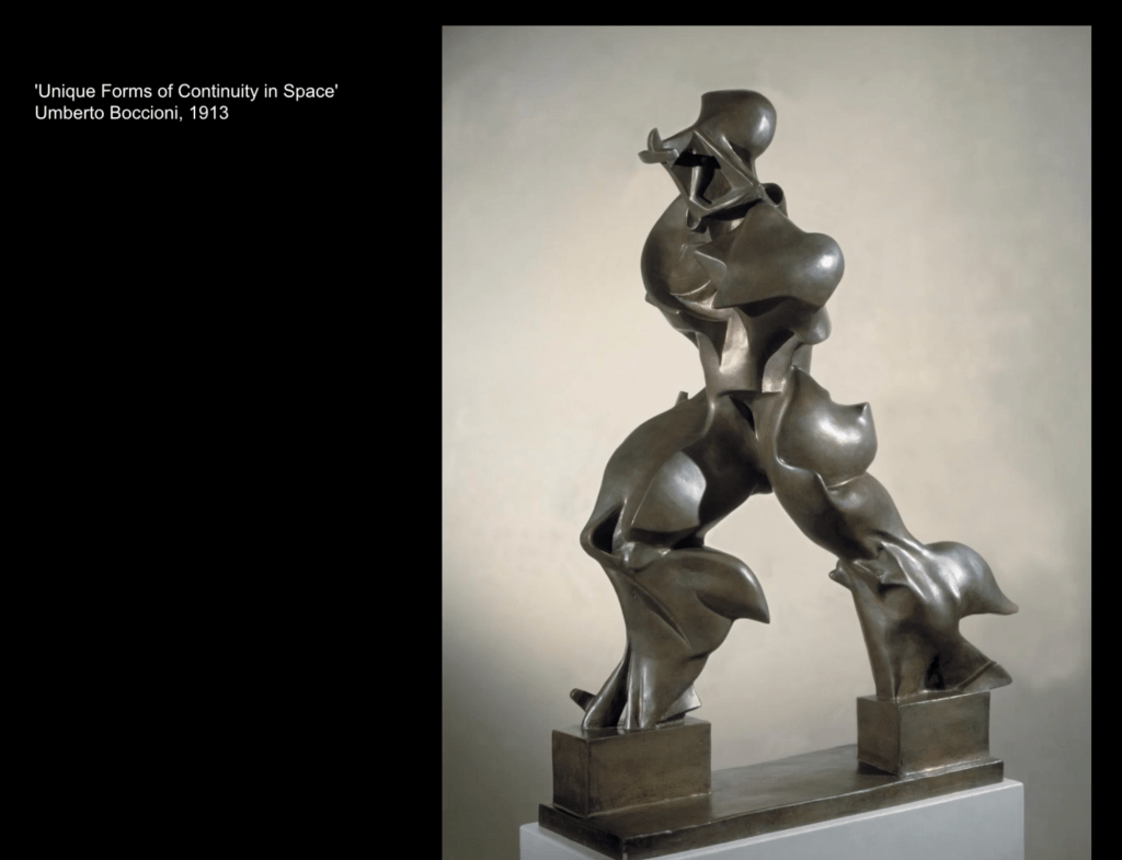
It was also a period of revolution, rebellion and the fertilisation of the most influential and creative periods of modern art, which saw the development of Cubism, Futurism, Russian Constructivism and Suprematism.
I think this new dynamism is perfectly encapsulated in this incredible sculpture called Unique Forms of Continuity in Space, which was created in 1914 by Umberto Boccioni
The modern machine age, and the build up to the first world war, also inspired Vorticism, an art movement founded by the artist and writer Wyndham Lewis in 1914.
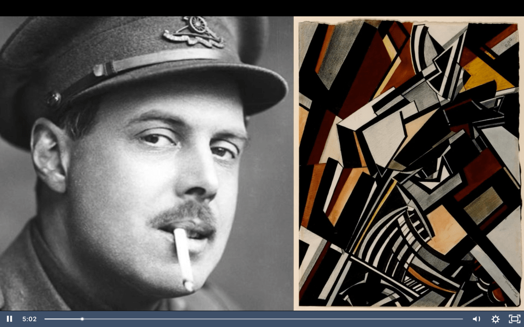
Vorticist painting combined cubist fragmentation of reality with hard-edged imagery derived from the machine and the urban environment. It was, in effect, a British equivalent to Futurism, despite Lewis’ deep hostility towards Futurists.
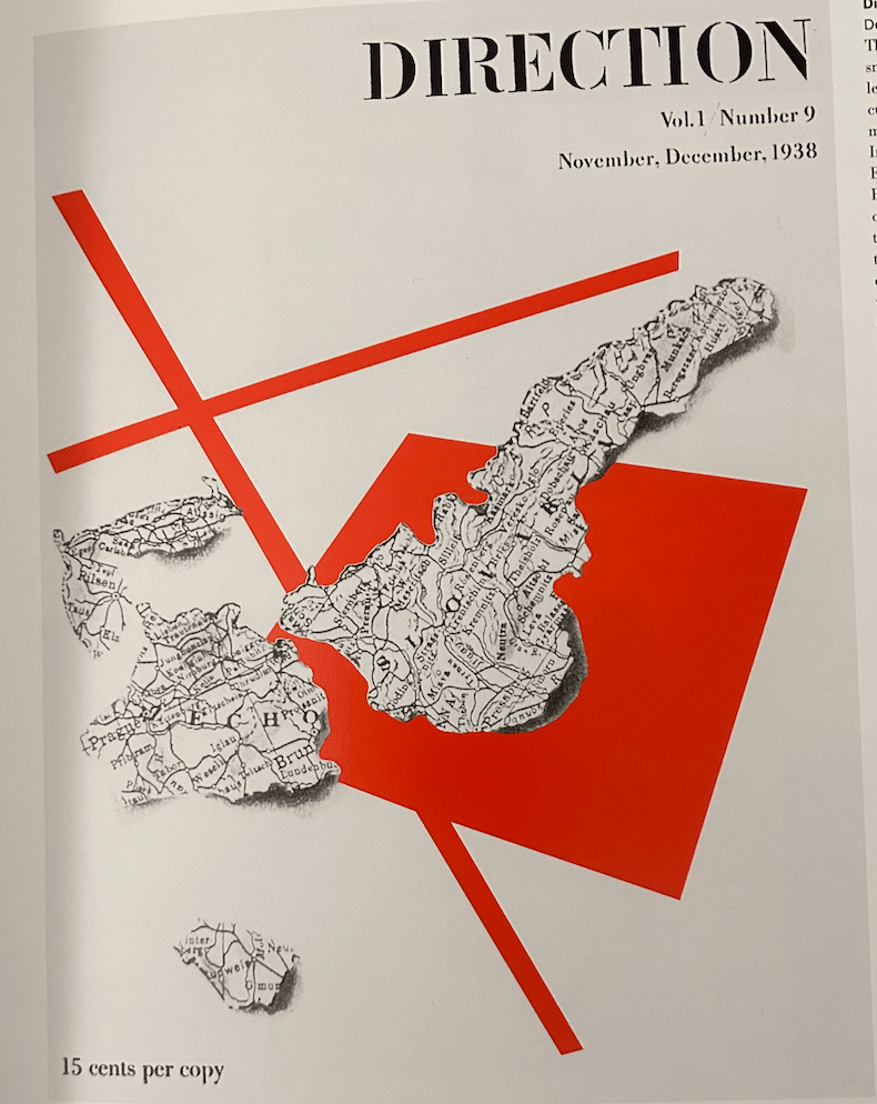
Vorticism was launched with the publication of Blast magazine, a vehicle for Lewis to ‘blast’ what he considered to be the self-indulgent and stuffy nature of British art and culture and create a space to proclaim the Vorticist aesthetic, which was:
‘The New Vortex plunges to the heart of the Present – we produce a New Living Abstraction.’
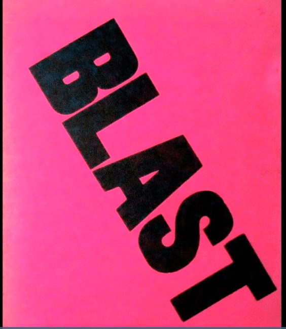
Blast’s radical intention was immediately evident by the front cover of the publication, which utilised a shocking magenta background colour, with the title BLAST written across the cover in huge, bold, black sans serif letters.
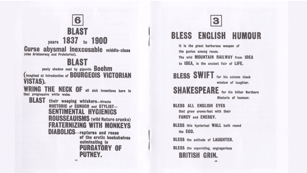
The first 20 pages of the Blast journal are presented like a manifesto. Each page has a dramatic piece of typography, in which the editors ‘blast’ and ‘bless’ different things – often these are the same things.
Blast is mocking and humorous to read, but has a vitriolic tone as well, which is emphasised by the unconventional rhythm of the typographic layout. It’s a dramatic piece of graphic design, which still looks relevant today and is widely considered a significant development in the production of artist publication design, and inspired the genre of graphic designers who write.
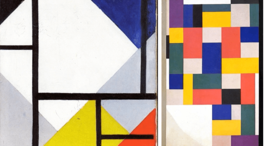
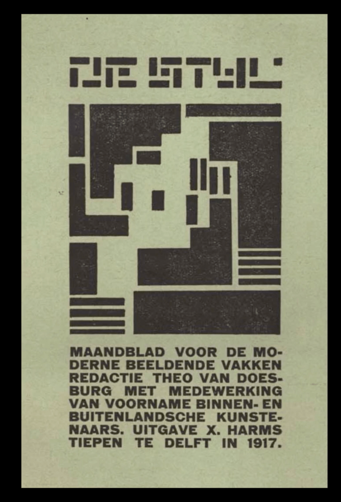
The artist publication that’s widely considered the most influential from this period is De Stijl – which means ‘style’ in Dutch – a journal that was edited and published by Theo van Doesburg from 1917
To give some context and background to the movement, members of De Stijl wanted to redefine the idea of art in the early 20th century. They wanted to strip it back and give it a new set of rules – a rejection and reaction against the decorative excessiveness of Art Deco and Art Nouveau.
The main principles of the movement focused on generating abstract and simplified images that utilise the most basic visual elements – a distillation to simple geometric forms and primary colours.
However, De Stijl’s ethos extended beyond just aesthetics and has a deeper social message, by removing the personality of the artist in favour of clarity and precision..
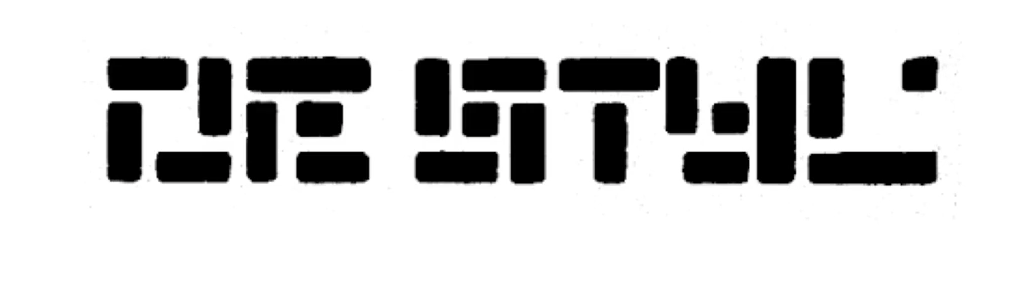
Constructed of evenly weighted stroke,s where each character is divided 5×5 into 25 smaller squares, the result is very square and blocky letter forms with some extreme characters.
This type design is widely seen as one of the earliest sans-serif, modular typefaces and has influenced legendary graphic designers such as Wim Crouwel.
The square composition is changing with each direction, interlocking with one-another with the deconstructed title typography.
The fact that the title, composition and sub-text are all justified into a defined rectangle, small in size on the cover with masses of space surrounding it, creates an overall minimal.
By the 1920s and 1930s, the development of the New Typography movement brought graphics and information design to the forefront of the artistic avant-garde in central Europe.
Rejecting traditional arrangement of type in symmetrical columns, modernist designers organised the printed page or poster as a blank field in which blocks of type and illustration could be arranged in harmonious, strikingly asymmetrical compositions.
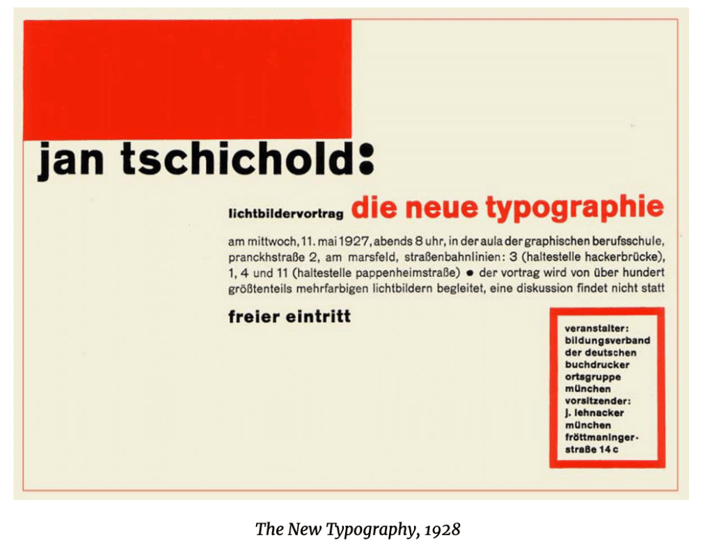
A leading advocate for the modernist design movement was Jan Tschichold, a German typographer and book designer who, in 1923, converted to Modernist design principles after exposure to Russian constructivist art and visiting the first Weimar Bauhaus, the revolutionary art, design and technical university
Jan Tschichold was a German calligrapher, typographer and book designer. He played a significant role in the development of graphic design in the 20th century – first, by developing and promoting principles of typographic modernism, and subsequently idealizing conservative typographic structures.
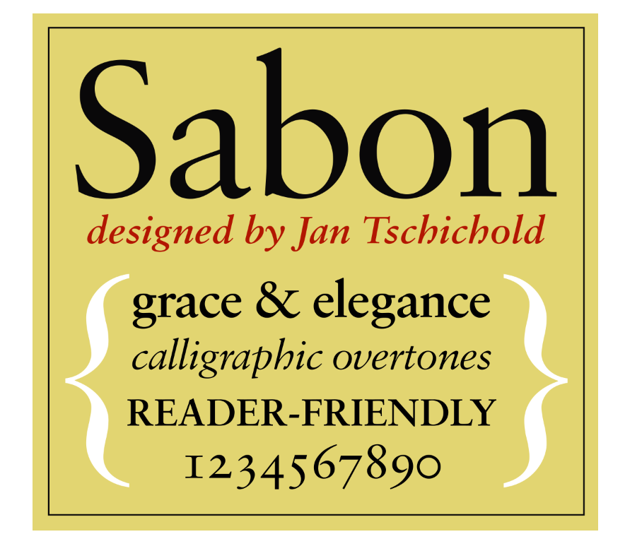
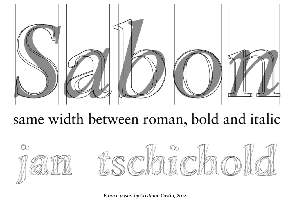
Jan Tschichold (pronounced yahn chih-kold), 1902–1974, was a highly regarded German calligrapher, typographer, book designer, and educator. He is considered one of the most influential figures in typography and design of the 20th century. His foray into Modernism, and then his return to Classicism highlighted his constant exploration into the “proper” use and application of type, grids, and overall design. Tschichold’s masterful understanding of type, lettering and design led him to work as a designer, educator, author of several books, and typeface designer—including his highly regarded Sabon. His impact on the print industry in Europe and the USA is uncontested, and his typeface Sabon is still in use today. (https://creativepro.com/jan-tschichold-master-typographer-of-the-20th-century/)
Born in Leipzig, Germany in 1902, Tschichold was trained by his father, who was a signmaker and calligrapher. Thus he began his practical education in typography and lettering. Once he decided his goal was be a typeface designer, he attended the prestigious Academy for Graphic Arts in Leipzig. After studying the traditional typographic conventions of the day, a visit to the Bauhaus and its functional design, as well as the influence of “radical” Constructivists such as László Moholy-Nagy and El Lissitzky had a powerful influence on him. He then adapted Modernist design principles, which included the exclusive use of sans serif type; non-centered type on posters, book covers, and such; and other rigid guidelines.
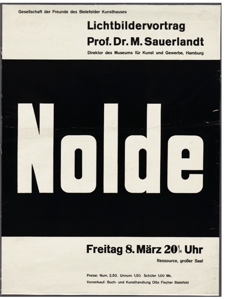
He first published his views in an article entitled Elemental Typography in 1925, which led to an uproar in the design world, but it eventually changed the course of what was considered traditional design with its centered type, “outdated” typestyles, and lavish ornamentation. His continuing work in this direction led to authoring his instructional book, The New Typography (Die neue Typographie), which was published in 1928.

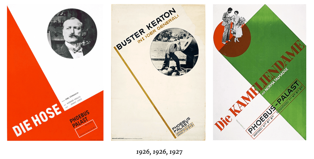
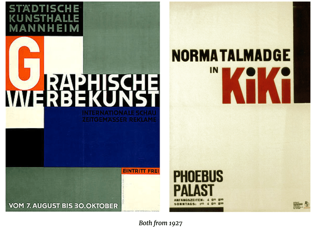
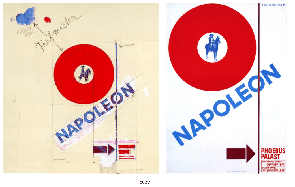
In his own words, he believed that “the essence of the new typography is clarity. This puts it into deliberate opposition to the old typography whose aim was ‘beauty’… The aim of every typographic work [should be] the delivery of a message in the shortest, most efficient manner… White space is to be regarded as an active element, not a passive background period… Asymmetry is the rhythmic expression of functional design. In addition to being more logical, asymmetry has the advantage that its complete appearance is far more optically effective and symmetry.” Since its initial release, The New Typography has been recognized as the definitive treatise on book and graphic design in the machine age.
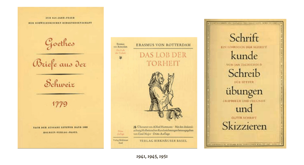
In the years up to 1933, Tschichold’s designs were in the style of the Bauhaus and “the new typography”. In that year, however, he fled from the Nazi government after a search of his house, temporary imprisonment, and the loss of his job. Tschichold then sought refuge in Switzerland, where he started working at the Basel School of Applied Arts, as well as part-time at the Benno Schwabe publishing house in Basel.
These years were another turning point for Tschichold, when he slowly abandoned his stringent design philosophies, the influence of the Bauhaus, as well as the asymmetrical arrangements of industrial typography, and returned to Classicism. He later condemned his own Die neue Typographie as being too extreme, denouncing his own Modernist design beliefs as being authoritarian with parallels to National Socialism and fascism and the more or less militaristic arrangement of lines. From 1938 on, he began to center align almost all his work. He then devoted himself completely to book typography. His quotes from this time include, “My errors were more fertile than I ever imagined… In the light of my present knowledge, it was a juvenile opinion to consider the sans serif as the most suitable or even the most contemporary typeface.”
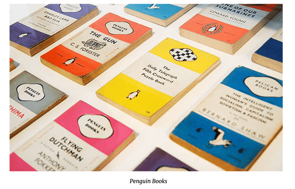
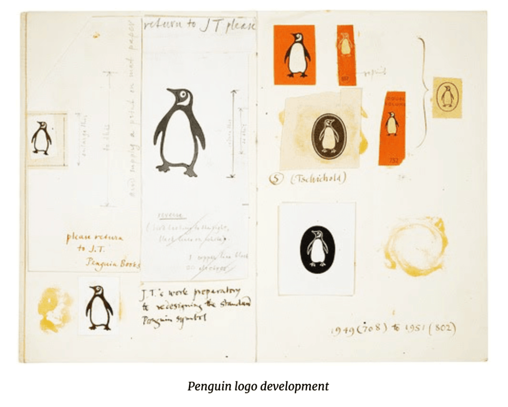
Penguin Books
In the mid-1940s, Tschichold joined the Penguin publishing house in London, where he began to redesign the template for their books, instituting designated typefaces and positions for the title and author’s name with a line between the two. His redesign incorporated different styles of Gill Sans to help focus on the simple and geometric shape of a sans serif typestyle. (Not all the books had a standard typeface, but Gill Sans was the primary type in many of the books.) This redesign led to the Penguin Composition Rules and King Penguin standard grids, which represent one aspect of the typographic revolution that Tschichold masterminded at the publishing house.
After Penguin, Tschichold returned to Switzerland in 1949, where he continued his work as a master typographer, writer, and educator. He did some traveling to the U.S. where he gave talks in Chicago as well as at Harvard and Yale universities. Jan Tschichold died on August 11, 1974, in Locarno, Switzerland.
Sabon was Tschichold’s most important typeface creation, and was modeled after a 1952 Garamond interpretation. It was initially created in response to a request by a German type foundry for a face with equal spacing in the roman and italic versions, which would simplify the typesetting. They also wanted a font that would behave the same way across the three tangible forms of technology available at the time: single-type machine composition, foundry type for hand composition, and linecasting.
The International Typographic Style, otherwise known as the Swiss Style, introduced modernist graphic design principles to the public consciousness on a global scale, and helped validate the industry.
As with the other visual revolutions outlined in this lecture, a journal was published to centralise the direction and governance of The International Language.
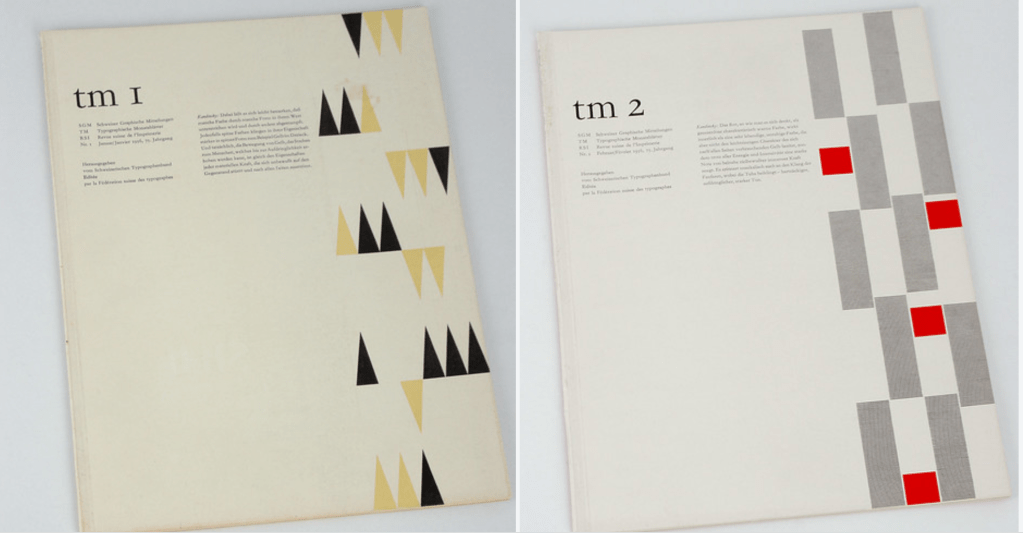
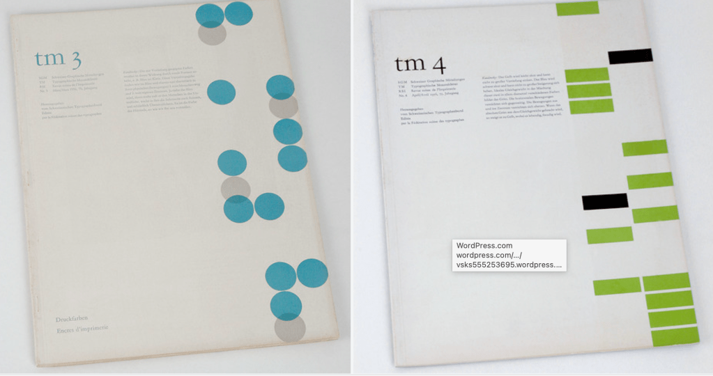
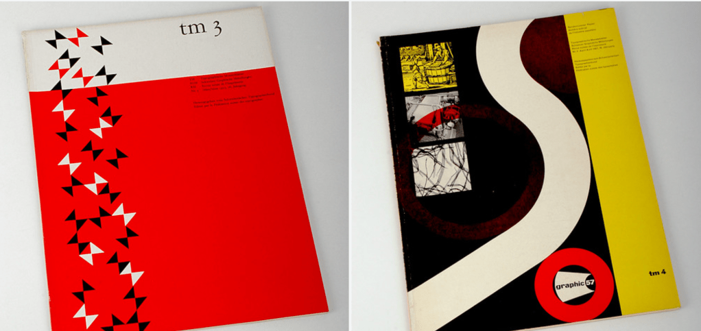
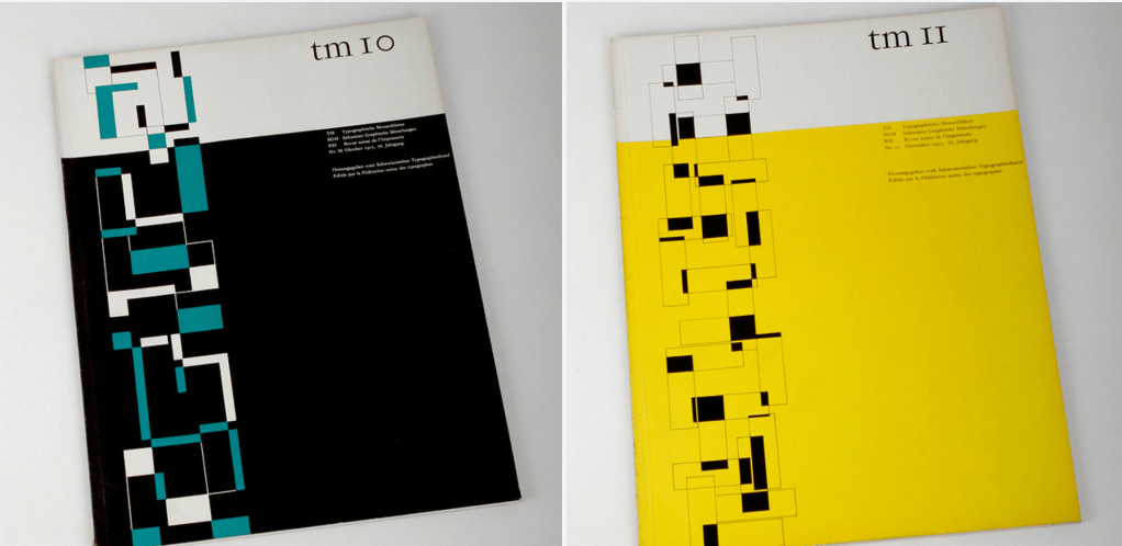
Neue Grafik, or the International Review of graphic design and related subjects, was initiated by designer Josef Müller-Brockmann and published in 18 issues between 1958 and 1965.
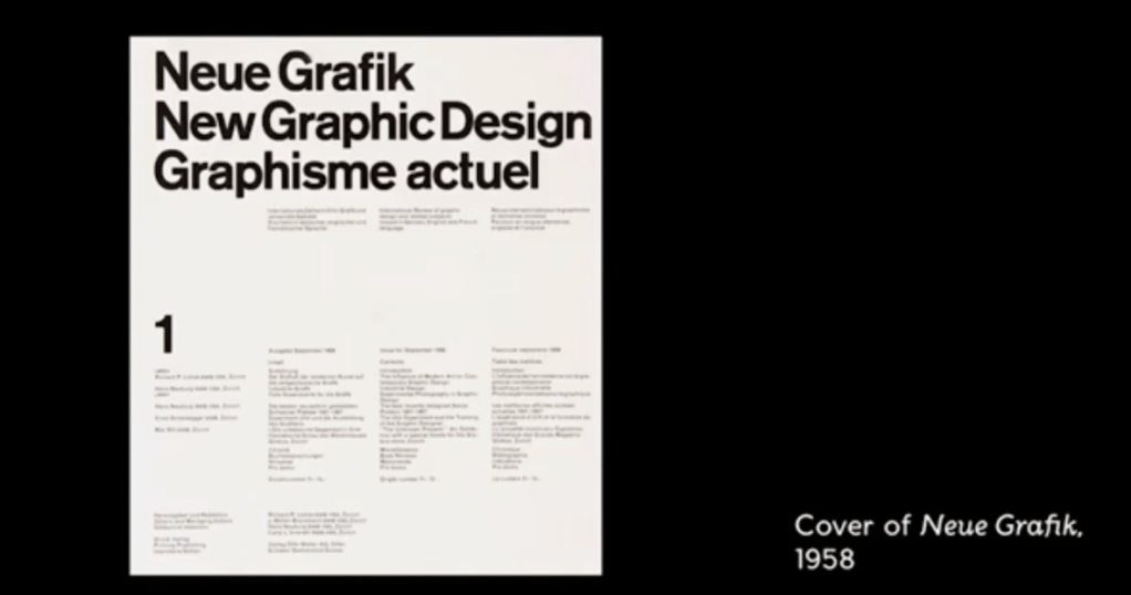
Neue Grafik (transl. New Graphic Design,French: Graphisme Actuel) was a quarterly graphic design journal founded in 1958. The journal disseminated the tenets of the International Typographic Style and was key in its emergence as a movement. Eighteen issues of the journal were published from 1958 to 1965 (https://en.wikipedia.org/wiki/Neue_Grafik )
Central to the journal was the conception of the designer as an individual endowed with a great deal of social responsibility. With the authority to effectively communicate ideas, the founders held, came responsibility to uphold values and justice. The journal was also known for advocating the use of photography as a central element in graphic design.
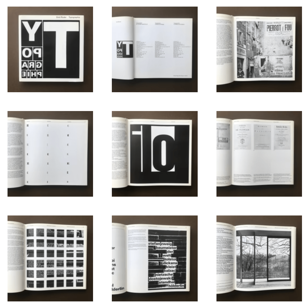
Another exponent of the International Typographic Style was Emil Ruder, a typographer who grew up in Zurich, Switzerland and later taught at the Basel school of design.
Ruder was a disciplinarian of letterpress typography and held a similar conviction to Jan Tschichold about upholding modernist principles. He also placed heavy importance on sans-serif typefaces and its importance to communicate ideas through writing.
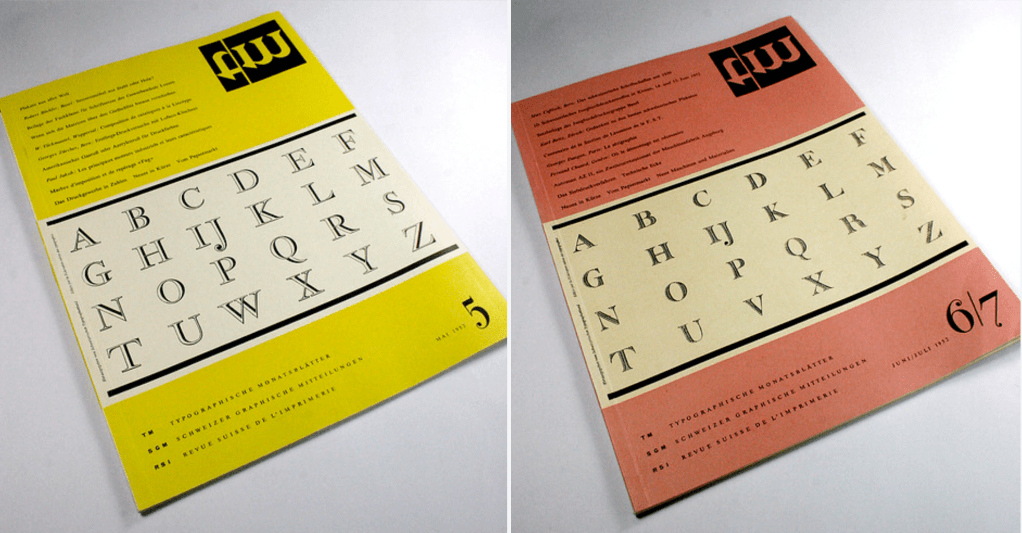
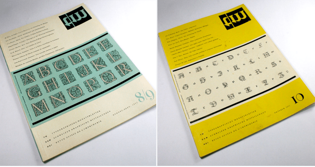
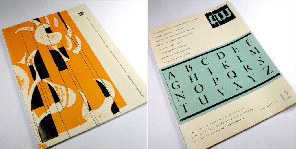
Ruder was an advocate of radical change and in 1957 and 1959, he contributed a series of four articles to the Typografische Monatsblätter – or Typographic Monthly – a trade journal that outlined theories of Modernist typography.
These four essays titled ‘Fundamentals: The Plane, The Line, The Word and Rhythm’, formed the basis of his thinking and the formation principles of typography in relation to the cultures, natural sciences, politics and societies of all times and places.
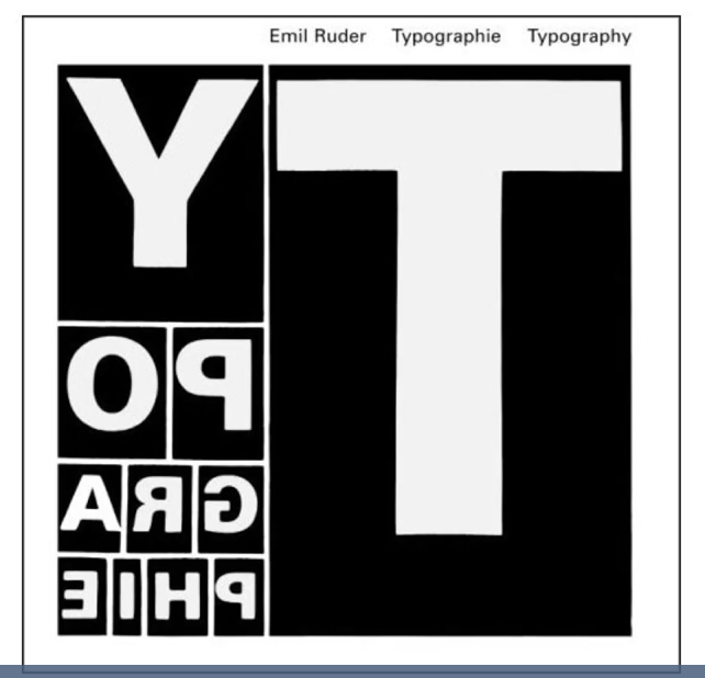
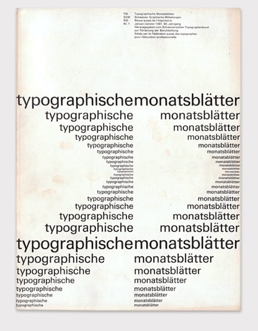
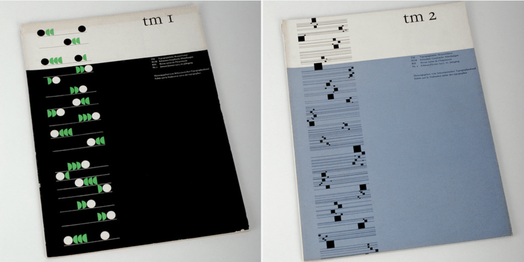
These four principles formed the basis for Ruder’s typography and design approach, which moved away from the subjective, style-driven typography of the past towards the precise application of text, where legibility and communication determine how a font is used.
His holistic approach is still recognised as fundamental for graphic designers and typographers all over the world. It was documented in his seminal book Typographie, published in 1967, which represents a critical reflection on Ruder’s teaching and practice, as well as a life-time of accumulated knowledge in grid system in Swiss Style design and his poster designs.
“The ‘design textbook’, which is how Emil Ruder characterized his book Typography, was first published in 1967, nearly 35 years ago. Since then, several editions have been re-printed and translated into various foreign languages. Today the “Ruder” is a standard work in the field of typography that has served entire generations of typesetters, typographers and designers as a foundation for their work. “Today the book has become a common utensil and has thus moved from the bookstore through the department store to the kiosk, […I. Thus, Typography actually would seem to have found its purpose as the means to the end of mass communication.” This sentence, which Ruder wrote in the 1967 introduction to his book, has proven particularly true today, in an age when our entire environment is registered through media. The book made a not insignificant contribution in this regard as well. Since Ruder died three years after his book was published, he was not able to experience its worldwide success.” (https://www.theprintarkive.co.uk/products/typographie-a-manual-of-design?variant=40258951119025)
By the mid 20th century, graphic design studios and advertising agencies adopted the reduced principles of the International Typographic Style and the artists movements that inspired them, such as Bauhaus and Constructivism, to help magazines and brands sell their products by projecting a contemporary and progressive image.
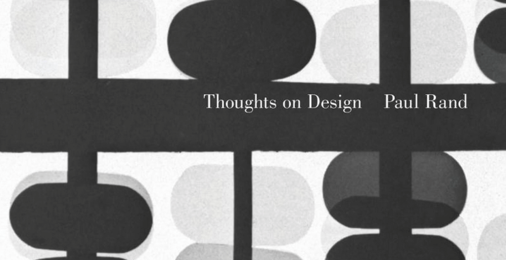
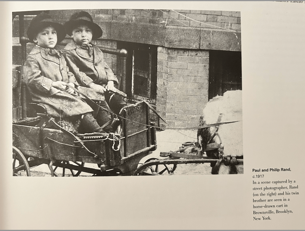
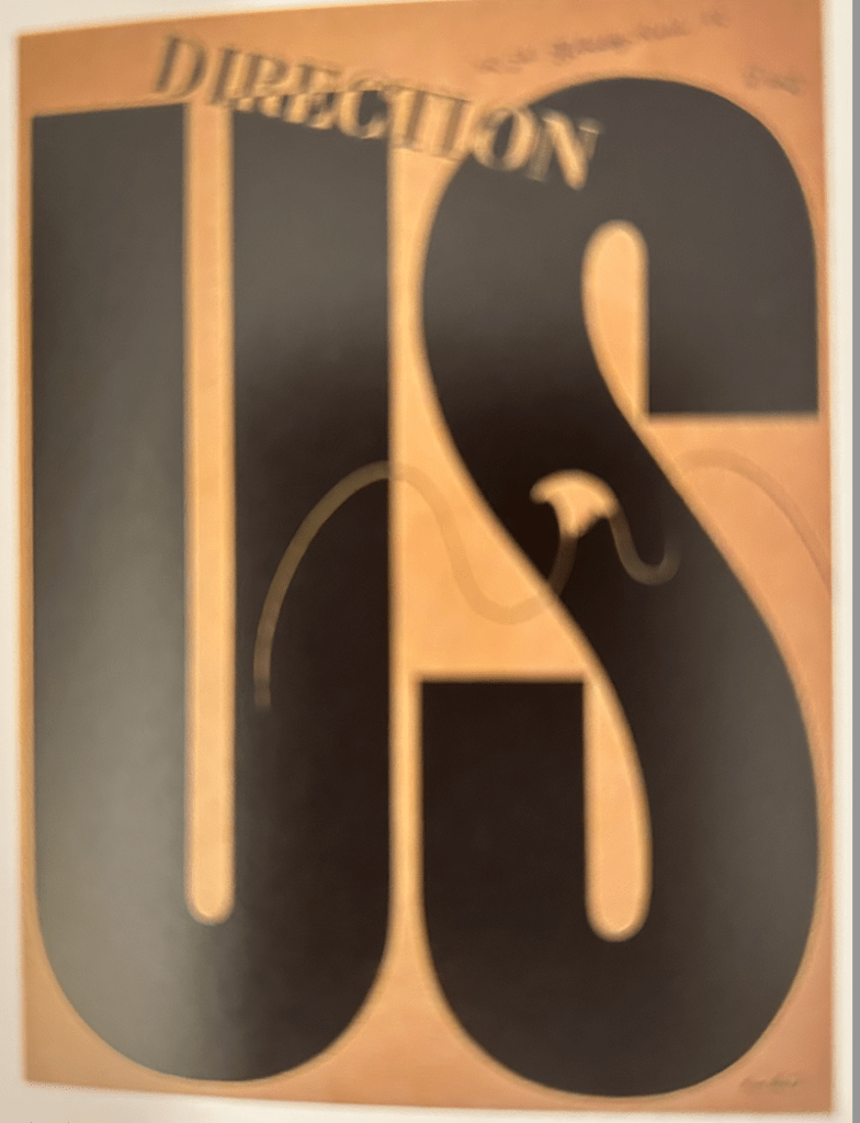
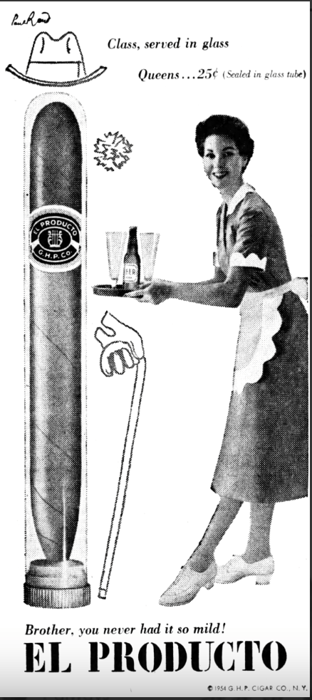
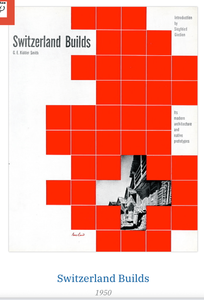
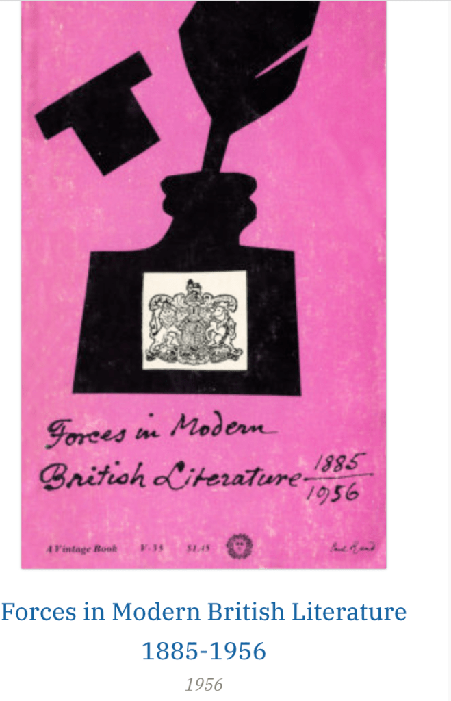
This approach was most pertinent in America, where companies spent large sums of money to advertise their products. One of the most celebrated designers of this era to recognise that good design meant good business was Paul Rand, a self-taught American graphic designer, who adopted European design principles to create visual identities for multinational corporations IBM, UPS and Enron.
I enjoyed watching the interview with Paul Rand – he said that many times the businessman don’t realize that the designers can improve not only the appearance but they may have ideas to improve the product itself.
Good designer can make things memorable, improve the general quality of our life – witch is the general reason of our existence.
He was making fun of the word “art director” (on a good way).
Fashionable and trendy is not always the best solution – people need to understand your work.
Sometimes people don’t understand what is logo and how it works. The logo becomes meaningful only after its use.
Paul Rand focused on the commercial side of art as a career

“His earliest breakthroughs evolved out of the design problems he was given at work. And while he refused to impose his will where it wasn’t appropriate, he took every opportunity to redefine the brief so that the solution could be solved according to his vision. When once asked why he adhered so strictly to his own icono -clastic ideas, Rand suggested that American designers were too fond of cliches, and he continue by saying that the difference between him and most other designers at the time was that: “I was not in sync with with conventional because I was aware of what was going on in Europe at the time. I was familiar with the Germans and that kind of work they were doing – and it was the best work that anybody had done…”
https://www.paulrand.design/work/Coronet-Brandy.html
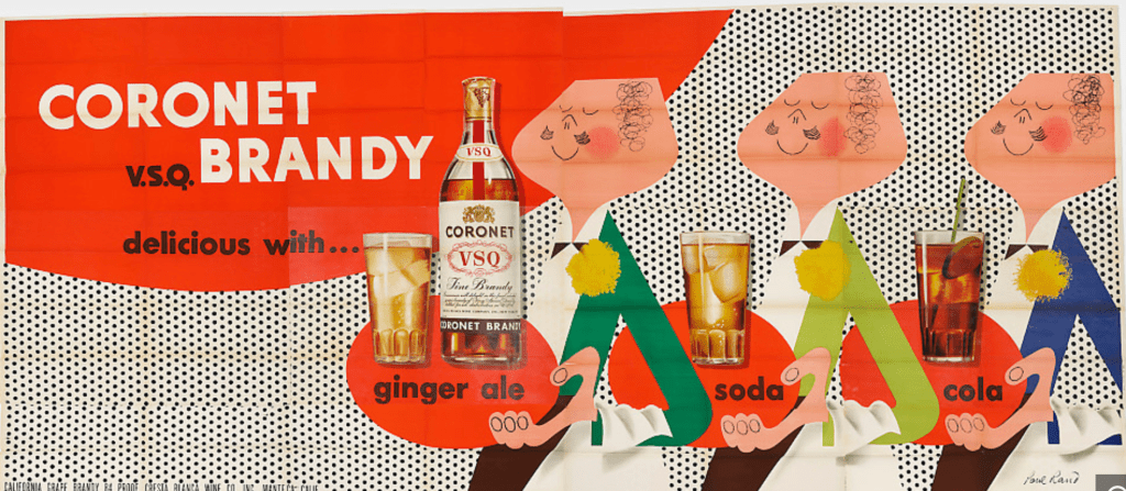
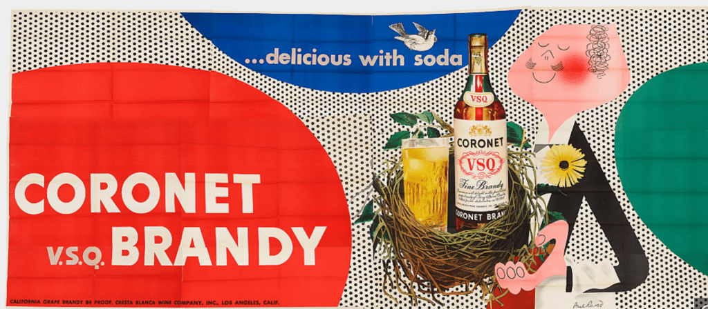
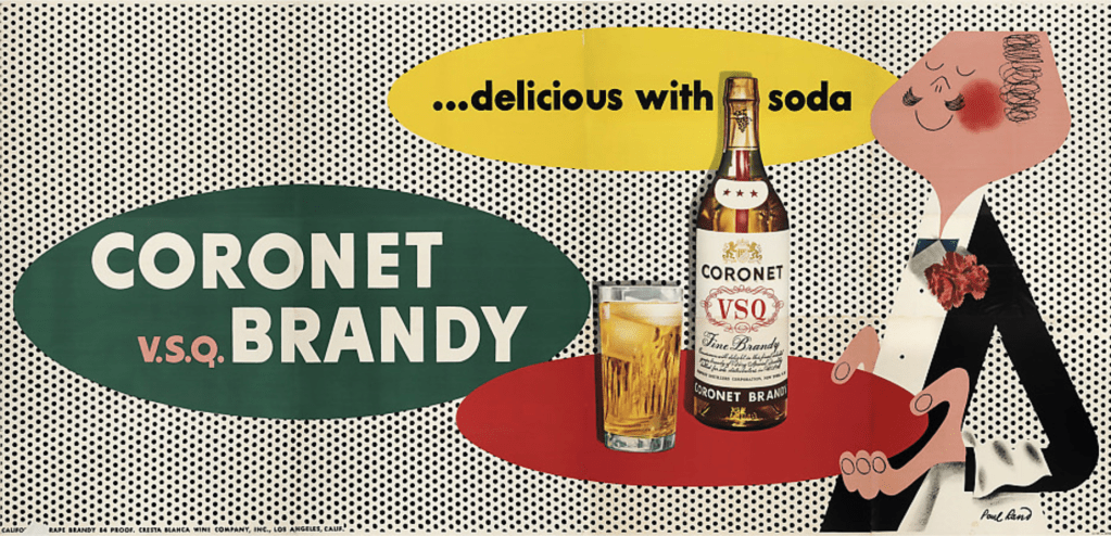
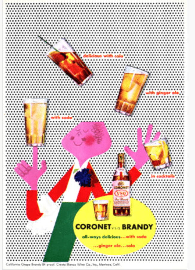
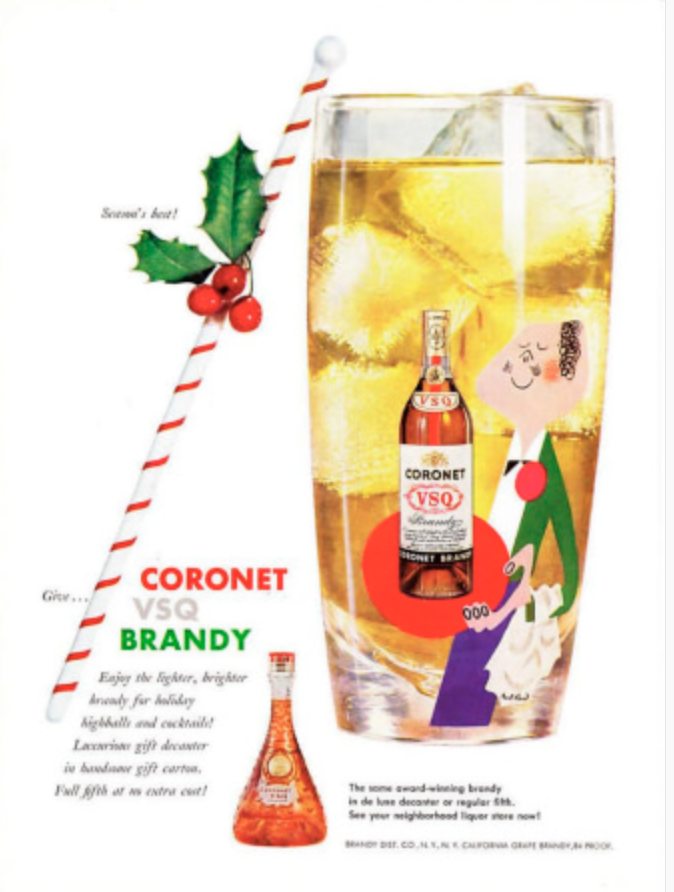

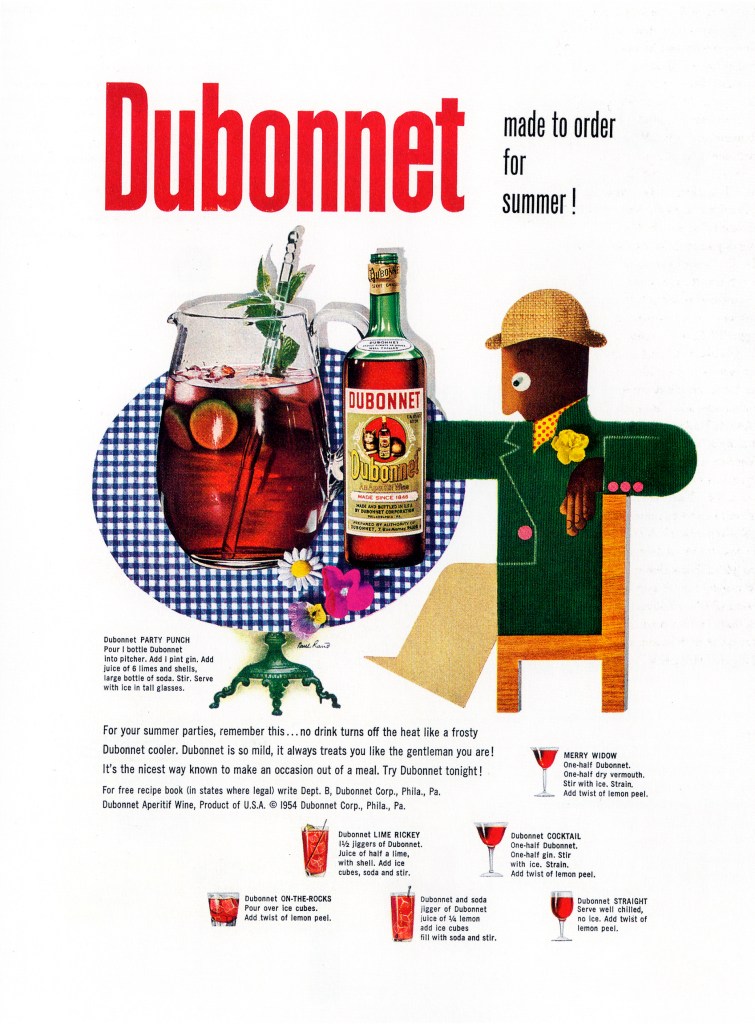
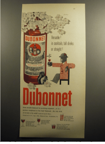
The campaign for this imported French aperitif was made famous by the French affichiste, A.M. Casandre, who developed the Dubonnet Man tradecaracter. Rand saw no good reason to change an already wining character and respected Casandre too much to feel he could improve upon his work. Instead, Rand hired the Italian illustrator Paulo Garretto to produce additional versions for American ads.


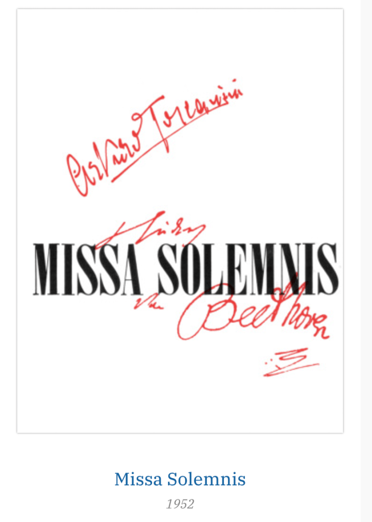
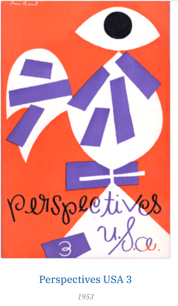
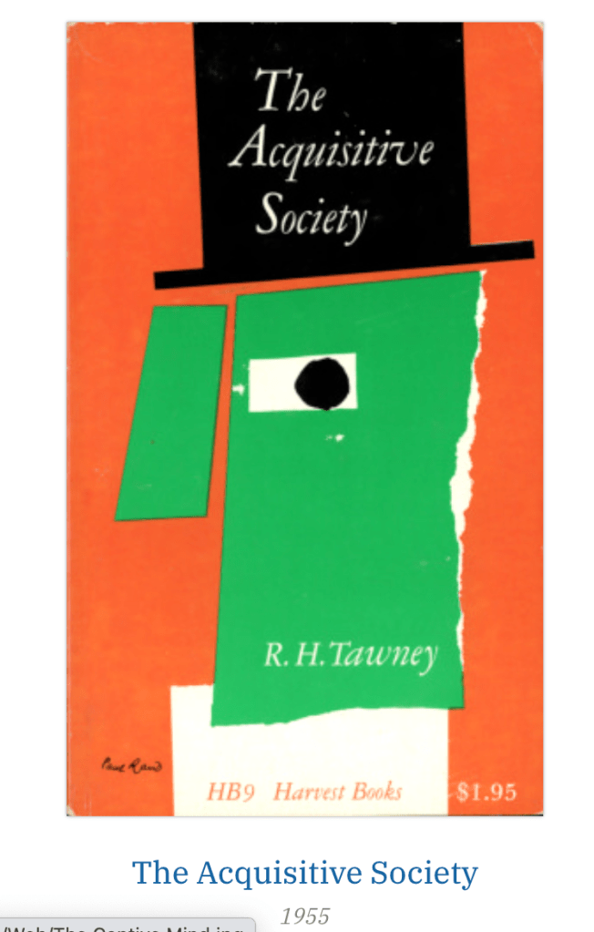
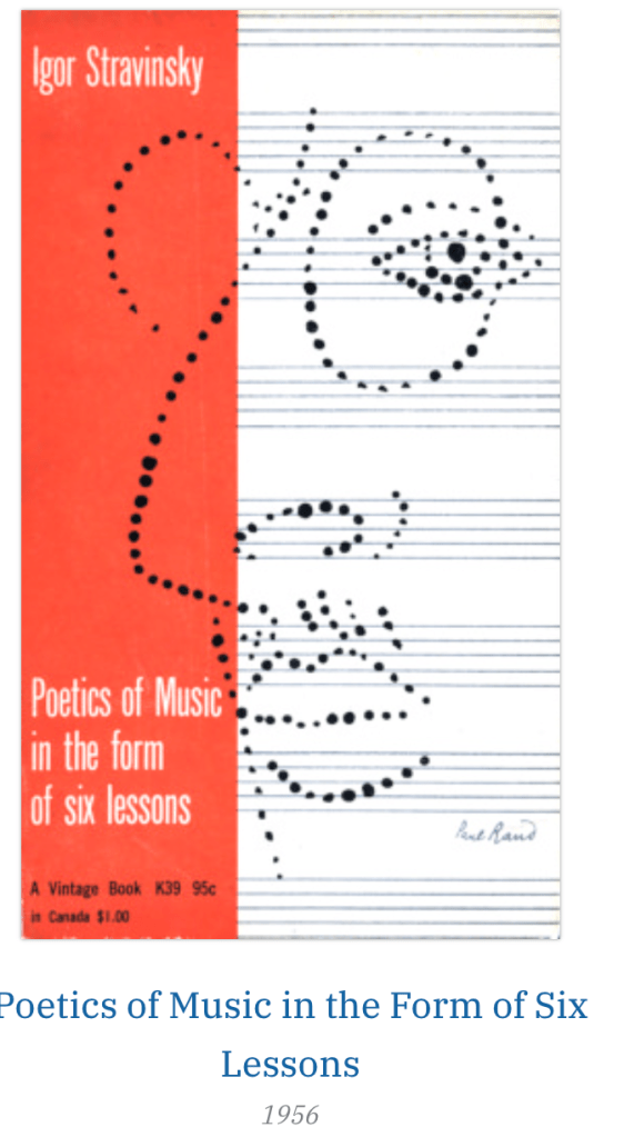
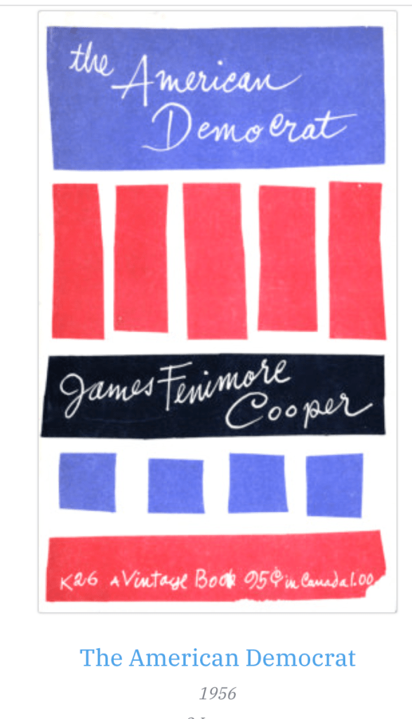
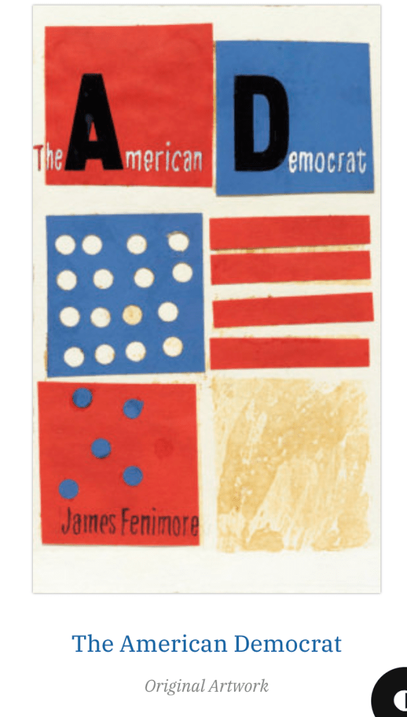
Although overshadowdowed by his advertising and corporate careers, Rand’s book jackets ad covers are arguably just as significant, and even more crucial in defining him as an artist with a unique vision.
Rand believed that book jackets were no different from any other medium that could benefit from good design, and he was convinced that is particular medium had even greater potential as an outlet for art than did advertising or magazines. A book jacket had to convey moods or interpret content.
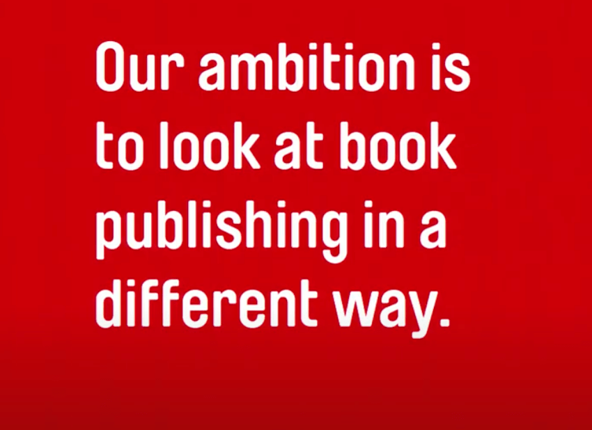
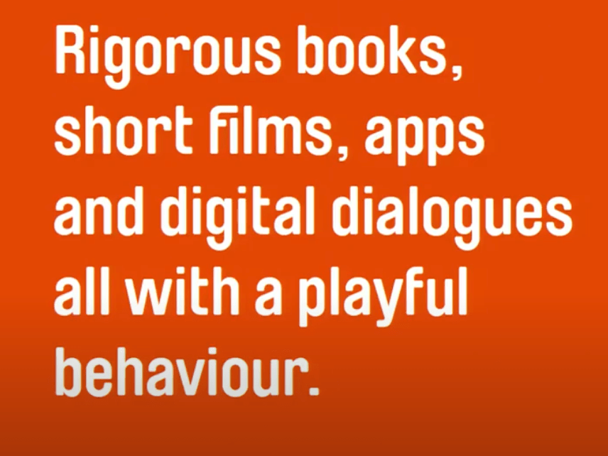
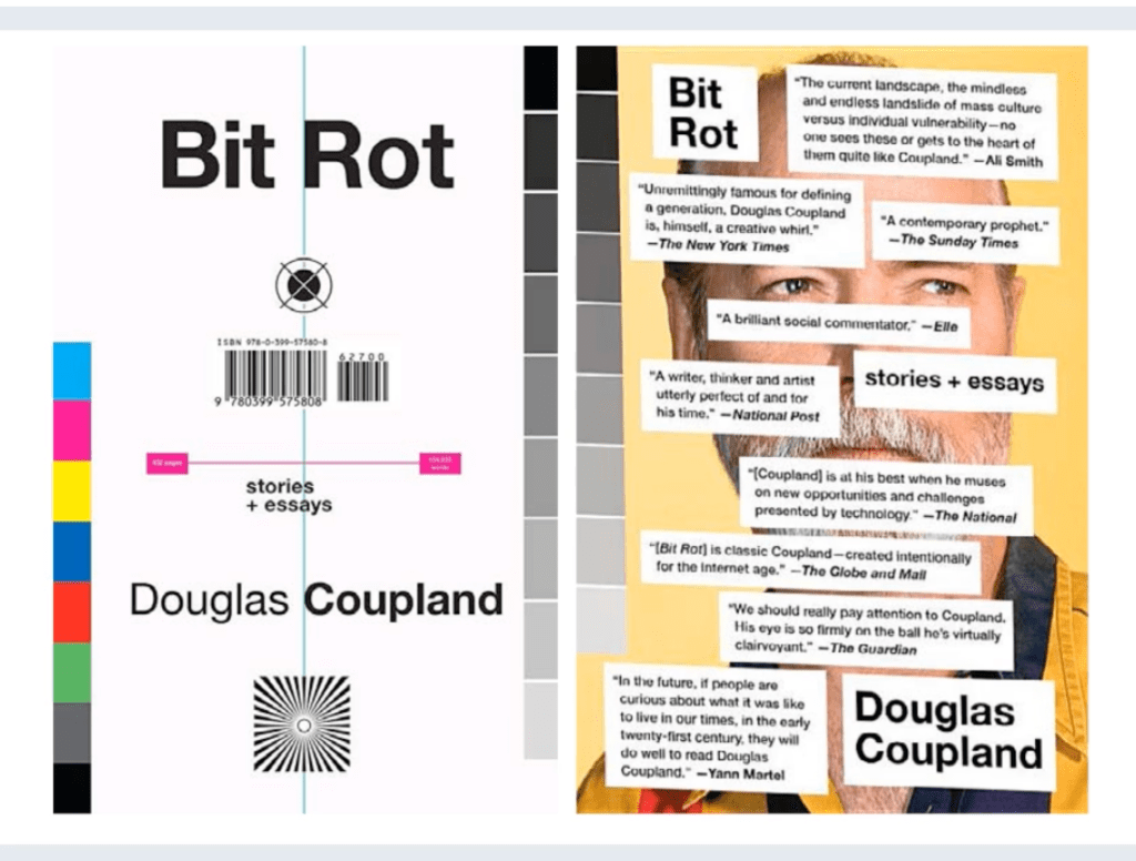
More recently, Shaughnessy co-founded Unit Editions with Tony Brook, the creative director from Spin design studio based in London, to publish beautifully produced books about graphic design and typography.
Their publishing output is varied, having produced inspirational and trend related books documenting super graphics, typography and studio culture. However, their most recent books are lavishly produced monographs about the output of iconic graphic designers, such as Herb Lubalin, Paula Scher and Vaughan Oliver.
He said sometimes the publishers don’t know what is in the books, they don’t know how to speak to the designers – but “we are”.
“We wont books that are different. Books that mix contemporary and historical but the historical have to be related with the contemporary. So, if we feel we wont learn anything from the historical figure, we wouldn’t do it.
Adrian Shaughnessy is one of the most established names in visual writing, but many graphic designers, including myself, have been compelled to explore the genre of written communication.
The majority of visual culture titles are aspirational, however some graphic designers write books that reflect on personal experience and the desire to vocalise pressing issues that engulf society and its connection to graphic design.
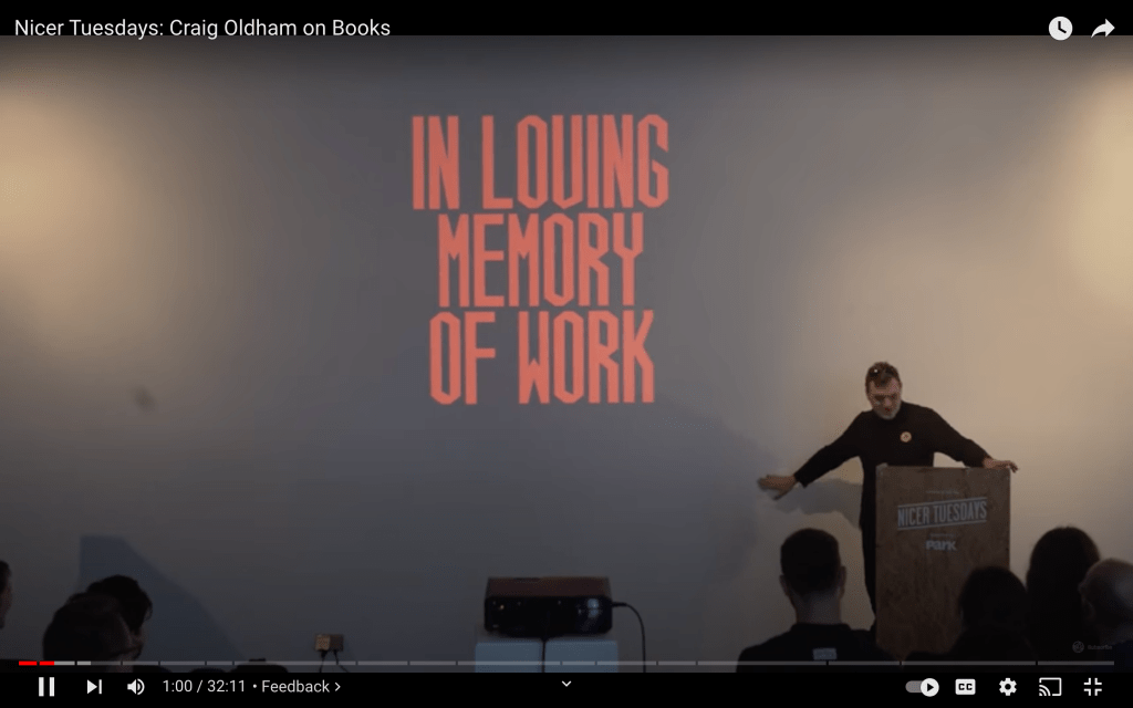
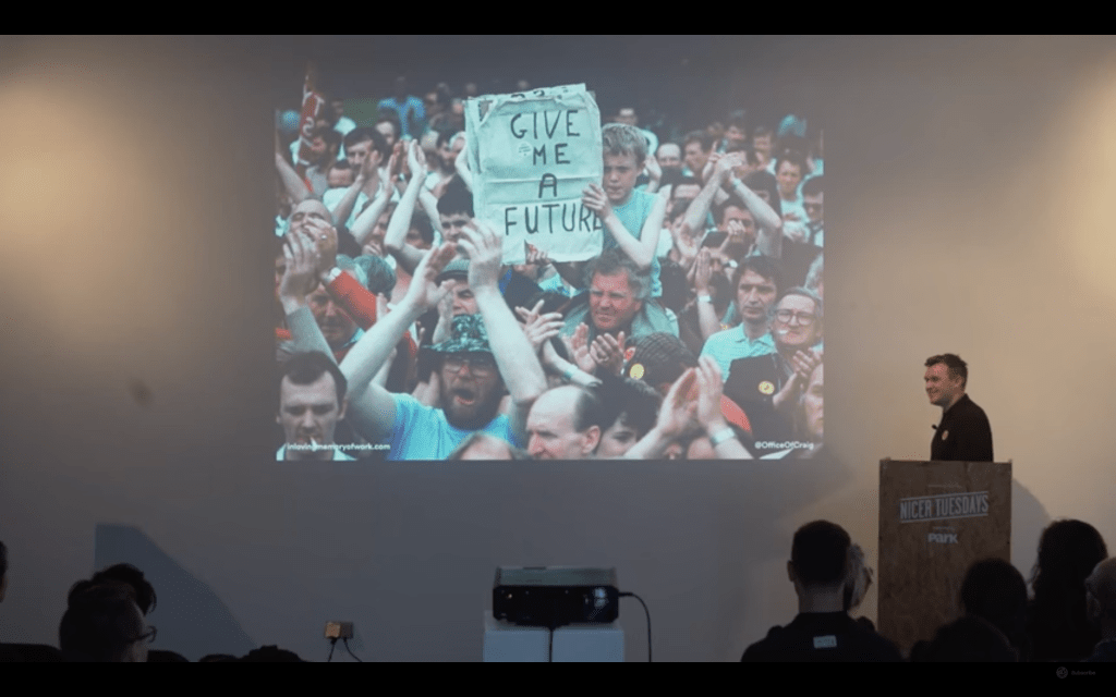
One such example is Craig Oldham, a graphic designer currently based in Manchester, UK, who is synonymous for work surrounding social issues such as his book In Loving Memory of Work, which is documents the impact of the miners’ strike in Yorkshire from 1984 to 1985.
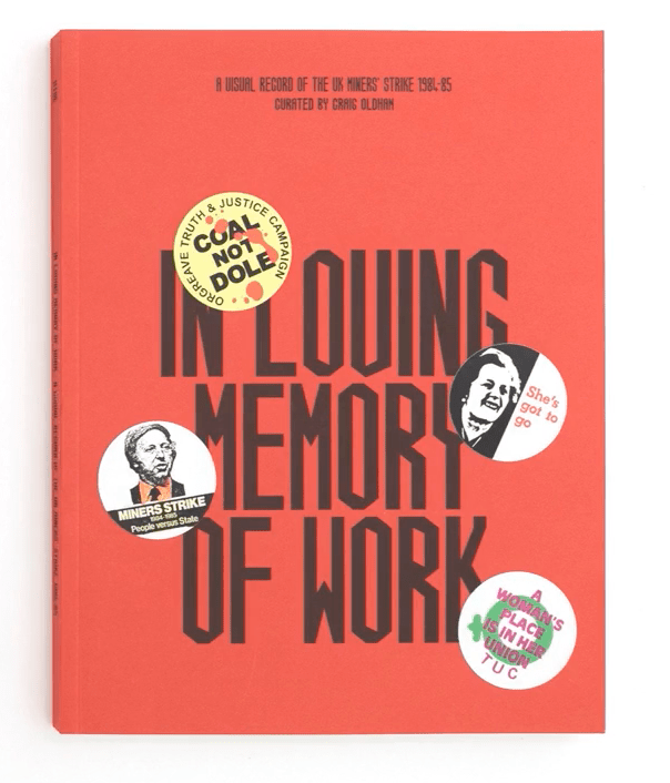
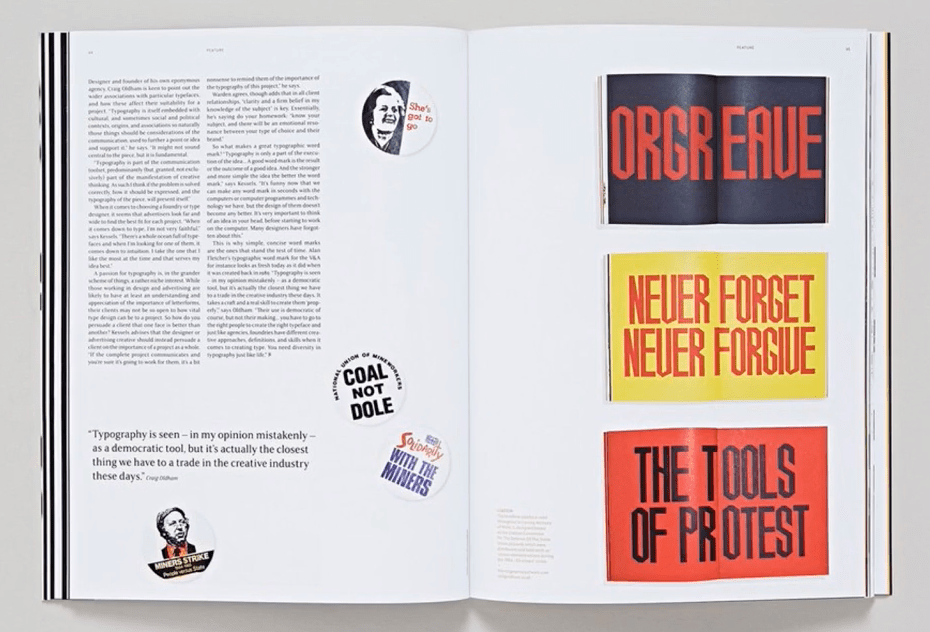
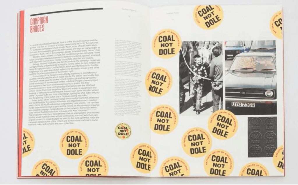
The book draws from personal experience and memory as a visual record of what the miners fought for day after day, month after month, and the ripple effect the passion for the strike had all over the country.
As Oldham explains in an It’s Nice That interview:
‘In Loving Memory of Work is about the collective creativity of working class people, people who dealt with their experiences and struggle creatively as a means of expression, and that’s a vital part of this particular period of history, and of humanity.’
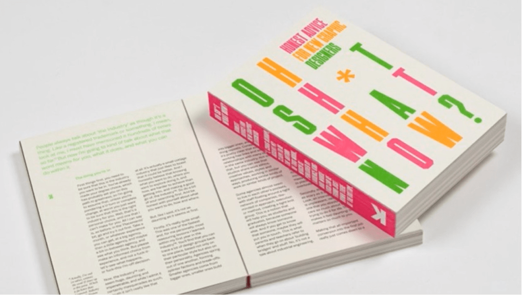
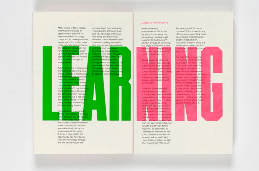
Craig’ second book is titled Oh Shit, What Now?, published by Laurence King. It offers advice to recent graduates, who are looking to gain experience in the graphic design industry. It’s an honest account based on his own experience within education and employment, which he explains in an AIGA Eye interview:
‘I’ve grown increasingly frustrated is one way of saying it, tired is another. I spend a lot of time with students and people in the industry already who are young and ambitious and hungry and want to make their own way, but there seems to be no meaningful discussion or pool they can draw from. For whatever reason, some designers don’t commit to being completely honest when someone asks them a question, so we end up with all these fucking platitudes about working hard and being nice to people.’
As human beings, we get used to “the way things are” really fast. But for designers, the way things are is an opportunity … Could things be better? How? In this funny, breezy talk, the man behind the iPod and the Nest thermostat shares some of his tips for noticing — and driving — change.
https://www.madethought.com/editorial/the-made-change-manifesto
BIG BUSINESSES CAN CHANGE THE WORLD BUT THEY’LL NEED GOOD DESIGN TO DO IT.
REDESIGNING TOMORROW.
THROW OFF THE SHACKLES AND SET THINGS ON FIRE.
The future of our planet will be shaped by bold solutions, not piecemeal change. Let’s ignore the status quo and prevailing logic; let’s make audacious creative choices that might shock people today but make perfect sense tomorrow. Let’s be courageous in everything we do, and raise our ambitions to nothing short of world-changing.
TRANSFORM FROM THE INSIDE
CALL A HALT TO GREENWASHING
Everyone is talking about sustainability, but carefully worded missives that signal intent but not action will get us nowhere. As creatives, it’s our ethical duty and professional imperative not to engage in greenwashing, so let’s interrogate everything and accept nothing without proof. And let’s offer solutions to those over-burdened with reasons ‘why not’ – as designers, our role is to see possibilities where others cannot, and give businesses something meaningful to write on their Sustainability tab.
PRESENT NEW WAYS OF MEASURING SUCCESS
Every business must be viable or it will fail. But we’re living in an extraordinary time, where industry leaders are beginning to redefine the metrics of success. From the Business Circle’s reclassifying profit as the fifth priority (which would have been unthinkable even a decade ago) to New Zealand’s recent reassessment of GDP, to the rise of B Corps – a fundamental shift in priorities is taking place. We’re waking up to the fact that purely profit-driven businesses are not going to change the world for the better. Let’s redefine success, and imagine a new ‘luxury’, a new ‘value’ and even a new ‘beautiful’ on the horizon
DEBUNK (развенчавай) THE MYTH OF THE QUICK FIX
HARNESS CREATIVITY FOR GOOD
For decades, design has been a massive accelerator of hyperconsumption, making people desire and demand an endless list of material possessions. Let’s refocus that creativity on finding solutions to the problems we have created. The brief to create change is so exciting – and every designer has it within them to incorporate it into every piece of work they do. We can all be more conscious about the people we work with, the projects we take on and the things we put out into the world. All of us can define and live by our own principles, to make the right choices. Our attitudes and decisions matter. This is the new remit of the creative.
REDEFINING THE ROLE OF THE DESIGNER
A good designer is one who looks beyond the superficial to see the true beauty in who we are and what we could become. Today, we create complexity where simplicity is the answer. We talk of the ‘circular economy’ as a new idea, but Nature is already the ultimate version. We broke that circle in the Industrial Revolution. Now, as we press forward into the Quality Revolution, we must relearn from Nature. In our man-made world of mass production and sameness, we must remember that every single leaf is unique in the real world. Let us not believe that the answers to our complex problems need to be complex. Complexity delays change. Simplicity will be our accelerator and good design has proven that less is always more, when less is beautiful, and enriches our lives.
FIND SOLUTIONS THAT APPEAL TO ALL
Sustainable design solutions are often too focused on literal interpretations of what it means to be green. It makes them niche when they should be universally appealing. Let’s eschew stereotypical ‘green’ design and focus on creating solutions that are eminently desirable and beautifully designed. Responsible long-term design is about the creation of a new aesthetic in which the right thing is also the most desirable thing to all.
CELEBRATE THINKING BRANDS AND BUSINESSES
Let’s celebrate the wins: those radical businesses and brands doing the right thing, transcending token gestures and leading by example. When we actively support, spread and build these brands – we’ll make everyone else hungry for the same treatment.
WE’RE IN THIS TOGETHER
We can all play a part. Whatever you do in the world, whatever your vocation, we call on you now to tap into your creativity and be part of this essential, incredible change. Never feel overwhelmed by the challenge to make a change – all change begins with small steps towards a common goal. We all have it within us to lead by example: real change begins with the person staring back at us in the mirror.
“AFTER THE FINAL NO, THERE COMES A YES, AND ON THAT YES THE FUTURE WORLD DEPENDS.”
— Wallace Stevens
https://www.audi.com/ci/en/intro/basics/tone-of-voice.html
- We use language elegantly and play with it. We take quattro literally here and appeal to the senses.
- Audi is sensuous pleasure, conveying a feeling of luxury and sophistication! We also reflect this in the language.
- We glide through the sentences: In the example, three sentences in a row start with the word “because,” generating a rhythm, with each picking up where the last left off.
- Every detail counts at Audi. And in our language, too, it is the subtleties that make the difference:
For example, “effortlessly” sounds more elegant than “easily.” In the same way, “makes an impression” is more stylish than “makes headway.”
https://ellenlupton.com/Designer-as-Producer
When Benjamin called for authors to become producers, he did not mean for them to become factory workers alienated from the form and purpose of the manu-factured thing. The challenge for design-ers today is to help become the masters, not the slaves, of technology. There exist opportunities to seize control—intellectu-ally and economically—of the means of production, and to share that control with the reading public, empowering them to become producers as well as consumers of meaning. As Benjamin phrased it in 1934, the goal is to turn “readers or specta-tors into collaborators.” His words resonate in current models of practice that view the reader as a participant in the construction of meaning
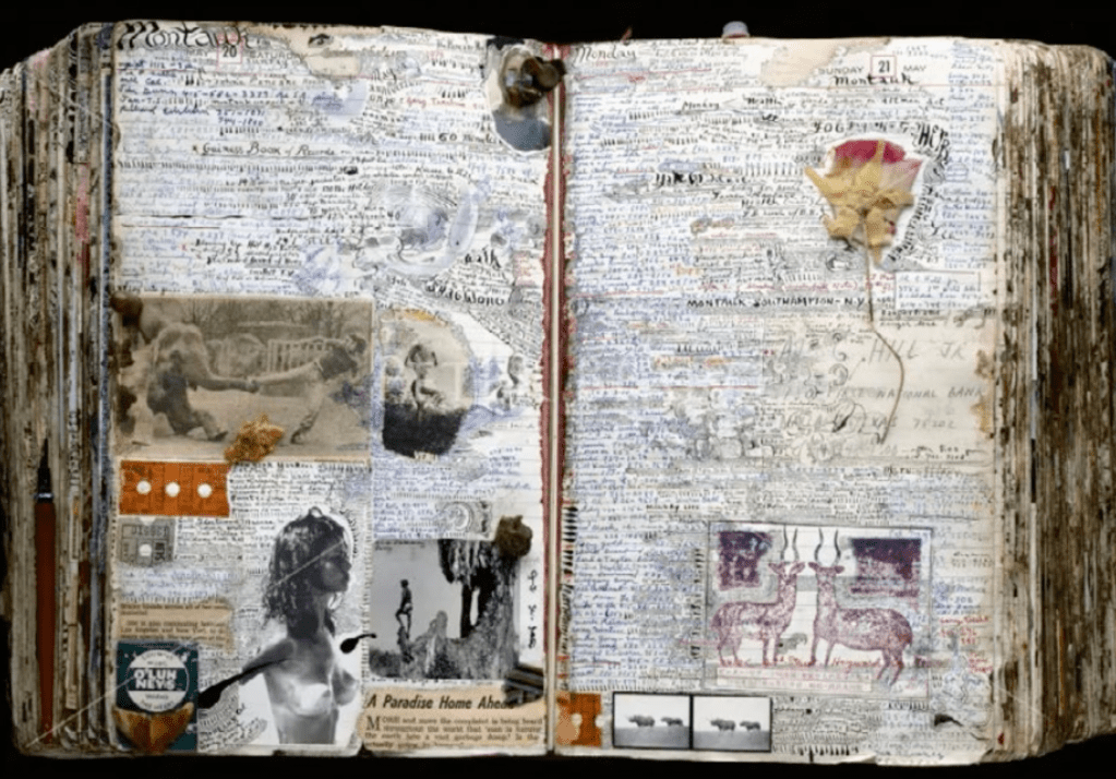
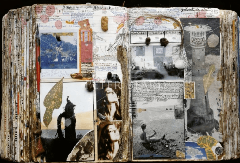
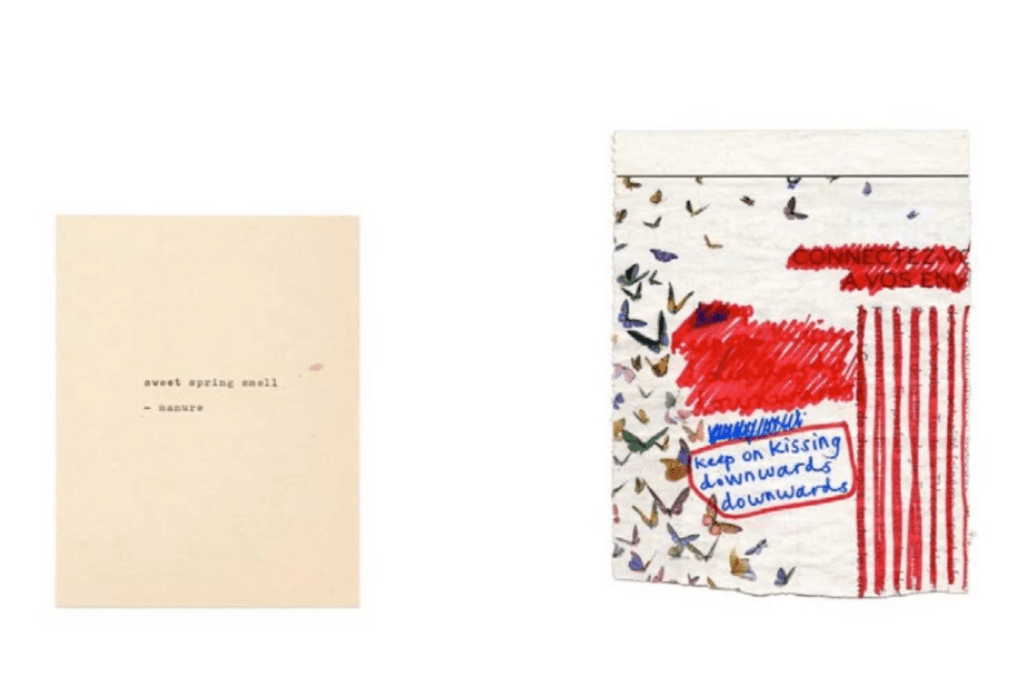
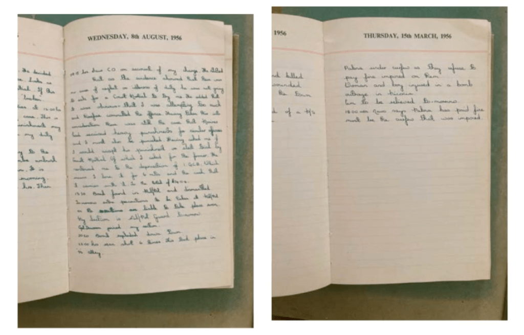
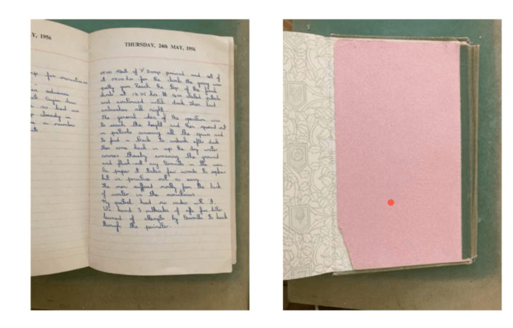
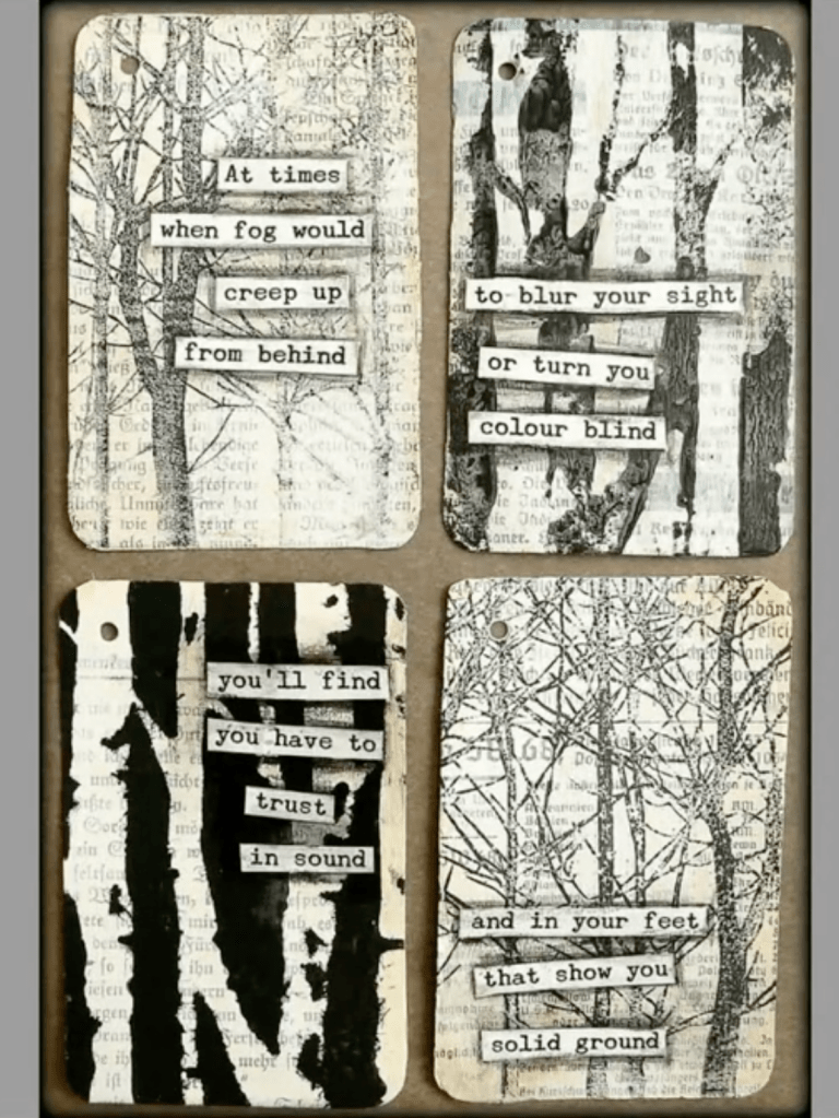
From the webinar with Frauke Stegmann
Examples of diary making


Leave a comment