This week we will analyze how artists and designers have become motivated to bring about change for the good and highlight some key moments throughout history and the tools used for provocation. We will conduct our own research into the history of artists and designers that instigate change.
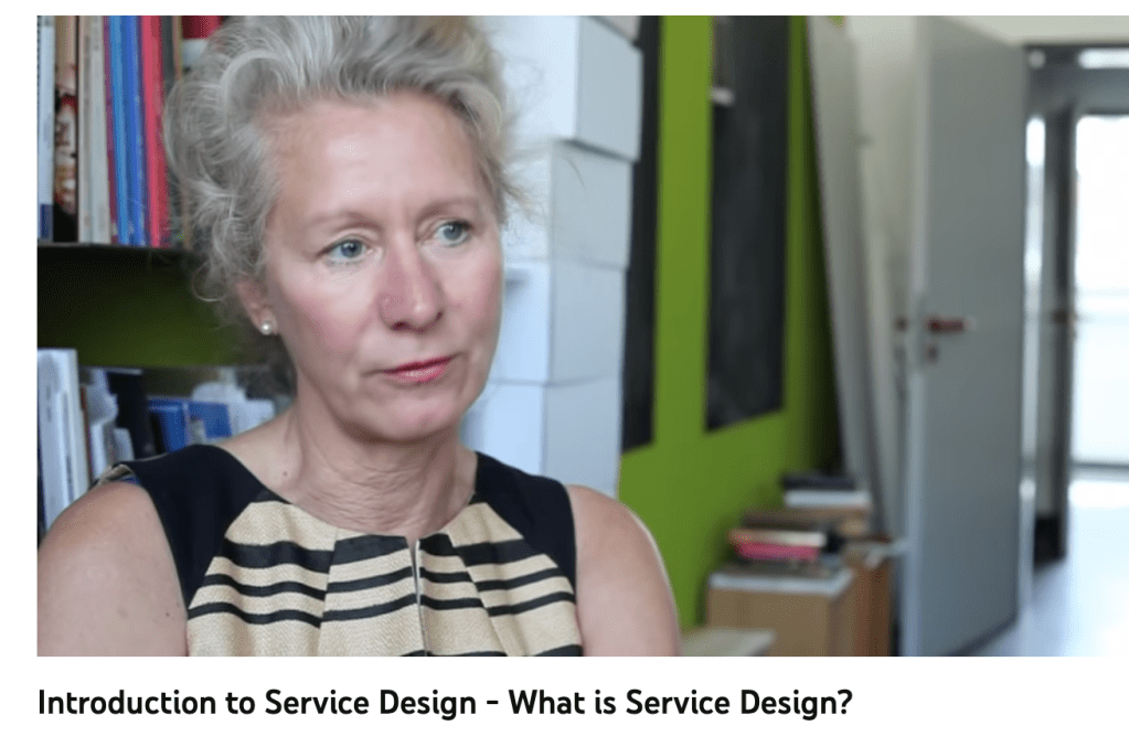
” Service design is a relatively new field in graphic design and was first introduced at the Köln International School of Design in 1991. In essence, the term describes the method for improving the quality of user service. This can be achieved through planning and organizing people, infrastructure, communication and material components of a service, in order to improve its quality and the interaction between service provider and customers. “
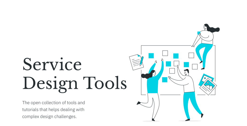
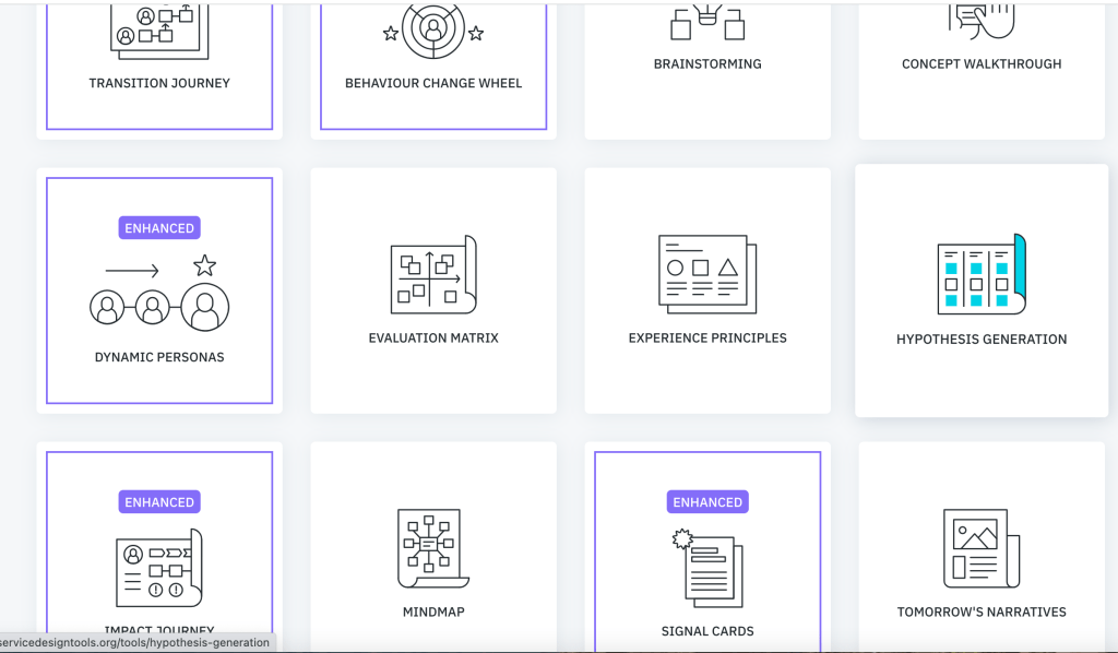
The website: http://www.servicedesigntools.org is an open source collection of service design tools.
“Within the last decade service design has develop robust frame…”
“Service design is about making services much better trough research, developing ideas and testing experiences.
Services range from product based to intangible and from simple (car mechanic…) to more complicated (staying in hotel, taking mortgage..) and highly complex (healthcare, education…)
Services affect most areas of our lives. “
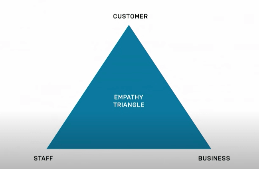
“Service design about collaboration…
There is a lot of focus in service design on tools and methods but they are useless when you don’t have the right technique. The techniques that I discuss in this video are: 1. Interviewing 2. Workshop facilitation 3. Storytelling 4. Rapid prototyping”
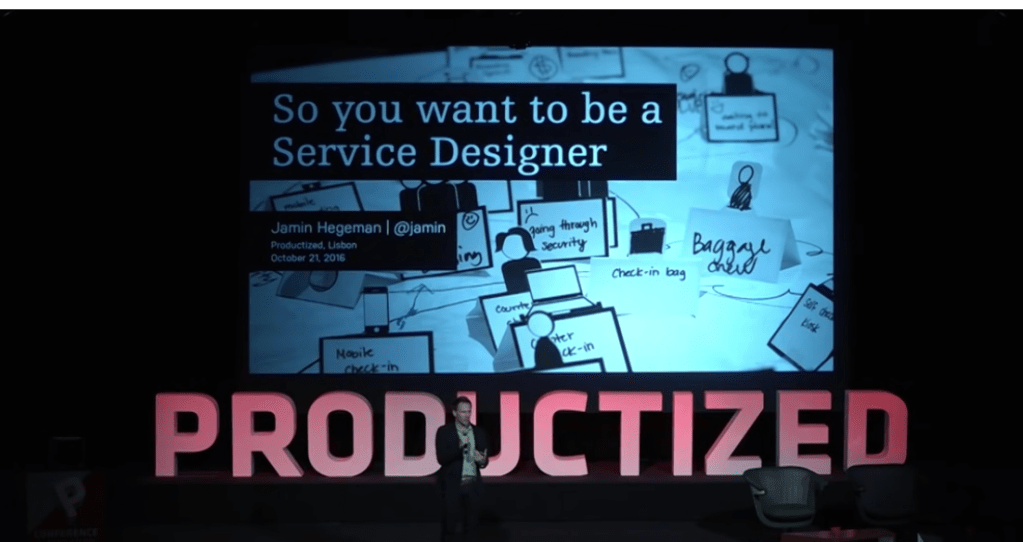
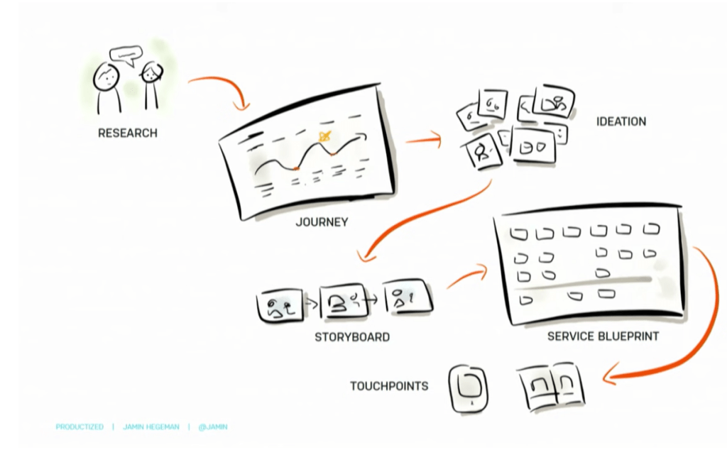
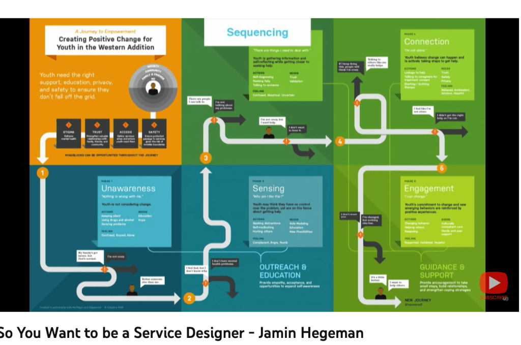
“In this talk Jamin Hegeman addresses what service design looks like, and the future of service design. Service design is no longer new or unknown. The practice is maturing as service design firms gain experience and organizations start to bring service design in house. Journey maps are all the rage, and everyone is talking about designing for the end to end customer experience. So what does it take to be a great service designer? What need do service designers address? What is the craft of service design? How might you build service design into your team?”
He said that service design has its own conference – the next one is in Amsterdam.
You need to understand the needs…
The process is similar as a design project…
journey maps – they are the vision or the story…
“Customer Journey Map: A customer journey map is a tool that shows the best and worst parts of a customer’s experience. The journey starts long before a customer starts to take an action, and shows the entire experience of the service through the customer’s perspective. (from lecture FU)”
Panel discussion on how to create a cohesive customer experience across digital and physical domains
Panelists: Katie Dill, Experience Design Lead, Airbnb – http://www.airbnb.com Robin Bigio, Creative Director, Good Eggs – http://www.goodeggs.com Frank Yoo, Director of Product Design, Lyft – http://www.lyft.com Moderator: Patrice Martin, Co-Lead+Creative Director, IDEO.org – http://www.ideo.org
“…is the place we have at least control over the design…
The earliest known example of protest ‘graffiti’ dates back to the Roman era, with examples of protest and political slogans being found carved into the walls of Pompeii, the ancient Roman city which was destroyed during the eruption of Mount Vesuvius in 79AD.
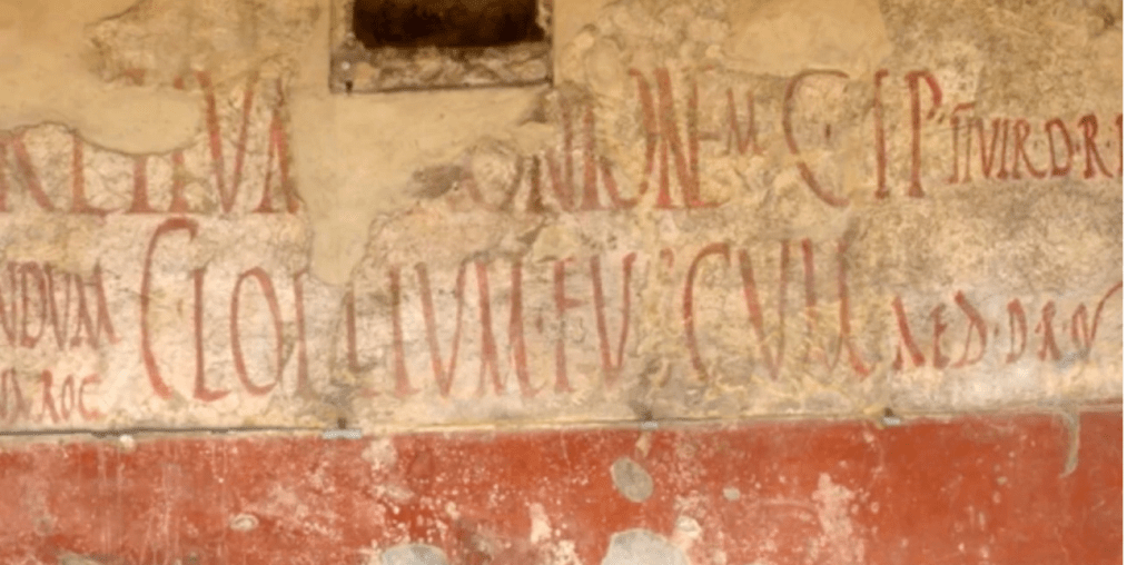
Scribbling graffiti was not an unusual practice centuries ago, and Romans liked to scrawl their jokes, political opinions, pleas and existential ramblings on the walls of communal and private buildings. Their scribbles are usually bawdy, lewd, full of profanity and vulgar, but at the same time they are the testimonies of a life lived in that period, and of the way public and private spheres were negotiated and expressed.
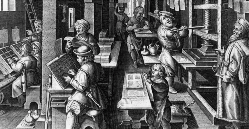
These early examples are significant in demonstrating the long history of agitation and self-expression. However, it wasn’t until advancements in technology brought about by the Industrial Revolution and in particular, the invention of the printing press that enabled people to reach a significant audience.
The printing press and especially Guttenberg’s movable type, enabled activists to cheaply mass produce information that rebelled against subjects such as the ruling classes, war and the church, to reach a wide audience.
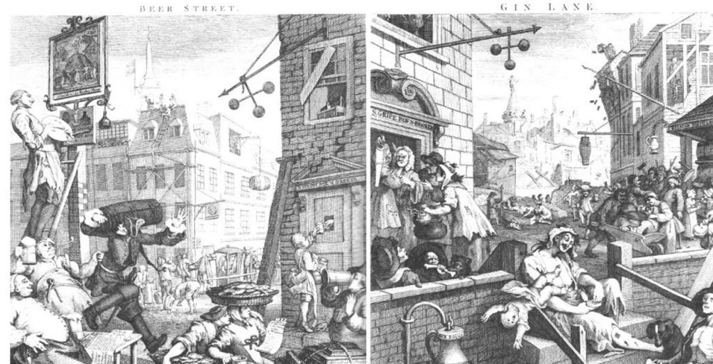
By the 1700s, political satire had become a powerful tool for ridiculing the ruling classes and agitating for social reform, through the production of cheaply produced newspapers and publications. It was a successful method because it combined humour and illustration to communicate to the working class, who were often illiterate.
Satire was used to great effect by the British engraver, William Hogarth, who was famous for creating a series of paintings of ‘modern moral subjects’, of which he sold engravings on subscription. Hogarth campaigned against the uncontrolled production and sale of cheap gin, through a painting called Gin Lane, which illustrated the evils of gin-drinking. The print was published as a pair with Beer Street, which culminated in the Gin Act of 1751, through which the number of gin shops was greatly reduced.
By the 1800s, satire had become a global movement, aided by the cost effectiveness of print, which spawned many satirical magazines, such as Puck in America, Punch, which was founded in the UK and Le Sourire from France.
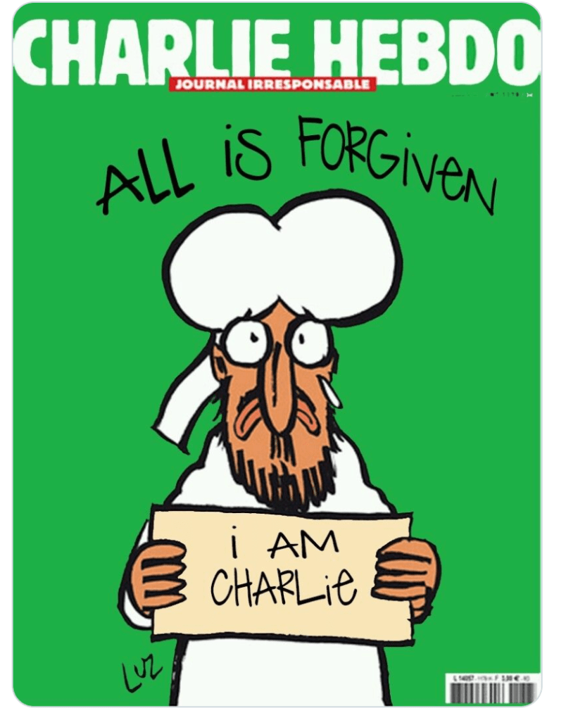
France, in particular, has a long history of satire, which was bought into the global consciousness by the gun attacks on the offices of Charlie Hebdo, a long standing satirical magazine based in Paris, which killed 12 people in 2015.
https://www.theguardian.com/media/2015/jan/13/charlie-hebdo-cover-magazine-prophet-muhammad
“
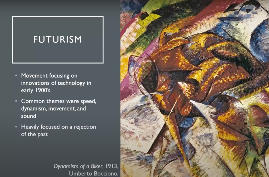
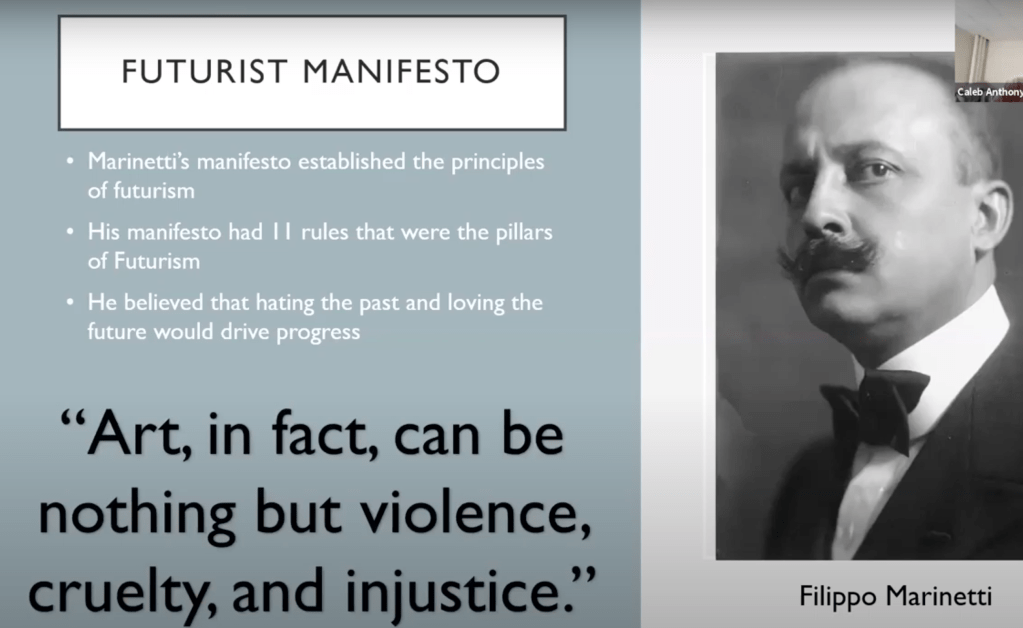
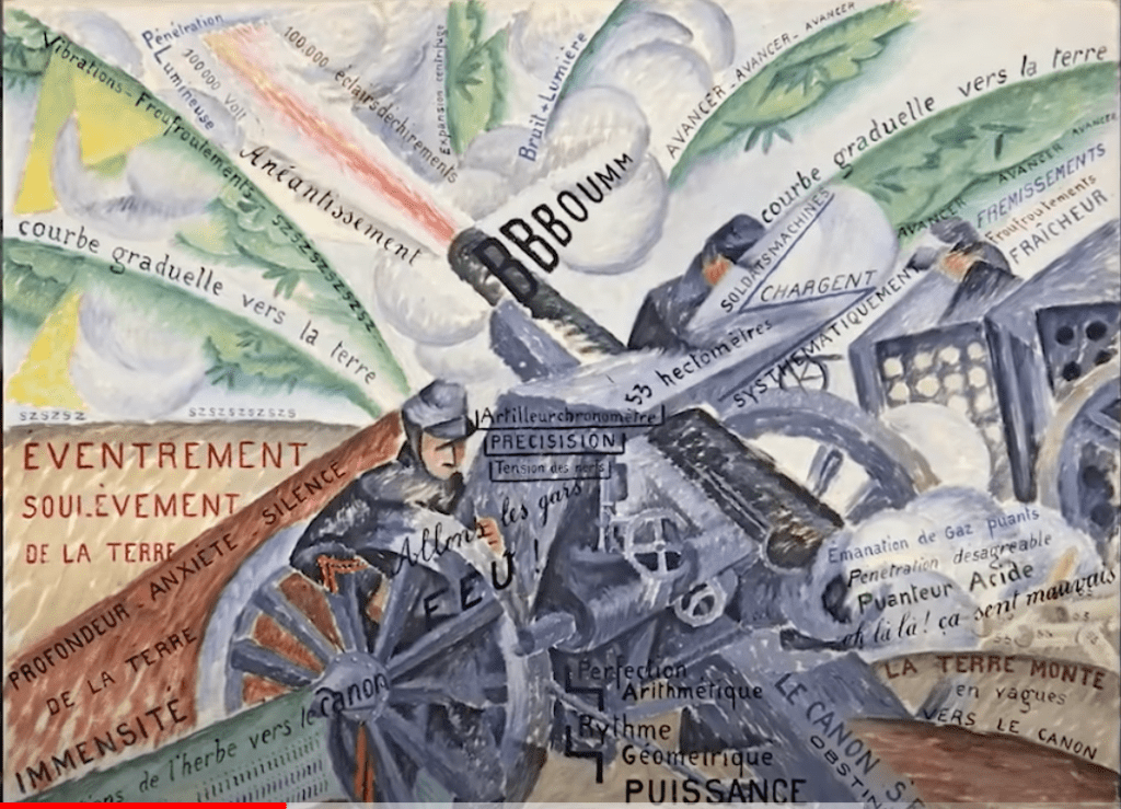
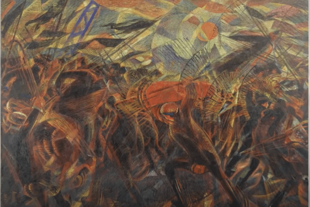
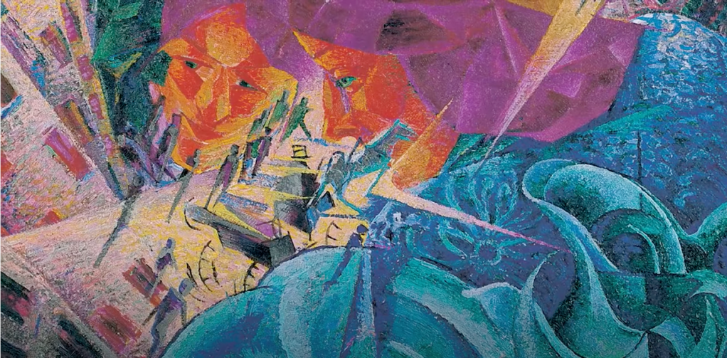
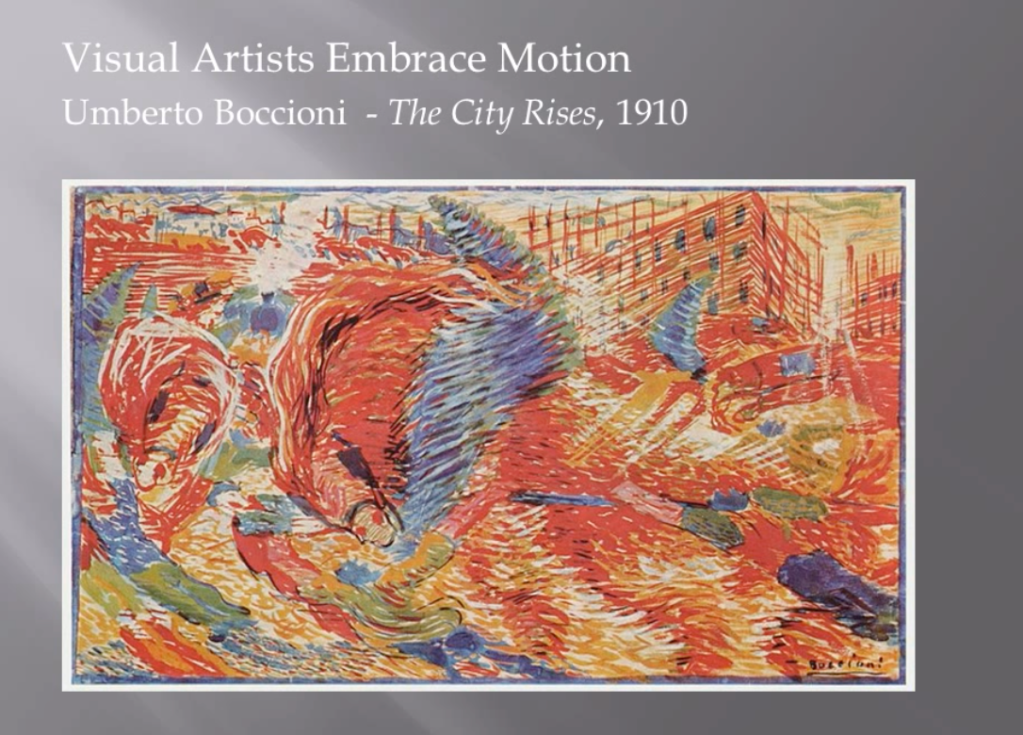
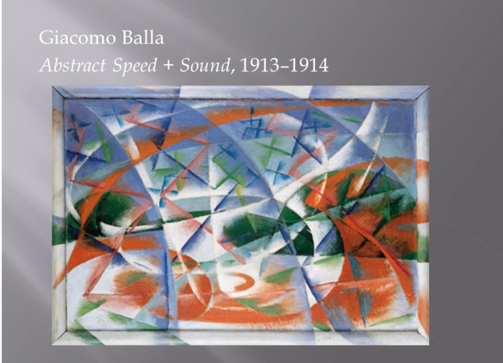
By the turn of the 20th century, society, politics and technology were changing irrevocably and art became a catalyst for rejecting the traditional social order. ‘Not the old, not the new, but the necessary’, was the mantra for the era surrounding the first world war, which spawned Marinetti’s Futurist manifesto on Vorticism and Dadaism, which reacted to advancements in society, politics and technology by developing new ways of seeing and expressing the world around them.
The Futurists, in particular, revolted against the traditional art and wanted to bring a new world order based on machine technology and war. They used multiple tools to project their provocation, which included painting, performance art and music. “

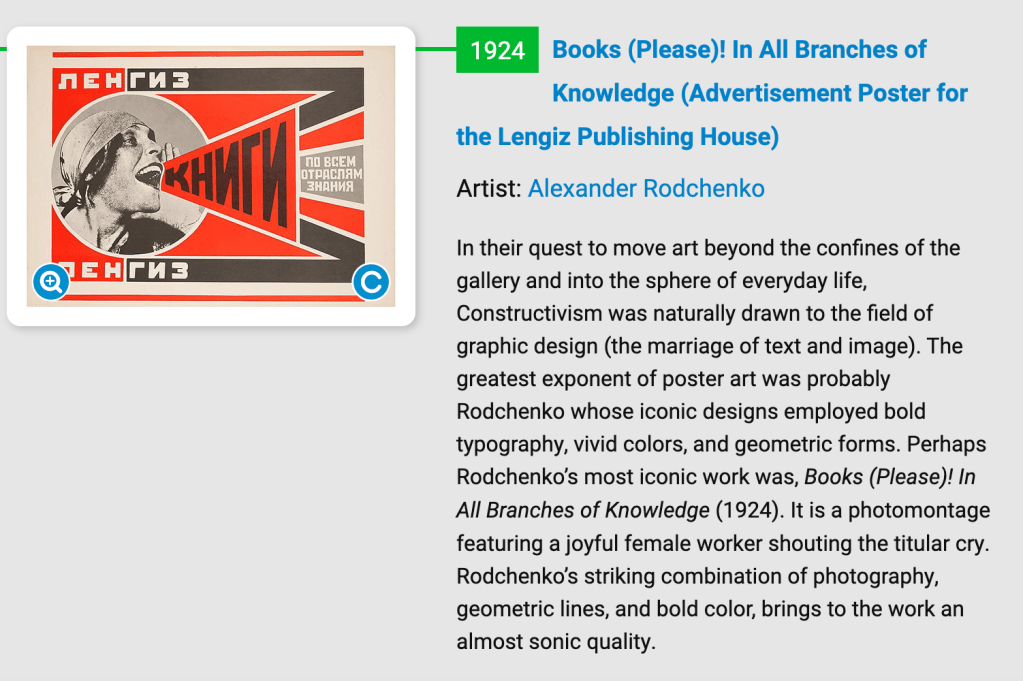
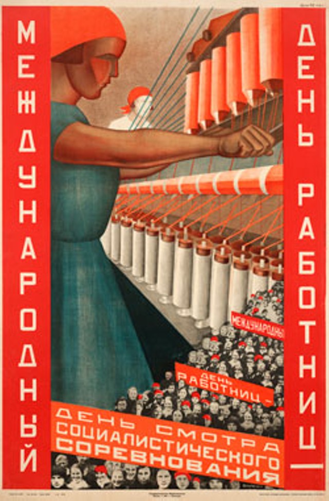
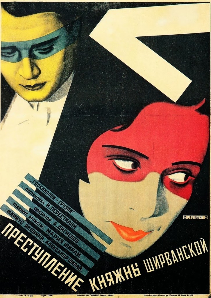
“Constructivism was an art movement founded by Vladimir Tatlin, in Russia, in 1913, who believed that art should reflect the modern industrial world.
Constructivism was a movement created by the Russian avant-garde, but quickly spread to the rest of the continent and produced work that sought to educate and provoke the working masses, not just the elite, in a bid to change society. The movement coincided with the Russian Revolution in 1917, and Tatlin was commissioned by the new Soviet Education Commissariat to educate the public with his art.
During the years following the October Revolution of 1917, posters were a vital way for the communists to get their beliefs across to a wider audience.
https://www.theartstory.org/movement/constructivism/
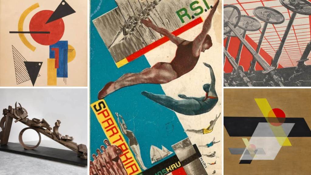
“Revolution and provocation were a global phenomenon during the first decades of the 20th century and not just reserved for Avant-garde Europeans. In 1910, Mexico entered a 10 year revolution, which aimed to oust the dictatorship of president Diaz, protest against the great divide between rich and poor and in particular, end the exploitation of the workers. The revolution initiated the Mexican mural renaissance, a visual art movement which played a key role in building a national identity in a country with 90 percent illiteracy.
Rivera was a dedicated artist, communist and was socially committed, which is reflected in his artworks that express a left-wing political orientation. He actively promoted socialism and believed in the revolutionary character of the arts. Many of Rivera’s murals depict Mexican history and society, especially the 1910 Mexican Revolution, with a revolutionary bias, and still can be found in the public spaces at the National Palace and Ministry of Public Education, in Mexico City.
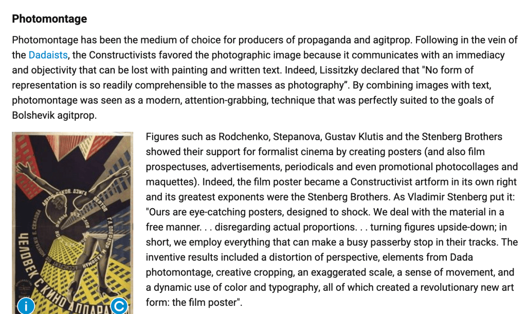
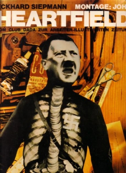
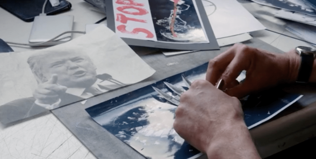
The rise of Hitler and the Nazi party had a devastating effect on humanity, society, politics and the termination of Avant-garde art movements, such as the Bauhaus. This was an era of widespread propaganda, often created by political parties, however some artists still managed to produce work that criticised fascism, despite great personal danger. One such political artist was John Heartfield, a German artist who received formative training in advertising with the Berlin Dada movement, and was one of the key components in the development of photo-montage.
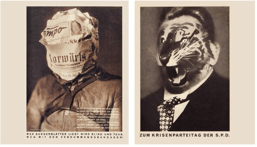
John Heartfield was a pioneer of modern photomontage, working primarily in Germany throughout the two world wars, using photomontage as a great political effect of gaining power.
His most famous image, Adolf, the Superman: Swallows Gold and Spouts Junk, created in 1932, shows Hitler from the waist up. A swastika replaces his heart, and his torso is an x-ray revealing gold coins flowing down his throat and collecting in his stomach.
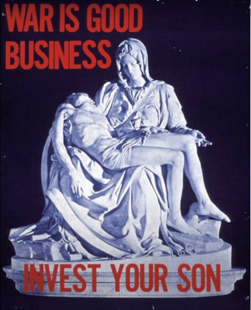
Another exponent of the photo-montage style is the British political artist Peter Kennard, who has created iconic work about capitalism and war since the mid 1960s
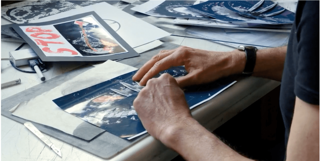

https://www.bbc.com/news/magazine-32706845. -Values (photograph taken in 1974) – by Peter Kennard
Kennard’s last image shows Earth as a human head – with missiles sticking out as hair – and the torso of a starving child underneath.
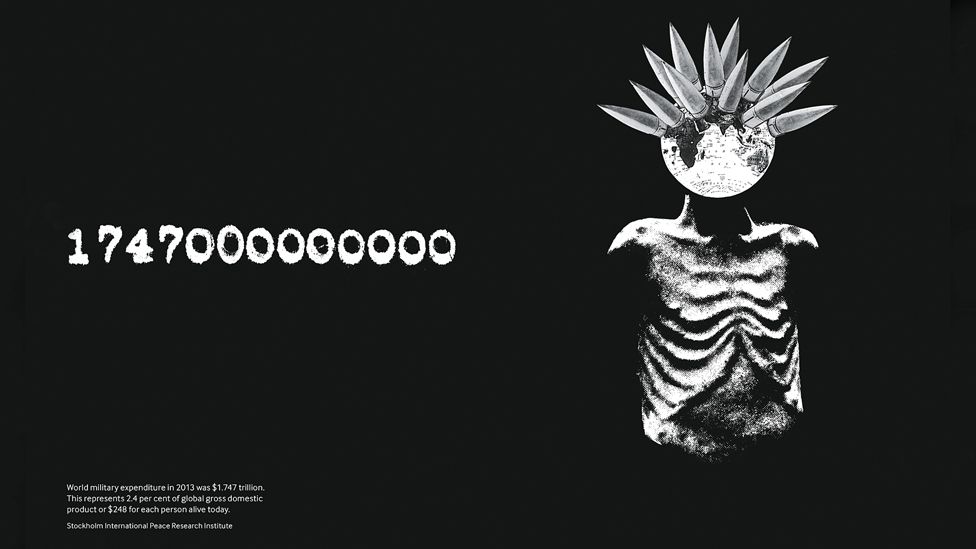
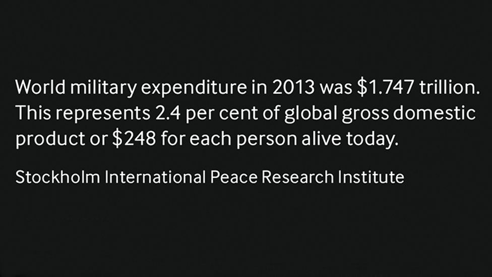
That image is juxtaposed with a giant financial figure – of more than $1.7 trillion – claimed to be the total amount of money spent on global military expenditure in 2013.
Kennard says he is trying to make people think and show the “stupidity and horror” of the way the world is being run
…this is today
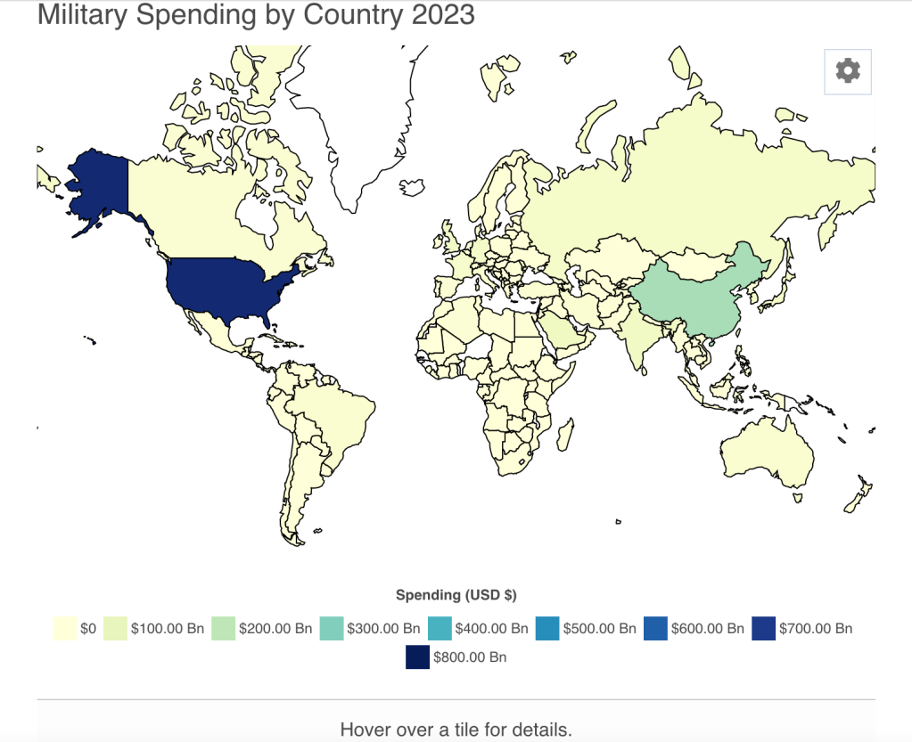
https://worldpopulationreview.com/country-rankings/military-spending-by-country
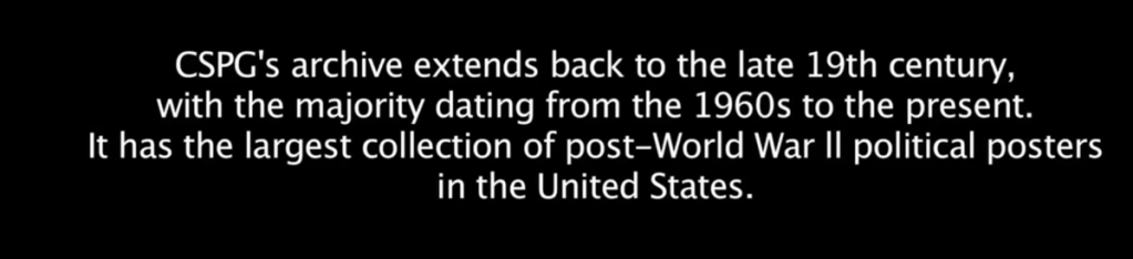
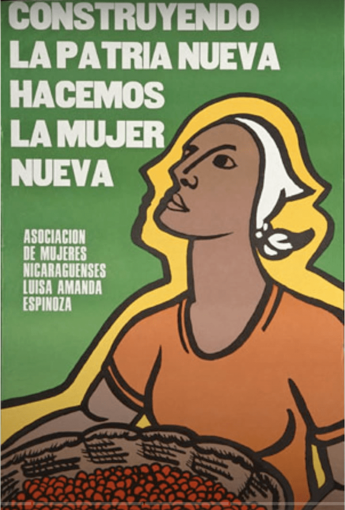
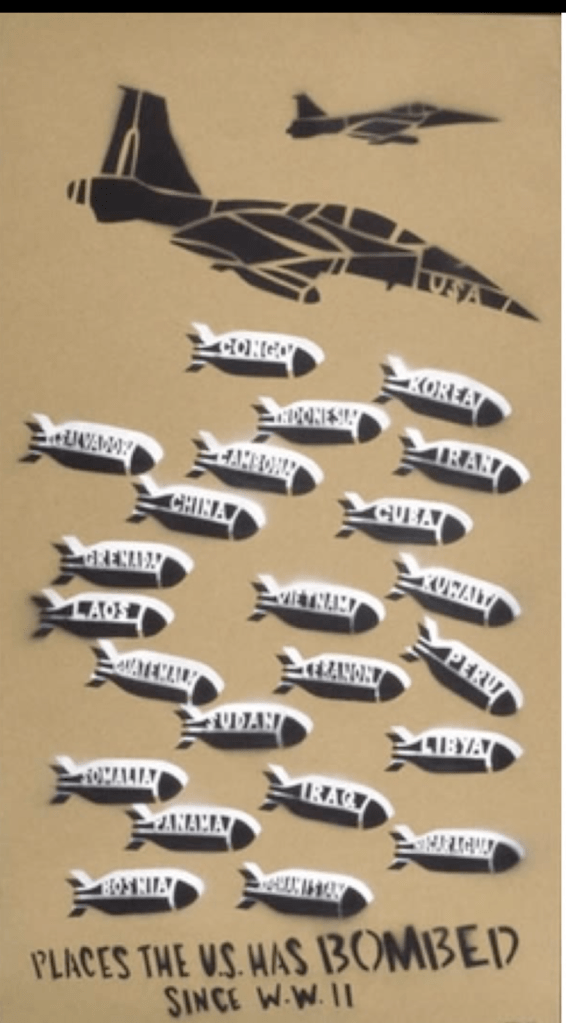
Center for the Study of Political Graphics -https://www.politicalgraphics.org/
“…the posters have the ability to move people…”
https://www.politicalgraphics.org/exhibitions
Design, When Everybody Designs : An Introduction to Design for Social Innovation
by Ezio Manzini , and Rachel Coad
Ainonghui is a wonderful example of the growing number of initiatives worldwide that are dealing with fresh, organic, healthy food and its links with farming: from farmers’ markets to food coops, zero-mile food, and community-supported agriculture.
For instance, in view of the widespread problem of a growing elderly population, the question could be: “How can we take care of all these elderly people?” In mature industrial societies and in the more globalized parts of emerging ones, i.e., in modernized societies, the mainstream answer is: “Create more dedicated professional social services.” However, the radically innovative one is: “Consider the elderly not only as a problem but also as possible agents for its solution; support their capabilities and their will to be actively involved, and optimize use of their social networks.” This initial revolutionary move of considering the elderly not only for what they need but also for what they are able and willing to do has led to a number of social inventions and enhancements.
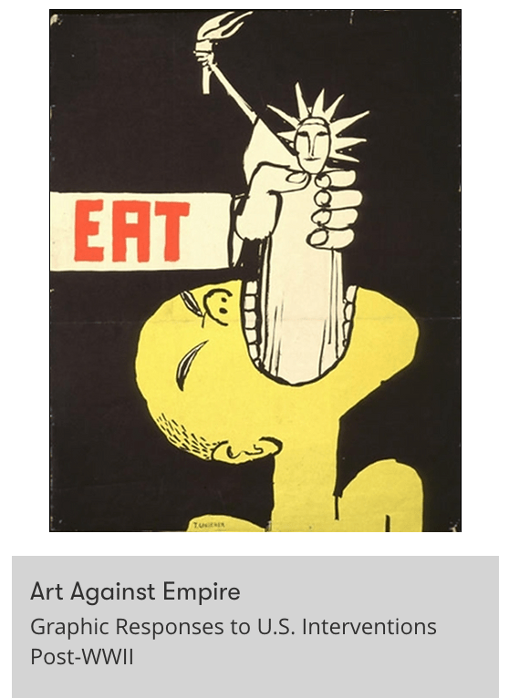
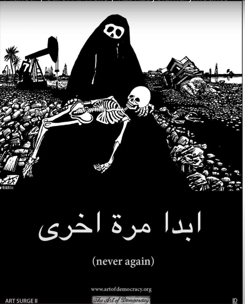
“Carol A. Wells is an activist, art historian, curator, lecturer, and writer. She has been collecting posters and producing political poster art exhibitions on a variety of human rights themes for over thirty years. Trained as a medievalist at UCLA, she taught the history of art and architecture for thirteen years at CSU Fullerton until a poster changed her life. In 1988, Wells founded the Center for the Study of Political Graphics, an educational and research archive with more than 85,000 domestic and international human rights and protest posters going back to the 19th century, including the largest collection of post WWII social movement posters in the U.S. Wells’ TEDxtalk will focus on the power of graphics to combat public apathy and feelings of helplessness, opening up a truly democratic arena for political debate.
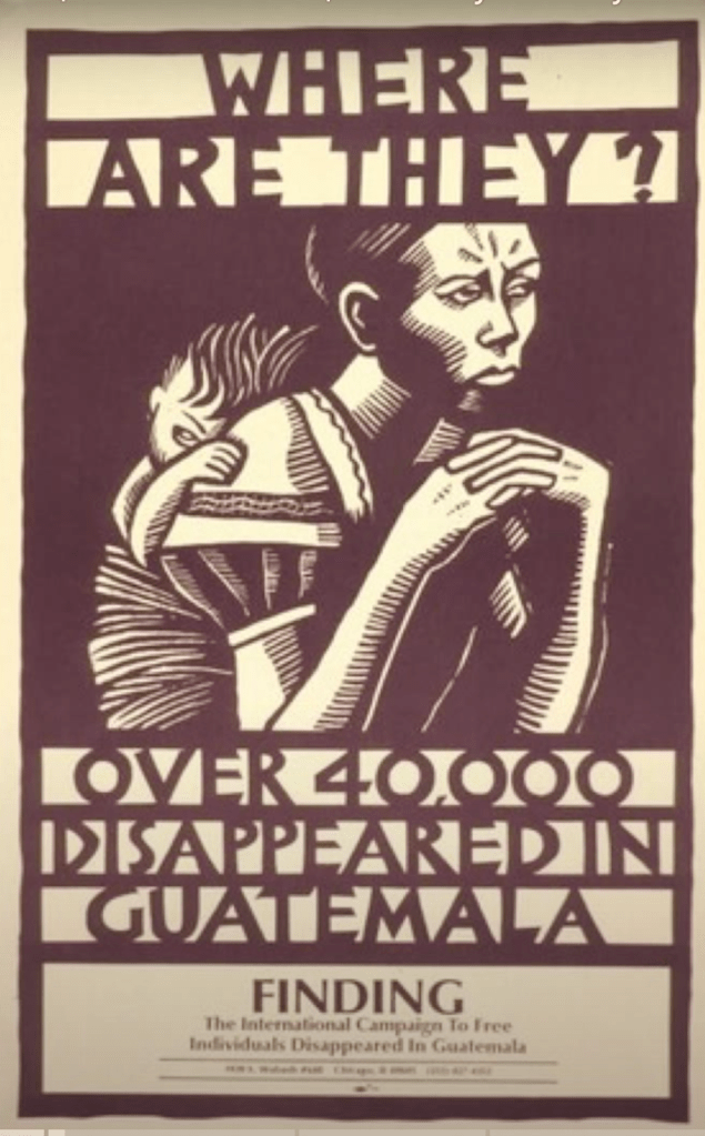
The Guatemalan genocide, also referred to as the Maya genocide, or the Silent Holocaust, was the massacre of Maya civilians during the Guatemalan Civil War by the US-backed Guatemalan military government
Children were often targets of mass killings by the army including in the Río Negro massacres between 1980 and 1982. An estimated 200,000 Guatemalans were killed during the war including at least 40,000 persons who “disappeared”. 93% of civilian executions were carried out by government forces.
Over the three years, the army destroyed 626 villages, killed or “disappeared” more than 200,000 people and displaced an additional 1.5 million, while more than 150,000 were driven to seek refuge in Mexico. (https://hmh.org/library/research/genocide-in-guatemala-guide/)
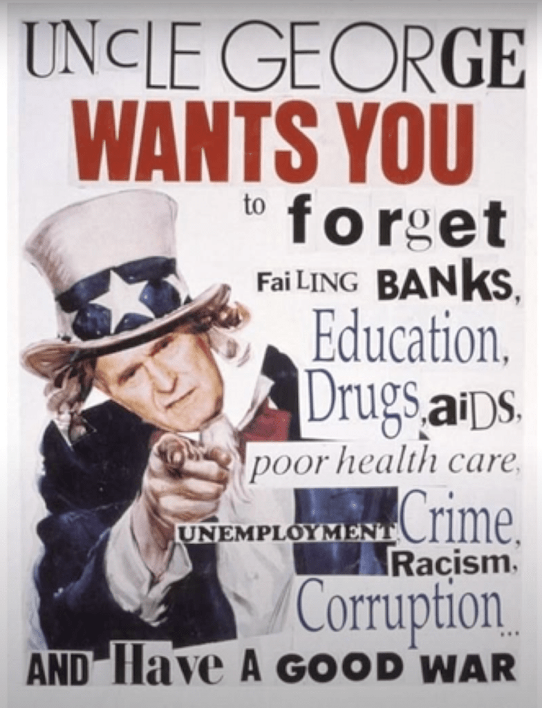
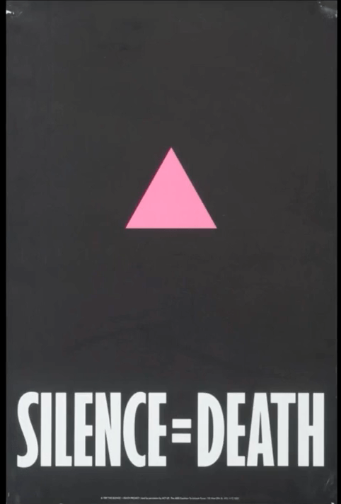
Posters stay in people’s mind – you can’t forget them
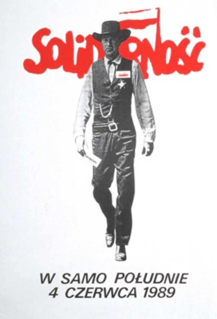
When in August 1980 the Gdańsk shipyard workers started a strike, they were convinced that only a strategy of non-violence could lead to success. Inspired by their charismatic leader Lech Wałęsa, they won the support of intellectuals in the opposition movement. This episode led to the founding of the first legal non-communist trade union; Solidarność.
(https://europeremembers.com/destination/solidarity/)
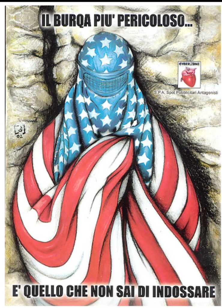
The poster that changed Poland
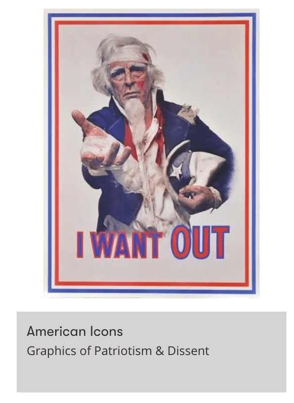
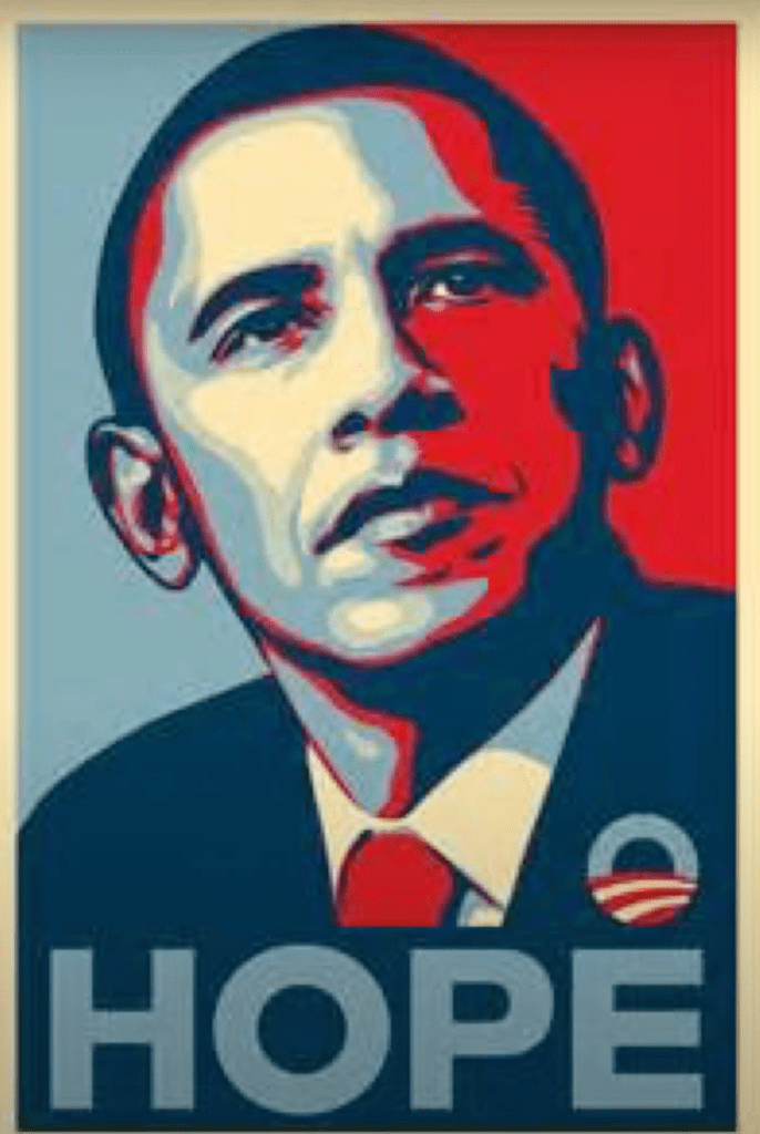
Poster that changed USA history
Service Design Tools: Communicating Methods Supporting Design Processes (2009), [Accessed 6 March 2019]. Available from: http://www.servicedesigntools.org/repository
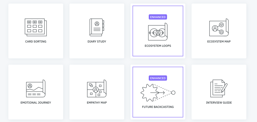
Card sorting helps uncover user’s mental models for better information architecture, and understand how to organize information in a way so that other people can find it. In an open card sorting exercise, users are asked to cluster the cards based on affinities, and assign the name they want to each of the groups. While in a closed card sorting exercise, users are asked to organize the individual cards into predetermined categories. Card sorting can be either moderated or unmoderated by the facilitator, it can be counducted on paper or using digital tools.
The emotional journey is an extension of the usual experience journey map (or customer journey map) that associates an indication of the emotional status of the user at each stage of the experience. The emotion can be represented by a curve floating from moments of frustration to delight, or by adding emojis and pictograms to the specific steps of the journey.
The diary study is a research method inspired by cultural probes, in which participants are asked to monitor and report specific data over a defined period of time. The diary can be analog or digital, request to simply log specific information or even take photos and videos. It could help with remote research, and facilitate self-reflection prior to an in-depth interview.
The empathy map is a canvas split into four quadrants (says, thinks, does, and feels), all positioned around the user. Filling the map allows to produce an overview of who the user is, and to identify inconsistencies in the perception of the same user from various team members (and so intervene to mitigate the conflict).
The interview guide (or discussion guide) is a logical sequence of topics and questions that help the researcher conduct an interview session. The guide is organized in sections according to the different topics that need to be explored during the research; each section comes with a detailed set of questions that help cover that topic. While during the interviews the conversation may go in many different directions, the guide helps the researcher remember all the key aspects to explore.
Writing notes during observations sessions help make the most out of that research activity, making sure to capture insights as well as data concerning what’s happening around (e.g. how many times an action is repeated, how long it takes, steps covered, etc.). Preparing a dedicated support such as a printed grid or notebook with specific investigation areas to fill during the session could be valuable to guide the researcher by suggesting data points to capture, and so avoid to forget any important aspects.
Tools for Ideation
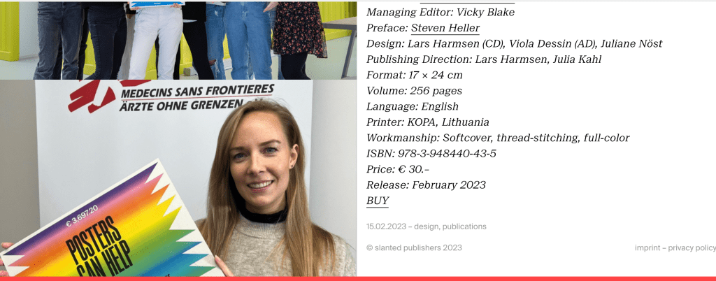
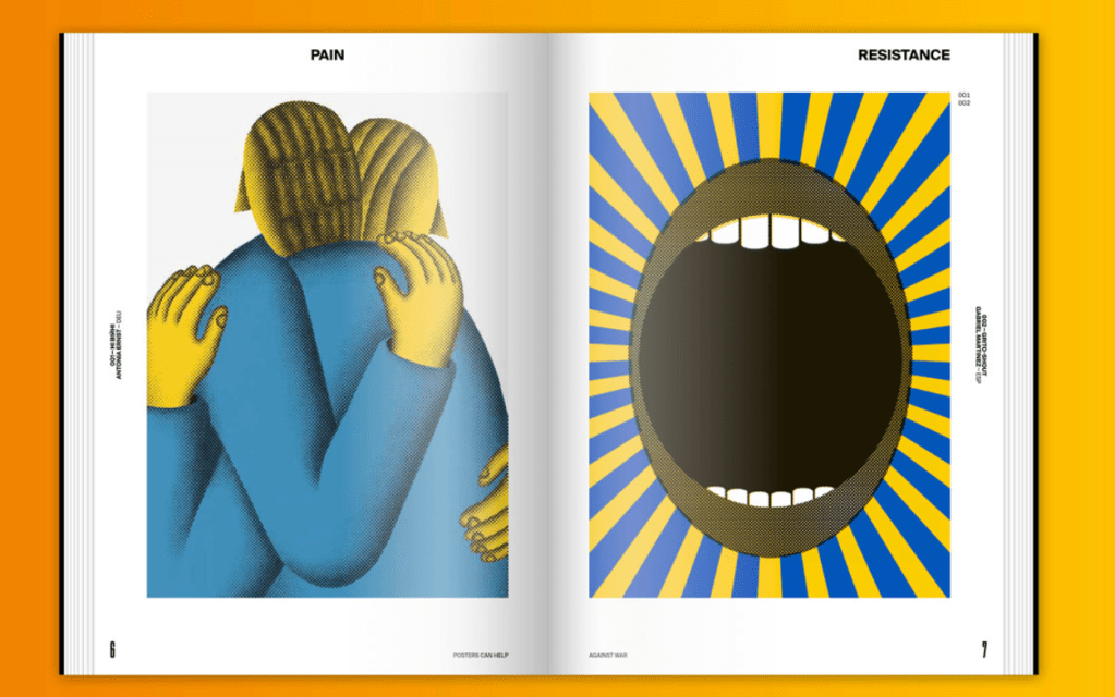
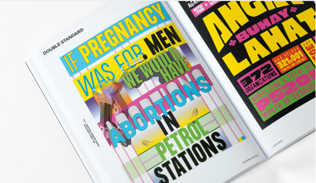
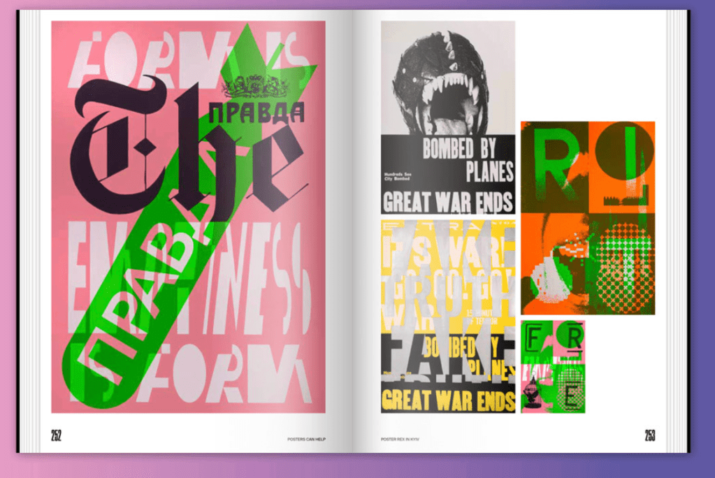
https://www.slanted.de/posters-can-help/
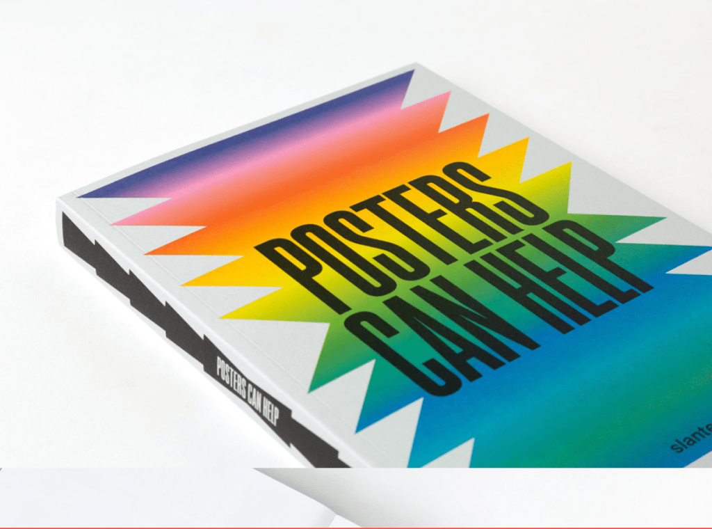
“We are very pleased to announce the release of a heartfelt project, the importance of which was amplified by the start of the Ukraine war almost exactly a year ago: Posters Can Help.
With a global call, we invited the design community to contribute with a piece of work and a donation. 434 people from all over the world participated in this project and almost 700 posters were submitted, which resulted in a colorful potpourri of posters, each one a compassionate outreach and act of charity—literally.
All the proceeds gained through the submissions have been donated to two selected organizations that we appreciate for their work: ARTHELPS and MSF—Médecins Sans Frontières. Any profits beyond covering the costs of printing the book will also be donated to those organizations. So let’s hope that soon there will be no more books left! “

https://www.itsnicethat.com/news/made-thought-plasticfree-creative-industry-130123
“We’re getting to the point where we realise that nearly everything needs to be redesigned,” explains Made Thought’s Ben Parker. “Many of the systems don’t work and we can no longer just continue to be complicit in designing into these broken systems as creatives. PlasticFree is a unique inspiration platform for the creative industry that empowers and educates creatives to design differently from the start.”
A Plastic Planet, who are focused on material solutions without plastic, is a partner on the project. Co-founder, Sian Sutherland, adds: “There is significant power held by the 160m global creatives to help us rethink how we take, make and waste, to reimagine different systems and material uses in a very different way from today.” Sutherland continues: “If we can ignite and empower creatives by giving them trusted, relevant data and inspiring case studies, we believe we can change everything much faster.”

https://www.dandad.org/awards/professional/2015/graphic-design/24586/chamber-collection-i/
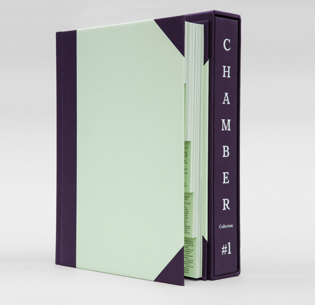
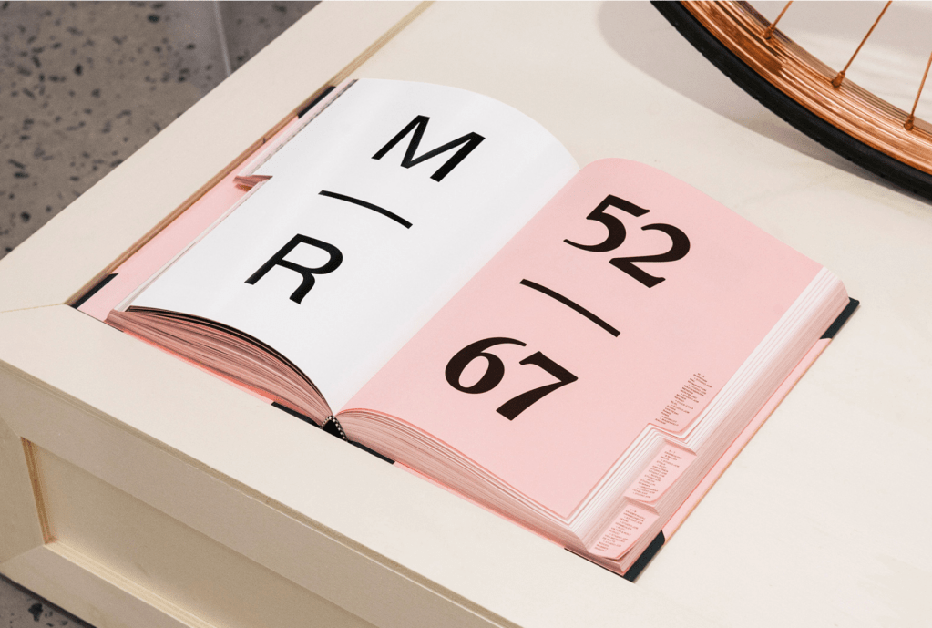
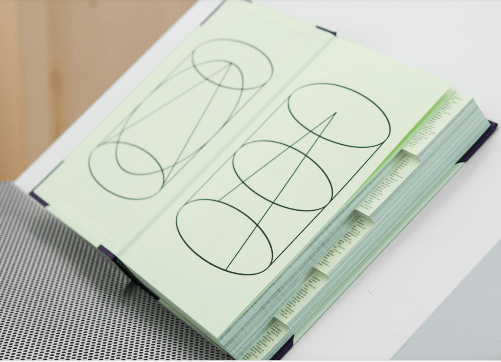
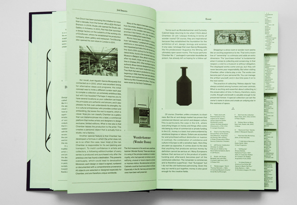
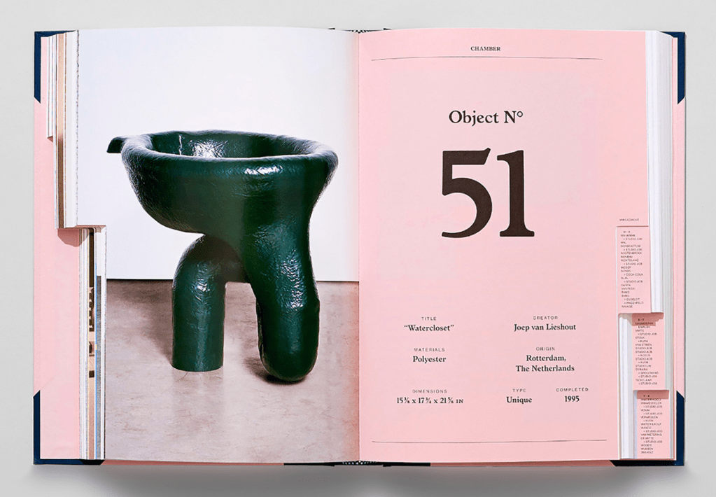
Chamber Collection #1 presents the gallery’s first collection, curated by Dutch design duo Studio Job. Within its pages, the 100 selected objects are encountered in alphabetical order according to the artists’ names which are indexed on die cut tabs. The book, designed by Studio Lin, comes in two colourways corresponding to the Chamber identity.
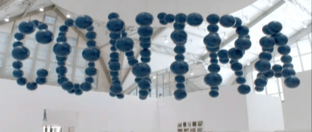
https://www.dandad.org/awards/professional/2010/environmental-design/18226/procontra/
This project is a giant installation for the Lead Awards, the host of the most important exhibition for photography and print media in Germany. 144 balls were mounted in the main exhibition hall, which seemed to be a chaotic structure. The chaos turns into a message when you look at it from two marked positions. From one position, pro; from the other, con. We asked people to get both points of view and rethink their opinions. Because where there is a pro, there is always a con.

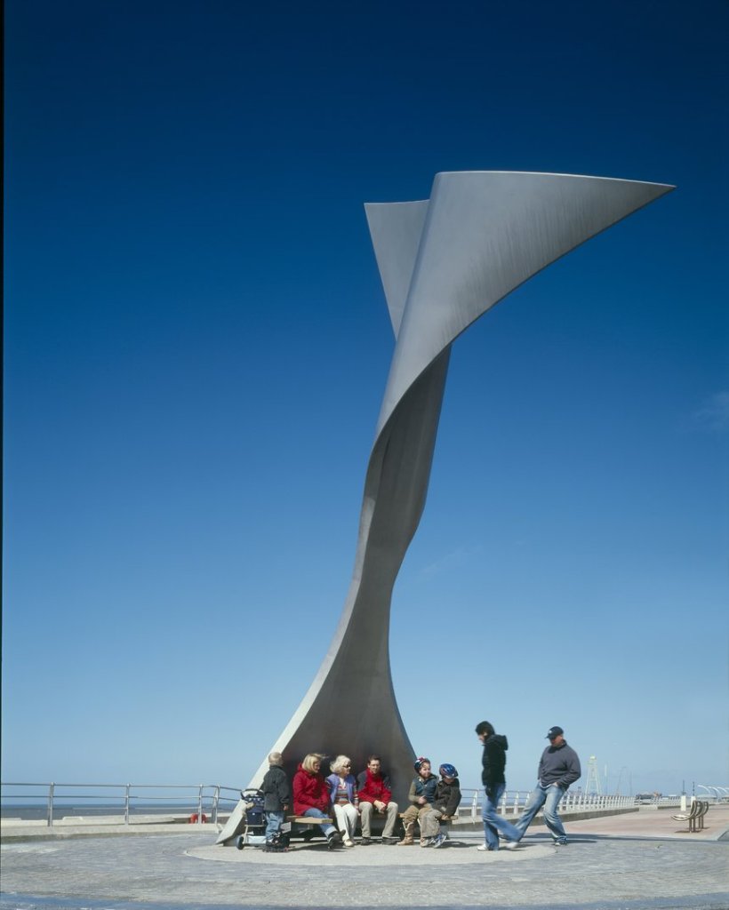
https://www.dandad.org/awards/professional/2007/environmental-design/16236/rotating-wind-shelter/
The shelters are designed to rotate according to the prevailing wind direction to shield the occupants from the elements. The shape was born out of a distillation of the key elements: a vane, which will turn the structure, and a baffle that will shelter the inhabitant from the wind. Extensive testing and development work was carried out to establish the performance of the shelters, looking specifically at the accuracy according to wind direction and also the speed of rotation. The shelter is eight metres tall and manufactured from resilient Duplex stainless steel. It sits on a four metre diameter turntable, which incorporates a damper to control the speed of rotation.

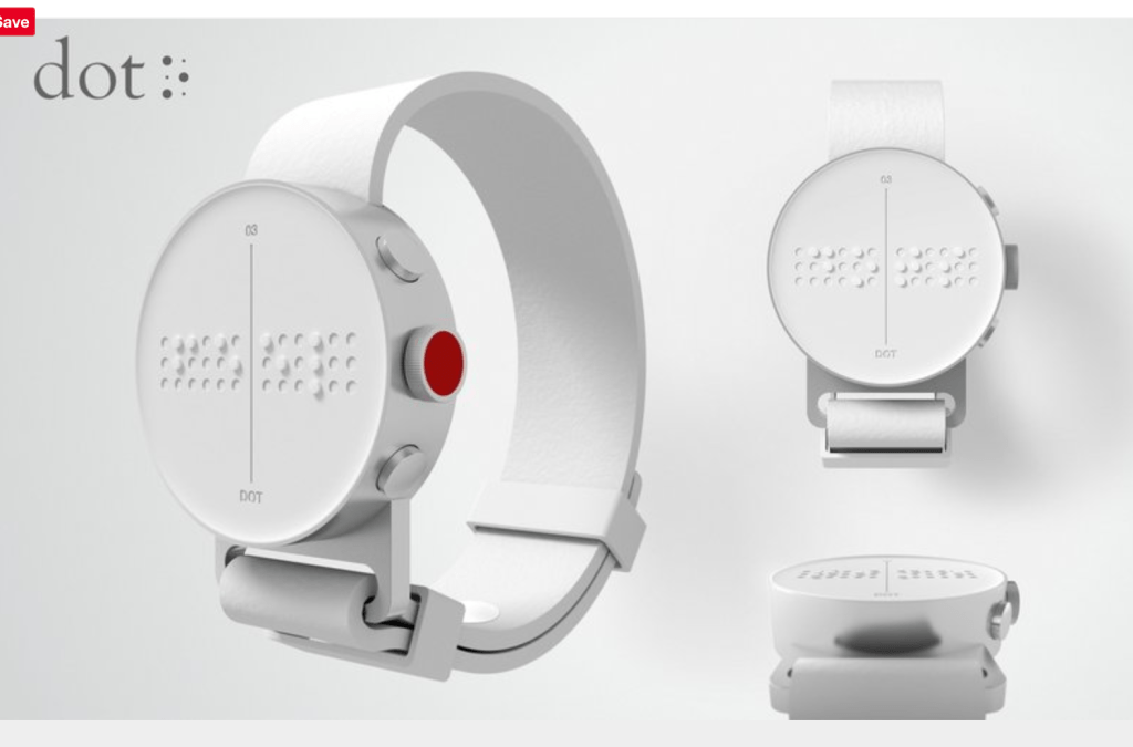
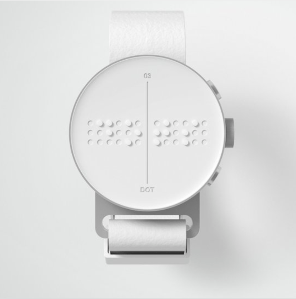
285 Mio. people worldwide are blind and/or visually impaired (B&VI). For the last 20 years, there were no innovations in communications technology for them:
Existing digital Braille devices are bulky and expensive. They weigh around 2kg and cost $3,000 to $15,000. This makes them unaffordable to the majority of B&VI people: only 5% own such a device.
Our objective was to develop a practical and affordable solution
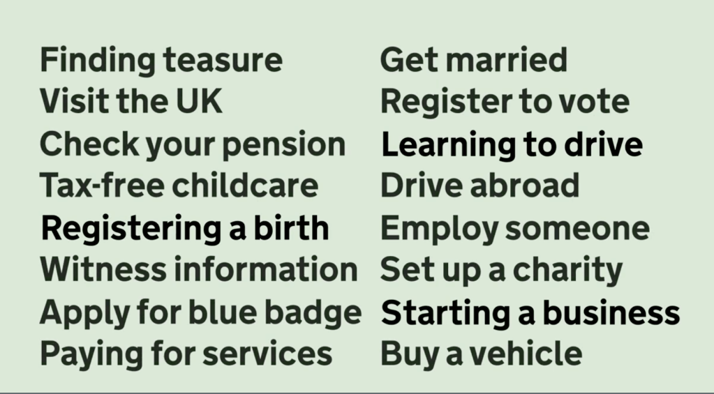
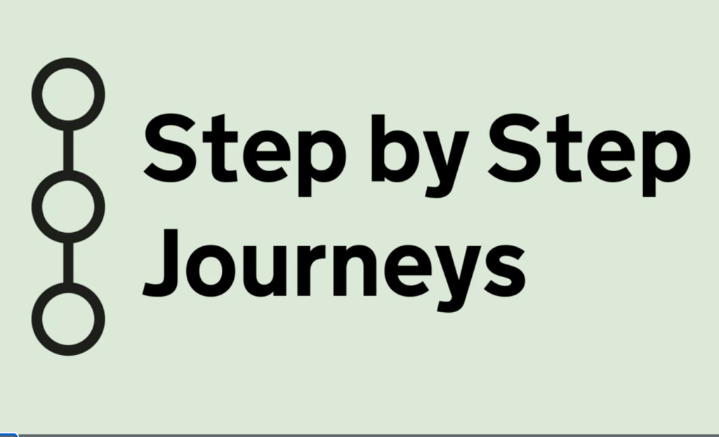
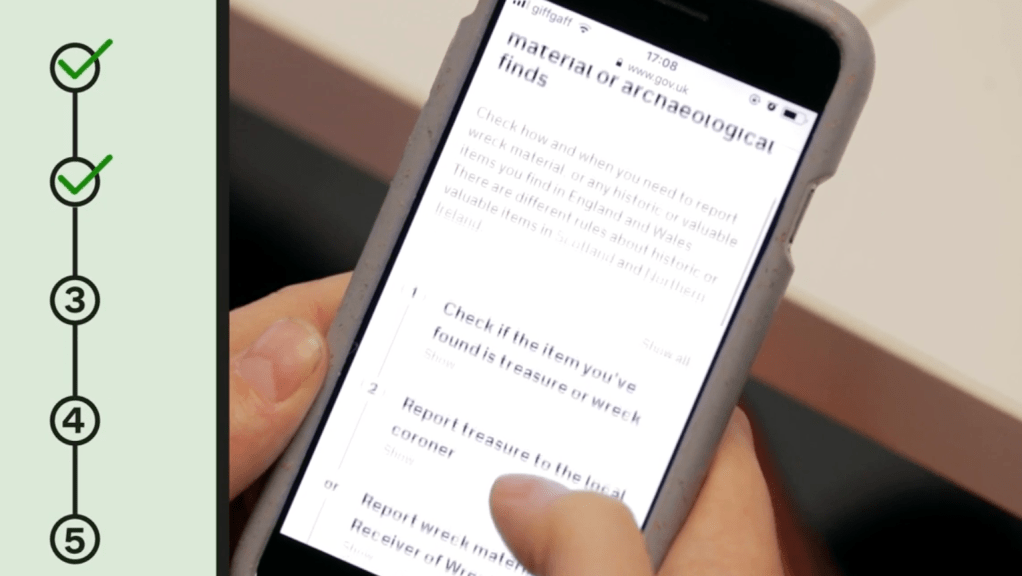
https://www.dandad.org/awards/professional/2019/digital-design/231113/govuk-step-by-step-journeys/
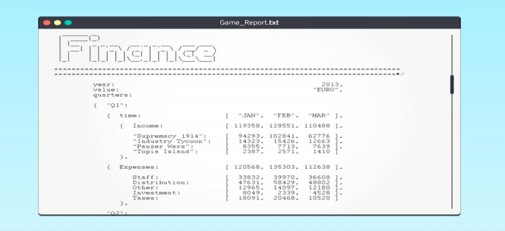
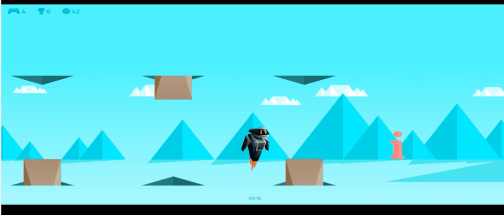
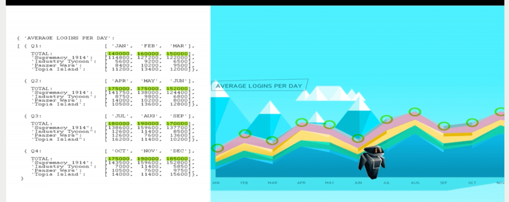
https://www.dandad.org/awards/professional/2015/graphic-design/24588/the-game-report/
Turning the numbers into fun
Gaming startup Bytro Labs wanted to convince potential investors and merger partners of not only their game developing skills, but their economic expertise, too. So, Serviceplan built the first business report that’s also a playable game. Distributed as a simple text file containing Bytro Labs’ regular business report, the text was written and formatted in a way that allowed it to function as programme code. Upon changing the file extension from .txt to .html, the business data became programming parameters for a game. This meant recipients didn’t have to just read the data, they could consume it as part of an interactive experience. The response rate was a whopping 94%
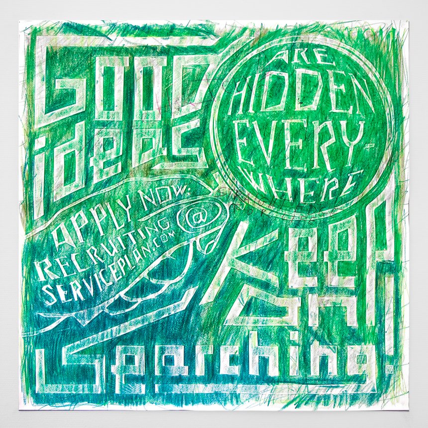
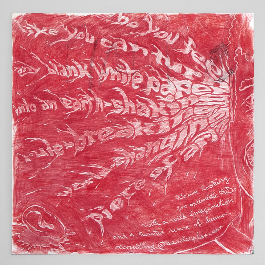
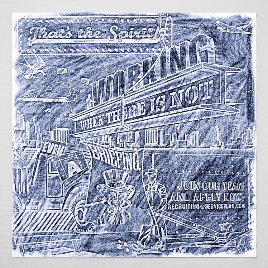
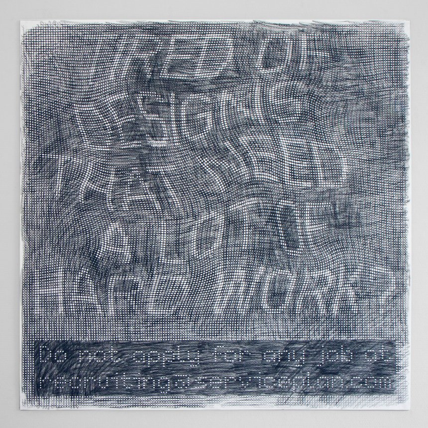
Serviceplan needs creatives who are searching for ideas everywhere and who are challenged by every blank sheet of paper. In order to communicate this message, we created posters that didn’t reveal their messages until someone started doodling on them. Hung up on the blackboards of design universities, our seven differently illustrated messages addressed our target group: creatives with wild imagination and endurance.
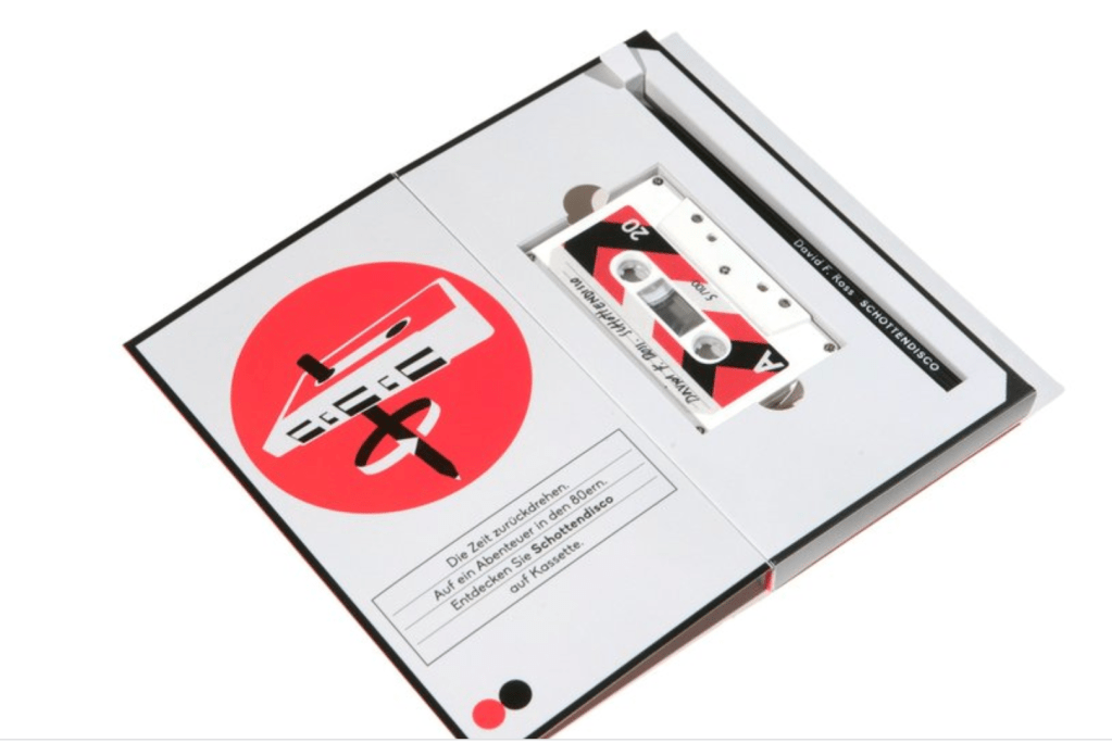
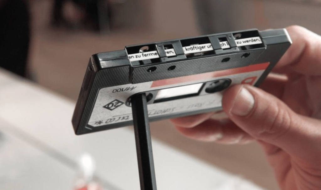
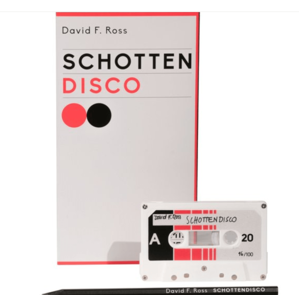
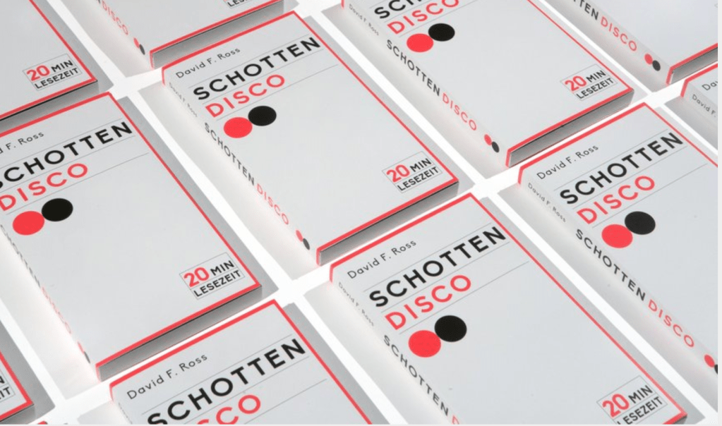
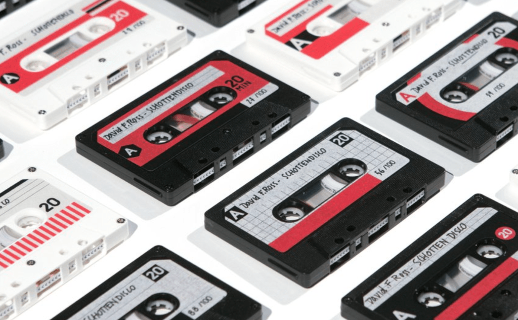
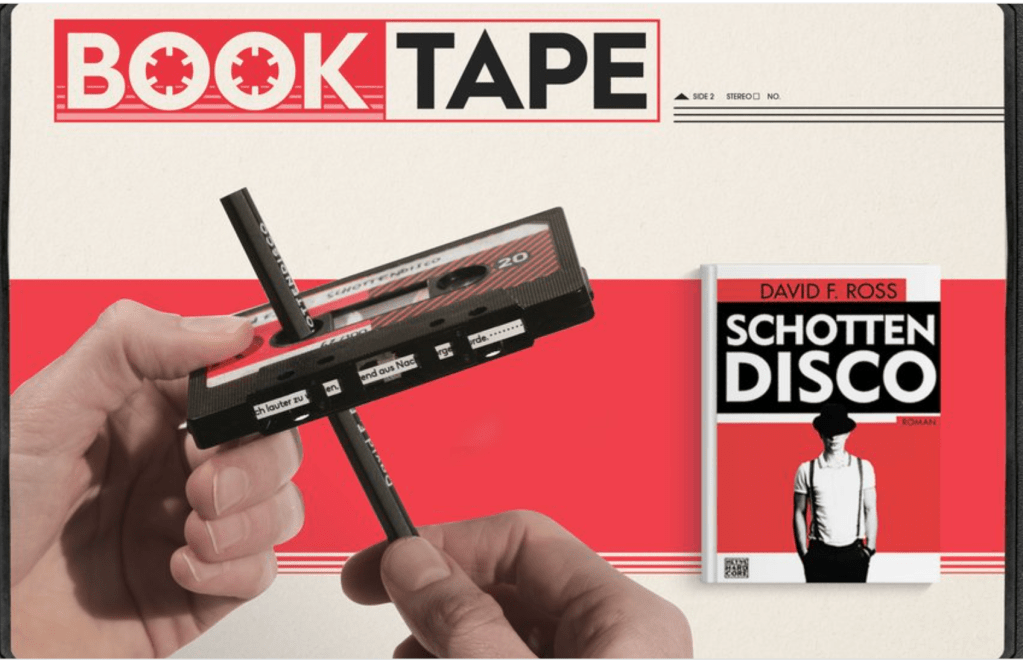
https://www.dandad.org/awards/professional/2017/graphic-design/25916/the-book-tape/
Random House wants to promote the release of „Schottendisco“, a story set in the 80s disco-music scene. How to generate hype in the midst of thousand of new releases?
We create a reading sample which will relive all the flavor of the 80s music.
By just replacing the tape of old cassettes, we literally put our book on tape and bring back a very special ritual: to read the book customers have to put a pencil in the tape and turn it around, diving into a story they might have missed otherwise.
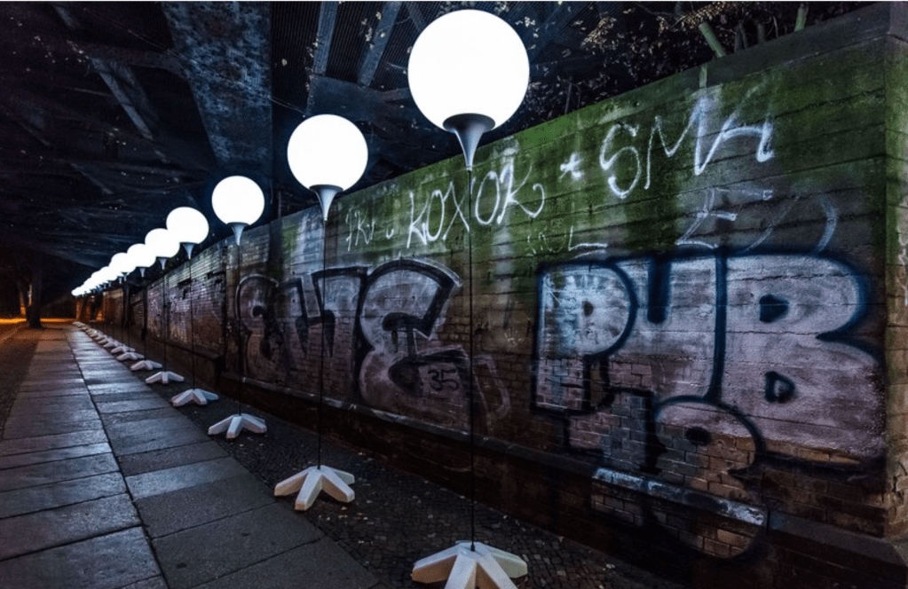
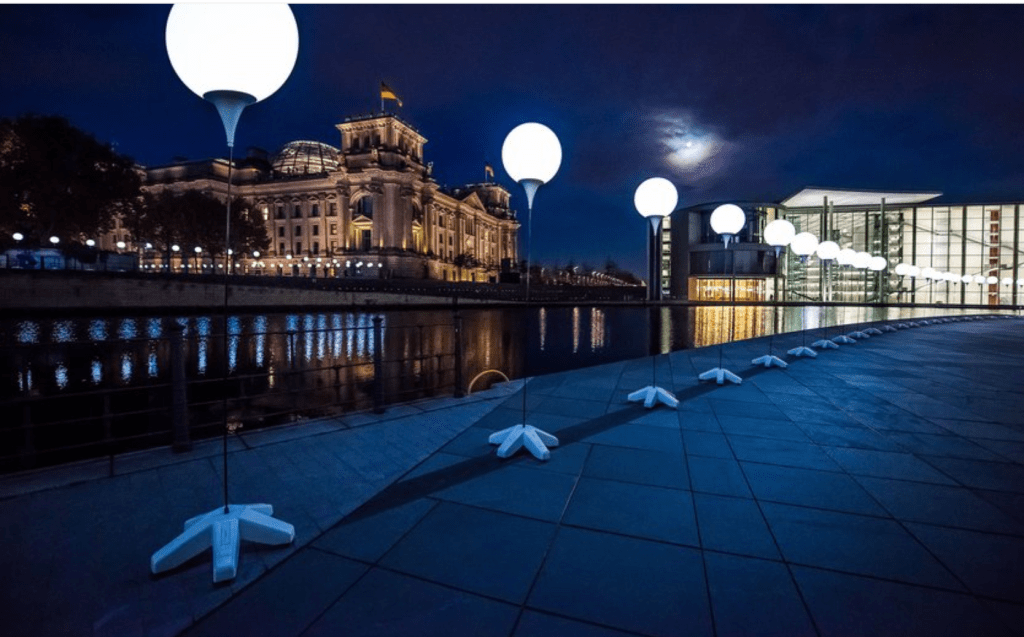
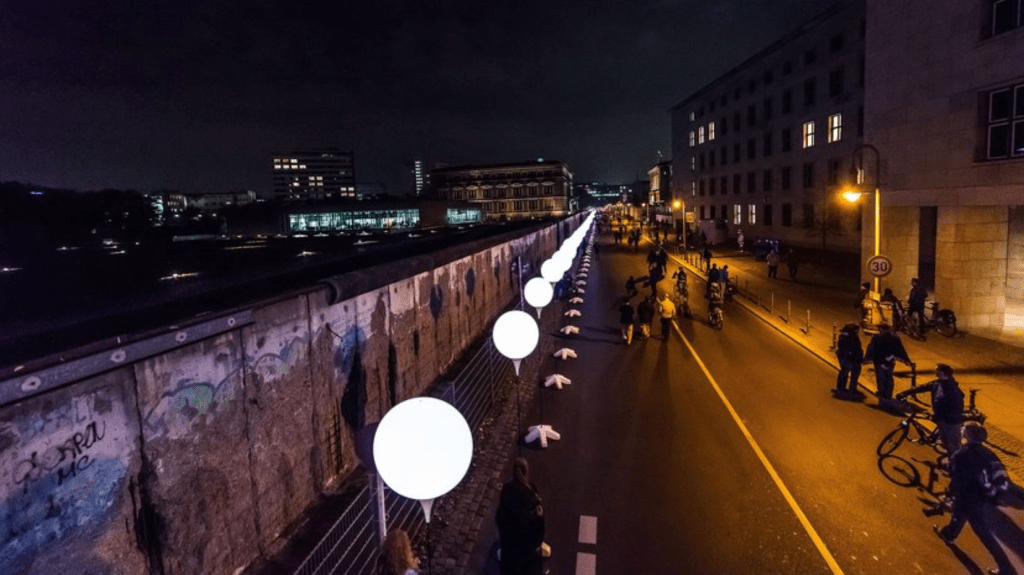
https://www.dandad.org/awards/professional/2015/spatial-design/24308/lichtgrenze/
To celebrate the 25th anniversary of the fall of the Berlin Wall, an extraordinary light installation appeared in Berlin on 7 November 2014. The Lichtgrenze (Border of Lights) saw 8,000 balloon pillars set up along the former 15.3 kilometre course of the Wall. In a televised spectacle on 9 November, volunteers performed a choreographed release of the balloons, sending them winding one by one into the night sky. With the help of the Berlin people, the Wall of Light, just like its 1989 counterpart, completely disappeared
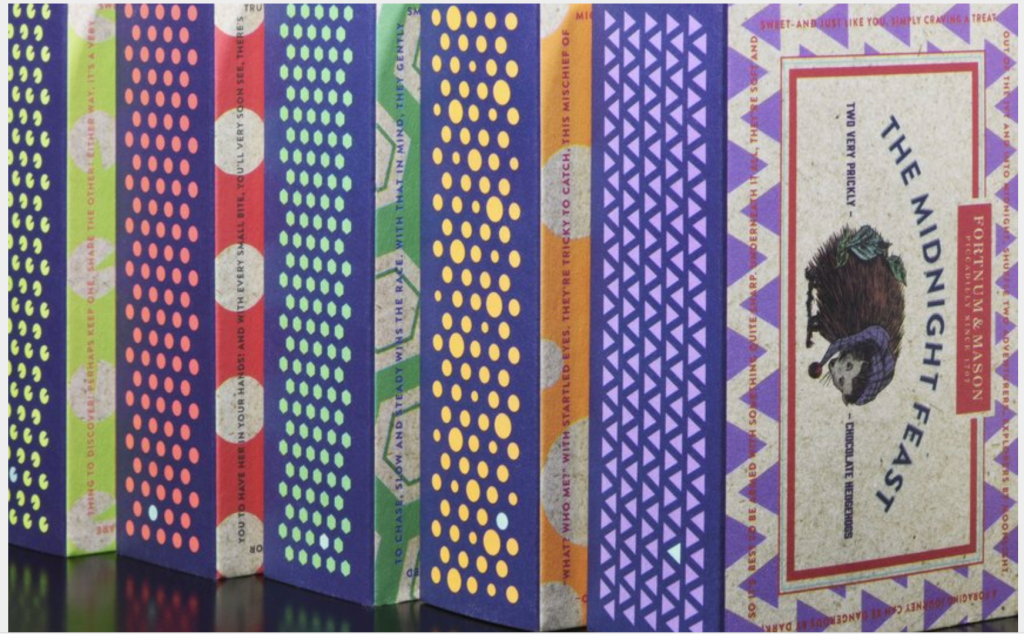
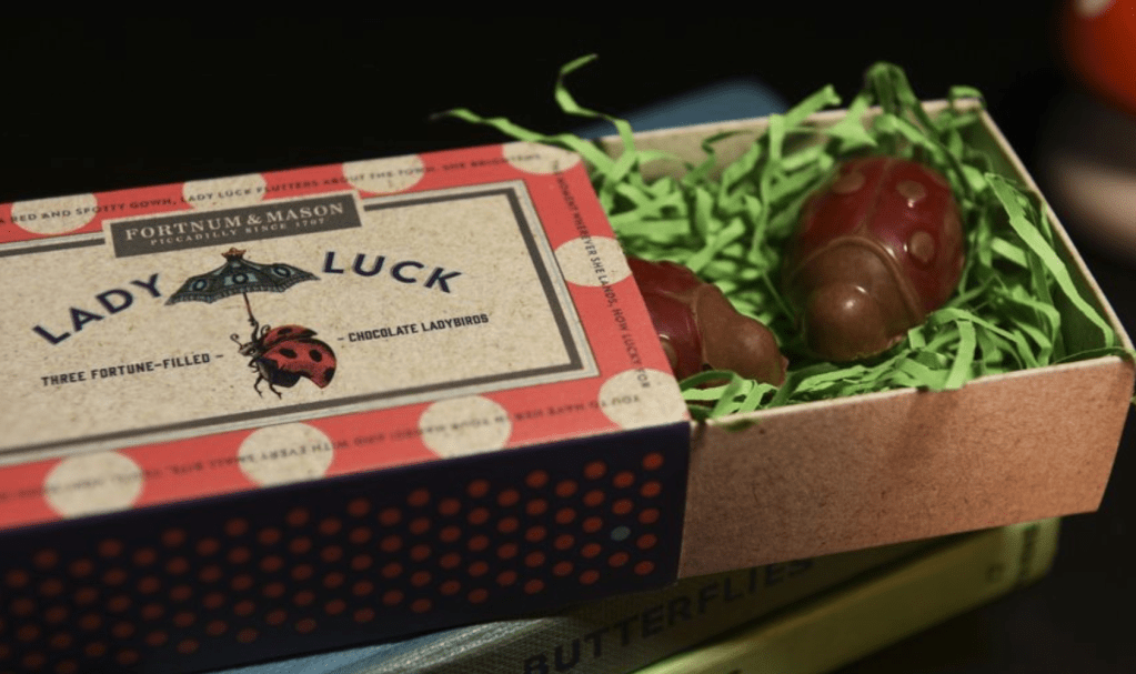
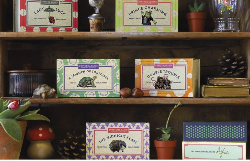
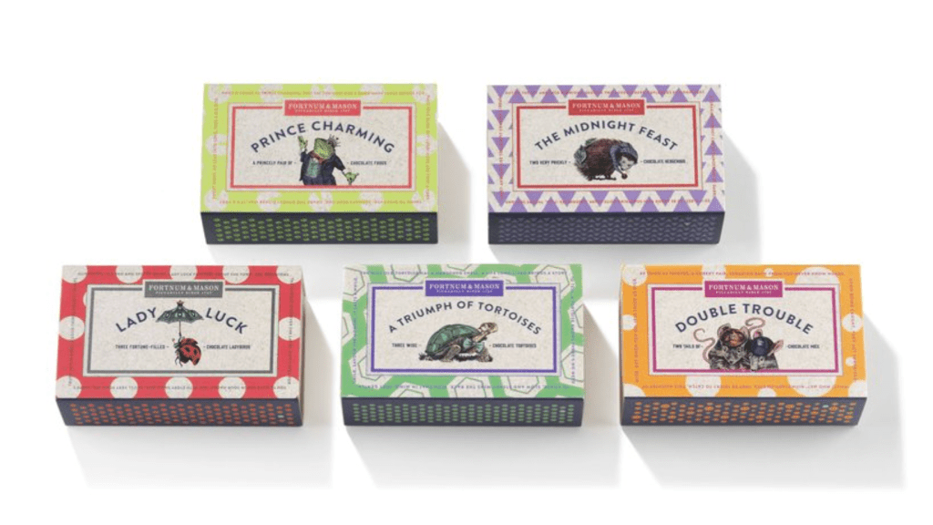
https://www.dandad.org/awards/professional/2015/packaging-design/24417/fortnum-and-mason-novelties/
Design Bridge London helped Fortnum & Mason build a new collection around the theme of wildlife found in English country gardens. Inspired by children collecting things and keeping them in little boxes, the matchbox pack is the perfect packaging for keeping special things safe and sound. Design Bridge illustrated a charming character for each of the different creatures within the family, as if from the pages of an Edwardian storybook. Each pack tells a timeless, multilayered story, created with wit, charm and humour.
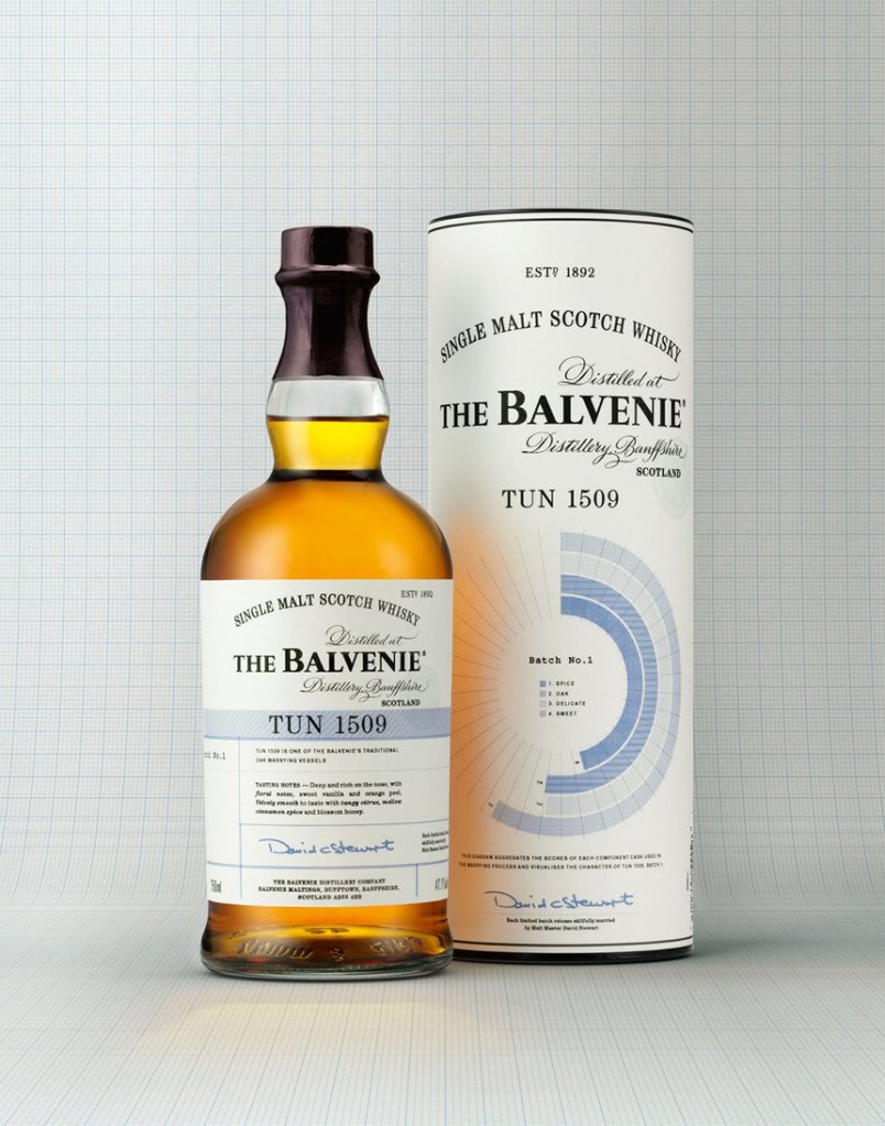
https://www.dandad.org/awards/professional/2015/packaging-design/24418/tun-1509/
Each batch of the Balvenie reflects different tasting notes. In the process of creating new blend Tun 1509, the Balvenie Malt Master rates all the barrels included in its production. Here Design created a circular diagram to indicate the taste highlights of each batch. Using data visualisation to illustrate a whisky is a unique method, and represents the attention to detail and craftsmanship that differentiates the Balvenie. Unusually, this pack is dual fronted, with a detailed table of contents on the back.
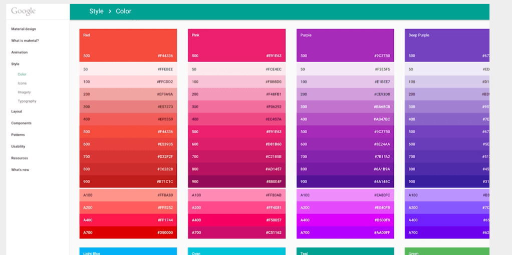
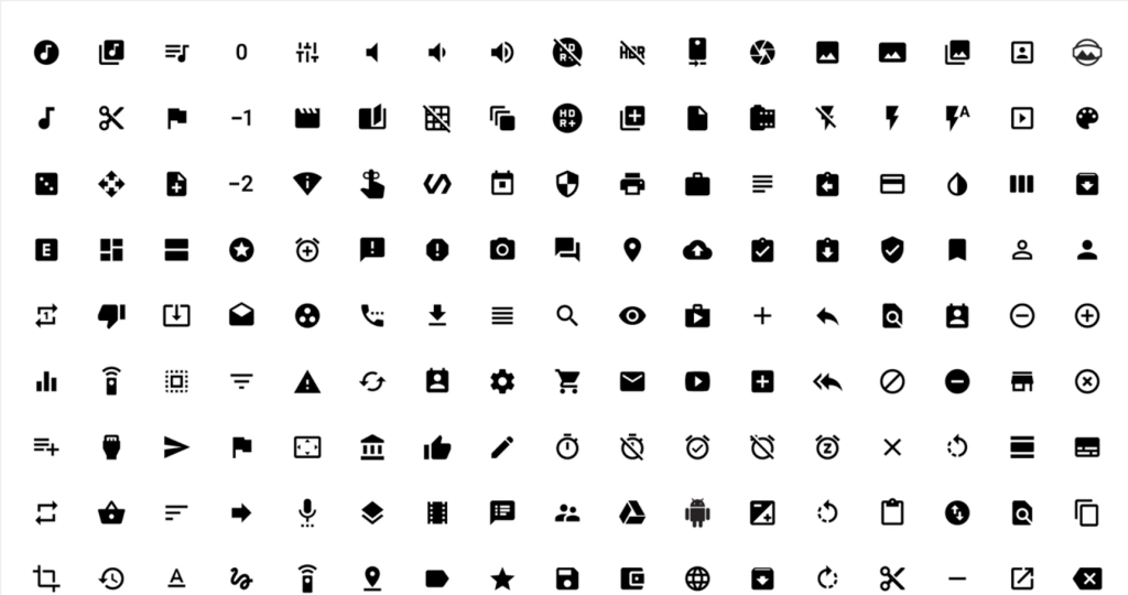
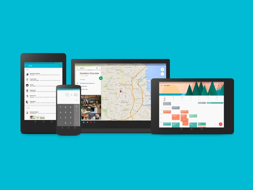
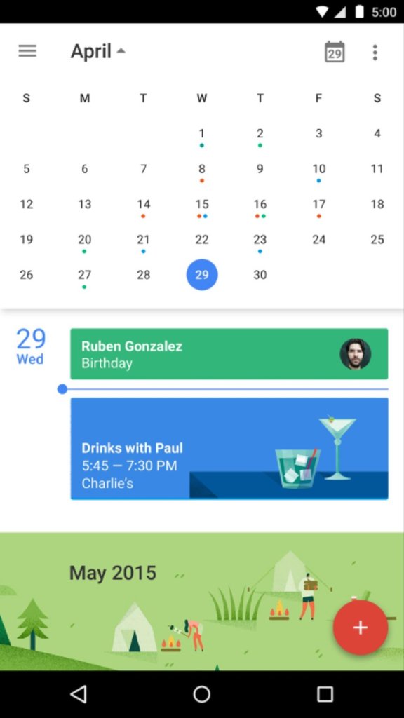
https://www.dandad.org/awards/professional/2015/product-design/24349/material-design/
Material Design
Informed by our physical interactions with paper, Google designed a visual system to unify their product experiences with those of Android. Adapting the behaviours implicit to paper and translating them into digital surfaces, Google built generative systems that create shadows dynamically, more natural interaction patterns and responsive surfaces. Building on classic principles of print design, content is front and centre. Surfaces and shadows establish a physical structure that intuitively explains hierarchy and interface interactions. Material Design was introduced with the Android Lollipop operating system and evolving design documentation lives online

Here an example for bad service design:
https://ssir.org/articles/entry/design_thinking_for_social_innovation#
Design Thinking for Social Innovation
By working closely with the clients and consumers, design thinking allows high-impact solutions to social problems to bubble up from below rather than being imposed from the top.
“In an area outside Hyderabad, India, between the suburbs and the countryside, a young woman—we’ll call her Shanti—fetches water daily from the always-open local borehole that is about 300 feet from her home. She uses a 3-gallon plastic container that she can easily carry on her head. Shanti and her husband rely on the free water for their drinking and washing, and though they’ve heard that it’s not as safe as water from the Naandi Foundation-run community treatment plant, they still use it. Shanti’s family has been drinking the local water for generations, and although it periodically makes her and her family sick, she has no plans to stop using it.
Shanti has many reasons not to use the water from the Naandi treatment center, but they’re not the reasons one might think. The center is within easy walking distance of her home—roughly a third of a mile. It is also well known and affordable (roughly 10 rupees, or 20 cents, for 5 gallons). Being able to pay the small fee has even become a status symbol for some villagers. Habit isn’t a factor, either. Shanti is forgoing the safer water because of a series of flaws in the overall design of the system.
Although Shanti can walk to the facility, she can’t carry the 5-gallon jerrican that the facility requires her to use. When filled with water, the plastic rectangular container is simply too heavy. The container isn’t designed to be held on the hip or the head, where she likes to carry heavy objects. Shanti’s husband can’t help carry it, either. He works in the city and doesn’t return home until after the water treatment center is closed. The treatment center also requires them to buy a monthly punch card for 5 gallons a day, far more than they need. “Why would I buy more than I need and waste money?” asks Shanti, adding she’d be more likely to purchase the Naandi water if the center allowed her to buy less.
The community treatment center was designed to produce clean and potable water, and it succeeded very well at doing just that. In fact, it works well for many people living in the community, particularly families with husbands or older sons who own bikes and can visit the treatment plant during working hours. The designers of the center, however, missed the opportunity to design an even better system because they failed to consider the culture and needs of all of the people living in the community.
This missed opportunity, although an obvious omission in hindsight, is all too common. Time and again, initiatives falter because they are not based on the client’s or customer’s needs and have never been prototyped to solicit feedback. Even when people do go into the field, they may enter with preconceived notions of what the needs and solutions are. This flawed approach remains the norm in both the business and social sectors.
As Shanti’s situation shows, social challenges require systemic solutions that are grounded in the client’s or customer’s needs. This is where many approaches founder, but it is where design thinking—a new approach to creating solutions—excels.
Traditionally, designers focused their attention on improving the look and functionality of products. Classic examples of this type of design work are Apple Computer’s iPod and Herman Miller’s Aeron chair. In recent years designers have broadened their approach, creating entire systems to deliver products and services.
Design thinking incorporates constituent or consumer insights in depth and rapid prototyping, all aimed at getting beyond the assumptions that block effective solutions. Design thinking—inherently optimistic, constructive, and experiential—addresses the needs of the people who will consume a product or service and the infrastructure that enables it.
Businesses are embracing design thinking because it helps them be more innovative, better differentiate their brands, and bring their products and services to market faster. Nonprofits are beginning to use design thinking as well to develop better solutions to social problems. Design thinking crosses the traditional boundaries between public, for-profit, and nonprofit sectors. By working closely with the clients and consumers, design thinking allows high-impact solutions to bubble up from below rather than being imposed from the top.”
Week 9 Challenge

Leave a comment