This week we have to analyse how a tone of voice is utilised by writers to emphasis a narrative and generate our own written and visual content that explores the relationship between content and form.
We have to consider our choices about form, layout, typeface selection, colour approach, materials and medium, in order to effectively tell our story. Ensure all components of our writing are embedded into the overall narrative, from tone of voice through to structure and pacing.
We have to write the first two paragraphs (approx. 400 words) of a written article exploring the tone of voice used by one of the following themes:
- A news story
- A children’s story
- A launch document for a new brand
- A love letter
- A business plan
- A diary
- A manifesto
- A speech
Present the story by itself (typeset In-Design file, for example) with any accompanying visuals.
Develop a simple design sketch of your final design proposal that explores the relationship between your written content and design form.
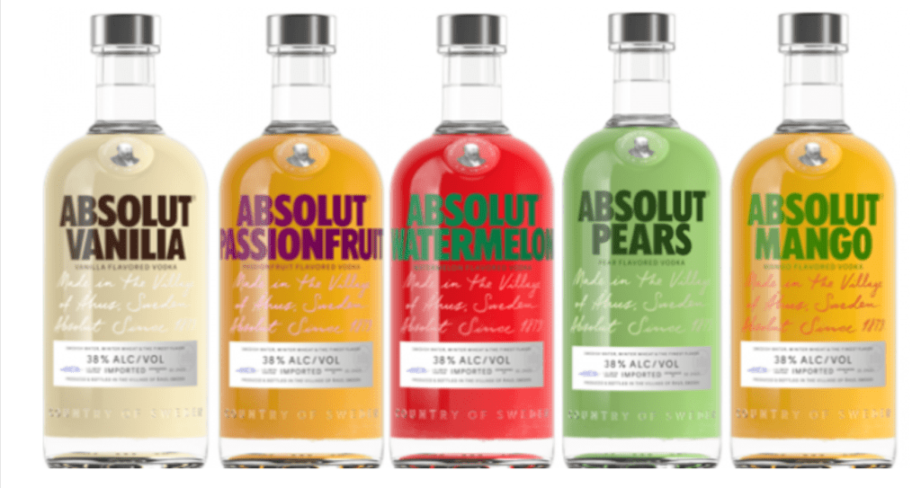
I was debating what to do this week and when I was checking my email, I saw a advertisement for the new Absolut vodka – the design of the bottles impressed me, so I decided to do some research about it.

https://thedieline.com/blog/absolut-juice-x-mariana-rodrigues?
Mariana Rodrigues Illustrates Absolut Juice’s Fresh New Designs
by Casha Doemland on 08/28/2018
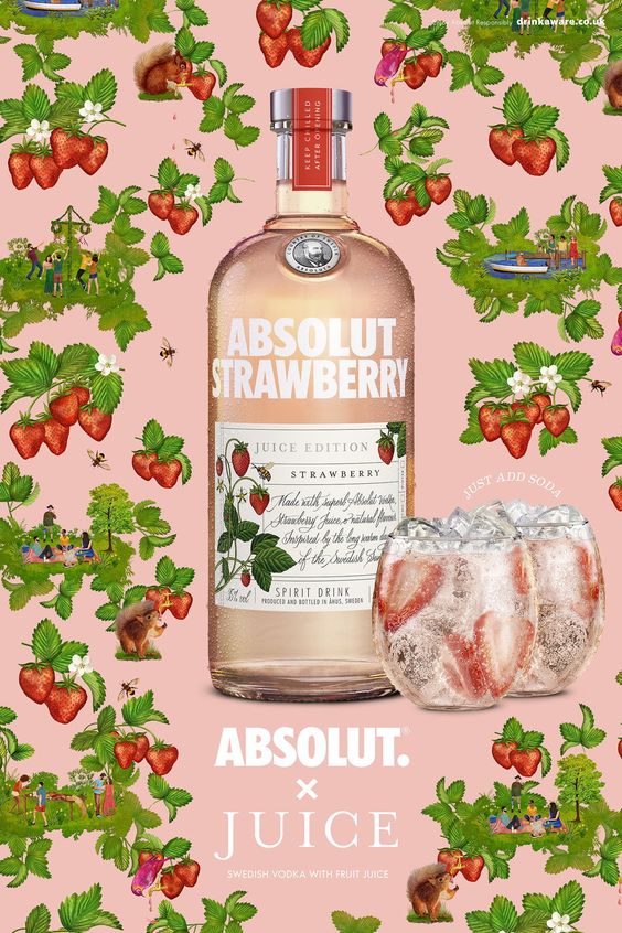
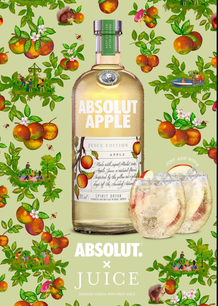
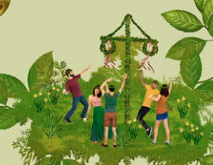
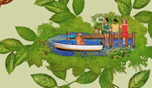
“These illustrations and patterns have been used on a series of products such as bottle labels, picnic blankets and hampers as well as across 48 and 96-sheets and digital, with small animated scenes as well as vines/branches growing out from the bottle’s label in digital.”
To bring this to life, Mariana was to treat the launch of the product as though it were a collaboration between a fashion label and a famous designer – but in this case the collaborators are simply : Absolut and Juice.”
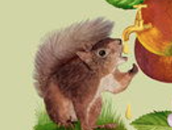
“Mariana’s wonderfully complex and intricate style was perfectly suited to this brief as the design had to feature a lot of small details such as Easter eggs, woodland animals, typically Swedish scenes such as a midsummer bonfire and of course the constant reference of fruit throughout.
Mariana drew reference from brands with a history of classic patterns such as Liberty, House of Hackney and Timorous Beasties whilst creating a fresher feel to ensure the end result didn’t feel to classical.”
Agency: BBHIllustrator: Mariana RodriguesClient: AbsolutLocation: London
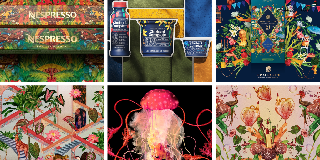
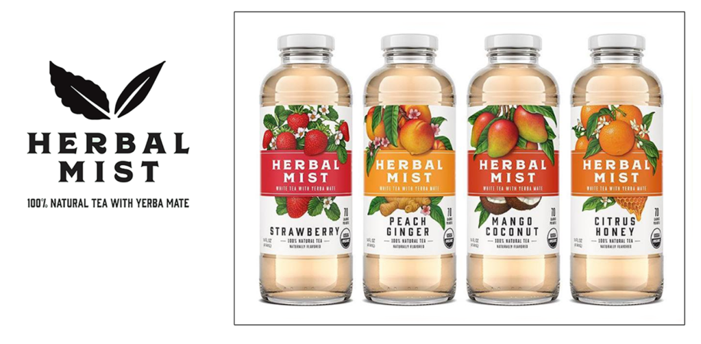
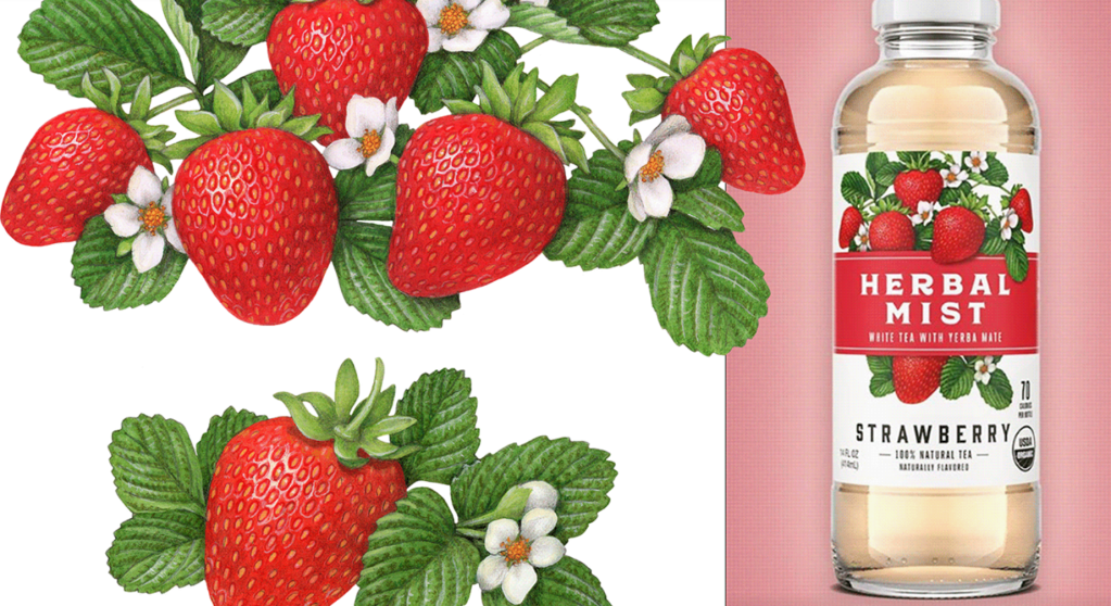
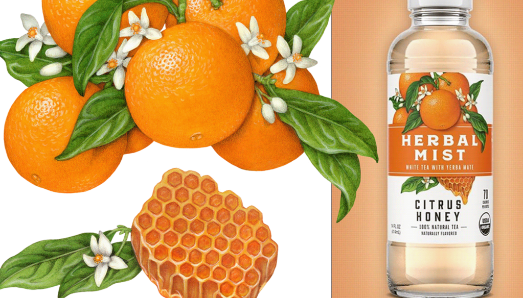
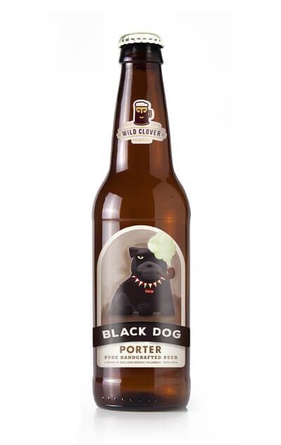
I found another designs that is so similar to the one for the vodka
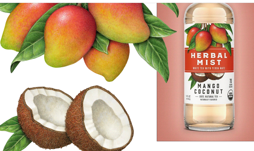
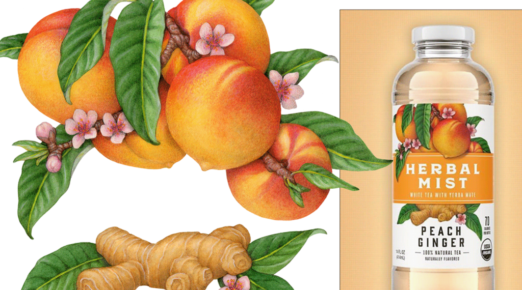
Brownstein Group, the longest-running independent marketing communications agency in Philadelphia, asked Douglas Schneider to create original illustrations for Herbal Mist’s newly redesigned packaging on both glass and plastic bottles for 2019.
Herbal Mist brews its tea with the world’s best teas, pure cane sugar, 100% natural fruit flavors, and superior Paraguayan yerba mate. Yerba Mate is nature’s purest source of caffeine and is an excellent anti-oxidant. Herbal Mist’s yerba mate tea gives the same energy boost and alertness benefits of a cup of coffee without the jitters, or the crash of the sugary energy drinks.
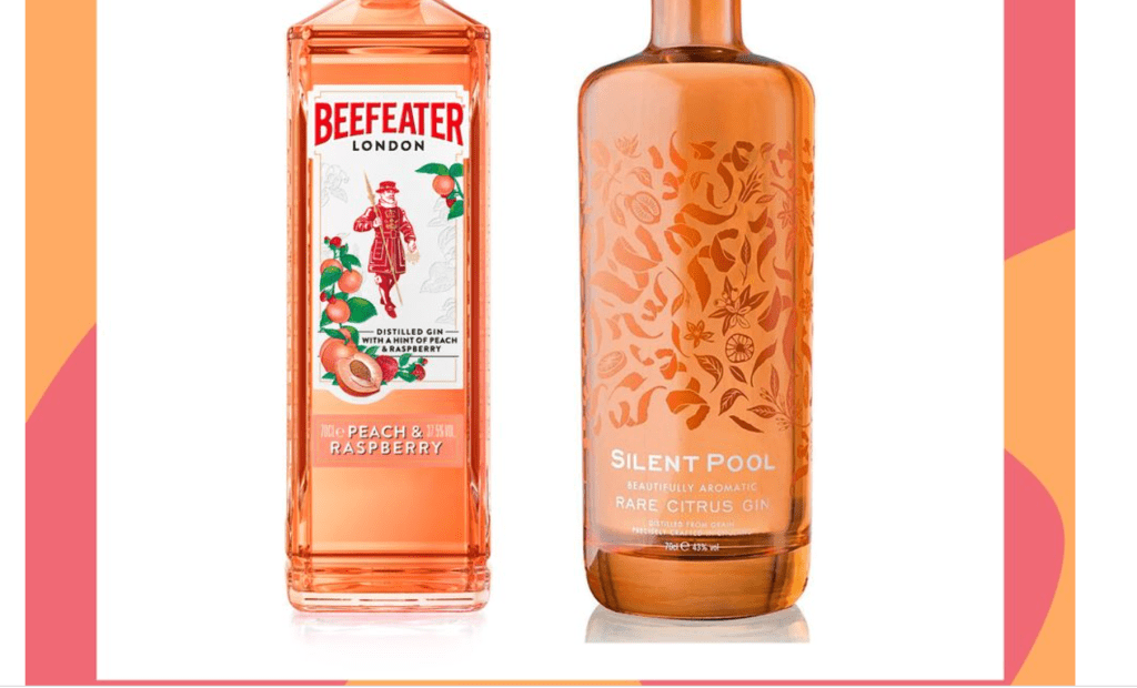
https://www.goodhousekeeping.com/uk/food/a26896669/gin/
“Here at Good Housekeeping, we’ve always been a big fan of the juniper-based spirit. From classic London dry gins to on-trend pink and flavoured styles, the market has never offered so many options. With that in mind, what are the best gin bottles out there?
East London Liquor scooped the top spot in this category. A super-smooth gin with well-balanced botanical flavours of juniper, coriander seeds, angelica root, cardamom, cubeb berries and a zingy lemon and grapefruit peel burst.
It was a tie for top spot in the flavoured gin category, but Beefeater Peach and Raspberry Gin ticked all our boxes. This spirit has a distinct bubblegum sweetness with notes of ripe peach. It’s seriously smooth and easy to drink, simply top with tonic and finish with a raspberry and peach slice garnish.
Our joint winner comes courtesy of Silent Pool. Made in Surrey using rare citrus fruits sourced from across the globe, our panel was full of high praise for the combination of yuzu and pomelo, and lingering citrus finish. Paired with campari and vermouth, this would make an exceptional negroni.”
Article about the new Absolut Juice
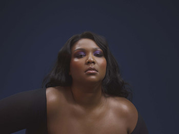
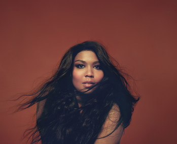
Absolut® Gets Juicy This Summer With New Absolut Juice™ & Lizzo
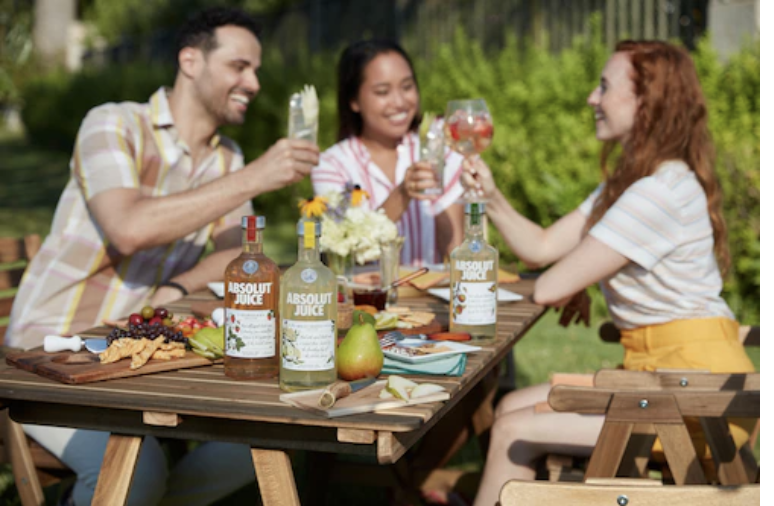
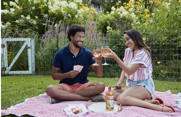
NEW YORK, July 17, 2019 /PRNewswire/ — Today, Absolut, Planet Earth’s Favorite Vodka, introduces Absolut Juice™ – the new must-sip spirit of the summer – with a juicy twist on squeezing the most out of life in collaboration with chart-topping singer Lizzo.

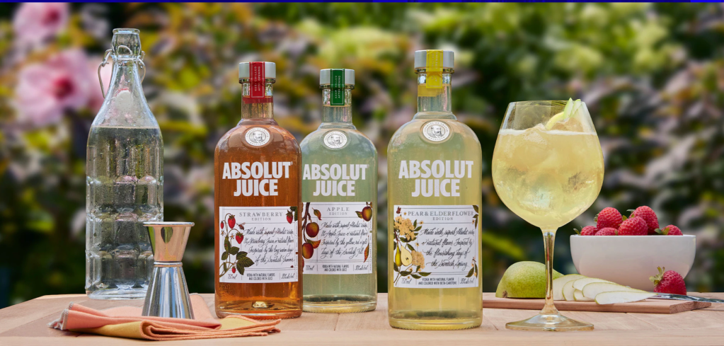
Made with superb Absolut Vodka and natural flavors from your favorite seasonal fruits – Absolut Juice offers a brand-new way to sip-with-a-spritz in two delicious favors, Strawberry and Apple. With no artificial flavors, five percent real fruit juice and 99 calories per serving1, Absolut Juice is perfect for mixing simple or craft-quality cocktails – like the summer-approved Absolut Juice & Club Soda with 20% fewer calories than a glass of rosé.
“Absolut Juice is the ripest, juiciest new spirit of the summer – and, in partnership with Lizzo, we’re using the song of the summer to prove just how much the ‘juice’ is worth the squeeze,” said Regan Clarke, Brand Director, Absolut, Pernod Ricard USA. “As Planet Earth’s Favorite Vodka, Absolut values our sustainable production practices, the planet and it’s people – now, with Lizzo, we’re bringing the party to the people with seriously juicy surprises.”
Blame it On the Absolut Juice & Lizzo
Absolut Juice and Lizzo are out here making news – starting with “squeezing” the moments of summer into a movement with fans across the country. From exclusive video drops to a summer of juicy surprises, fans can #GetJuicy with Absolut Juice and Lizzo by following @AbsolutVodka_US on Instagram, Twitter and Facebook to be the first to see Lizzo’s exclusive collaboration with Absolut Juice
“When I heard Absolut was launching a new product called, ‘Absolut Juice’ it was like they made it just for me! It’s an honor to celebrate the success of my first single with Absolut’s new product launch and the synergy is almost too perfect,” said Lizzo. “I can’t wait to sip this with my big grrrls all summer and on tour this Fall. We’re taking this on the road ya’ll cuz this Juice is worth the squeeze. Can I get some ice, please?!”
Squeeze the Moment this Summer with Absolut Juice
Whether you’re sipping seaside, by the pool, on a rooftop or backyard barbecue – #GetJuicy with Absolut Juice by squeezing the most out of every dog day of summer. From stirring in new social circles, to playing new mixes or mixing up new cocktails with friends.
Available in two refreshing, fruity flavors, Strawberry and Apple, Absolut Juice provides a versatile foundation for mixing effortlessly impressive cocktails – including:
Absolut Juice & Soda
1 Part Absolut Juice
2 Parts Club Soda
Mix in a wine glass over ice & sliced fruit (optional).
Absolut Juice Spritz
1 Part Absolut Juice
1 Part Club Soda
1 Part Sparkling Wine
Mix in wine glass over ice & garnish with sliced fruit (optional).
Absolut Juice Strawberry Punch
1 ½ Parts Absolut Juice Strawberry
1 Part Lemonade
½ Part Cranberry
Splash Club Soda
Lemon Peel
Build in wine glass with ice. Garnish with lemon peel.
Planet Earth’s Favorite Vodka… with Juice
Absolut’s commitment for the future is one that never stops progressing. We care about our people, the planet and how we make our products. That’s why, as Planet Earth’s Favorite Vodka, we continuously strive to create better products, more sustainably, and create a more open world for everyone – for current and future generations.
Absolut Juice continues our commitment to more sustainably produced and high-quality, products – featuring the perfect balance of Absolut Vodka with natural flavors. Absolut Juice Strawberry and Absolut Juice Apple are available nationwide for an MSRP of $19.99.
ENJOY RESPONSIBLY.
ABSOLUT® JUICE EDITION. VODKA WITH NATURAL FLAVORS AND COLORED WITH JUICE. PRODUCT OF SWEDEN. 35% ALC./VOL. © 2019 Imported by Absolut Spirits Co., New York, NY.
https://www.vectornator.io/blog/storytelling-in-design/
“In the case of design storytelling, your goal should be to create that emotional bond between your design and its audience. You should use imagination and empathy to spark a connection and take your audience on a journey, make them feel something, and drive them to action. Design gives us the opportunity to weave beautiful stories through visual communication and immersive experience.
While utilizing the arc in the design process, particularly in UX design, is necessary, we can also just focus on one element at a time, for example:
- Theme
- Character
- Symbolism
- Setting
- Perspective
- Journey or “plot”
Characters are central to storytelling and play a pivotal role in enhancing design as well. It’s an age-old fundamental that’s still alive and strong. If you’re designing a product, developing graphics for a brand identity, or putting together a marketing campaign, creating a character that your target audience will want to be, to have, or simply admire is textbook marketing psychology that can really lead to a lot of success in your design projects. Characters are a wonderful way to bring life to a brand and deepen its identity. Characters can bring together the themes, color palettes, typography, and tone of a brand in one succinct asset.
Text-based storytelling is making a big comeback. As a designer, you can use bold and captivating typography to get your visual story noticed. Using text as the focal point in a visual story immediately makes it more captivating, and it will be exciting to see this trend evolve and what designers do with it
Audio is a fantastic way to bring story and life to design projects. It can be used to improve accessibility in web design, to guide a gallery experience, and overlay static visuals on social media, for a more dynamic experience. With audio clips gaining popularity on social media platforms such as Instagram to promote audio-based media, there are some cool opportunities to marry audio with graphic design for an ultra-engaging multimedia experience.
“Theme” is another storytelling fundamental that’s more ongoing than simply a trend, but seems to snowball and only gain importance, especially with anything and everything becoming a brand on social media, theme is being used more and more for differentiation. Having a visual theme in place makes your design appear more consistent. Plus, it binds elements together in a way that ensures your audience knows they’re part of the same theme.
Symbolism plays an essential role in traditional and visual storytelling and is a big graphic design trend at the moment.
There are tons of interesting psychological factors behind symbolism, and how people are influenced by symbols of power. Symbolism plays an essential role in storytelling, from ancient myths that use animal totems, gods, and goddesses as symbols to convey messages, to novels, contemporary films, and of course modern branding.
Storytelling is an essential part of our world and is a major creative element in books, movies, and television shows. In fact, every part of your own life can be broken down into a story, and those stories can be told through design. A graphic designer tells a story with their design in order to create a finished product that resonates with the audience.
raphic designers are encouraged to tell stories with their designs which take the viewer beyond the surface and resonates more deeply with them.
However, in practice what does this actually mean, and how does this manifest in the graphic and design process?
Storytelling in literature takes the form of narrative where the reader journeys through exposition, conflict, rising action and denouement. Looking more broadly at the field of visual design you can easily see the parallels between creating narratives with character and creating scenarios and personas. A key reference point in literature on this subject is Greek philosopher Aristotle’s writings on persuasion.
The Interaction Design Foundation outlines in the list below how Aristotle’s seven elements of good storytelling can be applied to planning a project.
- Plot – what are users trying to achieve/overcome?
- Character – who are the users: not just demographically, but what insights do you require to understand what they’re truly like and their real needs?
- Theme – how can you establish a trustworthy presence to them and still set yourself apart from competitors? How do you reflect the overall obstacles users must overcome?
- Diction – what will your design say to users and how? Does a formal/informal tone match what they’d expect to find? How much text is appropriate?
- Melody – will the overall design pattern appear pleasant and predictable to users, moving them emotionally?
- Décor – how will you present everything so the graphics match the setting the users can sense? Is a classic design or a stylised, niche layout in step with their expectations?
- Spectacle – how can you make your design outstanding so users will remember it?
The creation of personas, scenarios and other foundational details are there to help map out and gain an understanding of the user, not to communicate directly with them. After all, understanding the people who are engaging with your work and knowing the context in which your work is created is key to good design. A successful piece of design anticipates and leverages off the common experiences of the people engaging with the work.
1: Plot
Creating plot is a type of problem solving – it is the building block on which a story is created, solving the way your characters will travel through their journey. When it comes to website and brand design, your users are your characters. As such, graphic designers have to be adept problem solvers. Like creating the plot for a gripping novel, a graphic designer must find the most efficient and compelling way to present a website. Just like writing a novel, graphic design requires careful planning. A designer must map out the beginning, middle and end of a user’s interaction with your website or brand. The beginning is what encourages the user to take the journey into discovering your brand. The middle is engagement with your brand – learning about you, how you can help them, and why they need your service or product. And the end is your call to action, the encouragement to engage your services or buy your product.
2: Emotional Connection
Plot alone, however, doesn’t make a story. Good graphic design creates an emotional connection with the user. Emotional connections are the best way to engage a user. They become invested in what you’re telling them.
3: Less is More
Another cliché, but just as important when it comes to graphic design. Less really is more. An engaging story doesn’t need to be complex or elaborate, nor does graphic design.
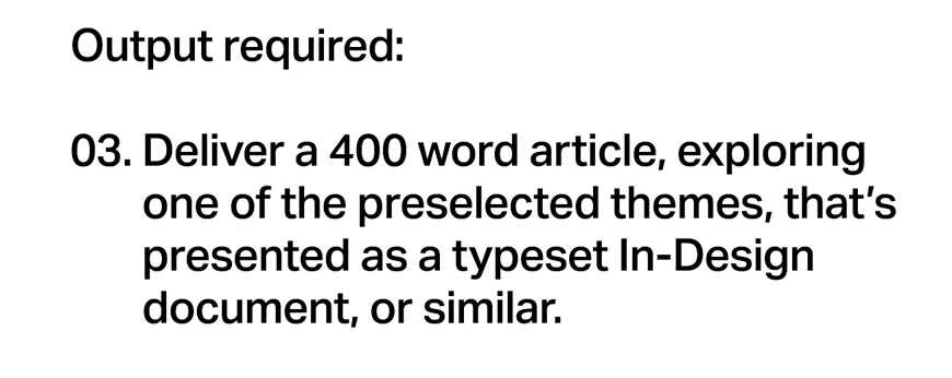
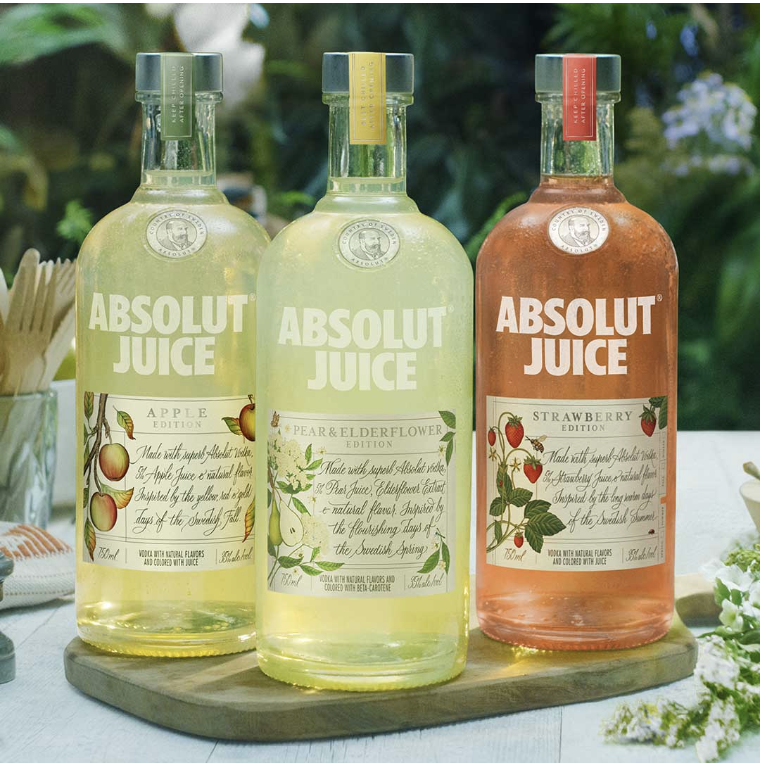
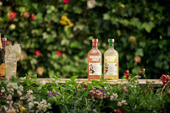
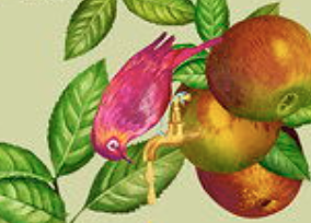
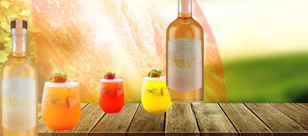
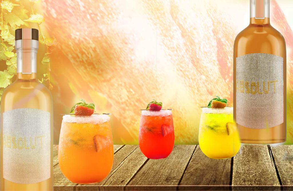
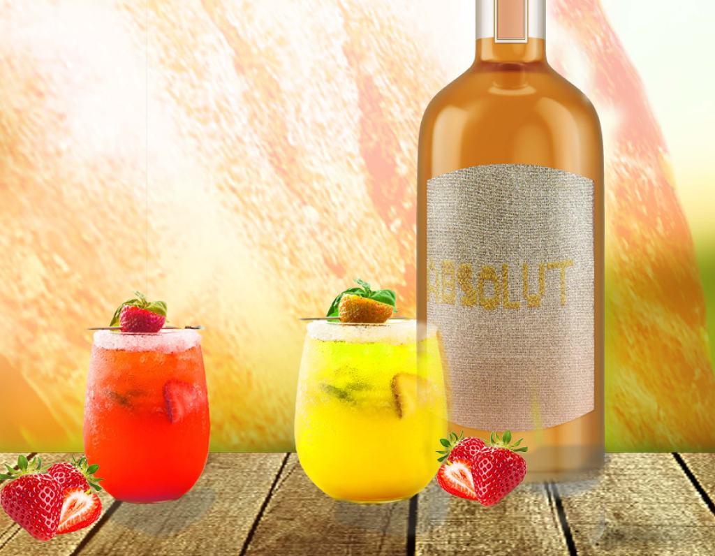
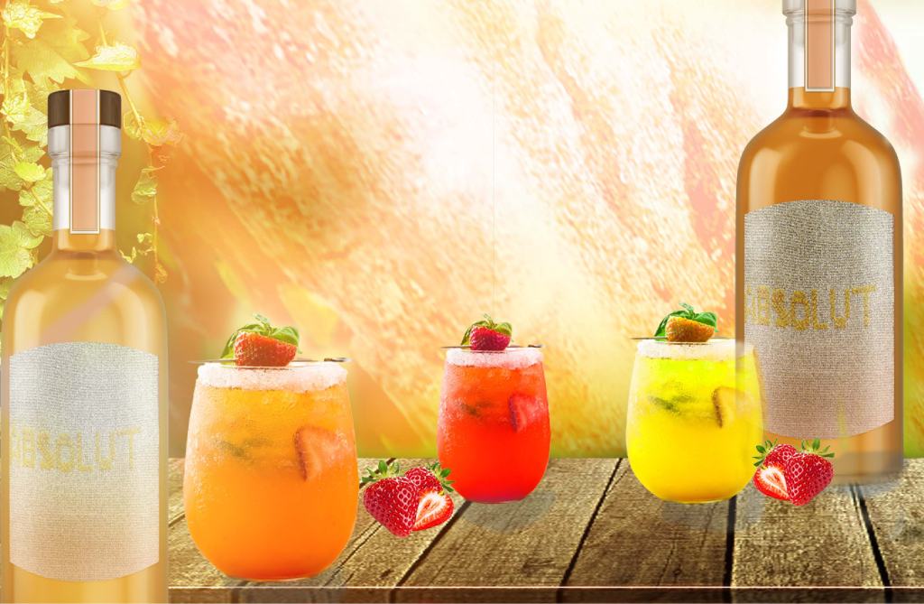
In the beginning of the summer on 2019, the Swedish vodka company Absolut launched a spirit combined wit strawberries and apples creating the Absolut Juice Edition. The design is created by Mariana Rodrigez. She uses the fruits in their natural form – strawberries with their vines and apples hanging from trees.
I think the retro nature look is very wise decision because it will attract very well the target audience of the product (mostly women or people who like fruity and not so strong drink).
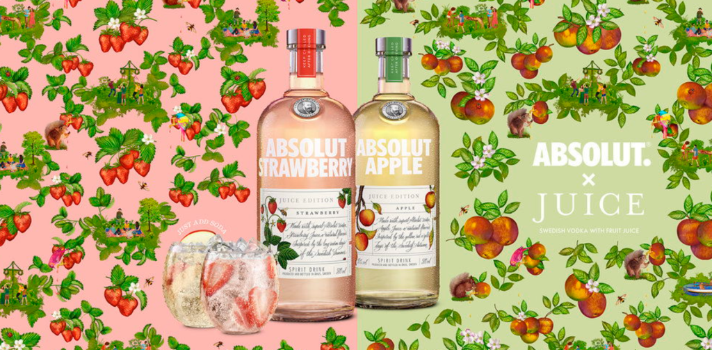
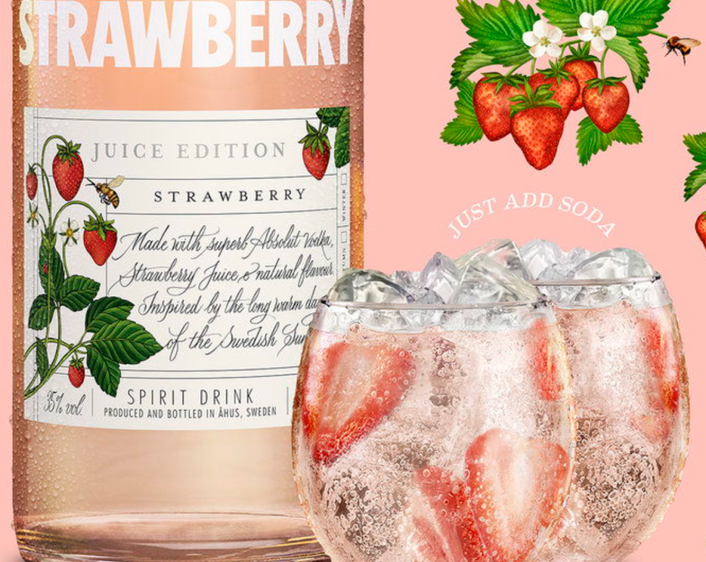
The design of the bottle labels is simple but very stylish and unique. Mariana uses an image of the fruit on both sides (bigger on the left and smaller on the right), centered title ‘Juice Edition’ with serif font with increased tracking between the letters and subtitle ‘Apple’ or ‘Strawberry’ with smaller font size but less saturated. That makes the text to pup up to the reader’s eyes quick.
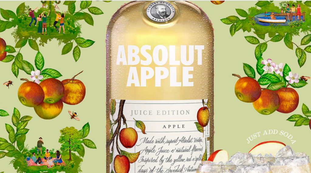
“Made with superb Absolut vodka, Strawberry juice, natural flavor. Inspired by the long warm days of the Swedish Summer.
“Made with superb Absolut vodka, Apple juice, natural flavor. Inspired by the yellow, red and gold days of the Swedish Autumn.”
Below the subtitle is the description of the product with a fancy script lettering and wrapped right form the image. It reminds me of a letter coming from far way. That suits so well the retro look of the fruit illustration.
On the bottom is sans serif text ‘Spirit drink’ with increased tracking for better readability.

I think the design looks amazing but is also little controversial with what we are taught in the design classes – not to use so many fonts. In the label we have serif, script and sans serif combined in great hierarchy. This comes to tells us that sometimes we can break the rules as long as it works with the concept and the look of the design.
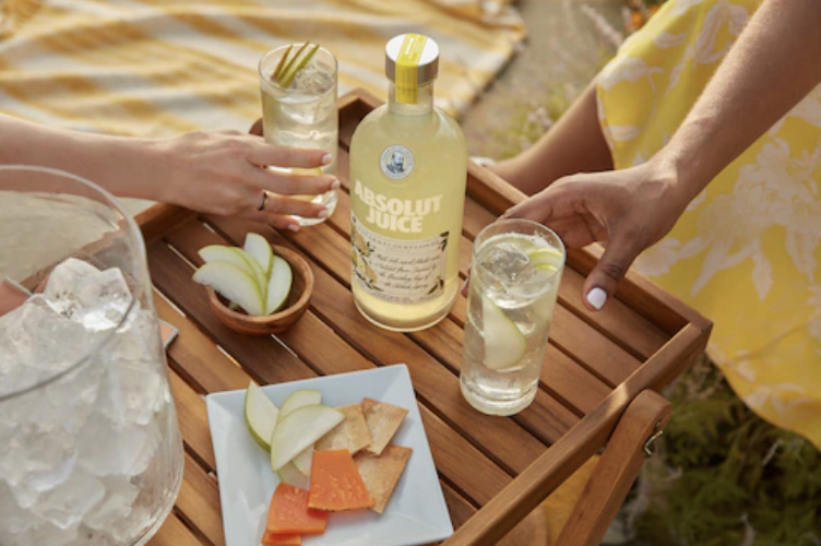
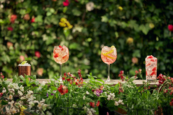
The two glasses next to the bottle are full it soda, the vodka, real fruit and plenty of ice. The icy cold drink makes the viewer to want to try it. So, the goal gets achieved – to convert the reader to a potential buyer. The text above the cups ‘Just Add Soda’ is either created on a path of a circle or created and then warped to this direction. The message shows the simplicity of the use of the product – ‘just add soda’ and enjoy it.
Mariana Rodrigez is using another great tool in the design of the representation of the new product – putting the product in matching background. At first, you can see it but if you look closer, you will see the additional images that she is using to complement the design. That’s how she is telling the story!
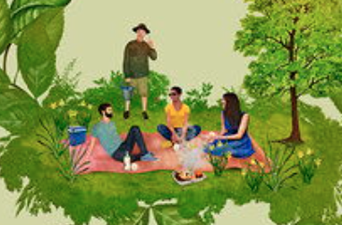
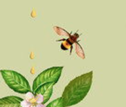
The small illustration not only matches the overall design but shows the functionality of the product – you can go on picnic or have a gathering and take a bootle with you. Of course, is a warning – ‘ENJOY RESPONSIBLY‘. After all, it is an alcohol and we have to drink responsibly.

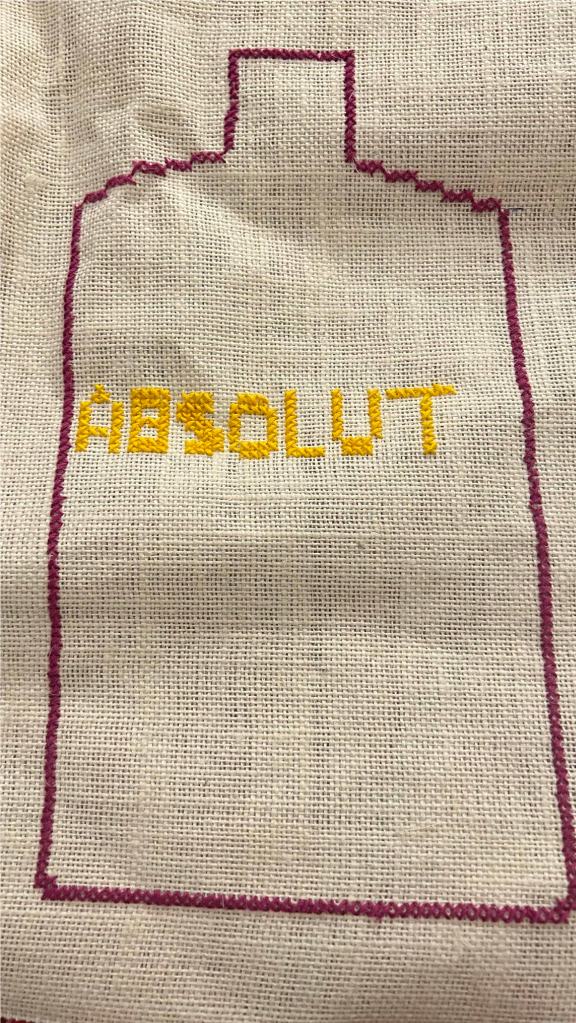
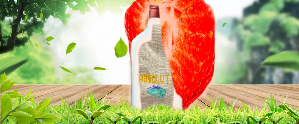
This is a cross-stitch model of the existing add – because the product has main target women, I think this look will be able to catch their attention.
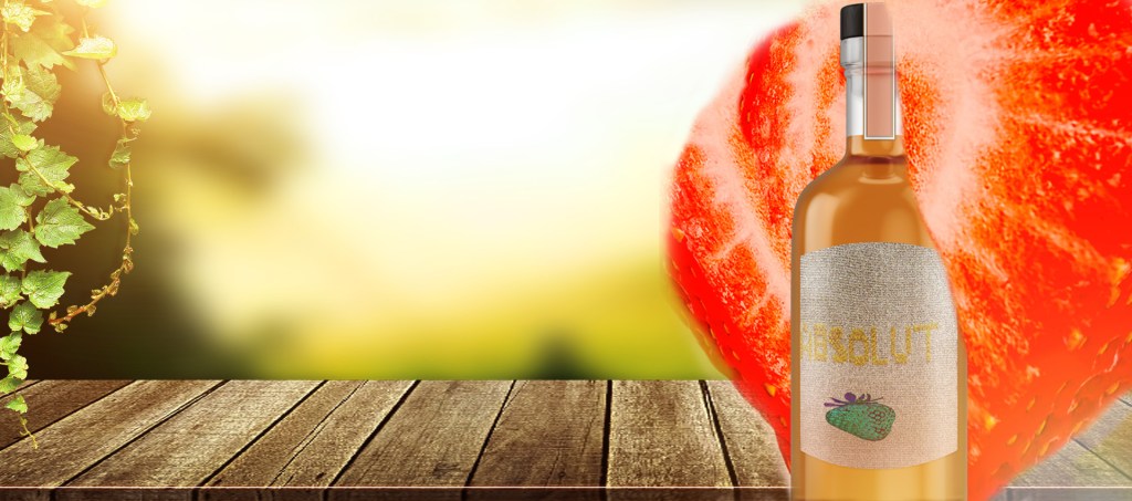
I continue working on the project:
I created this – to use it for bottle label
I did experiment with couple versions:
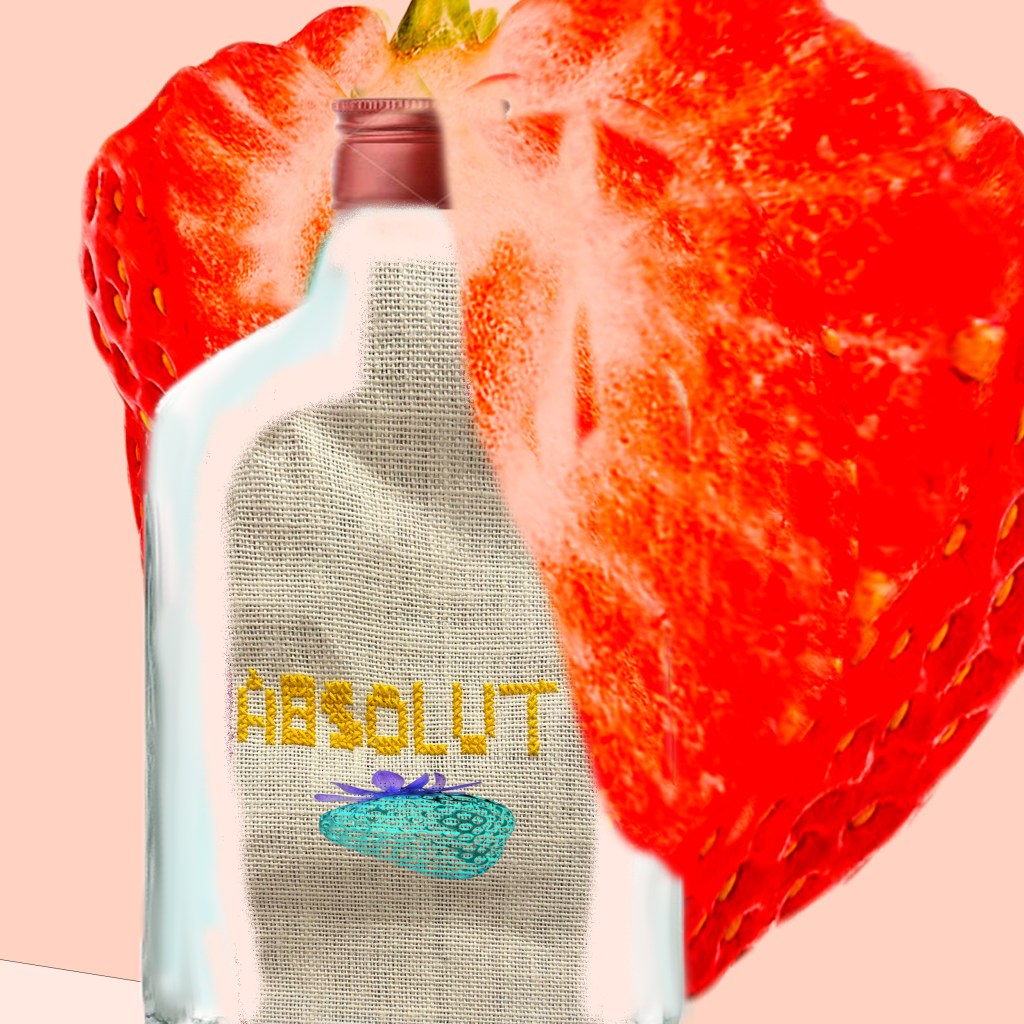
I saw couple mistakes so I start working on it again
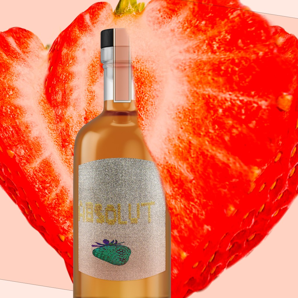
This is my final version

Leave a comment