We explored the classic relationships between graphic designers, clients and collaborators.
Weekly Learning Objectives
You will be working towards achieving the following learning outcomes detailed in Assignment 2:
LO1: Research – select and deploy appropriate research methodologies to inform the needs within a project.
LO4: Distil – position a creative strategic insight that has been distilled and refined through an informed investigation.
LO5: Imagine – deliver appropriate and innovative ideas that embrace risk, have contemporary relevance and question the boundaries of the discipline.
LO8: Design – realise a final solution that evidences its strategic journey and clear relationship between form and function.
LO9: Communicate – communicate effectively in a range of contexts and situations to specialist and non-specialist audiences.
L10: Manage – demonstrate applied planning and organisational skills to support self-directed project work and inform ongoing professional development needs.
Design to Change the World
Part 1 is a live recording of ‘Design to Change the World’ at the global design Forum, London Design Festival 2018. Chaired by Susanna Edwards.
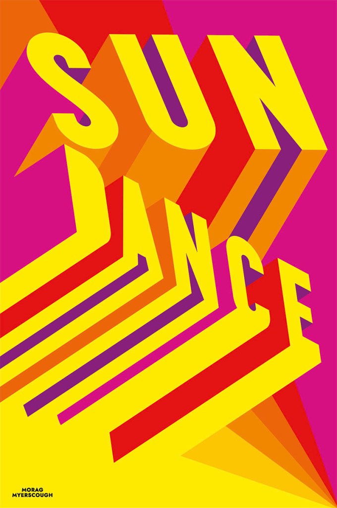
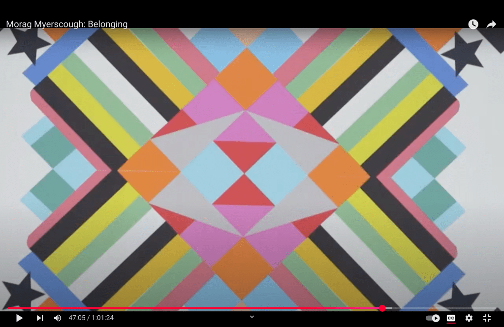
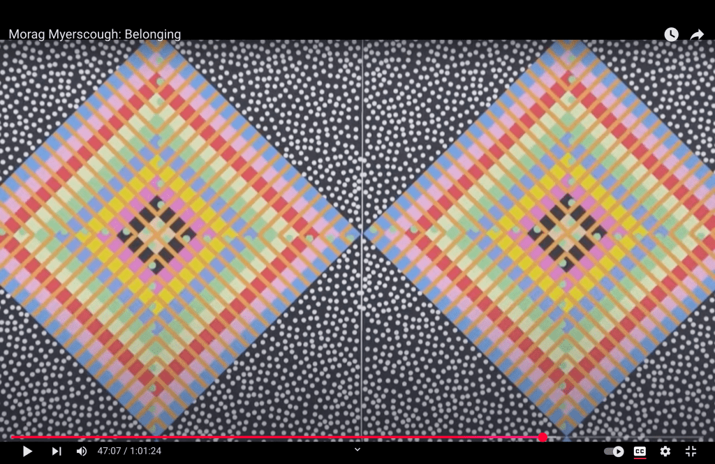
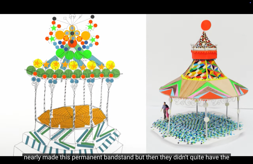
Morag Myerscough shared how living in London for so many years he has been fascinated by how colour and pattern can change urban environments, and people’s perceptions of spaces, into places. I see actually the same here in the town where I lived for almost 20 years – so many businesses and stores have opened trough the years but they changed the look with the time.
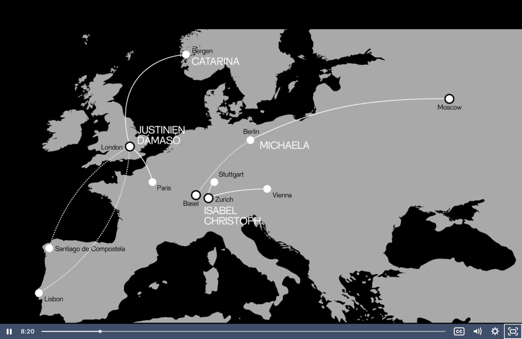
The other speaker is Christoph Miller from Offshore Studio, witch he created with Isabel in 2016. They do editorial design, web design, posters, vinyl covers …
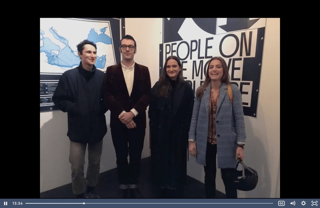
“When I say ‘we’ it’s not only Isabel and me, there’s a whole team involved. In the beginning there were four people. Justinien, who is our editor, he’s originally from Paris, he moved to London where he is living now. There was also Caterina, a girl from Portugal. She’s opted out now, but we have two new editors, Michaela, who lived in Russia and is now in Switzerland, and also Damaso who is from Spain but is living in London now. So, its’ pretty interesting that migration is very much embedded into our own lives. It’s very much our own story as well. Actually, we are all living in countries where nobody holds the passport of.”
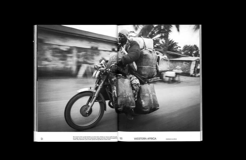
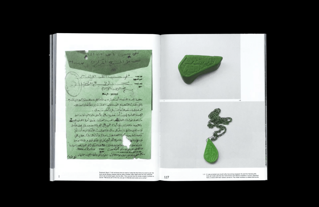
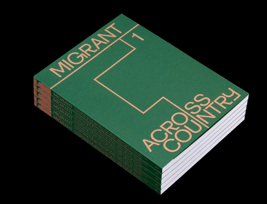
Their project “Migrant Journal” shows us how the graphic design is responding to the social events of its time.
Christoph Miller’s Migrant Journal illustrates how design can be used as a tool for storytelling, research, and advocacy, addressing complex global issues like migration. This expands the traditional role of designers beyond aesthetics to include intellectual and social contributions.
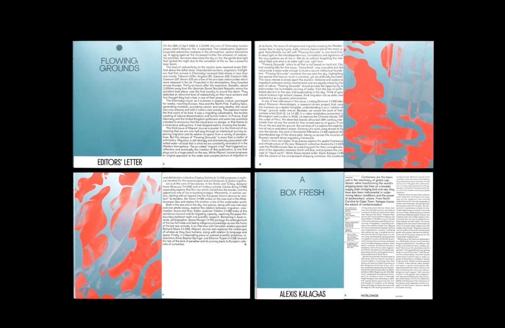
It is interesting that they are digging really deep into archives and old atlases, looking at what they are doing so well, and what kind of colour palette do they have,
I think going back to the old always gives you idea for something good. I can relate to them – I keep many old magazines, books, brochures – I think that they can always contribute somehow to creating something new.
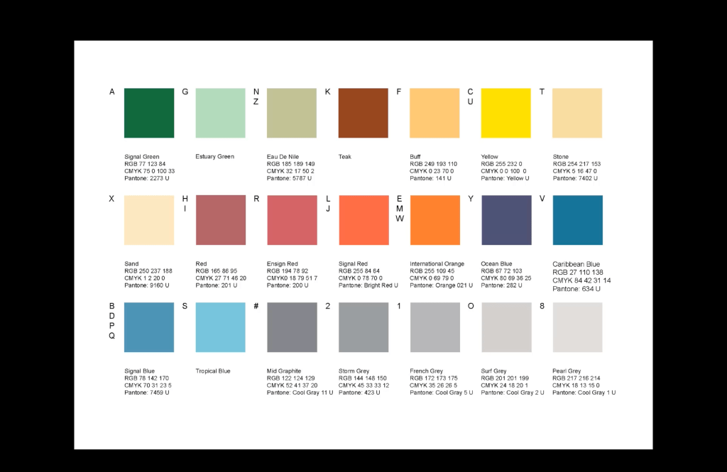
They use different colour palette for each issue. Also they are using spot metallic colour that’s used for starting pages, for infographics, and for images, The layout concept is with a grid that’s repeated for each issue.
They try to carry messages to different platforms, to reach different people, and different audiences.
Morag was doing the commission of the bedrooms in the hospital in Sheffield.

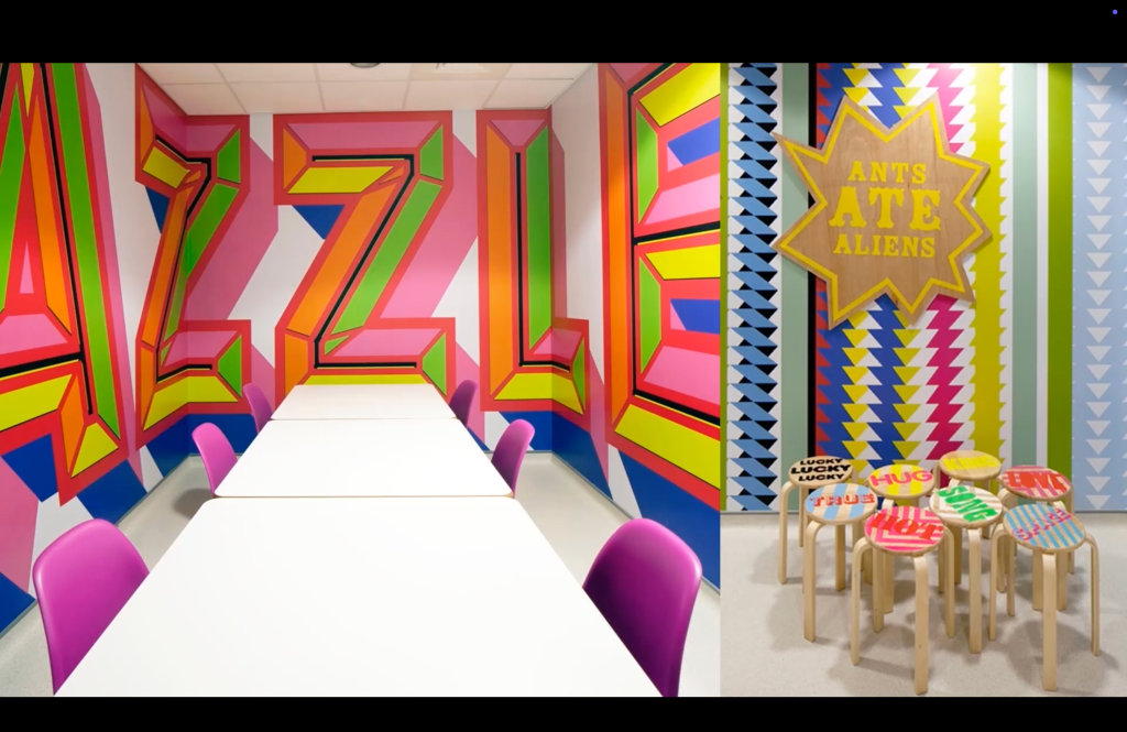
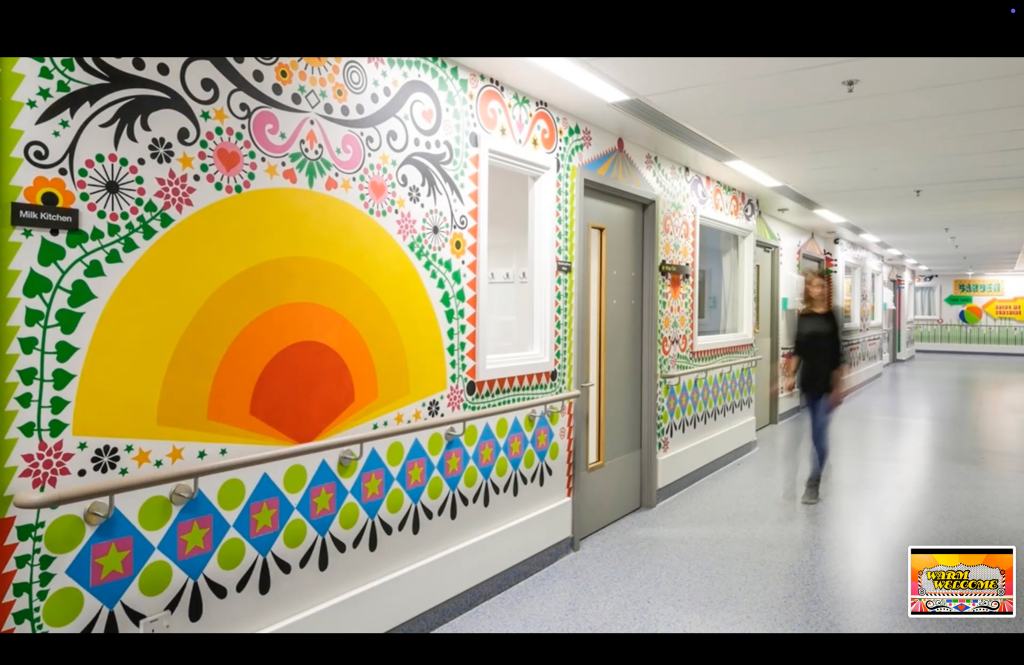
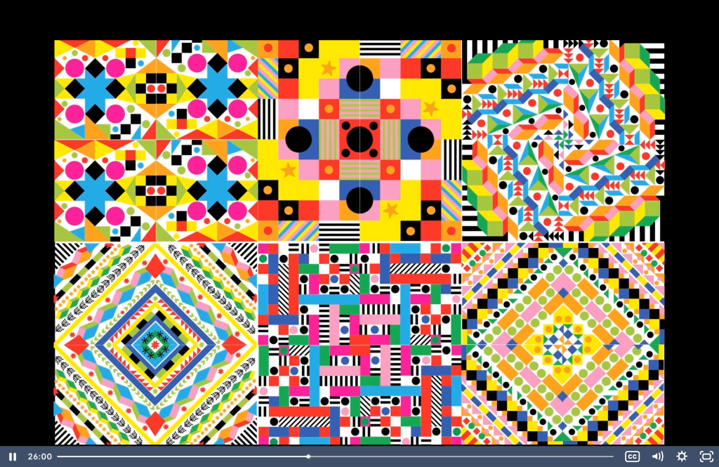
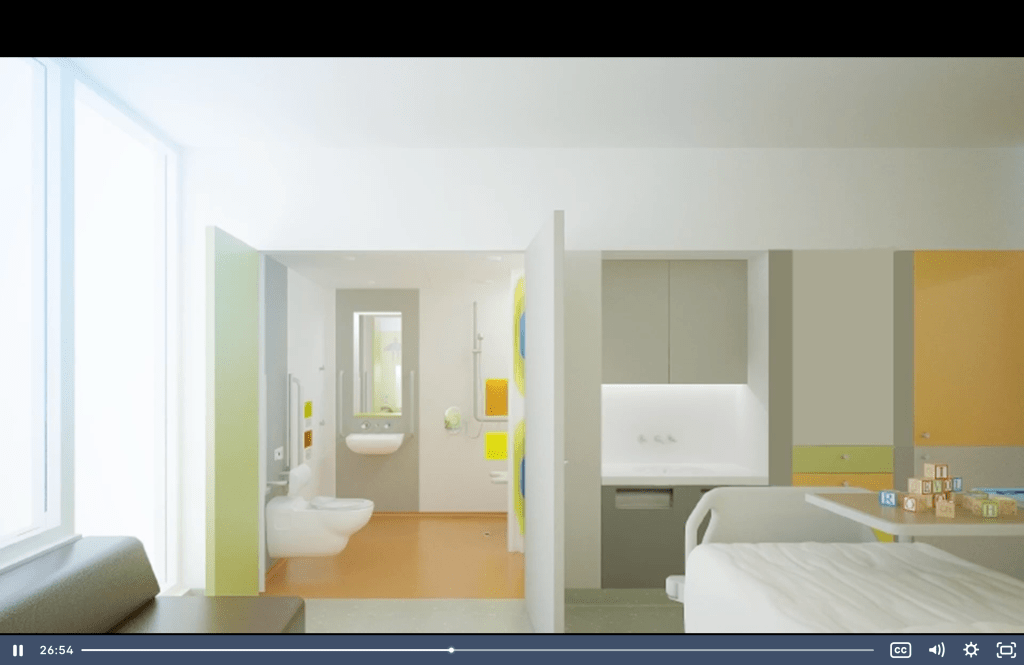
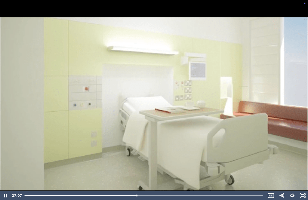
In the process the nurses reacted to the colorful theme and she had to do some changes. This comes to show us that doesn’t mater how beautiful is the design, it may have some obstacles in the developing process because other people don’t like it or think that is not good for the particular purpose.
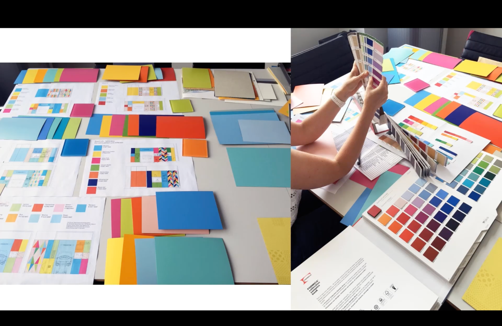
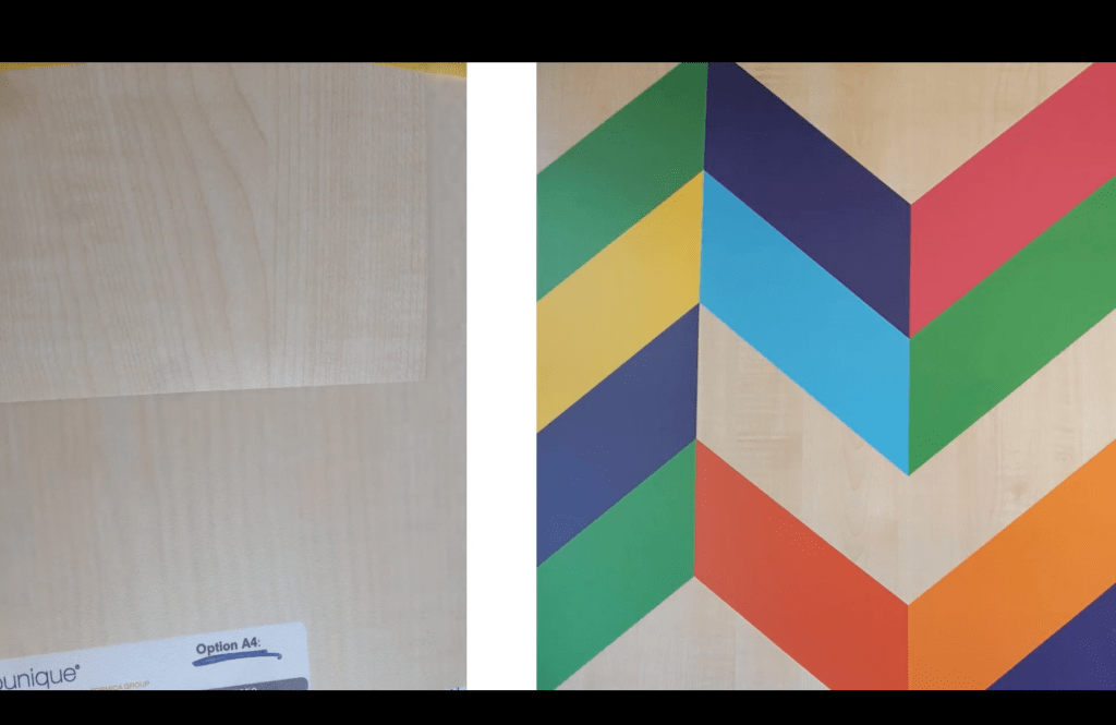
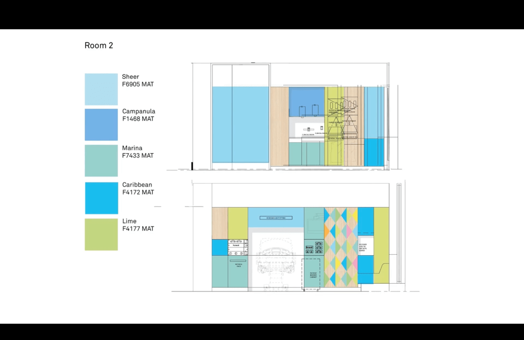
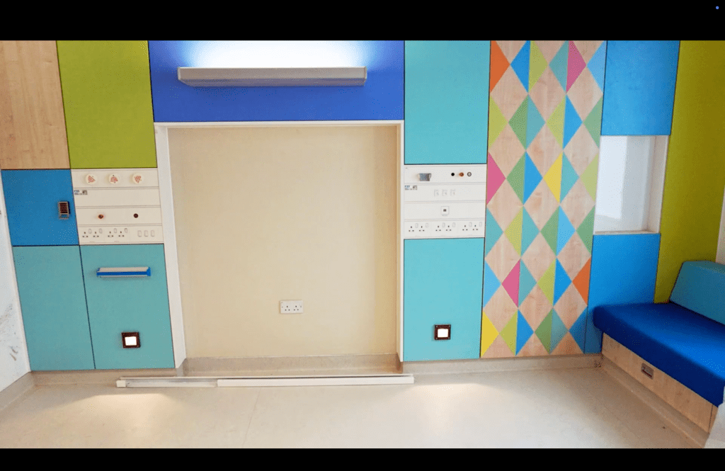
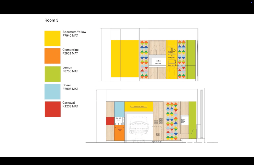
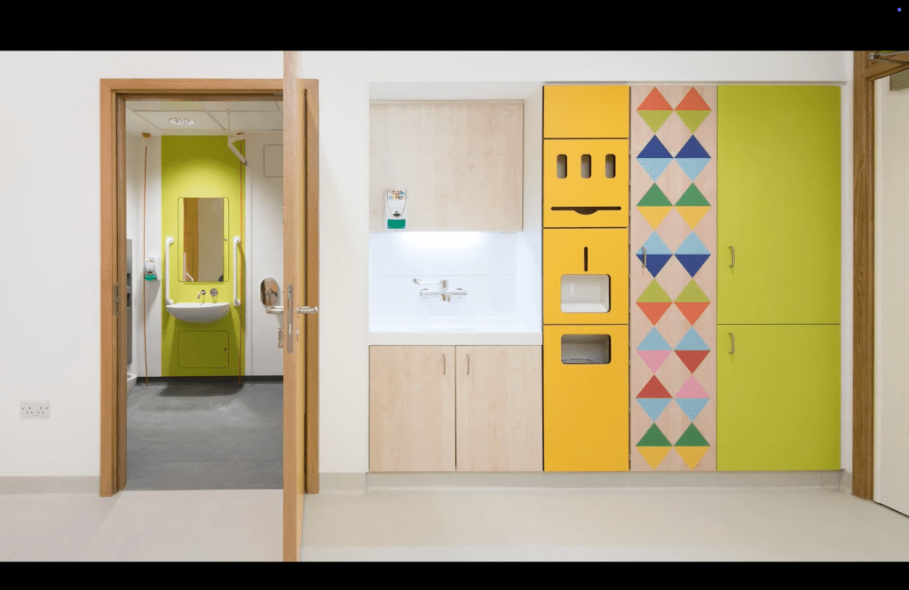
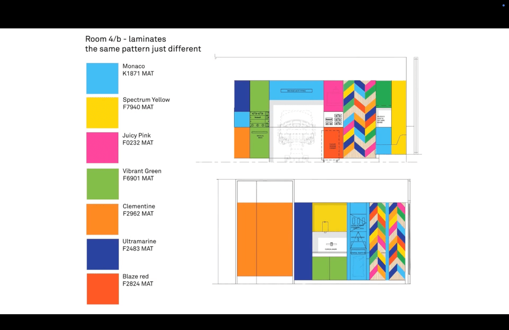
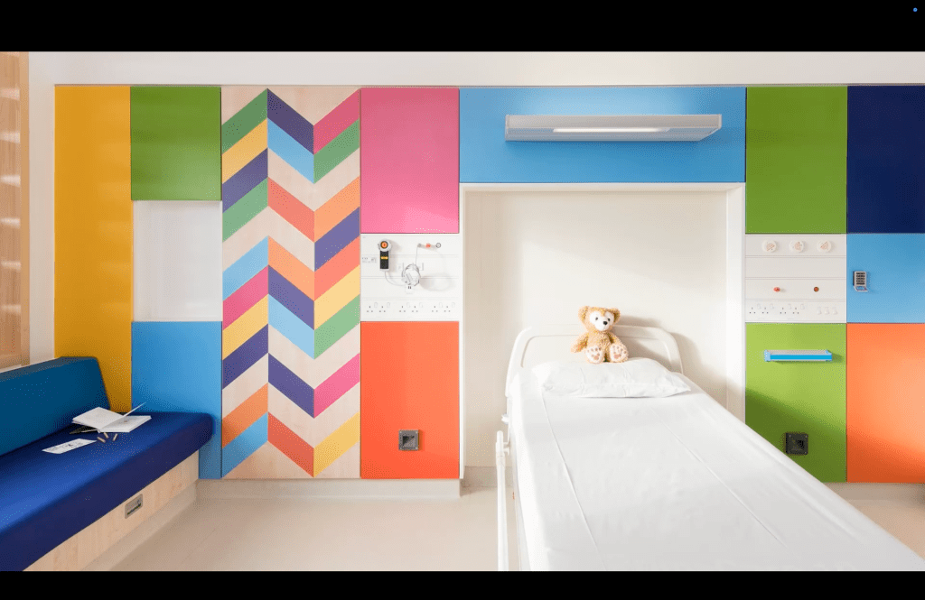
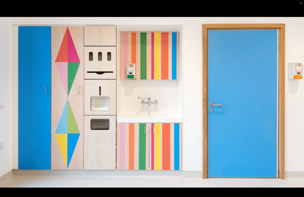
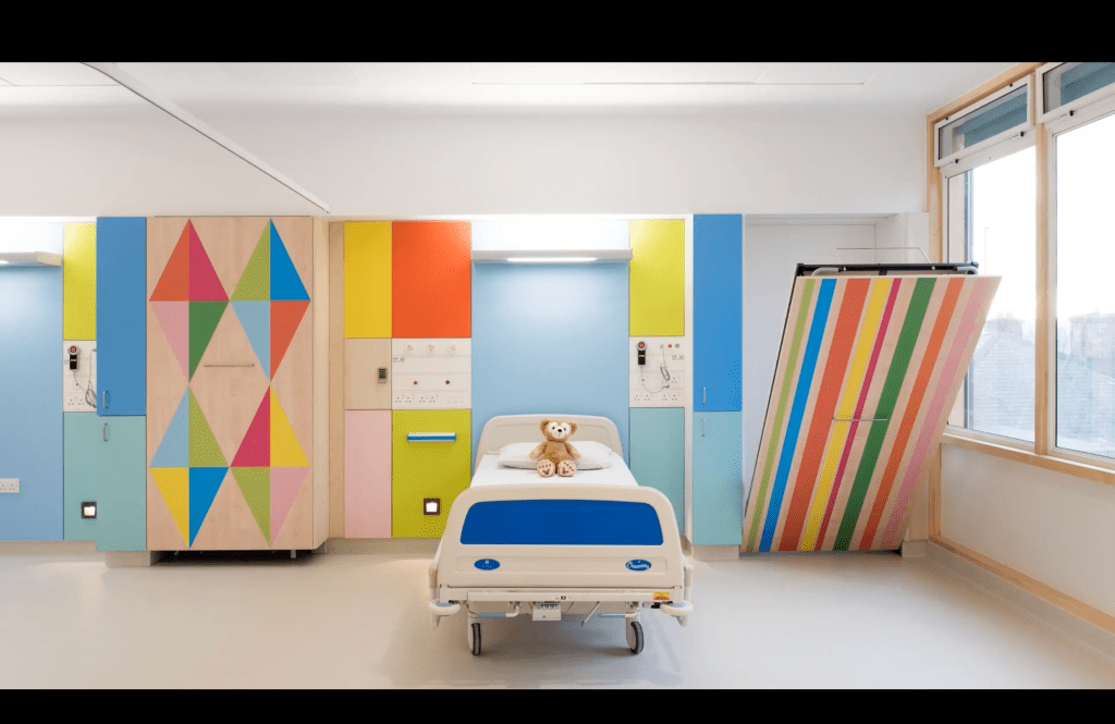
She added wood to the design and that made the space much warmer.
Susanna Edwards asked very interesting question: “This is to you Christoph as well. Do you feel that communication designers are now more intellectually and creatively equipped to innovate in areas of social and political research? Is this integration of design and social sciences an essential need for more speculative interpretation and resolution of the world’s or society’s future needs? It’s something that we think about in education a lot but is this an essential role within communication design? “
–I think the huge challenge is to maintain that standard of being eager to know more, to learn more, to also see things that are different from design blocks, visual things. Try to push your capabilities in terms of I don’t know whatever theory, go to fields that are totally different, like you said, social sciences or whatever. I think maybe design education can be a starting point for that, giving you the curiosity, giving you the idea of how important it can be to have that knowledge and work with it.
‘Design to Change the World’
https://www.offshorestudio.ch/
https://www.are.na/offshore/offshore-work
Graphics that Engage
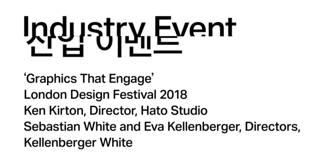
We explored co-creation, play, and public engagement in graphic design through innovative projects and collaborative processes.
Eva Kellenberger, Sebastian White, and Kenjiro Kirton, were the speakers.
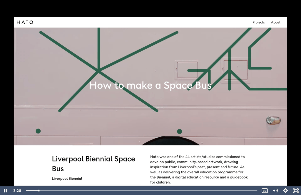
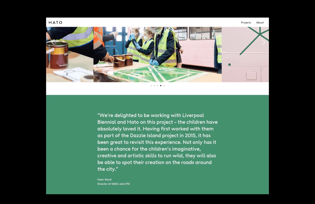
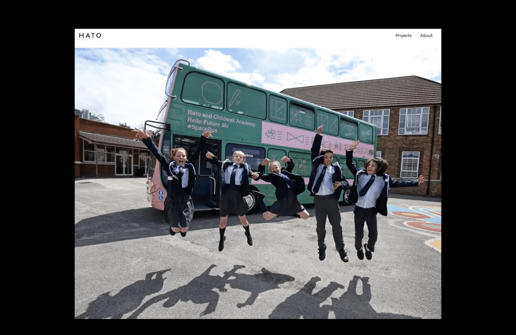
“Kenjiro Kirton emphasized the importance of co-creation in fostering an engaged society, empowering individuals to make informed decisions, and creating innovative frameworks through collaborative processes, as demonstrated in projects like the D&AD Festival and Space Bus.
Eva Kellenberger and Sebastian White discussed their iterative design process for Middlesbrough Institute of Modern Art (MIMA), which involved public workshops, field trips, and collaborative creation of visual elements like linocut typefaces and paint splatter-inspired designs.
Both speakers highlighted the challenges and benefits of balancing control and openness in co-creation, with Eva noting the importance of trusting the process and allowing public input to shape outcomes organically.
Kenjiro explained how co-creation extends beyond public participation to include listening to clients and collaborators, emphasizing its integral role in design briefs across industries.”
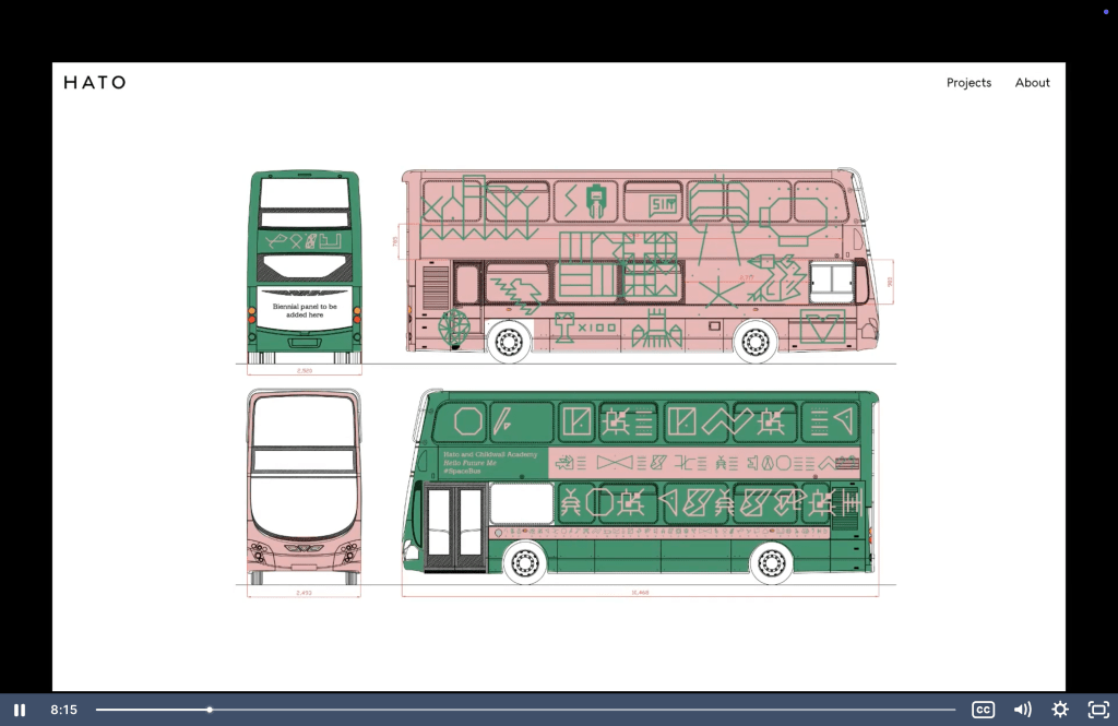
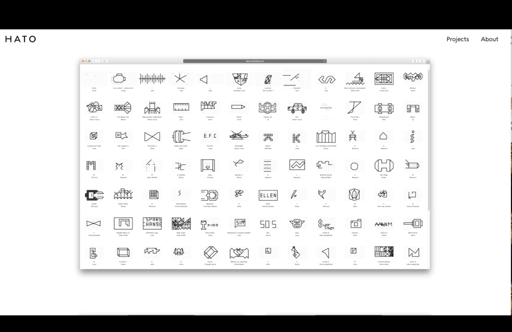
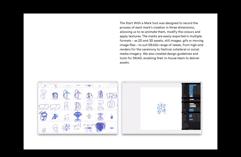
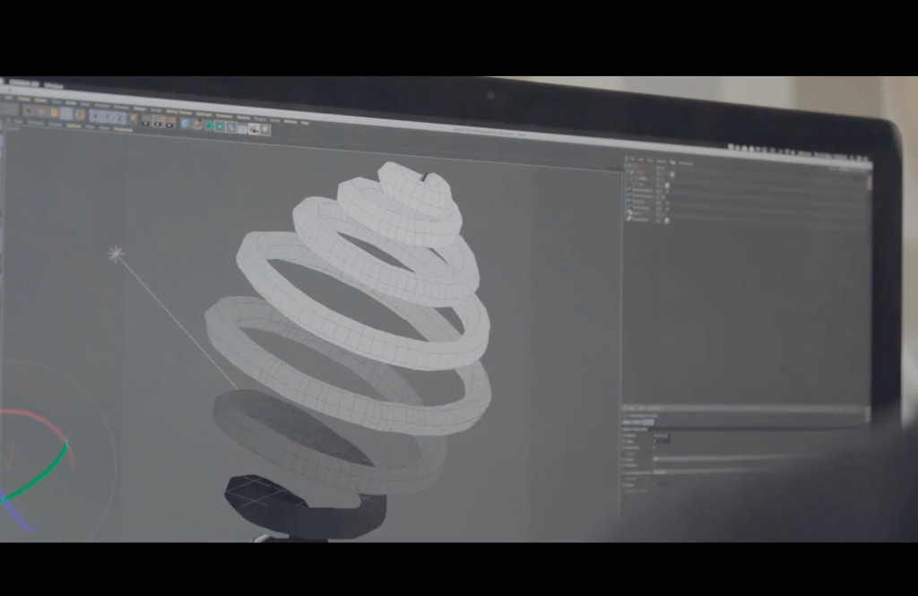
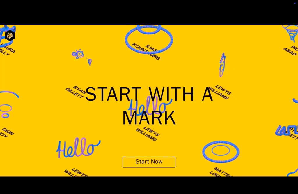
“It uses community generated graphics for a huge range of deliverables, from external windows to partition walls, to even more of a micro level such as printing materials, flyers and posters and so forth. This unique system enabled us to produce an extremely flexible and powerful campaign.
To coincide with the festival, we produced an augmented reality iteration of the drawing tool. That allowed users to make marks with their mobile phone in the real world. And alongside this we worked with Microsoft Surface to produce a drawing tool version on the surface devices. That allowed people in the festival to actually make marks on site, using the pen tool on the screen. “
The lecture concluded with reflections on the evolving role of graphic design in fostering community engagement and addressing social responsibilities.
https://kellenberger-white.com/
“Kellenberger–White is a graphic design studio in London. We develop visual languages and creative strategies for people and institutions to communicate with impact. Our work is collaborative, context-responsive and rooted in human touch.
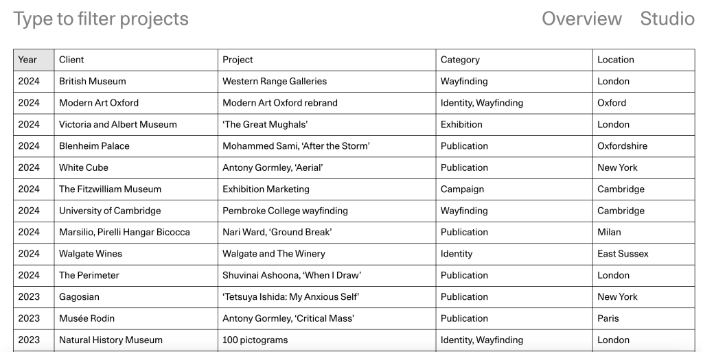
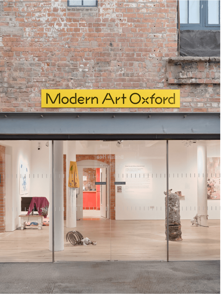
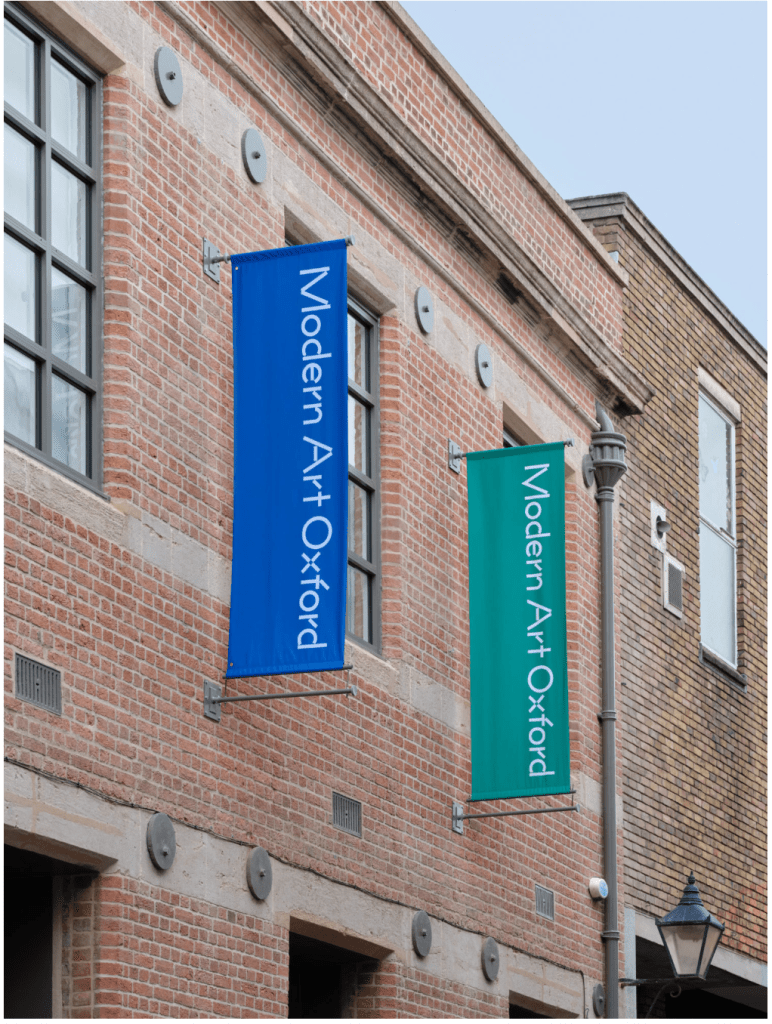
Notable commissions include: exhibition design for the V&A, the British Museum, and the Design Museum; wayfinding for the London School of Economics and the University of Cambridge; brand identities for Goldsmiths Centre for Contemporary Art and Modern Art Oxford; and publications with MIT Press, Tate, Hauser & Wirth, Pace, Lisson, Sadie Coles, and White Cube.
Our work has been acquired by public collections across Europe, garnering awards such as the Swiss Federal Office of Culture’s Most Beautiful Swiss Books and the Tokyo Type Directors Club. We are members of the Alliance Graphique Internationale.
Founded in 2009 by Eva Kellenberger and Sebastian White, the duo work on every project alongside a core team which includes Alma de Juan Rollán and Sohee Kim.”
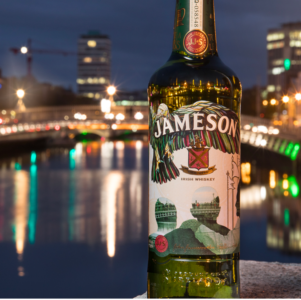
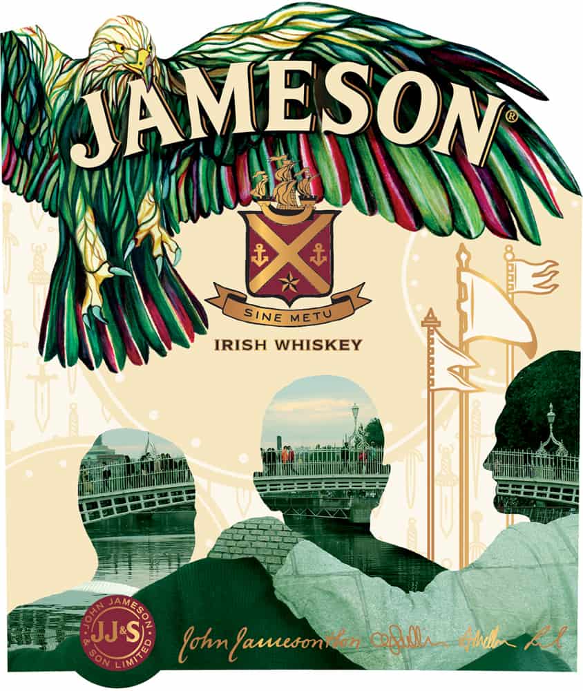
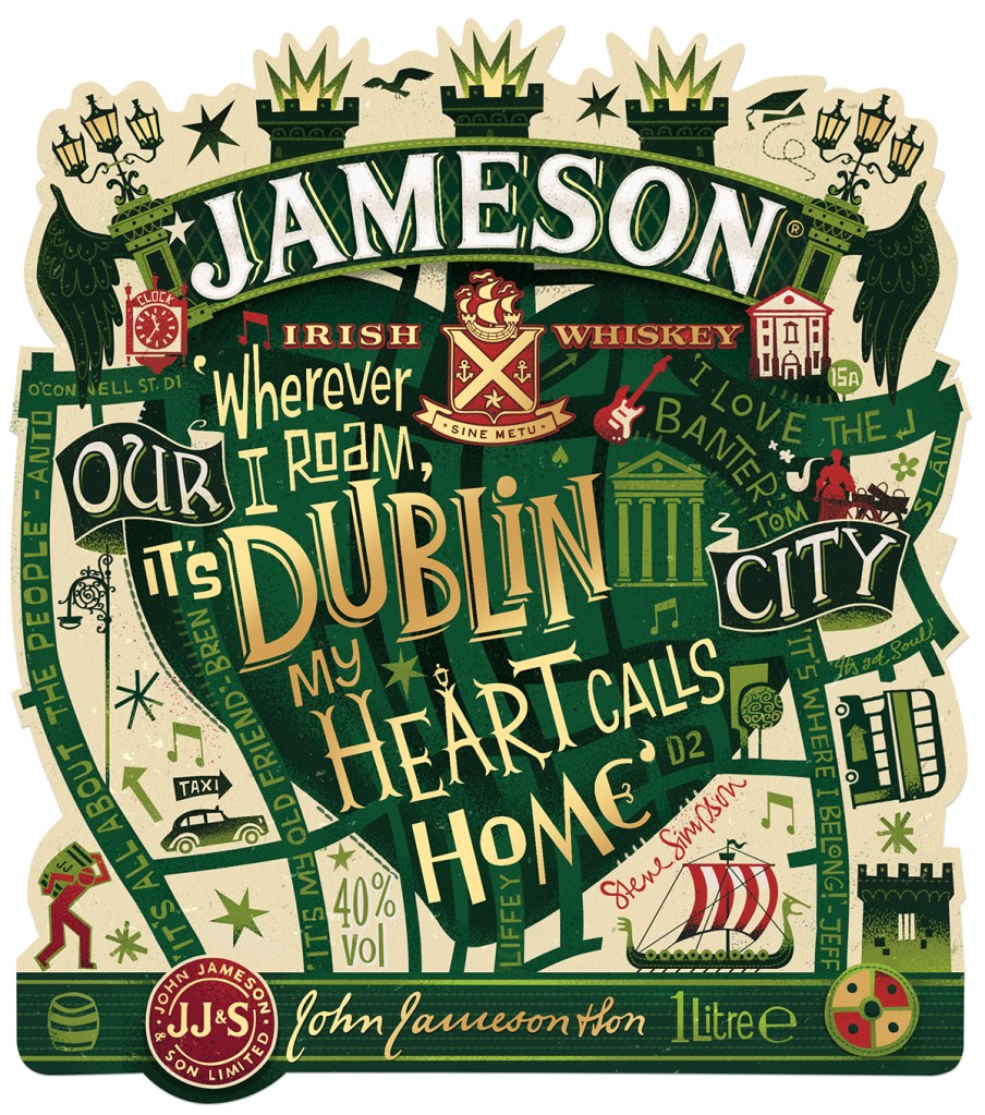
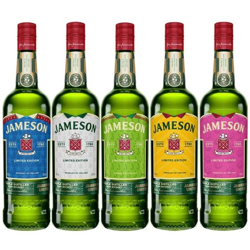
Presentation of Havana Club 3 and Jamieson Ltd Edition:
collaborative projects by Pearl Fisher London.
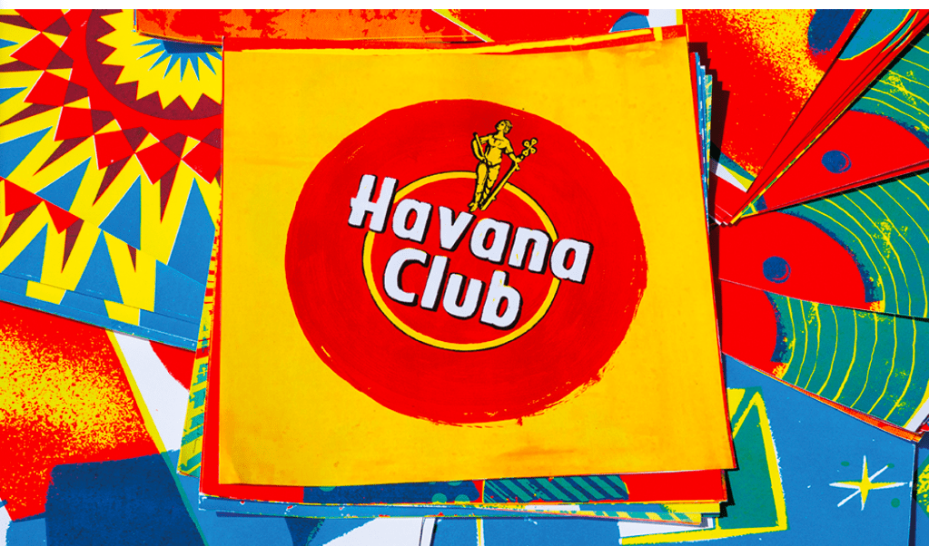
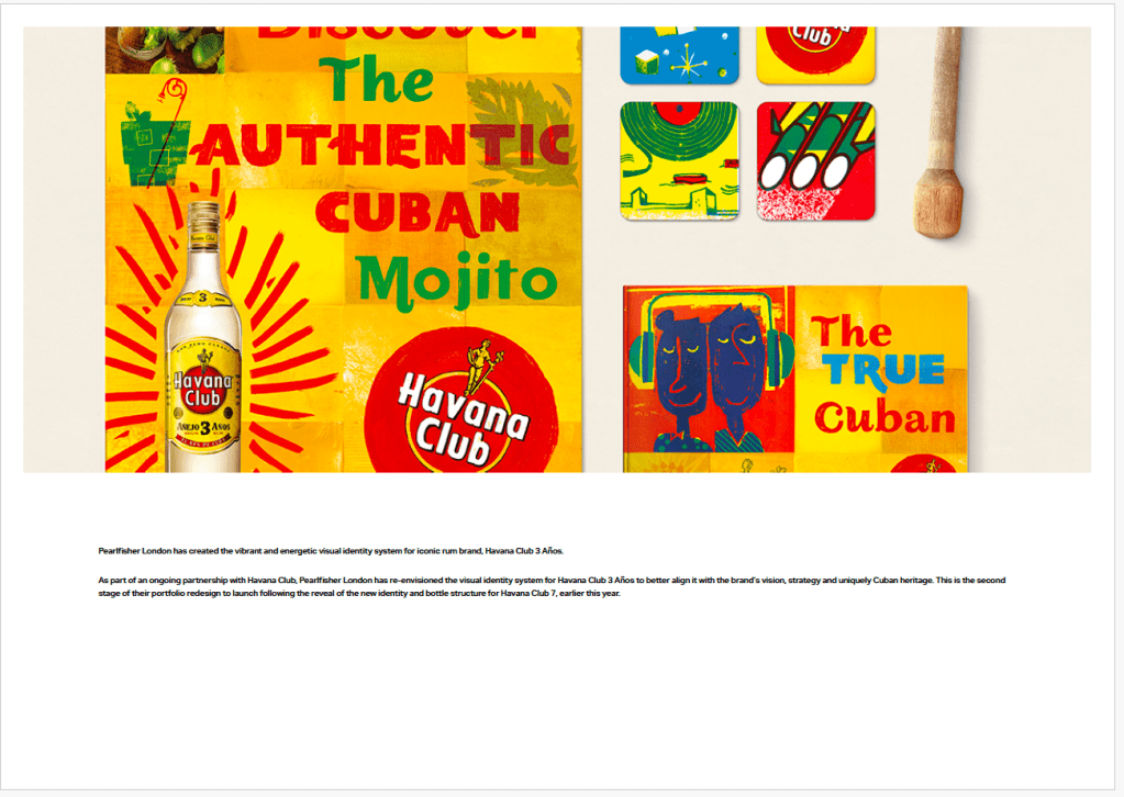
I like the combination of these bright colors, shapes, images and typography. You get the feeling of the Cuban community.
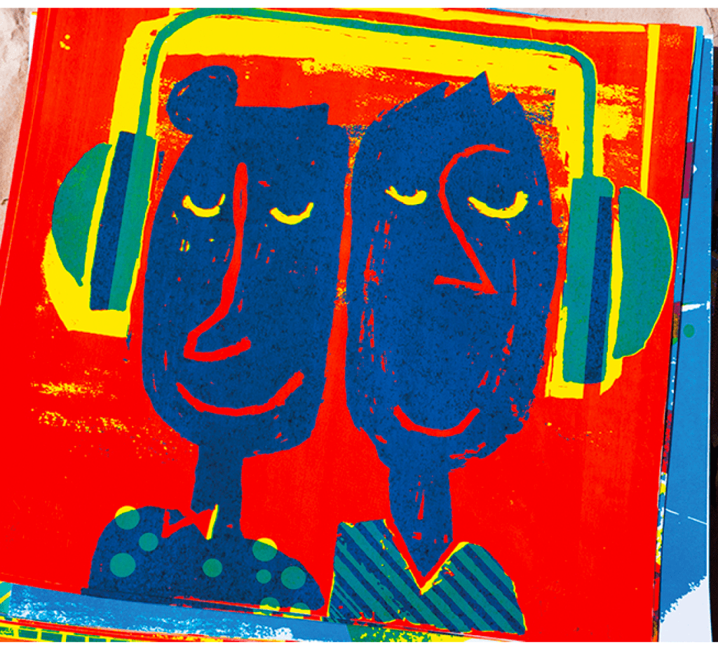
These is the project for the creation of the annual limited edition of the Jameson whisky.
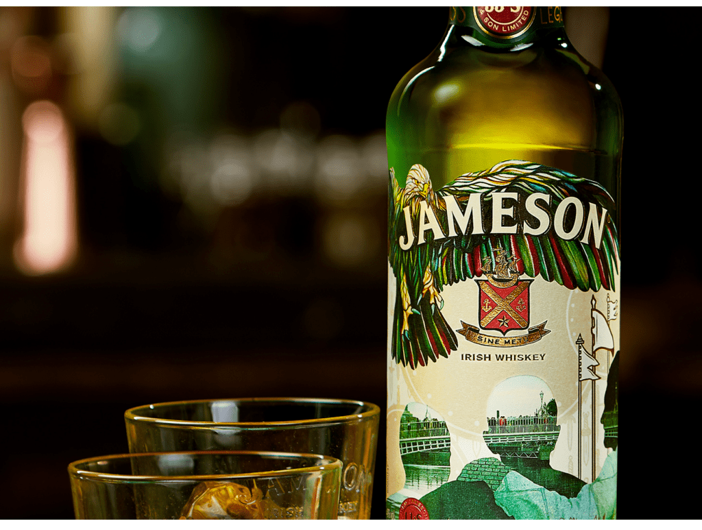
The goal was to deliver sense of connection with people on a more of a global level and I think was achieved successfully.
They have used doubled exposure in the shapes of the people to create the global perspective of the project.
And the hand on the back is sending the message of togetherness and piece.
https://www.friendandjohnson.com/illustrators-down-the-street-designs-illustration
https://www.100archive.com/projects/jameson-2020-limited-edition-bottle-design
1. Carter, M., Mandani, S. (2016) ‘Tune out, dive deep, read on’, [online] Eye Magazine, Summer. Available at: http://www.eyemagazine.com/feature/article/tune-out-dive-deep-read-on
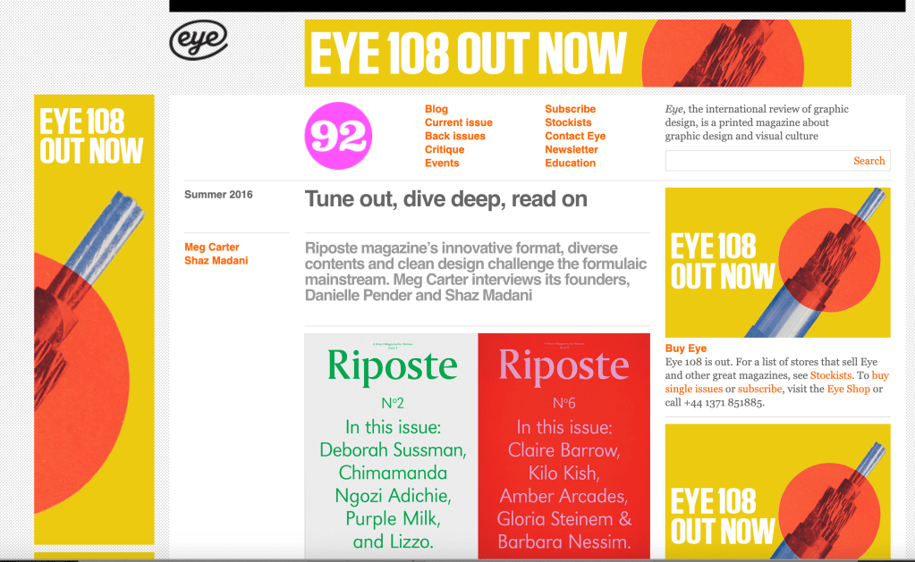
“Launched in 2013, Riposte was born of a desire to create an antidote to mass-market women’s magazines obsessed with airbrushed celebrity cover stars and bikini-body headlines. Today, the magazine has an articulate, opinionated and loyal audience attracted by its in-depth exploration of subjects...
Eye is the world’s most beautiful and collectable graphic design journal, published quarterly for professional designers, students and anyone interested in critical, informed writing about graphic design and visual culture.
Madani says: ‘My background is in print, and we shared the belief you can’t replace the feeling of holding a printed magazine in your hands. A magazine is a more timeless and collectable object that, in turn, equates to better written and long-form articles,’ she says. ‘Print forces you to think more carefully about commissions and content. Every inch and page of a printed magazine is precious: you just can’t be frivolous or careless with it!’”
I agree – maybe I am old fashioned – but I preferred printed magazine than digital. The feeling is different.
When you’re building something, there comes a point when you can start thinking of expanding,’ says Pender. Her wish-list includes a spin-off book, products, developing live talks and social events and upgrading the Riposte website beyond its current ‘shop window’ function.“
2. It’s Nice That, Danielle Pender (2019) Nicer Tuesdays Riposte magazine, [online video]
Danielle Pender talks about why she decided to launch a new women’s title and the challenges involved in launching a new print venture. She again said that she doesn’t believe that print is death.
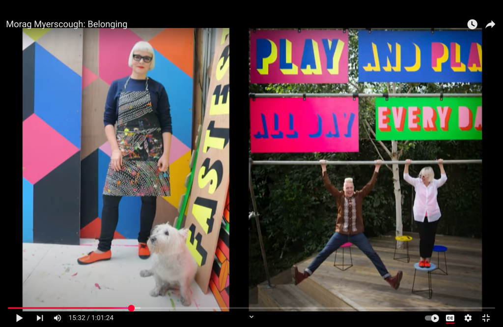
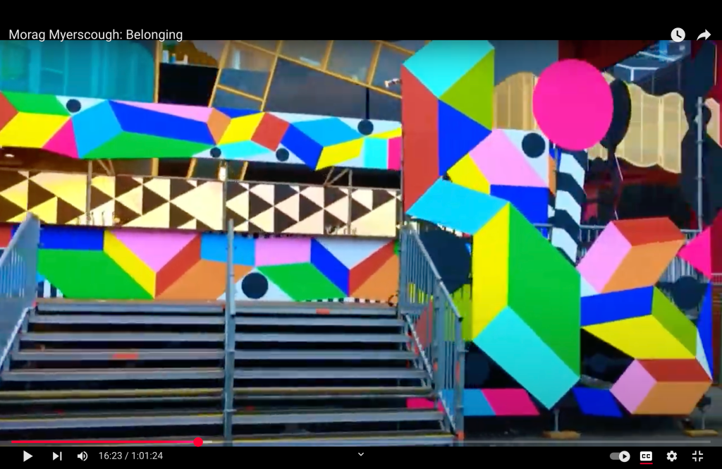
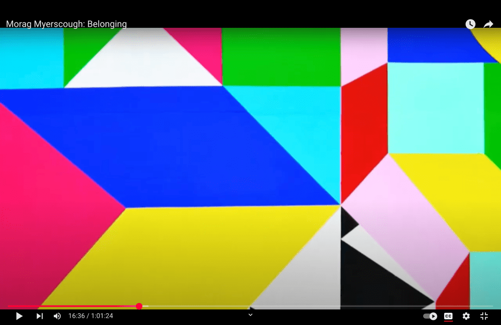
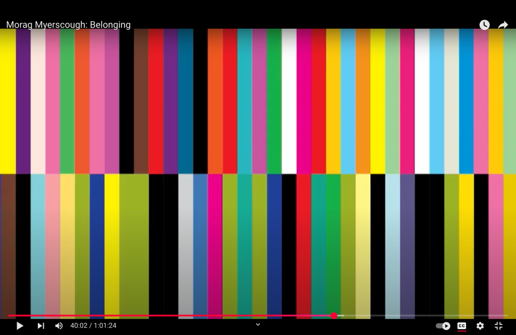
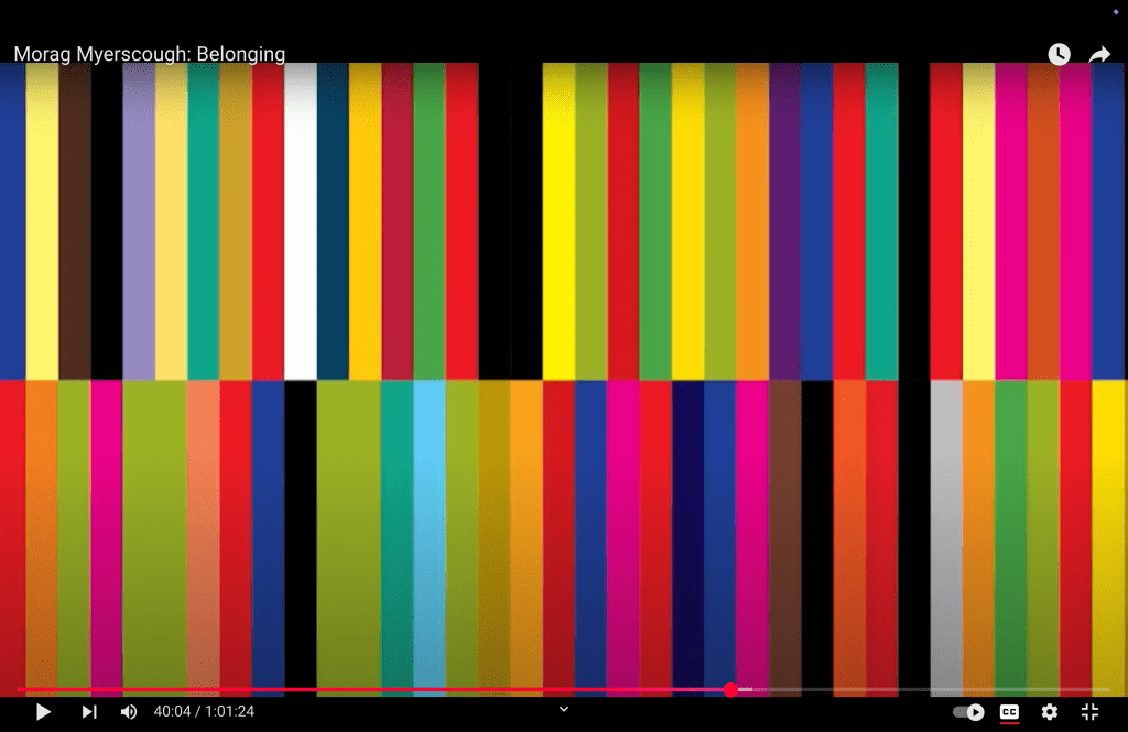
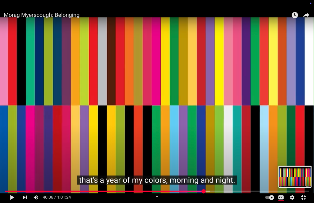
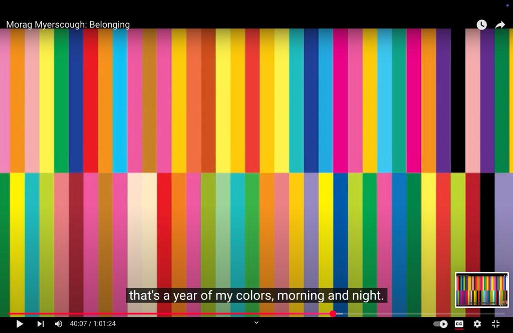
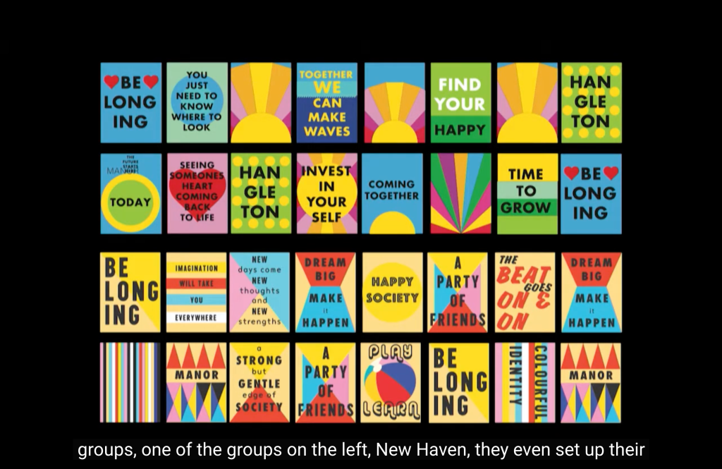
Penny Stamps Lecture Series, MoragMyerscough(2018) Belonging,
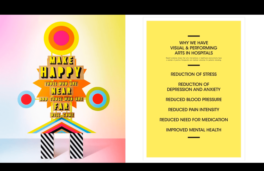
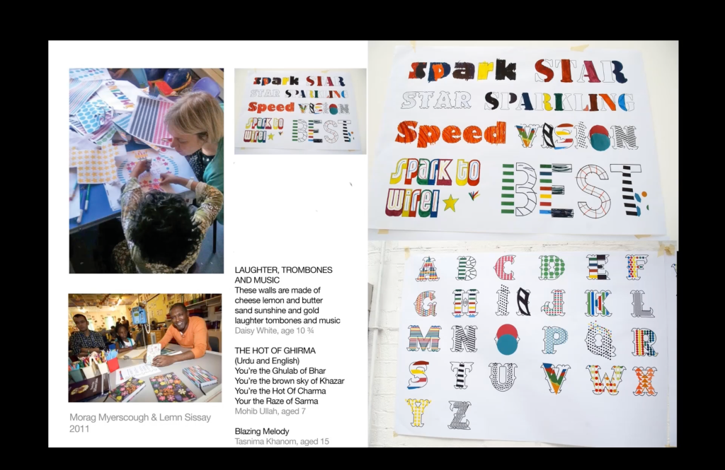
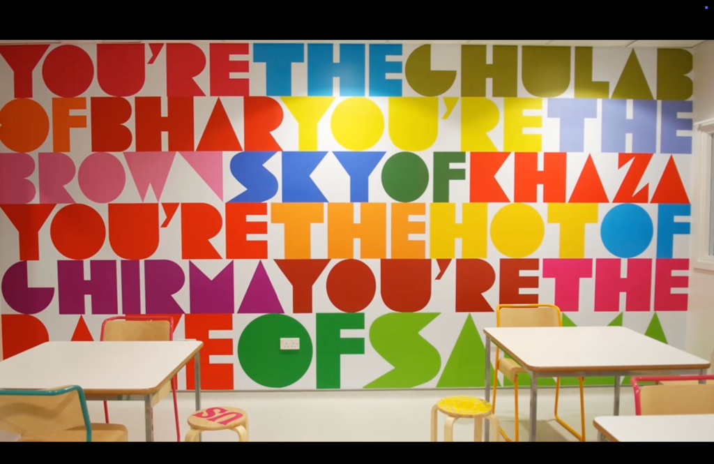
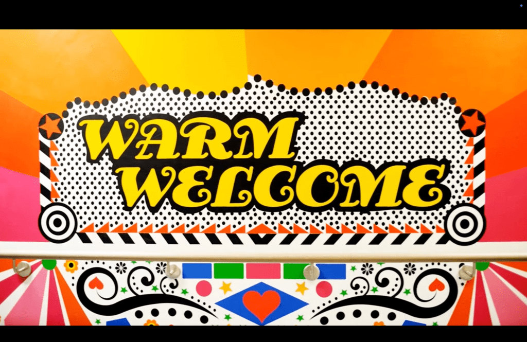
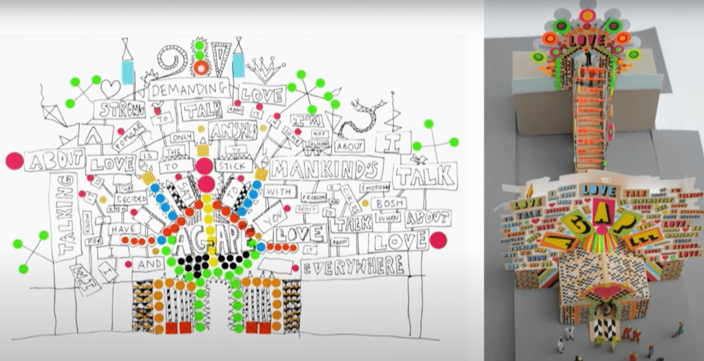
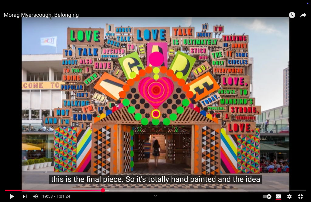
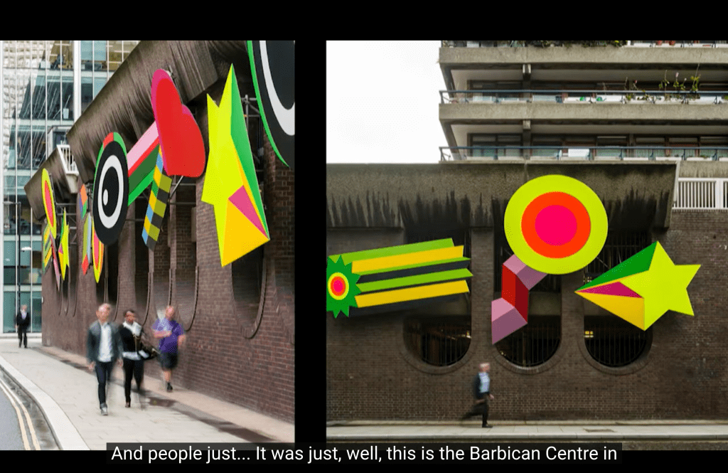
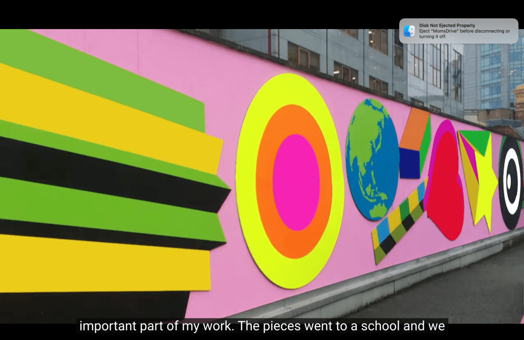
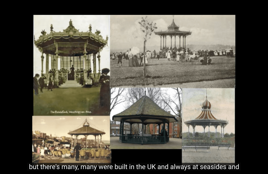
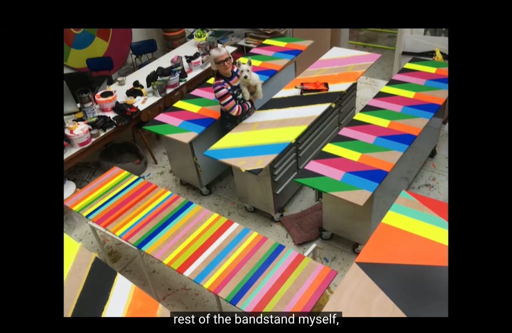
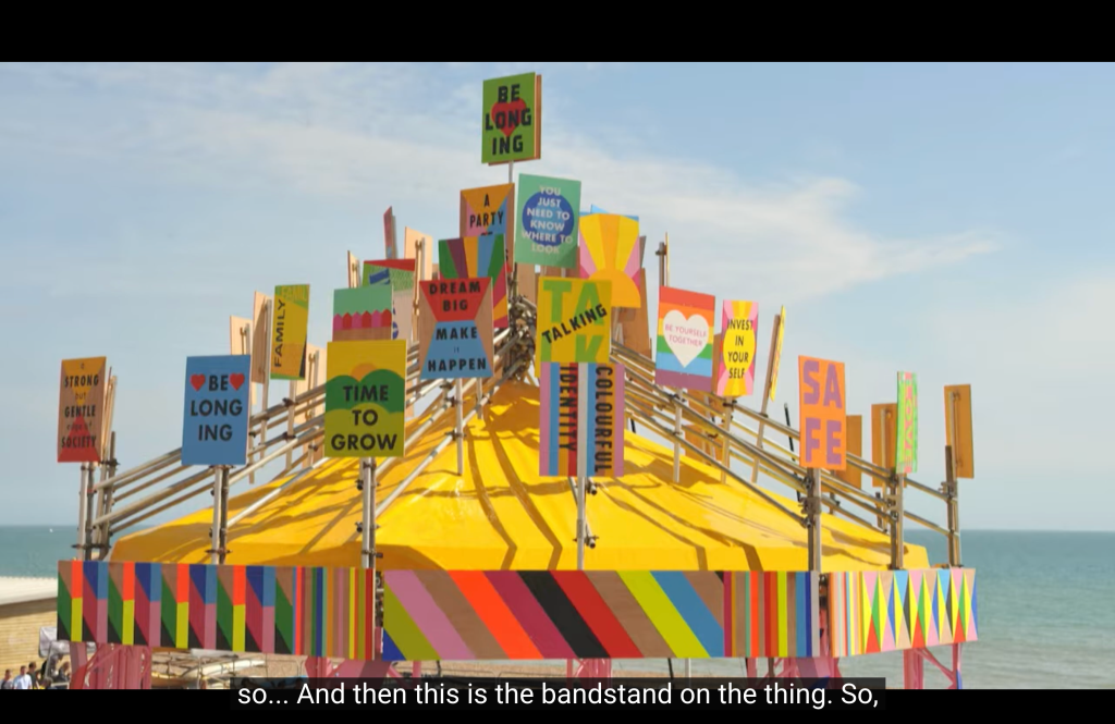
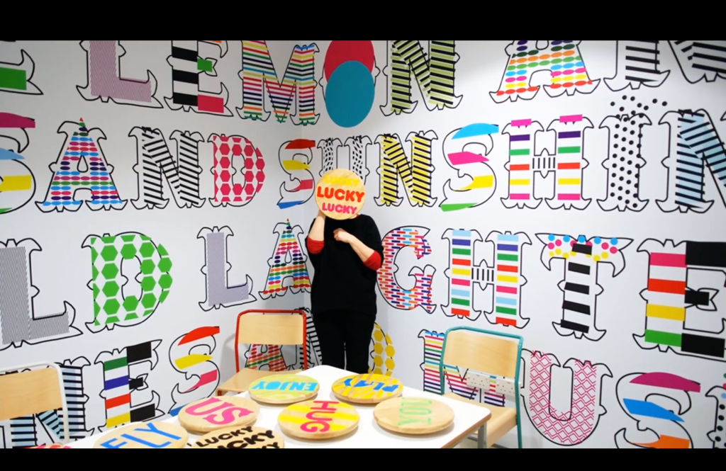
“A proud Londoner, Morag Myerscough has always lived in the city and has been fascinated by how color, pattern, and words can change urban environments and perceptions of spaces into places. From schools and hospitals to cultural hubs and town centers, Myerscough explores the theme of “belonging” in her work, using it to transform public spaces by creating welcoming, engaging experiences for everyone. Myerscough’s Temple of Agape, built for the 2014 Festival of Love on London’s South Bank, used public space to create an open, interactive symbol of devotion to love in all of its forms. Rooted in creating a sense of joy and belonging for all who encounter a space, Myerscough creates specific local responses to each distinct audience that will see and experience her work, using it to create community and build identity. Her visual vocabulary is inclusive by nature and its effortless energy resonates both visually and emotionally with audiences well beyond geographical and cultural boundaries. Myerscough’s contribution to educational environments was recognized in 2015, when her work with Allford Hall Monaghan Morris on Burntwood School won the Stirling Prize for Architecture. She was made an RSA Royal Designer for Industry in 2017.”
These is her family:
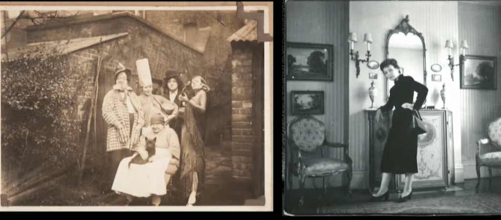
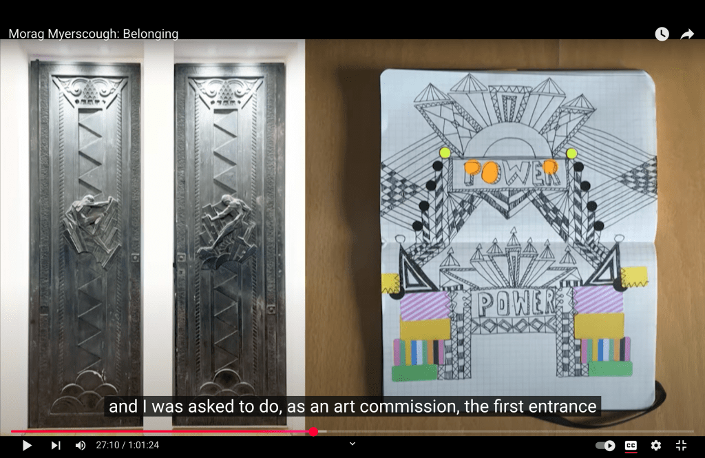
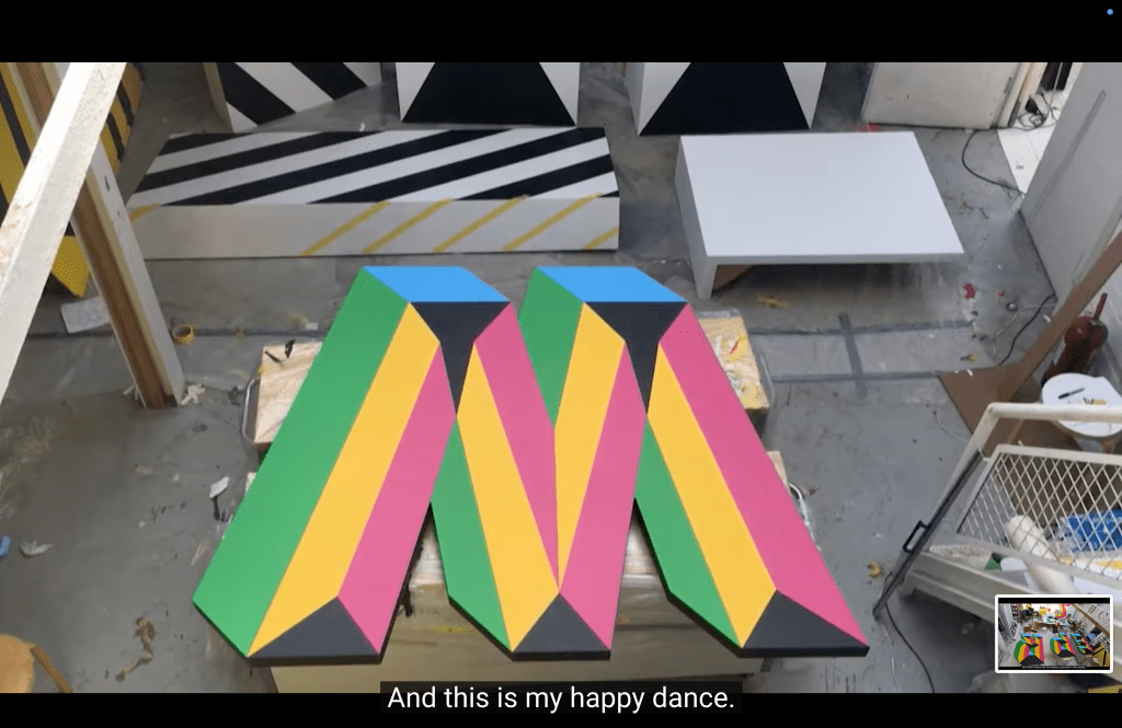
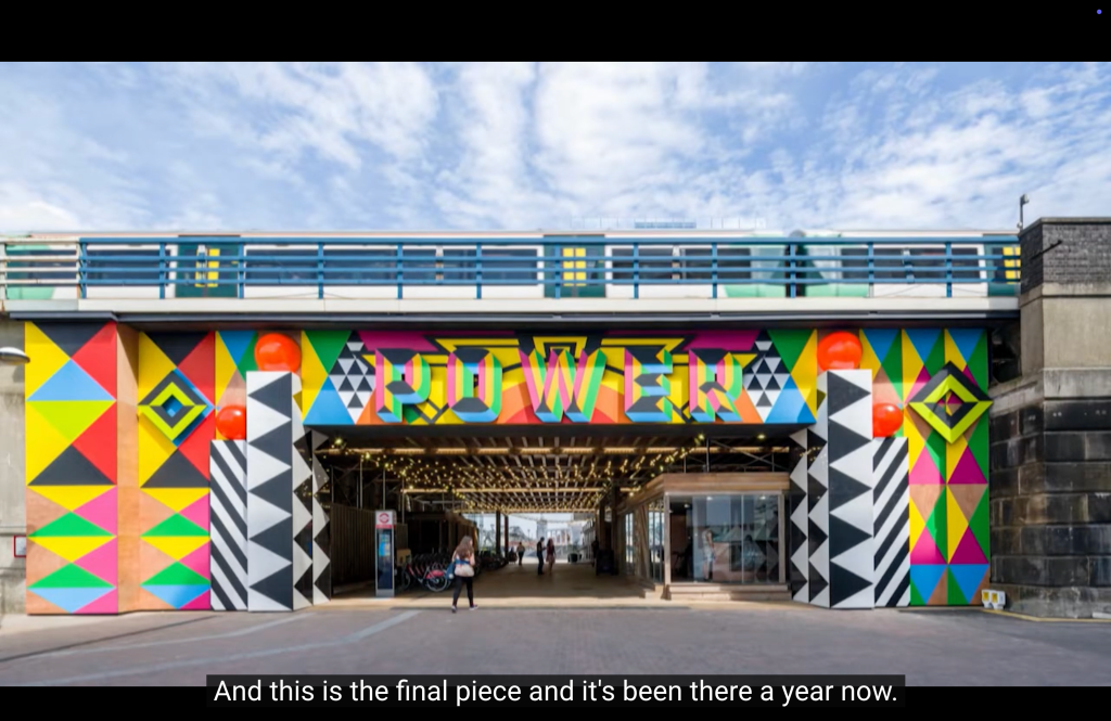
This is her first project for the streets of London:
It is interesting that she gets ideas from traveling and seeing a lot of things
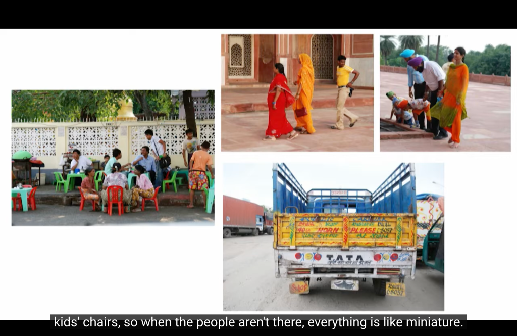
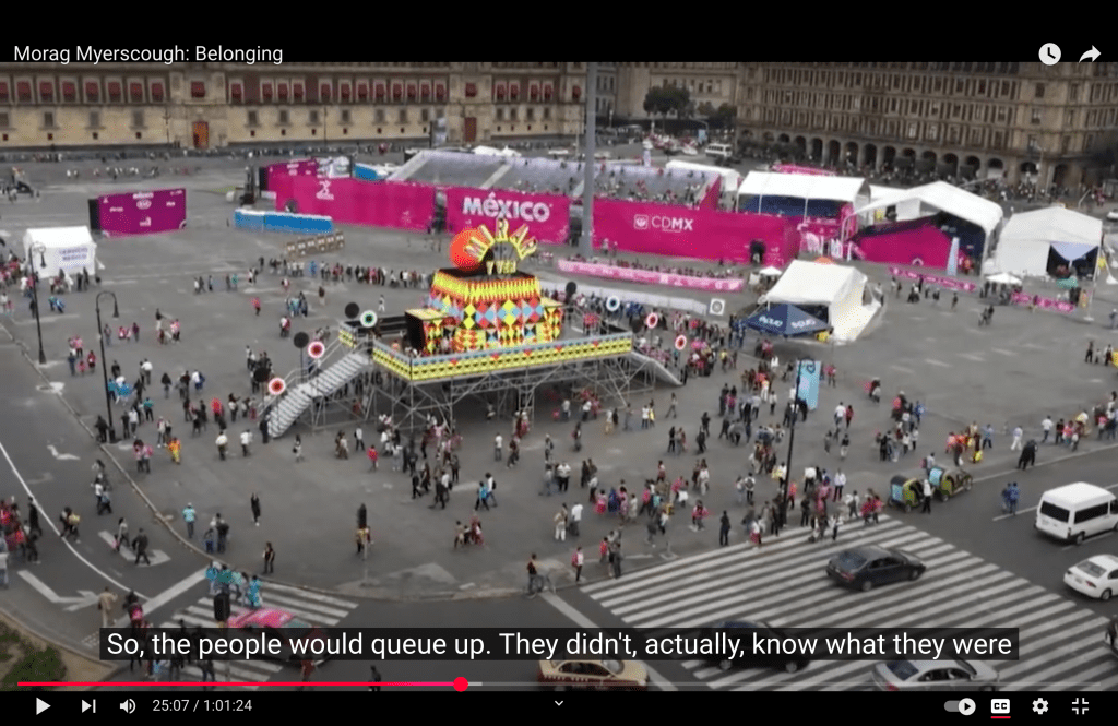

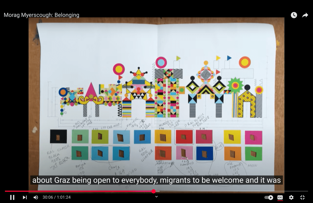
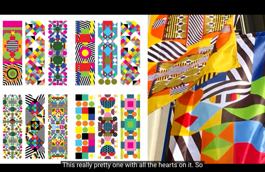
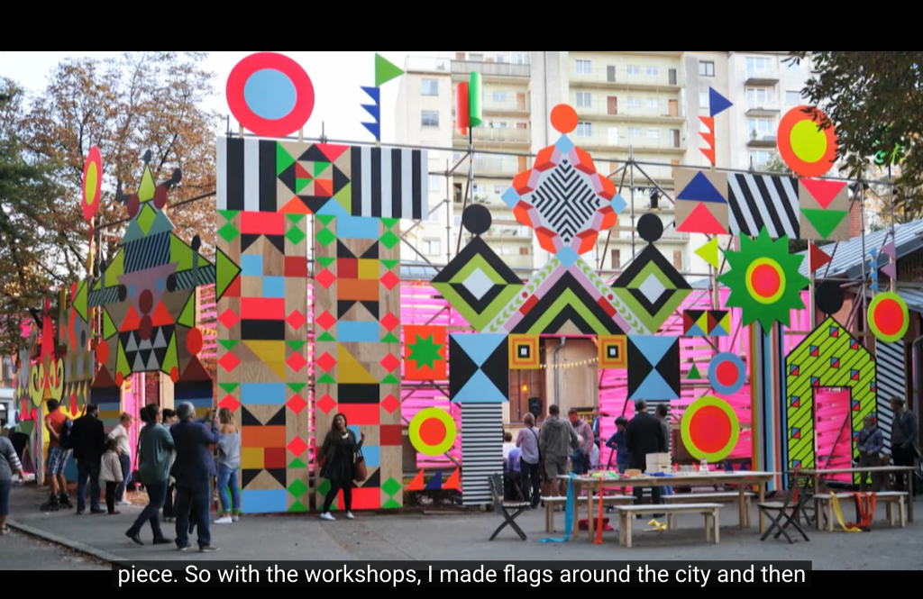
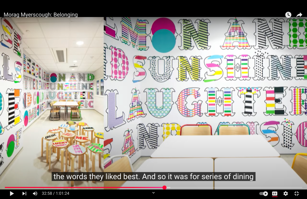
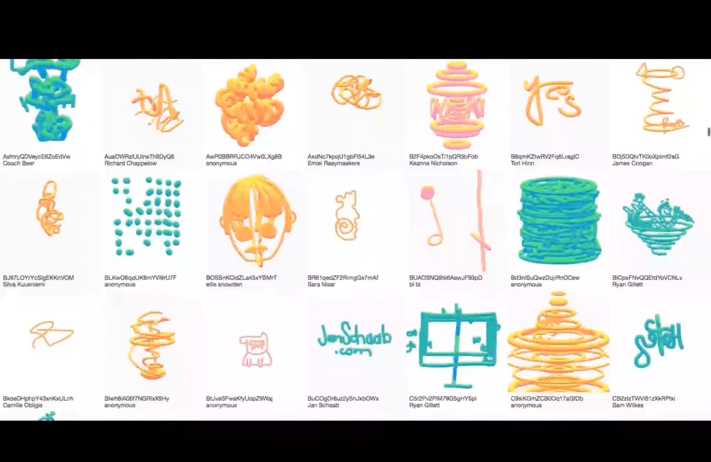
I learn that you can get inspiration from the audience sometimes for your projects – she was putting the kids to color different shapes and they came up with so interesting designs.
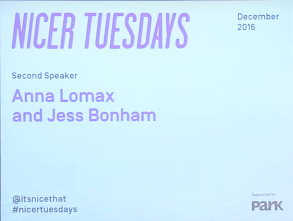
It’s Nice That, AnnaLomax and Jess Bonham (2016). Nicer Tuesdays
It’s Nice That, Liv Siddall(2016) Nicer Tuesdays: Rough Trade ;magazine
BBC News (2019), ‘Photographer Trevor Keys album sleeves go on show’
https://www.bbc.com/news/uk-england-humber-41331715
“Key lived in London but grew up in Hull and attended the city’s art college. He died of a brain tumour in 1995 at the age of 48. Trevor Key’s portfolio includes Mike Oldfield’s Tubular Bells cover and New Order’s Technique and True Faith.”
https://www.showstudio.com/contributors/harri_peccinotti
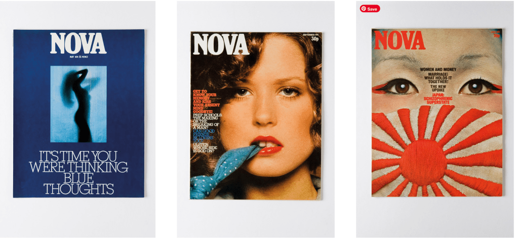
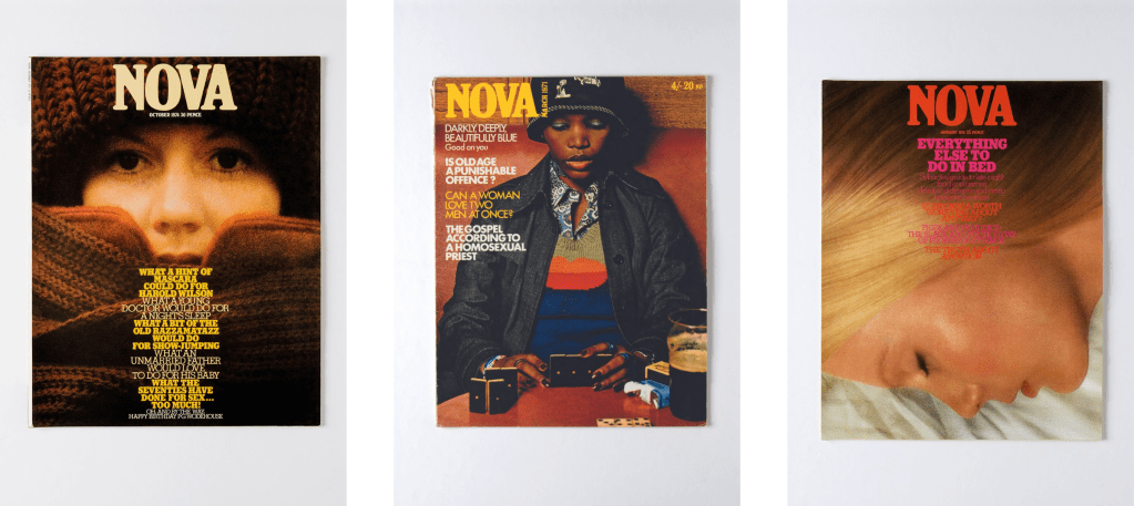
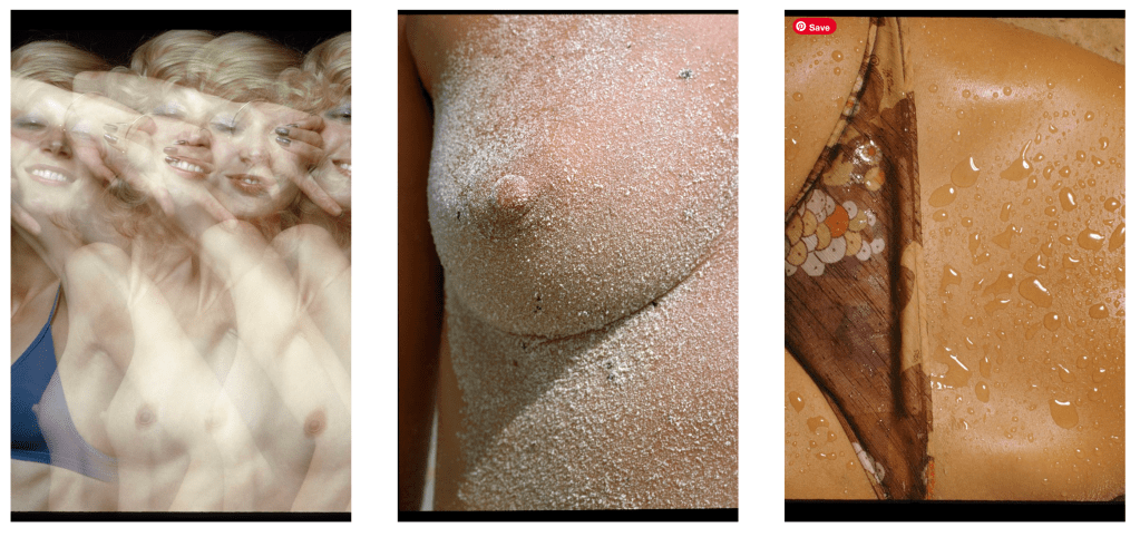
“Harri Peccinotti is a British born photographer now based in France.
He was first known for his legendary work for Pirelli Calendar in 1968 and 1969. Since then, he has been a major influence in both art and fashion photography.
He was art director at UK fashion magazine Nova and photographed a number of book covers for Penguin during the 70’s. His mastery of capturing the female form and classy use of eroticism has given him the timeless photographic success he enjoys today and renews for recently published stories in Vogue Hommes International, Muse, Purple Fashion, The Gourmand or 7000 Magazine, among others.”
https://www.maryambrepresent.com/work/biography/harri-peccinotti

O’Brien, K. (2019) ‘Director Tony Kaye happy to be working and out of “Hollywood jail”’,
https://www.thedrum.com/news/2018/04/17/director-tony-kaye-happy-be-working-and-out-hollywood-jail
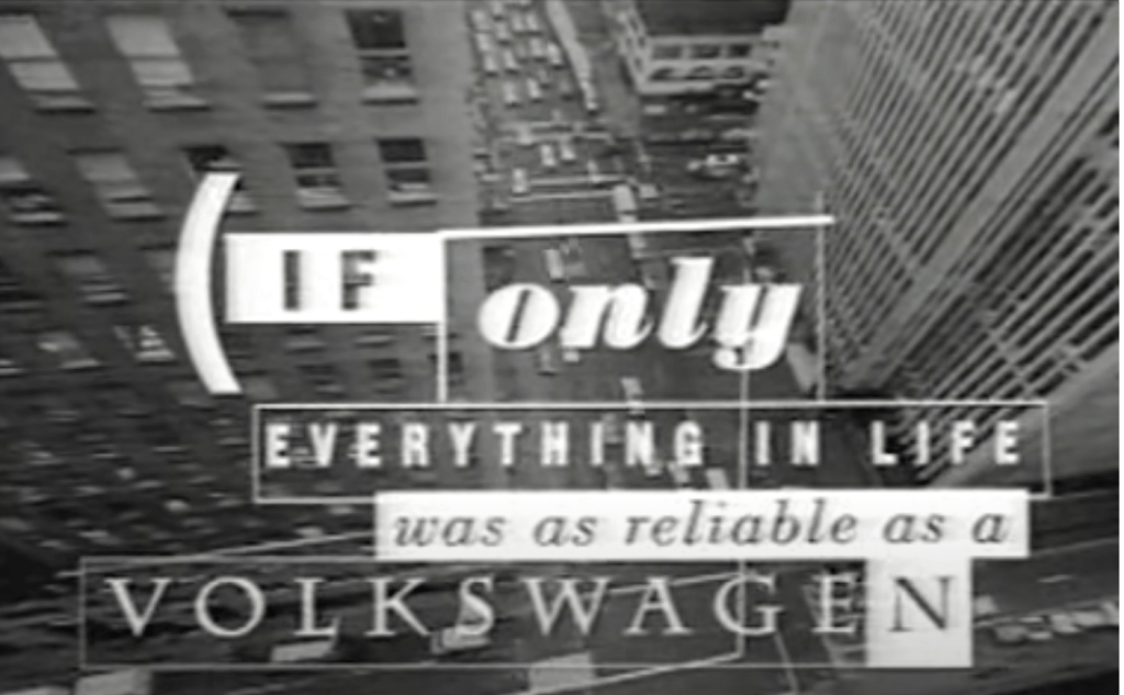
“As an ad director, Kaye helped change the way people think about advertising. His style went way outside of the box. Both visceral and real, with visual ideas that were big and cinematic, Kaye developed a reputation for an edgy style that borrowed from movies, often shooting in grainy black and white. His D&AD-winning 1990 ‘God Bless the Child’ ad for VW showed gritty scenes of urban life as a little girl watched, then gets safely into a Volkswagen Passat with the tagline ‘If only everything in life was as reliable as a Volkswagen.’ His Volvo ‘Twister’ spot showed the violence of tornadoes as a storm chaser deftly dodged storm debris in his car.”
DesignBoom (2019) Interview with graphic designer Vaughan Oliver,
https://youtu.be/r9UYuw5DKgQ?si=1i61c3KlmPy0ToFZ
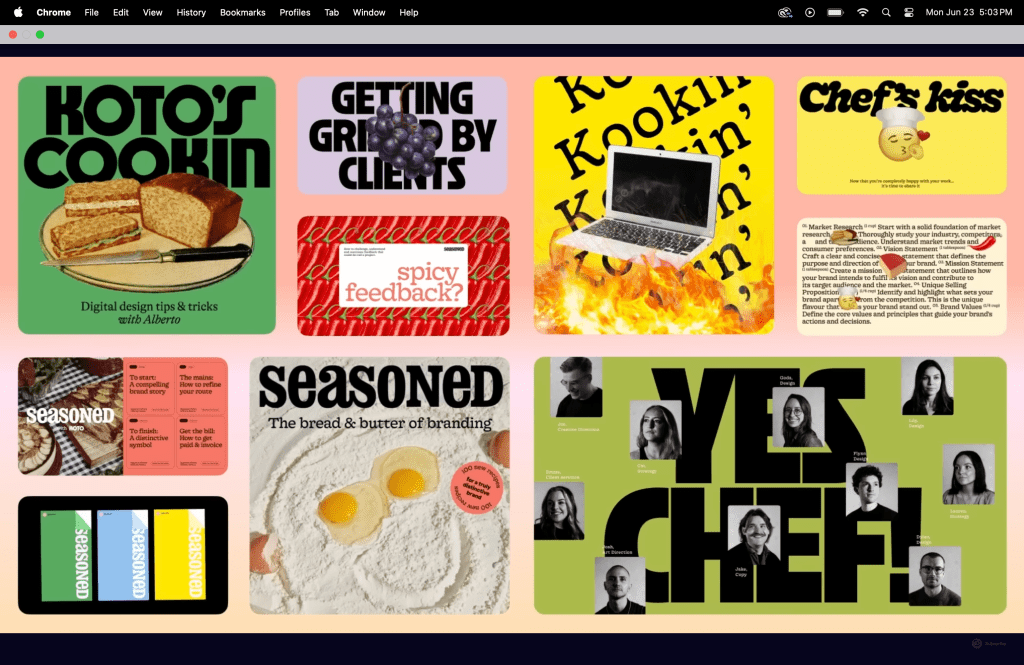
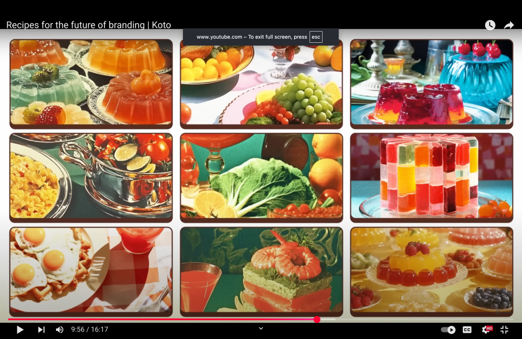
It is interesting how they use the concept of creating recipes and cooking to the graphic design.
Working on the Project 1 and 2

I changed the colors – I think the blue that I had before was too boring – I wanted something brighter and more energetic.
I am still not happy with these colors, so I did another change
I am not sure about the brown fill color – I will think about it again
Here the new layout:
It seems that something is missing – I decided to add some shapes in the background – to add some movement and make it more modern
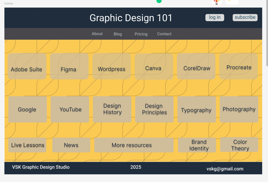
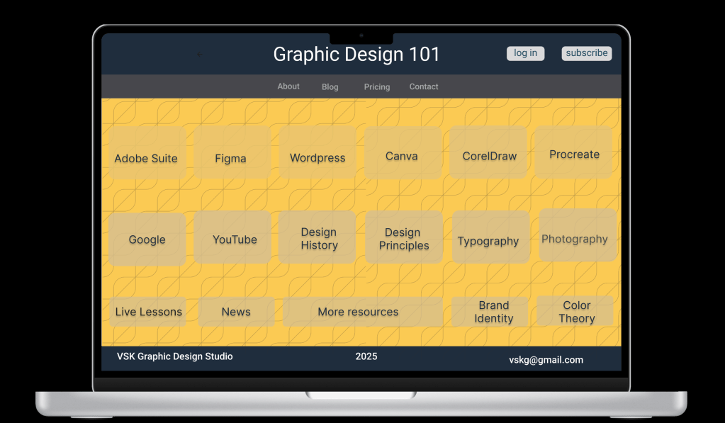
so far the prototype looks like this
Assignment 5
Researching the ways in which graphic designers produce work collaboratively. Reflecting on examples of impactful collaborative work.
I think today the collaboration is on very different level from years ago – sometimes creating one project involves web designers, UX and UI designers, developers, content writers, and marketing teams (witch can also has many different positions)
Good management of the feedbacks and clear communication are very important elements of the collaboration process.
In Miro and FigJam you can put your brainstorm ideas and sketches and share it with the team.
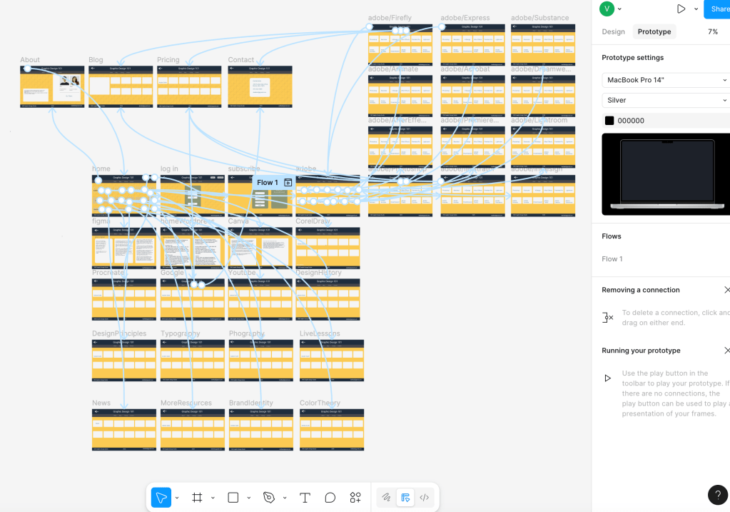
With Figma you can do changes in real-time. I am doing my project 1 on Figma (the prototype) and I use 2 computers (laptop and desktop) – as soon as I do something on the one, immediately shows on the other screen – it is so helpful.
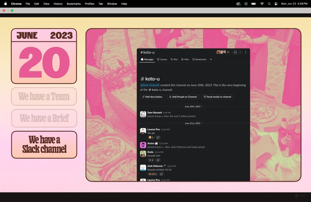
You can use communication platforms like Discord, Microsoft Teams, and Slack to provide the whole team with information about the project.
We learn about the Offshore Studio that they find way to communicate for their projects despite the different locations of each one of the team.

Christoph Miller said “When I say ‘we’ it’s not only Isabel and me, there’s a whole team involved. In the beginning there were four people. Justinien, who is our editor, he’s originally from Paris, he moved to London where he is living now. There was also Caterina, a girl from Portugal. She’s opted out now, but we have two new editors, Michaela, who lived in Russia and is now in Switzerland, and also Damaso who is from Spain but is living in London now. So, its’ pretty interesting that migration is very much embedded into our own lives. It’s very much our own story as well. Actually, we are all living in countries where nobody holds the passport of.”
There is another time of collaboration that we learn about this week – with people that are non designers, they are part of the collaboration that the project is crated for. For example Morag was designing some of the spaces with the help of group of kids – this is very unique approach.

https://metadesign.com/en/offices
“Our team across eight locations uses the power of creativity to transform businesses for the better.” – so, having different locations is actually a plus when it comes to crating a project – I think that people with different thinking and skills can contribute to the project differently and this will help the creation of a unique design.
